Tag: french
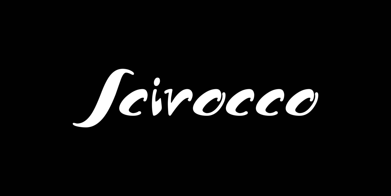
Scirocco Font
“Scirocco” is a hot and humid wind that blows from the Sahara over to France and Italy. It crosses the mediterranean sea and carries lots of fine desertdust with it. Once it hits the costs of Provençe one can feel
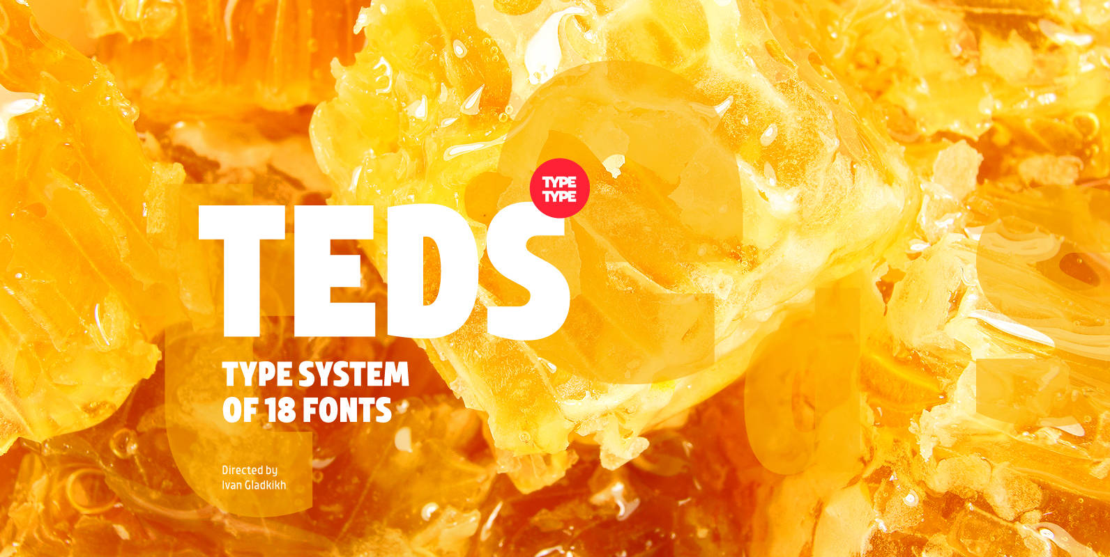
TT Teds Font
Teds is a geometric non-serif with narrow proportions created for universal application in any types of text. Relatively tall lowercase characters, open forms of semicircular characters, and low contrast between vertical and horizontal lines make this font type easy to
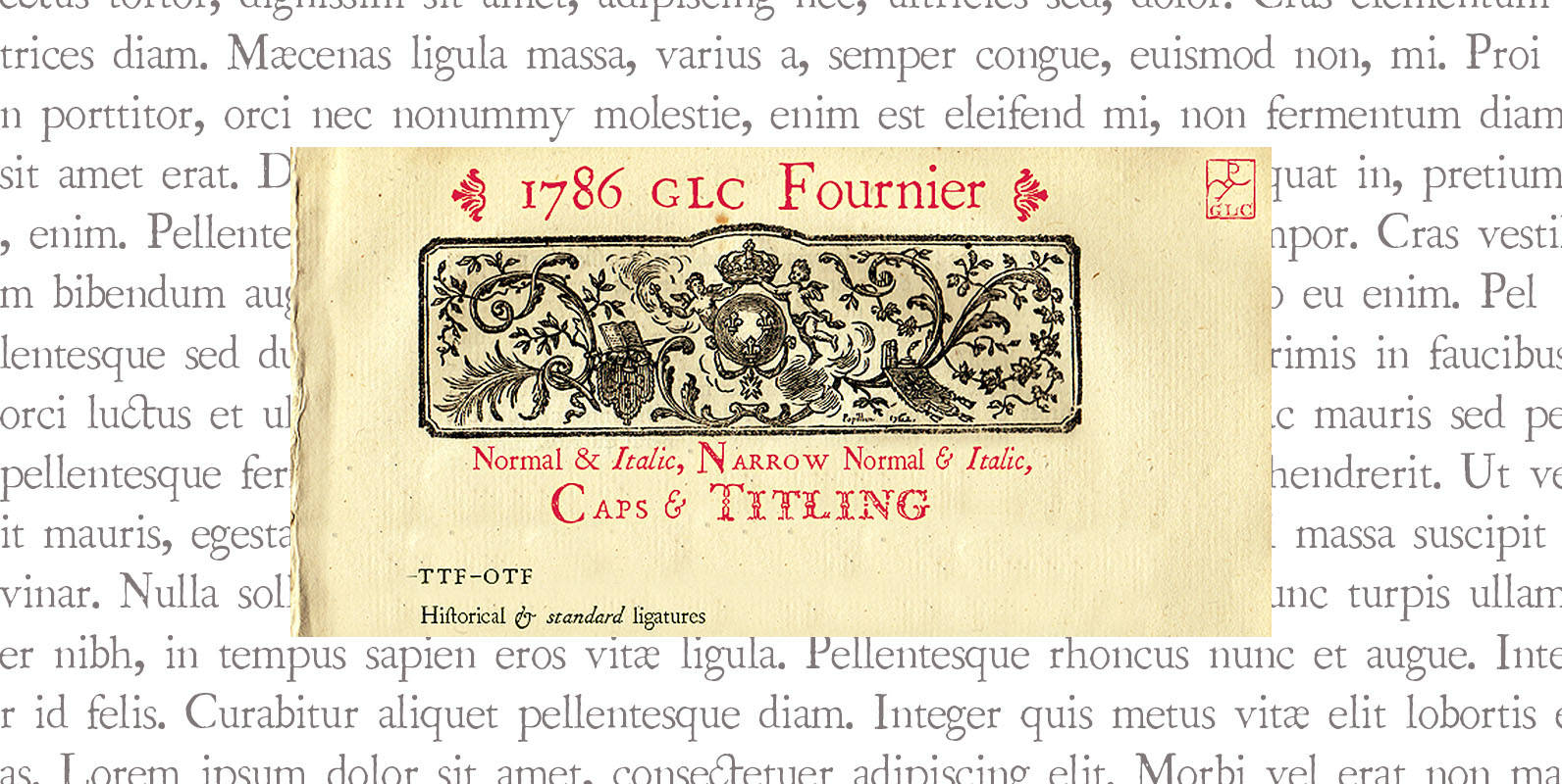
1786 GLC Fournier Font
This family was created inspired from numerous documents and books printed in Paris during the end of the 1700s. Mainly, documents printed by P.G. Simon & N.H. Nyon, “Printers of the parliament” were used for the Normal and italic styles
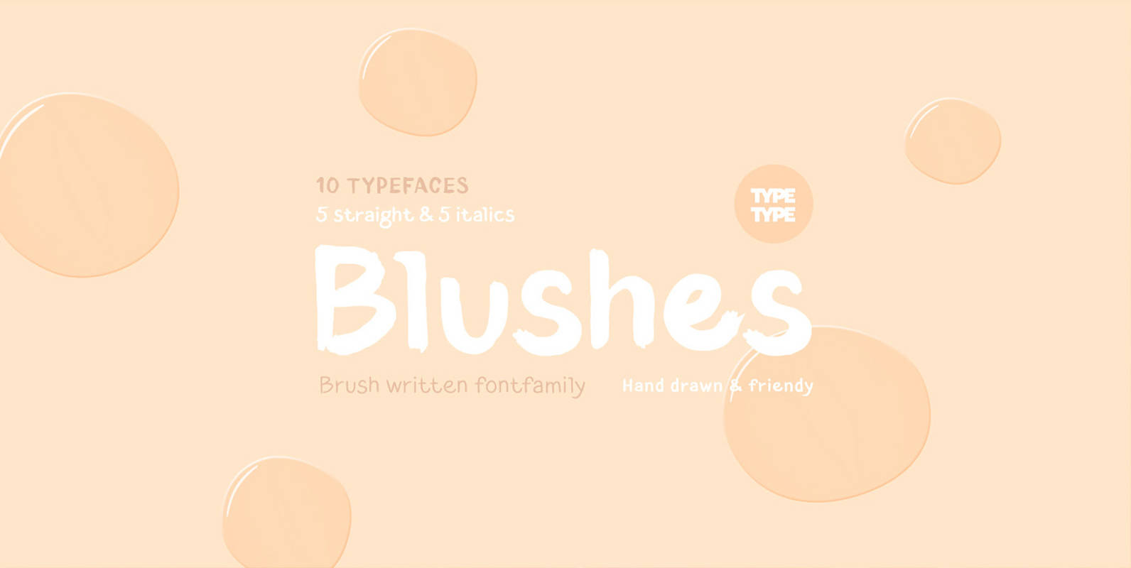
TT Blushes Font
Glitter, flashing cameras and fame – now you know how to deal with this stuff! Freshness and brightness is what defines the Blushes fontfamily, which is created for beauty and fashion industries. TT Blushes is a vibrant part of you
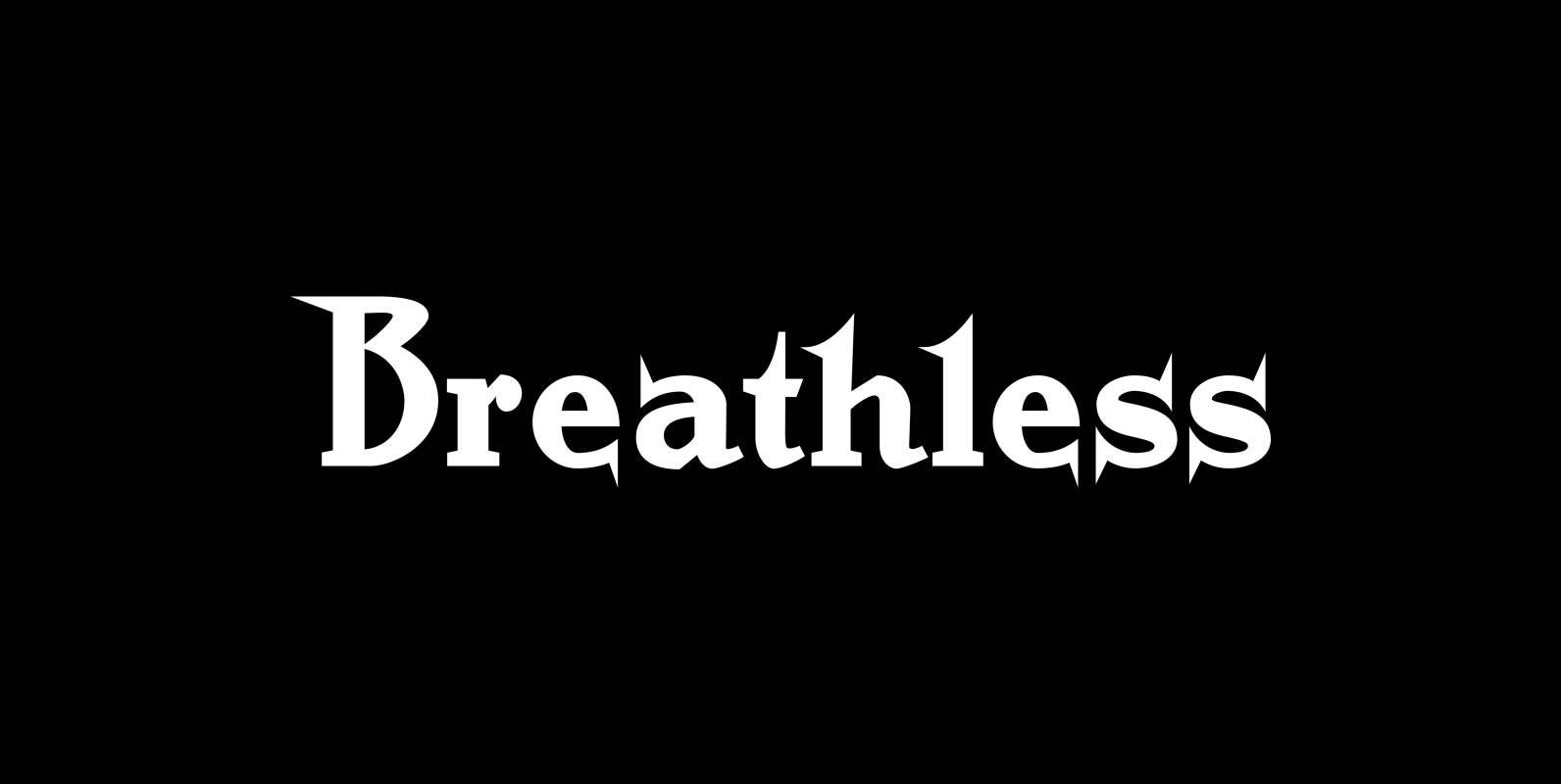
Breathless Font
“Breathless” was inspired by movie posters of the “Nouvelle Vague” era. When Jean Seberg and Jean-Paul Belmondo were young and films in black and white. So I named this very spiky affair after that phantastic movie of my youth “A
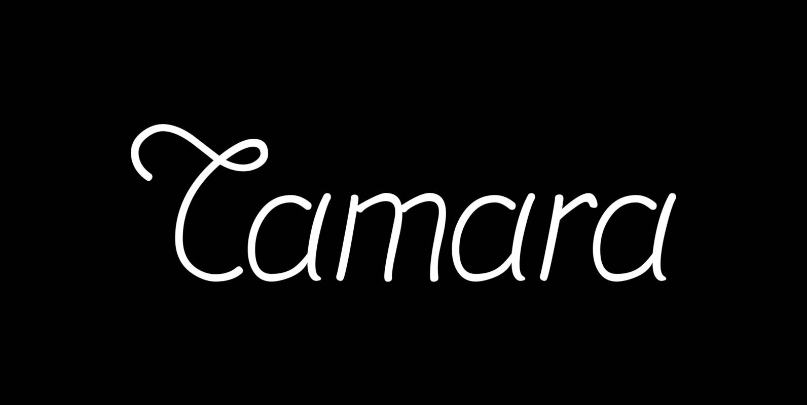
Tamara Font
“Tamara” is a very open kind-of-art-deco-script based on some initials for “Semplicita” made in the 1930s by the “Nebiolo” foundry. I designed a complete set with three weights. Since I am an ardent admirer of “Tamara de Lempicka” the Polish-French
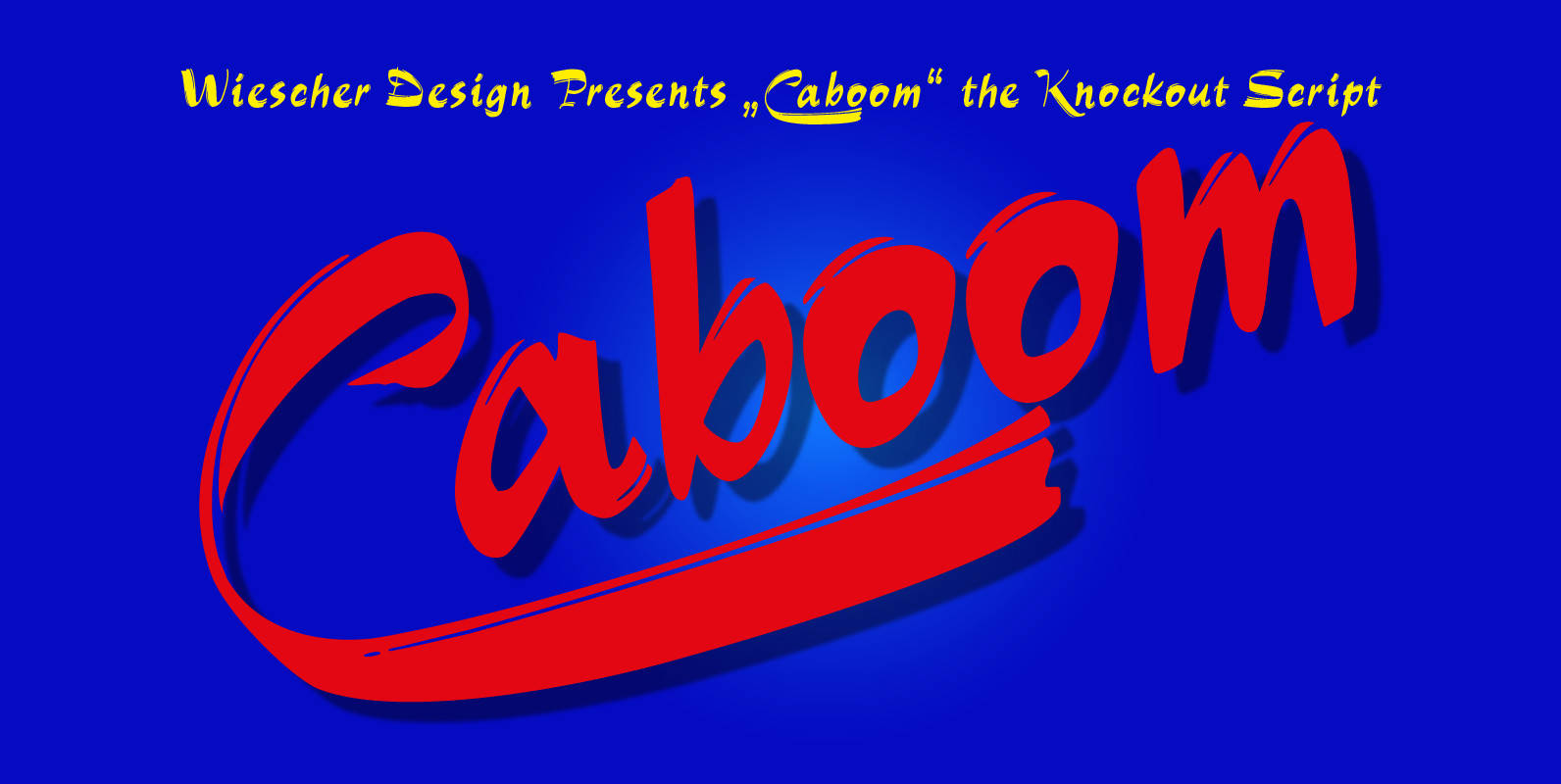
Caboom Font
Caboom is a very lively script. I got the idea when I was in Paris the last time and discovered that a small movie theater was showing “Zazie dans le Metro” by Louis Malle. Just had to do a crazy
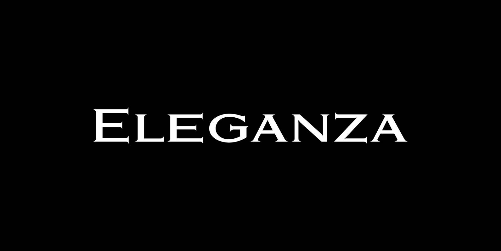
Eleganza Font
“Eleganza” is my most elegant typeface. At least that is what I think! I use it for business cards and everything that has to be elegant with that extra touch. The font comes in pairs for the price of one.
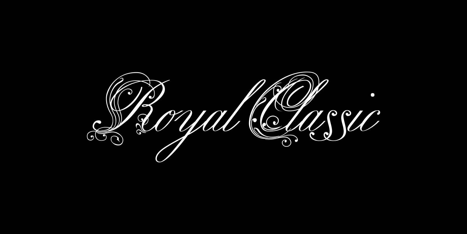
Royal Classic Font
Royal Classic is another work that is based on a design that has initially been commissioned by King Ludwig I of Bavaria for in-house-use. I bought a set of his chief scribes guidelines for writing and one of the scripts
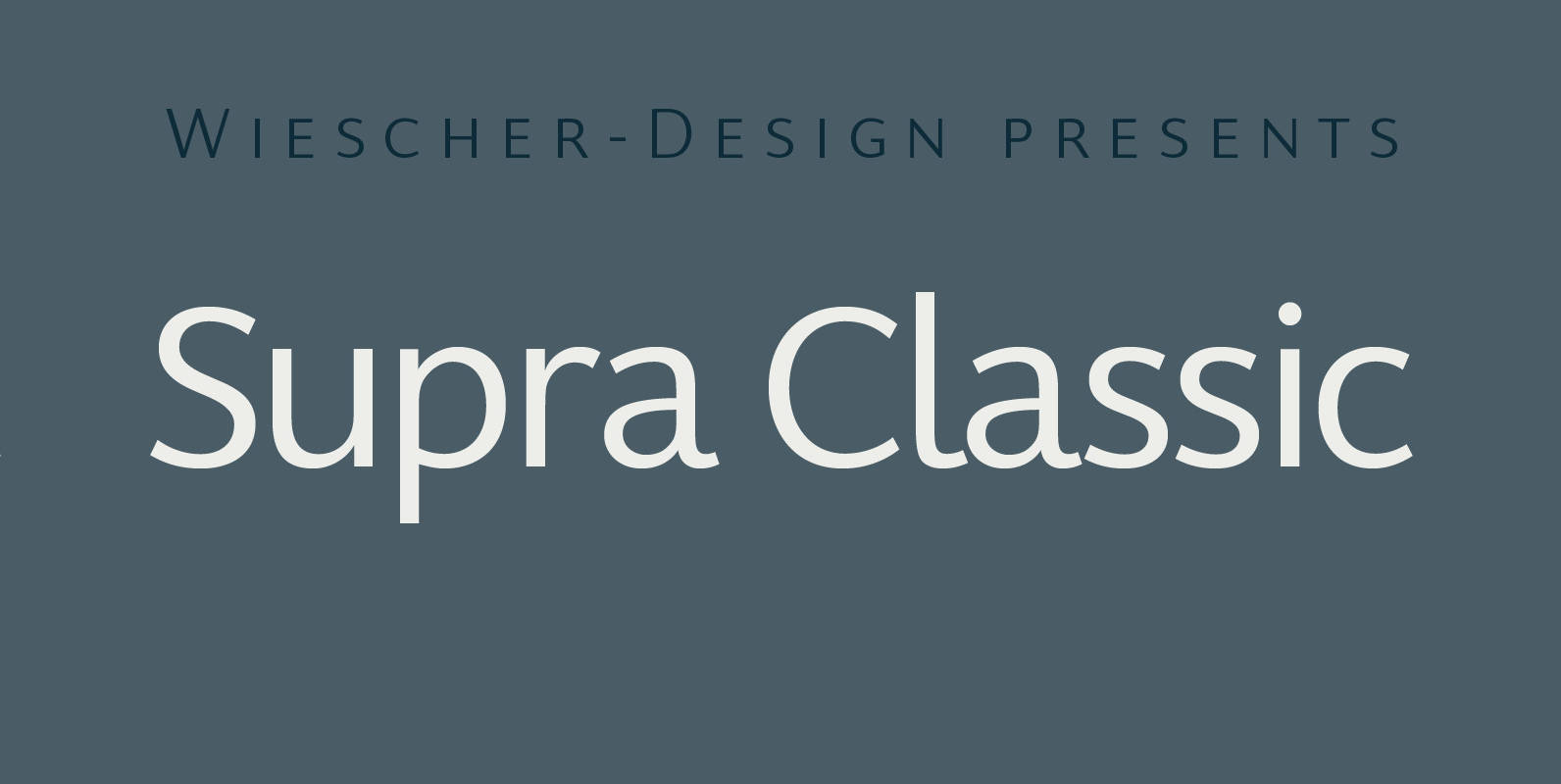
Supra Classic Font
“Supra Classic” designed by Gert Wiescher in 2014 – has 10 weights with corresponding italic cuts. The designs elegant contrast in the up- and downstrokes makes for better legibility and a pleasing personality. The dominant x-height with its high ascenders
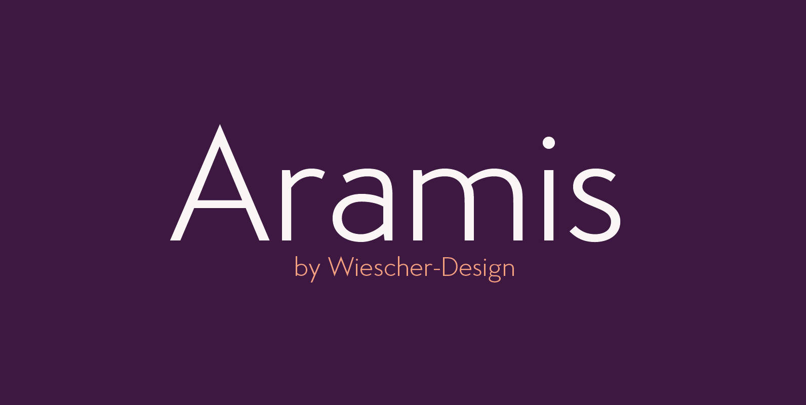
Aramis Font
“ARAMIS” is a new linear Sans with a French touch– designed by Gert Wiescher in 2014 and 2015 – has 7 weights with corresponding italic cuts. The small contrast in the linear Sans makes it not quite so linear and

Filson Soft Font
Filson Soft is the rounded version of the popular Filson Pro. At first sight, the main feature of Filson Soft are the distinctive letters ‘K’, ‘Q’ and especially ‘R’ that make the font family very elegant. With its rounded terminaisons,
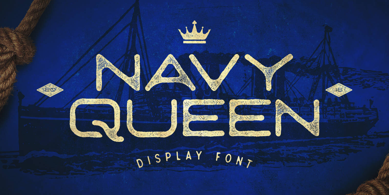
Navy Queen Font
Navy Queen is a over-extended, geometrically designed sans serif display font that pays homage to simpler times. This font will act as a great addition to any vintage design project including posters, logos, crests, packaging, and so much more! Navy
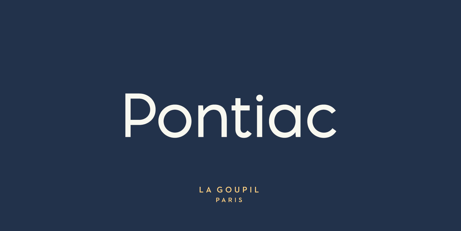
Pontiac Font
Pontiac is a sans serif OpenType font designed by Fanny Coulez and Julien Saurin in Paris. Somewhere between Akzidenz Grotesk and Neutra, Pontiac is a functional font with something more, something warm, geometric but human, something distinctive, something French finally.
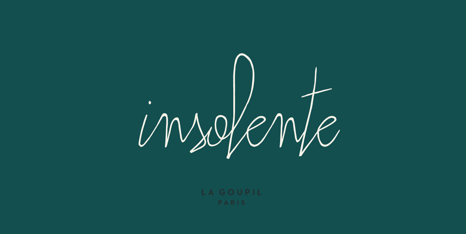
Insolente Font
Insolente is a versatile and realistic human script designed by Fanny Coulez and Julien Saurin in Paris, perfect for giving your designs a personal touch. The family includes two fonts: Insolente Regular, with ligatures and double-letter ligatures, and Insolente Alternates,
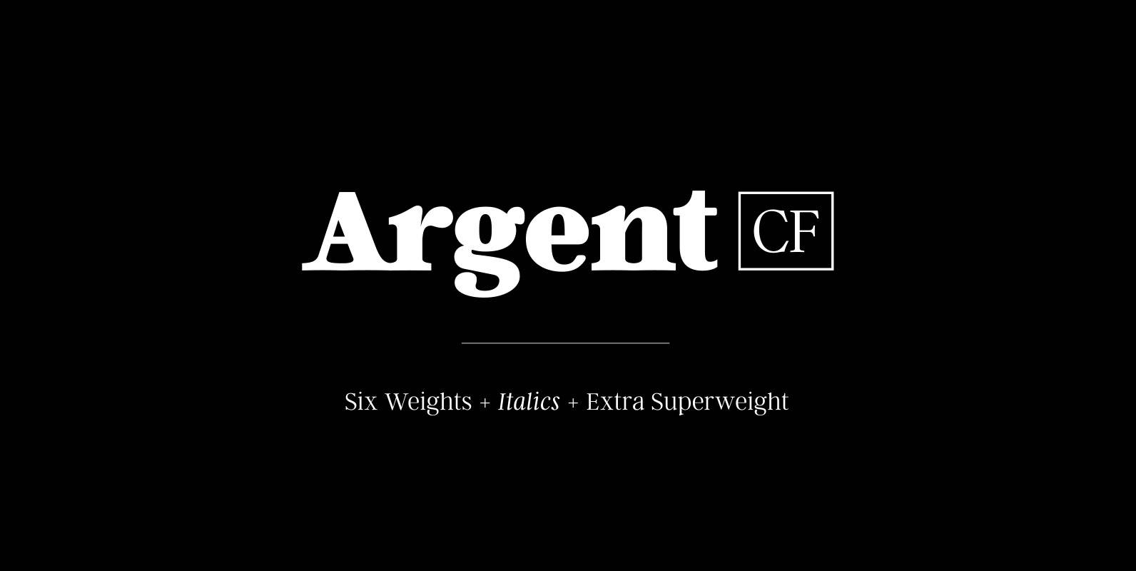
Argent CF Font
Argent is dashing and expressive, with a pronounced x‑height and evocative, flowing letterforms. Featuring charming italics, a host of OpenType features, wide language support, and lots of character, Argent excels at headings, titles, and logos. Features – 6 weights +
