Tag: Functional
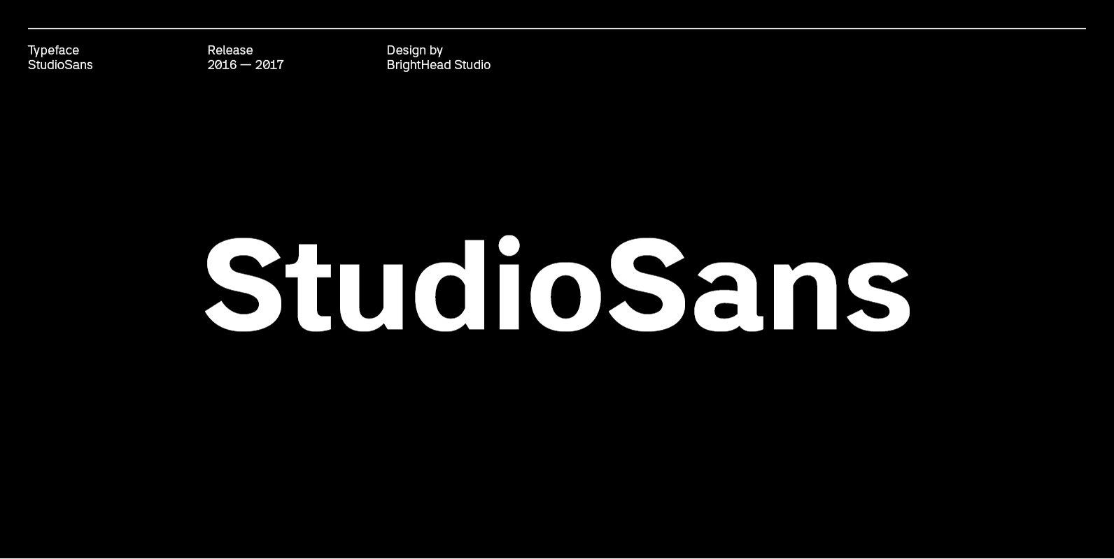
Studio Sans Font
StudioSans — is a modern representative of the class of sans-serif fonts inspired by the traditional Swiss design and typography of the mid 20th century. This is a minimal, clean and open font family with friendly forms. Focuses on functionality,

Nokio Sans Font
Nokio Sans is a clean, minimalist sans serif typeface designed by TypeUnion. The font incorporates clean lines and curves to produce a structured typeface with a subtle playfulness. Nokio Sans is made up of 5 weights + italics and also
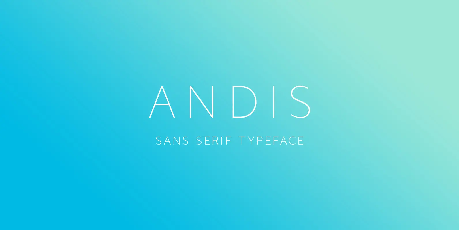
Andis Font
Andis’ rough cut makes it an interesting display typeface, but thanks to its generous x-height and firm serifs, Andis works equally well in text sizes. The typeface’s idiosyncratic italic builds a strong contrast with the roman. Andis is both functional
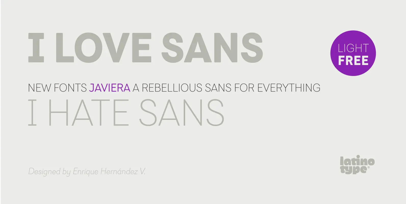
Javiera Font
Javiera is a geometric sans-serif typeface with humanist attributes. One of its main features is its small x-height, which makes ascenders and descenders look longer. The contrast gives the font a more stylised look, typical of humanist fonts. Curves and
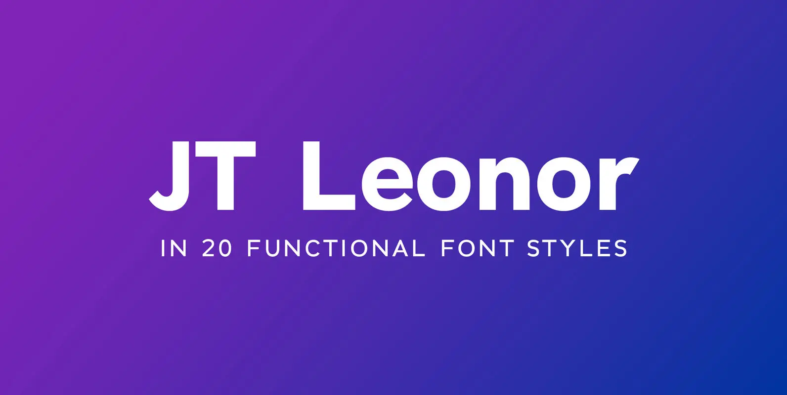
JT Leonor Font
JT Leonor is inspired by the world renowned Gotham typeface but with a more square feel in its light weights and a rounder bold range, this typeface is perfectly suited to both large chunks of body copy as well as
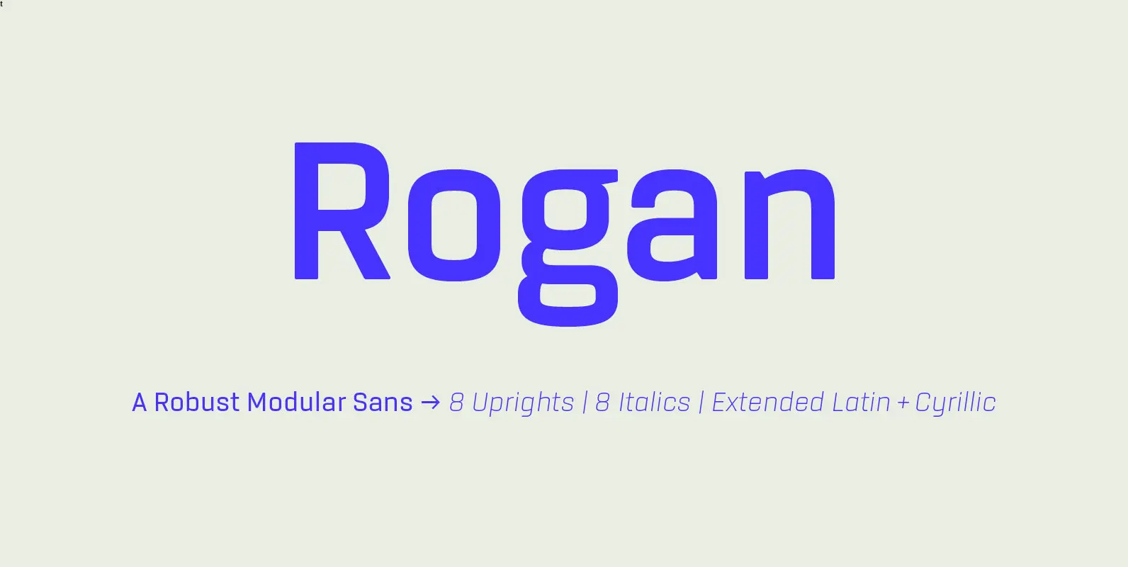
Rogan Font
Rogan: A Robust Modular Sans. Rogans clean lines started out as an exercise in modularity and geometric forms. This initial construction approach was then adapted to improve the functionality of the family; Breaking away from the strictly modular system in
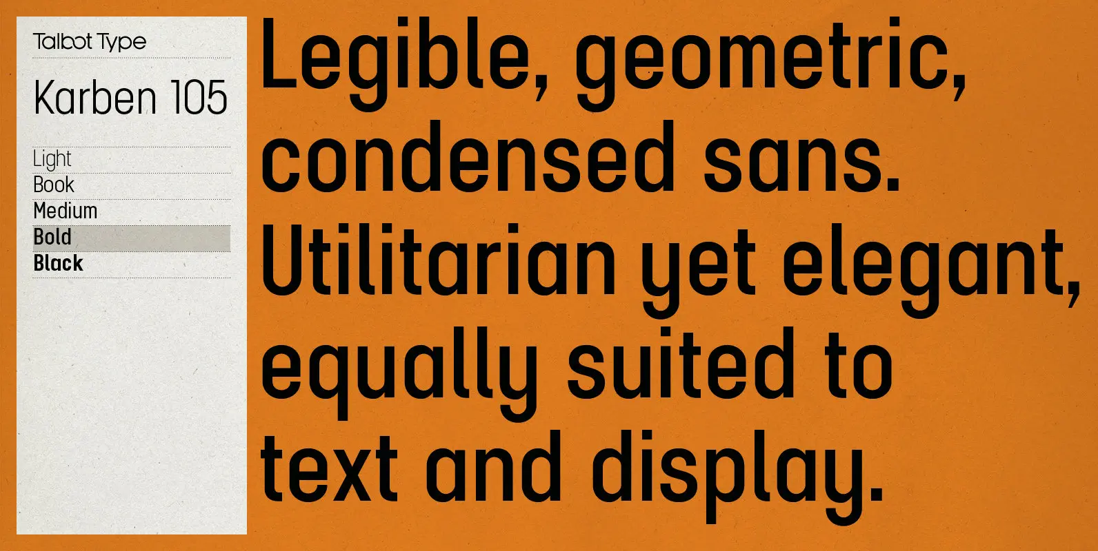
Karben 105 Font
Karben 105 is inspired by the classic, no nonsense DIN, and has a form that follows its highly legible function. Based on a lozenge, it has a clean and pure geometry with even stroke weights. Karben 105 is available in
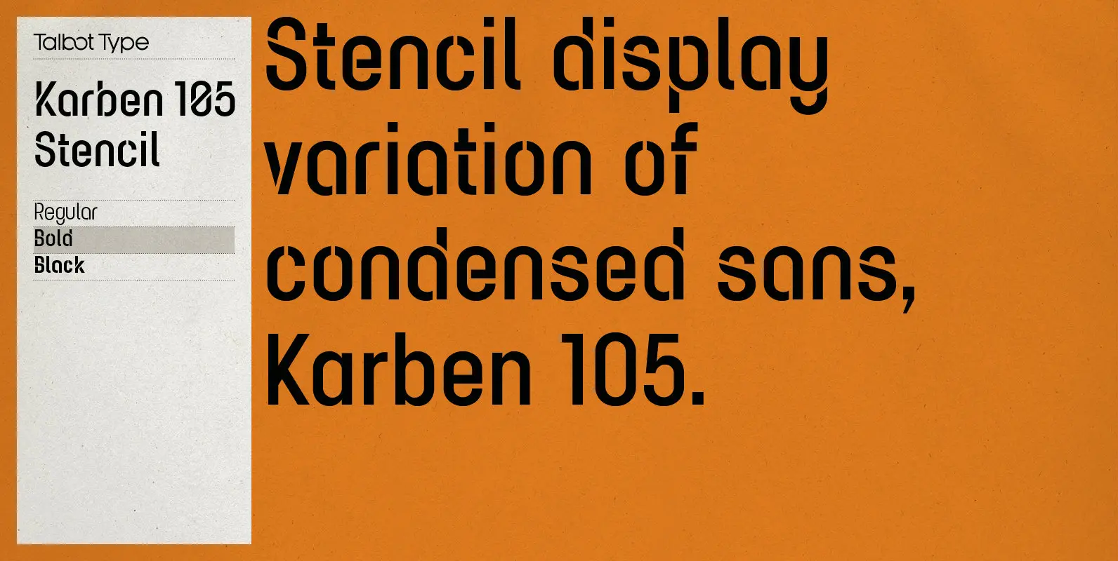
Karben 105 Stencil Font
Karben 105 Stencil is a contemporary stencil font. The stencil breaks in the letters are applied in a way that is sensitive to the forms of the character in pursuit of a more elegant stencil. Karben 105 Stencil is available
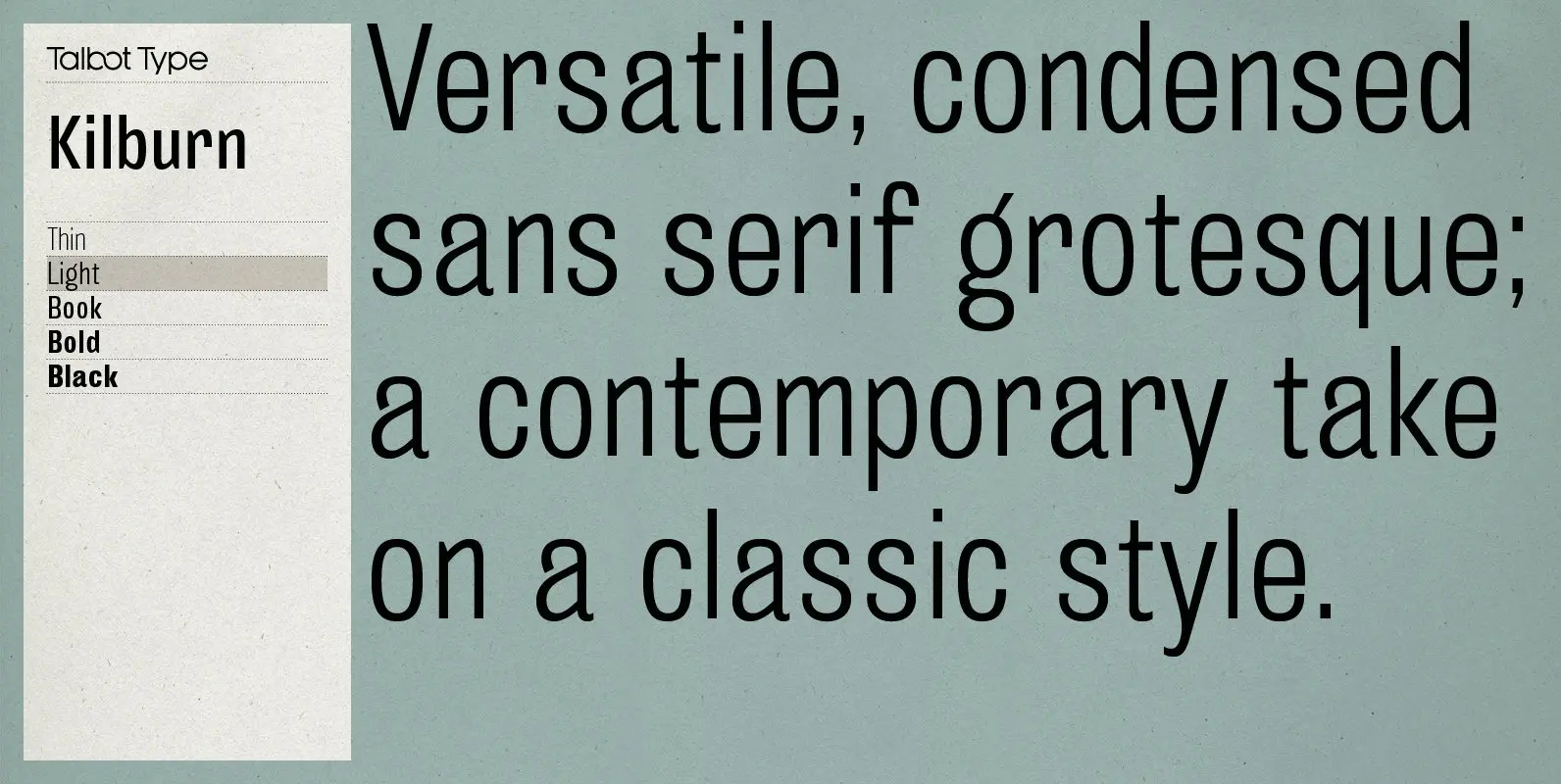
Kilburn Font
Kilburn is a no-nonsense, condensed Gothic sans-serif. For over a century the condensed sans-serif has been the ‘go to’ font for gravitas and authority. Kilburn continues in the fine tradition of fonts such as Franklin Gothic, News Gothic and Trade
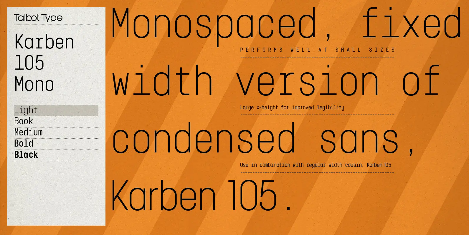
Karben 105 Mono Font
Karben 105 Mono is a monospaced variation of Karben 105. The clean and pure geometry of Karben 105 makes it highly suitable for adaptation to this monospaced variant. It has an even look and retains its legibility at very small
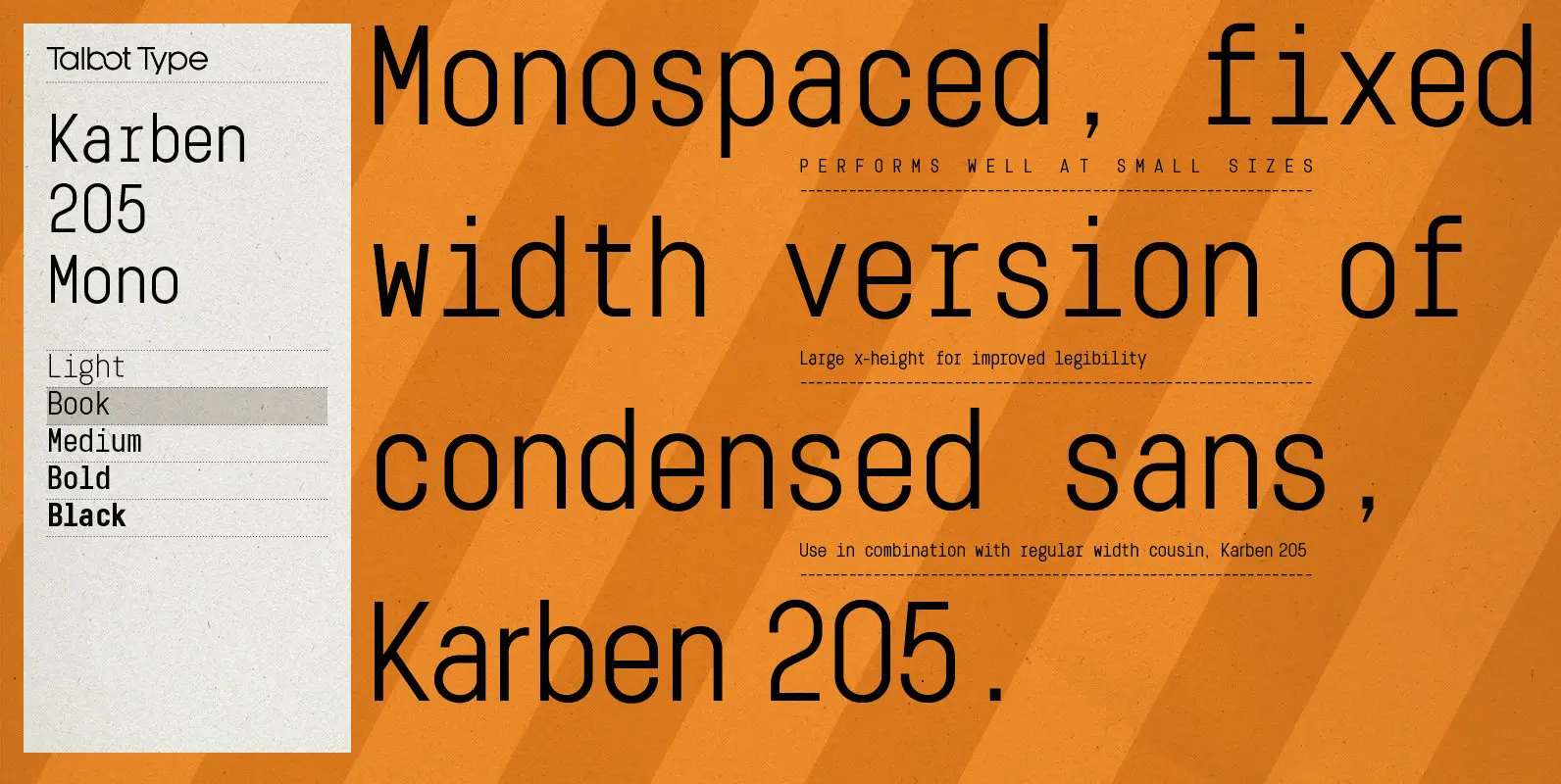
Karben 205 Mono Font
Karben 205 Mono is a monospaced variation of Karben 205. The clean and pure geometry of Karben 105 makes it highly suitable for adaptation to this monospaced variant. It has an even look and retains its legibility at very small
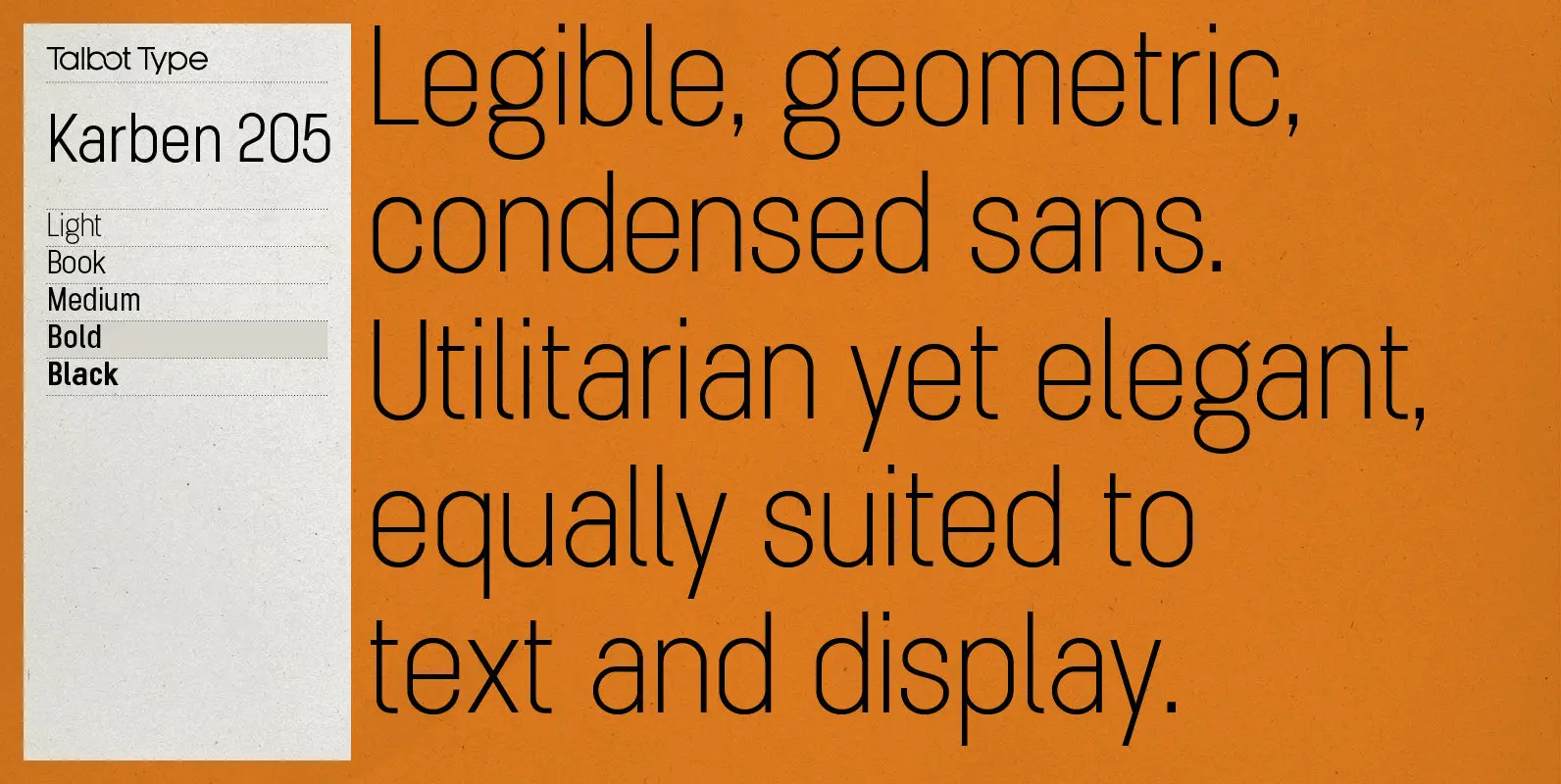
Karben 205 Font
Karben 205 is inspired by the classic, no nonsense DIN, and has a form that follows its highly legible function. Based on a lozenge, it has a clean and pure geometry with even stroke weights. Karben 205 is available in

TT Lakes Font
The idea for this font emerged in the city of Priosersk, which until World War II was a Finnish city called Kakisalmi. At the city museum we came across an unusual sign plate with the former name of the railway
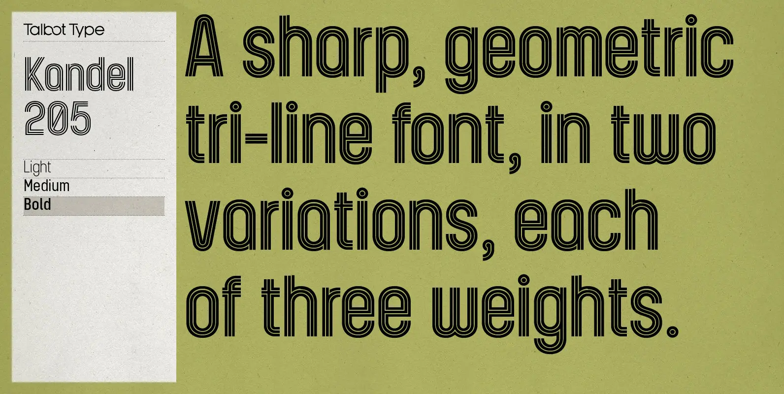
Kandel 205 Font
Kandel 205 is a geometric, tri-line, display and headline font available in a family of three weights. Its bold, graphic styling gives it great stand-out qualities and a highly individual look. It’s particularly well suited to bringing energy to designs,
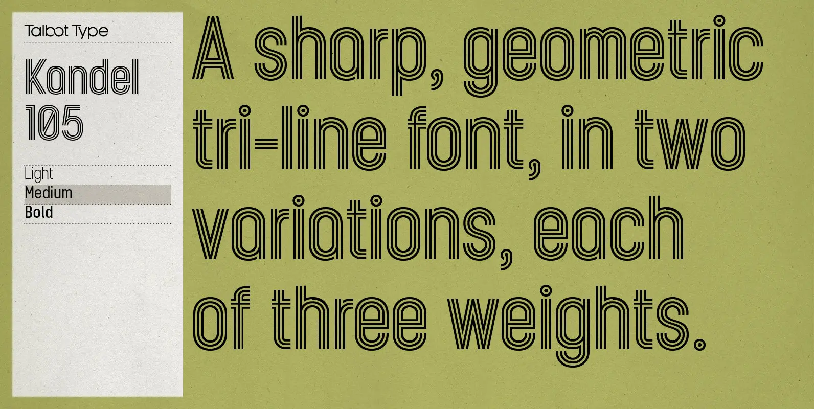
Kandel 105 Font
Kandel 105 is a geometric, tri-line, display and headline font available in a family of three weights. Its bold, graphic styling gives it great stand-out qualities and a highly individual look. It’s particularly well suited to bringing energy to designs,

Henderson Slab Font
A few bold caps drawn by Albert Du Bois for the 1906 Henderson Sign Painter book started me in the direction of looking at how sign painters approached slabs after the industrial revolution. The usual happened from there. My exercise
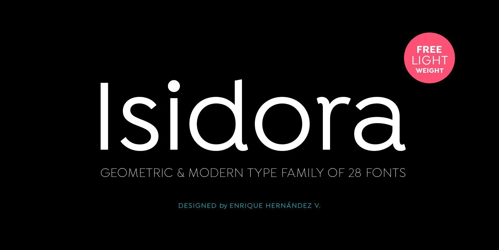
Isidora Font
Designed by Enrique Hernández V. Isidora is a modern geometric font based on the classic typefaces of the early 21st Century yet with a contemporary and functional touch. In spite of its strong and rational structure, the font also looks