Tag: Functional
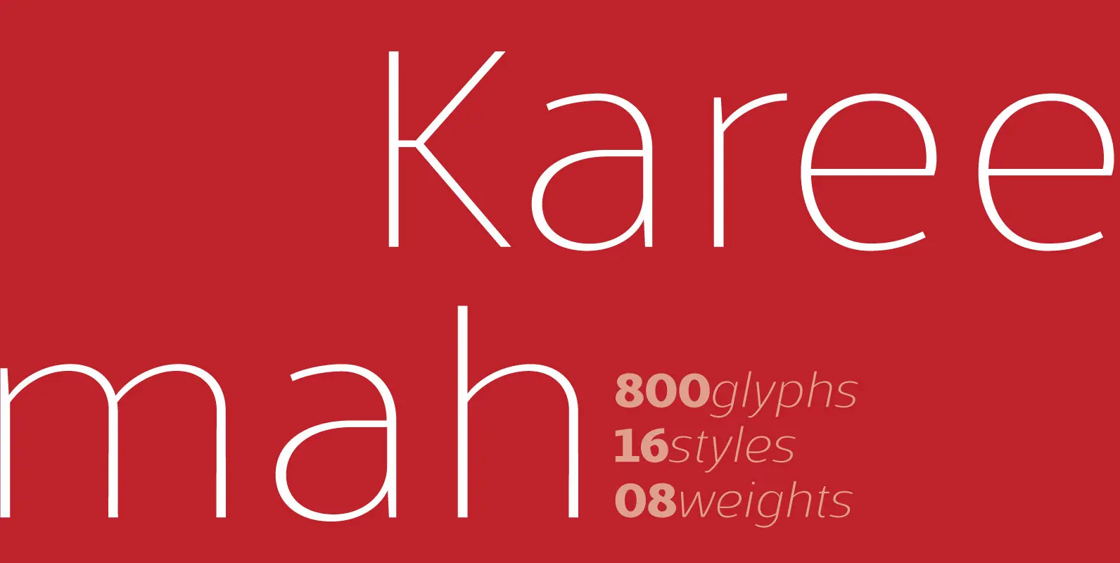
Kareemah Font
Kareemah is a humanist typography, composed by roman and italics with 16 styles and 08 weights (800 glyphs) including ligatures, alternates, small caps, old styles figures, fractions, superiors, inferiors and more. Perfectly legible and clean in the long, simple texts
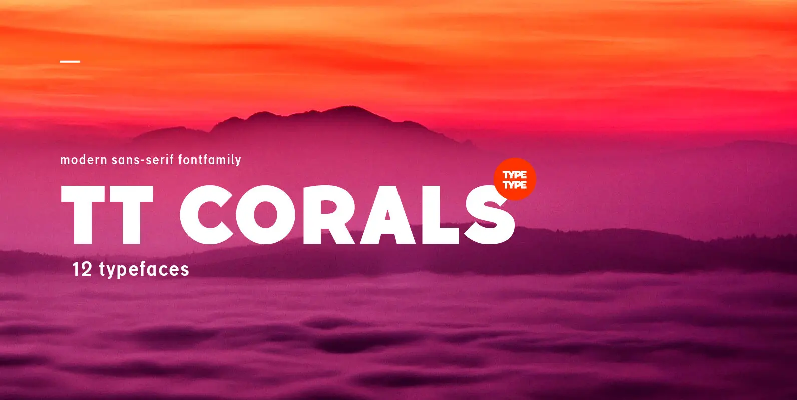
TT Corals Font
TT Corals is a modern humanistic sans-serif which has many typical traits of the beginning of the 20th century. For an increased functionality of the font family we’ve created 6 typefaces of various weights: Thin, Light, Regular, Bold, Extrabold, Black.

Gerlach Sans Font
As the foundry’s new flagship family, Gerlach Sans was named after the highest peak in Slovakia. Its functional design is enhanced by a few subtle ingredients, adding life and giving words a more playful voice. The family has eight weights
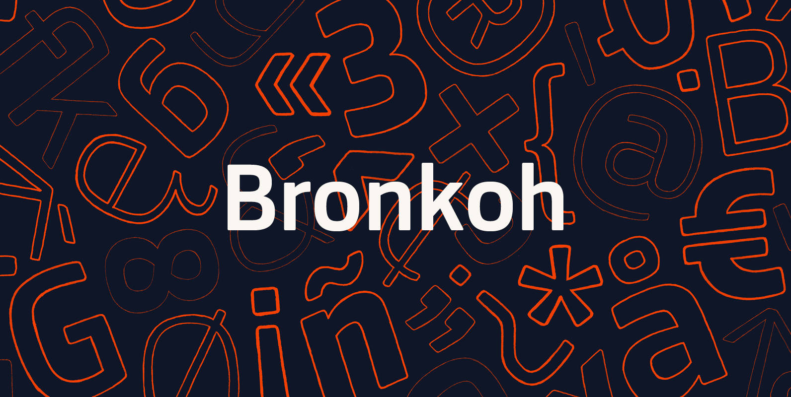
Bronkoh Font
A subtly softened sans, Bronkoh aims to give a friendly face and soft touch to type both onscreen and in print. Humanist forms and generous apertures make this a sturdy and legible face while it's softened curves and terminals give

Erbaum Font
Erbaum is a display square sans serif type family. It is straight-forward in overall structure, simple and rational in details. Erbaum was designed to maximise clarity, with an emphasis on construction and pragmatic aesthetics. The concept behind this typeface was

Sana Sans Font
Sana Sans is a humanist functional typeface with a modern feel. It is intended to be a face well-suited for multiple purposes, especially in publishing. Sana Sans looks perfectly legible and clean in long texts, and neat and simple in
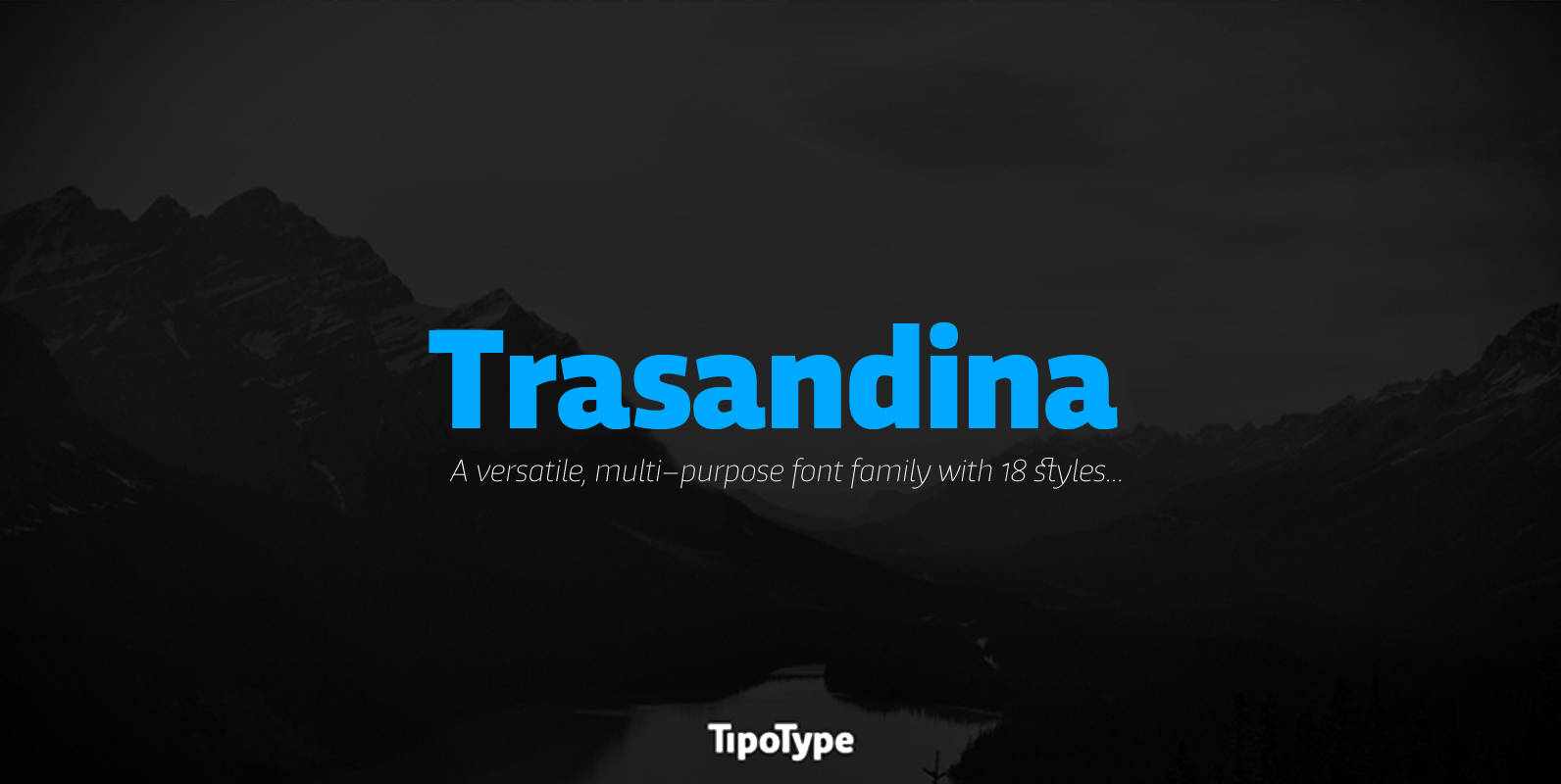
Trasandina Font
Trasandina is a very unique font-family: a modern, versatile, workhorse typeface with a special personality, given by the mix of humanist and geometric models, remaining far from both extremes. This typeface has 9 styles plus their matching italics, it has
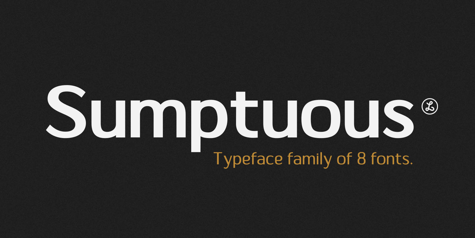
Sumptuous Font
Sumptuous is a sans-serif family combining the geometric and the humanist models. presented by Locomotype. Suitable for magazine, paragraph, headline, body text and logo design. Complete family make your job is so easy to mix and match your designs to
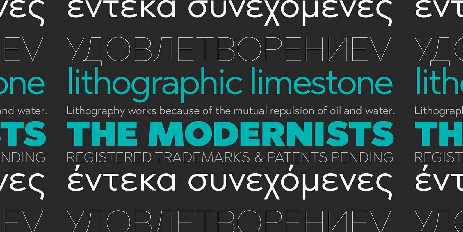
Abrade Font
Abrade is a geometric sans serif with rational design choices for contemporary functionality. The family is designed with a medium x-height to provided great legibility in both display and text sizes. The forms are refined to work well in print
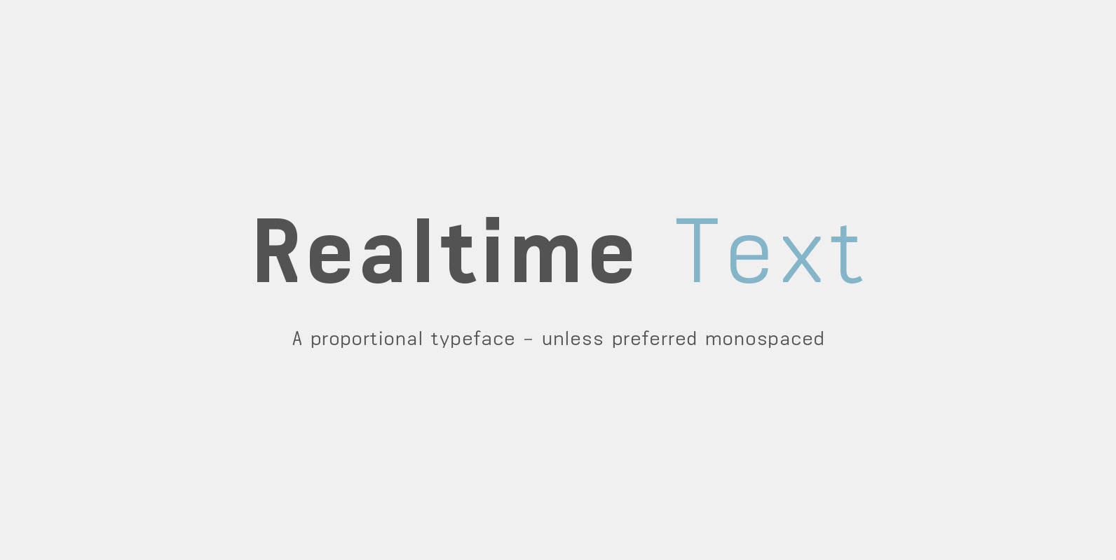
Realtime Text Font
Realtime Text is the proportional alternative to the monospaced Realtime type family. Nevertheless Realtime Text includes a monospaced design already built into the font. It is employable through OpenType by activating alternate characters. Realtime Text is a technical yet friendly
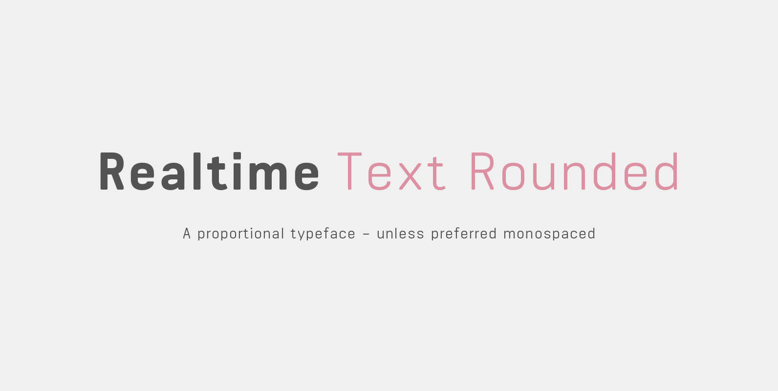
Realtime Text Rounded Font
Realtime Text Rounded is the proportional alternative to the monospaced Realtime type family. Nevertheless Realtime Text Rounded includes a monospaced design already built into the font. It is employable through OpenType by activating alternate characters. Realtime Text Rounded is a
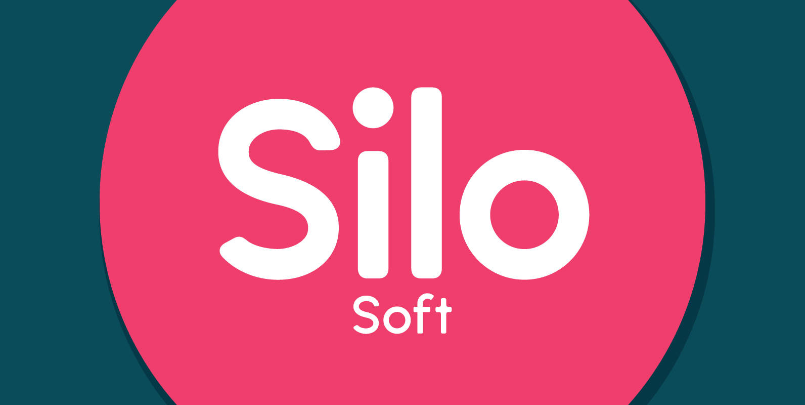
Silo Soft Font
Designed and built in London by TypeUnion, Silo Soft is a fluid sans serif typeface embodying energetic curves and a clean, functional structure. The Silo Soft Family is made up of 6 weights, which range from a delicate Extra-Light, all
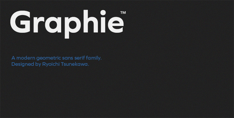
Graphie Font
Graphie is a modern geometric sans-serif family designed by Ryoichi Tsunekawa and the whole family consists of 16 style: eight weights from Thin to ExtraBold and their matching Italics. The range of styles provides flexibility for title, headline and body
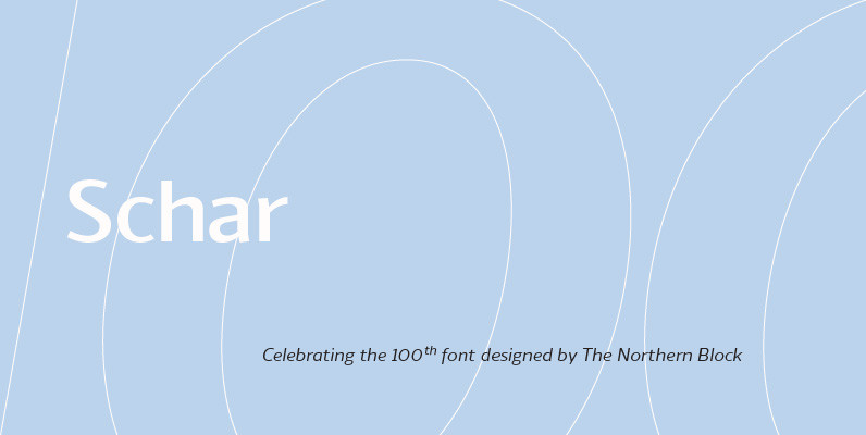
Schar Font
A humanist sans designed like a serif with high-stroke contrast, but without serifs. Calligraphic forms and consistent angle axis are combined to create a fluid and dynamic personality. Schar is a balanced sans serif with classic proportions ideally suited for
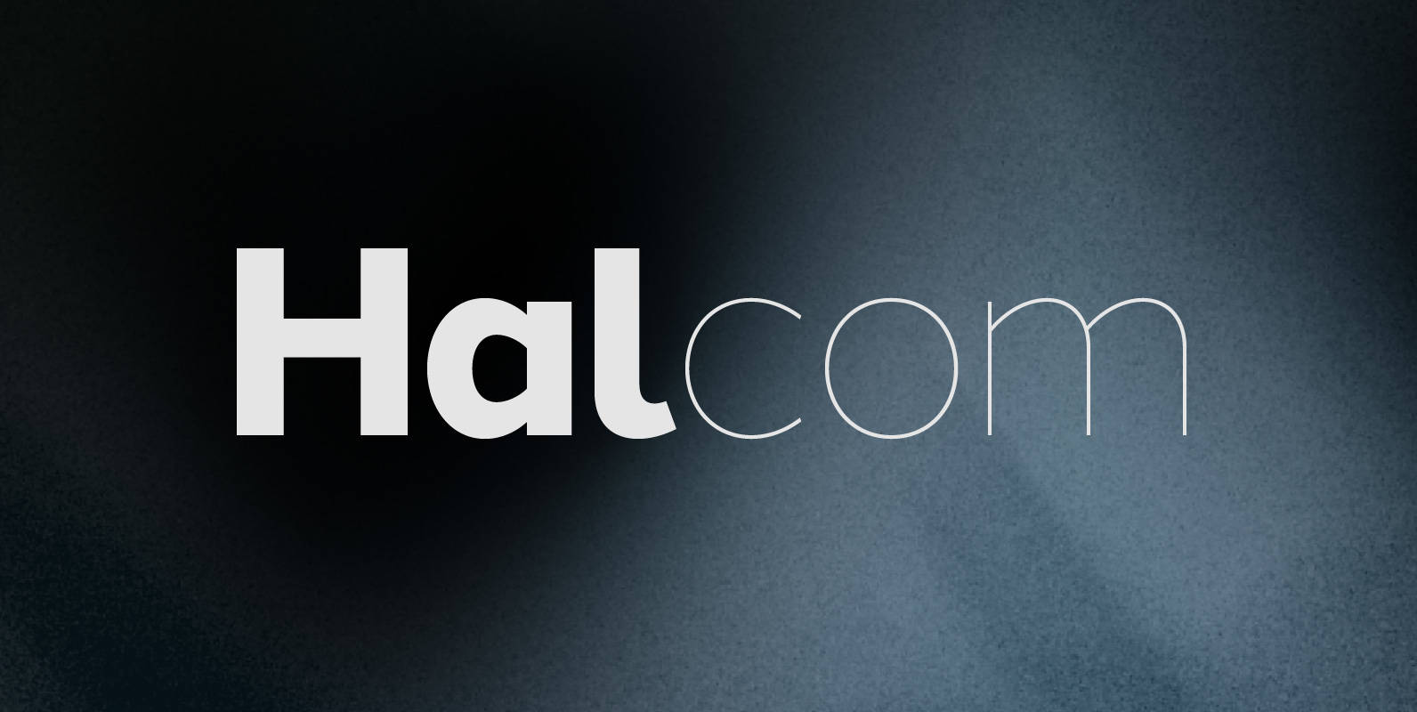
Halcom Font
A modern sans serif typeface inspired by the historic geometric’s of the 1920’s, specifically Futura. The design is not a simple pastiche of what went before this is much more than that. It is a close investigation to how Futura
