Tag: futuristic
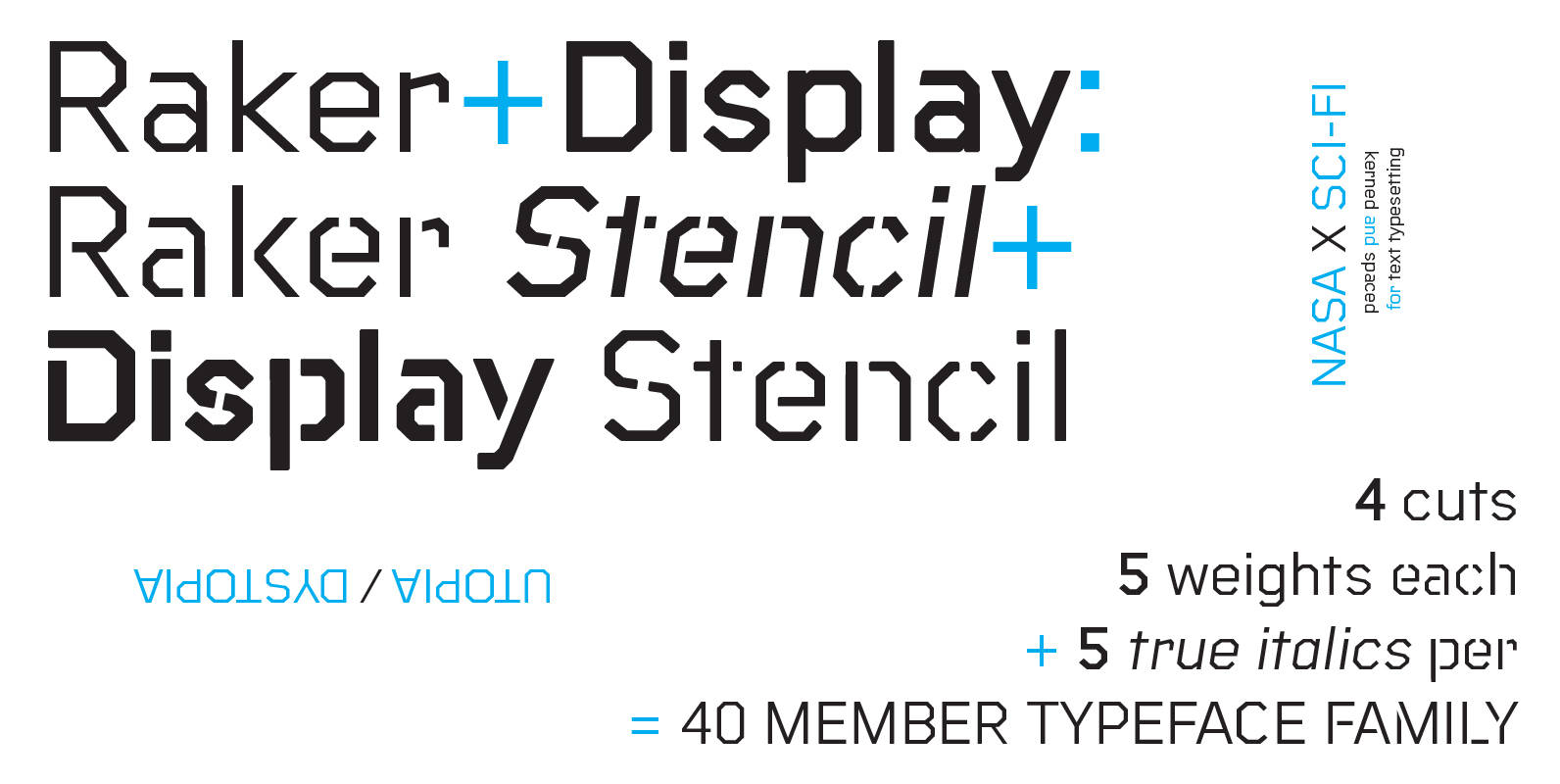
Raker Font
Raker was born out of a love for retro science fiction aesthetics as evidenced in films like The Clone Returns Home, Moon,and Alien, while simultaneously being a text typeface with a humanist influence and solid spacing. The family includes 4
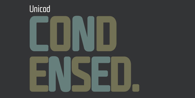
Unicod Sans Condensed Font
This font has been especially designed for Mostardesign Studio by Olivier Gourvat. Created in 2010, this font family has been designed to serve sectors like financial services, modern industries, business and many more activities who needs a modern aspect in
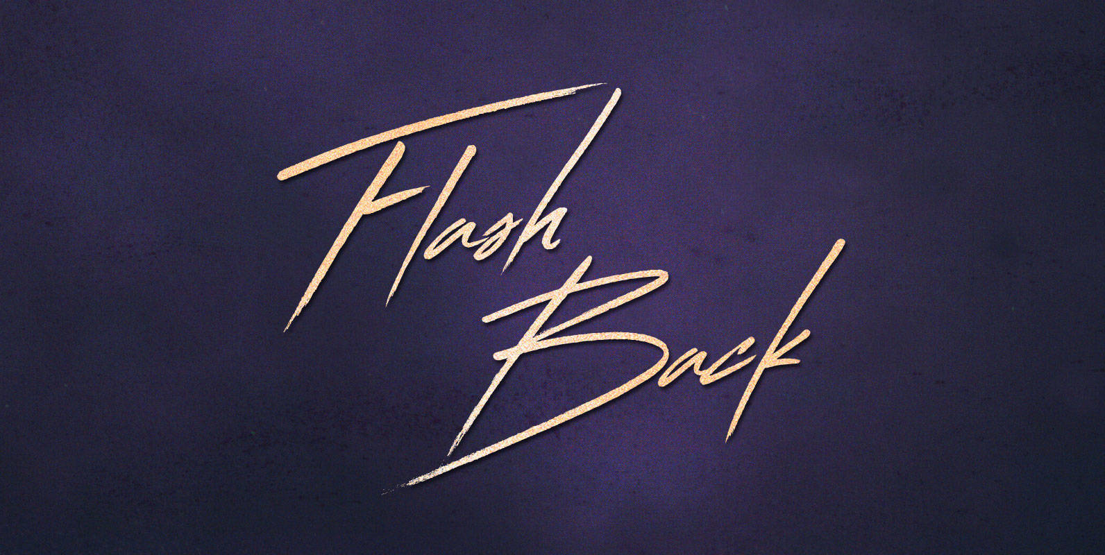
Flash Back Font
To place the beginning of the end, Corey had to think back 22 years, through yearning reminiscence, to his beginning. In learned memories of his birth to his 18 year old mother, the Flash Back is his starting point, and
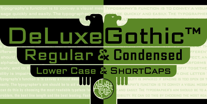
DeLuxe Gothic Font
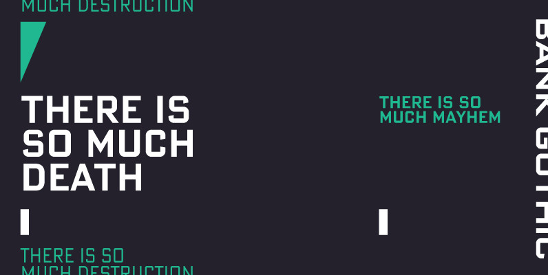
Michael Doret was always very aware of the fact that Morris Fuller Benton’s classic Bank Gothic, a longtime favorite of his, didn’t contain any lowercase characters. So he set out to remedy that by designing his all new DeLuxe Gothic,
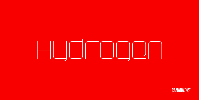
Hydrogen Font
Hydrogen is a clean geometric unicase family that expresses the mechanics, expansive technologies and conflicted ethics of the rapidly changing 21st century. Coupled with the right measure of Oxygen, Hydrogen becomes water, the ace of elements – rhythmic, dynamic, ever-flowing,
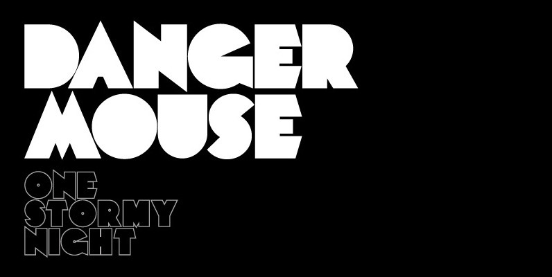
Mekon Font
A modern heavy weight typeface ideal for use on print, web, motion, t-shirts and apparel. Details include 4 styles with 3 alternatives, extended European character set, manually edited kerning and Euro symbol. Published by The Northern Block Download Mekon
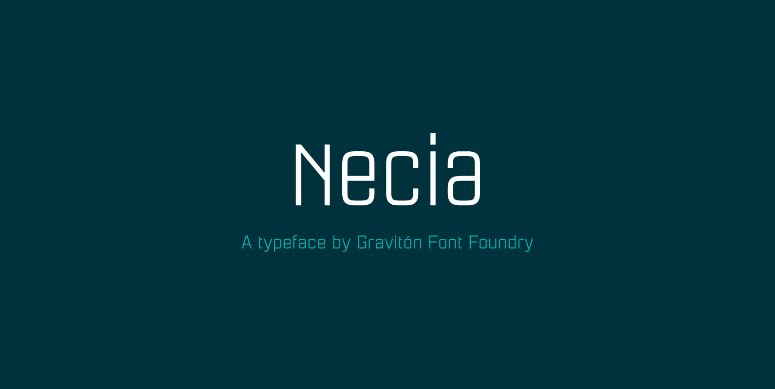
Necia Font
Necia font family has been designed for Graviton Font Foundry by Pablo Balcells in 2014. It is a modular, geometric and slightly condensed typeface which has been conceived to be primarily a display typeface, but given its clarity it can
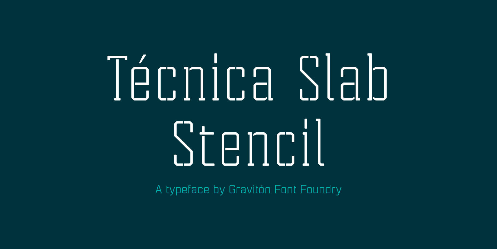
Tecnica Slab Stencil Font
Tecnica Slab Stencil font family is the stencil version of Tecnica Slab font family, it has been designed for Graviton Font Foundry by Pablo Balcells in 2014. Tecnica Slab Stencil consists of 8 styles. The 4 “Stencil 1” styles contain
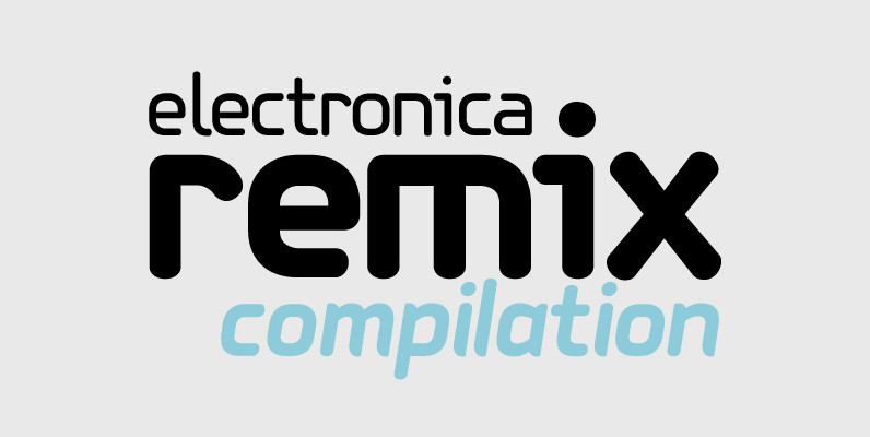
PF Isotext Pro Font
This typeface is based on iso 3098, a technical documentation issued in 1974 by ISO International Organization for Standardization, which proposed a set of characters for use on technical drawings and associated documents Isotext is based on the original standards
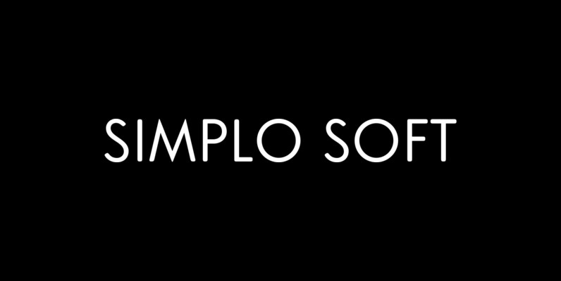
Simplo Soft Font
Simplo Soft is the soft companion of Simplo. In Simplo Soft, Simplo’s original sharp geometrics have been tempered by the moderate rounding of the edges of its characters — creating a softer and friendlier geometric typeface. Simplo Soft is ideal
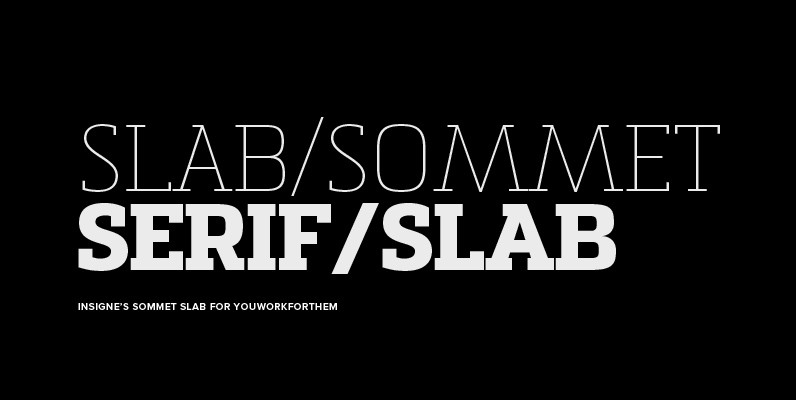
Sommet Slab Font
The Sommet family of typefaces has been updated with a new slab serif variant. Expanding on Sommet’s successful design principals, Sommet Slab is there when you need more impact and power. Sommet Slab is available with six weights and complementary
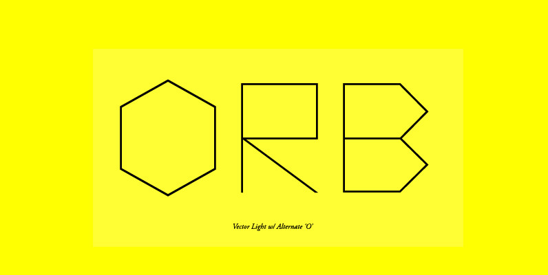
Vector Font
Vector is inspired by the 1979 Atari Asteroids video game UI screen font, yet it has been completely reworked to achieve a more balanced and refined visual aesthetic, loosely adhering to the original source. Letterform widths, angles, metrics and kerning
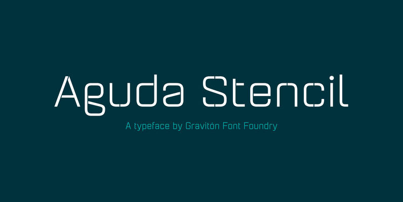
Aguda Stencil Font
Aguda Stencil font family is the stencil version of Aguda font family, it has been designed for Graviton Font Foundry by Pablo Balcells in 2014. Aguda Stencil consists of 16 styles. The 8 “Stencil 1” styles contain a narrow stem
