Tag: futuristic
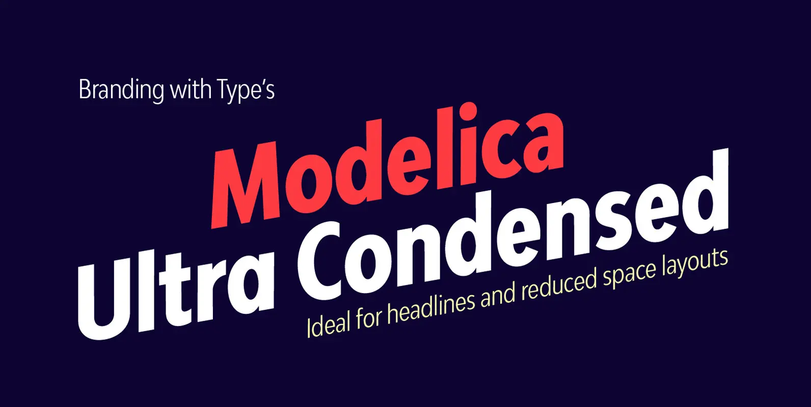
Bw Modelica Ultra Condensed Font
Designed by Alberto Romanos, Bw Modelica is a minimal, robust, reliable & pragmatic geometric sans. Its clean shapes and generous x-height makes it a very competent face for both, display and body copy purposes. It’s available in four widths, each
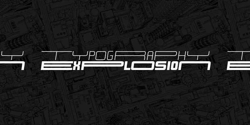
Design System Font
Design System is a great type system consisted of 5X7X2=70 font styles from 70s-style simple square sans to the widest style of all time that are best for titles, logo and text. Their simple form does not limit the target
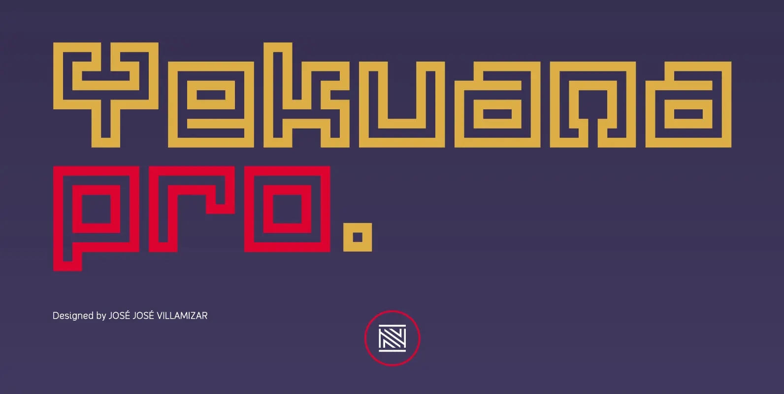
Yekuana Pro Font
Yekuana Pro is a typeface whose design is based primarily on the study of certain geometric ethnic ancestral Venezuelan signs, visually rich and originally used in the enrichment of various utilitarian objects with high symbolic and cultural content. It’s a
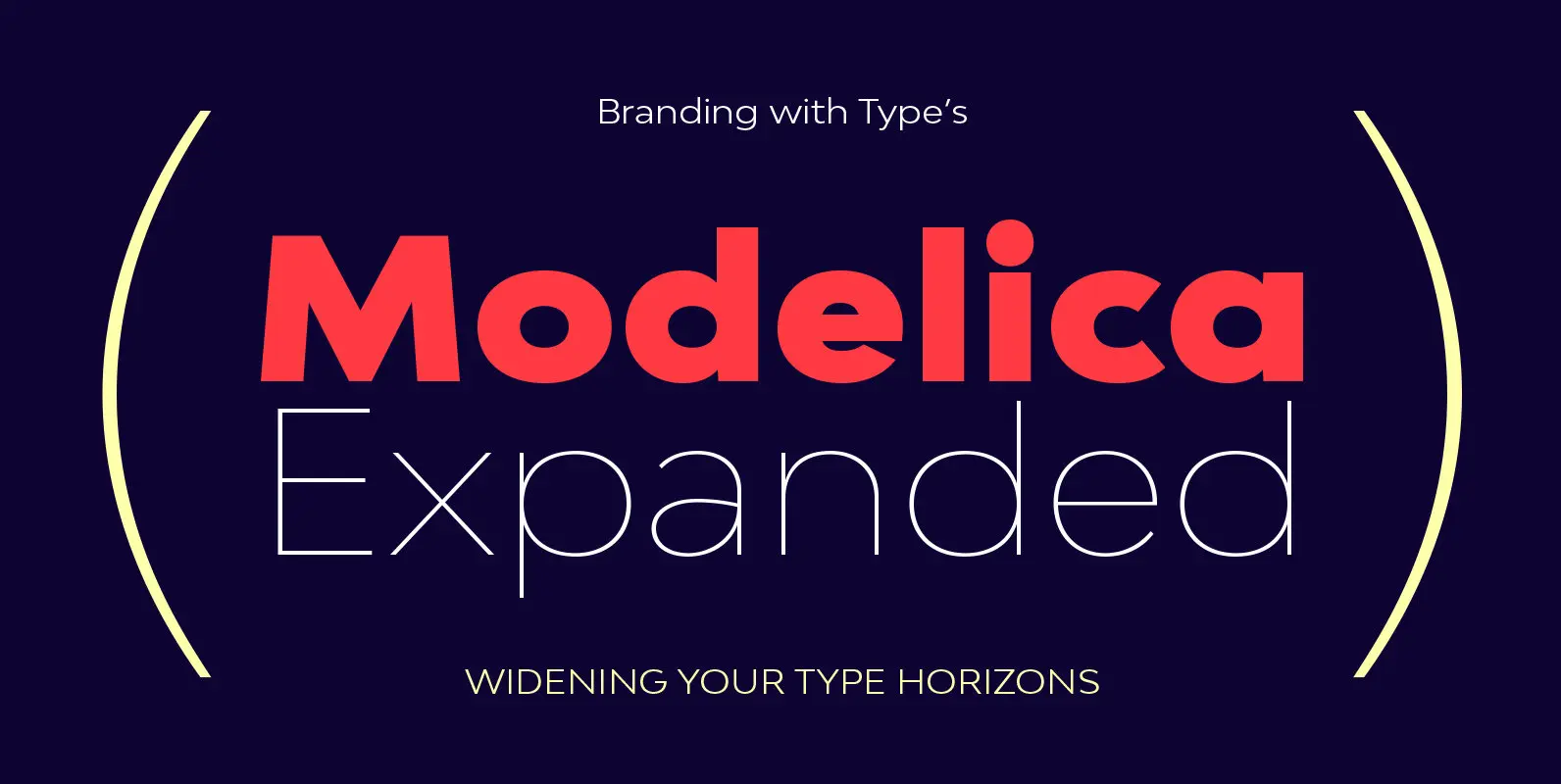
Bw Modelica Expanded Font
Designed by Alberto Romanos, Bw Modelica is a minimal, robust, reliable & pragmatic geometric sans. Its clean shapes and generous x-height makes it a very competent face for both, display and body copy purposes. It’s available in four widths, each
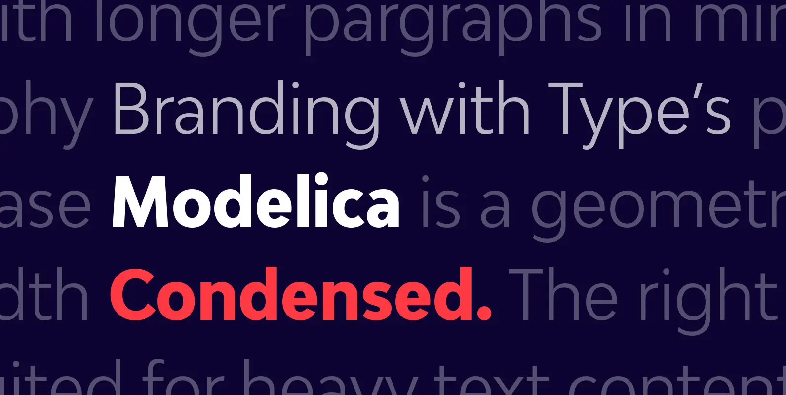
Bw Modelica Condensed Font
Designed by Alberto Romanos, Bw Modelica is a minimal, robust, reliable & pragmatic geometric sans. Its clean shapes and generous x-height makes it a very competent face for both, display and body copy purposes. It’s available in four widths, each
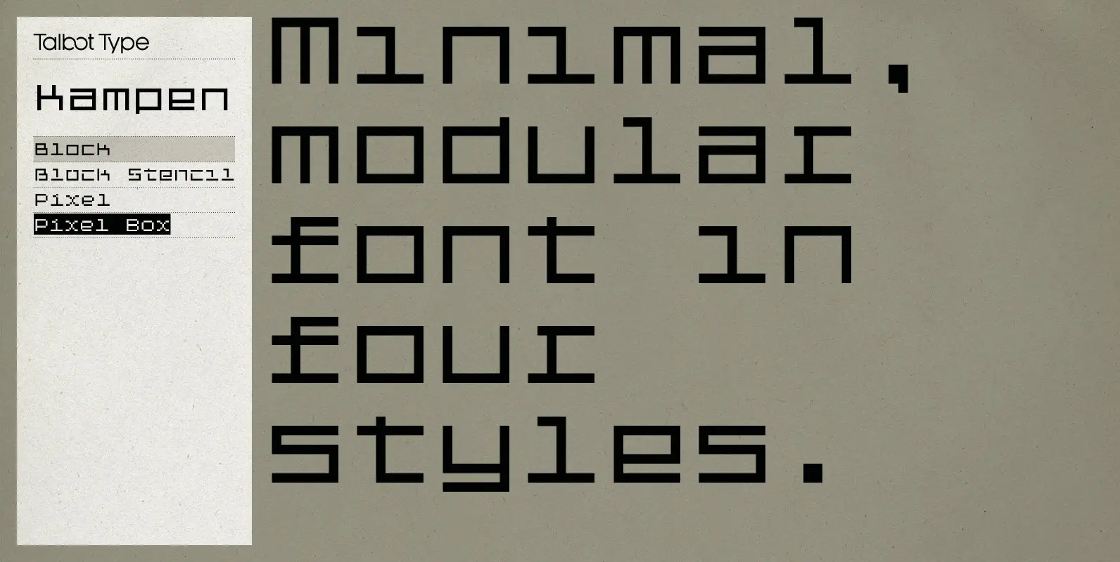
Kampen Font
Kampen is a minimal, modular, monospaced font. There are two variants, each available in two styles. The two variants — Block and Pixel — differ considerably in look, however the characters in both are designed using the same 7 x
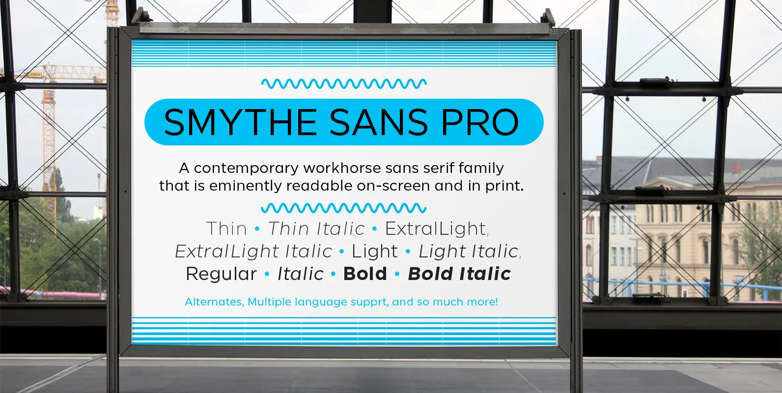
SmytheSans Pro Font
SmytheSans Pro is a contemporary workhorse sans serif family that is eminently readable on-screen and in print. It is an updated version of our popular family Smythe Sans—we extended the characters sets, redrew most of the characters, rigorously spaced and
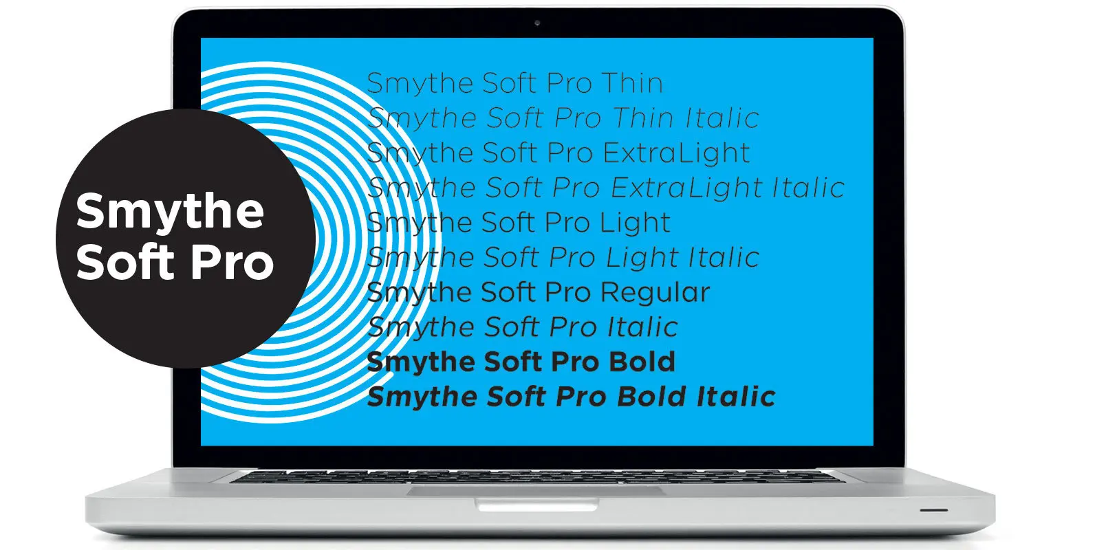
SmytheSoft Pro Font
SmytheSoft Pro is a contemporary workhorse sans serif family that is eminently readable on-screen and in print. It is an updated display version of our popular family Smythe Sans with custom rounded terminals, rigorously spaced and kerned. Smythe Soft Pro
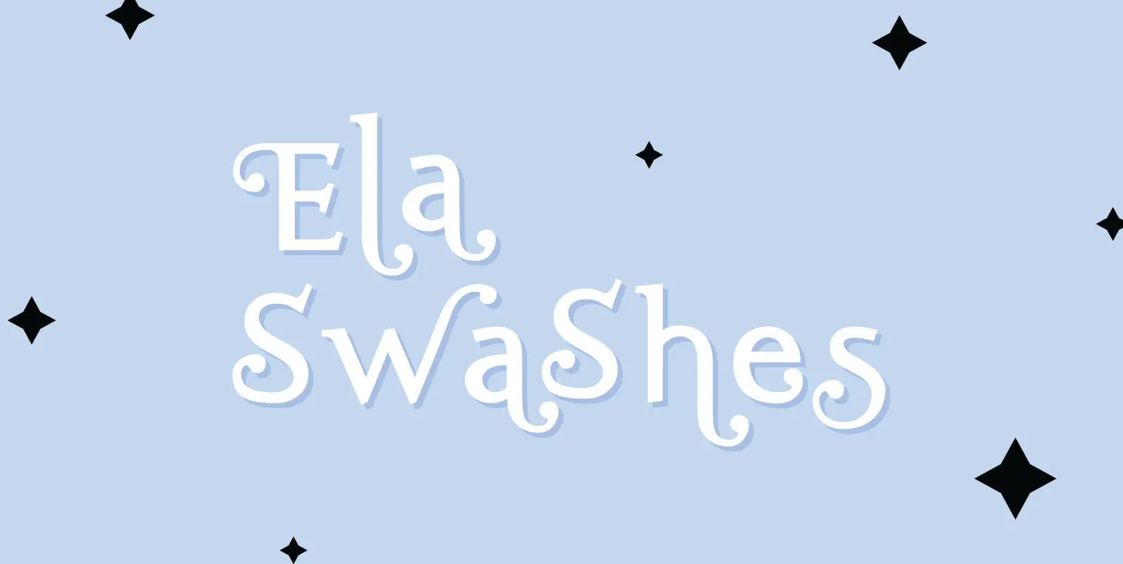
Ela Swashes Font
“Ela Swashes” are not meant to and can not be used as a standalone typeface. Swashes are a set of many different embellished letters to be used together with Ela Demiserif fonts of corresponding weights. Published by Wiescher DesignDownload Ela
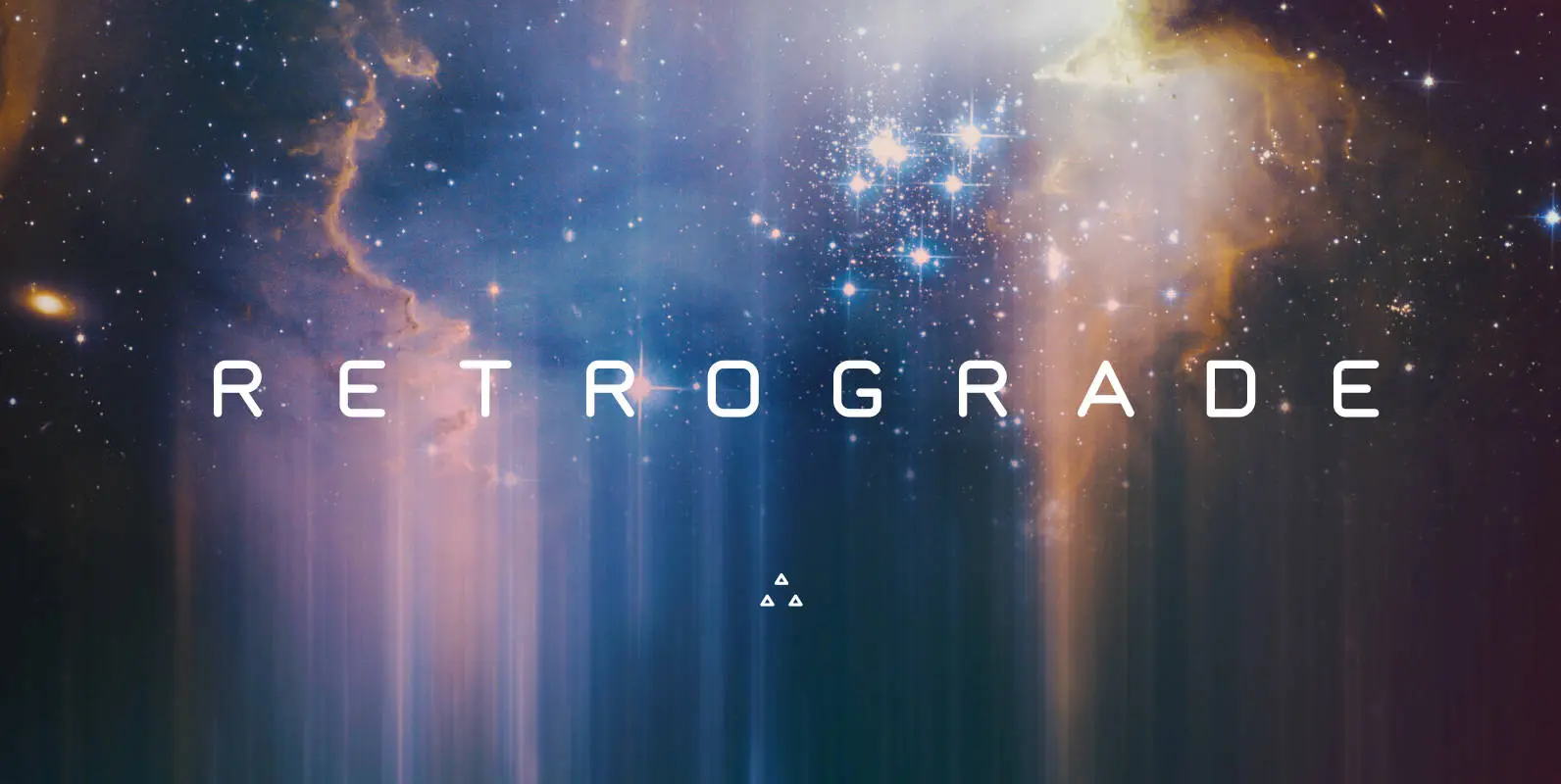
Retrograde Font
Retrograde is round, simple, and crystal clear. It reproduces incredibly well at any size, and was created with the physical world in mind. Each character is the same width, in both regular and bold weights, which makes applying it in
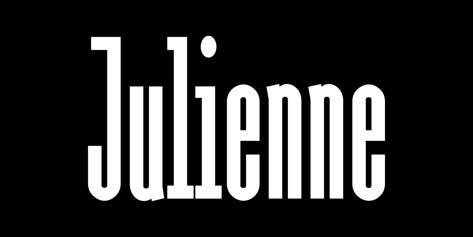
Julienne Font
Cooks call thinly cut – like matchsticks – vegetables »Julienne«. I found that was a fitting name for this very narrow typeface. Julienne Slim is the extreme cut of the two. Personally I do not use narrow typefaces very often,
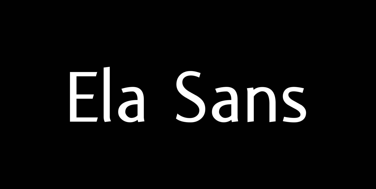
Ela Sans Font
“Ela Sans” is the sister of the typeface I originally designed for the business of my second wife and mother of my two sons, her name is – of course – Michaela. Ela – the typeface – is suitable for
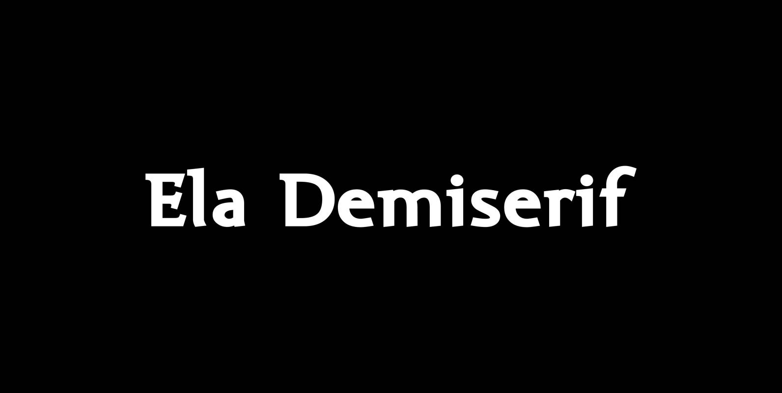
Ela Demiserif Font
Ela Demiserif is the typeface I originally designed for the business of my second wife and mother of my two sons; her name is, of course, Michaela. Ela – the typeface – is suitable for magazines, newspapers, posters, advertisements, books,
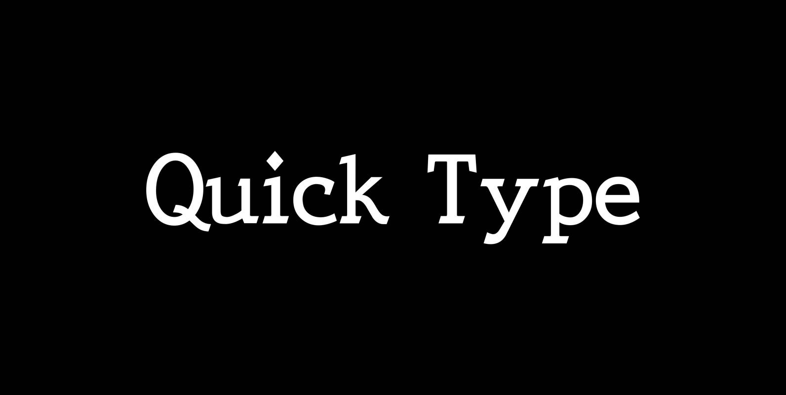
Quick Type Font
QuickType is a typeface I designed for demonstration purposes. I used it to illustrate my first book about type design. I has crooked slab serifs and looks very much like a typewriter font. But in order to make things clear
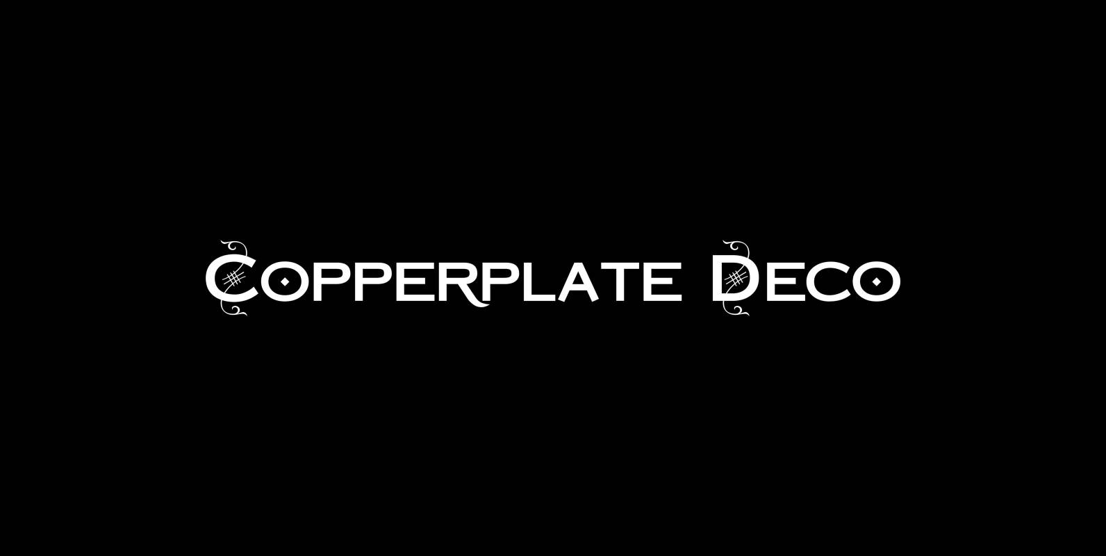
Copperplate Deco Font
“Copperplate Deco” is my sparingly decorated version of my Copperplate fonts. They can be used as stand alone fonts. Published by Wiescher DesignDownload Copperplate Deco
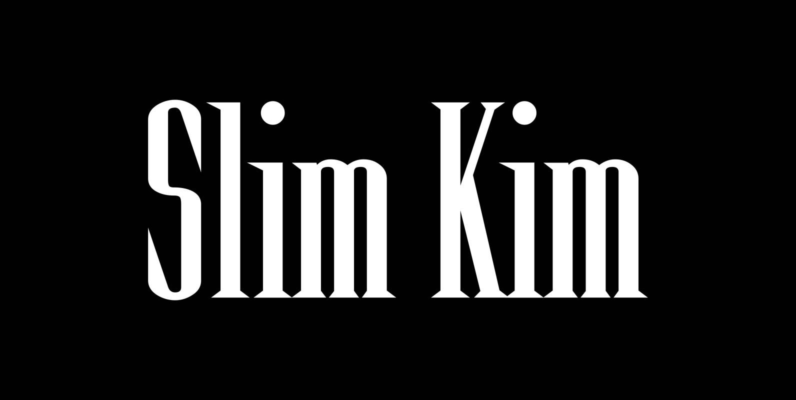
Slim Kim Font
“Slim Kim” is the sister font of “Julienne”. This font has very spiky serifs, so I did not want to make an extra slim version. This font mixes perfectly with “Julienn”. So whenever you need an especially slim serif font
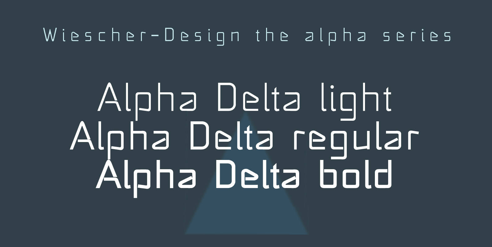
Alpha Delta Font
“Alpha Delta” the standard paperclip is the basic idea behind this font. By working on it, I changed it so that it doesn’t look too much like a paperclip any more. Published by Wiescher DesignDownload Alpha Delta
