Tag: garalde
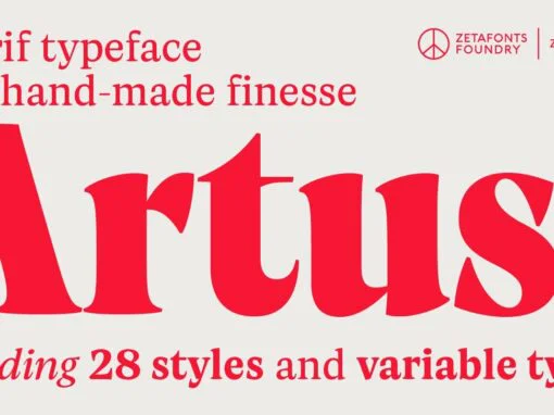
Artusi Font
Pellegrino Artusi was a celebrated Italian food writer, who is credited with the creation of one of the most influential cookbooks in the history of Italian cuisine. Taking inspiration from his legacy, Francesco Canovaro decided to work on a typographic
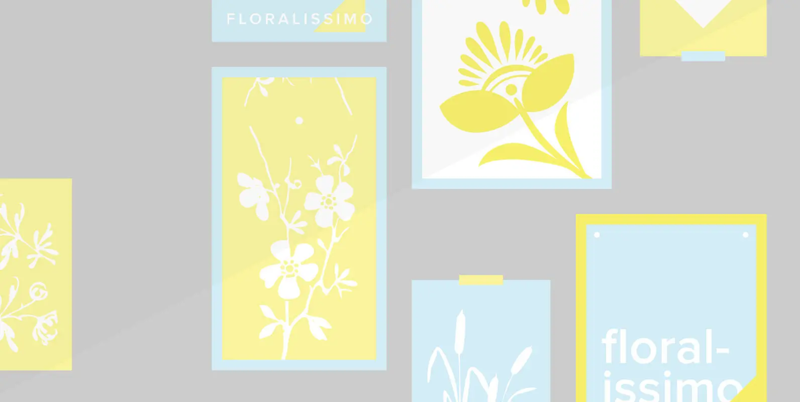
Floralissimo Font
“Floralissimo” are flowery embellishments that I found in several old publishing books dating back over a hundred years. I thought they might be useful for some of you, so I digitised them. Published by Wiescher DesignDownload Floralissimo

Stanhope Font
Designed by Les Usherwood. Digitally engineered by Paul Hickson. Les based the design on a turn-of-the-century typeface of the same name. The foundry is believed to be Soldans & Payvers, circa 1904. Published by Red RoosterDownload Stanhope
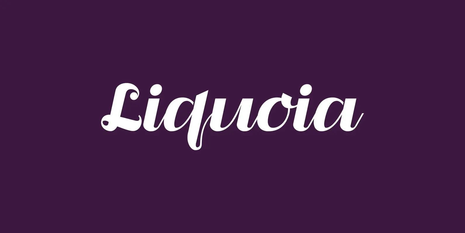
Liquoia Font
“Liquoia” are three scripts with lots of contrast and different embellishments. “Liquoia-A” has the elegant, flaming decoration it blends well with “Fleurons-Six”. “Liquoia-B” has the flowery embellishments and goes very well with my Ornata-A and Ornata-B. “Liquoia-C” is the plain,

Dundee Font
Designed by A. Pat Hickson, Dundee is a new design inspired by the various mastheads used in children’s comic books in England, published by D.C. Thompson of Dundee, Scotland. Published by Red RoosterDownload Dundee

Administer Font
Designed by Les Usherwood. Digitally engineered by Steve Jackaman. A few weights were originally released by another foundry; but this complete version of the family is a better match to Les original drawings! Published by Red RoosterDownload Administer

Veronese Font
Designed by Steve Jackaman, Veronese is based on the early original Monotype design, you can definitely see the influence of Italian Old Style, Jenson and Morris Golden Type. Published by Red RoosterDownload Veronese
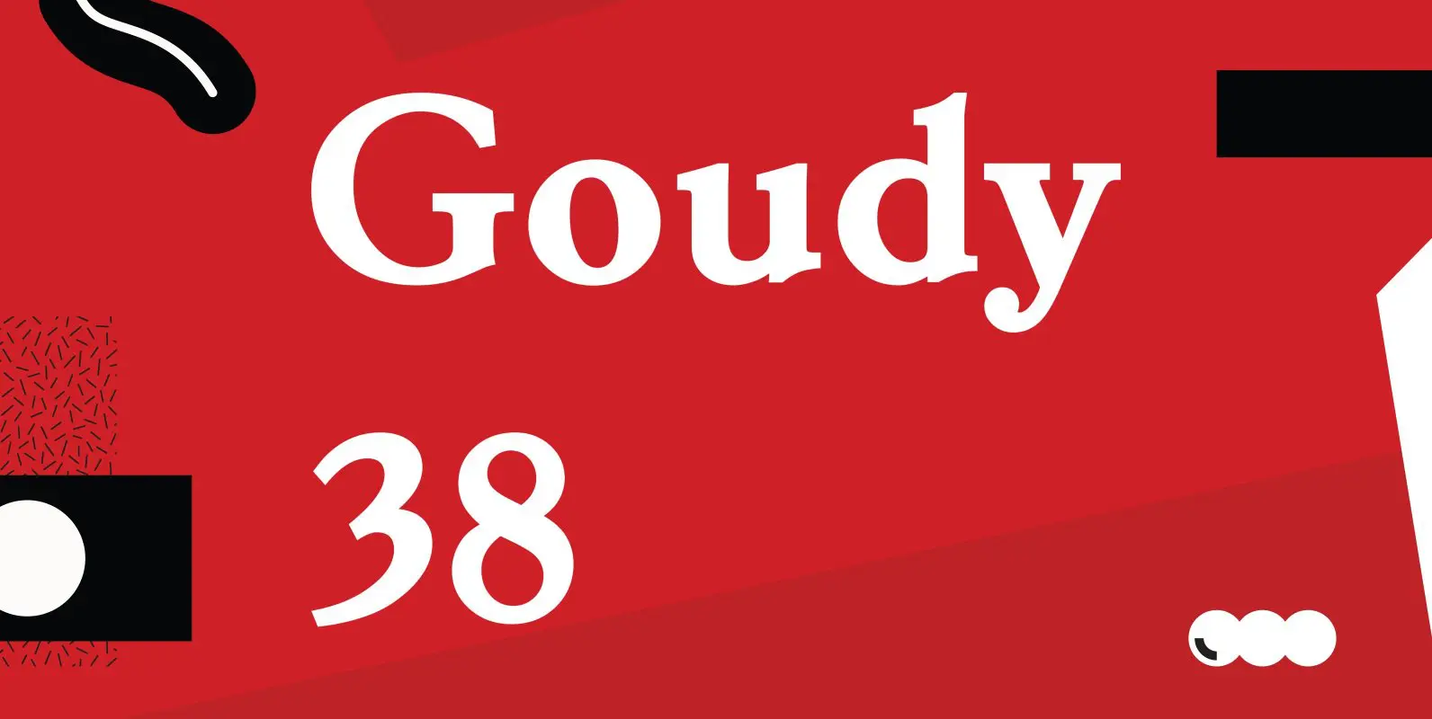
Goudy 38 Font
Designed by Les Usherwood. Digitally engineered by Steve Jackaman. Originally designed by Frederick Goudy for the original Life magazine, circa 1908. The typeface was used almost exclusively for their advertising and was often known as Goudy Gimbel; but the typeface
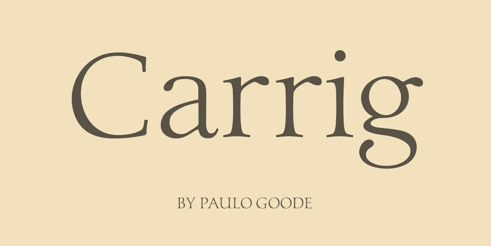
Carrig Font
Carrig is a Classic Antiqua typeface that was inspired by letterforms that have been carved into stone and weathered by time. Features: • Full European Character Set • 410 Glyphs • Alternate Letterforms for capitals O, Q, R and U.
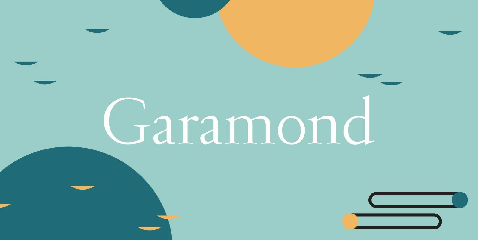
Garamond Font
Garamond was originally designed by R.H. Middleton for Ludlow, circa 1929-30. Digitally engineered by Steve Jackaman. Published by Red RoosterDownload Garamond

Silverado Font
Designed by Steve Jackaman, Silverado is based on a classic serif type design called Eldorado. Published by Red RoosterDownload Silverado
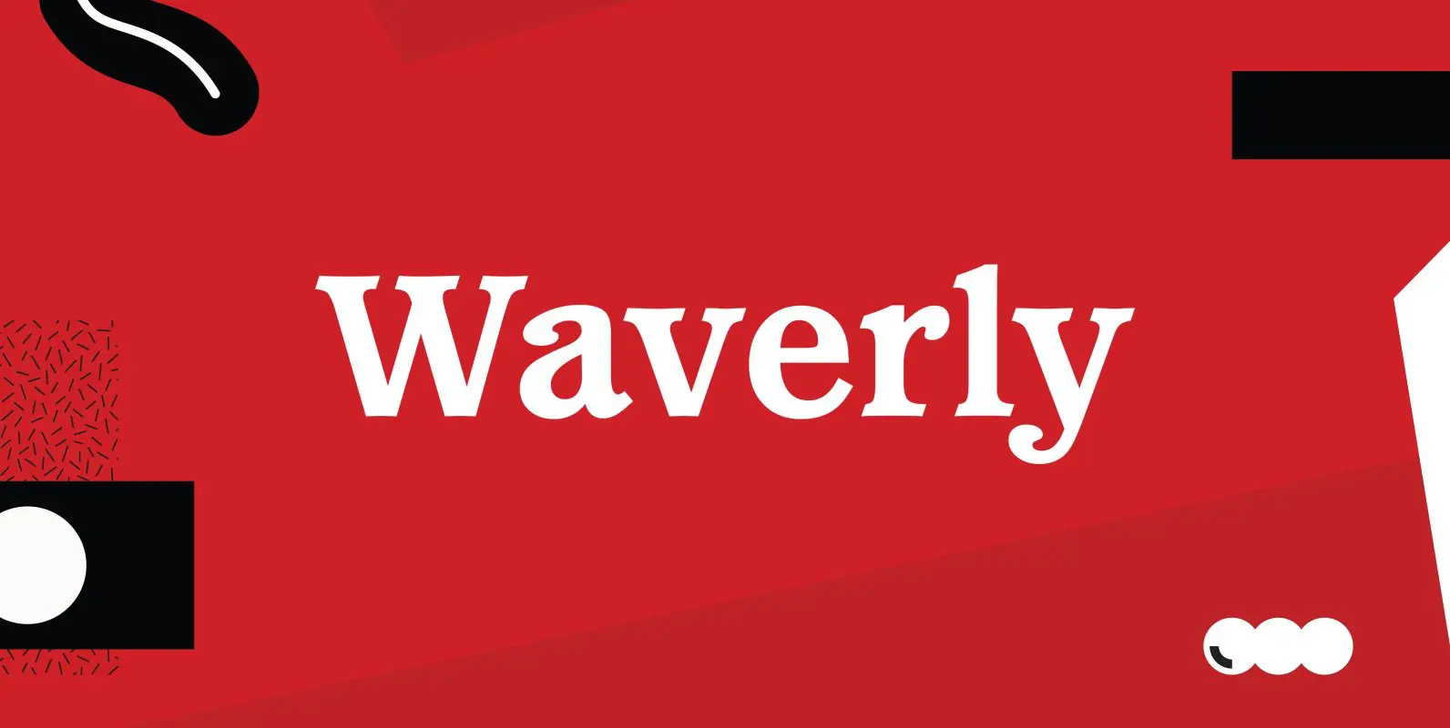
Waverly Font
Waverly is a round and soft serif designed by Les Usherwood, digitally engineered by Steve Jackaman. Published by Red RoosterDownload Waverly

Leighton Font
Designed by Paul Hickson, Leighton is a clean serif based on Lectura, a design by Dick Dooijes of the Amsterdam Foundry (1966). Published by Red RoosterDownload Leighton

Bellini Font
Designed by A. Pat Hickson, Bellini is an original design based on the typeface Progreso from the Gans foundry circa 1923. Published by Red RoosterDownload Bellini
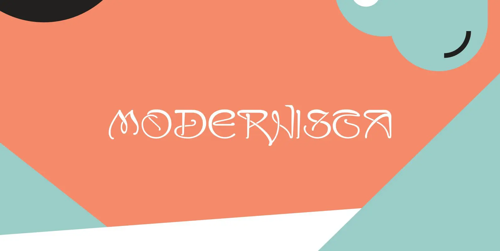
Modernista Font
“Art Nouveau” happened over Europe under different names. They called it “Jugenstil” in Germany, “Le style moderne” in France, »Sezessionsstil« in Austria and Eastern Europe, “Stile Liberty” in Italy and “Modernista” in Spain. “Jugendstil” in Germany is what started modern
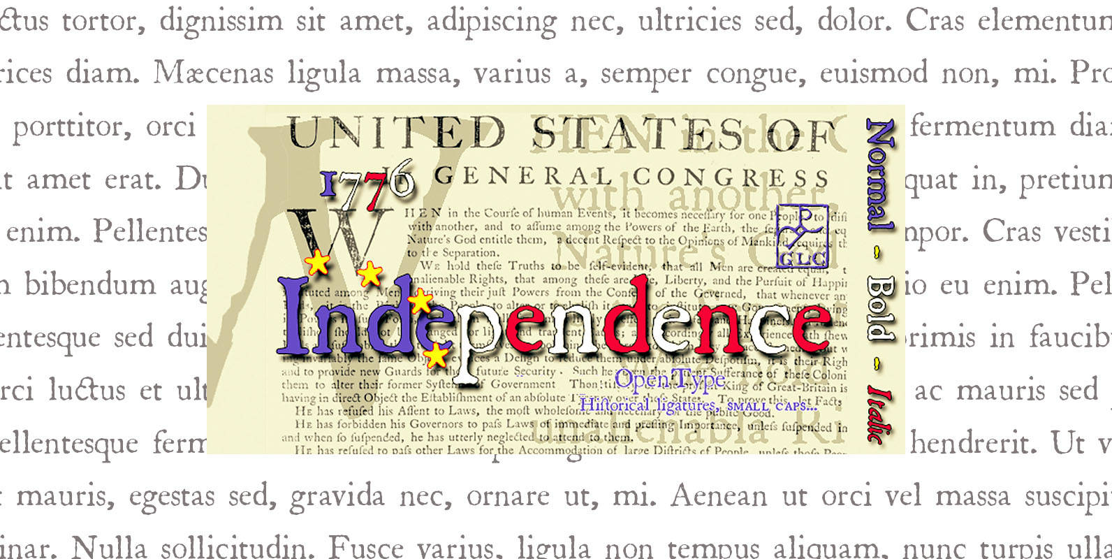
1776 Independence Font
1776 Independence was designed inspired mainly from the font used by John Dunlap in the night of 1776 July 4th in Philadelphia to print the first 200 sheets of the Congress’ Declaration of Independence establishing the United States of America.
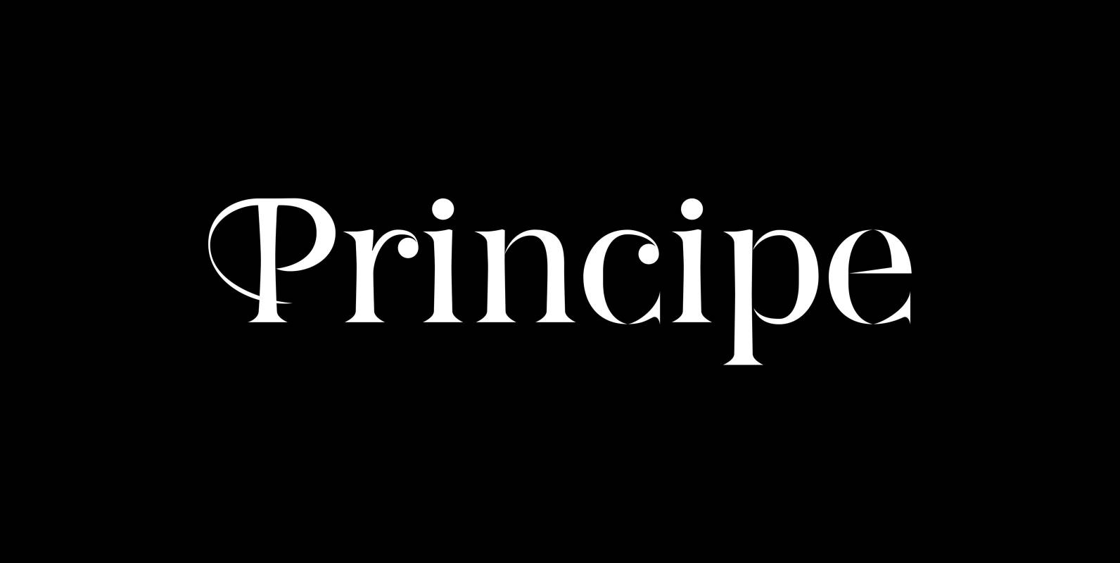
Principe Font
“Principe” is the Bodonian idea driven to the limit by abolishing most of the hairlines! The shape is completed only by the eye of the reader. This gives room for elegant embellishments and makes for a surprisingly new look to
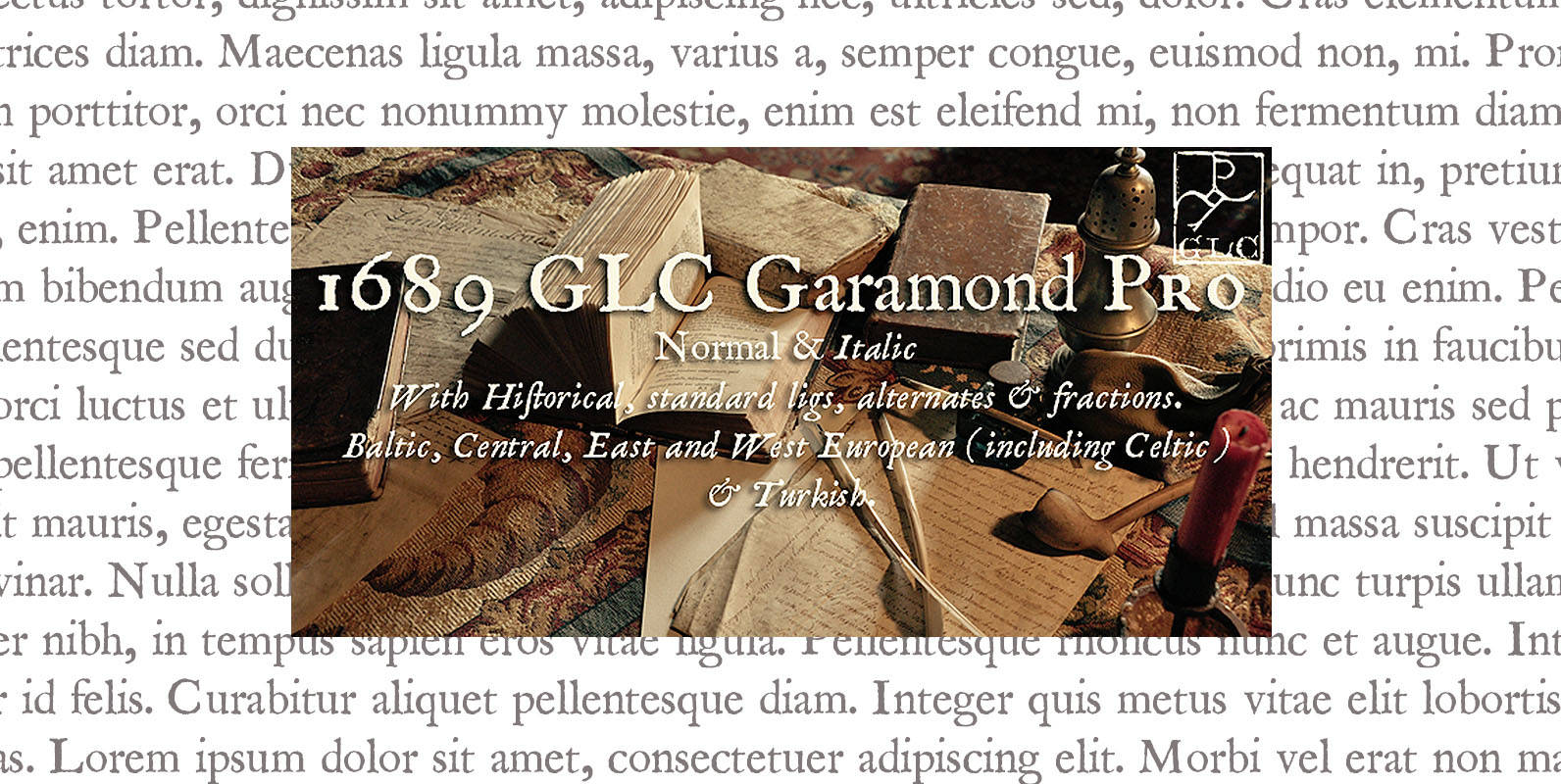
1689 GLC Garamond Pro Font
This family was created inspired from a Garamond pattern set of fonts used for an edition of “Remarques critiques sur les œuvres d’Horace” by “D.A.E.P.” published in Paris in 1689 by two different booksellers : Deny Thierry and Claude Barbin.