Tag: garalde
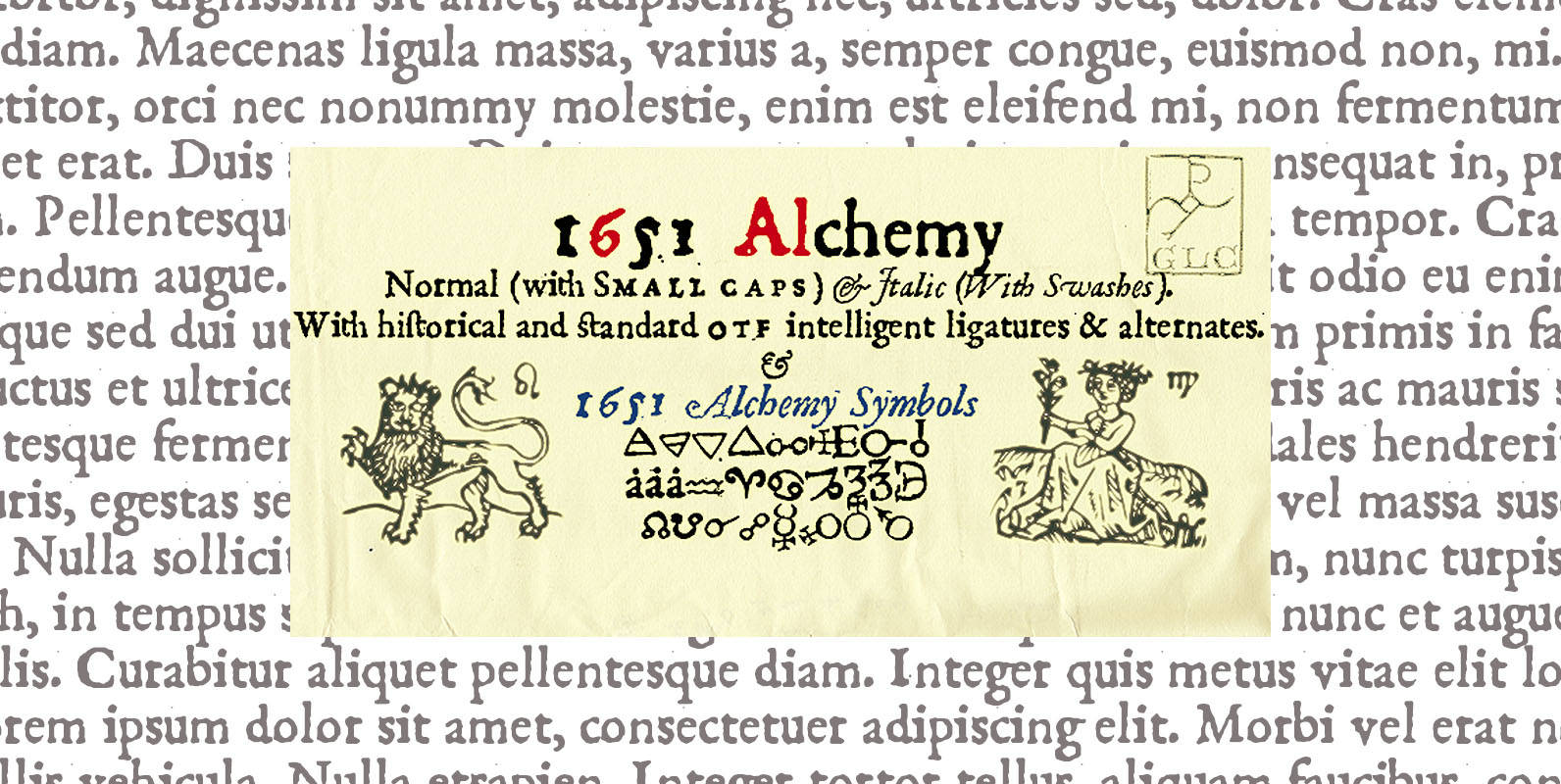
1651 Alchemy Font
This family is a compilation created from a Garamond set in use in Paris circa 1651, but similar to those, eroded and tired, who were in use during centuries to print cheap publications, as well as in Europa than in
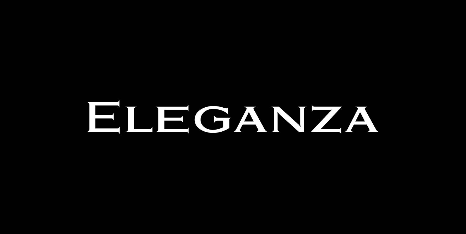
Eleganza Font
“Eleganza” is my most elegant typeface. At least that is what I think! I use it for business cards and everything that has to be elegant with that extra touch. The font comes in pairs for the price of one.

Ornata Font
“Ornata” (A,B,C,D,E,F,G) are series of old ornaments that I am trying to save from oblivion. I am not just scanning these, I am completely redesigning the ornaments from scratch, thereby eliminating imperfections. These ornaments have been first designed by the
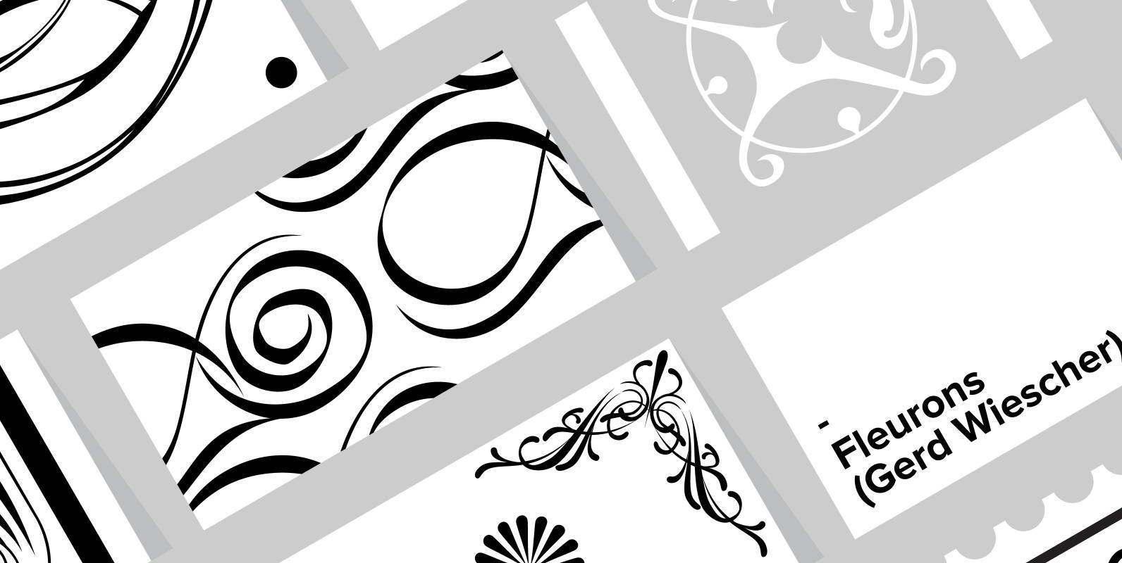
Fleurons Font
“Fleurons” are embellishments and here is my sixth and so far most beautiful round. I again found some nice old ones and made them completely new. Published by Wiescher DesignDownload Fleurons
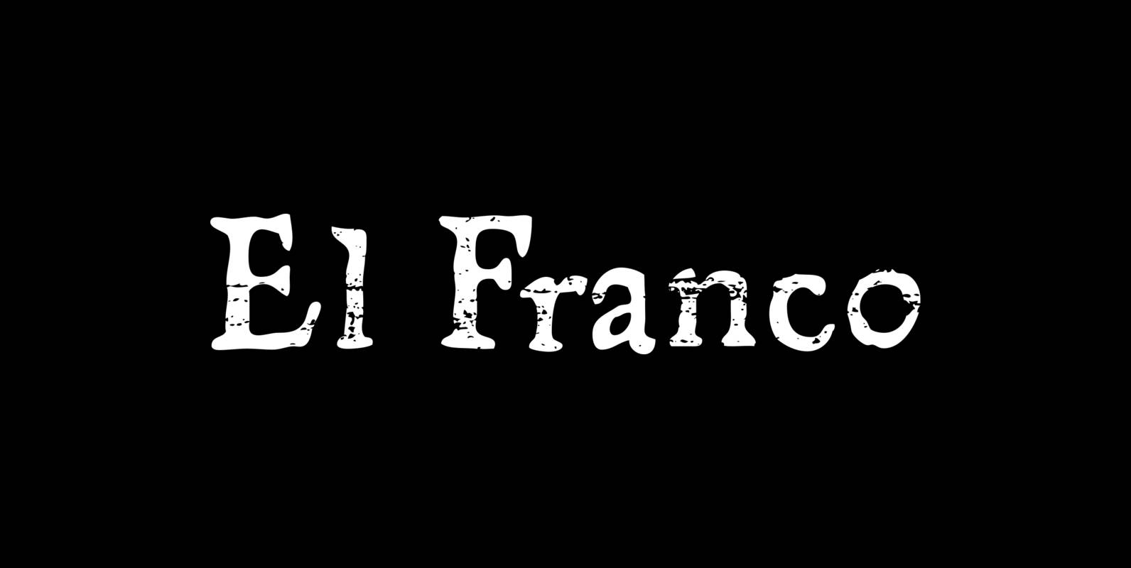
El Franco Font
El Franco is a font design published by Fonthead. Published by Fonthead Design Inc.Download El Franco

Anglecia Pro Text Font
Anglecia Pro is an exquisite and versatile system of three transitional serif typefaces designed to work together in editorial design. Sharing the same skeleton, vertical axis, and trapezoidal uncurved serifs, each of these faces bears different key dimensions and different
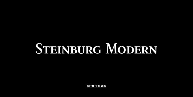
Steinburg Modern Font
Steinburg Modern™ is largely a variation on a Garamond-styled typeface with differences in some character designs and in the overall character proportions. In addition, the curved brackets that were a distinctive part of Garamond’s 16th century design are perhaps the

Aquinas Font
Leading British designer David Quay created this elegant Roman typeface with strong, classical letterforms. Aquinas creates a graceful, rough edged pen-on-parchment effect and is the perfect choice where an expensive, upscale look is required. Published by LetrasetDownload Aquinas
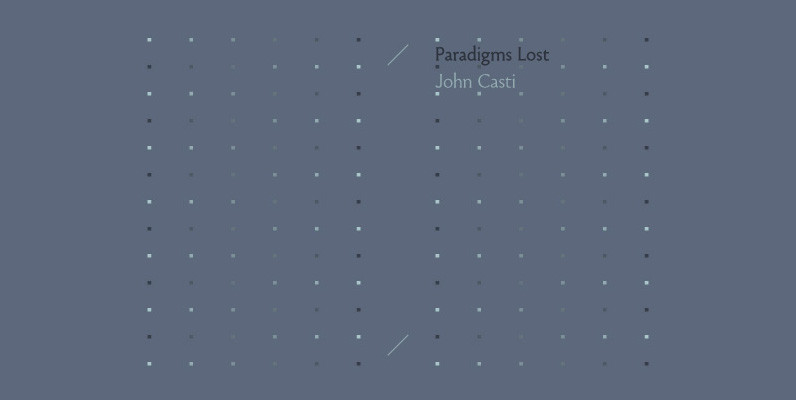
Paradigm Font
Originally released in 1995 as a three font family, Paradigm forcefully addressed the emaciating effect that digitization was then exerting upon traditional serifed typography. Investigating the new media of a much previous era, Nick Shinn deconstructed the first roman type,
Copacabana Font
Copacabana is heavily based on one of my favourite typefaces Goudy Old Style Italic. It is sharper and more clearly defined than Goudy yet still retains it old style characteristics. The face is slightly angled so is basically upright whilst
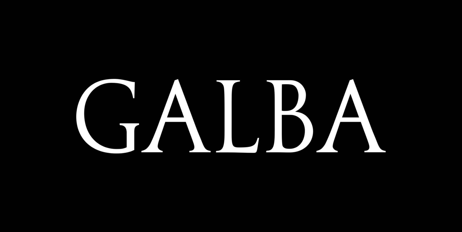
Galba Font
Galba is a font design released for the Mecanorma Type Collection. Copyright 2004 Trip Productions BV. Published by MecanormaDownload Galba

Brigade Font
In searching for a Roman to use there were bits of Bembo,Times,Garamond etc., that I liked and bits that I did not. So I set out to take the best bits of all my favourite Romans and tried to create

WTC Goudy Font
Designed by Frederic William Goudy, WTC Goudy is a serif font release by URW. Contains language support for West, East, Turkish, Baltic, and Romanian. Published by URW Type Foundry GmbHDownload WTC Goudy
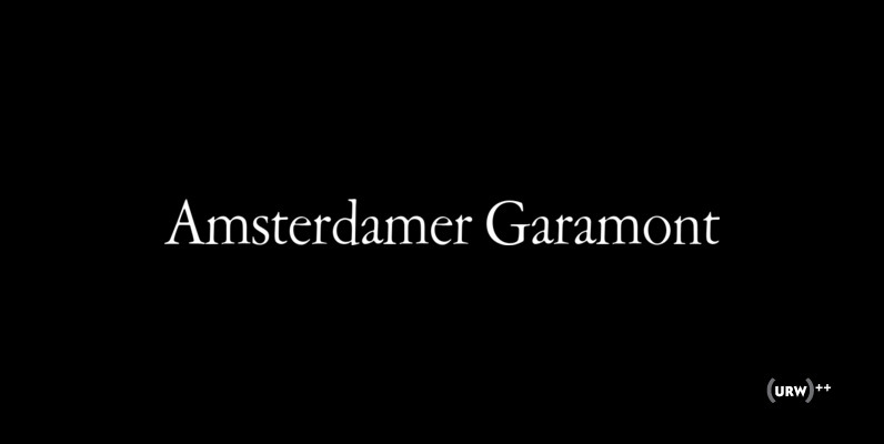
Amsterdamer Garamont Font
Amsterdamer Garamont is an old style serif that was originally designed by Morris Fuller Benton in 1917. Published by URW Type Foundry GmbHDownload Amsterdamer Garamont
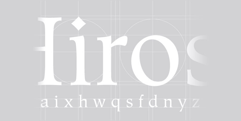
Hiroshige Font
A vintage and classic serif designed by Cynthia Hollandsworth, Hiroshige brings elegance and class to any project. Works great in both content and headline usage. Published by URW Type Foundry GmbHDownload Hiroshige
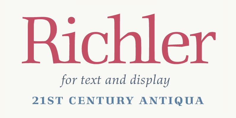
Richler Font
An open, evenly spaced book face designed for quality headlines and enhanced readability in text. Published by ShinntypeDownload Richler
Beckenham Font
Designed by Les Usherwood, Beckenham was digitally engineered by Steve Jackaman. The x-heights are radically different; the x-height on the light version is small, and gets larger as the weights progress. Published by Red RoosterDownload Beckenham

Aquiline Font
Handsome, adventurous, legible and elegant, this script has the feel of practical handwriting from past centuries. Aquiline is based on a cursive italic style influenced by the 16th century European writing masters. The Aquiline design team turned to Ludovico degli