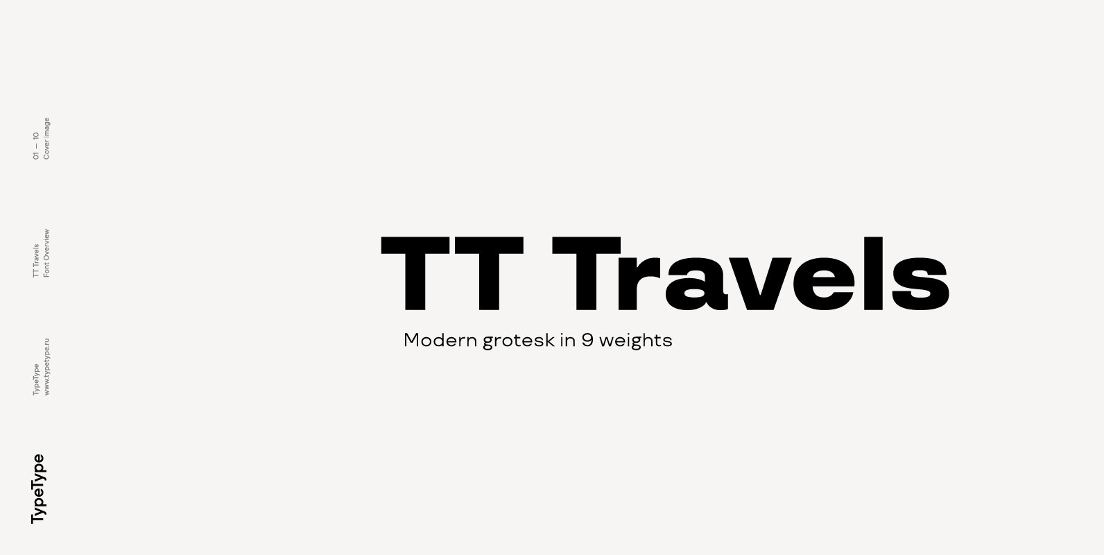
Tag: geometric  

Visby Round CF Font - Image 3

Visby Round CF  Font

Visby Round takes the charismatic forms of its older sibling Visby and softens them, creating a friendly new look. Perfect anywhere you need a little smooth sans-serif goodness. – Eight weights and obliques – OpenType features, including alternates –  Latin

Sango Font - Image 4

Sango  Font

Sango is a sans serif font design published by TYPE714 Published by TYPE714Download  Sango

Winner Font - Image 7

Winner  Font

Winner—Classic athletic aesthetics, finally as a versatile contemporary font family. Just when you thought there was nothing left to add to the classic sports design, we lifted it to a whole new level. Whatever you want to set in whatever

Fibra Font - Image 9

Fibra  Font

The font is actually not a revival of ‘Avant Garde’—by Herb Lubalin—but it takes its spirit. Fibra is a geometric sans serif, yet without the typical structural strictness of these kind of fonts, that represents experimental type design. This  can

Visby Slab CF Font - Image 10

Visby Slab CF  Font

Visby Slab is a geometric slab serif built on the popular Visby font family. Fun to use and delightfully expressive, Visby Slab is vibrant and strong in all of its eight weights, and features true italics and wide language support.

Filter CF Font - Image 11

Filter CF  Font

Fusing constructivism, fashion, and design, FILTER CF is an experimental display typeface in five weights. Excellent for short bursts of stylized text, Filter features Latin and Cyrillic alphabets with nods to art deco, geometry, and science fiction. Version 2  adds

Marseille Font - Image 12

Marseille  Font

Marseille is an Art Deco-inspired typeface which is based on Louise Fili’s iconic cover design for the hauntingly beautiful Marguerite Duras novel, The Lover. The font is available in six irresistible weights: thin, light, regular, medium, semibold, and bold.  Each

Rhizome Font - Image 13

Rhizome  Font

Rhizome combines a glimpse into the past and what is considered as visionary in typography. It juxtaposes a geometrical construction with classical proportions, letterforms from serif typefaces and details that seem to be shaped by a wedge. Rhizome covers  the

Kentledge Font - Image 15

Kentledge  Font

Kentledge is a geometric grotesque sans type family based on geometric forms that have been optically corrected for better legibility. The family includes extended language support (over 200 languages), alternates, ligatures and more. It is best suited for graphic  design

Publica Slab Font - Image 17

Publica Slab  Font

‘Publica Slab’ is the serifed sister of Publica Sans and Publica Play – packed with subtle open type features, tabular options, rare currencies signs and symbols and arrows, ‘Publica Slab’ provides everything you need for big design tasks like signage,

dT Jakob Font - Image 18

dT Jakob  Font

dT Jakob started as a revival by Gustavo Soares for Paul van der Laan’s class at the Type and Media Masters, in The Hague, NL – back in 2007. There are quite a few excellent geometric sans typefaces available,  but