Tag: geometric
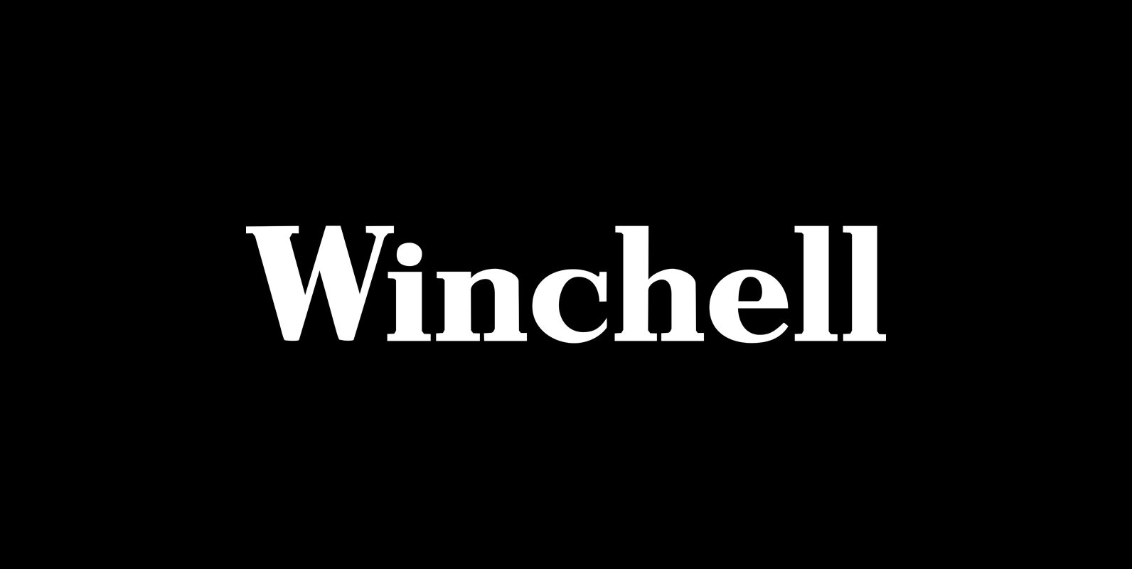
LTC Winchell Font
Winchell is the only identified typeface designed in Buffalo, NY prior to the formation of P22 type foundry. It was created by Edward Winchell of the Matthews-Northrup Printing Works and released by the Inland Type Foundry in 1903. The Winchell
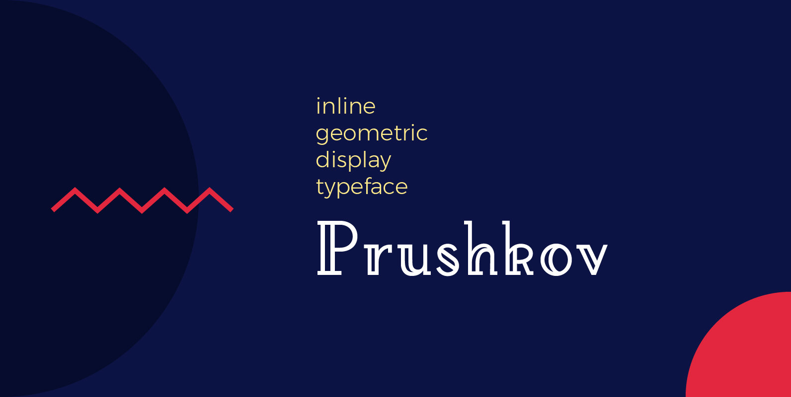
Prushkov Font
Prushkov is the first typeface that I have made. Its name comes from the town I currently live in. The design was inspired by both geometric typefaces like Futura, and didone type like Bodoni. Its aim (perhaps quite bold) is
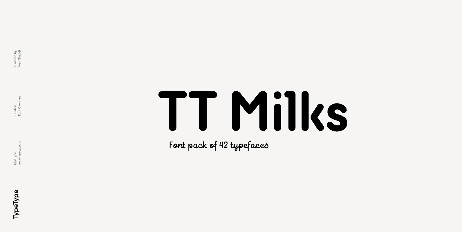
TT Milks Font
Initially the idea for TT Milks was to create a collection of typefaces to be used for packaging and branding of dairy products. We’ve started by creating a main sans-serif and a supporting script, worked on their compatibility, and created
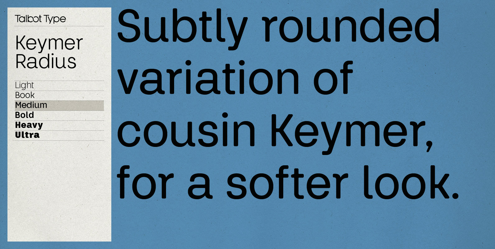
Keymer Radius Font
Talbot Type Keymer Radius is related to Talbot Type Keymer; where Keymer is square-edged, Keymer Radius is subtly rounded for a softer look. Keymer Radius mixes geometric and humanist traits to achieve a modern, clean, elegant appearance. It is a
Cocotte Font
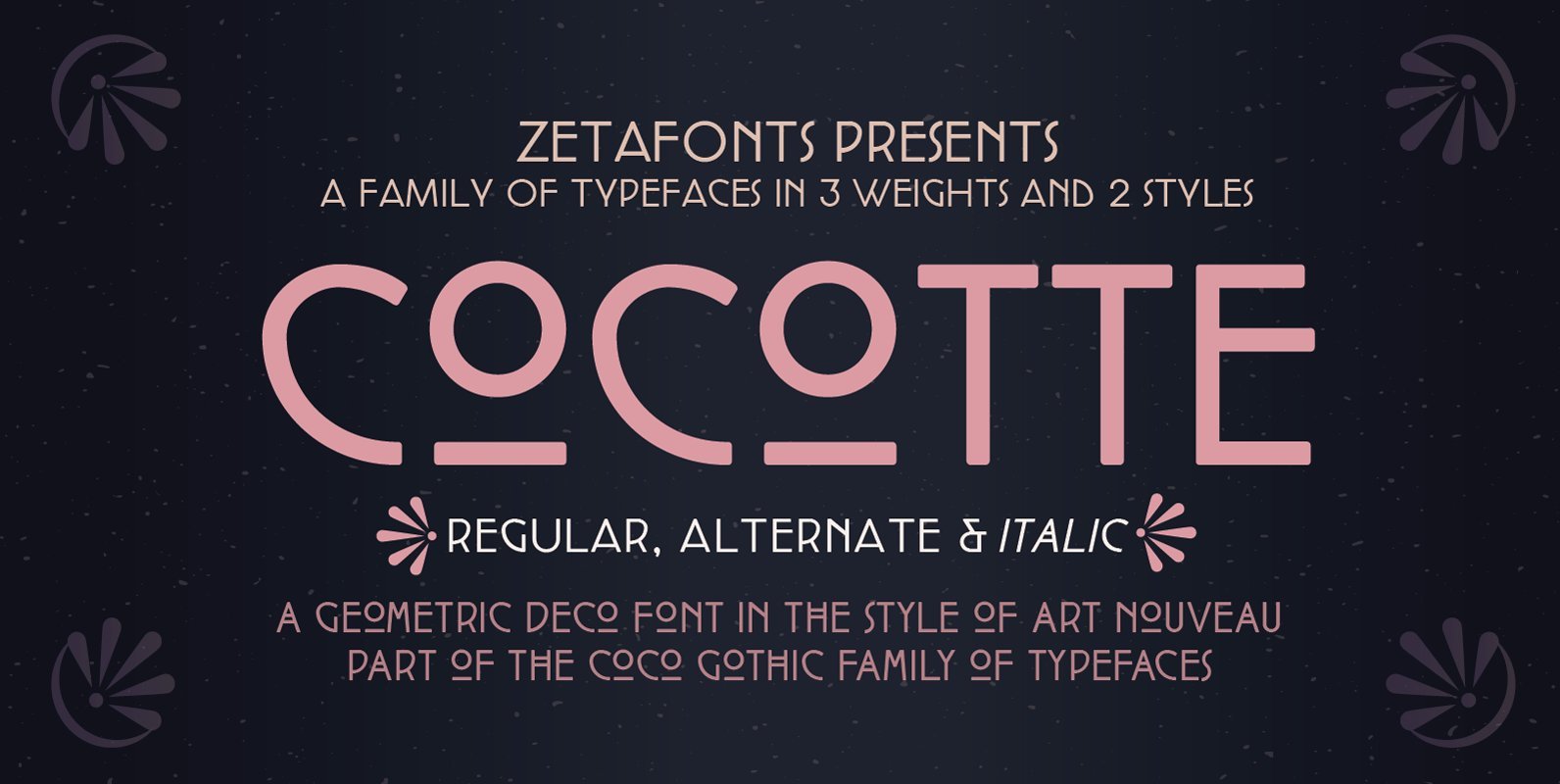
Cocotte is a small caps sans serif display typeface inspired by the graphic style of early art nouveau. It comes in three weights with matching italics and features a regular style, inspired by arts&crafts and geometric jugendstil, and an alternate

Folty Font
Folty is a geometric sans serif design that was inspired by modern graphic design and contemporary typefaces. The family contains 6 weights from thin to bold, which works best for advertising, packaging, editorial, logo, branding and numerous other purposes. Published
Le Havre Width Font
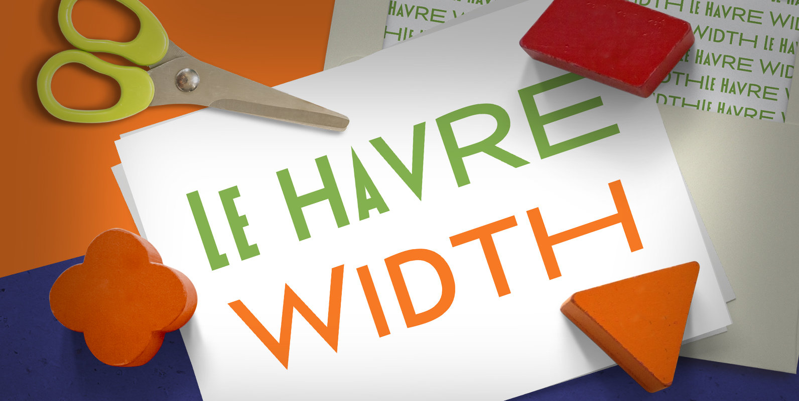
Le Havre Width is the loveable putty of fonts. Stretch it. Squish it. Squeeze it. Whichever way you play with it, you’re bound to find hours of fun ahead. This avant-garde typeface family has six distinct weights–each one including a
Umbero Font
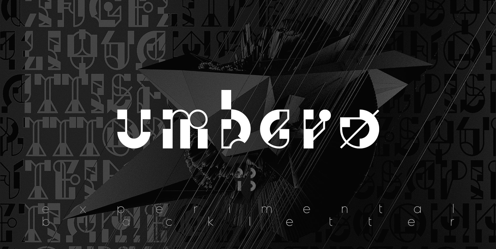
Umbero is experimental blackletter design with high contrast, inspired by constructivism and modern calligraphy. Published by NaumTypeDownload Umbero
Kontora Font
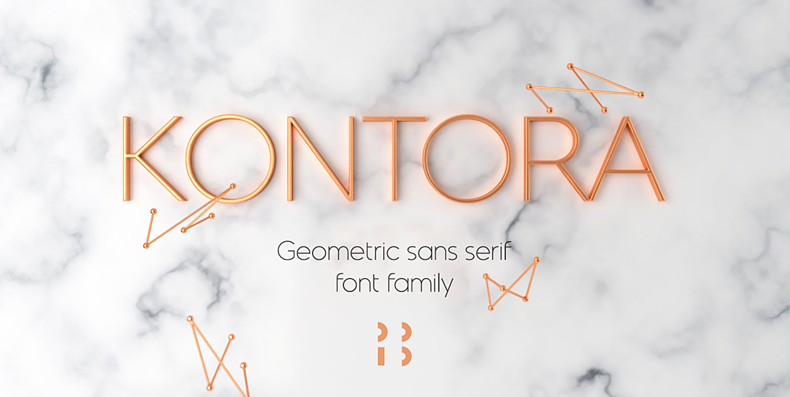
Kontora is a basic and universal geometric grotesque design, that can be applied to various styles of layouts. It has minimum details, mostly modern proportions and letter forms, along with a touch of retro. Published by NaumTypeDownload Kontora
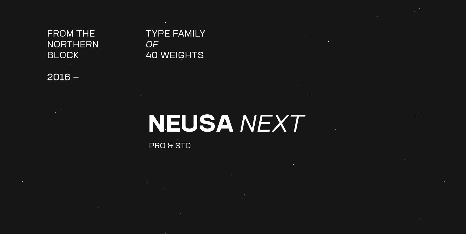
Neusa Next Font
Neusa Next is a geometric sans serif type family designed by Maria V. Pigoulevskaya. Its wide range of weights, widths and matching italics provides the designer with a complex and rich typographic palette. Designed and released as Neusa in 2012,
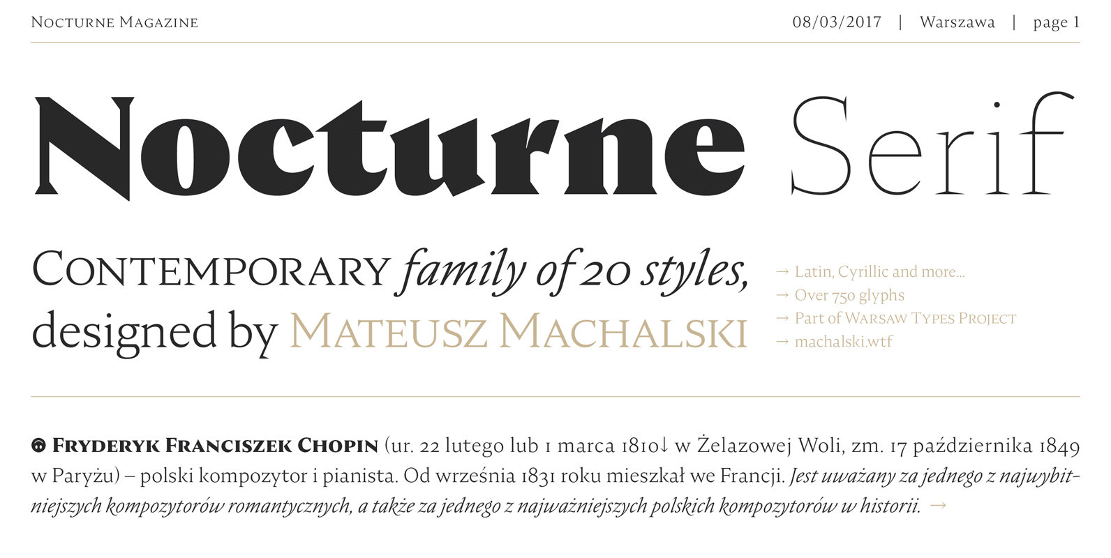
Nocturne Serif Font
Nocturne Serif is a font inspired by the lettering on stone tablets commemorating the victims of World War II and Warsaw architecture. Nocturne is a text font that features clean geometrical shapes, high contrast and is modernist in character. All
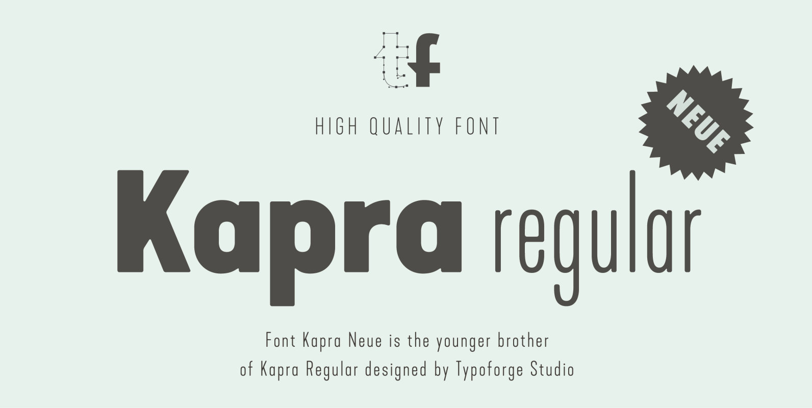
Kapra Neue Font
Kapra Neue is a younger sister of Kapra. New family has refreshed proportions, rounded corners, and a new shape of glyphs. It is characterised by a wide range of instances – 24 new weights, from Thin Condensed to Black Expanded,
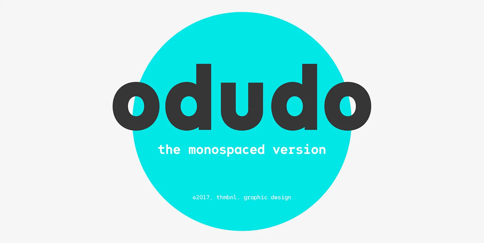
Odudo Mono Font
This is the monospaced version of the original Odudo typeface, designed in collaboration with Alberto Romanos. The typeface shares the same width across all weights without losing the familiar geometric Odudo-feel. It comes with extended Latin support and contains four
