Tag: geometric
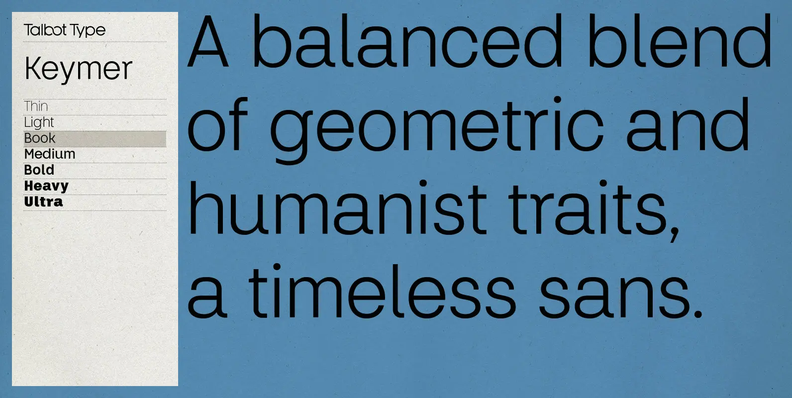
Keymer Font
Talbot Type Keymer is inspired by Margaret Calvert’s Transport typeface, designed for the British road sign system in the early 1960s. Keymer mixes geometric and humanist traits to achieve a modern, clean, elegant appearance. It is a legible and versatile
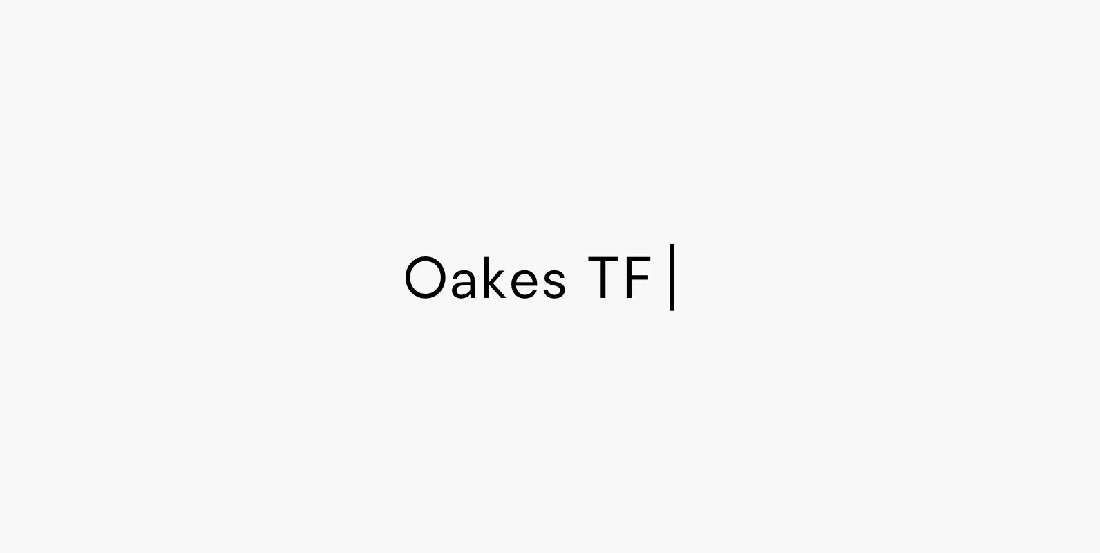
Oakes Typeface Font
Oakes is a typeface that is a progression of my previous typeface – Orkney. It retains the same metrics and character, whilst becoming more smart and corporate. The aim for this rendition of the typeface was to make a letterset
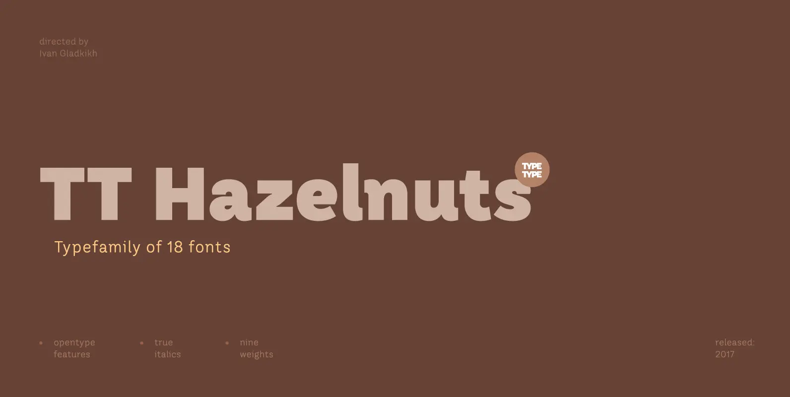
TT Hazelnuts Font
TT Hazelnuts is a display sans-serif font family containing a set of elegant and delicate decorative elements. Initially the family was designed for highly specialized areas, but we’ve decided to extend the number of typefaces and to make the family

Trenda Font
Designed by Daniel Hernández and Paula Nazal. Corrections and review by Alfonso García and Rodrigo Fuenzalida. Trenda is a geometric sans-serif typeface based on the uppercase of Trend—a Latinotype font, released in 2013, that was very well received. This new
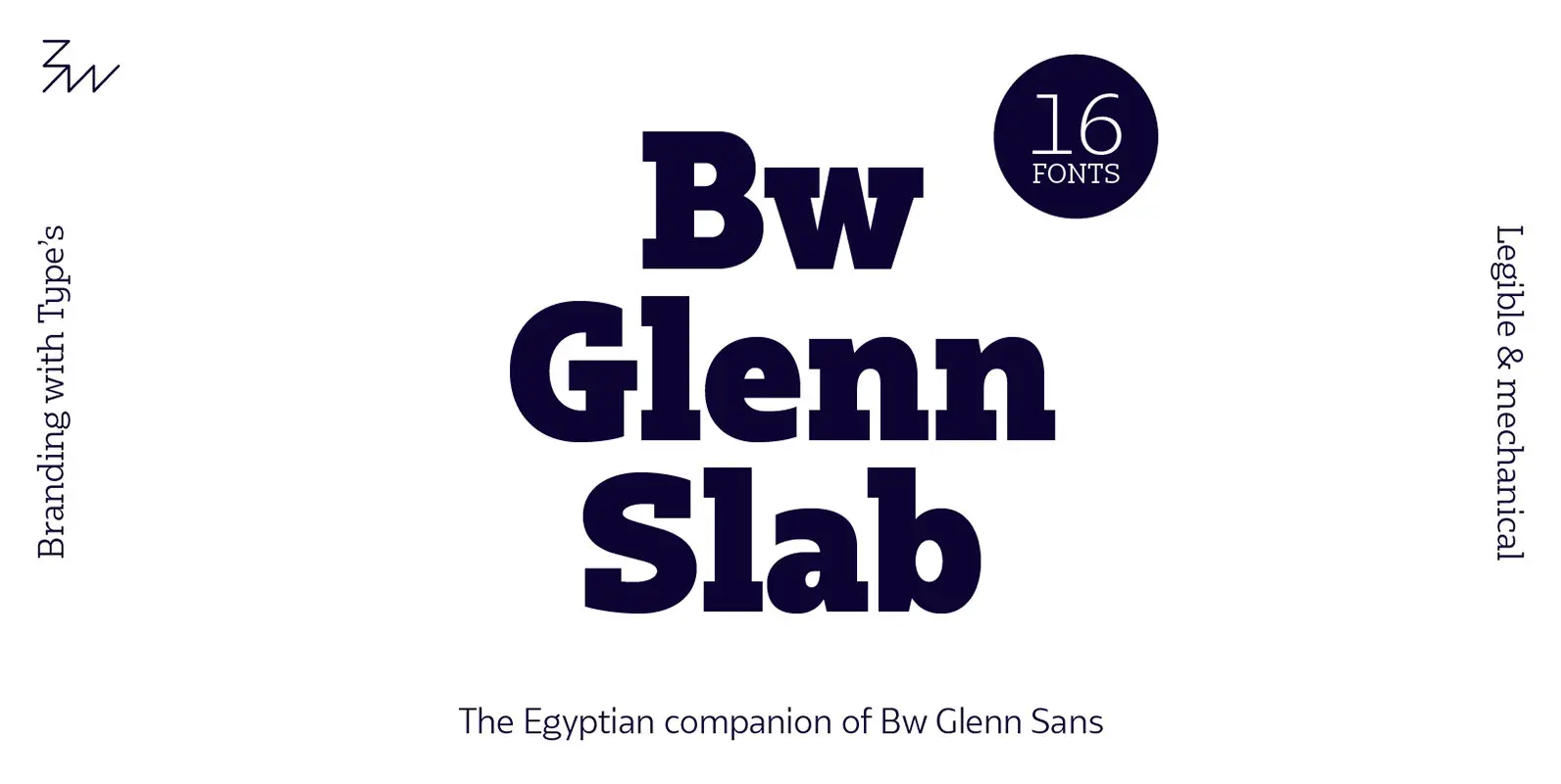
Bw Glenn Slab Font
Bw Glenn Slab is a confident and robust font family with a sturdy feel offering no concessions for ambiguity. Its strict geometry and open shapes provide a very legible and clean texture, performing well on print and screens alike. It’s
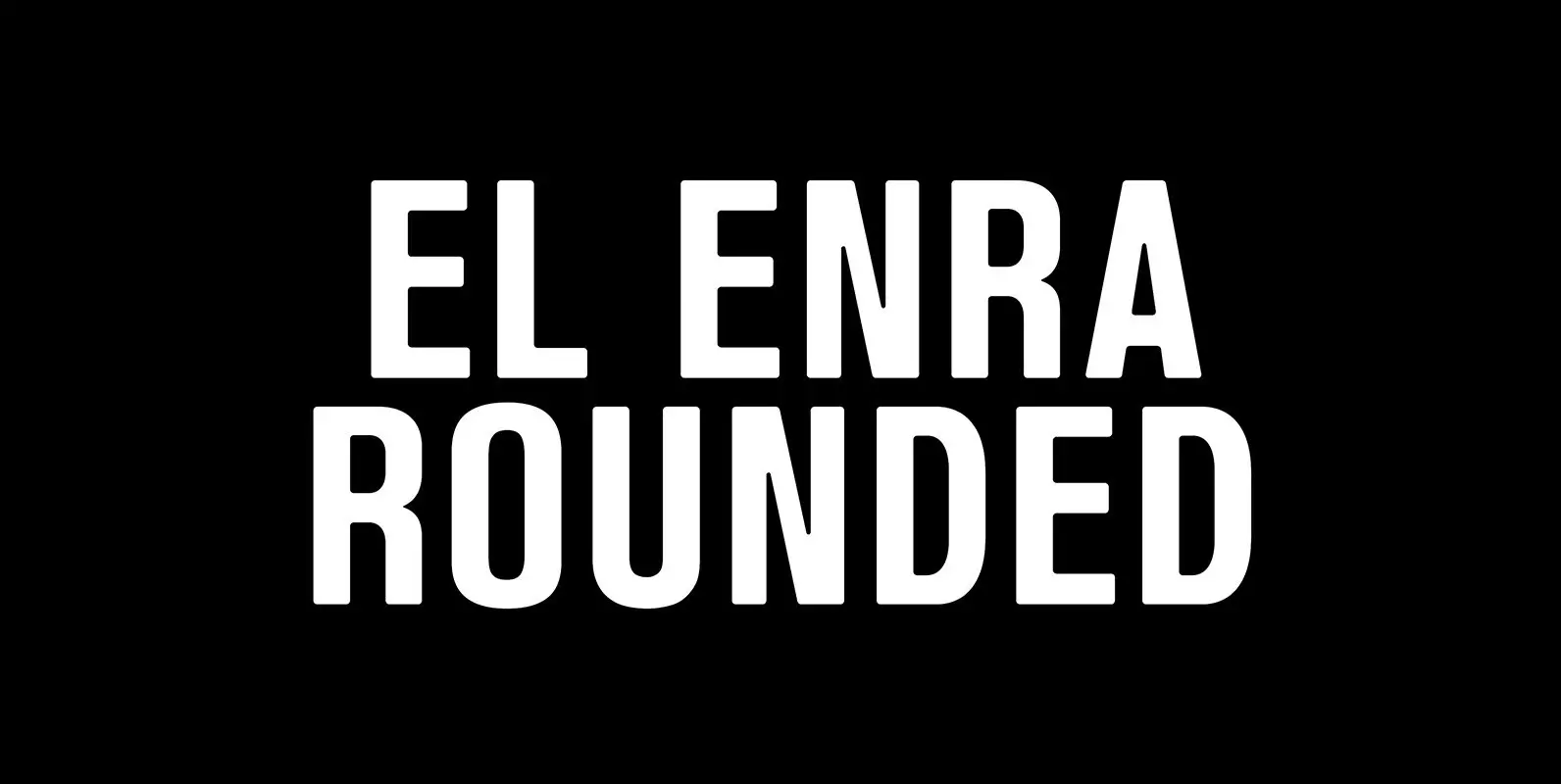
El Enra Rounded Font
El Enra is a bold and condensed typeface that is suitable for headlines, posters and titles. This is the rounded corners version — El Enra Rounded. Published by Hanken Design Co. Download El Enra Rounded
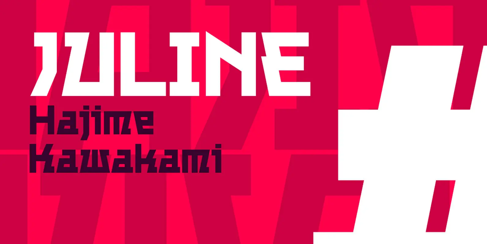
Juline Font
Juline has the character like a straight-based robot, mixed with curved letters. Published by URW Type Foundry GmbHDownload Juline

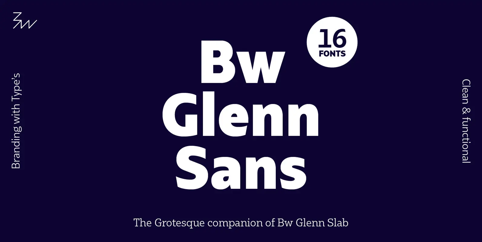
Bw Glenn Sans Font
Bw Glenn Sans is the result of mixing a grotesque skeleton with traits of the British sans serif tradition. The result is a modern and clean sans serif family that speaks with clarity and authority. Its contained width makes it
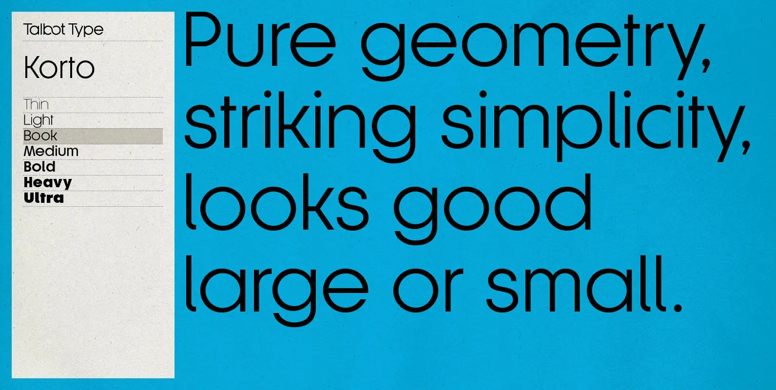
Korto Font
Korto is a clean, elegant and highly legible, geometric text and display font. Inspired by classic sans-serifs such as Futura and Avant Garde, this stylish, minimal typeface is available in a comprehensive family of seven weights and is suitable for
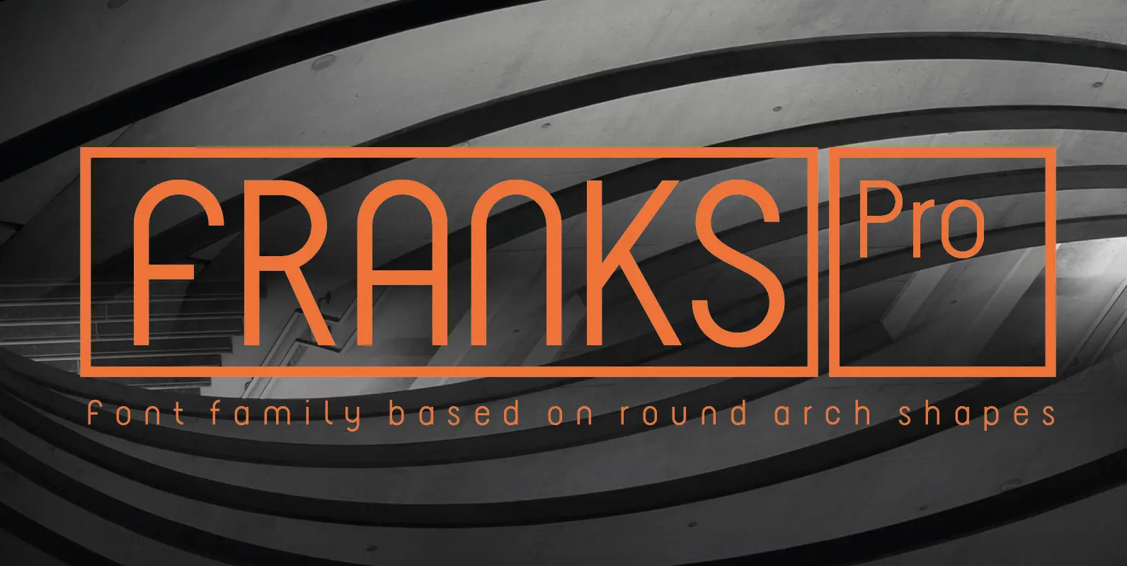
Franks Pro Font
The design of Franks Pro is based on round arch shapes. The font supports all european languages and contains 3 styles. Published by Philippe MoeschDownload Franks Pro
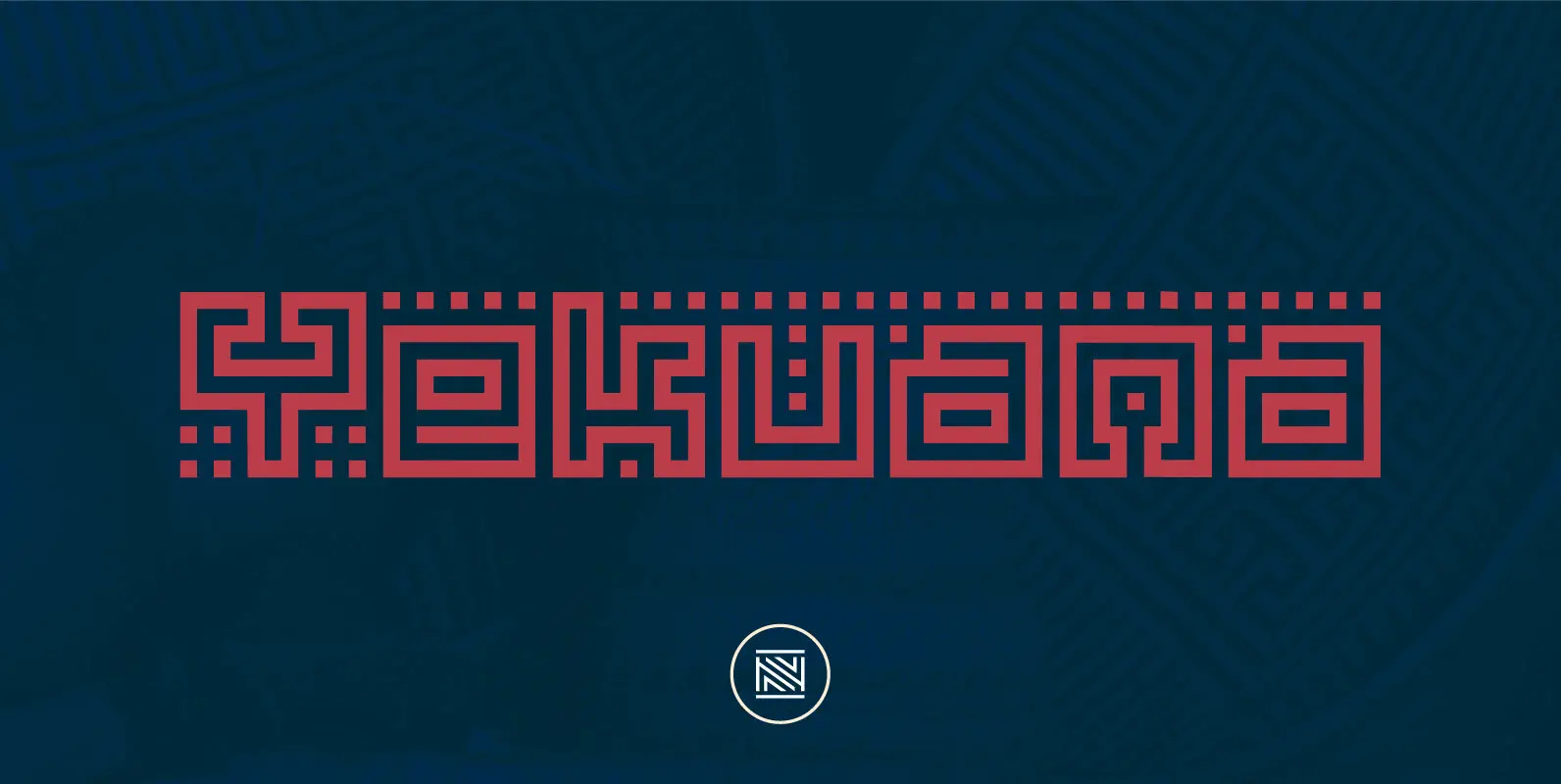
Yekuana Font
Yekuana is a typeface whose design is based primarily on the study of certain geometric ethnic ancestral Venezuelan signs, visually rich and originally used in the enrichment of various utilitarian objects with high symbolic and cultural content. Yekuana is a
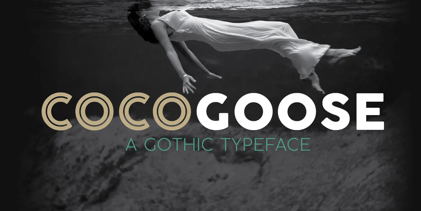
Cocogoose Pro Font
Cocogoose is a geometric sans serif typeface designed with straight, monolinear lines and circular or square shapes. Its strong, modernist look has been softened by rounded corners and slight visual corrections that make Cocogoose not only perfect for logos and
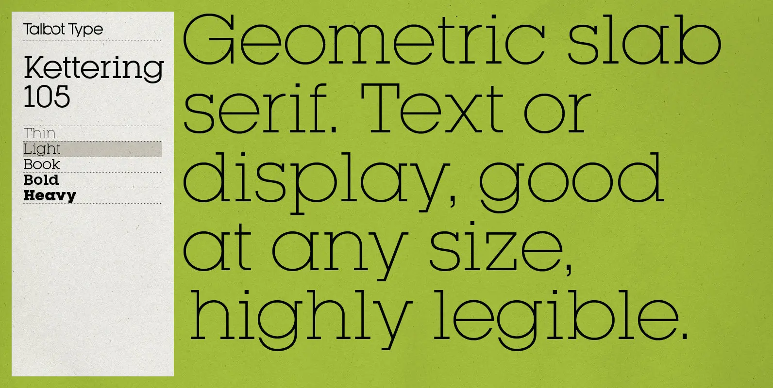
Kettering 105 Font
Kettering 105 is inspired by the classic, geometric slab-serifs such as Lubalin, but has shallower ascenders and descenders for a more compact look. It’s a versatile, modern slab-serif, highly legible as a text font and with a clean, elegant look
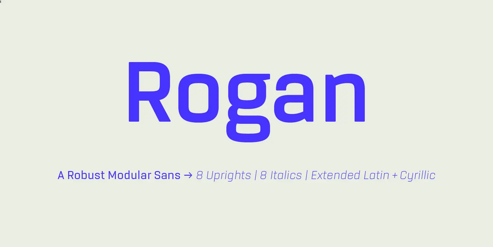
Rogan Font
Rogan: A Robust Modular Sans. Rogans clean lines started out as an exercise in modularity and geometric forms. This initial construction approach was then adapted to improve the functionality of the family; Breaking away from the strictly modular system in
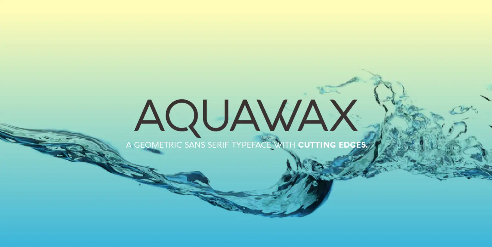
Aquawax Font
Balancing sharp angles with soft rounded shapes, AQUAWAX is a geometric sans serif typeface family evoking a contemporary sensibility of digital smoothness and liquid connections. Optimized for maximum screen readability, it covers over 40 languages that use the Latin alphabet,

Snatch Font
Snatch is a dynamic and expressive type system designed for impassioned and unprejudiced creative directors who look to combine the rough with the sexy. The font is well-suited for publishing projects, branding and packaging. Snatch is composed of three sections: