Tag: geometric
Design System Font
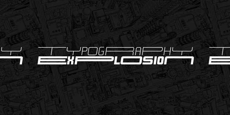
Design System is a great type system consisted of 5X7X2=70 font styles from 70s-style simple square sans to the widest style of all time that are best for titles, logo and text. Their simple form does not limit the target
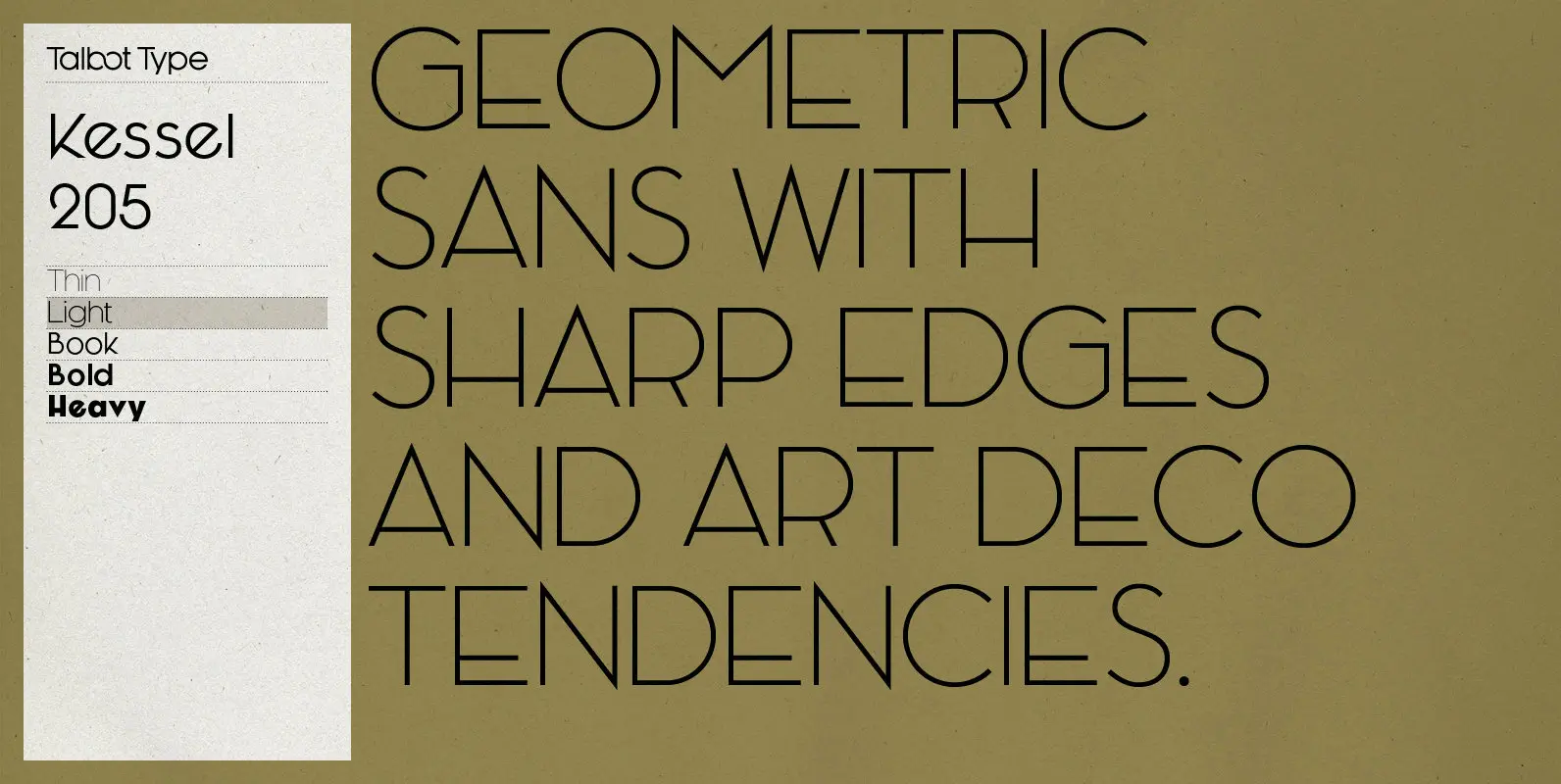
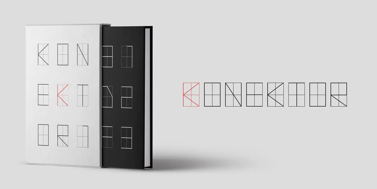
Kessel 205 Font
Kessel 205 is inspired by the classic, geometric sans-serifs such as Futura, but has shallower ascenders and descenders for a more compact look, and features an art deco influence with sharp points at the apex of many characters, lowered crossbars
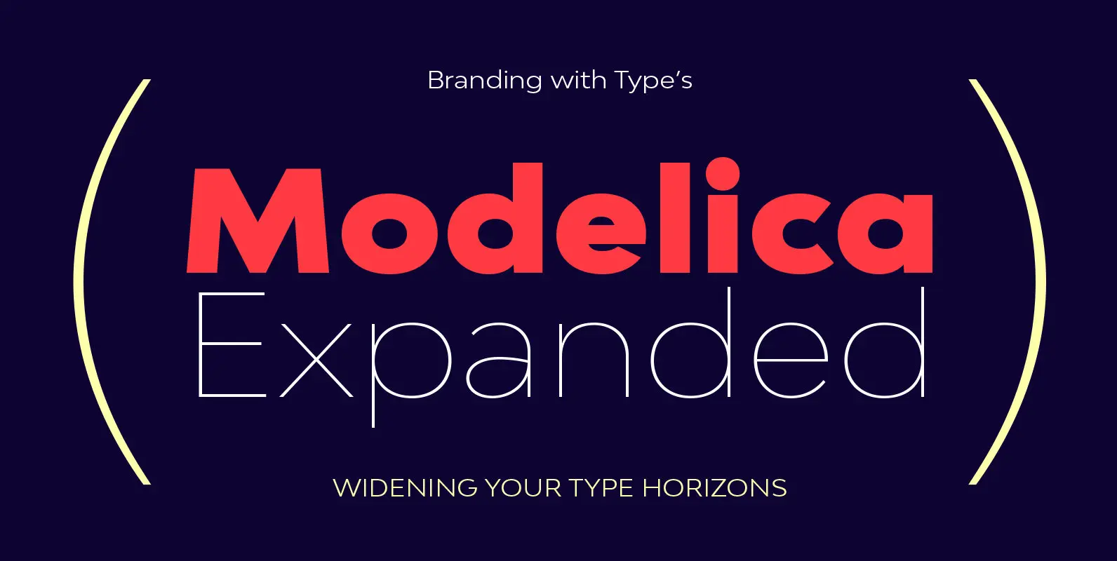
Bw Modelica Expanded Font
Designed by Alberto Romanos, Bw Modelica is a minimal, robust, reliable & pragmatic geometric sans. Its clean shapes and generous x-height makes it a very competent face for both, display and body copy purposes. It’s available in four widths, each
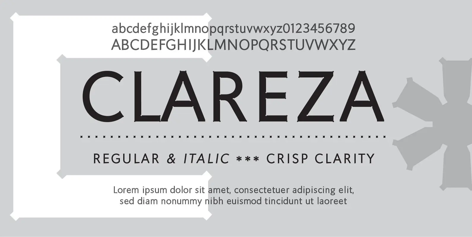
Clareza Font
Clareza means “Clarity” in Portugese. That was exactly the goal in creating this font. We managed to create a font that is crisp and extremely legible at all sizes but then comes to life in an interesting and unusual way
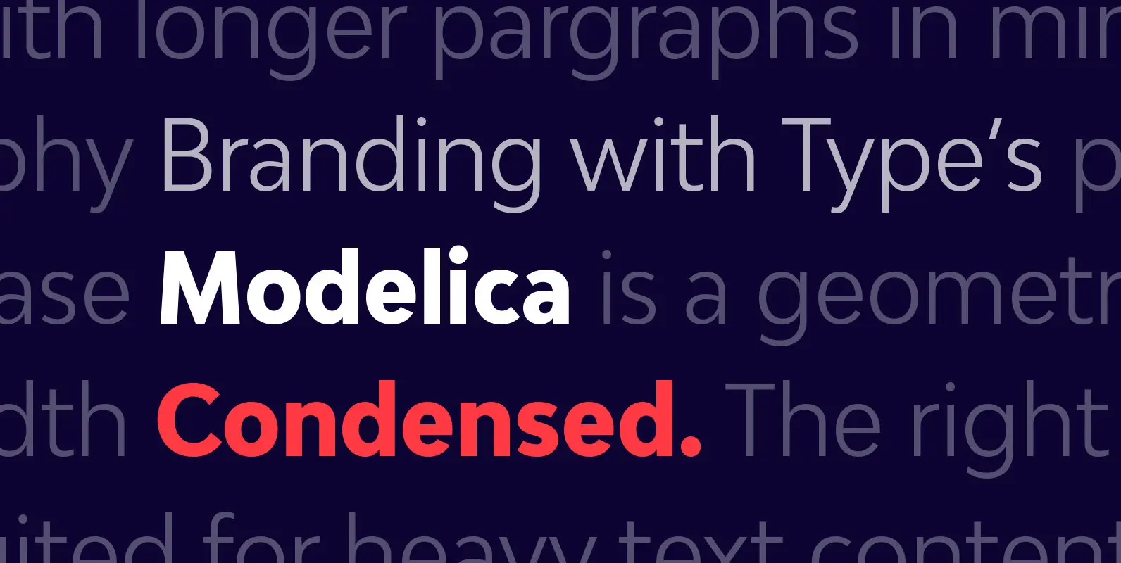
Bw Modelica Condensed Font
Designed by Alberto Romanos, Bw Modelica is a minimal, robust, reliable & pragmatic geometric sans. Its clean shapes and generous x-height makes it a very competent face for both, display and body copy purposes. It’s available in four widths, each

Cabulosa Font
Cabulosa is an experimental unicase font based on Brazilian street lettering. The rounded forms join together for horizontal as well as vertical rhythm. Cabulosa is an excellent font for display headlines, posters, and magazine type treatments. Published by Frederico AntunesDownload
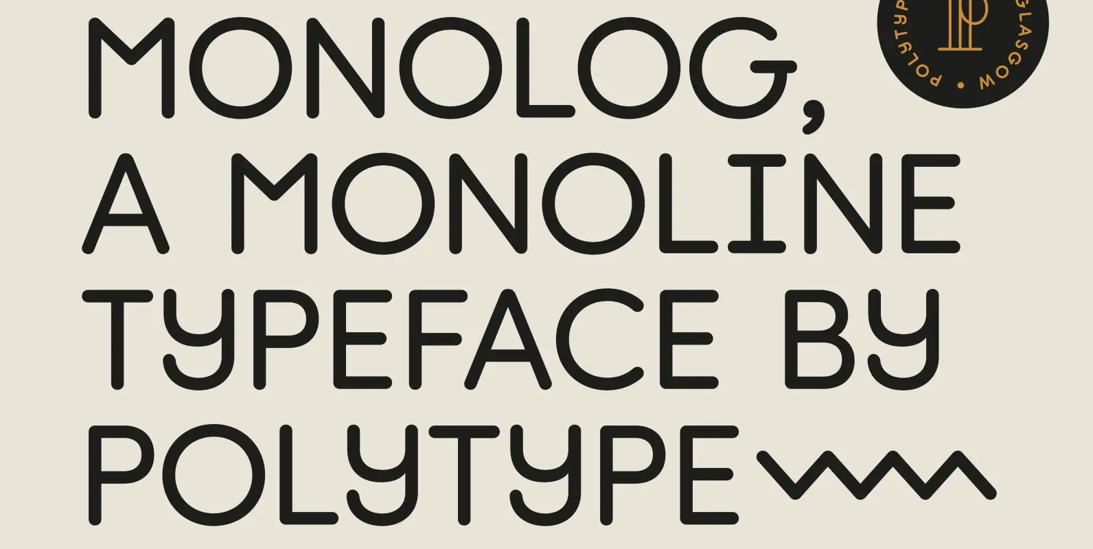
Monolog Font
Monolog is an especially monolinear rounded display typeface, designed to work great alongside monoline illustrations, logos and icons, while still performing well in some text settings. A number of contemporary quirks in its construction establish visual interest, while Monolog’s clean,
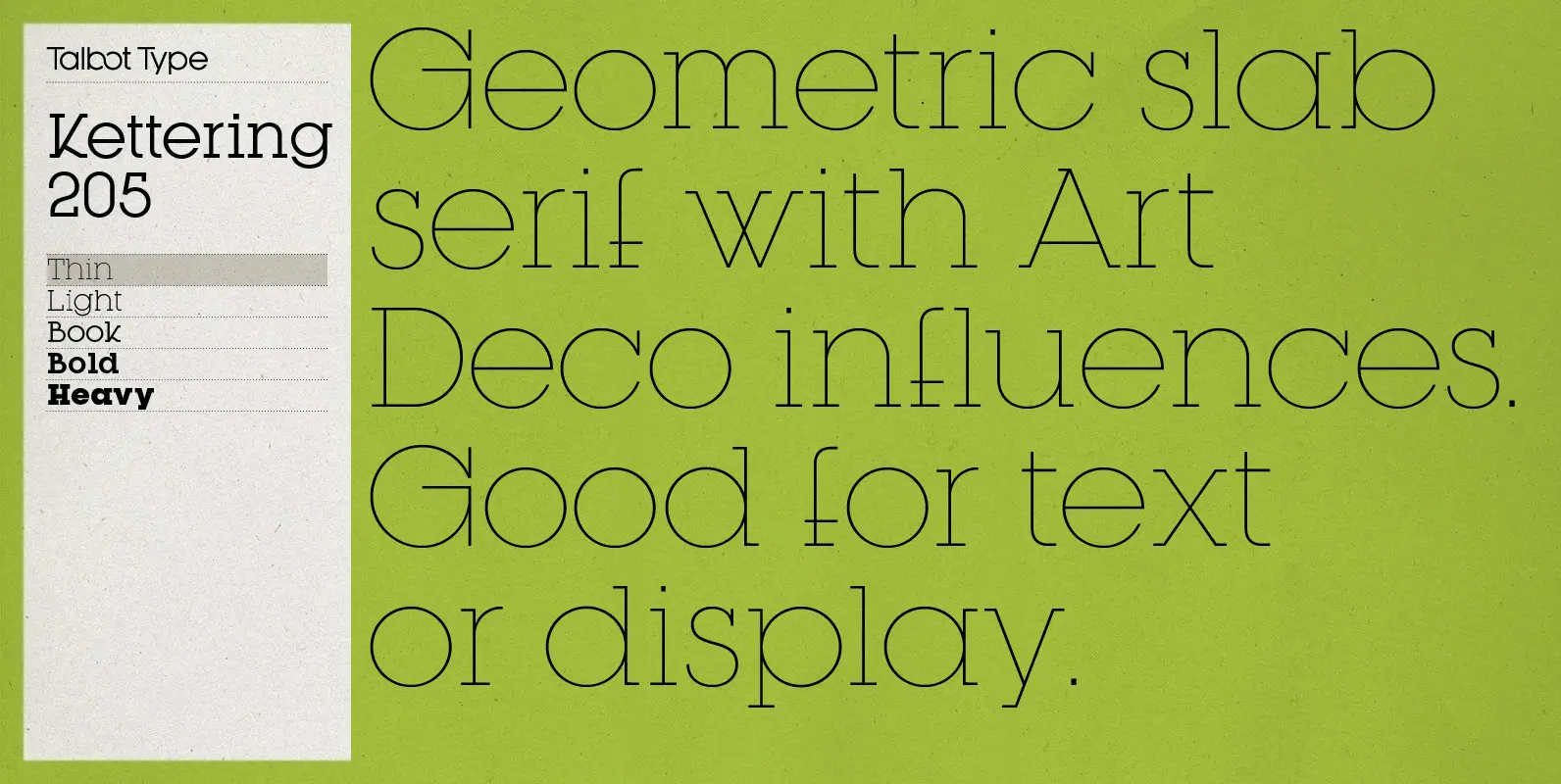
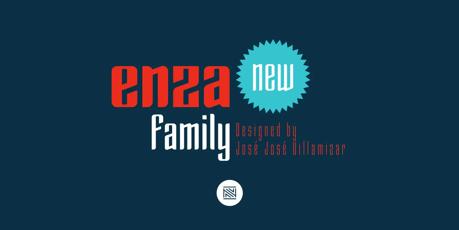
Kettering 205 Font
Kettering 205 is inspired by the classic, geometric slab-serifs such as Lubalin, but has shallower ascenders and descenders for a more compact look, and features art deco influenced, lowered crossbars and an oblique crossbar on the lower case e. It’s
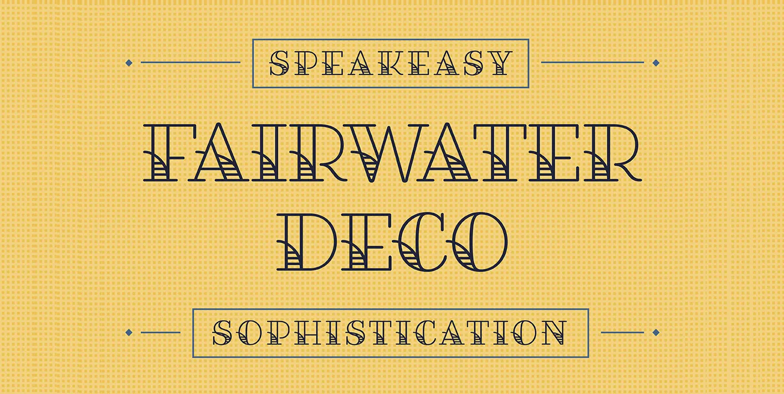
Fairwater Serif Font
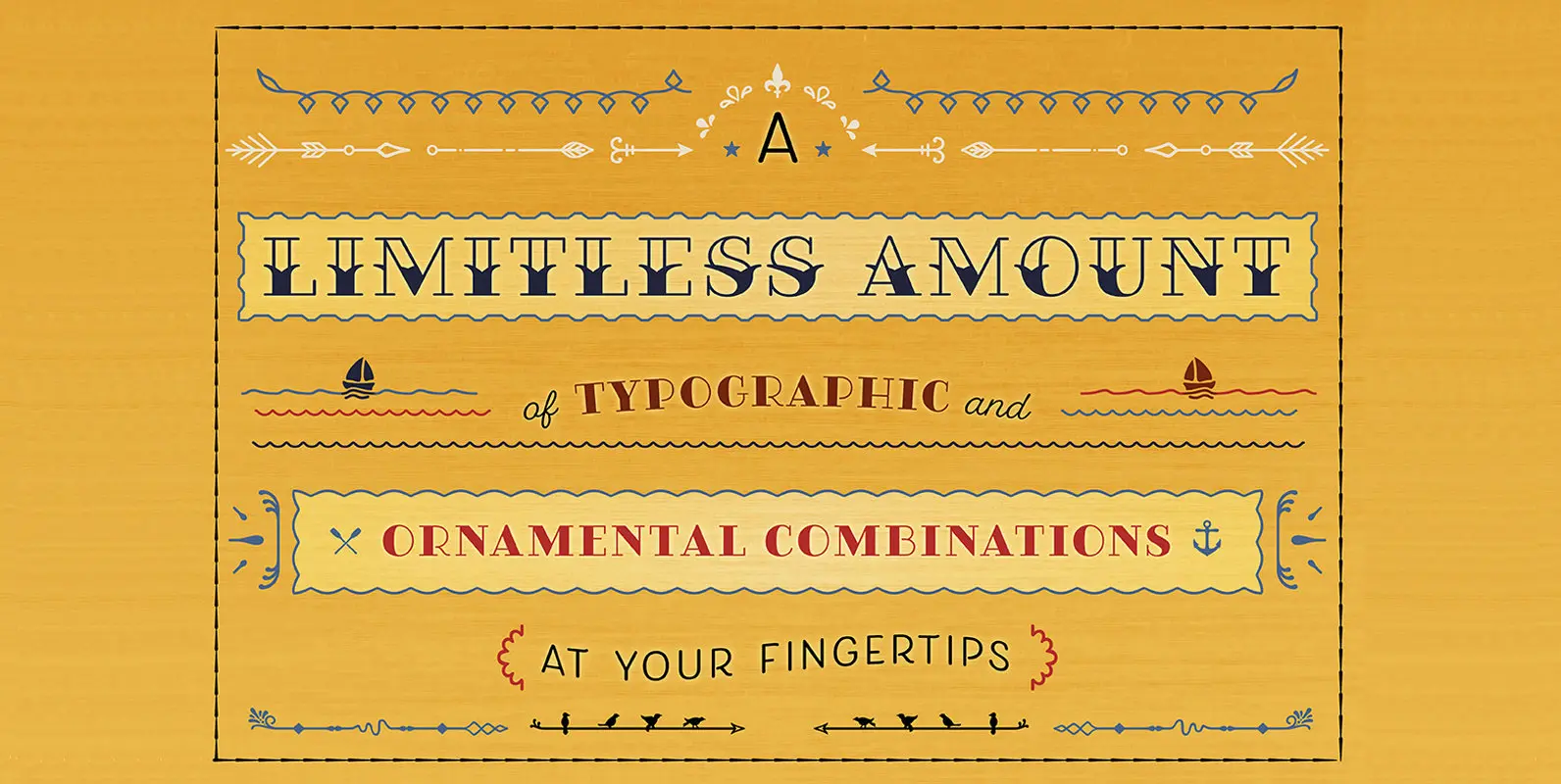
Fairwater’s aesthetic derives from the simplified, forgiving letterforms of tattoo lettering – and the pictorial themes that informed early-to-mid 20th-century naval tattoos that evokes 20th-century craftsmanship, maritime themes, and colorful, salty personalities. 386 Glyphs and 26 Stylistic Alternates View the
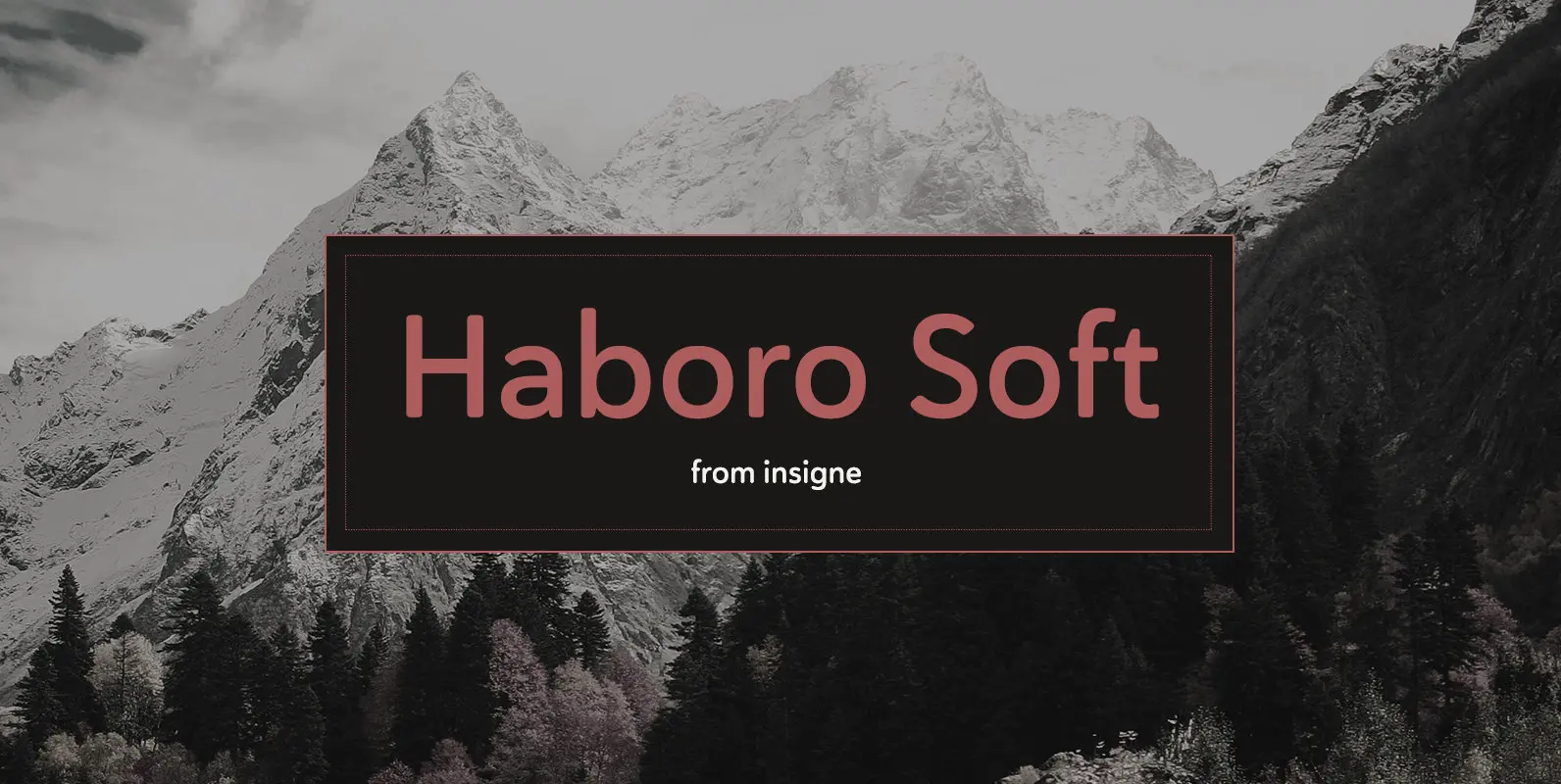
Haboro Soft Font
Stop trekking through the thick, wintery font forest, and step lightly into the fresh life of the Haboro hyper family. Though simple in nature, the Haboro hyper family provides you with a variety of options. Take, for instance, Haboro Soft,
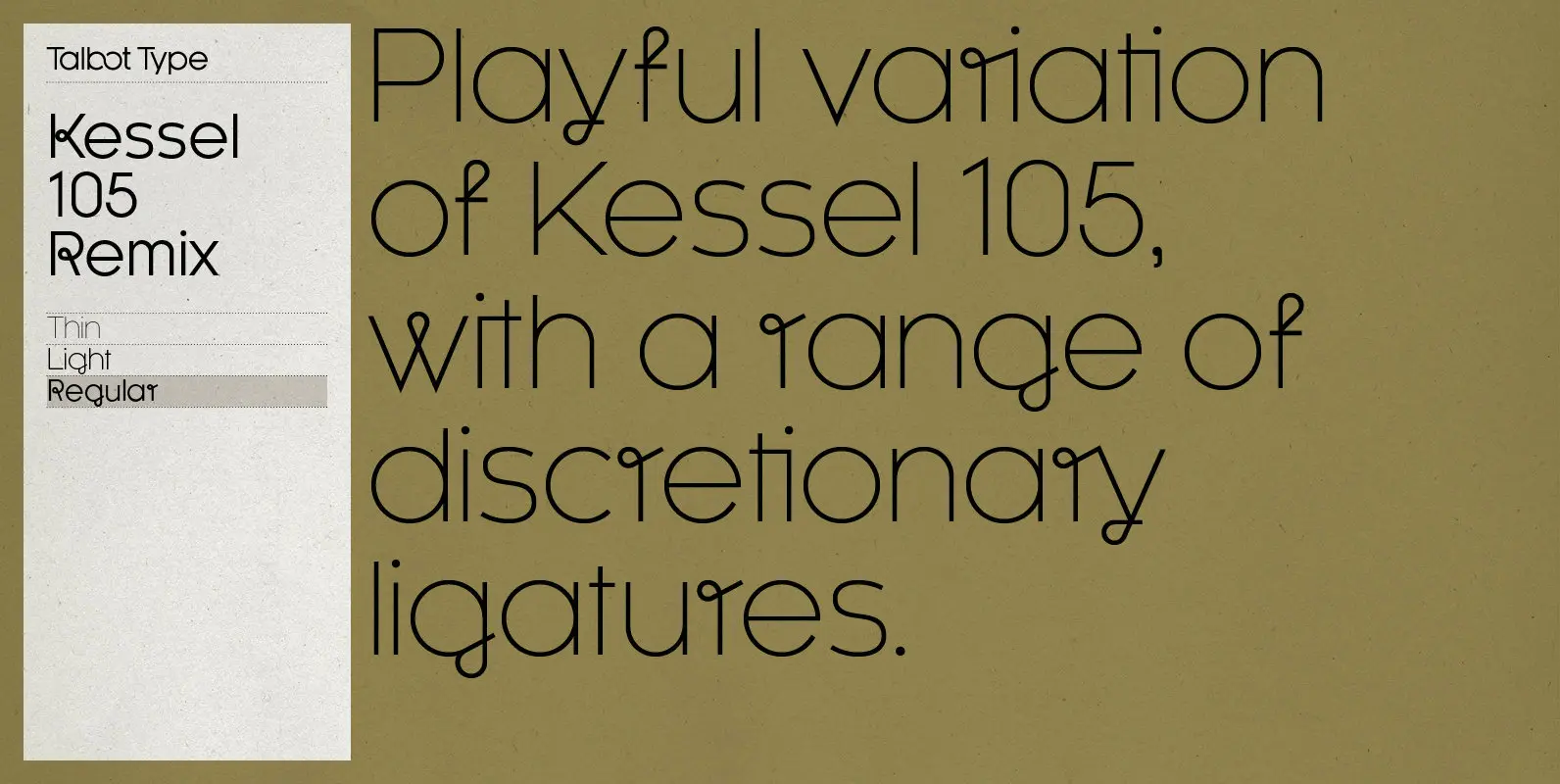
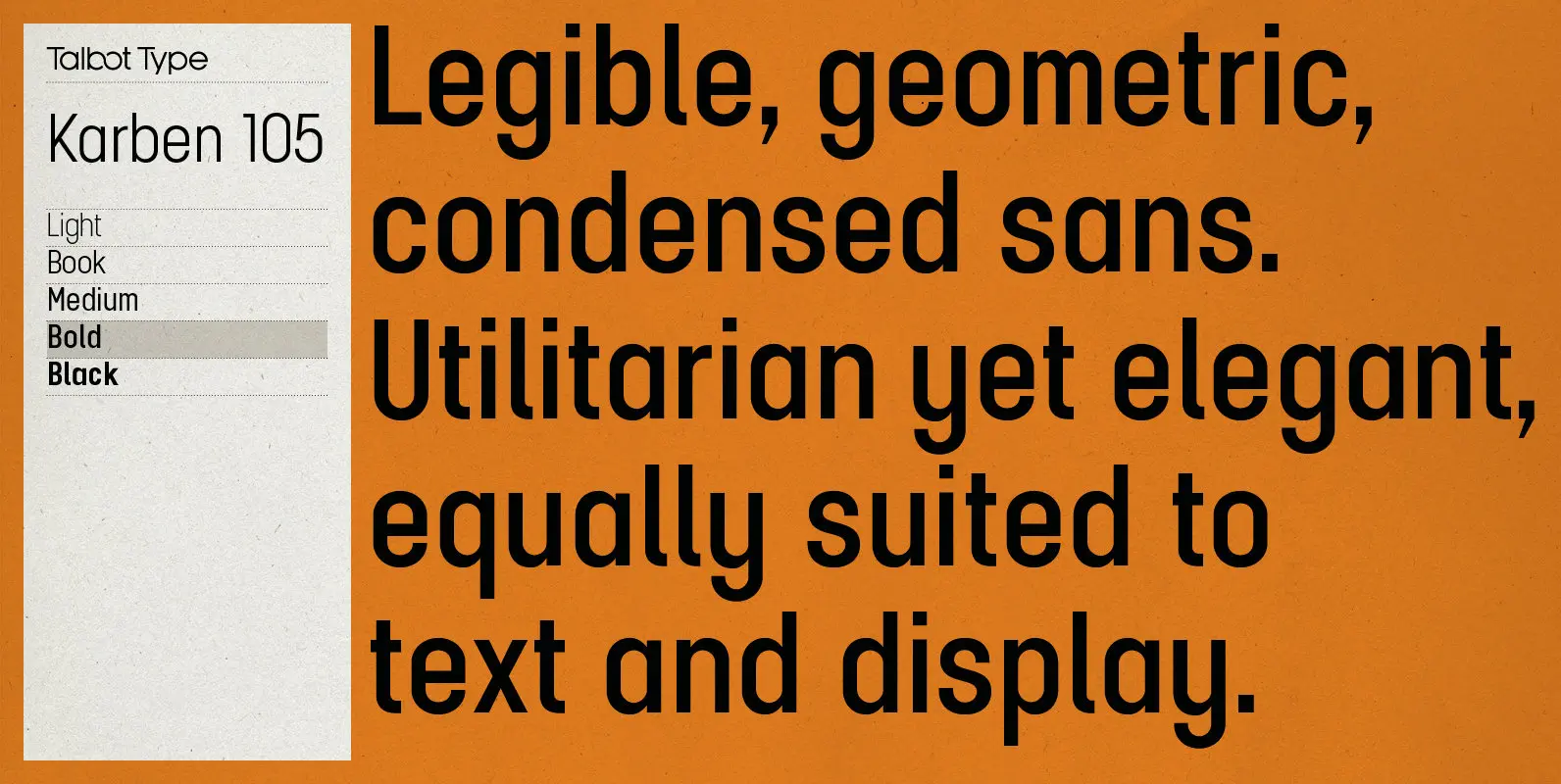
Kessel 105 Remix Font
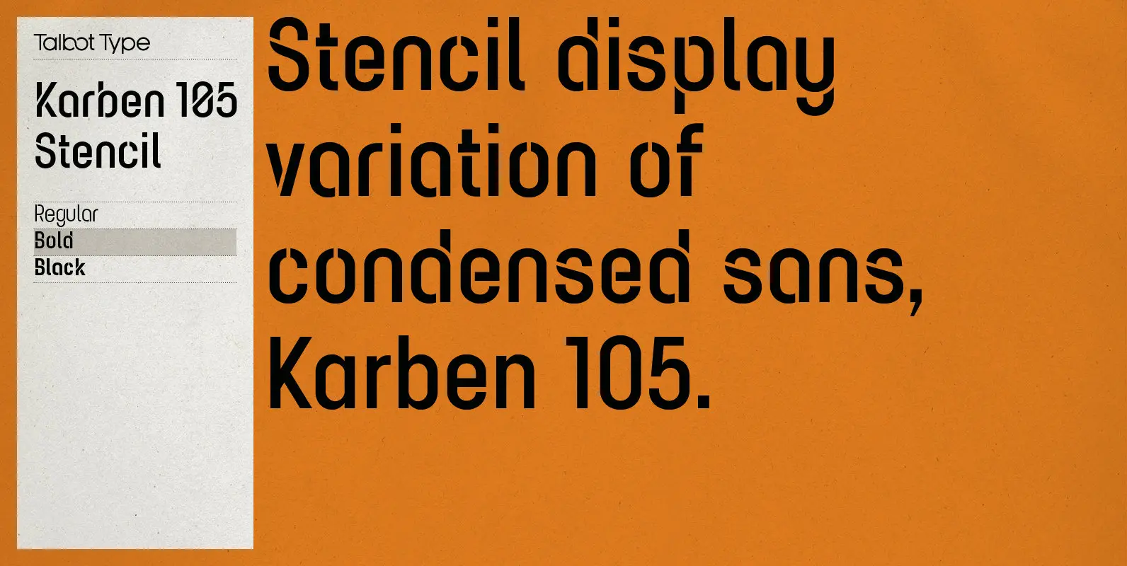
A remixed variation, available in three weights, of the popular Talbot Type geometric sans Kessel 105. The addition of occasional flourishes at the intersections of strokes, in both upper and lower case, adds character charm, making the font a perfect
