Tag: geometric
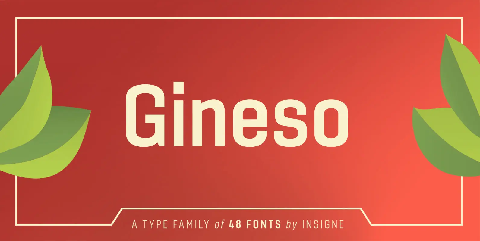
Gineso Font
Michaelangelo. da Vinci. Bellini. Rafael. Masters of Italian art whose names have dwarfed those of many other great Italian artists. Yet relics from these other artists remain, though often unnoticed because of their practical nature. These unknowns are the Italian

CA Geheimagent Font
CA Geheimagent is perfect for setting text about restrictions, or permissions if you prefer. Not quite a text font, not quite a headline font, it’s a bit of both. The Italic style break up the strictness of the regular fonts.
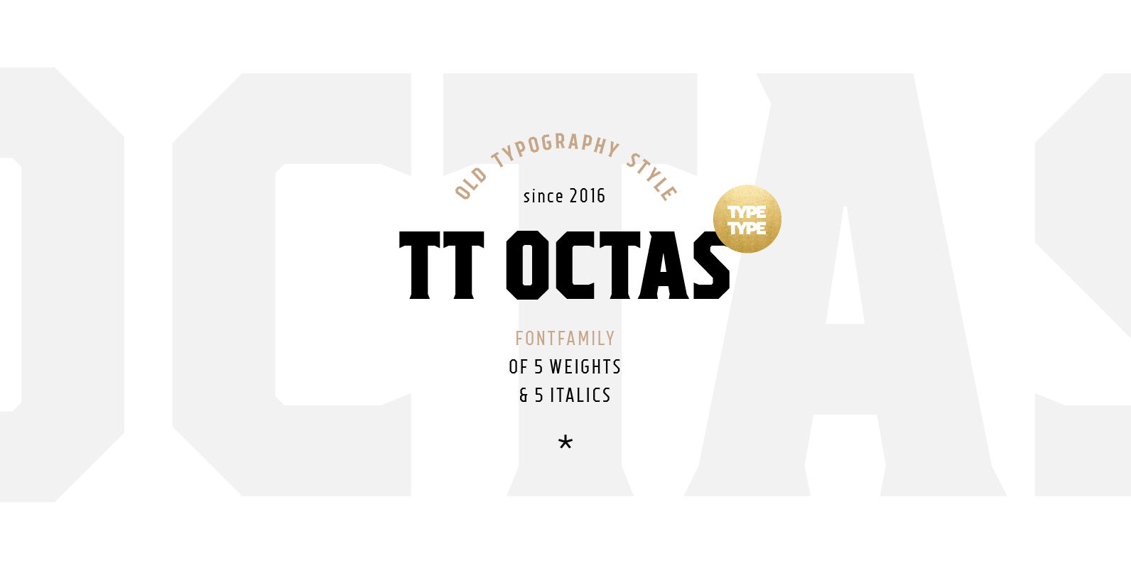
TT Octas Font
TT Octas is a narrowly proportioned font family built upon the principle of octagonal forms: all circles in this font family are actually octagons. Thanks to small serifs, TT Octas has a saturated and vintage character to it. Simple depiction
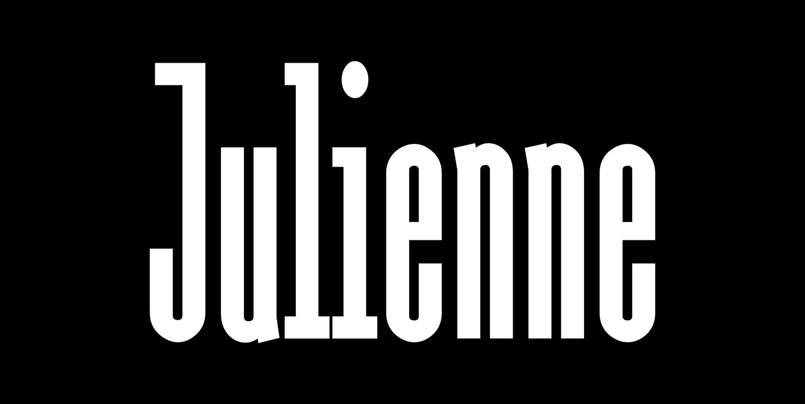
Julienne Font
Cooks call thinly cut – like matchsticks – vegetables »Julienne«. I found that was a fitting name for this very narrow typeface. Julienne Slim is the extreme cut of the two. Personally I do not use narrow typefaces very often,
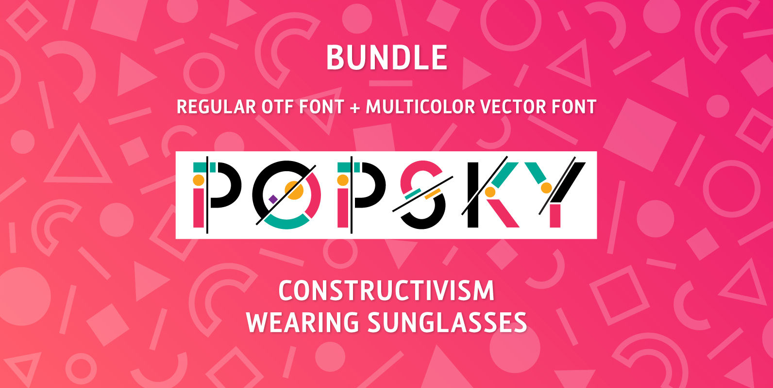
Popsky Font Bundle Font
Meet Popsky, a multicolor font which has optimism and motivation incorporated in its design. It’s super easy to use, just install it like any other font and type your multicolor text! Perfect for eye candy social media posts, logos, or
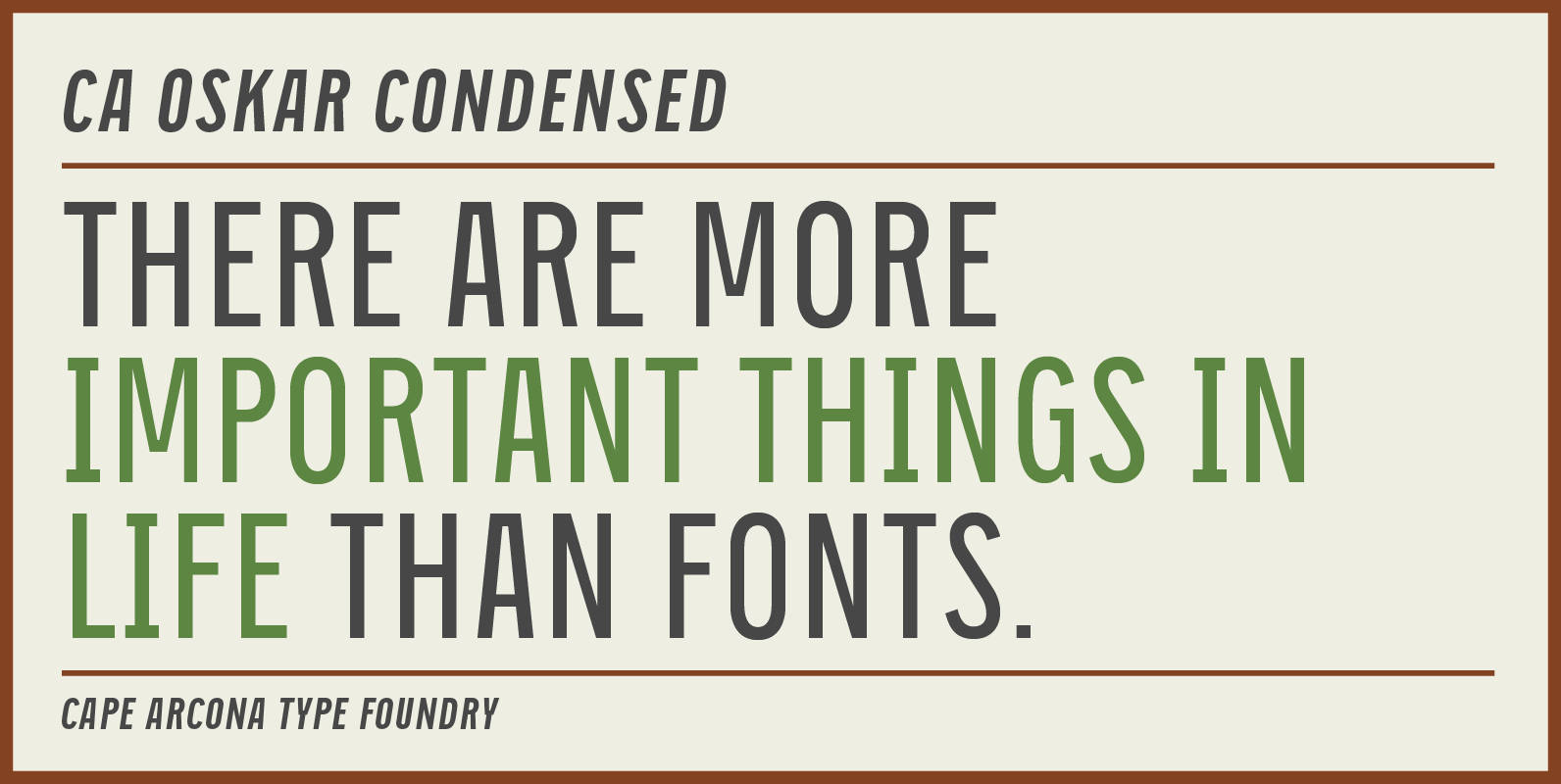
CA Oskar Condensed Font
CA Oskar came into being as a custom typeface for the international Traumzeit music festival. As a substantial part of the new corporate identity, it had to be characteristic, but also flexible in use. Starting with the design of compressed
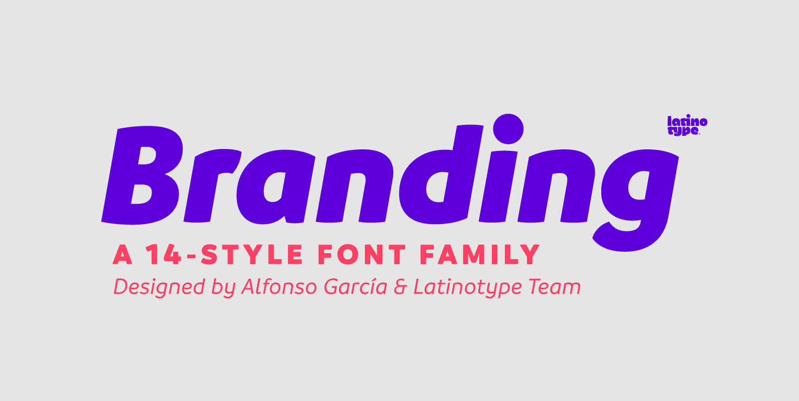
Branding Font
Branding, a modern typeface for modern needs! Branding, especially designed for meeting contemporary aesthetic and functional needs, is the interpretation of a modern typeface from the designer’s own perspective. This typeface encapsulates a wide range of nuances and combines, seemingly,
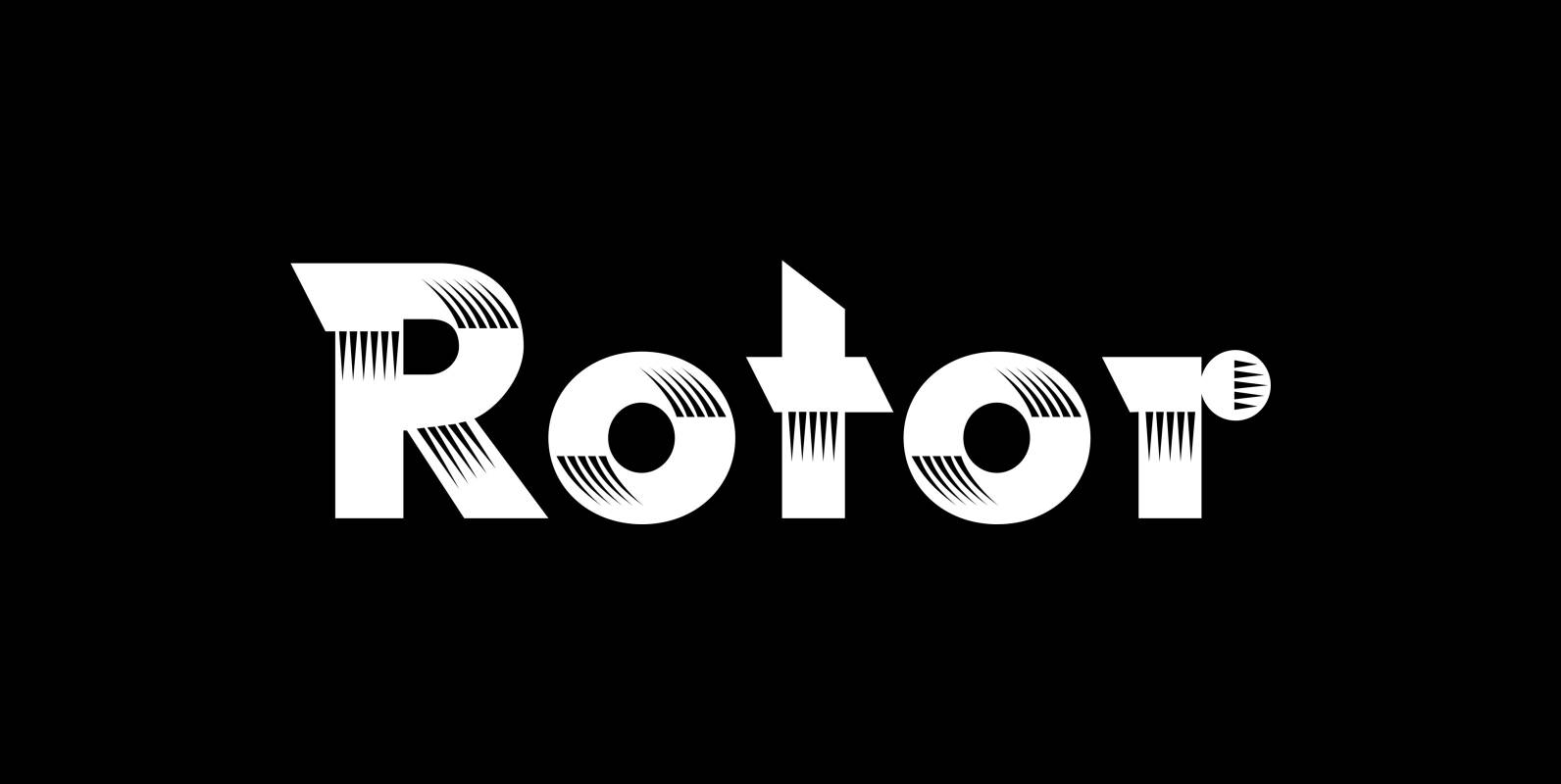
Rotor Font
“Rotor” is a speedy font. In 1929 K. Sommer designed a typeface for Linotype called »Vulcan«, some years later they re-published the typeface and called it “Dynamo”. The early Vulcan design inspired me to do this new, faster typeface in
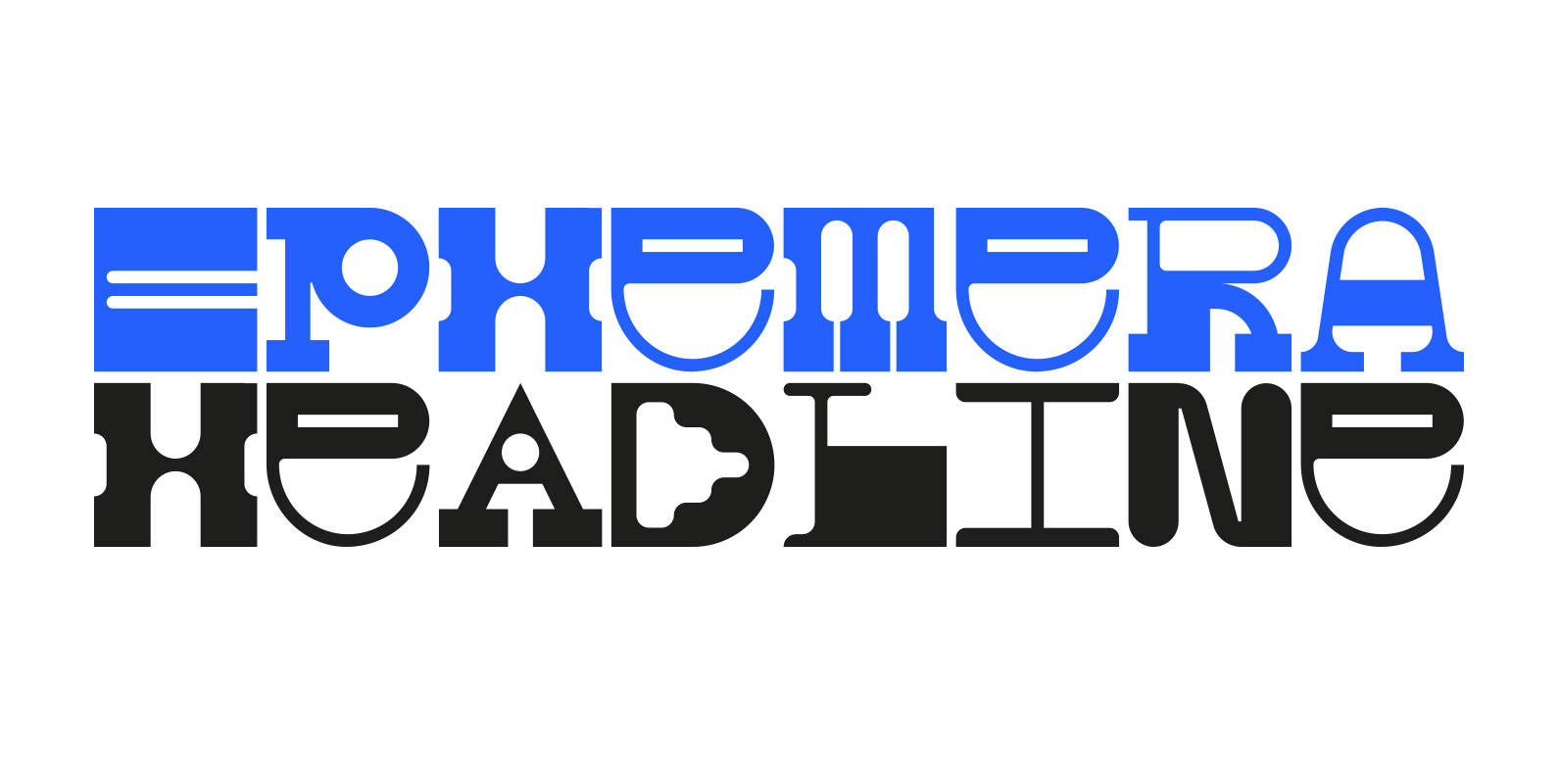
Ephemera Font
Ephemera is a fixed-width headline typeface with a range of glyphs and alternate characters FROM PARTS UNKNOWN. Published by FROM PARTS UNKNOWNDownload Ephemera
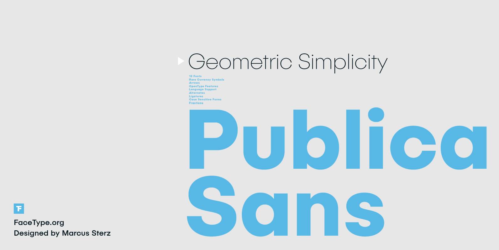
Publica Sans Font
Publica Sans is a clean geometric typeface, equipped with a variety of OpenType features to give you all you need for great typography: Alternates, arrows, rare currency symbols, case sensitive forms, various sets of figures and discretionary ligatures. Alternates: Give
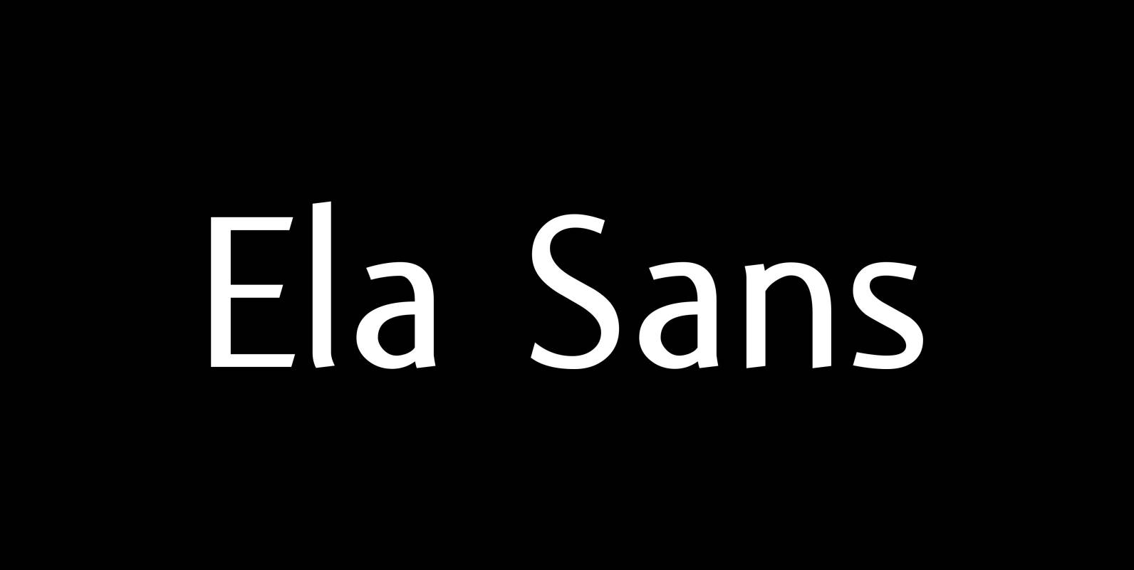
Ela Sans Font
“Ela Sans” is the sister of the typeface I originally designed for the business of my second wife and mother of my two sons, her name is – of course – Michaela. Ela – the typeface – is suitable for
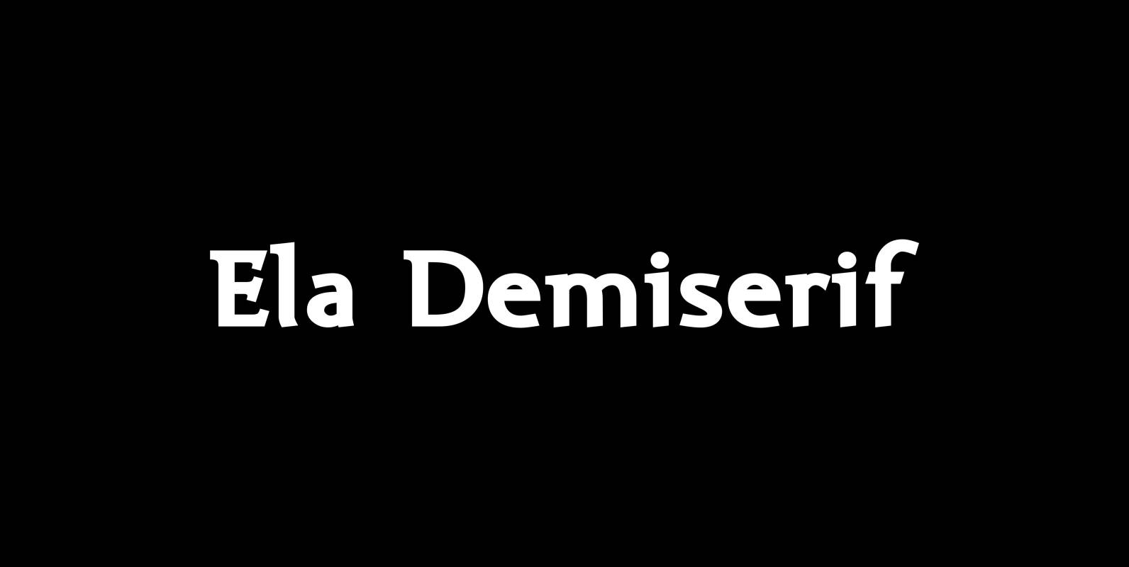
Ela Demiserif Font
Ela Demiserif is the typeface I originally designed for the business of my second wife and mother of my two sons; her name is, of course, Michaela. Ela – the typeface – is suitable for magazines, newspapers, posters, advertisements, books,
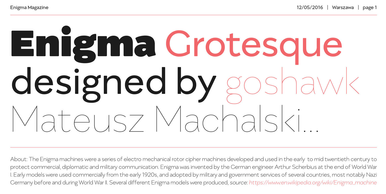
Enigma Grotesque Font
Enigma Grotesque, designed by Mateusz Machalski, is a classical sans geometric typeface with gentle contrast. The family is characterised by a lot of details, which gives it a friendly feel. The scalable x height and rounded corners make Enigma a
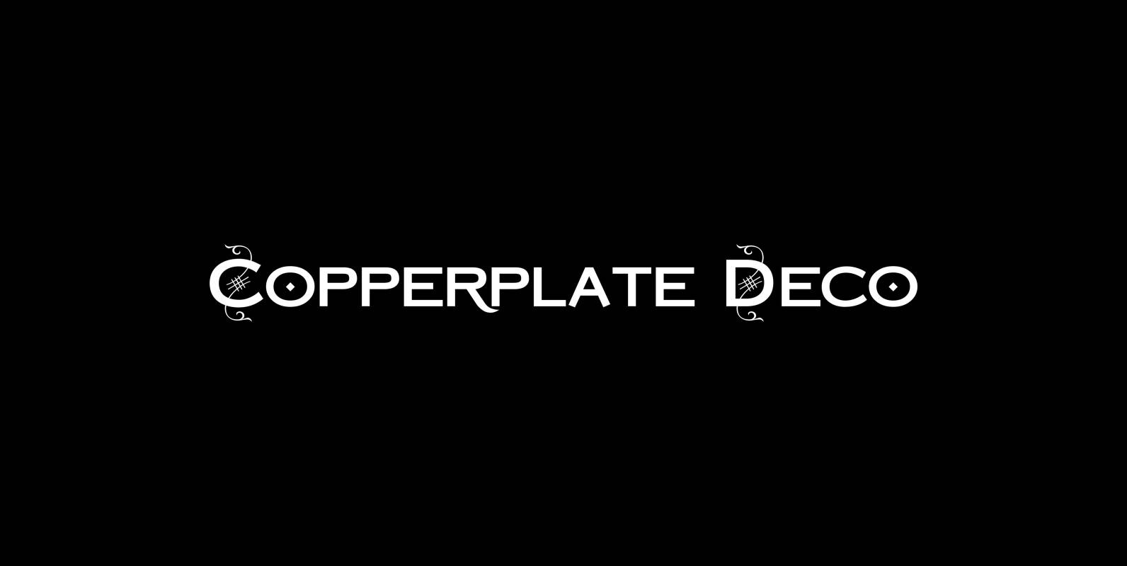
Copperplate Deco Font
“Copperplate Deco” is my sparingly decorated version of my Copperplate fonts. They can be used as stand alone fonts. Published by Wiescher DesignDownload Copperplate Deco
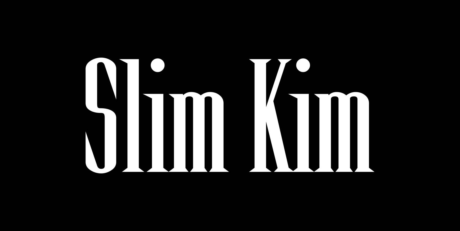
Slim Kim Font
“Slim Kim” is the sister font of “Julienne”. This font has very spiky serifs, so I did not want to make an extra slim version. This font mixes perfectly with “Julienn”. So whenever you need an especially slim serif font
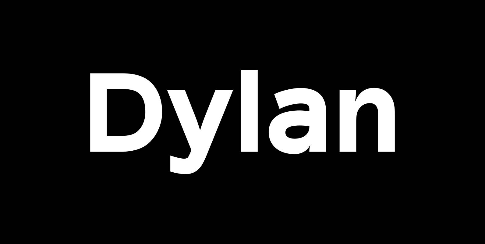
Dylan Font
“Dylan” is a Sans typeface in the best American tradition. In order to keep corners open and to make the font more readable in small sizes it has deep cuts where curves join straights. I designed 7 finely tuned weights
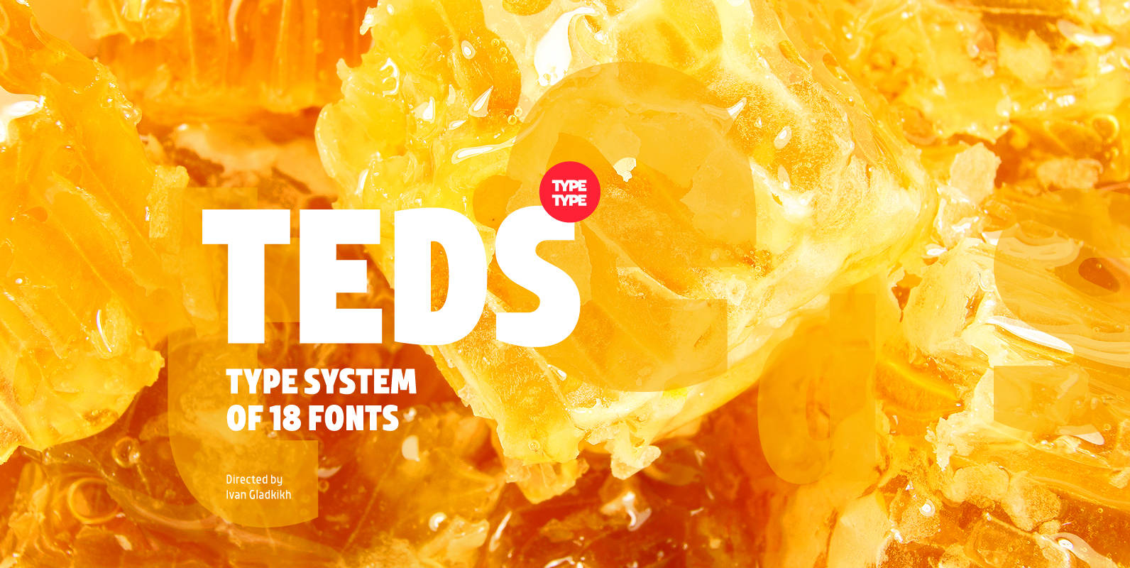
TT Teds Font
Teds is a geometric non-serif with narrow proportions created for universal application in any types of text. Relatively tall lowercase characters, open forms of semicircular characters, and low contrast between vertical and horizontal lines make this font type easy to
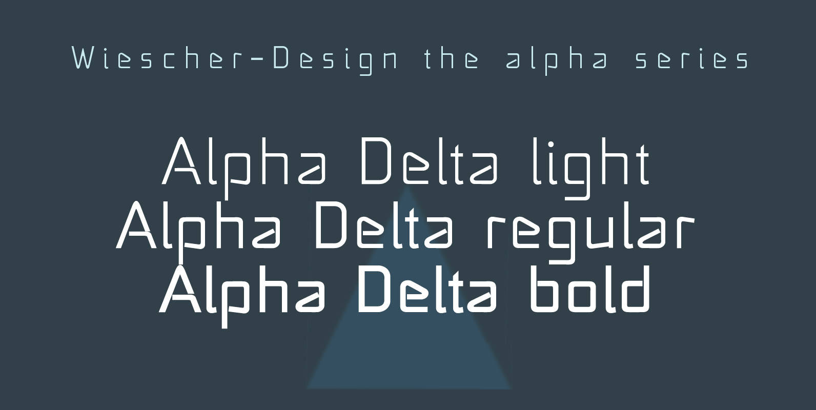
Alpha Delta Font
“Alpha Delta” the standard paperclip is the basic idea behind this font. By working on it, I changed it so that it doesn’t look too much like a paperclip any more. Published by Wiescher DesignDownload Alpha Delta