Tag: geometric
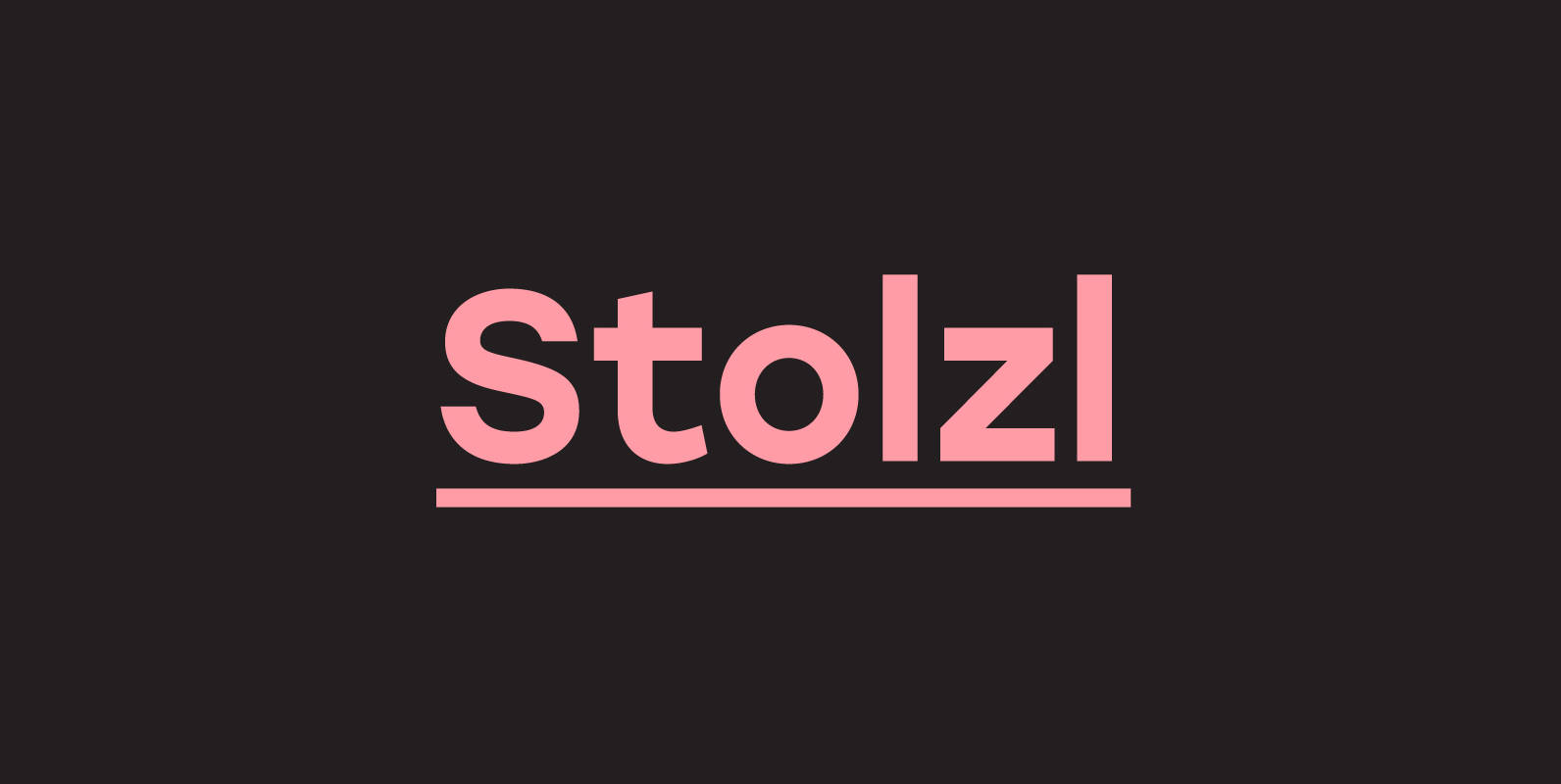
Stolzl Font
Stolzl Text is the companion of Stolzl Display type family by The Northern Block, which was optically tailored to perform as a functional addition to this concept steered font collection. Stolzl Text is the latest addition to the Stolzl type
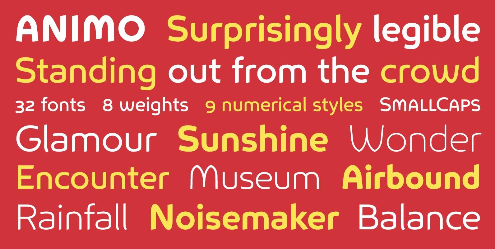
Animo Font
Animo stands out from the crowd. Animo is surprisingly legible for its outspoken personality. Many of Animo’s small details were crafted to enhance its legibility, while preserving its personality. Animo is suitable for both text and display use — for
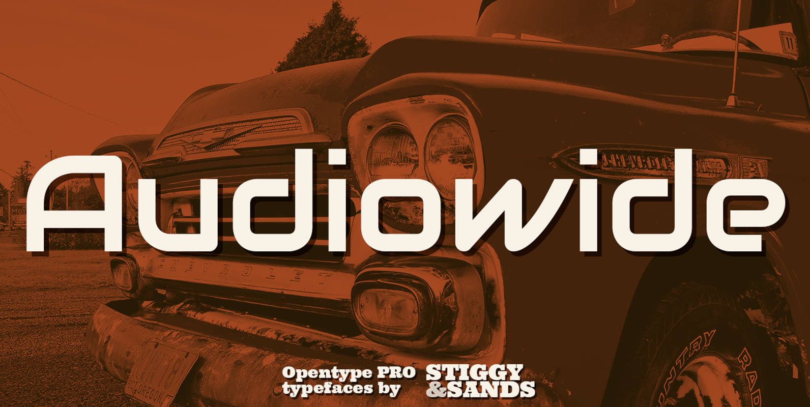
Audiowide Pro Font
Our Audiowide Pro has vague inspirations from other styles like that of Handel Gothic and the Converse logo, yet it veers off in a direction of its own for a slightly more techno-futuristic and yet cleanly readable format. Great for
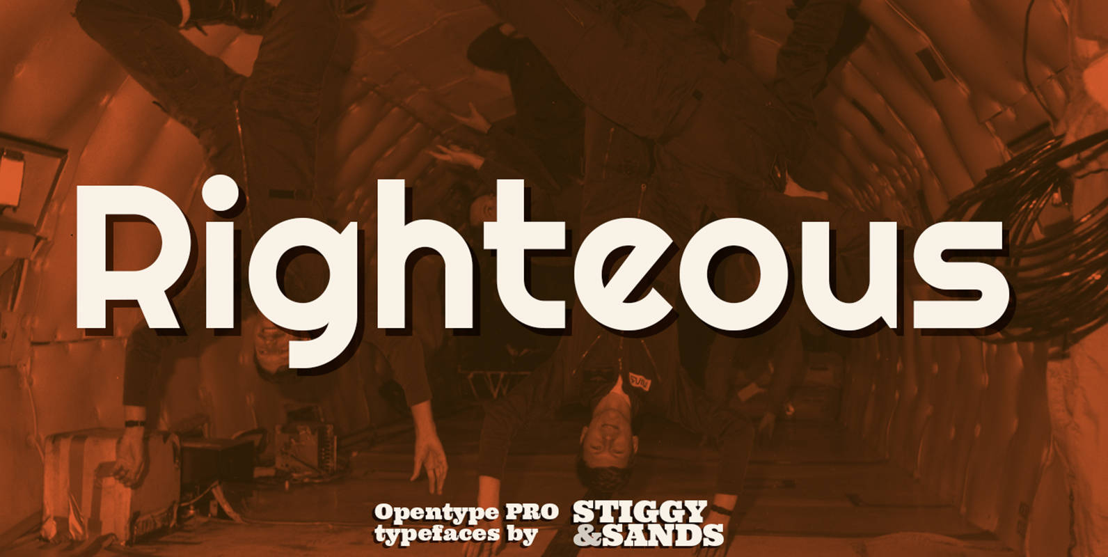
Righteous Pro Font
Our Righteous Pro was inspired by the all-capital letterforms from the deco posters of Hungarian artist Robert Berény for Modiano. Grid based and geometric in execution, the font is highly readable at a wide range of point sizes, ideal for
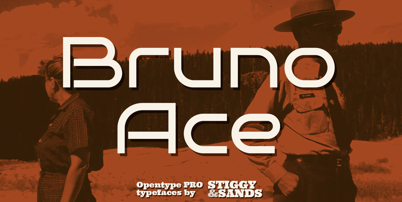
Bruno Ace Pro Font
Our Bruno Ace Pro draws its inspiration from modern automotive logotypes. This geometric sans-serif has a wide stance with a tall x-height for a strong look and appeal, as well as ease of legibility. The SmallCaps and extensive figure sets
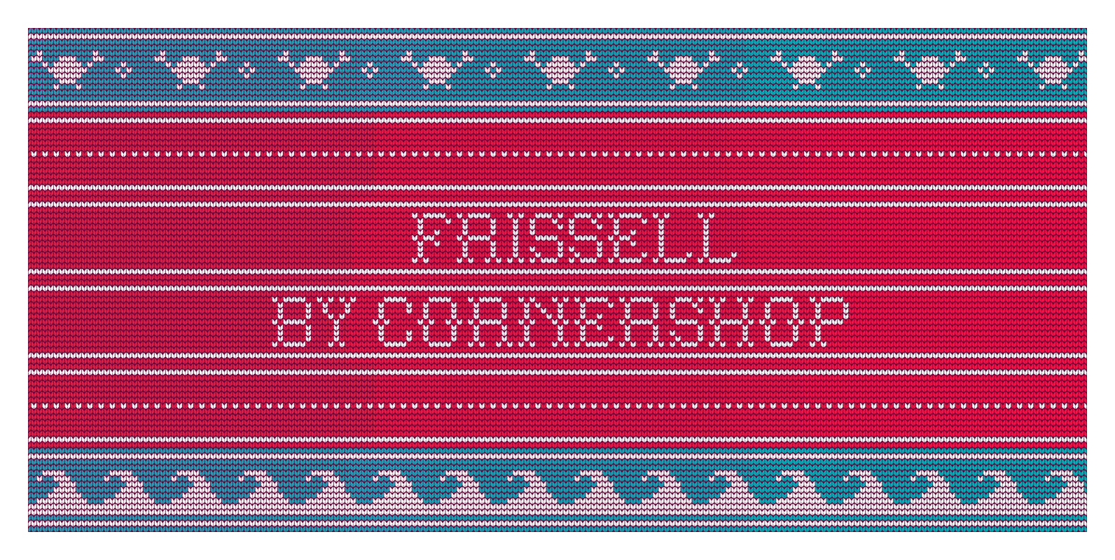
Frissell Font
‘Frissell’ is Cornershop’s ode to a hot roast Christmas lunch on a forty degree day, ‘Let It Snow’ blasting on repeat in department stores as you swelter through your Christmas shopping and Love Actually on the TV again. Frissell is
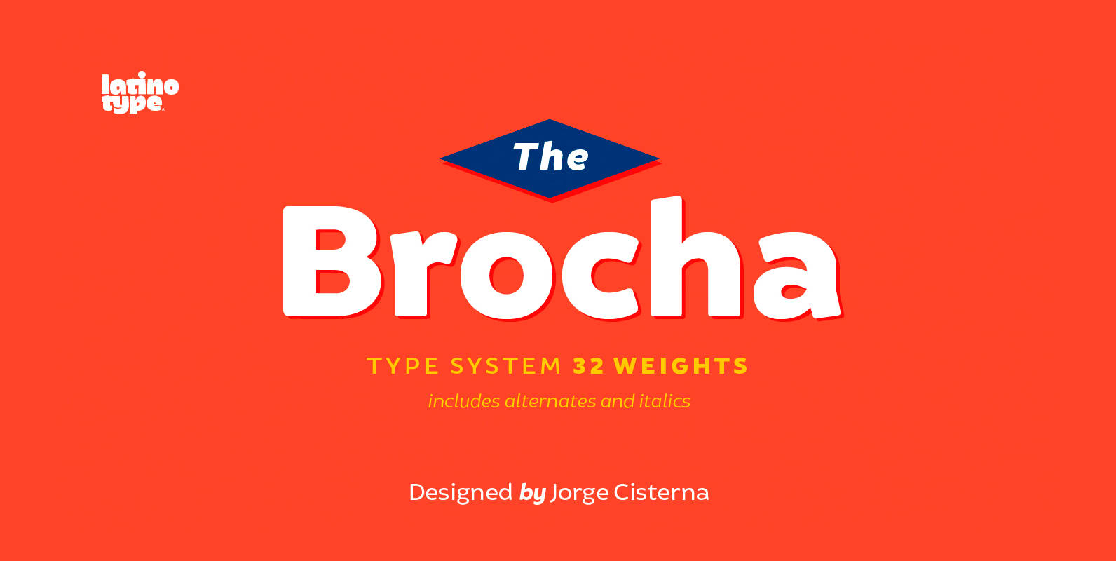
Brocha Font
I made the first sketches for Brocha when I first visited Easter Island in 2011. I took inspiration from pre-Columbian art for such sketches, but I must say that they were kind of rough and clumsy; it was an experimental,

Averes Title Font
Averes Title is a sharp geometric sans titling typeface available in three weights. It features an array of stylistic discretionary ligatures with corresponding accented variants supporting numerous languages. Features include: Discretionary ligature feature Romanian s accent language feature Dutch IJ
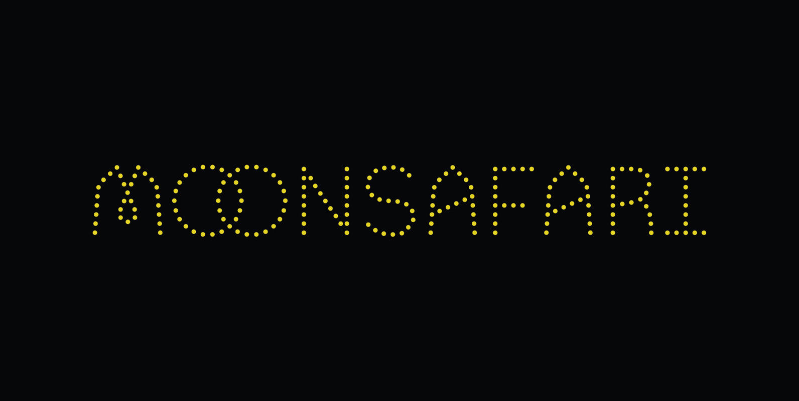
Moonsafari Font
Moonsafari is a 1970’s dotted geometric typeface. Designed for use in branding, signage and editorial. Published by Alley KurganDownload Moonsafari
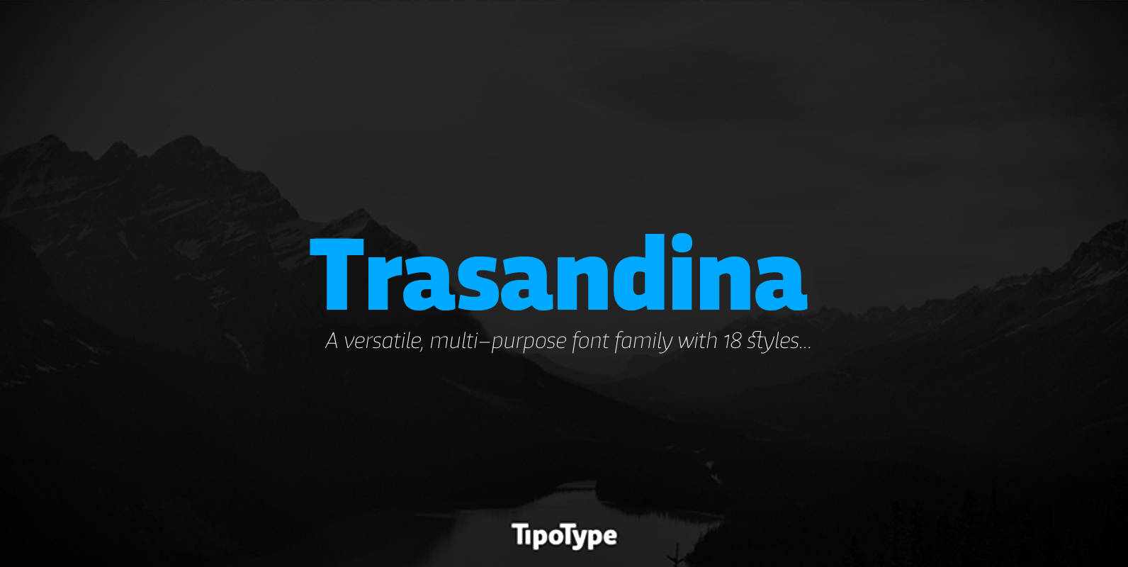
Trasandina Font
Trasandina is a very unique font-family: a modern, versatile, workhorse typeface with a special personality, given by the mix of humanist and geometric models, remaining far from both extremes. This typeface has 9 styles plus their matching italics, it has
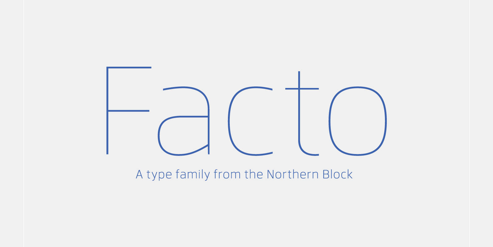
Facto Font
A simple, mechanical typeface without distractions. Slightly condensed curves are developed from a compact grid layout to produce a crisp, fresh and legible type family. The unadorned letterforms work perfectly with complex information-based applications such as user interfaces, mobile devices
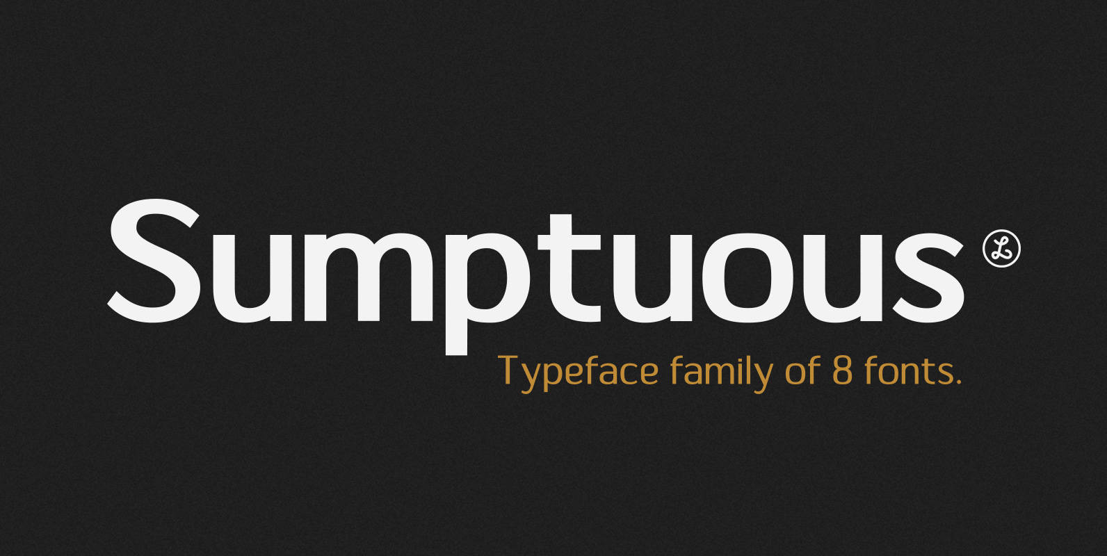
Sumptuous Font
Sumptuous is a sans-serif family combining the geometric and the humanist models. presented by Locomotype. Suitable for magazine, paragraph, headline, body text and logo design. Complete family make your job is so easy to mix and match your designs to
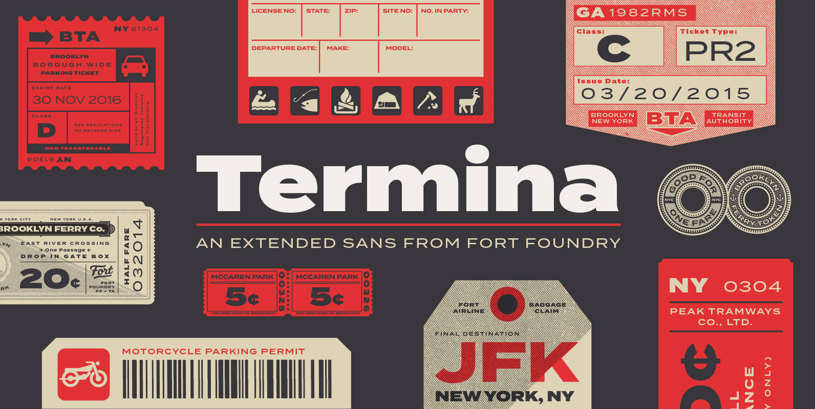
Termina Font
Amongst the landscape of geometrics, Termina breaks the norm with its generously wide letterforms. The typeface was conceived after finding and examining specimens for Industria, a family designed by Hermann Zehnpfundt in the early nineteen-hundreds for Emil Gursch. Something about
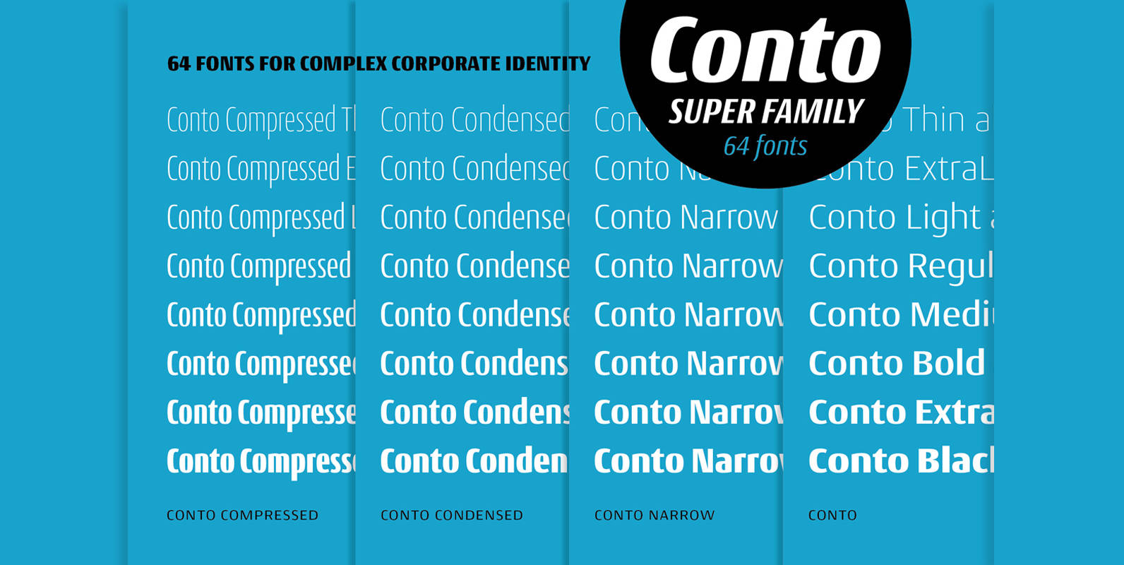
Conto Font
The Conto super family is a powerful and clear typeface for complex corporate typography. From essential text to captions, tables and advertising, the 64 weights have the flexibility to fulfil your every typographic need. The Conto family is simple, serious,
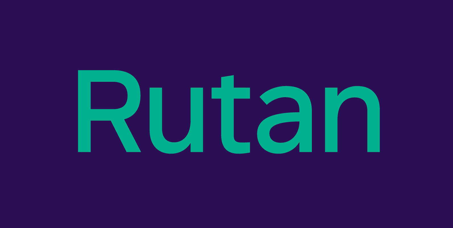
Rutan Font
Rutan is a modern sans serif type family designed for pleasurable reading. Although built essentially on a geometric foundation, the typeface has been skilfully shaped into an aesthetically pleasing and legible tool. Slightly condensed and compact, it is a perfect
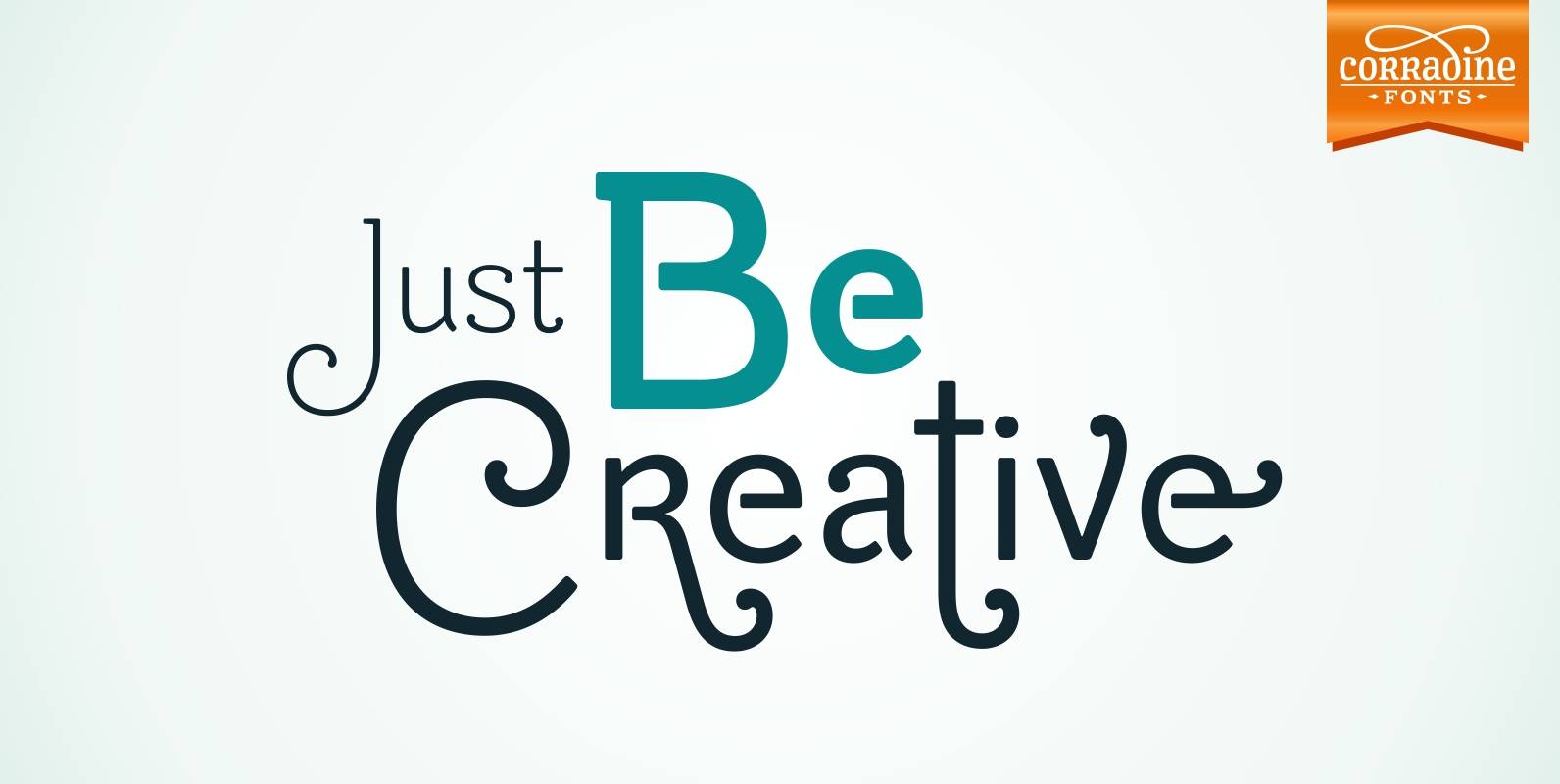
Be Creative Font
When you are trying to solve any problem, surely you round the solution like a swirl. This typeface represents that continuous search of creative solutions. So, our recommendation is “Be Creative” always. Based on the skeleton of the classic typeface
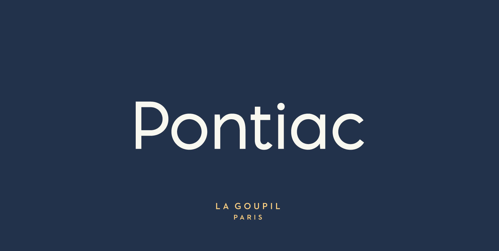
Pontiac Font
Pontiac is a sans serif OpenType font designed by Fanny Coulez and Julien Saurin in Paris. Somewhere between Akzidenz Grotesk and Neutra, Pontiac is a functional font with something more, something warm, geometric but human, something distinctive, something French finally.
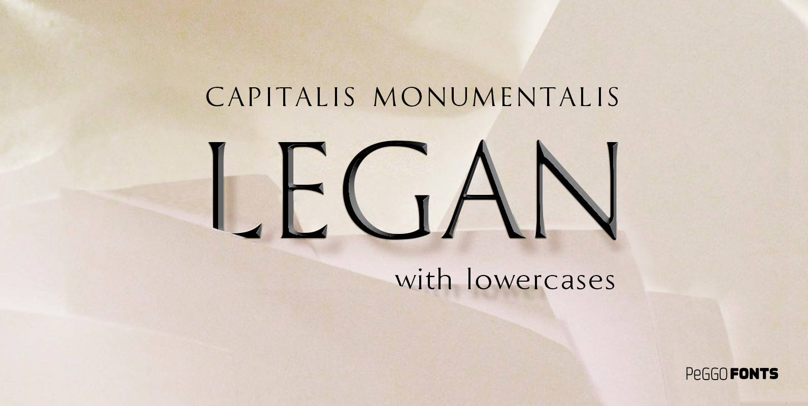
Legan Font
Legan is a font created by PeGGO Fonts, a very large typeface that follows the classical Trajan pattern, several geometrical proportions like root five, divine proportion (Golden Ratio), regular square, between other ones, same like Greek Trajan uppercase letters used