Tag: geometric
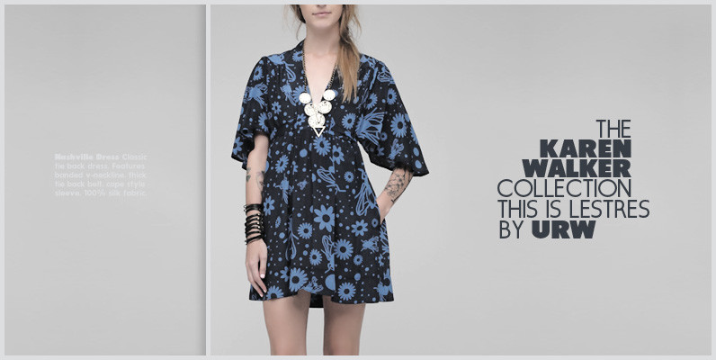
Les Tres Font
German designer Claudia Kipp has stated that she sees design as a “necessity to improve and enrich the visual world,” and her modern and clean sans typeface Les Tres certainly does its share. Working with great efficiency and great impact,
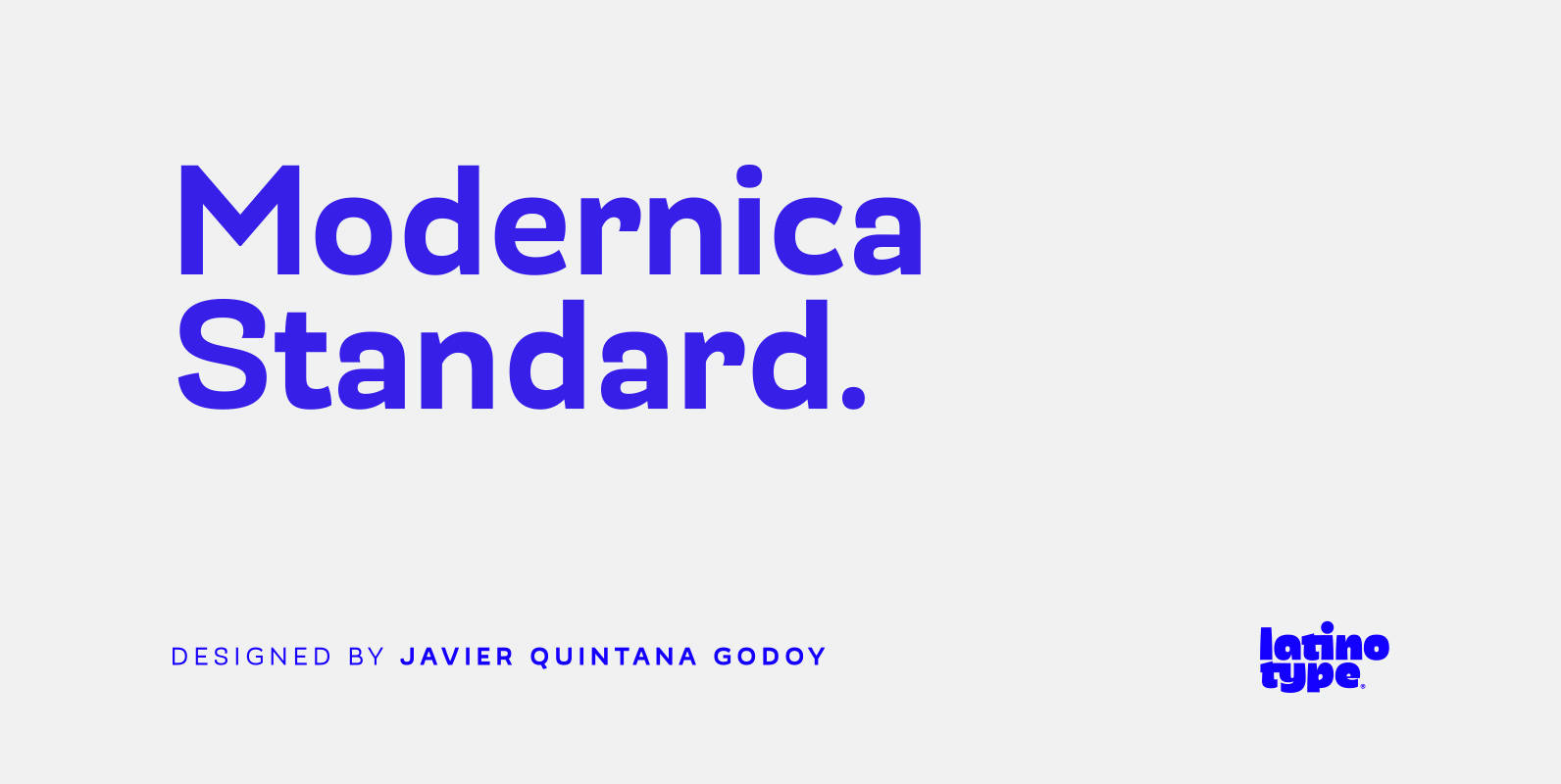
Modernica Standard Font
Modernica Standard™ is an excellent tool that provides a large range of possibilities in design work. It is a sans serif font that contains eight weights plus matching italics. Modernica Standard™ is the extension of the Mazurquica family, a condensed
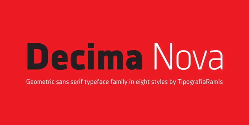
Decima Nova Font
Decima Nova is a geometric sans serif typeface family, built in eight styles. The typeface is ideal for use in display sizes, but also is quite legible in text and is well suited for editorial and identity design. Published by
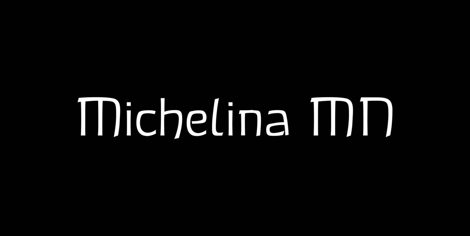
Michellina Font
Michellina is a font design released for the Mecanorma Type Collection. Copyright 2004 Trip Productions BV. Published by MecanormaDownload Michellina
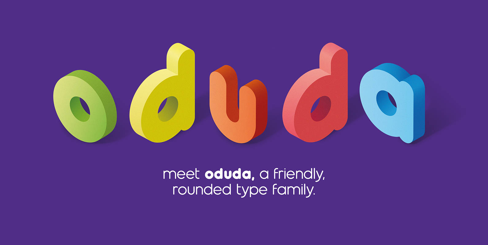
Oduda Font
Oduda is a geometric, rounded typeface designed by thmbnl. The use of perfect round shapes and quite a short ascender height makes it a very stable, yet a playful looking typeface. Next to the demo version of the bold weight,
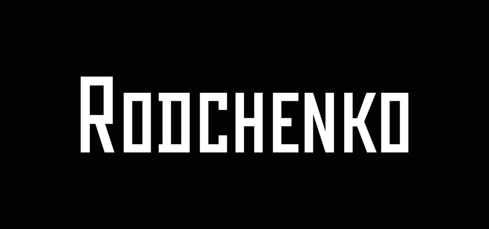
Rodchenko Font
Designed at ParaType in 1996-2002 by Tagir Safayev. Inspired by works of Russian Constructivists of the 1920s and 30s: Alexander Rodchenko, Varvara Stepanova, Vladimir and George Stenberg, Gustav Klutsis and others. A geometrical, caps and small caps only, sans serif
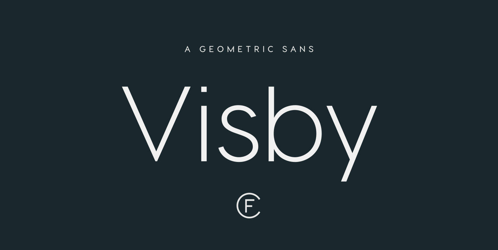
Visby CF Font
Friendly and charismatic in lowercase; sophisticated and authoritative in uppercase. Visby is a geometric font family inspired by the stark beauty and crisp air of the Arctic North. Hard lines and sharp corners mesh with smooth, rounded forms, while subtle
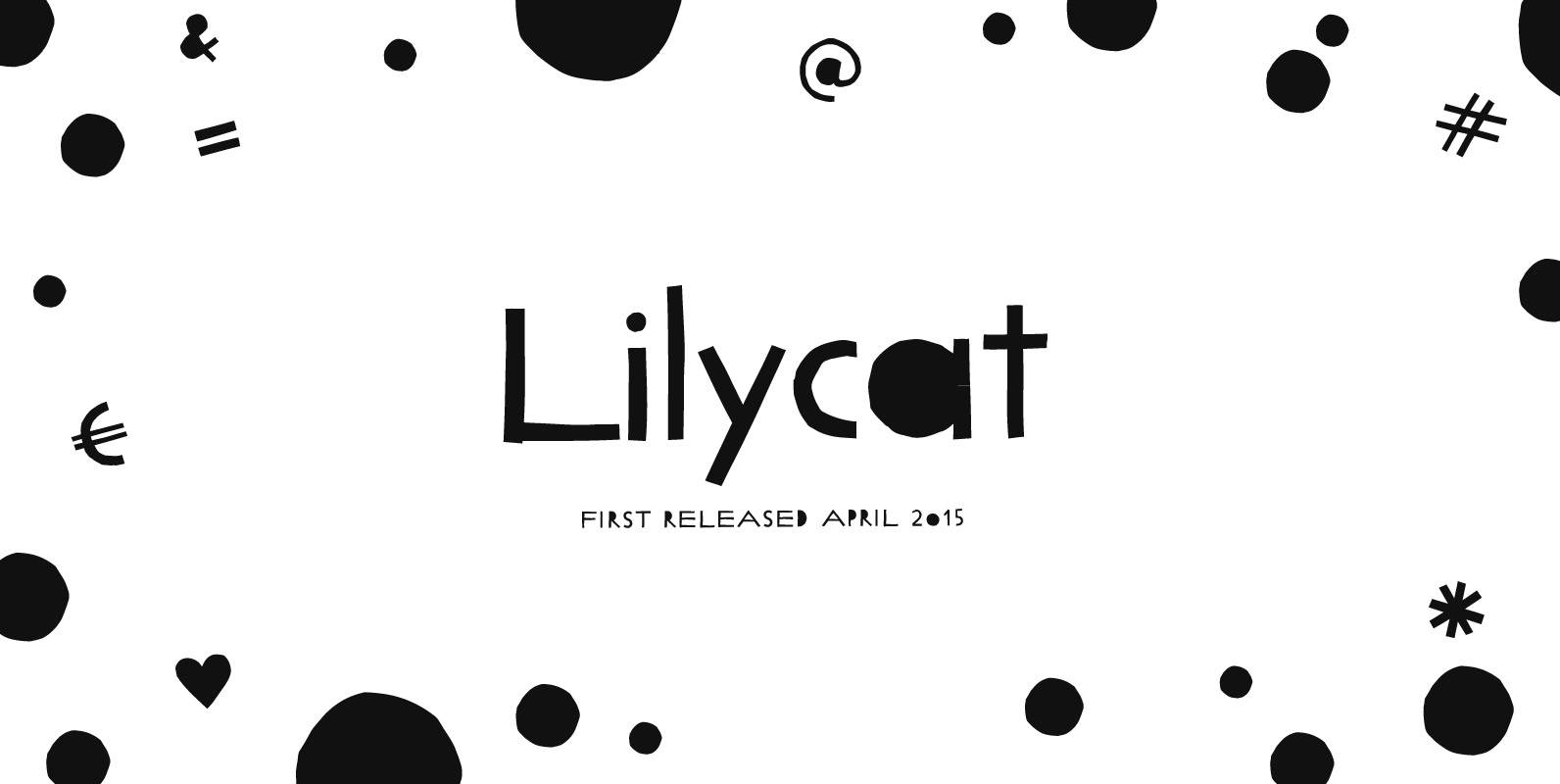
Lilycat Font
Lilycat is inspired by paper cutting. Individual characters were created by assembling basic cut-out paper shapes; rectangles, cut-out circles and half circles. They share characteristics of Futura and Art Deco fonts. Uneven edges give it a crafty, authentic feel. Capitals
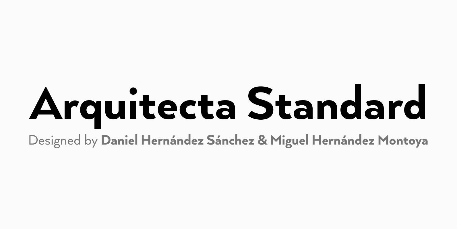
Arquitecta Standard Font
Arquitecta Standard. The humanist typography as a rational project. Since the experimentation from the Bauhaus through modern sans history we looked for a new mix to construct a rational geometric typeface with humanist proportions suitable for text layout and continuous

Glasgow Font
Designed by Steve Jackaman, Glasgow is a modern and unique sans-serif font that was re-tooled from the original QBF Collection. Published by Red RoosterDownload Glasgow

Neustadt Font
Designed by Joern Oelsner, the Neustadt font family was originally designed as a corporate font for Sport 2000, one of the leading buying groups in the European Sport Retail Industry. After it has been successfully established, it is now available

Nikaia Font
Nikaia started as an experimental typeface (the script weights) and was then expanded to its logical conclusion (italic & regular), producing the fastest look typeface in the world. Nikaia looks clean and sharp at any size, with 5 weights for
Code Pro Font
Code Pro is a font family inspired by the original Sans Serif fonts like Avant Garde or Futura, but with a modern twist. It is clean, elegant and straight-to-the-point. Code font is applicable for any type of graphic design: web,
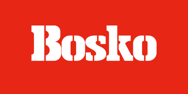
Bosko Font
A robust slab serif typeface that combines classic proportions with contemporary styling. These carefully crafted letterforms are best suited for use on book jackets, news headlines, packaging, posters and t-shirts. Details include 4 distinct styles, a full character set, manually
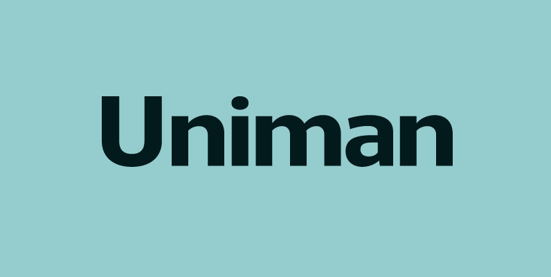
Uniman Font
A clear and simple sans serif typeface. Straight lines are combined with precision curves to form a functional and versatile font best suited for a wide range of applications. Developed to meet the needs of the professional user, details include
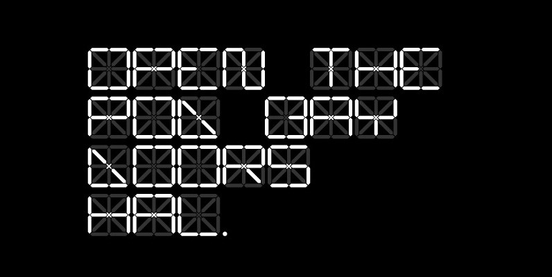
C13 LCD Font
A super technical display typeface born of a desire to improve upon the mundane typography rendered via traditional liquid crystal displays. Not for amateurs. Published by cypher13Download C13 LCD
Archie Font
Archie is a wide attention-grabber based on a simple geometric alphabet drawn in the early 1930s by Dutch calligrapher and lettering artist Martin Meijer. This digital family expands considerably on the original letters, adding biform shapes, small caps, italics across