Tag: geometric
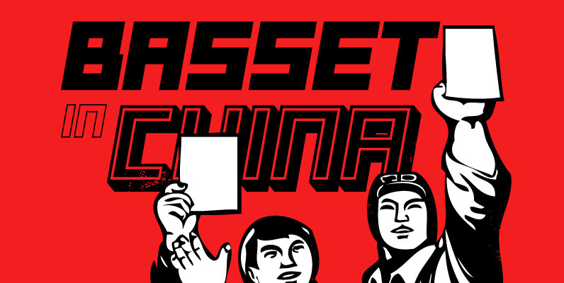
Basset Font
Designed by A. Pat Hickson. Digitally engineered by Steve Jackaman. Originally in five weights, Steve produced three additional weights. Published by Red RoosterDownload Basset
Suomi Sans Font
There are many sans serif typefaces with calligraphic tendencies, but Suomi Sans is different: the outside forms are fairly basic, fairly narrow sans serif style, but the counter forms have a strong calligraphic flair with accented upper left and lower
Tailor Font
Tailor was a study of slab serif style with round and comfortable feel. I wanted to merge round shapes with exaggerated ink traps for legibility. Published by Suomi Type FoundryDownload Tailor
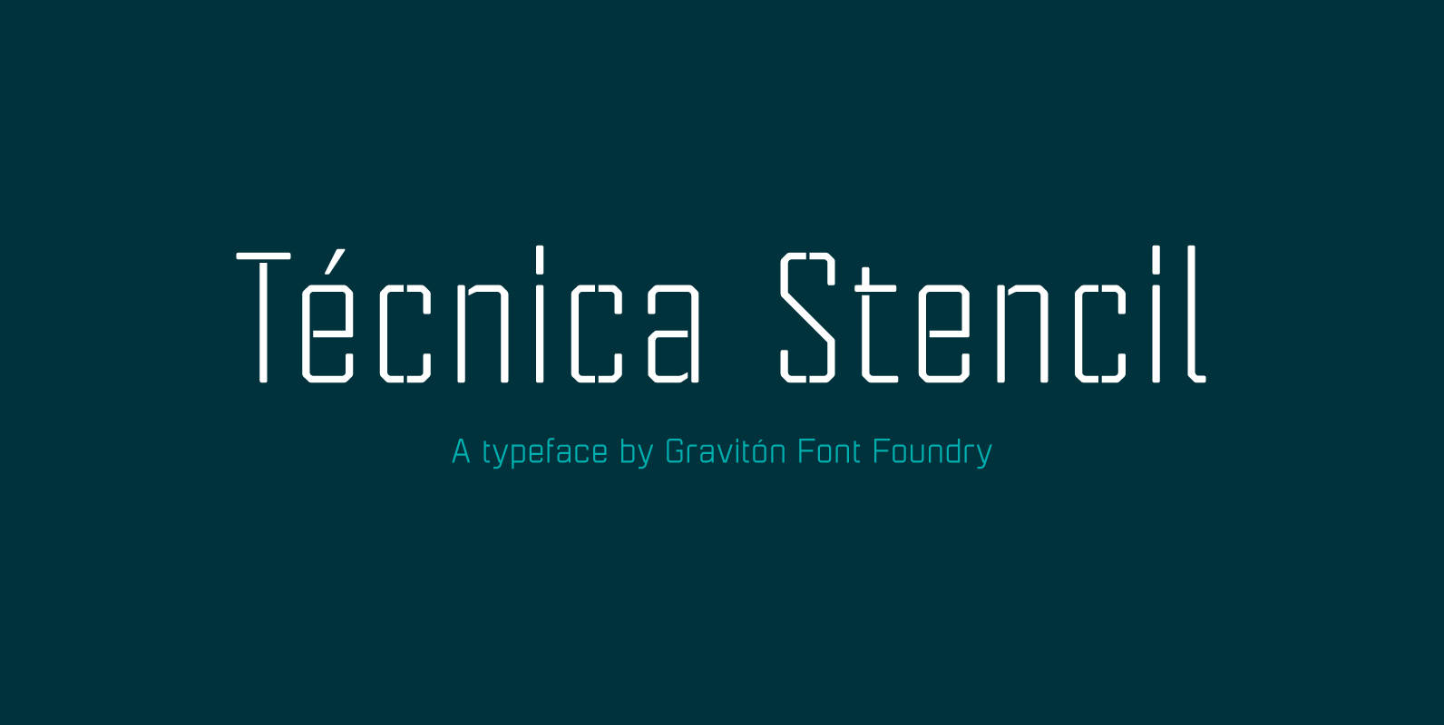
Tecnica Stencil Font
Tecnica Stencil font family is the stencil version of Tecnica font family, it has been designed for Graviton Font Foundry by Pablo Balcells in 2014. Tecnica Stencil consists of 8 styles. The 4 “Stencil 1” styles contain a narrow stem
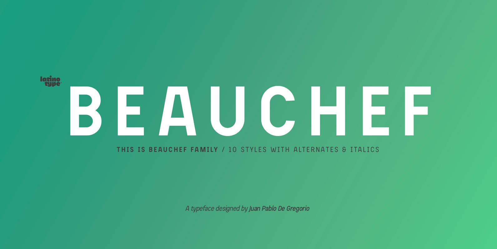
Beauchef Font
Beauchef is a sans serif typeface originally created to meet the needs of Centro de Modelamiento Matemático de la Universidad de Chile (University of Chile Center for Mathematical Modeling). Beauchef is a typeface with rough strokes that features subtle optical
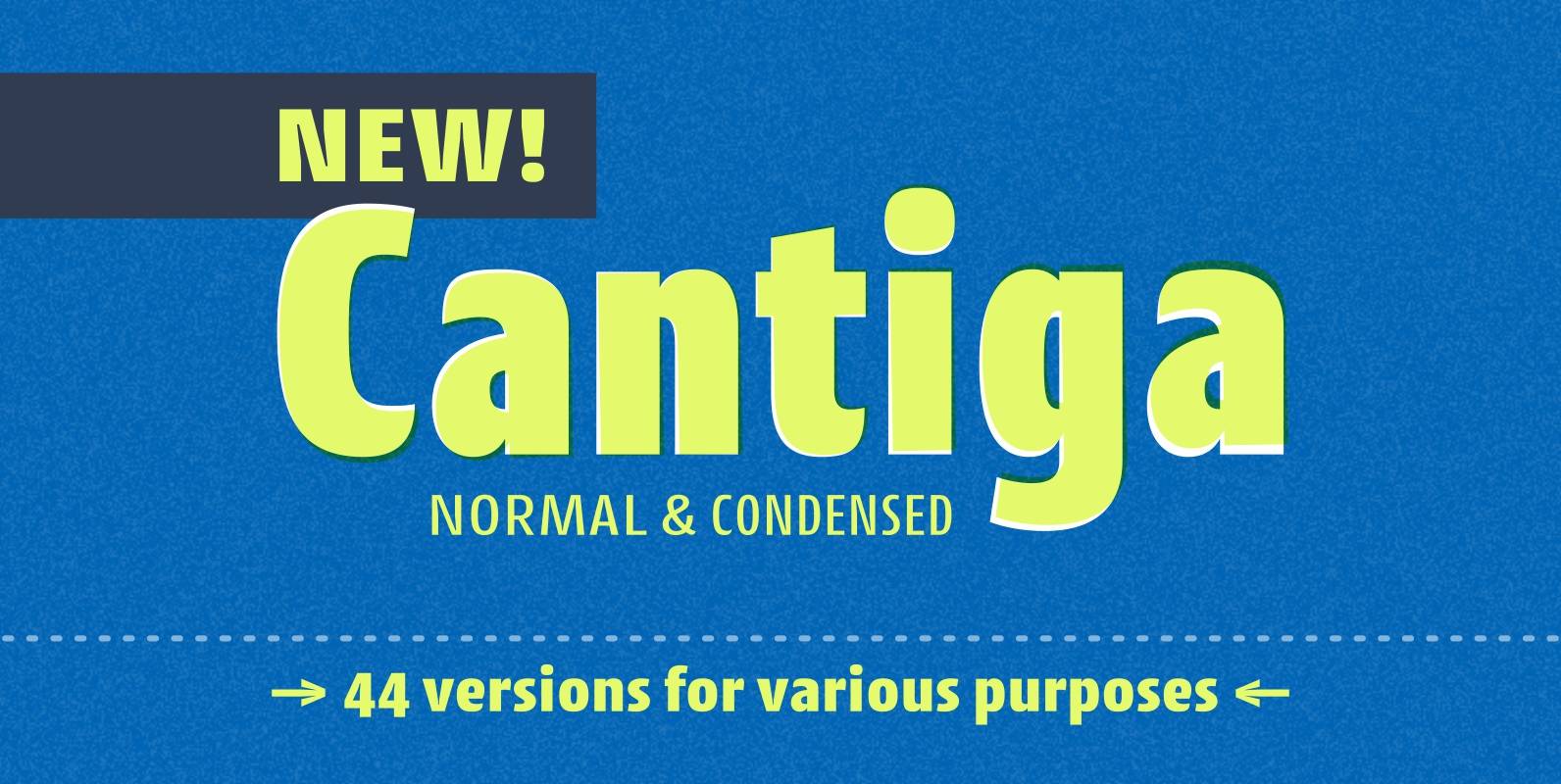
Cantiga Family Font
“Cantiga” is a monophonic song or melody, sometimes repetitive, often with unpretentious themes. In the same simplicity, this font family combines robustness with some very fine details, with 44 versions for various purposes. Choose thinner (or thicker) versions for titles,
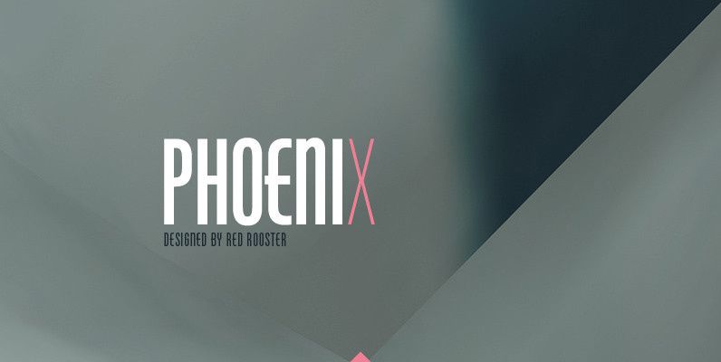
Phoenix Pro Font
Designed by Steve Jackaman and Ashley Muir. The original Phenix typeface was produced in 1935 by Morris Fuller Benton for ATF. Utilizing the original proofs, we have added three additional complementary weights with all the alternate glyphs. Our Phoenix Pro
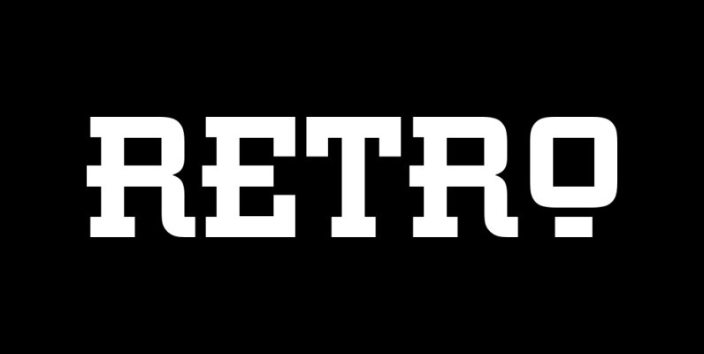
Retro Font
This all capital, slab serif typeface was inspired by elements of early 20th century Constructivist, Bauhaus, Art Deco and Streamline graphic movements. Retro Bold has a strong graphic appearance, a selection of alternative letters and is suitable for a wide
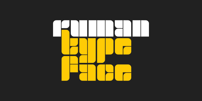
Ruman Font
Ruman is a decorative and display typeface suitable for logotypes and posters. It’s another very simple origami style font working well especially with short words, that look almost like an abstract picture. Published by Juraj ChrastinaDownload Ruman
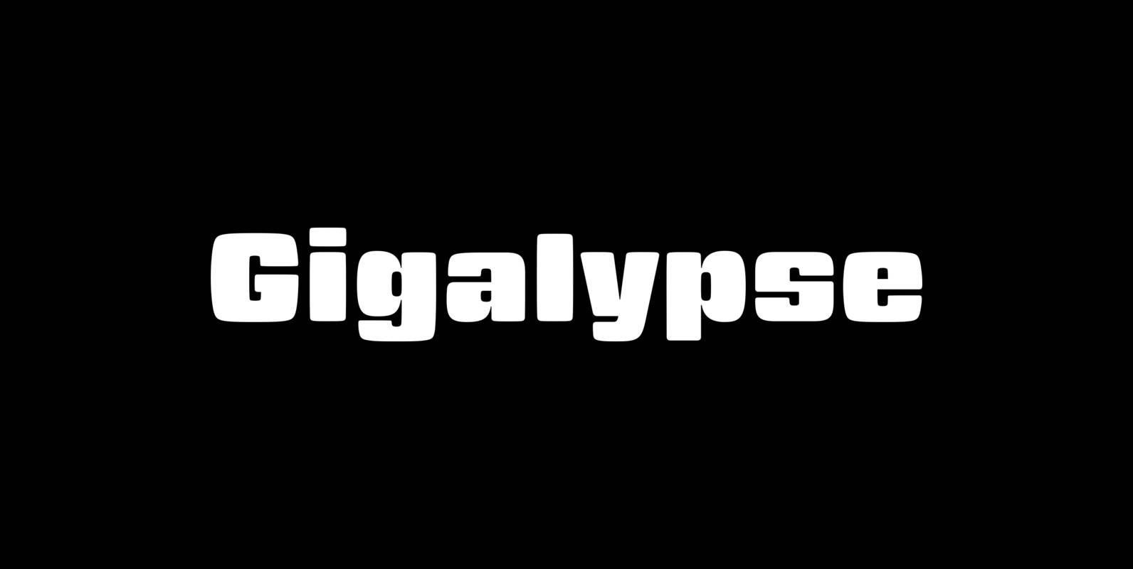
Gigalypse Font
Gigalypse is a one-weight workhorse. As a square sans Gigalypse can look smart, serious, and even futuristic. Round corners and curved sides add warmth and humor tempered by sophisticated geometry. This soft sophistication makes Gigalypse work whenever heavy display type
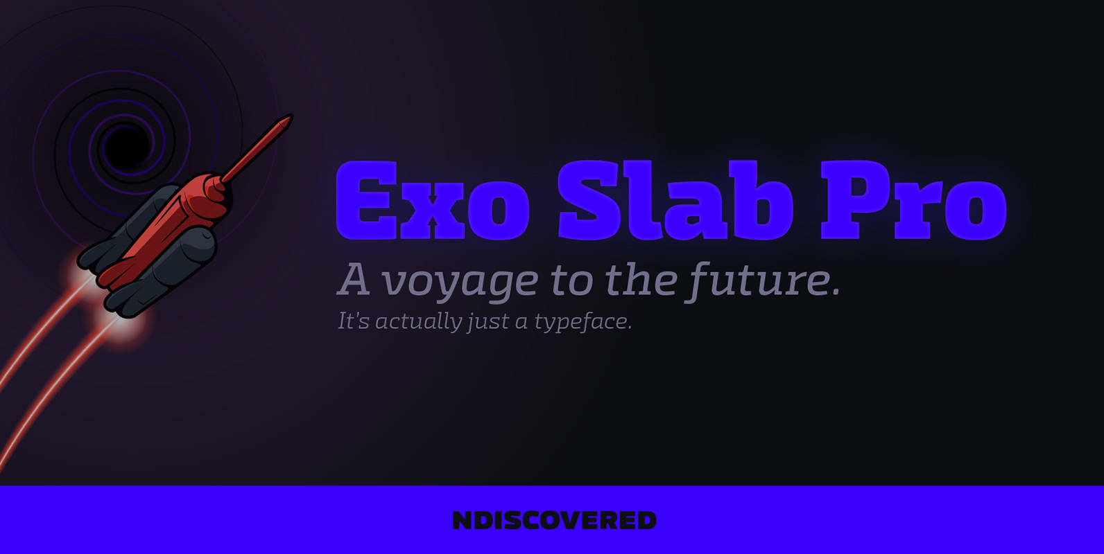
Exo Slab Pro Font
Exo Slab Pro is a slab serif with a technological and futuristic tone. Even though it has a very peculiar look and many distinct shapes that pop out in an headline, it also works well as whole creating a nice
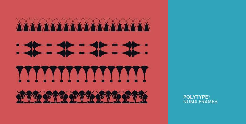
Polytype Numa Frames Font
Designed by Karl Nayeri, Polytype-Numa Frames is a font released for the Prime Graphics Type Collection. Copyright Prime Graphics. Published by Prime GraphicsDownload Polytype Numa Frames

Emblema Headline Font
Based in Corradine Fonts font Emblema 65, Emblema Headline was thought to be a powerful tool for modern designers who need a vintage Art Deco style font with personality and high quality. The Emblema Headline family have four layers each
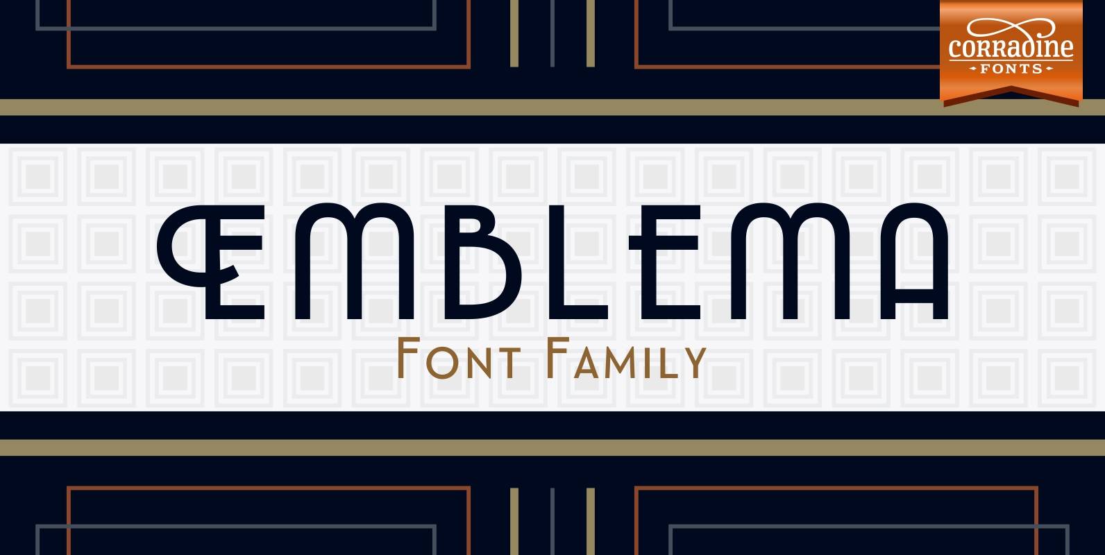
Emblema Font
Emblema is an evocative font that remains Art Deco style from early decades of the 20th Century. Its geometric shapes gives a clean and modern look to the designs where it is applied. Emblema was designed in 12 near but

Maisy Font
A chic and simple geometric hand font. Maisy comes with a set of icons and is perfect for fashion, marketing, books, websites, magazines, film and television. Maisy comes in two font styles (basic/wide) and four weights (light/regular/bold/black). Published by Cultivated

Andes Italic Font
Andes, designed by Daniel Hernández, is a display typeface that has neo-humanist characteristics. Its different terminals, among other elements, give it a look of mixed typography.Andes is a typeface with 10 Upright weights & 10 Italics, ranging from Ultra Light
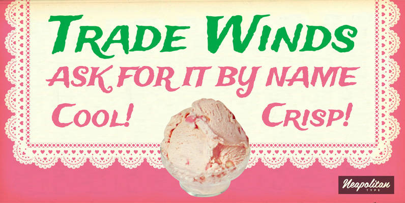
Trade Winds Pro Font
Ahoy, matey! Prepare to set sail on the high seas! Let Tradewinds guide you to exotic ports of call where your next adventure begins. This breezy font by Squid and Neapolian will blow you away! The Pro version has been
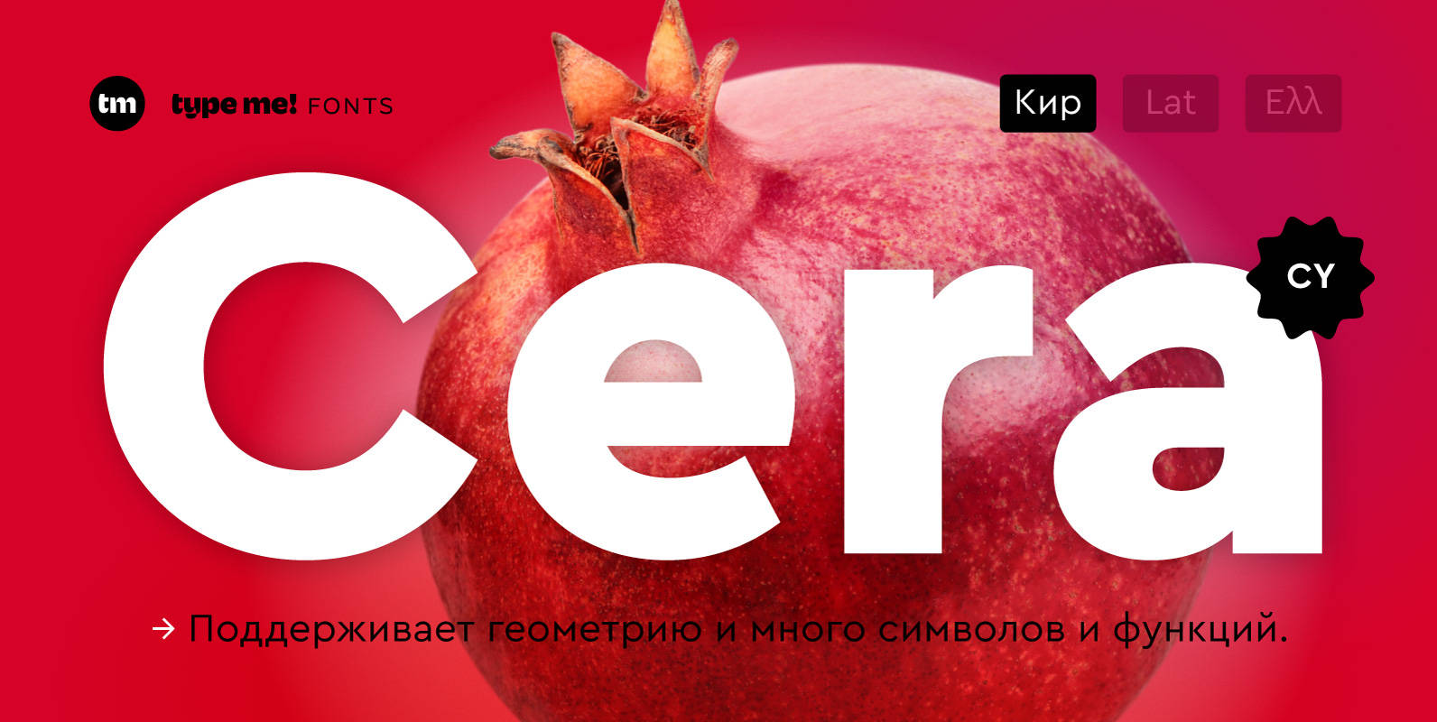
Cera CY Font
The sans-serif typeface – designed between 2013 and 2015 – is supporting pure geometry plus Cyrillic script and basic Latin letters. With over 490 glyphs per weight Cera CY cares about localized letter shapes plus ordinals and provides matching OpenType