Tag: geometric

Blop77 Font
Blop77 is a geometric sans-serif type family, consisting of 3 weights. It is based on the Blop11, being its expanded version. Blop77 is well-suited to headlines and short text. Published by Pawel OsialDownload Blop77
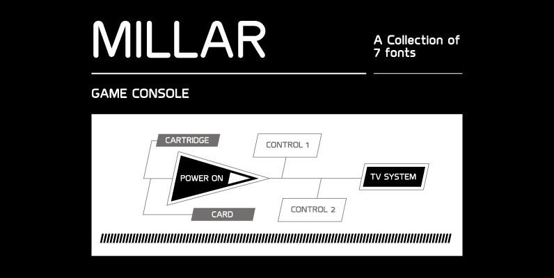
Millar Font
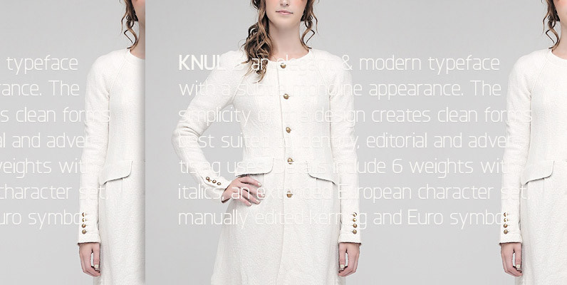
An elegant monoline typeface with smooth corner detailing. The simple linear design is best suited to identity, editorial and on screen uses. Details include 7 weights, a complete character set, manually edited kerning and Euro symbol. Published by The Northern
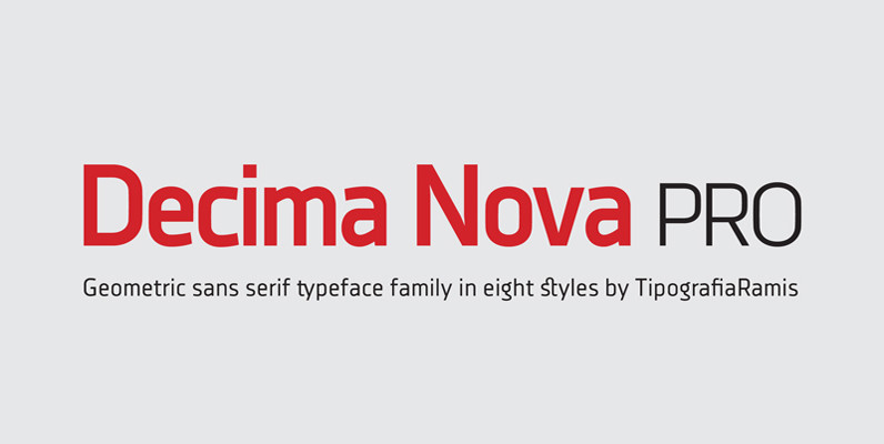
Decima Nova Pro Font
Decima Nova Pro is a geometric sans serif typeface family, built in eight styles. The typeface is ideal for use in display sizes, but also is quite legible in text and is well suited for editorial and brand design. Features
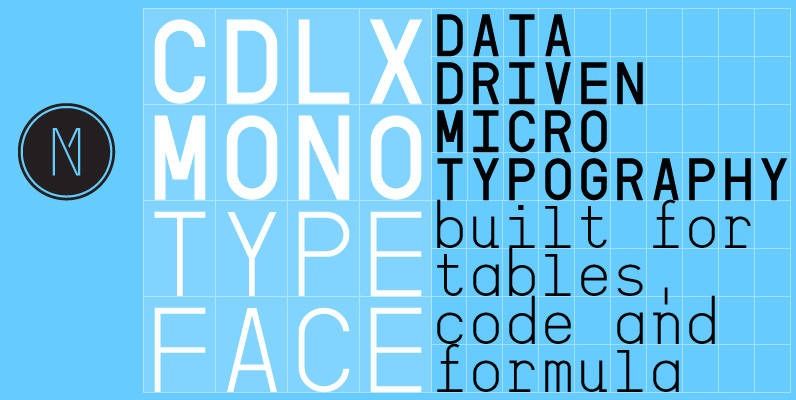
CDLX Mono Font
CDLX Mono is a simple and clear geometric monospaced typeface. It was originally buildt for tables, code, formulas and other data driven typographic needs but also works well for professionally set copytext. CDLX Mono comes in three weights (light, regular,
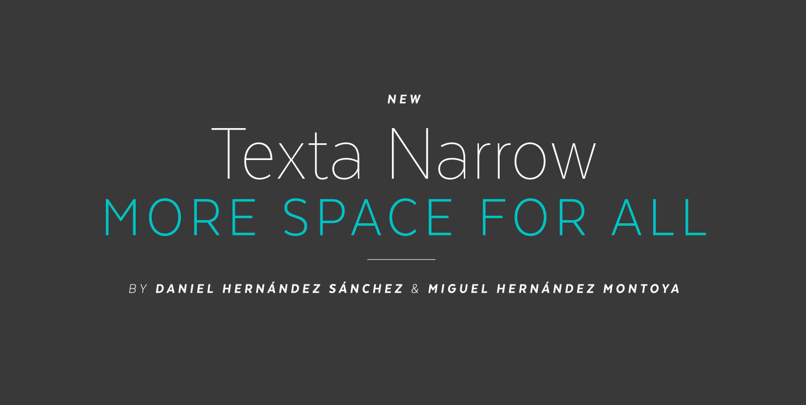
Texta Narrow Font
Texta Narrow. More space for all. Through studying humanists’ models from Edward Johnston to Adrian Frutiger and the Gothic Alphabet made by sign painters comes Texta Narrow, a contemporary, rational, transparent and useful Sans to compose all kind of texts.

Conifer Font
Conifer is a blocky geometric sans serif font that adheres to strict grid rules in order to define its corner angles. Its seemingly rigid form is tempered by the soft, rounded corners, and fine notched details present at acute angles
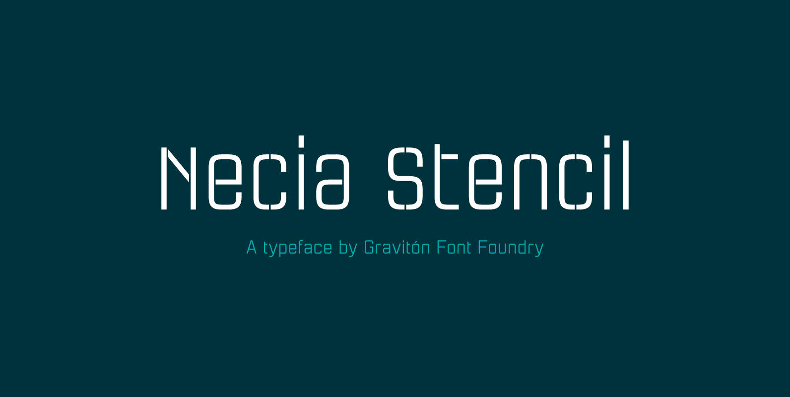
Necia Stencil Font
Necia Stencil font family is the stencil version of Necia font family, it has been designed for Graviton Font Foundry by Pablo Balcells in 2014. Necia Stencil consists of 16 styles. The 8 “Stencil 1” styles contain a narrow stem
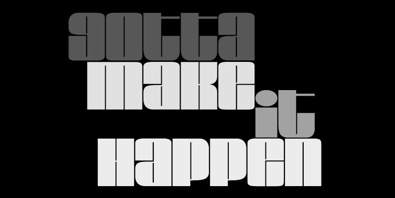
Loudine Font
Loudine is a striking decorative display typeface, great for posters, book covers and magazine headlines. It comes in two widths, each of them packed with a set of stylistic alternates: just turn on the feature in an OpenType savvy program

YWFT Pello Font
At first glance, YWFT Pello might appear to be something from the tonalpohualli, and may inspire a pilgrimage to Teotihuacán. However, after a few moments (and perhaps a quick sacrifice to Quetzalcoatl for good measure), you should begin to see
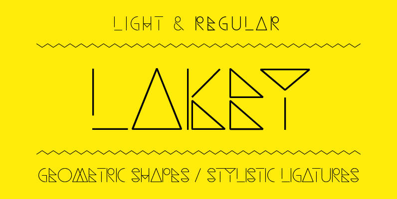
Lakey Font
Lakey designed by Philippe Moesch is a light & regular weighted, fine lined, modern font based on geometric shapes with glyphs for all european latin based languages and some extra stylistic ligatures. • Light & Regular weight • Stylistic ligatures
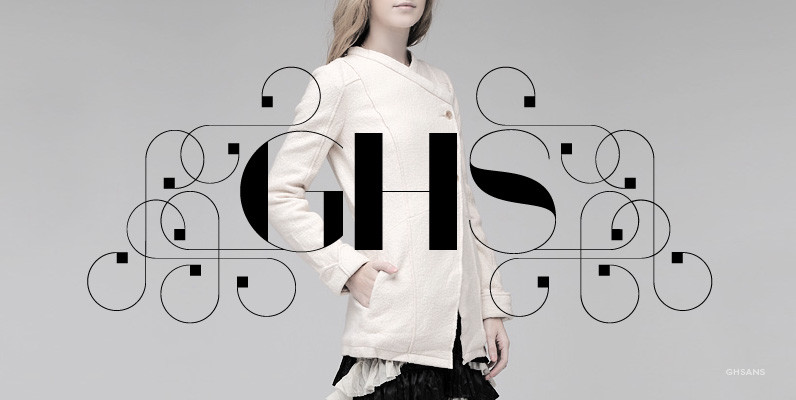
GHSans Font
Based on the successful GHS font, GHSans is a modern and fashionable complementary sans serif with all the features of the original. It comes in 4 styles, each sold in 3-font sets containing a Key font, and two ‘Layer’ fonts
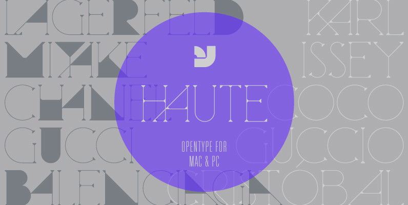
Haute Font
Haute is a finely crafted serif display typeface that blends the fashion world with a subtle Herb Lubalin touch. It includes alternate letterforms which creates a bold geometric rhythm within the typeface. Updated version now includes not only opentype, but

