Tag: geometric
Loudine Font
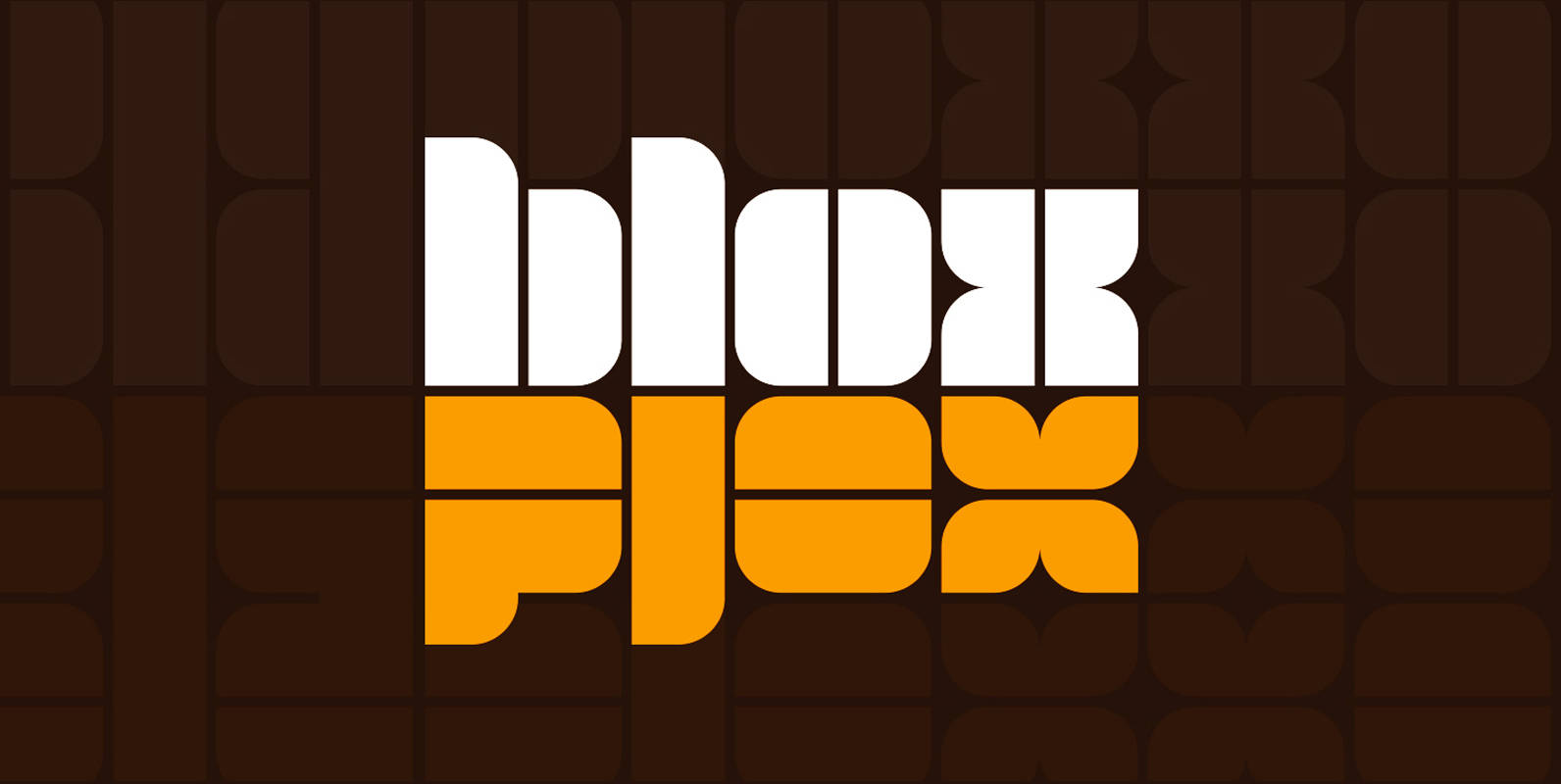
Loudine is a striking decorative display typeface, great for posters, book covers and magazine headlines. It comes in two widths, each of them packed with a set of stylistic alternates: just turn on the feature in an OpenType savvy program

YWFT Pello Font
At first glance, YWFT Pello might appear to be something from the tonalpohualli, and may inspire a pilgrimage to Teotihuacán. However, after a few moments (and perhaps a quick sacrifice to Quetzalcoatl for good measure), you should begin to see
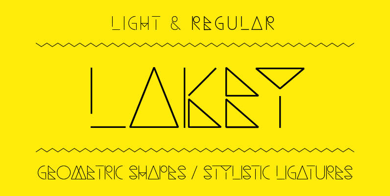
Lakey Font
Lakey designed by Philippe Moesch is a light & regular weighted, fine lined, modern font based on geometric shapes with glyphs for all european latin based languages and some extra stylistic ligatures. • Light & Regular weight • Stylistic ligatures
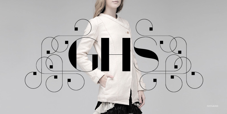
GHSans Font
Based on the successful GHS font, GHSans is a modern and fashionable complementary sans serif with all the features of the original. It comes in 4 styles, each sold in 3-font sets containing a Key font, and two ‘Layer’ fonts
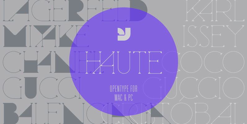
Haute Font
Haute is a finely crafted serif display typeface that blends the fashion world with a subtle Herb Lubalin touch. It includes alternate letterforms which creates a bold geometric rhythm within the typeface. Updated version now includes not only opentype, but

Santino Font
Santino is a rounded monoline, post-bauhaus geometric font with smooth extremes and a touch of modern sensuality. It is named after Ariel Negro Di Lisio’s son. Published by SudtiposDownload Santino
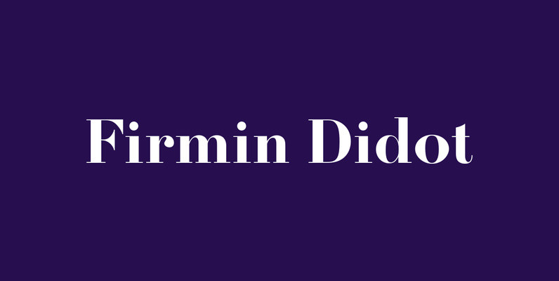
Firmin Didot Font
Designed by URW Studio in 1995, Firmin Didot is a Serif (Antiqua) / Old Style font release by URW. Contains language support for West, East, Turkish, Baltic, and Romanian. Published by URW Type Foundry GmbHDownload Firmin Didot
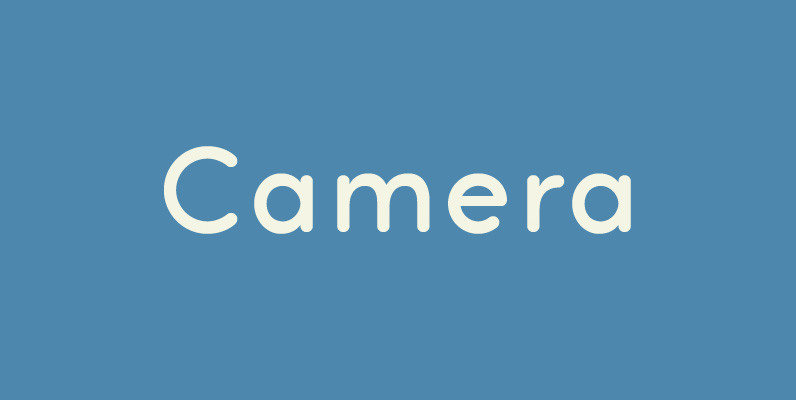
Camera Font
Legible, simple and very lovely sans serif is based on artdeco advertisment from 1800s to early 20th. The sweetest sans for your retro-style project. Published by Dharma TypeDownload Camera
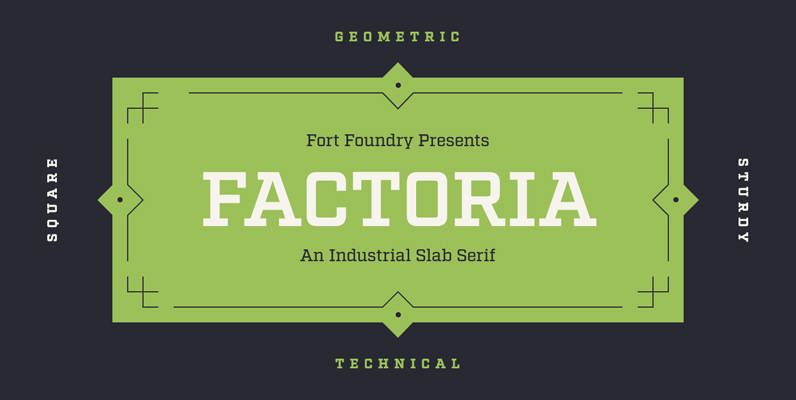
Factoria Font
Born out of the Industry typeface, Factoria is a geometric, square slab. The hard-working family can jump from the side of an industrial building and into a sports magazine in a jiffy. The lighter weights exhibit a clean, no-nonsense vibe
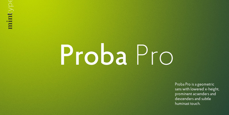
Proba Pro Font
Proba Pro is a geometric sans with lowered x-height, prominent acsenders and descenders and subtle huminast touch. It comes in 7 weights + matching italics each supporting numerous Latin-based languages as well as major Cyrillic languages. It is packed with
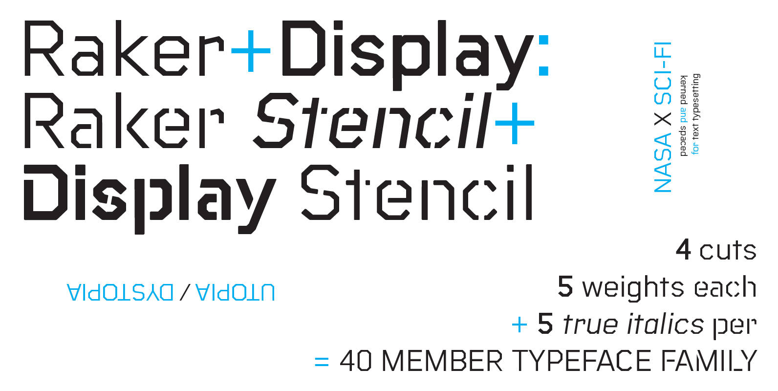
Raker Font
Raker was born out of a love for retro science fiction aesthetics as evidenced in films like The Clone Returns Home, Moon,and Alien, while simultaneously being a text typeface with a humanist influence and solid spacing. The family includes 4

Arquitecta Office Font
We have adapted the version of our Arquitecta font for use in Microsoft Office™. It only has 4 variants: regular, italic, bold and bold italic. Font weights have been named in a way that can be clearly shown up in
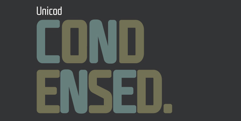
Unicod Sans Condensed Font
This font has been especially designed for Mostardesign Studio by Olivier Gourvat. Created in 2010, this font family has been designed to serve sectors like financial services, modern industries, business and many more activities who needs a modern aspect in
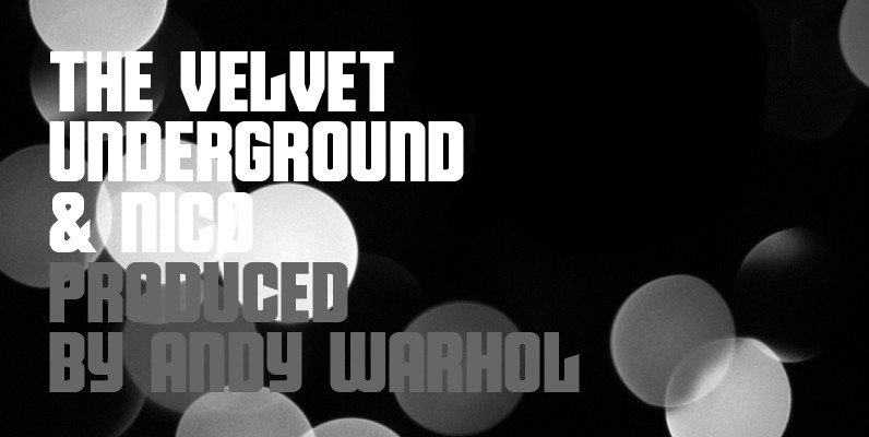
Velvet Font
Velvet is a heavy rounded block retro face inspired by the typeset album covers of the protopunk rock band The Velvet Underground. Stylistically, Velvet’s extreme angled terminals exude a sense of tension and irreverence, contrasting the subtle rounded block letter
