Tag: geometric
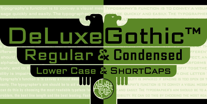
DeLuxe Gothic Font
Michael Doret was always very aware of the fact that Morris Fuller Benton’s classic Bank Gothic, a longtime favorite of his, didn’t contain any lowercase characters. So he set out to remedy that by designing his all new DeLuxe Gothic,
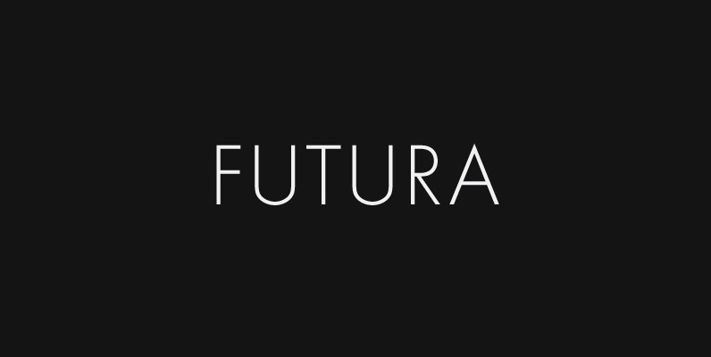
Futura Font
Futura. The very name brings to mind jet-age splendor of the highest order, and indeed the text on the commemorative plaque left behind on the Moon by the Apollo 11 astronauts in July, 1969 is set in Futura. There is
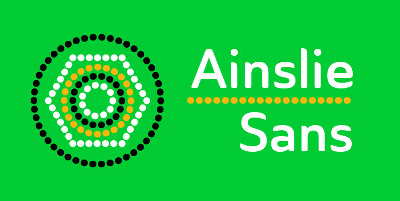
Ainslie Sans Font
The original Ainslie was inspired by Mt. Ainslie and the city of Canberra’s inner suburb of the same name. Canberra is Australia’s capital–a planned city designed by American architect Walter Burley Griffin. Griffin’s style and geometric design for the city,

Turn Right Display Font
A display font that attempts to bridge the gap between classic geometric and neo grotesque faces simple shapes with a robust, no nonsense approach. Published by Jamie WinderDownload Turn Right Display
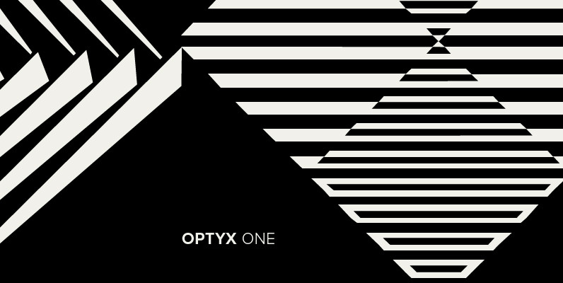
Polytype Optyx One Font
Designed by Karl Nayeri, Polytype Optyx One is a font released for the Prime Graphics Type Collection. Copyright Prime Graphics. Published by Prime GraphicsDownload Polytype Optyx One
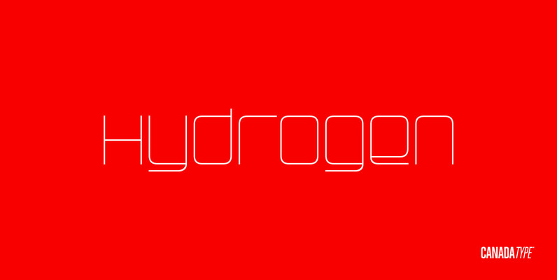
Hydrogen Font
Hydrogen is a clean geometric unicase family that expresses the mechanics, expansive technologies and conflicted ethics of the rapidly changing 21st century. Coupled with the right measure of Oxygen, Hydrogen becomes water, the ace of elements – rhythmic, dynamic, ever-flowing,

Centima Font
Centima – a geometric sans serif typeface family, built in six styles. The typeface is intended for use in display sizes, but also is quite legible in text and is well suited for editorial and brand design. Centima is released
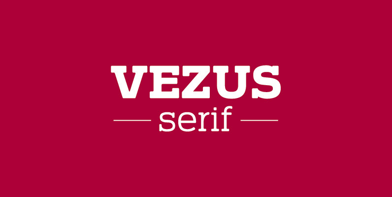
Vezus Serif Font
Vezus Serif is a legible slab design created by Dusan Jelesijevic. Published by Tour de Force Font FoundryDownload Vezus Serif
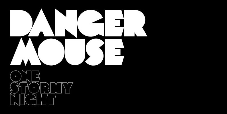
Mekon Font
A modern heavy weight typeface ideal for use on print, web, motion, t-shirts and apparel. Details include 4 styles with 3 alternatives, extended European character set, manually edited kerning and Euro symbol. Published by The Northern Block Download Mekon
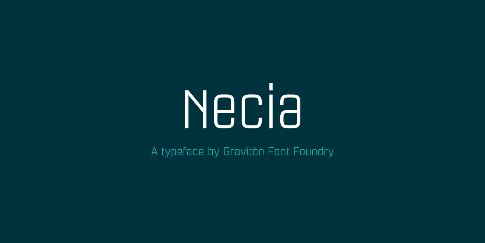
Necia Font
Necia font family has been designed for Graviton Font Foundry by Pablo Balcells in 2014. It is a modular, geometric and slightly condensed typeface which has been conceived to be primarily a display typeface, but given its clarity it can
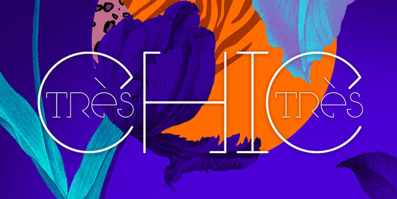
Tres Tres Chic Font
First partnership between Firmorama com & dooType studios, Très Très Chic is a display font, developed to be versatile and illustrative, with strong features that provide personality to the drawing The characters were built based in primary geometric forms and
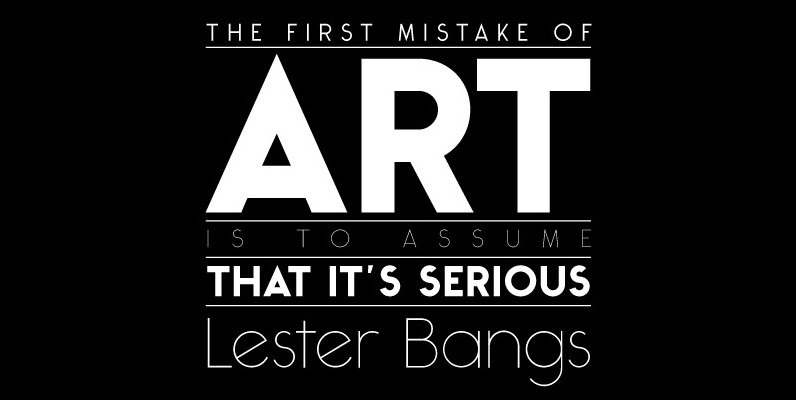
Ealing Font
The Ealing font is a clean, geometric design inspired by the historic modular designs of the 30’s. With a large weight contrast, this font ranges from a refined light cut to a chunky, black style. Published by Michael ParsonDownload Ealing
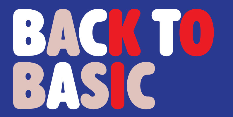
Alphabet Soup Pro Font
Designed by Steve Jackaman. In the early 1980’s, Steve worked at Typographic House in Boston, Massachusetts. At the time, ‘Typo’ House, as it was affectionately known, was the largest type house in New England. This font was designed and produced
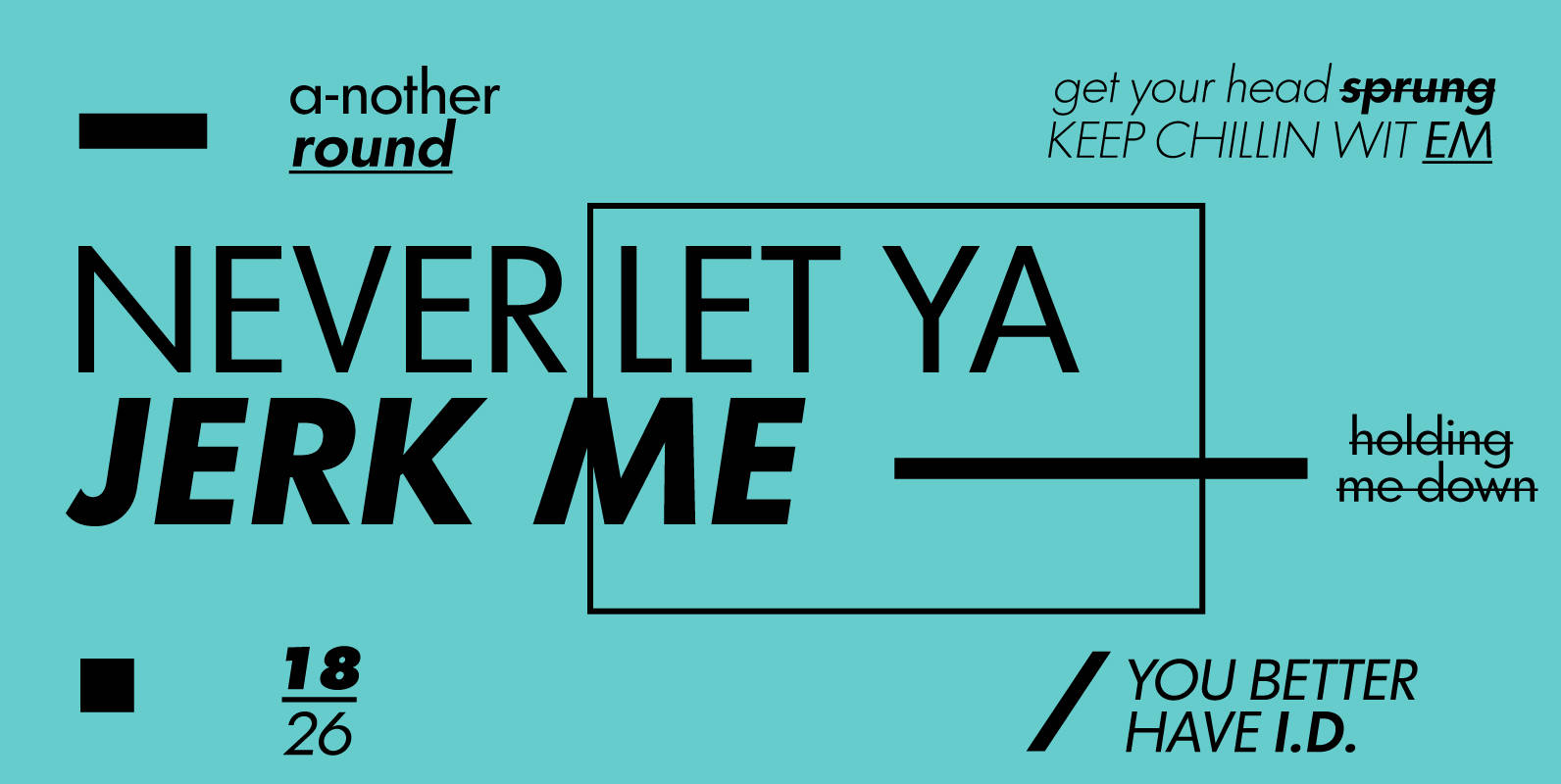
Graphicus DT Font
Graphicus DT is a sans-serif font design, published by DTP Types Limited. Published by DTP Types LimitedDownload Graphicus DT
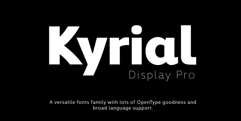
Kyrial Display Pro Font
Designed in 2011 by Olivier Gourvat, this font family has generous proportions with a range of weights make it a versatile family for print and web design work. Kyrial Display Pro is also a pratical typographic choice to express strength,
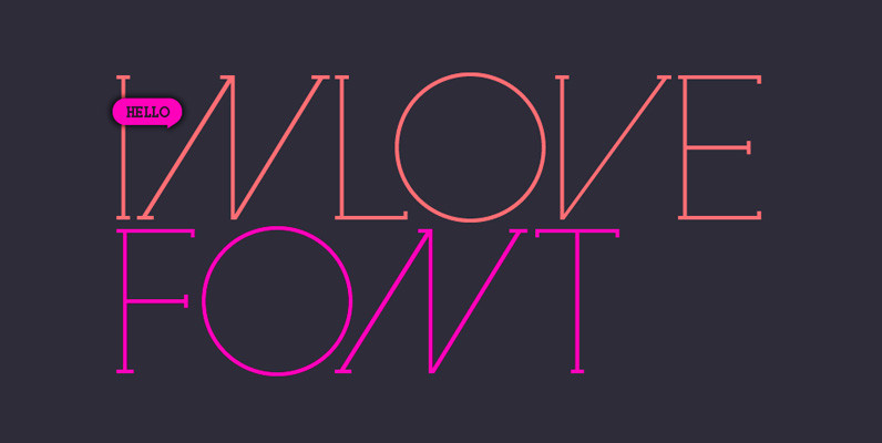
Inlove Font
Ideal for magazines, posters or flyers, Inlove is a modern take of Ariel Di Lisio passion for geometric and very contrasted typefaces. Because the strong influence over his work, Ariel was invited during 2009 to be part of the Herb
