Tag: geometric
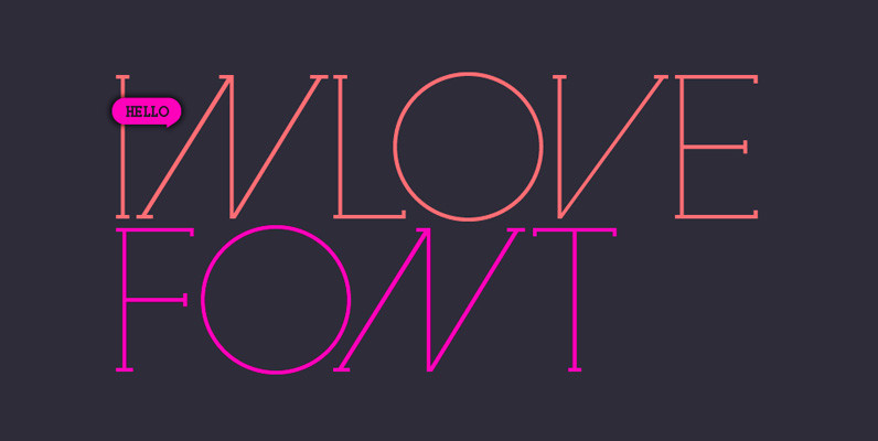
Inlove Font
Ideal for magazines, posters or flyers, Inlove is a modern take of Ariel Di Lisio passion for geometric and very contrasted typefaces. Because the strong influence over his work, Ariel was invited during 2009 to be part of the Herb

Robotik Font
This slab serif Egyptian typeface follows the trend for simple, mechanically constructed typefaces and is an ideal choice for communicating a feeling of precision and strength. Robotik is equally effective when set with normal or wide letter and word spacing.
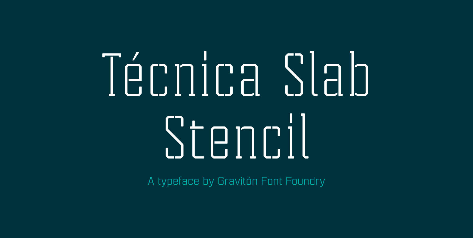
Tecnica Slab Stencil Font
Tecnica Slab Stencil font family is the stencil version of Tecnica Slab font family, it has been designed for Graviton Font Foundry by Pablo Balcells in 2014. Tecnica Slab Stencil consists of 8 styles. The 4 “Stencil 1” styles contain
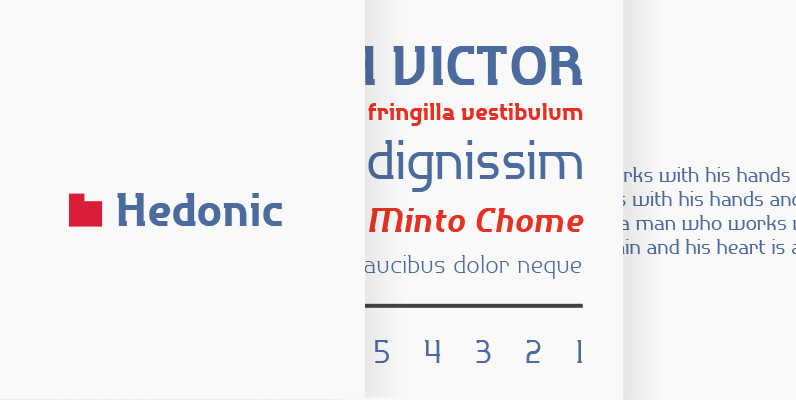
P22 Hedonic Font
Hedonic has just a hint of a slab serif and even that is used so sparingly that it almost feels like a sans serif font. Its design does appear to be painfully simple, but there are many interesting features including
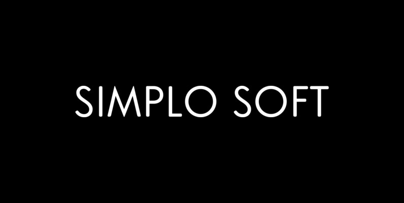
Simplo Soft Font
Simplo Soft is the soft companion of Simplo. In Simplo Soft, Simplo’s original sharp geometrics have been tempered by the moderate rounding of the edges of its characters — creating a softer and friendlier geometric typeface. Simplo Soft is ideal
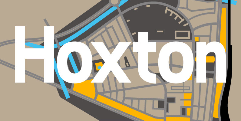
Hoxton Font
A modern humanistic san serif typeface. The horizontal structure of the font gives it a clean lateral dynamic that is ideal for on screen uses. Also the proportions have been condensed to maximise the use of space across various layouts.
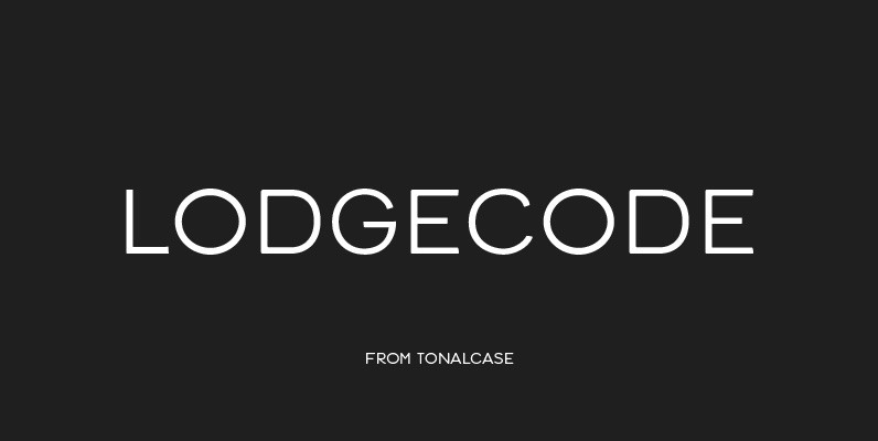
Lodgecode Font
Lodgecode functions as a geometric sans, but evokes more warmth. Corners are softened to provide a tactile, worn-in feel, while still maintaining a polished appearance. Lodgecode lends an understated simplicity to small settings, such as stationery and interface typography, but
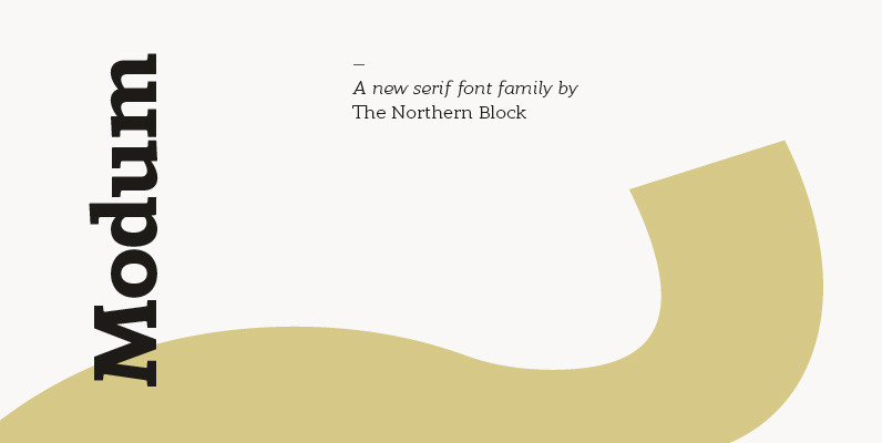
Modum Font
A contemporary serif font family. The design takes influence from traditional serif forms to develop a precise, highly functional text face with a low contrast. Smooth radius details are blended with carefully drawn angles that give a crisp, distinctive aesthetic

Bikra Font
Bikra Plain and Bikra Stencil are tough and curve-less fonts – works for t-shirts, logos and magazines. Published by FaceTypeDownload Bikra
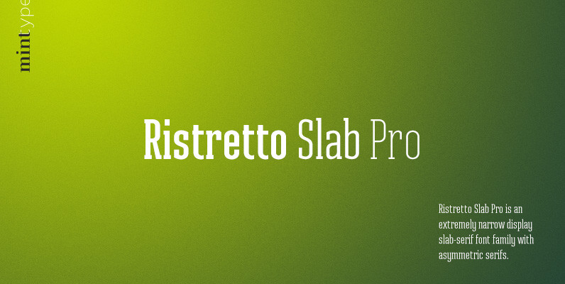
Ristretto Slab Pro Font
Ristretto Slab Pro is a slab-serif companion to Ristretto Pro. It’s an extremely narrow display slab-serif font family with asymmetrical serifs and consistent character width across weights, available in 8 weights. It features rich language support, 6 sets of figures
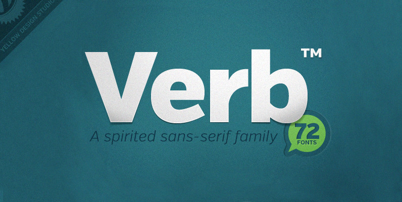
Verb Complete Series Font
Verb from Yellow Design Studio is a 72-font sans-serif superfamily that’s confident, friendly and energetic. At text sizes it’s highly legible, while at larger sizes it reveals lively shapes and personality. It has four subfamilies including Regular, Condensed, Extra Condensed,
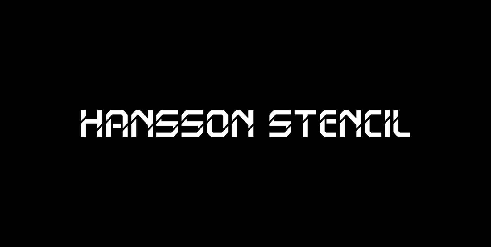
Hansson Stencil Font
Hansson Stencil is a font design released for the Mecanorma Type Collection. Copyright 2004 Trip Productions BV. Published by MecanormaDownload Hansson Stencil
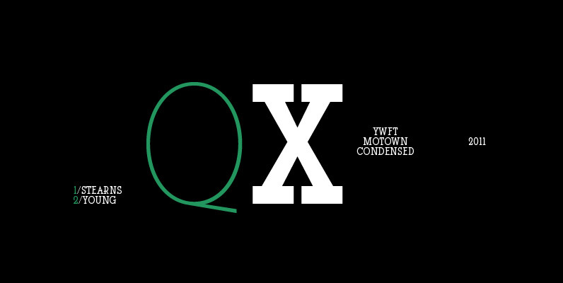
YWFT Motown Condensed Font
YWFT Motown Condensed is a geometric slab serif that contains a total of 5 weights. Although it was intended to be used as a display face, YWFT Motown Condensed’s heavier weights can be used effectively for text as well. The
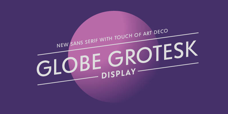
Globe Grotesk Font
Globe Grotesk is modern art deco inspired sans serif. Its root goes to beginning of last century into Czechslovakia. The design is inspired in Universal Grotesk – font made by unknown designer. There are some really unique details in the
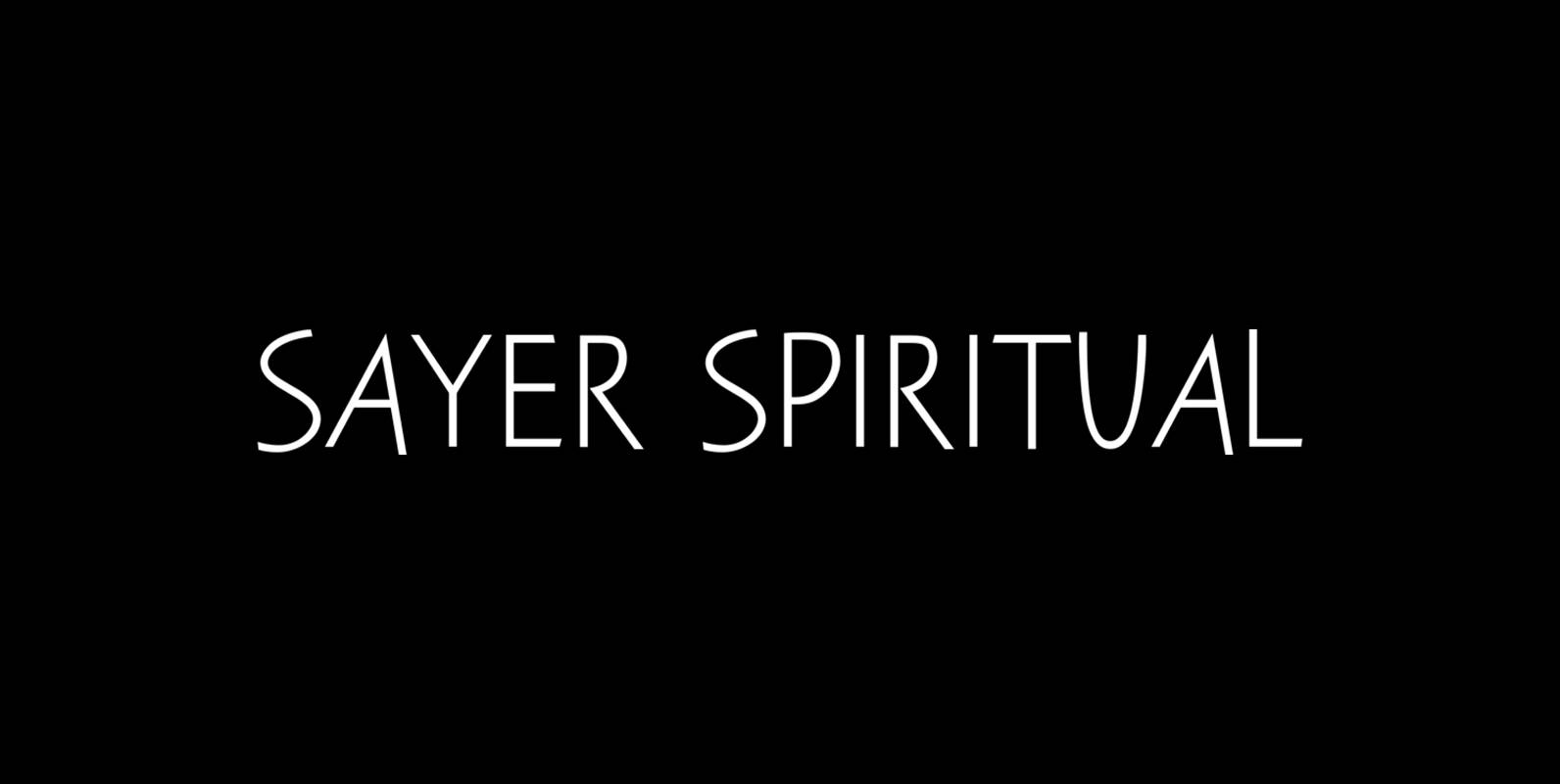
Sayer Spiritual Font
Sayer Spiritual is a font design released for the Mecanorma Type Collection. Copyright 2004 Trip Productions BV. Published by MecanormaDownload Sayer Spiritual
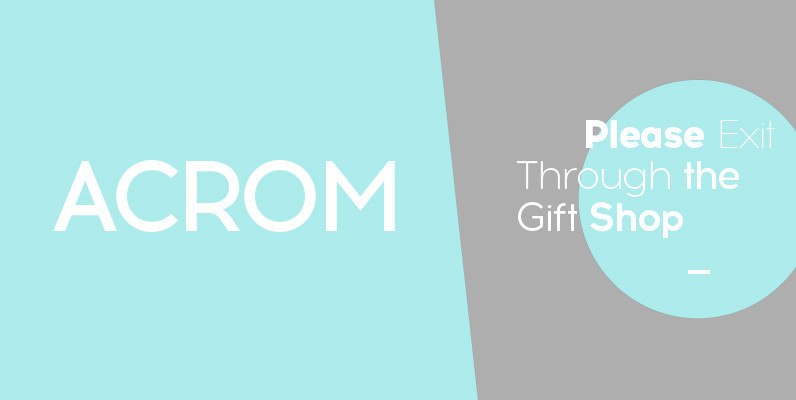
Acrom Font
Acrom is a geometric sans serif typeface with a minimal stroke contrast. It was designed with a modern, contemporary context in mind. Acrom is not merely mechanical, it can also be recognised as a natural typeface with subtle geometric aesthetics. The humanist
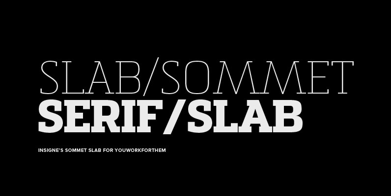
Sommet Slab Font
The Sommet family of typefaces has been updated with a new slab serif variant. Expanding on Sommet’s successful design principals, Sommet Slab is there when you need more impact and power. Sommet Slab is available with six weights and complementary

Blop11 Font
Blop11 is a geometric sans-serif type family, consisting of 3 weights. Blop11 Bold is inspired by 1800s-style wood, poster typeface. Owing to its rounded terminals, Blop preserves natural organic quality of wood typeface. The Regular and Light versions are contemporary