Tag: geometric
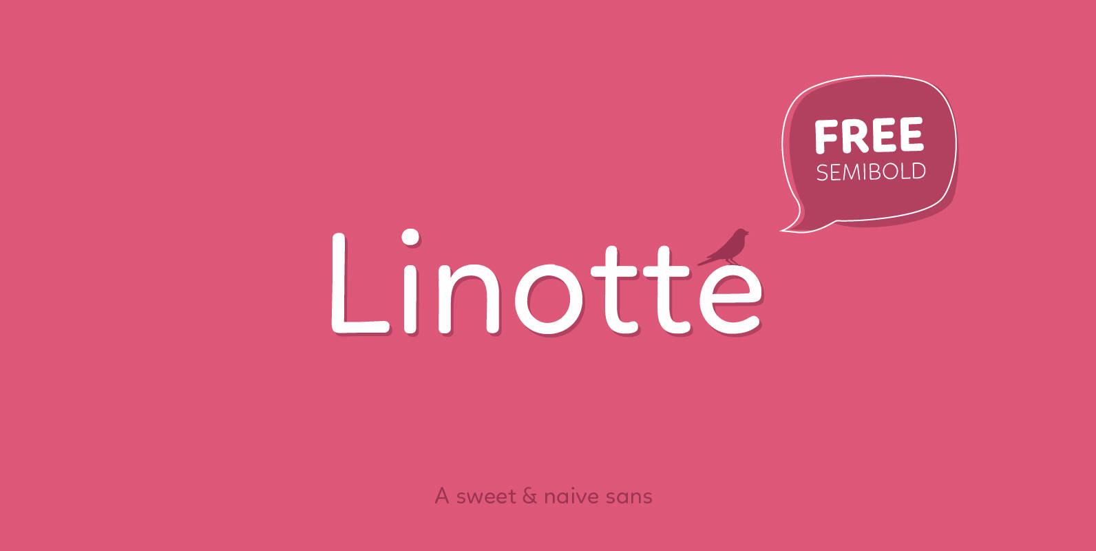
Linotte Font
Linotte is a rounded sans family with good vibes, designed by Joël Carrouché. Slight irregularities give the typeface a warm and naive look, while the solid geometric construction allows good legibility in long texts and small sizes. Linotte is ideal
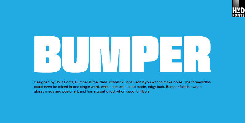
Bumper Font
Bumper is the ideal ultrablack Sans Serif if you wanna make noise. The three widths could even be mixed in one single word, which creates a hand-made, edgy look. Bumper falls between glossy mags and poster art, and has a
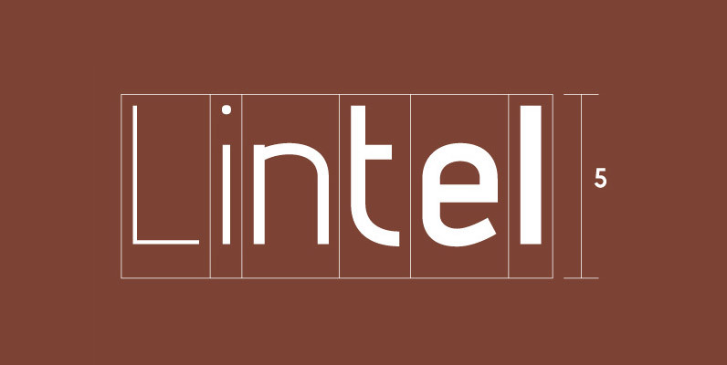
Lintel Font
A modern san serif typeface with a pure clean line form. The idea has been to design a font with a proportioned and balanced structure that is applicable to a wide variety of uses. Details include 6 weights with italics,

Marine Font
Marine is a geometric sans but with the softness of humanistic strokes. It’s mild contrast and multiple different styles allow Marine to work well as both a text and display font. It also includes an Up version and calligraphic features
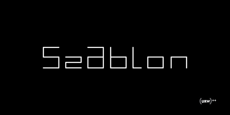
Szablon Font
Designed by Wojtek Podulka in 2004, Szablon is a modern and obscure type design. Szablon maintains a modern, minimal and avant garde presence that works great in branding projects. Published by URW Type Foundry GmbHDownload Szablon
Raleigh Gothic Font
Designed by Steve Jackaman. Based on the ATF typeface by Morris F. Benton, circa 1934. Steve created two additional new weights. Published by Red RoosterDownload Raleigh Gothic
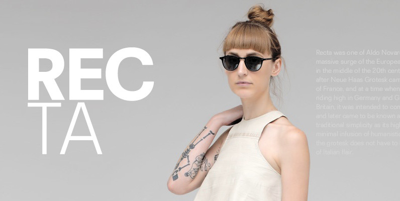
Recta Font
Recta was one of Aldo Novarese’s earliest contributions to the massive surge of the European sans serif genre that was booming in the middle of the 20th century. Initially published just one year after Neue Haas Grotesk came out of
Basik Font
As the name suggests, Basik is a simple, clean and versatile sans-serif typeface designed by Superfried. It is equally apt in both body or display scenarios and it is now available in a stencil style. There are already numerous san-serif
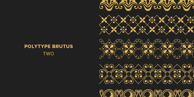
Polytype Brutus II Frames Font
Designed by Karl Nayeri, Polytype Brutus II Frames is a font released for the Prime Graphics Type Collection. Copyright Prime Graphics. Published by Prime GraphicsDownload Polytype Brutus II Frames
Iron Maiden Font
Designed by Steve Jackaman, Iron Maiden is a retro display face released by Red Rooster. Published by Red RoosterDownload Iron Maiden
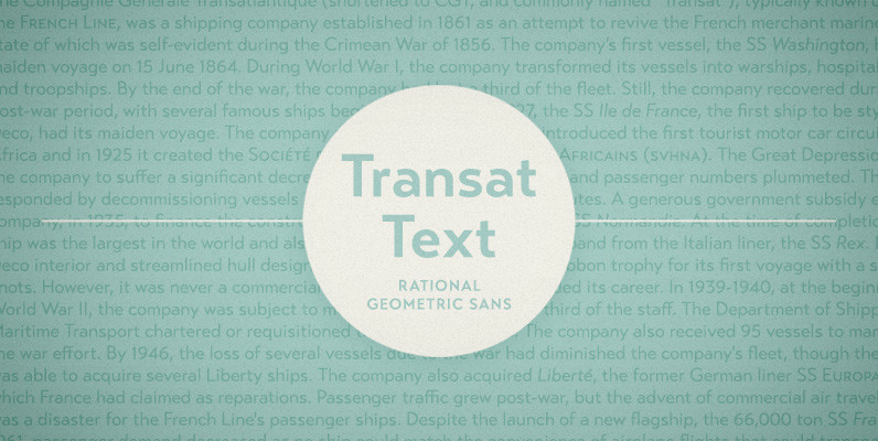
Transat Text Font
Transat Text is a geometric sans serif typeface, and is the more rational sibling to the unabashedly Art Deco “Transat”. Transat Text has a slightly taller x-height than its counterpart, making it easier to read at small sizes, but also

Ambassador Plus Font
Hairline display fonts are elegant and subtle with touch of luxury. They are the Champagne of type. Ambassador Plus Family represents a set of classy typefaces best suitable for magazines, cosmetics packaging, advertising or any kind of fine and sensitive
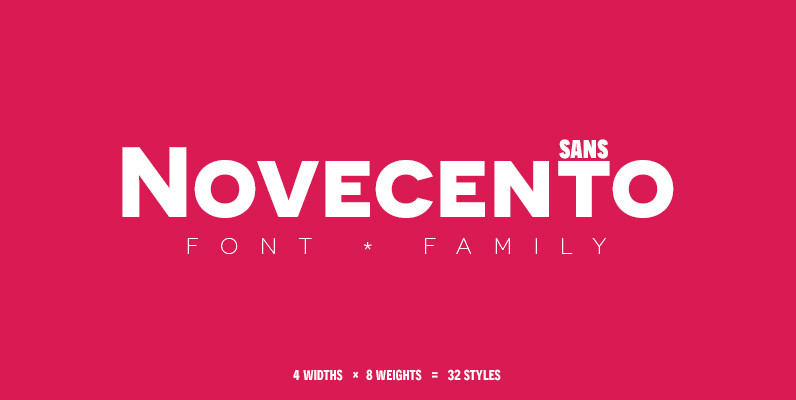
Novecento Sans Font
Novecento sans is an uppercase-only font family inspired on European typographic tendencies between the second half of 19th century and first half of the 20th. It looks rational and geometric. However, it is optically corrected and balanced. This font face
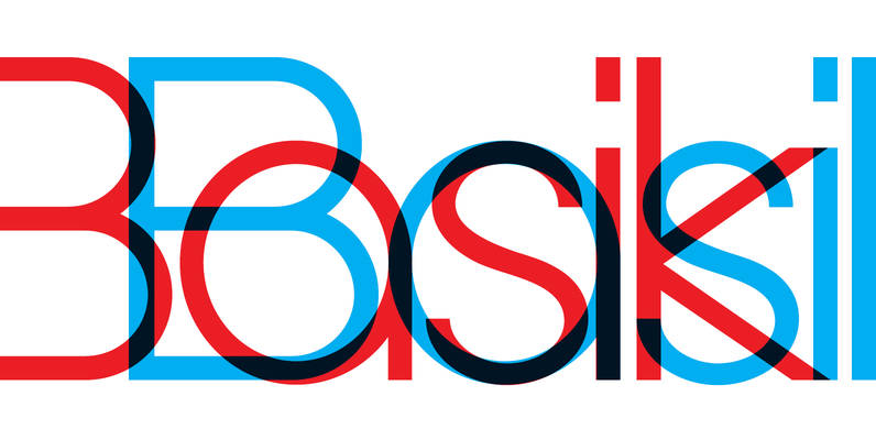
YWFT Basel Font
YWFT Basel is a heavy sans-serif font that began as a revival of the metal type Spartan Black, an American copy of Futura developed in 1936. The final release of YWFT Basel ultimately took on a character of its own,