Tag: geometric
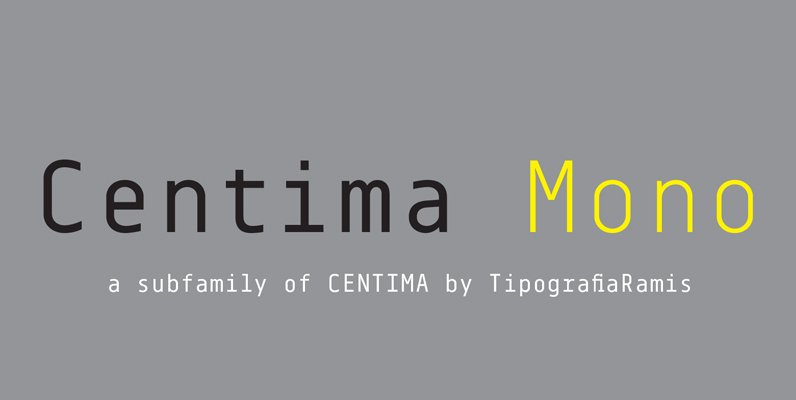
Centima Mono Font
Centima Mono is a subfamily addition to Centima type family. Centima Mono is a condensed geometric monospaced san serif, built in six styles. The typeface is intended for use in display sizes, but also is quite legible in text and

Crillee Font
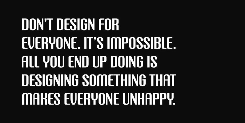
This slick-looking geometric typeface evokes a feeling of power and speed when closely spaced in word settings. The Crillee range is an excellent choice when a contemporary appearance is required. Produced in the Type Studio by type designer, Dick Jones.
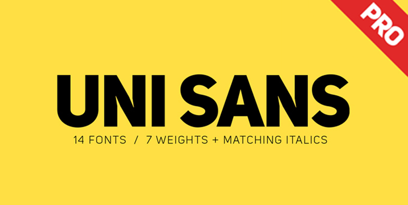
Uni Sans Font
Looking for a type that will work in blocks of text for callouts, captions and headlines? Well, find that unique balance by using Uni Sans – a custom sans font which is applicable for any type of graphic design –
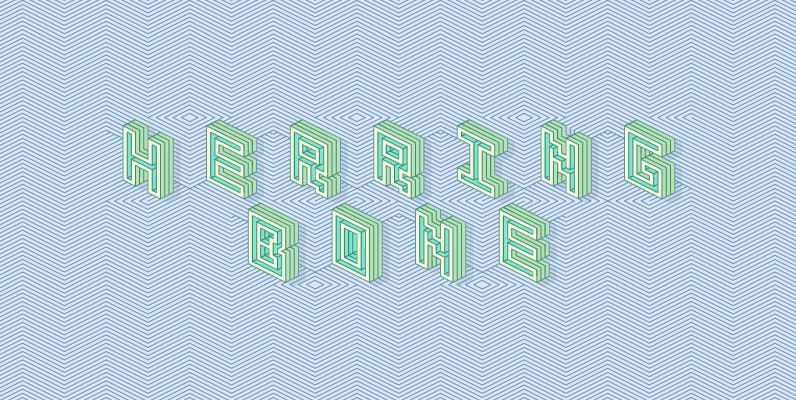
Herringbone Font
Herringbone is a unique geometric display face. Letters and words align with a diagonal pattern, alternating with upper and lowercase characters. Use the solid accompanying fonts “knockout, extrude, outer, and inner” to colour in between the lines by stacking layers
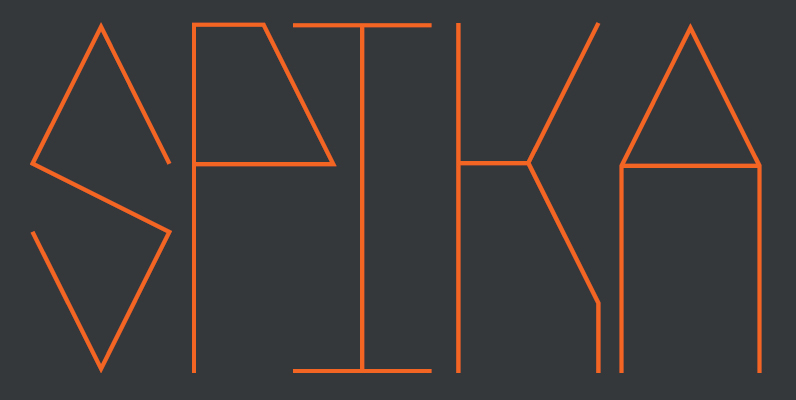
Spika Font
Spika is a geometric, monospaced sans serif font. This tall, condensed typeface is simple in its structure yet strong in its design. Informed by basic geometry and inspired by simplistic, clean design principles Spika has an almost retro style but

Johann Font
Johann is an elegant, geometric, san serif typeface who’s clean, simple structure and form create a versatile typeface that works effortlessly across print & digital applications. Created in 2012 by NiceType, the Johann family consists of 5 weights, plus corresponding
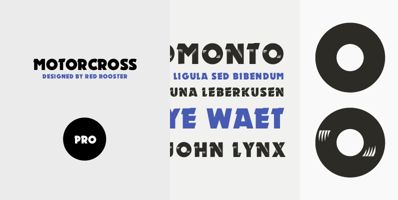
Motorcross Pro Font
Revival of the Ludwig & Mayer type design from 1930. Motorcross Pro includes over 800 glyphs and supports 131 languages. Published by Red RoosterDownload Motorcross Pro

Heliotype Font
The delightful calligraphic appearance of this all capital typeface is heightened by a controlled, textured edge and a whimsical, free-flowing embellishment running throughout. Hazel benefits from slightly wider than usual letter and word spacing. Created by accomplished British designer Phill
Refrigerator Deluxe Font
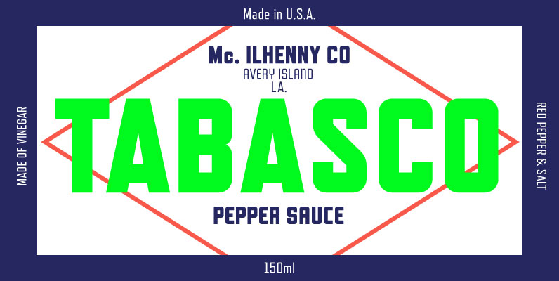
Refrigerator Deluxe (2008) was inspired by generic block-style lettering typical of the mid-20th century. It follows the typical American model that can be seen in old lettering manuals, although I designed it purely from memory. I originally released it in
Directors Gothic 220 Font
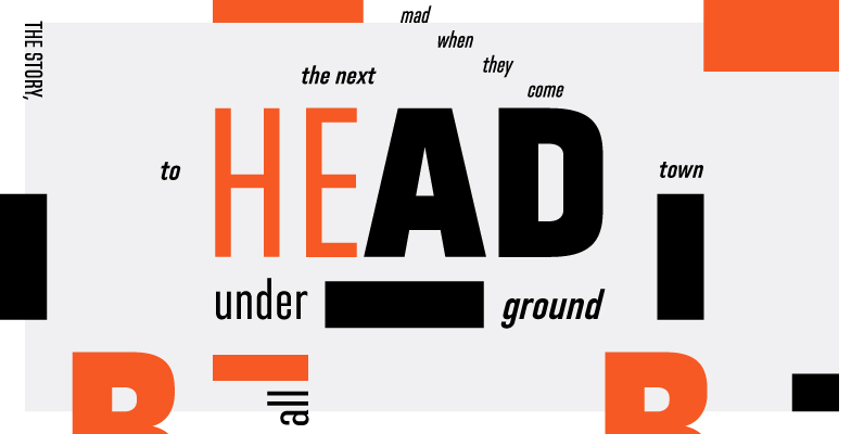
Handcrafted by Lettering Inc as part of its core library of typefaces in the 1930s, Directors Gothic was dramatically expanded throughout the lifetime of the company and remains a timeless classic. Inspired by the Art Deco movement popular at the
