Tag: geometric
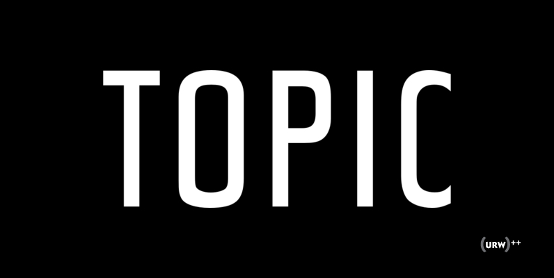
Topic Font
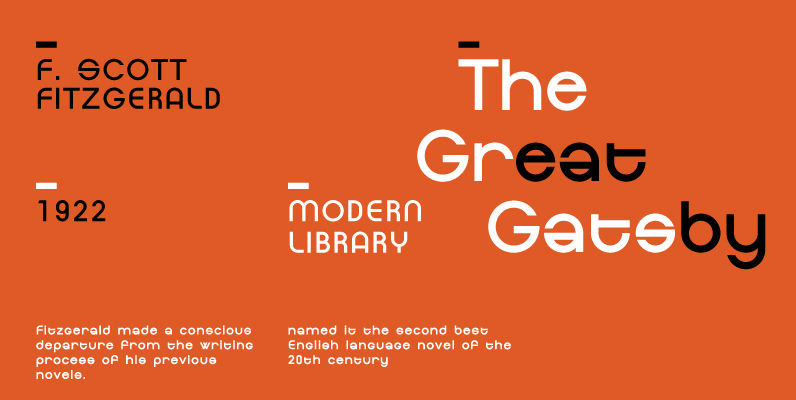
Designed by URW Studio in in 1995, Topic is a unique, effective and geometric sans. Topic works in both content and headline usage. Published by URW Type Foundry GmbHDownload Topic
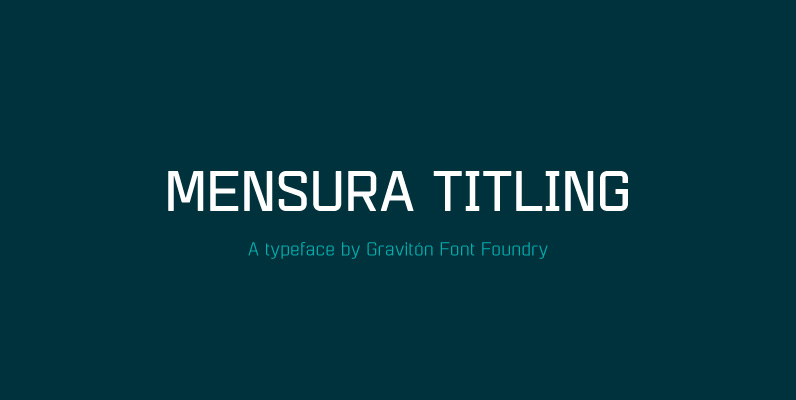
Mensura Titling Font
Mensura Titling font family is the display version of Mensura font family, it has been designed for Graviton Font Foundry by Pablo Balcells in 2013. Mensura Titling consists of 12 styles including italics. The styles included in the font have
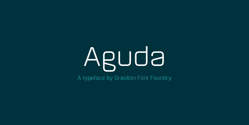
Aguda Font
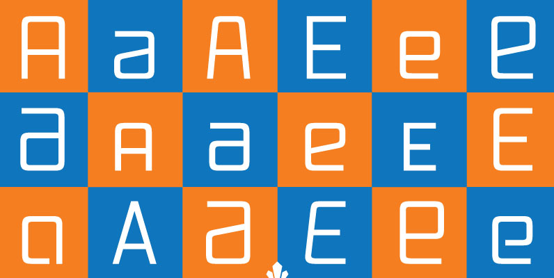
Aguda font family has been designed for Graviton Font Foundry by Pablo Balcells in 2014. It is a modular, geometric typeface which has been conceived to be primarily a display typeface, but given its clarity it can also be used
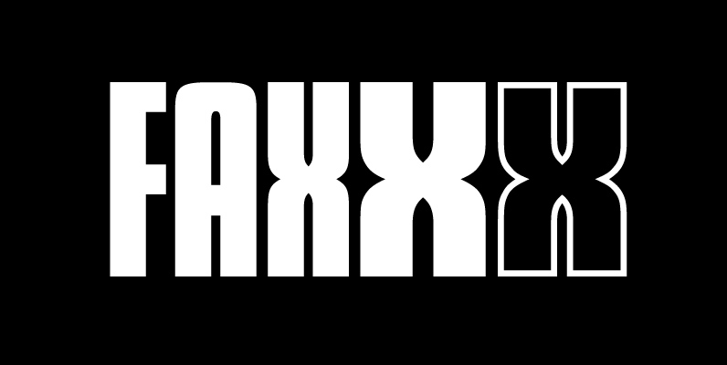
Futura Display Font
Released in 1932, Futura Display (Futura Schlagzeile) uses more angular strokes than the traditional design, resulting in rectangular letter forms. Designed by Paul Renner. Published by URW Type Foundry GmbHDownload Futura Display

Blippo Font
Blippo was designed by Joe Taylor for Fotostar in 1969 as a black version of Burko Bold, which itself is based on the unfinished design by the German Bauhaus school. The font was named Blippo Black by Joe’s boss, Robert
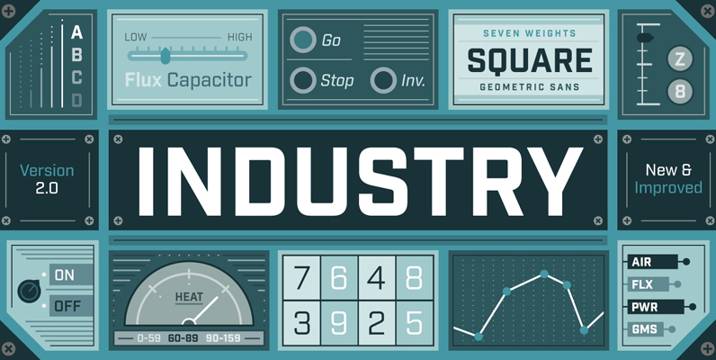
Industry Font
Forged from geometric and technical styles, Industry stands sturdy and strong. The sans serif family includes seven weights with corresponding italics. The typeface is meant to be a workhorse that can span from a refined vintage feel to an industrial
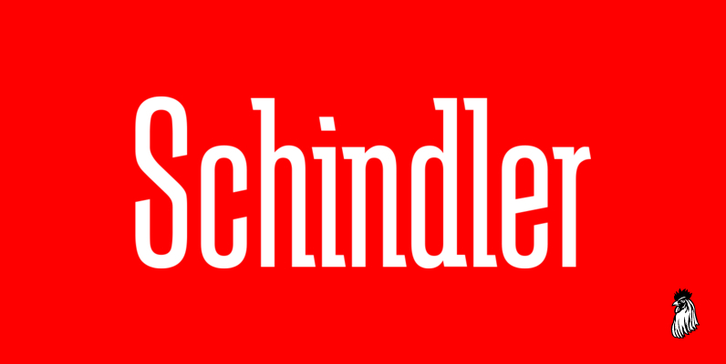
Schindler Font
Designed by Steve Jackaman, Schindler is an original font design released by Red Rooster. Published by Red RoosterDownload Schindler
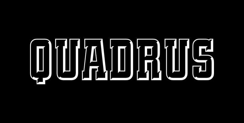
Quadrus Font
This condensed, open slab serif typeface was created by New York graphic designer Peter Fahrni, who was inspired by the lettering styles typical of baseball, basketball and football sportswear. It’s condensed feature offers widespread application potential, particularly for sports related
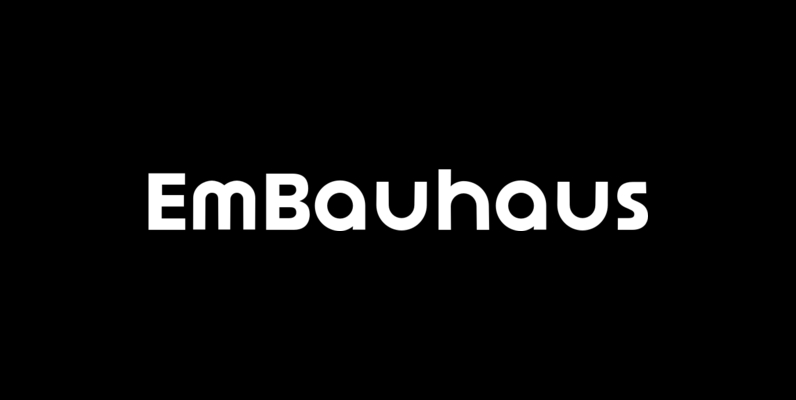
EmBauhaus Font
EmBauhaus is a display typeface, geometric in style, inspired by the face named after the world changing Bauhaus School. To aid readability I rethought the original typeface and closed all of the voids cut out of the strokes. We also
Dienstag Font
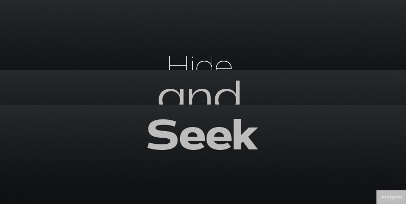
Dienstag is an extended sans-serif and a new companion to insigne’s popular Montag family. Dienstag is a bit more formal than its predecessor as it lacks Montag’s rounded terminators. Dienstag originally included four different weights, and this was expanded to
Torcao Font
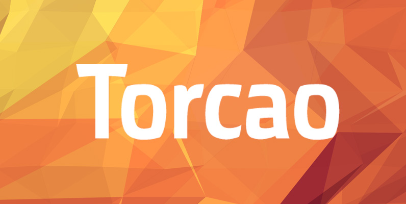
Torcao is not merely an experimental font, though. The figures have been crafted and refined into a functional, hard-working typeface that lends itself to many sizes and environments. The font family features a tall x-height and light modulation, which give
