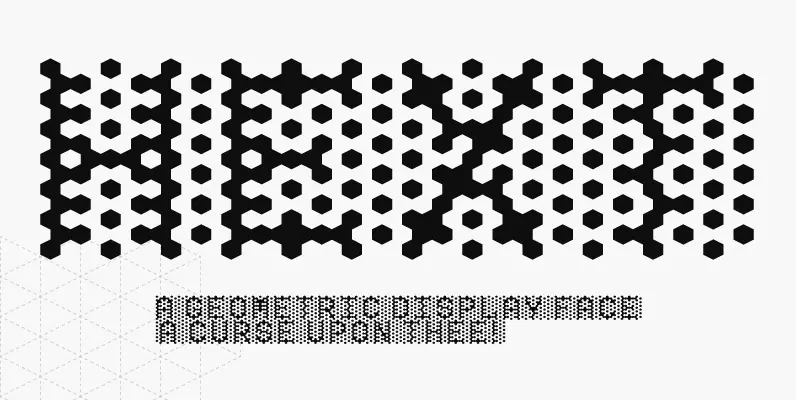
Tag: geometric
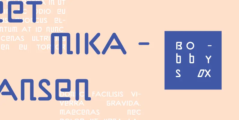
Bobbysox Font
Who would have thought that mixing roman and italic letterforms within the same font would work? Well, Bobbysox proves that you can, and with stunning results. Its designer, Alan Dempsey, has been creating letterforms for many years and his latest
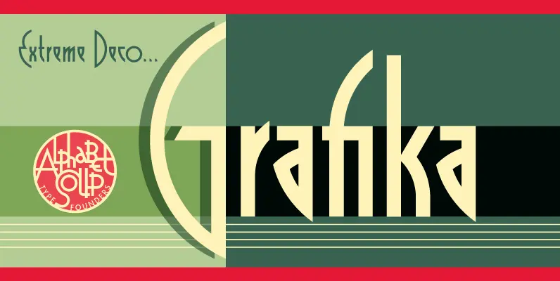
Grafika Font
Grafika is a completely original design, done in an Art Deco spirit reminiscent of the 1920s and 30s. Michael Doret designed Grafika many years ago to be typeset for both opening and end credits and for title cards for the
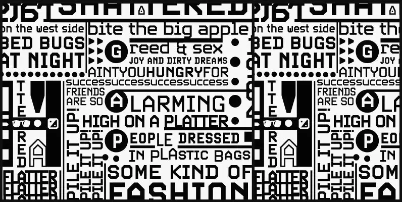
Screener Font
Game over. Insert coin to continue. 1 coin, 1 play. Credits 00. Screener is the latest child of arcade alphabets. Not too trendy, not too retro, not too stand-out, yet clear and fresh. Although it boasts plenty of the traits
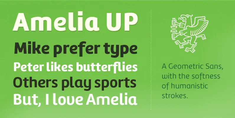
Amelia UP! Font
Amelia is a geometric sans, but it keeps the softness of humanistic strokes. The contrast and the differents styles alows Amelia to work as a text or display font. Also it incorporate a Up version, that incorporate calligraphic features that
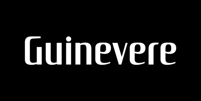
Guinevere Pro Font
Guinevere Pro is a typeface designed by Icelandic art director Sigurdur Armannsson. It started in 2001 as simple hand-drawn sketches of a few letters built from modules, then became an experiment with four goals: – Construct an original alphabet from
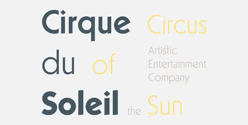
Kaapeli Font
I’ve had mixed feelings about Kabel; It is a brilliant headline font with a lot of character, but it’s the characters I have problems with. The versions of all big foundries have the same flaws (in my opinion), especially lowecase
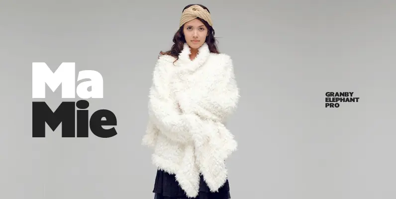
Granby Elephant Pro Font
Designed by Steve Jackaman & Ashley Muir. The Granby family of typefaces was first produced in 1930 by Stephenson Blake, Sheffield, UK. Granby Elephant contains all the high-end features expected in a quality OpenType Pro font. Published by Red RoosterDownload
