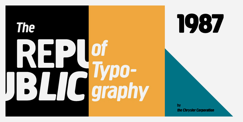
Tag: German
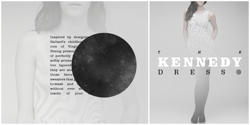
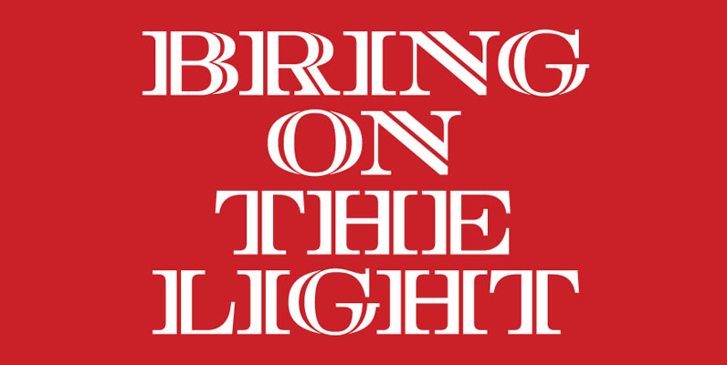
URW Clarendon Font
URW Clarendon is a family of 50 serif fonts for only $99. This version of Clarendon was released by URW Studio, (based on Hermann Eidenbenz’s version) in 1994. Clarendon is an English serif typeface that was originally created in England
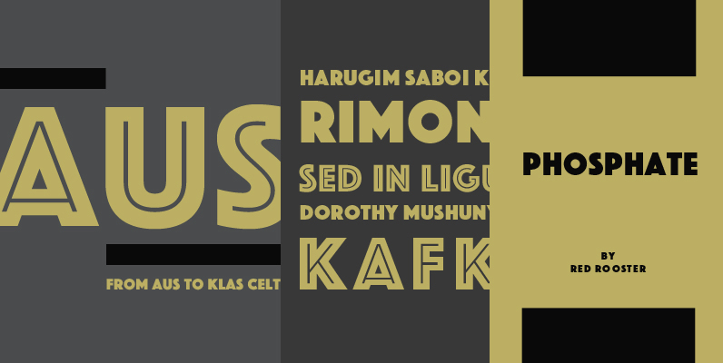
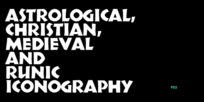
Phosphate Pro Font
Designed by Steve Jackaman. Based on the design Phosphor by J. Erbar, for Ludwig Published by Red RoosterDownload Phosphate Pro

Corporate A Font
The Corporate ASE typeface trilogy was designed by Prof. Kurt Weidemann, a well-known German designer and typographer, from 1985 until 1990. This superb trilogy consisting of the Corporate A (Antiqua), Corporte S (Sans Serif), and Corporate E (Egyptian) is a
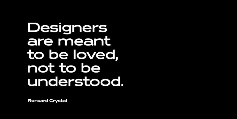
Ronsard Crystal Font
Designed by Steve Jackaman and Ashley Muir. The original Ronsard Crystal began its life as a single-weight photolettering font in the 1950s. We lliked it so much, that we decided to design four traditional weights to go with the original
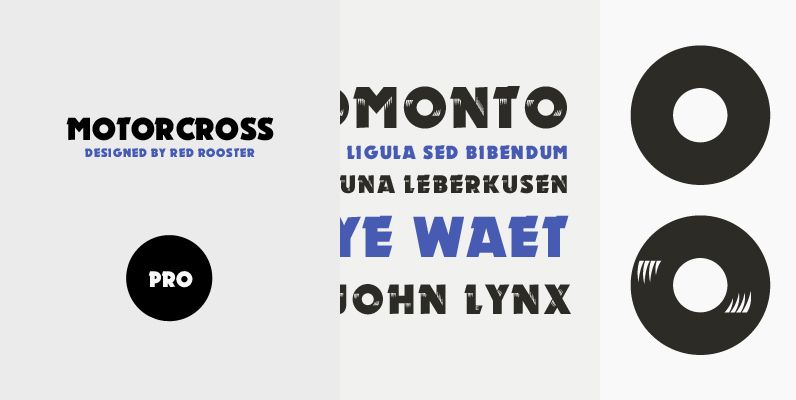
Motorcross Pro Font
Revival of the Ludwig & Mayer type design from 1930. Motorcross Pro includes over 800 glyphs and supports 131 languages. Published by Red RoosterDownload Motorcross Pro
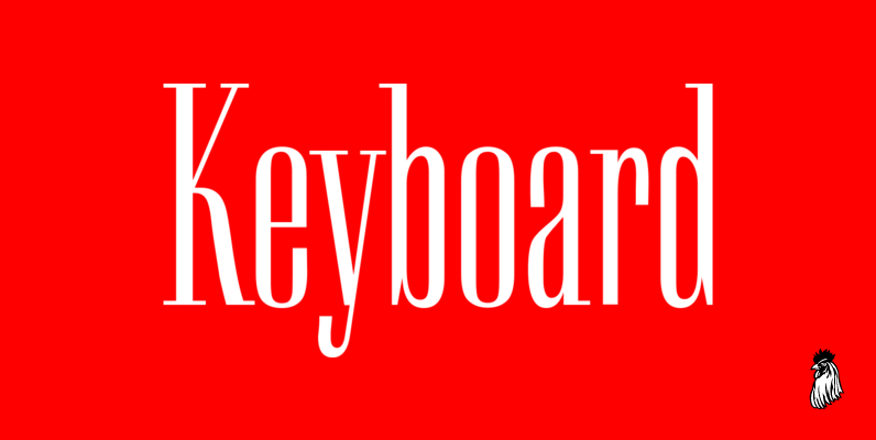
Keyboard Font
Keyboard was designed by Paul Hickson. This elegant serif release is based on the original design, circa 1951. Copyright International TypeFounders, Inc. Published by Red RoosterDownload Keyboard
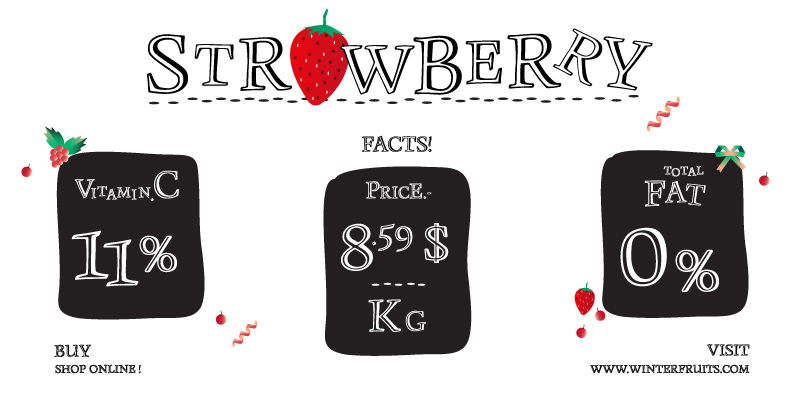
Monument Font
Monument is a titling version of Manuskript Antiqua, originally designed by Oldrich Menhart in 1952. Ralph M. Unger, who also redesigned Menhart’s Manuskript Antiqua, redrew, completed and digitally remastered Monument for profonts. Monument is also available as part of URW’s
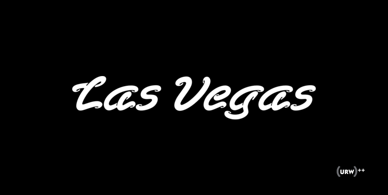
Las Vegas Font
Las Vegas is a playful, fluid and fun script originally designed URW in 1990. Works great in retro and t-shirt projects. Published by URW Type Foundry GmbHDownload Las Vegas

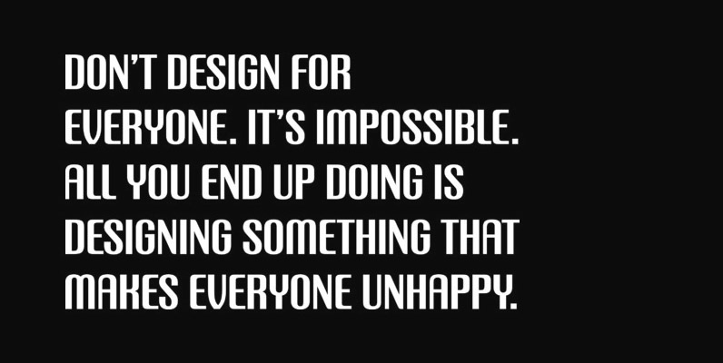
Aquarius Font
Designed by Steve Jackaman, Aquarius is based on the popular 1968 VGC typeface drawings. Published by Red RoosterDownload Aquarius
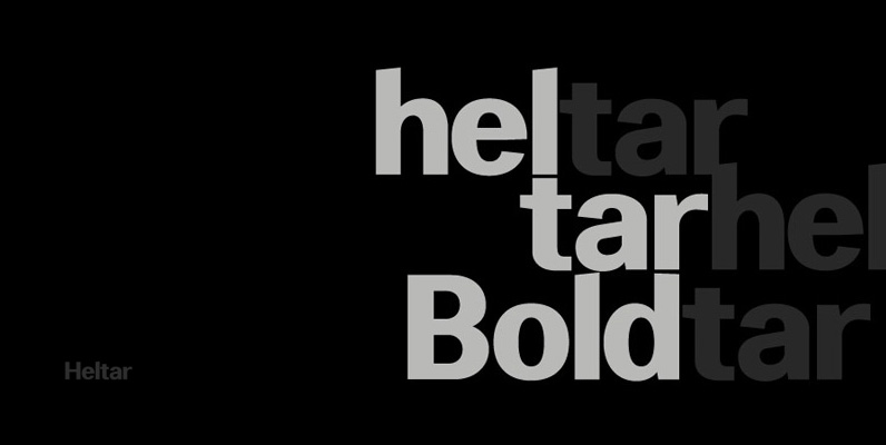
Heltar Font
A modern neo-grotesque typeface. Having grown up in Sheffield and been completely immersed in the work of The Designers Republic I became very drawn to their treatment of Helvetica, especially the close tracking of the letter space. This visual investigation
