Tag: German
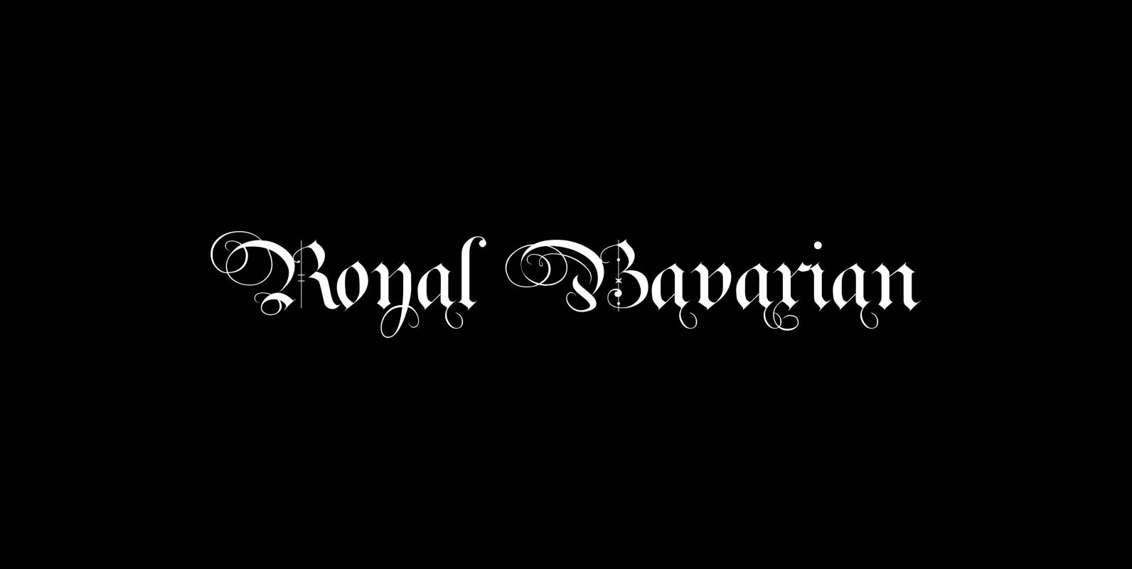
Royal Bavarian Font
“Royal Bavarian” was commissioned by King Ludwig 1st of Bavaria round about 1834. He was probably the greatest king Bavaria ever had, but he fell in disgrace for a short affair with the famous infamous “Lola Montez” and subsequently had

Soft Times Font
“Soft Times” has been easy on my nerves after the strain of “Hard Times”. The harder the Times are the more do we need some soft typefaces, this one is the soft counterpart for “HardTimes”. Published by Wiescher DesignDownload Soft
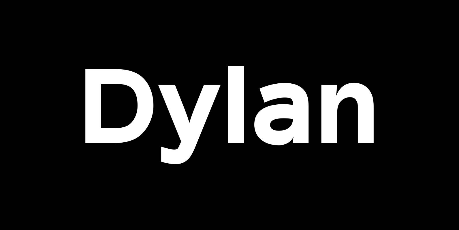
Dylan Font
“Dylan” is a Sans typeface in the best American tradition. In order to keep corners open and to make the font more readable in small sizes it has deep cuts where curves join straights. I designed 7 finely tuned weights
TT Teds Font
Teds is a geometric non-serif with narrow proportions created for universal application in any types of text. Relatively tall lowercase characters, open forms of semicircular characters, and low contrast between vertical and horizontal lines make this font type easy to
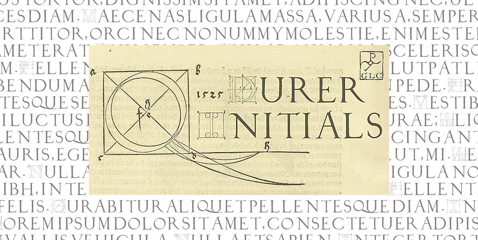
1525 Durer Initials Font
In 1525, Albrecht Dürer, the well known German great artist, was publishing the so called “Underweysung der Messung mit dem Zirckel und Richtscheyt”, printed in Nuremberg. This handbook explain with numeral figures how to drawn with compasses and ruler. A
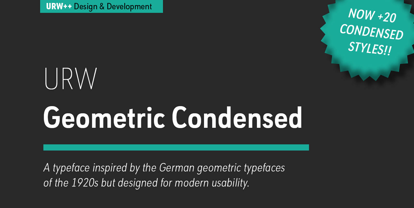
URW Geometric Condensed Font
URW Geometric Condensed is the matching complement for the URW Geometric. Including 20 additional condensed styles the URW Geometric Condensed is the space-saving alternative in the URW Geometric family. URW Geometric is a sans serif typeface inspired by the German
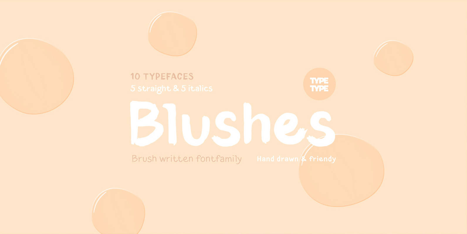
TT Blushes Font
Glitter, flashing cameras and fame – now you know how to deal with this stuff! Freshness and brightness is what defines the Blushes fontfamily, which is created for beauty and fashion industries. TT Blushes is a vibrant part of you
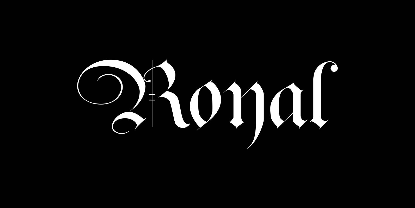
Royal Font
The “Royal Fonts” value pack contains the famous blackletter “Royal Bavarian”, “Ayres Royal”, “Royal Blossom” and “Monkey Initials”. Plus “Romain Royal” in two cuts, this used to be the text face once designed exclusively for the king of France, the
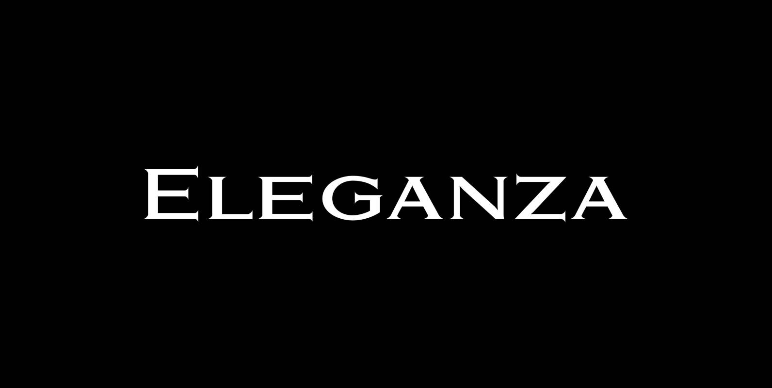
Eleganza Font
“Eleganza” is my most elegant typeface. At least that is what I think! I use it for business cards and everything that has to be elegant with that extra touch. The font comes in pairs for the price of one.

Hard Times Font
“Hard Times” has been hard work, designing a handmade typeface must always have the right balance between rough and smooth, specially with this Times-like face. It has the big European glyph-set, so that it can be used all over the
Bodoni Classic Font
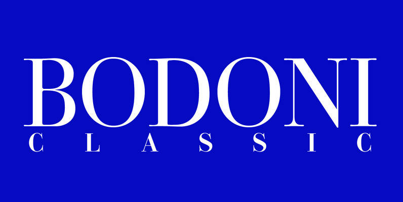
I became interested in designing Bodoni Classic because of a lazy graphic designer at Jacques Damase publishing house. He had to change a single letter on a bookcover about J. B. BODONI. The French call him Jean Baptiste instead of
Orbis Pro Font
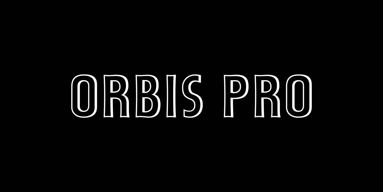
Walter Brudi’s elegant shadowed display font brought to life again and carefully extended with Baltic, Turkish and Central European character sets. Published by RMU TypedesignDownload Orbis Pro
Steinschrift Pro Font
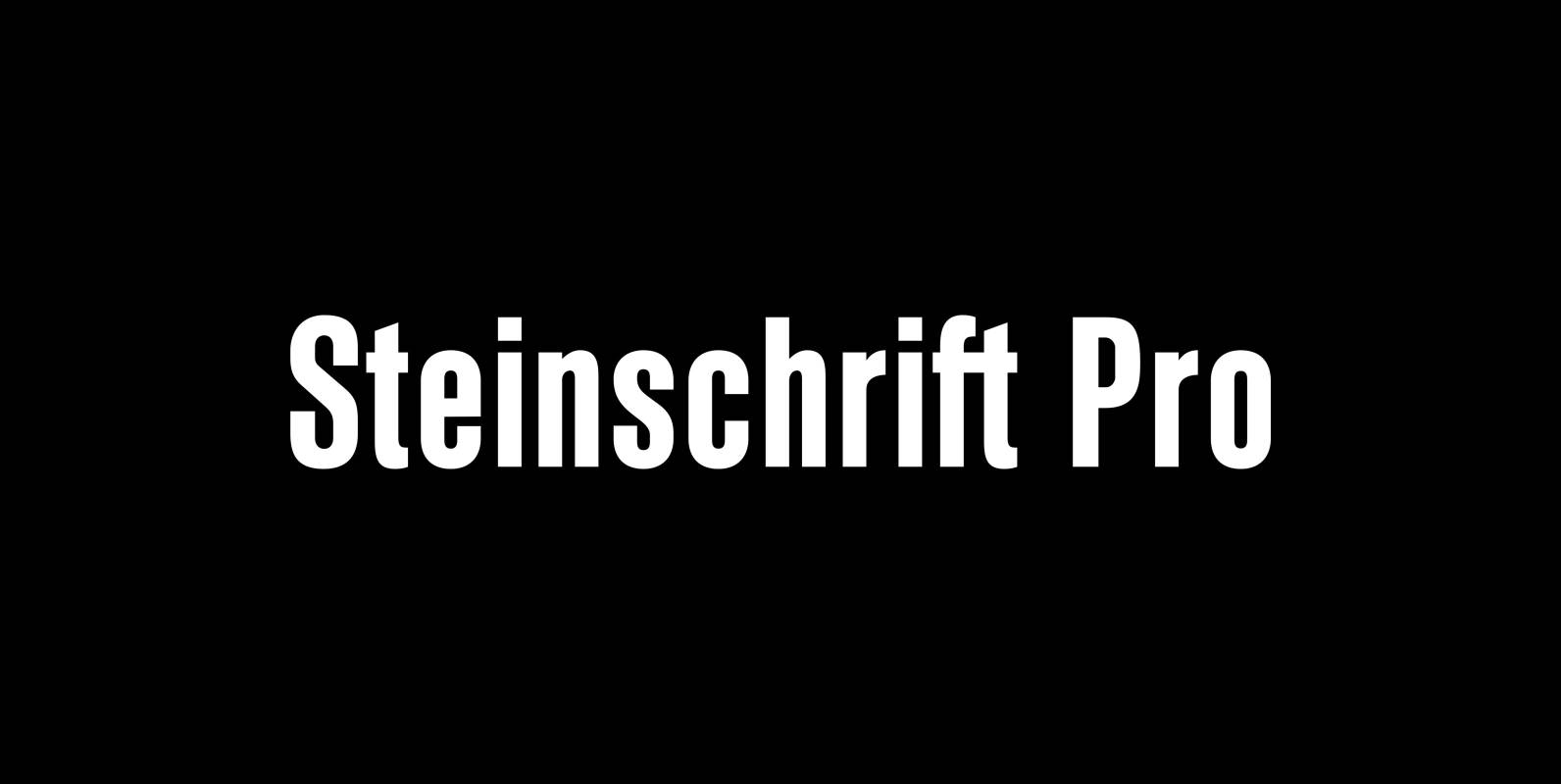
Steinschrift Pro is a versatile condensed and semibold sans serif font which, beside of West European, Central European, Baltic and Turkish character sets, comes with a Cyrillic set as well. It can be used in ads, book titles and headlines
Supra Rounded Font
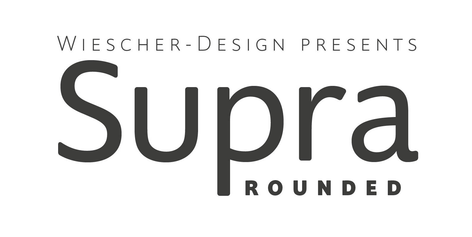
“Supra Rounded” is the newest addition to my big Supra family. It really rounds of the huge family with a friendly design, that makes it an excellent and elegant text-typeface. It is an OpenType family for professional typography with an

Emilia Font
Emil Rudolf Weiss’s 1920s Antiqua font family, redrawn and redesigned for nowadays use. This well-proportioned serif font family makes a good impression in ads, magazines and books. Published by RMU TypedesignDownload Emilia
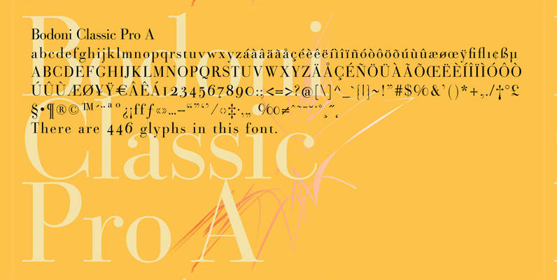
Bodoni Classic Pro Font
This is my new, completely worked over and fine-tuned Bodoni Classic for Europe (no Greek and Cyrillic). I have added a set of elegant Swashes (B) and 2 alternating uppercase swirly Initials (C) as well as two lowercase end-letters (D).
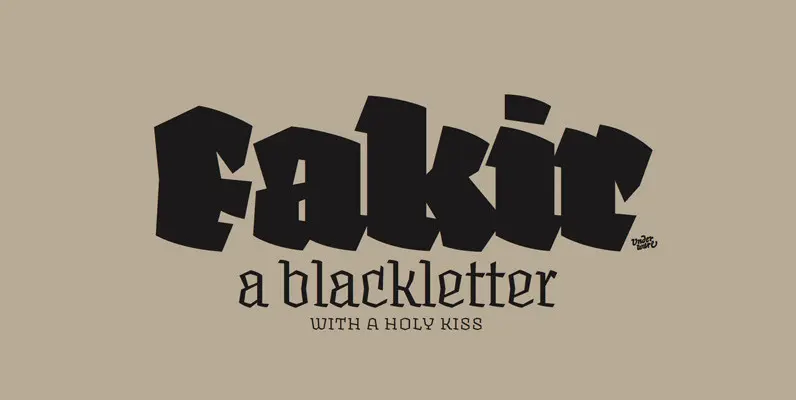
Blackletter Fonts Can Add Powerful Meaning to Your Project Font
Down go the house lights, and with an explosion of fire, the brutal assault of YWFT Fraktur washes over the congregation at sonic pressure levels that rattle teeth and break glass. This is the power of the deadlest elegance this
