Tag: German
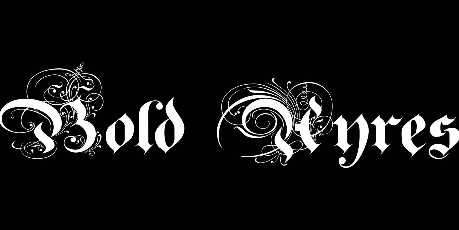
Bold Ayres Font
BoldAyres is the heavy version of my Ayres Royal that was inspired by famous calligrapher Ayres and a little bit by a Bavarian King. Published by Wiescher DesignDownload Bold Ayres
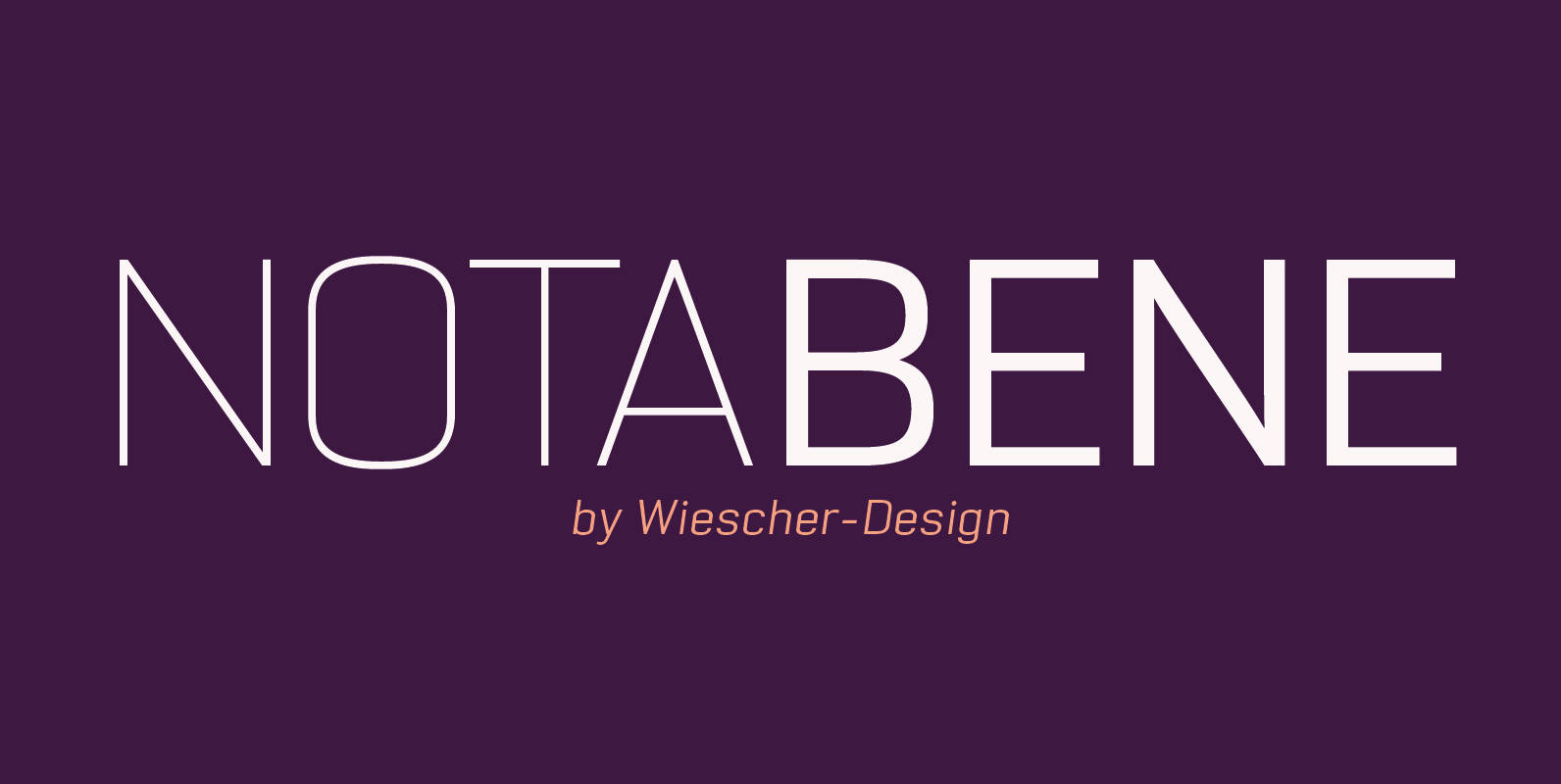
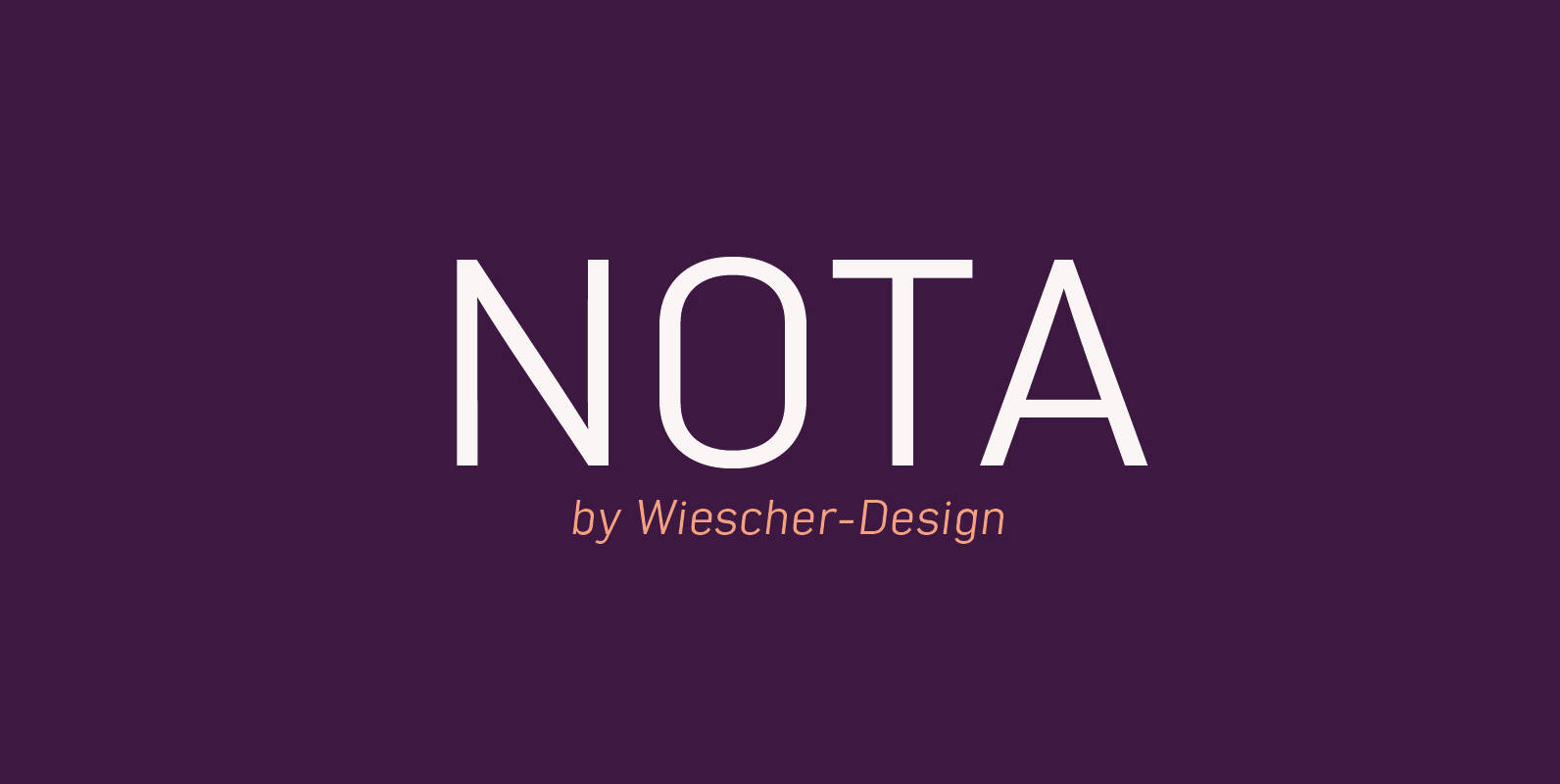
NotaBene Font
“NOTABENE” is a new, squarish, narrow, technical font– designed by Gert Wiescher in 2015 – has 7 weights with corresponding oblique cuts. “NOTABENE” is well suited for advertising, logo, billboards, small text, signage, branding, packaging, editorial, posters, web and screen
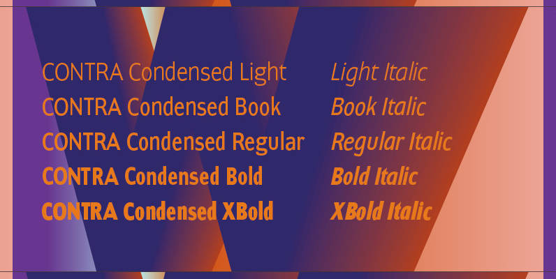
Contra Condensed Font
Contra Condensed is the condensed version of my Contra family of fonts. It is very condensed, but not yet narrow. It is well suited in all situations where one needs to save space. Published by Wiescher DesignDownload Contra Condensed
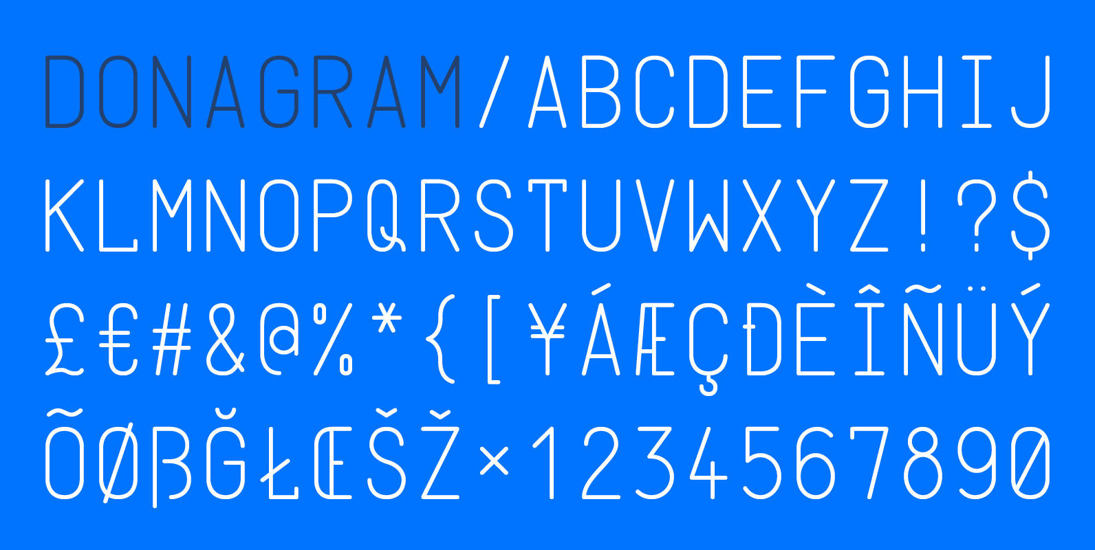
Donagram Font
Donagram is a typeface inspired by telegrams from the 1940s. Available in three weights, it’s roots are in the functional usage of the telegraph machine. Donagram has been developed into a modern, clean and elegant typeface. Published by AtworkDownload Donagram
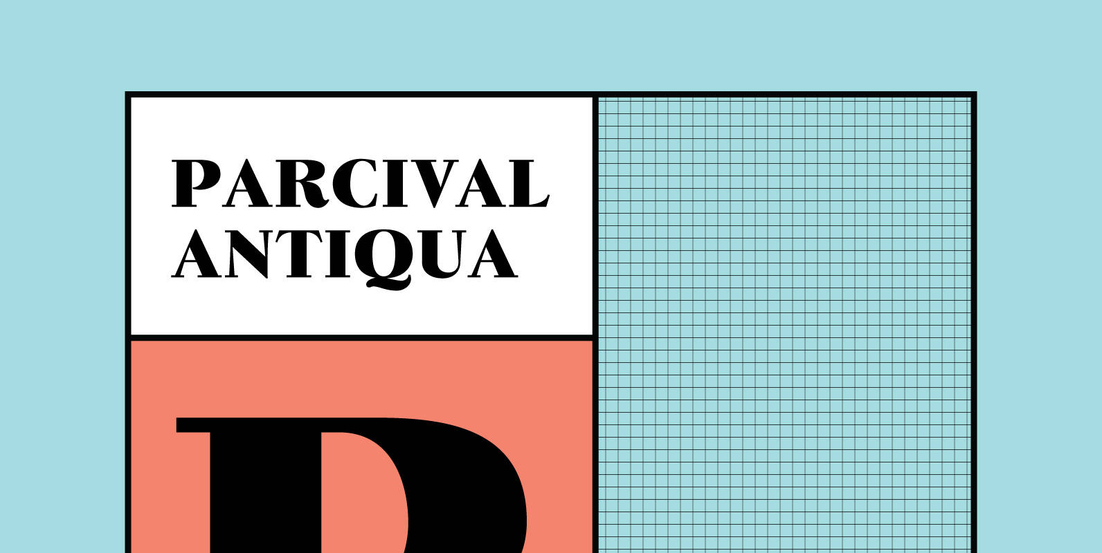
Parcival Antiqua Font
Schelter & Giesecke’s highly esteemed font family, cut by Thannhaeuser, freshly redesigned for present-day use. Published by RMU TypedesignDownload Parcival Antiqua
Erler Titling Font
Herbert Thannhaeuser’s 1953 titling font Erler Versalien which was distributed by Typoart in hot-metal times, was carefully redrawn and redesigned. Published by RMU TypedesignDownload Erler Titling
Navy Queen Font
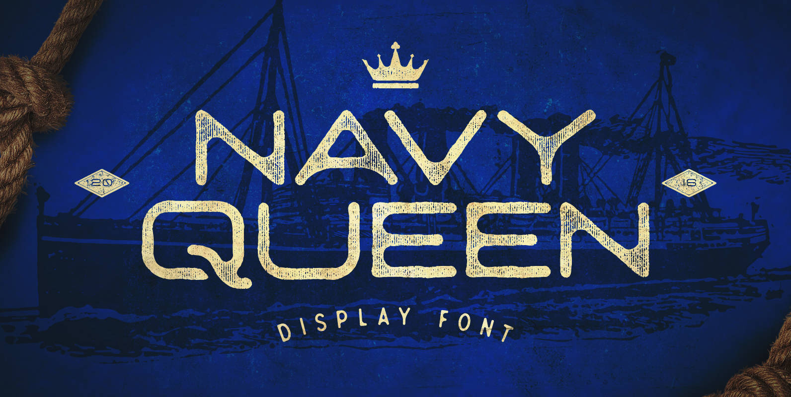
Navy Queen is a over-extended, geometrically designed sans serif display font that pays homage to simpler times. This font will act as a great addition to any vintage design project including posters, logos, crests, packaging, and so much more! Navy
Coop Blackletter Font
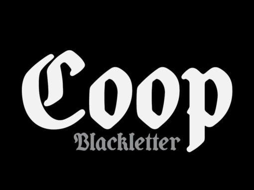
Coop Blackletter’s core concept was to create a more friendly blackletter typeface by pulling together two very different sources of inspiration. The design is a synthesis of the rounded, affable features and heavier weight of Cooper Black with the underlying
URW Geometric Font
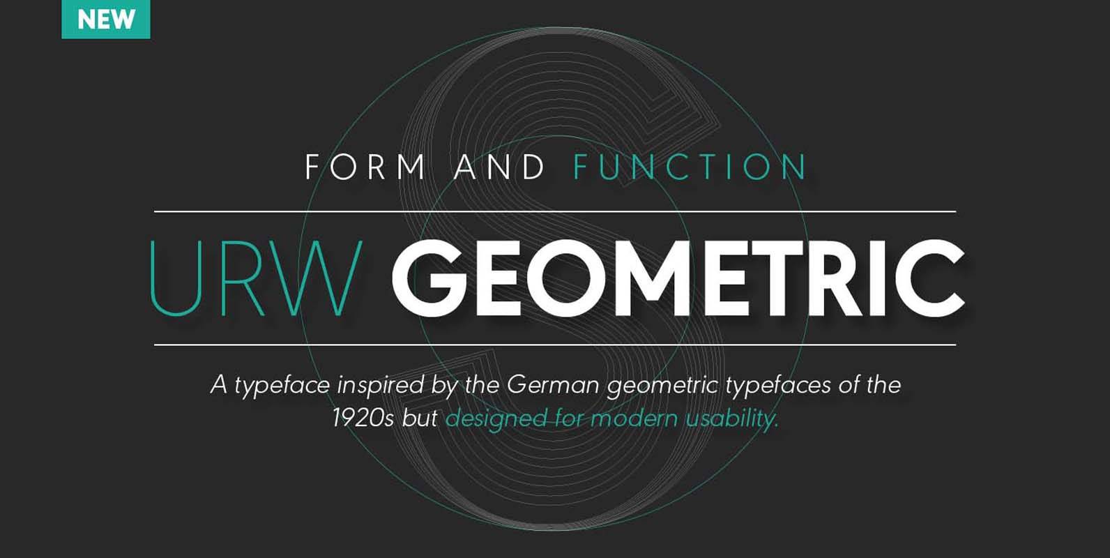
URW Geometric is a sans serif typeface inspired by the German geometric typefaces of the 1920s but designed for modern usability. The character shapes have optimized proportions and an improved balance, the x-height is increased, ascenders and descenders are decreased.
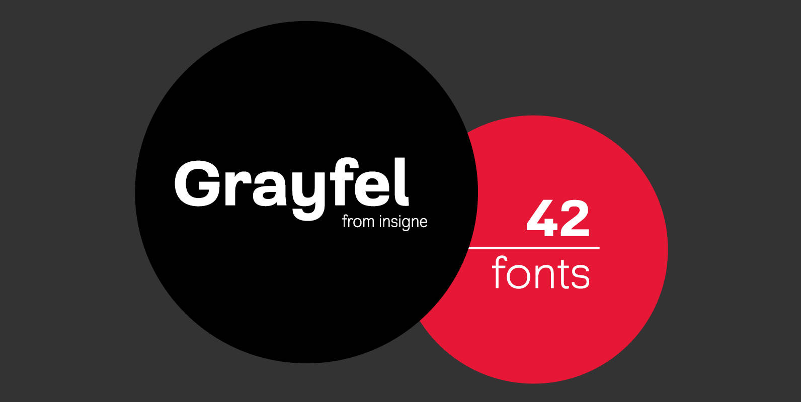
Grayfel Font
As designers, we seek perfection and originality. The more we step back and look at our work, the more changes we tend to find necessary. Drastic modifications are inevitable. The same is true of Grayfel. Grayfel began as an exercise
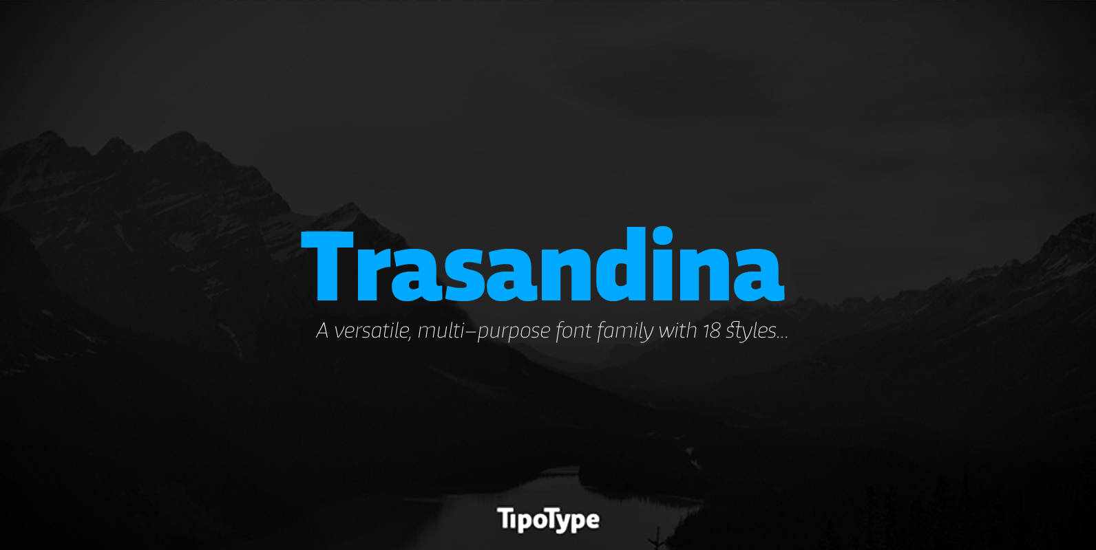
Trasandina Font
Trasandina is a very unique font-family: a modern, versatile, workhorse typeface with a special personality, given by the mix of humanist and geometric models, remaining far from both extremes. This typeface has 9 styles plus their matching italics, it has
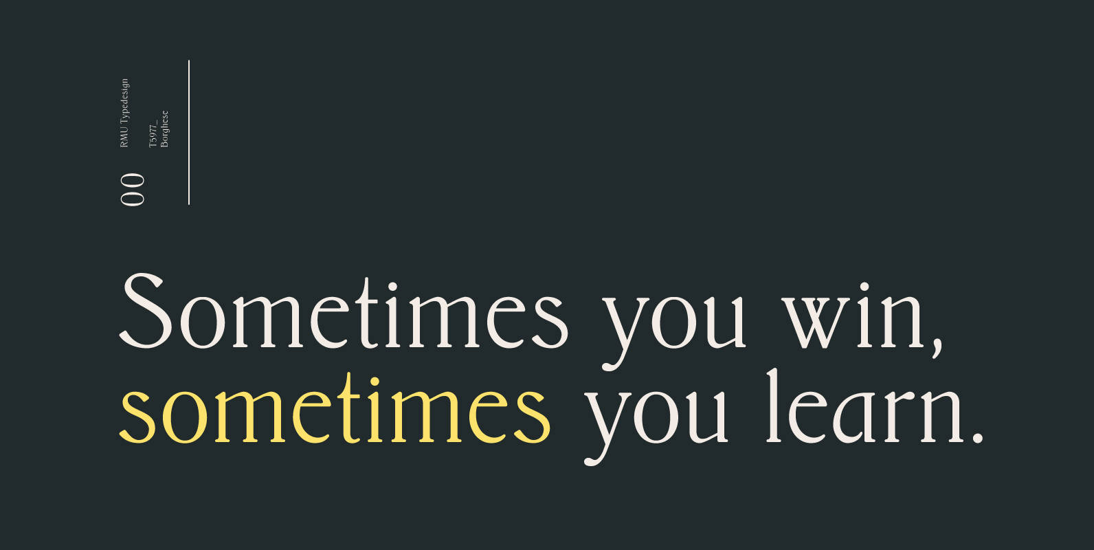
Borghese Font
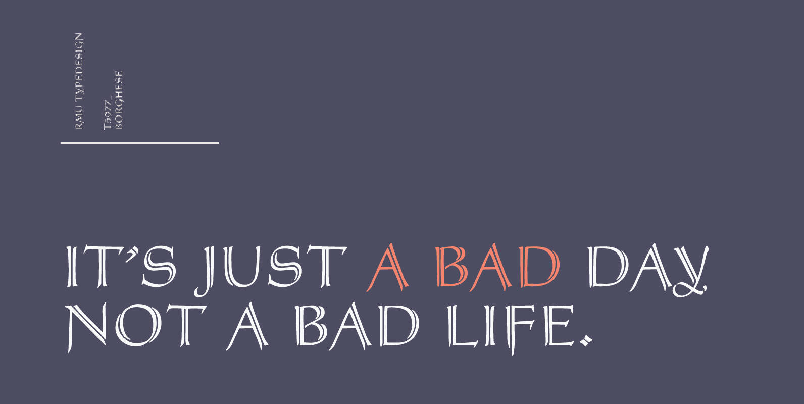
Borghese – a 1904 Schelter & Giesecke font in Art Nouveau style was completely redesigned and is an ideal body text companion of display fonts from the same era. Published by RMU TypedesignDownload Borghese
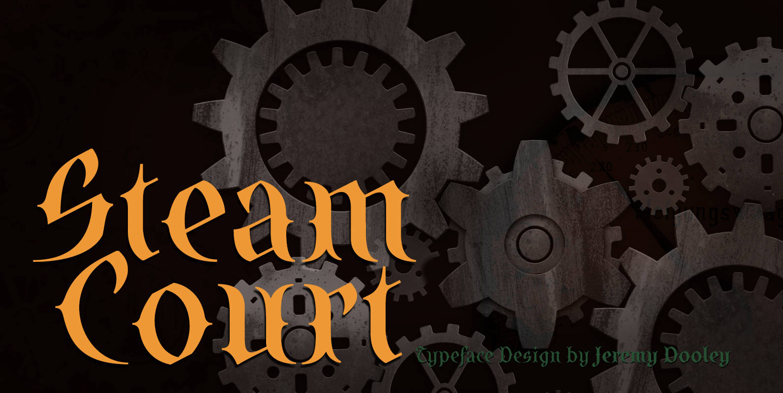
SteamCourt Font
A bit of background if you will: In early 2014, some friends from my college days banded together to form their own game company. Their first launch? A current Kickstarter they named SteamCourt. I love Kickstarter. It’s a fantastic platform,
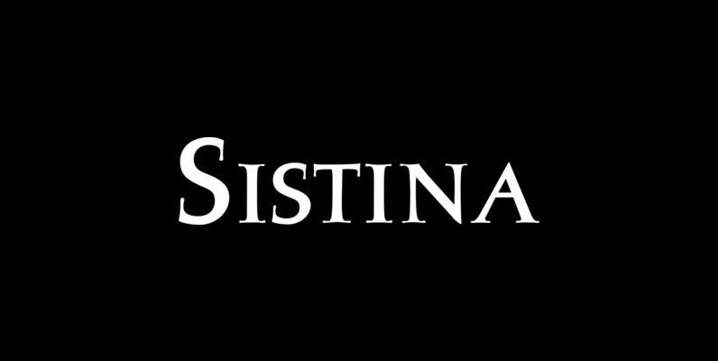
Sistina Font
Sistina, designed by Hermann Zapf in 1950 was first named Aurelia Titling. It is a heavy supplement to the Michelangelo Titling based on studies of inscriptions in Rome. First released in hotmetal at D. Stempel AG, Frankfurt in 1951, Sistina
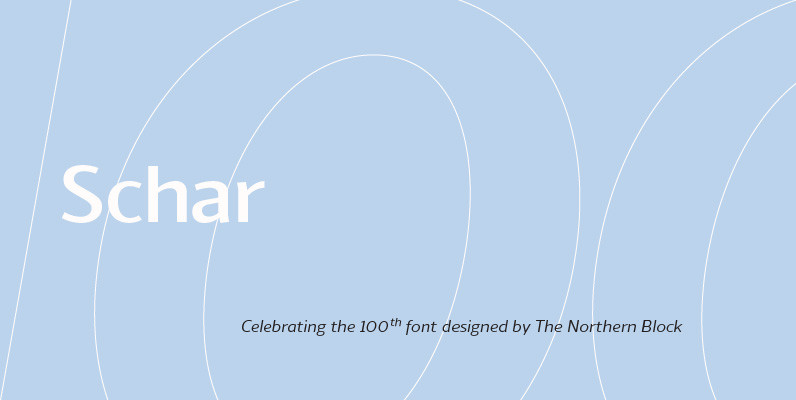
Schar Font
A humanist sans designed like a serif with high-stroke contrast, but without serifs. Calligraphic forms and consistent angle axis are combined to create a fluid and dynamic personality. Schar is a balanced sans serif with classic proportions ideally suited for
