Tag: gothic
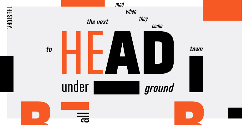
Directors Gothic 220 Font
Handcrafted by Lettering Inc as part of its core library of typefaces in the 1930s, Directors Gothic was dramatically expanded throughout the lifetime of the company and remains a timeless classic. Inspired by the Art Deco movement popular at the
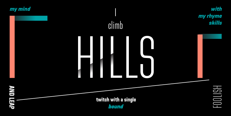
Directors Gothic 250 Font
Handcrafted by Lettering Inc as part of its core library of typefaces in the 1930s, Directors Gothic was dramatically expanded throughout the lifetime of the company and remains a timeless classic. Inspired by the Art Deco movement popular at the

Chubbet Distended Font
Chubbet (pr. Chub-bay) Distended is the extended version of Chubbet . The Chubbet weight starts off plumper than plump, then it expands inward until there is a minimal amount of positive space. Published by Emboss FontsDownload Chubbet Distended
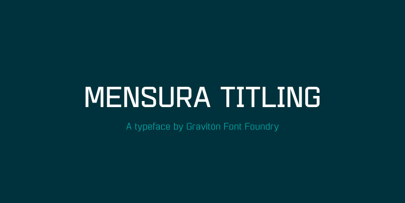
Mensura Titling Font
Mensura Titling font family is the display version of Mensura font family, it has been designed for Graviton Font Foundry by Pablo Balcells in 2013. Mensura Titling consists of 12 styles including italics. The styles included in the font have
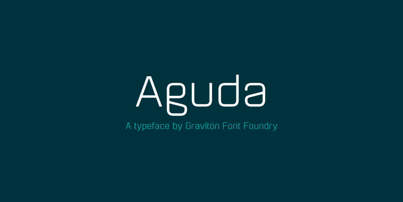
Aguda Font
Aguda font family has been designed for Graviton Font Foundry by Pablo Balcells in 2014. It is a modular, geometric typeface which has been conceived to be primarily a display typeface, but given its clarity it can also be used

HGB Lombardisch Font
In mediaeval times, Lombardic initials were popular for embellished upper case in handwriting. Also, in ancient print products of the reanaissance, like e.g. in the Schedelschen Weltchronik of 1493, Lombardic initials were used to mark indentions. In other cases, Lombardic

LTC Goudy Sans Font
Goudy Sans Bold was originally designed by Fredric Goudy in 1922 as a less formal “gothic” and finished in 1929. The light was designed in 1930 and the Light Italic in 1931. Alternate letterforms are included in these three Goudy
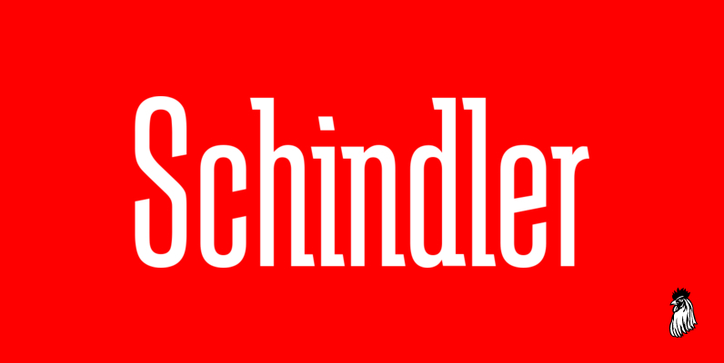
Schindler Font
Designed by Steve Jackaman, Schindler is an original font design released by Red Rooster. Published by Red RoosterDownload Schindler
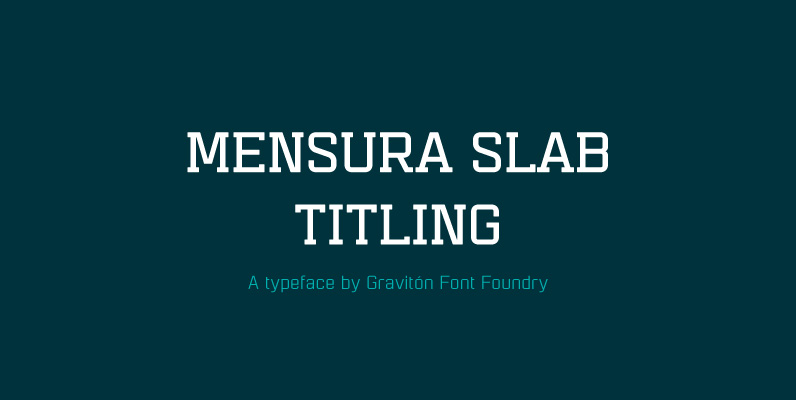
Mensura Slab Titling Font
Mensura Slab Titling font family is the display version of Mensura Slab font family, it has been designed for Graviton Font Foundry by Pablo Balcells in 2014. Mensura Slab Titling consists of 12 styles including italics. The styles included in
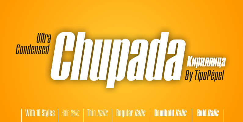
Chupada Font
Chupada is an ultra-condensed font family noted for their exaggerated x-height, which consists of five different weights, accompanied by their italic version. It contains all the central european characters and Cyrillic. Chupada with its bold semi-modular forms make it ideal
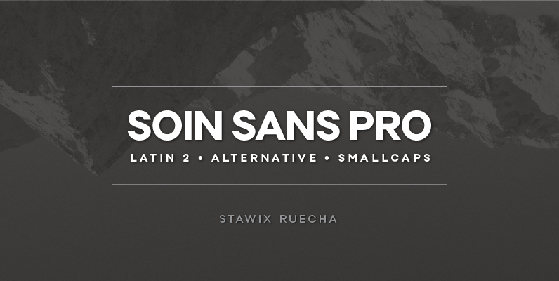
Soin Sans Pro Font
Soin Sans Pro is a clean and modern sans-serif design by Stawix Ruecha. Published by STAWIXDownload Soin Sans Pro
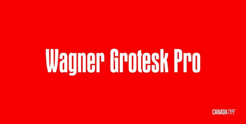
Wagner Grotesk Pro Font
This is the elaborate digital version of Edel Grotesque Bold Condensed (also known as Lessing, Reichgrotesk, and Wotan Bold Condensed) a 1914 typeface by Johannes Wagner, which was later adopted by pretty much every European type foundry, exported into the
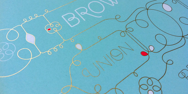
Brownstone Sans Font
One design sparks another. As Alejandro Paul experimented with the strokes and curves of the monoline script Business Penmanship, he discovered interesting new forms and shapes that didn’t fit the Spencerian theme of that typeface. These forms simmered in Ale’s
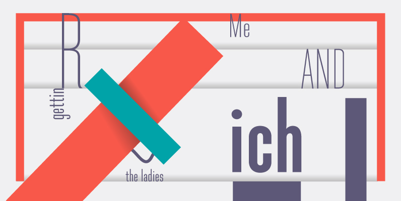
Directors Gothic 210 Font
Handcrafted by Lettering Inc as part of its core library of typefaces in the 1930s, Directors Gothic was dramatically expanded throughout the lifetime of the company and remains a timeless classic. Inspired by the Art Deco movement popular at the
