Tag: graceful
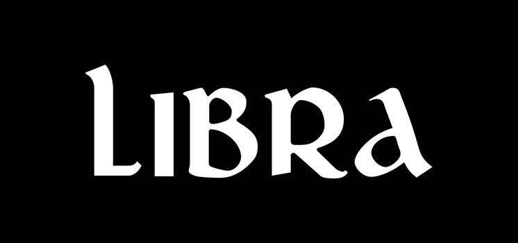
Libra Font
Libra is a font design released for the Mecanorma Type Collection. Copyright 2004 Trip Productions BV. Published by MecanormaDownload Libra
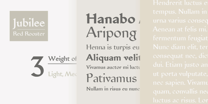
Jubilee Font
Designed by Paul Hickson. Designed by the famous English (type designer) Eric Gill, it was created specially for the Silver Jubilee Wedding Anniversary announcement of George VI and Queen Mary. Published by Red RoosterDownload Jubilee
Hauser Script Font
Designed by George Hauser, Hauser Script was digitally engineered by Steve Jackaman from original Ludlow drawings, circa 1936. Published by Red RoosterDownload Hauser Script
Elisar DT Infant Font
Elisar DT Infant is a sans-serif font design, published by DTP Types Limited. Published by DTP Types LimitedDownload Elisar DT Infant

Delargo DT Pro Font
Delargo DT Pro is a sans-serif font design, published by DTP Types Limited. Published by DTP Types LimitedDownload Delargo DT Pro
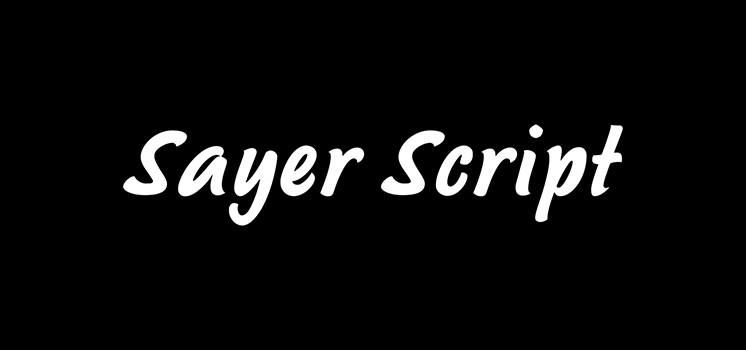
Sayer Script Font
Sayer Script is a font design released for the Mecanorma Type Collection. Copyright 2004 Trip Productions BV. Published by MecanormaDownload Sayer Script
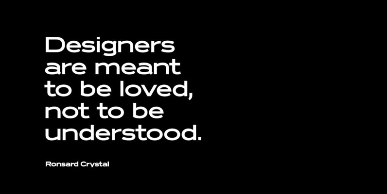
Ronsard Crystal Font
Designed by Steve Jackaman and Ashley Muir. The original Ronsard Crystal began its life as a single-weight photolettering font in the 1950s. We lliked it so much, that we decided to design four traditional weights to go with the original
Creighton Font
Designed by Steve Jackaman and Ashley Muir. It was our initial intention to develop a suitable lowercase for Les Usherwood’s ‘Elston’ typeface, based on a few characters from an old German typeface called Hermes Grotesque (Woellmer, Berlin). However, the new

Delargo DT Rounded Font
Delargo DT Rounded is a sans-serif font design, published by DTP Types Limited. Published by DTP Types LimitedDownload Delargo DT Rounded
Sovba Font
Sovba is an amiable rounded sans-serif inspired by handwriting. Sovba is useful for a look that is uniquely casual, fresh and smooth. Sovba simplifies character forms down to their basic characteristics, and has a strong, silky smooth forward motion. Sovba
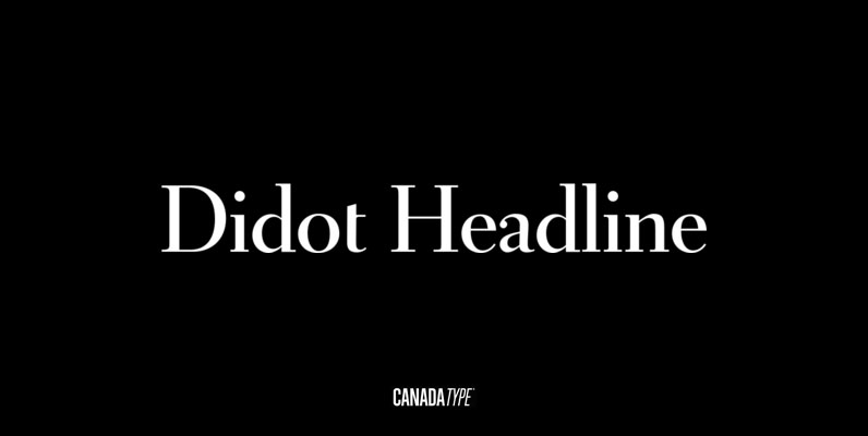
Didot Headline Font
In spite of its name, this font family embodies the ultimate classic modern advertising typeface, rather than concern itself with revivalism or Didone authenticity. Naturally the spirit of the original Didot faces still exists in this family, but over twelve
Orpheus Pro Font
The original Orpheus design by Walter Tiemann (1926-1928, Klingspor) was certainly a masterpiece. Unfortunately, like so many typefaces of that between-wars era, it got overlooked when type technology changed over to film, and once again when digital type came around.

Goudy Old Style DT Font
Goudy Old Style DT is a serif font design, published by DTP Types Limited. Published by DTP Types LimitedDownload Goudy Old Style DT
Fellowship Font
Named in tribute to the members of the American Typecasting Fellowship, this font is an original expression of Jim Rimmer's left-handed calligraphy. It was designed and cut in 24 p in the early 1980s, then cast as foundry type on
Cotillion Pro Font
Cotillion is an original design Jim Rimmer finished just before the turn of the century. Alongside its evidence of Jim's nostalgia at the deco type designs he was exposed to as a child, it distinctly shows a type designer who

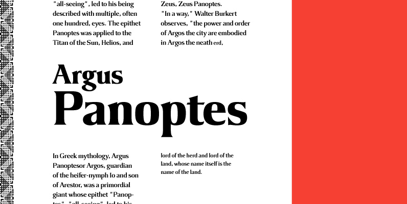
Argus Font
Designed by Steve Jackaman, Argus is a serif design based on the popular 1968 VGC typeface. Published by Red RoosterDownload Argus
Lombriz Font
Lombriz attempts to bridge the gap between different kinds of typography – including packaging, signage, and sporting. The result is a heavy, yet casual, 1950s-inspired semi-connected script. The freestyle Lombriz feels friendlier, more readable, and a touch more ‘real’ than