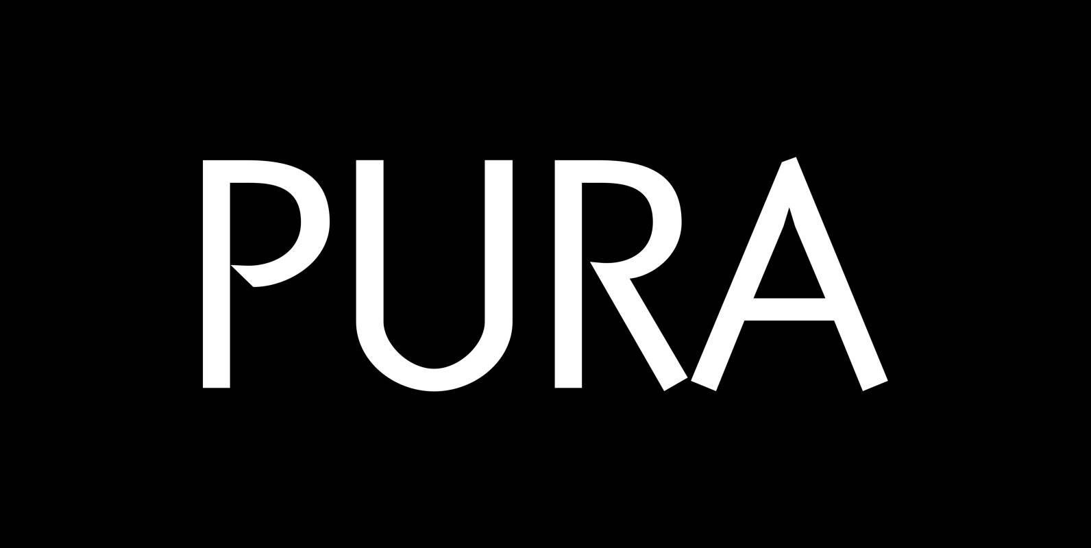
Tag: grotesk

Gerlach Sans Font
As the foundry’s new flagship family, Gerlach Sans was named after the highest peak in Slovakia. Its functional design is enhanced by a few subtle ingredients, adding life and giving words a more playful voice. The family has eight weights
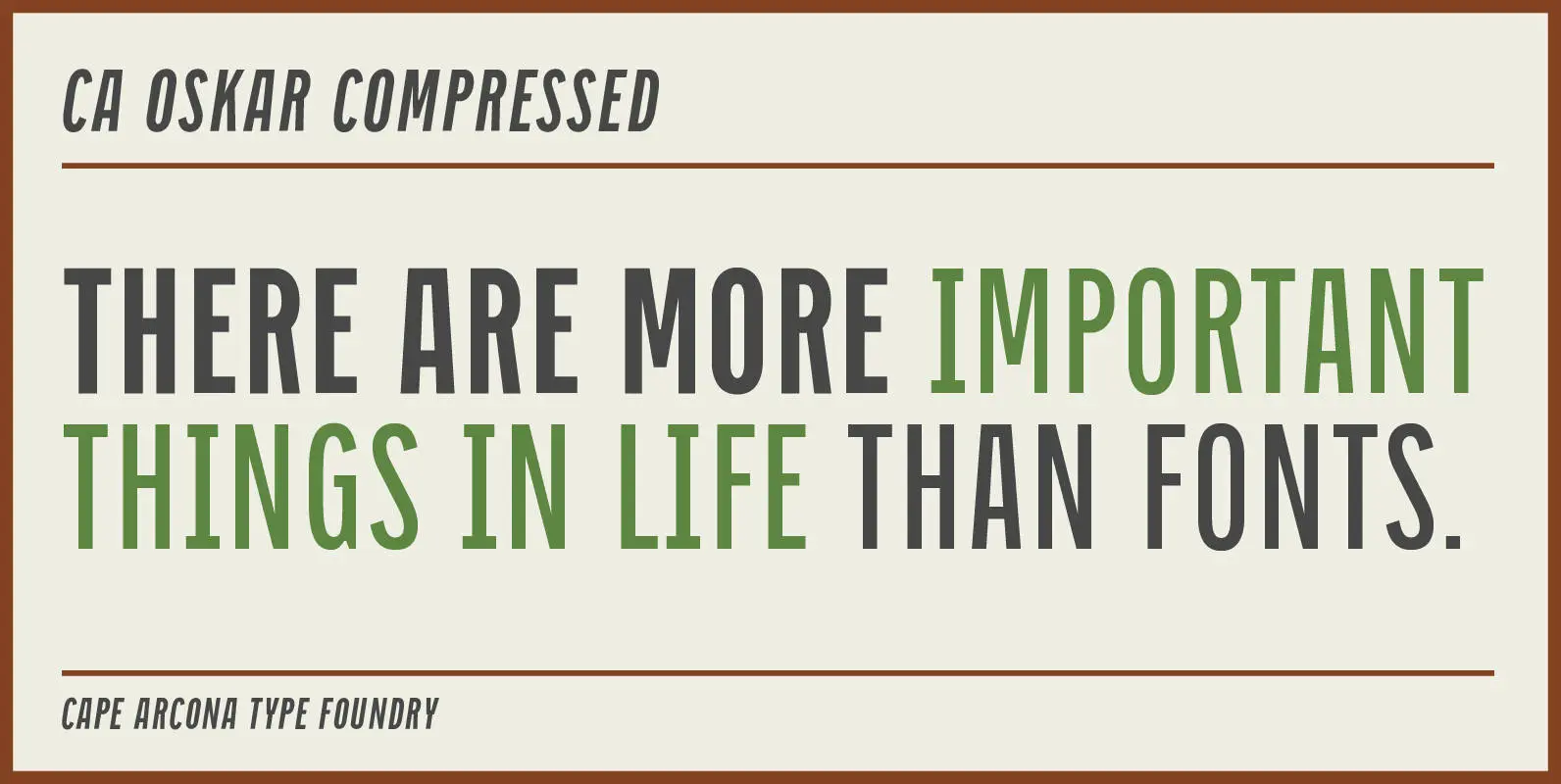
CA Oskar Compressed Font
CA Oskar came into being as a custom typeface for the international Traumzeit music festival. As a substantial part of the new corporate identity, it had to be characteristic, but also flexible in use. Starting with the design of compressed
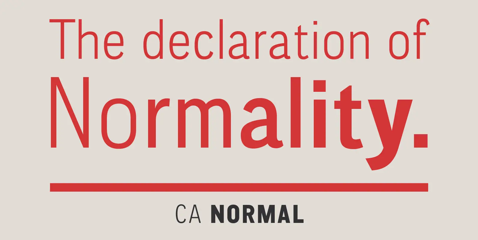
CA Normal Font
CA Normal is a typeface aiming for beauty without ostensible effects, merely relying on clarity and well balanced proportions. It merges influences from European grotesques and American gothics, breeding an experimental mongrel. The underlying concept stays in the background, giving
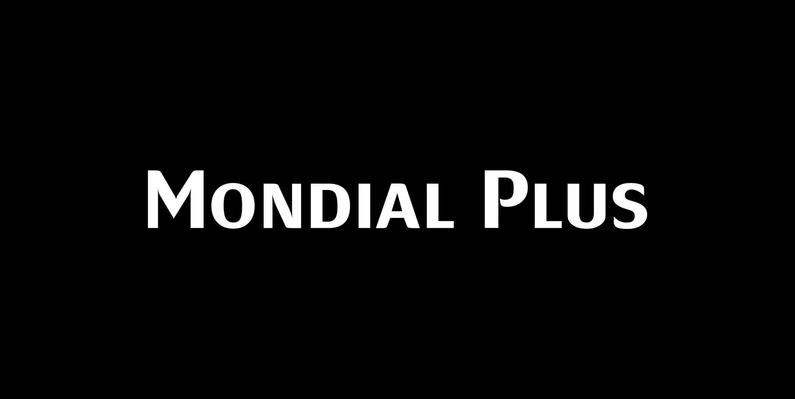
Mondial Plus Font
Mondial Plus is – as the name implies – a font meant for the whole world. Mondial Plus is the newer and better version of Mondial. Mondial Plus is designed to work in small sizes for body text. Only in
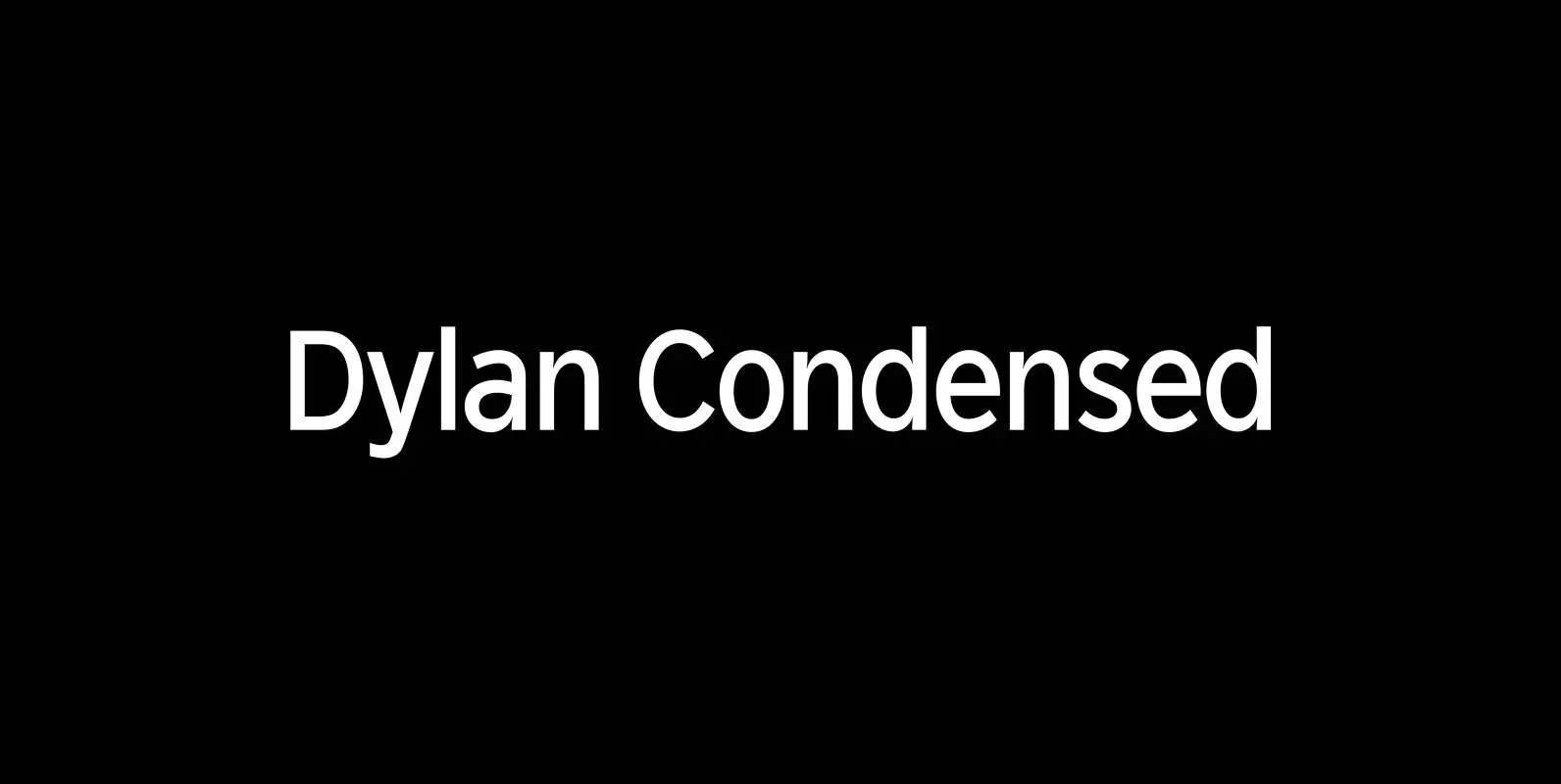
Dylan Condensed Font
Dylan is a Sans typeface in the best American tradition. In order to keep corners open and to make the font more readable in small sizes it has deep cuts where curves join straights. I designed 8 finely tuned weights
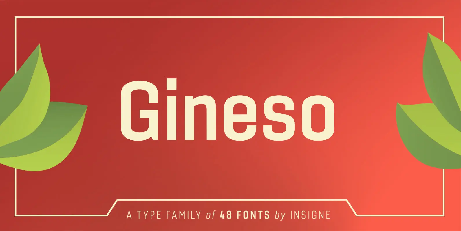
Gineso Font
Michaelangelo. da Vinci. Bellini. Rafael. Masters of Italian art whose names have dwarfed those of many other great Italian artists. Yet relics from these other artists remain, though often unnoticed because of their practical nature. These unknowns are the Italian
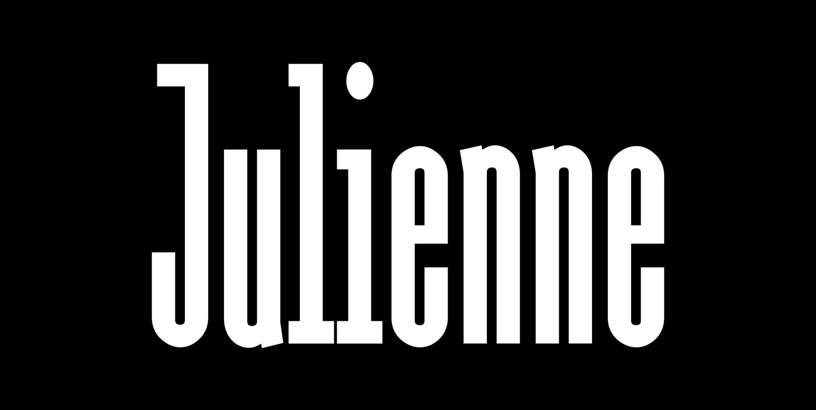
Julienne Font
Cooks call thinly cut – like matchsticks – vegetables »Julienne«. I found that was a fitting name for this very narrow typeface. Julienne Slim is the extreme cut of the two. Personally I do not use narrow typefaces very often,
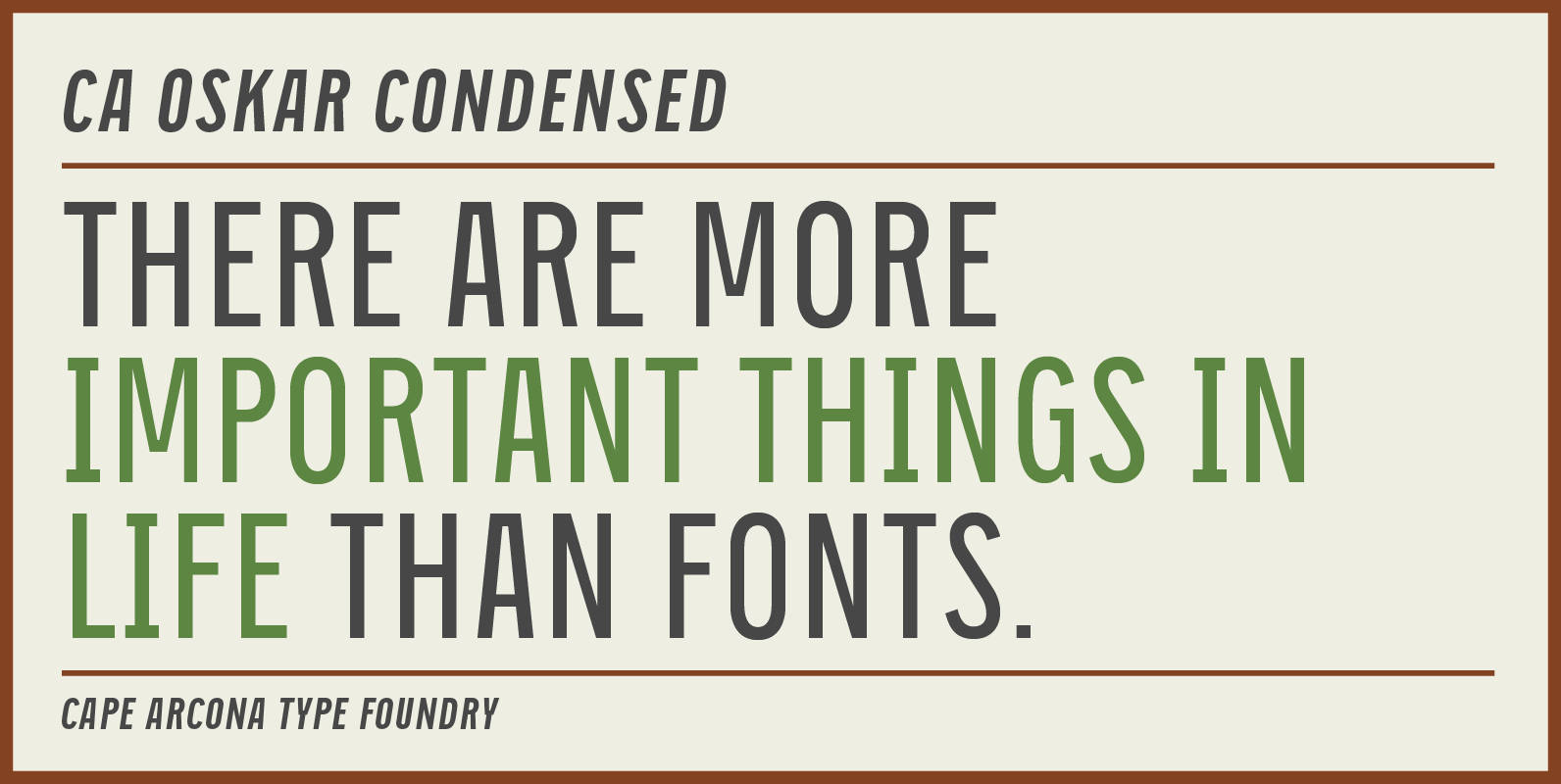
CA Oskar Condensed Font
CA Oskar came into being as a custom typeface for the international Traumzeit music festival. As a substantial part of the new corporate identity, it had to be characteristic, but also flexible in use. Starting with the design of compressed
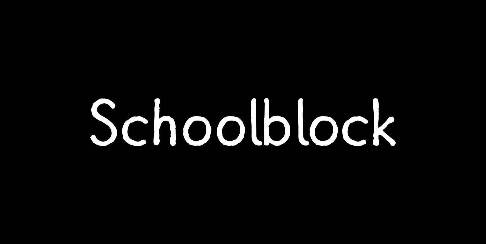
Schoolblock Font
“Schoolblock” is the typeface German schoolchildren learn to imitate when they are taught the “printed” letters. Published by Wiescher DesignDownload Schoolblock
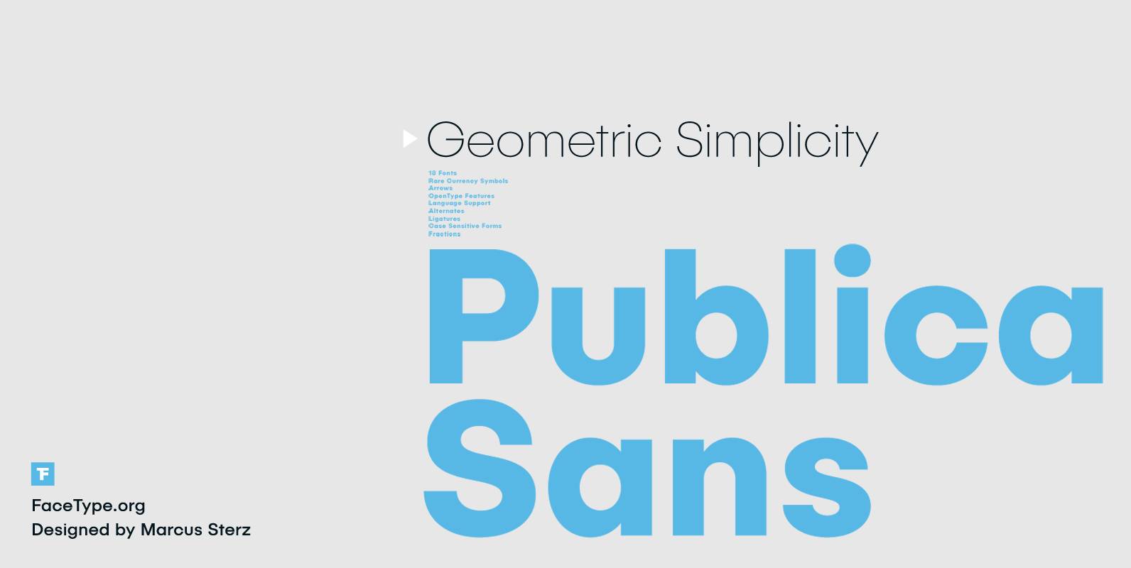
Publica Sans Font
Publica Sans is a clean geometric typeface, equipped with a variety of OpenType features to give you all you need for great typography: Alternates, arrows, rare currency symbols, case sensitive forms, various sets of figures and discretionary ligatures. Alternates: Give
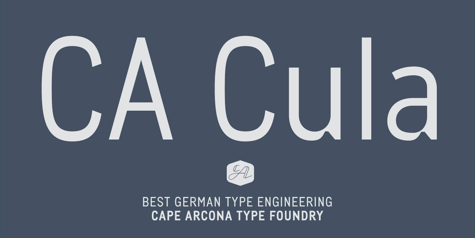
CA Cula Font
CA Cula is standing in the tradition of cool tempered sans serif typefaces like DIN. But at a closer look it reveals a tendency towards rounder reading-friendly forms. The denaturalized ink traps give CA Cula a very special and individual
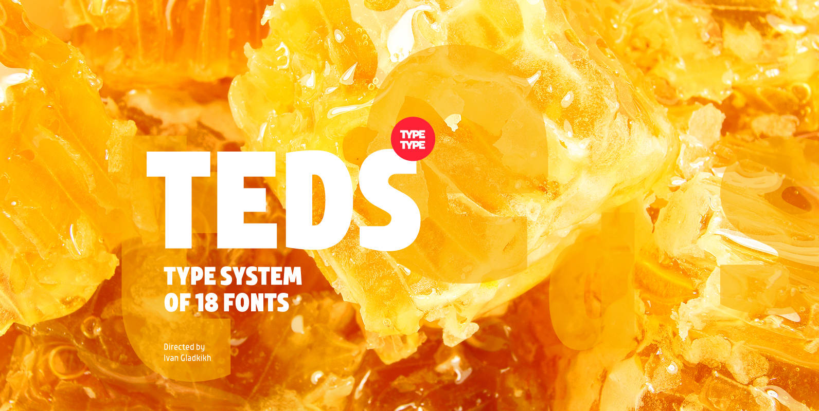
TT Teds Font
Teds is a geometric non-serif with narrow proportions created for universal application in any types of text. Relatively tall lowercase characters, open forms of semicircular characters, and low contrast between vertical and horizontal lines make this font type easy to

