Tag: grotesk
Queulat Font
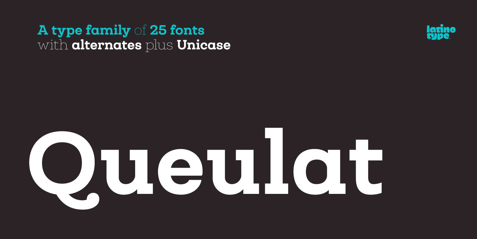
Queulat is a hybrid typeface that combines two different styles, reflecting charm, freshness and, especially, a strong personality. The font is inspired by Modern and Grotesk styles. The former is shown in some characteristic features such as teardrop terminals, which
Alpha Echo Font
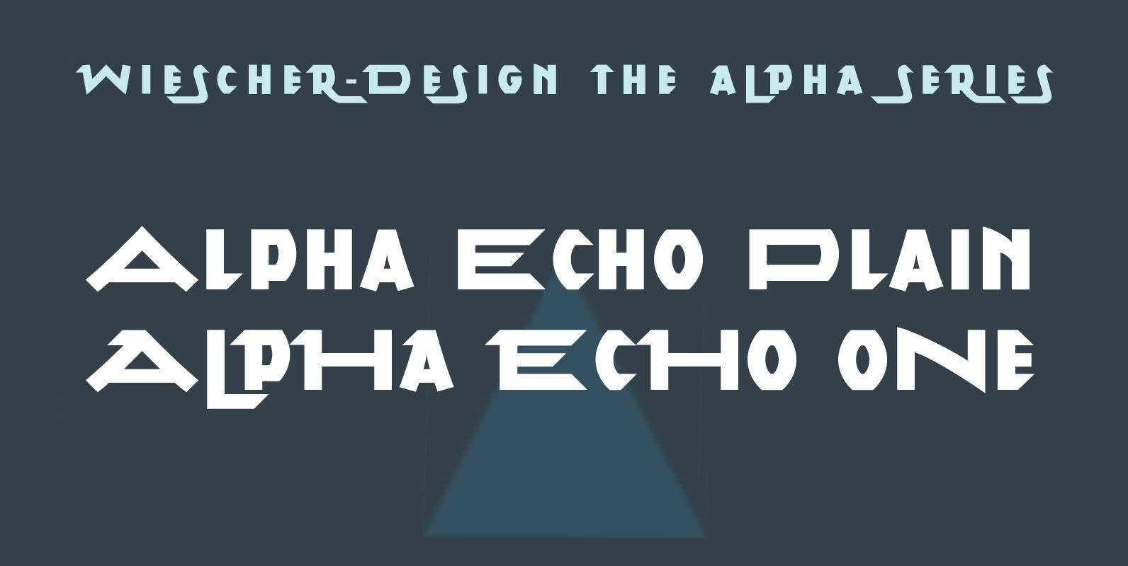
“Alpha Echo” is another of my experimental typefaces. Very stretched and pointed with wide and narrow capitals only. For additional mixability I designed a set of swashes. Everything mixes with everything. Give it a try, it is very interesting. Published
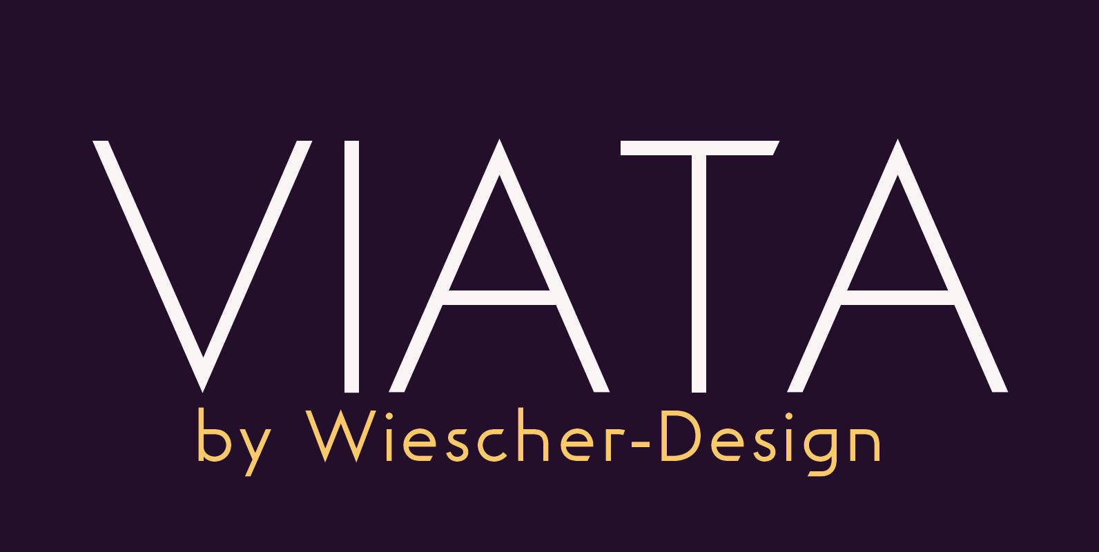
Viata Font
“VIATA” is my new experimental Sans again based on the modernistic, constructivist letterforms of the “Bauhaus” era. The names Herbert Bayer and Paul Renner come to mind as design beacons of that time. “VIATA” has flat tops and round bottoms,
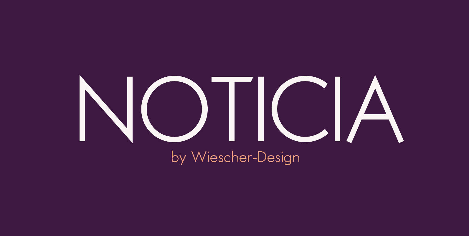
Noticia Font
“NOTICIA” is my new Sans based on the modernistic, constructivist letterforms of the “Bauhaus” era. The names Herbert Bayer and Paul Renner come to mind as design beacons of that time. “NOTICIA” is different in its proportions and long ascenders
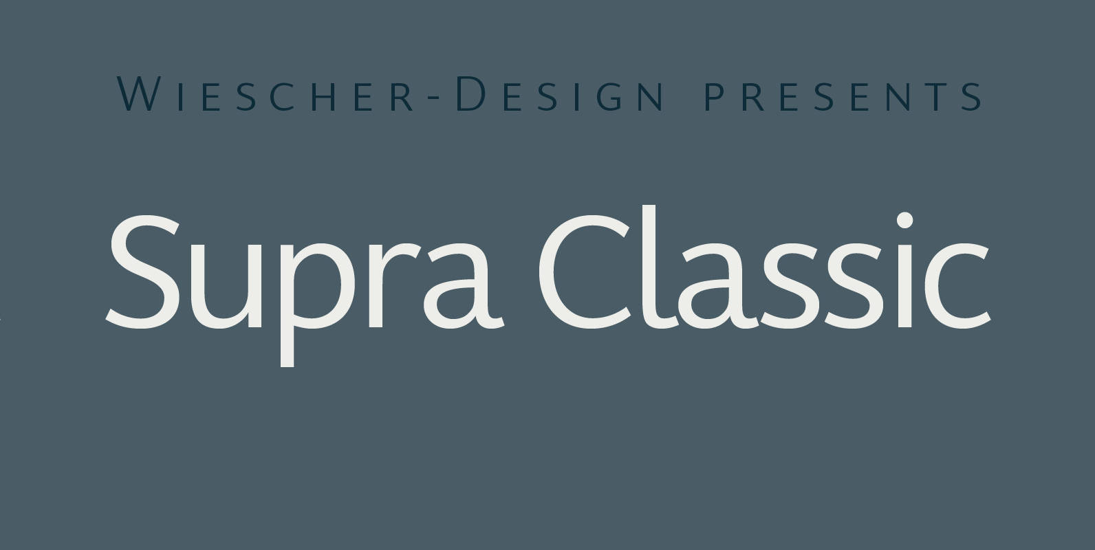
Supra Classic Font
“Supra Classic” designed by Gert Wiescher in 2014 – has 10 weights with corresponding italic cuts. The designs elegant contrast in the up- and downstrokes makes for better legibility and a pleasing personality. The dominant x-height with its high ascenders

Supra Condensed Font
“Supra Condensed” designed by Gert Wiescher in 2013 – is the condensed version to this new sans typeface family of eight weights with matching italics. The condensed version is designed for space-saving typography but with high legibility in mind. The

Blitz Font
A very glitzy Blitz! I always wanted to design a typeface that was top heavy, but I never new how not to make it look like Antique Olive, until recently I had an idea. My new family is very readable
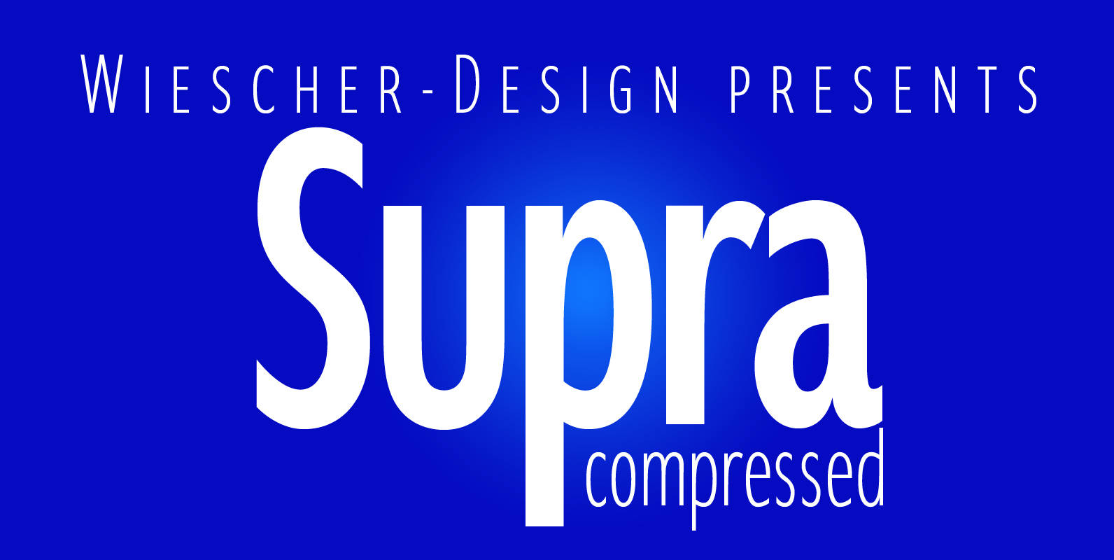
Supra Compressed Font
“Supra-compressed” designed by Gert Wiescher in 2013 – is the extreme version of this family. But despite it being very slim it is still – because of its openness – a very readable font. The light and normal weights and
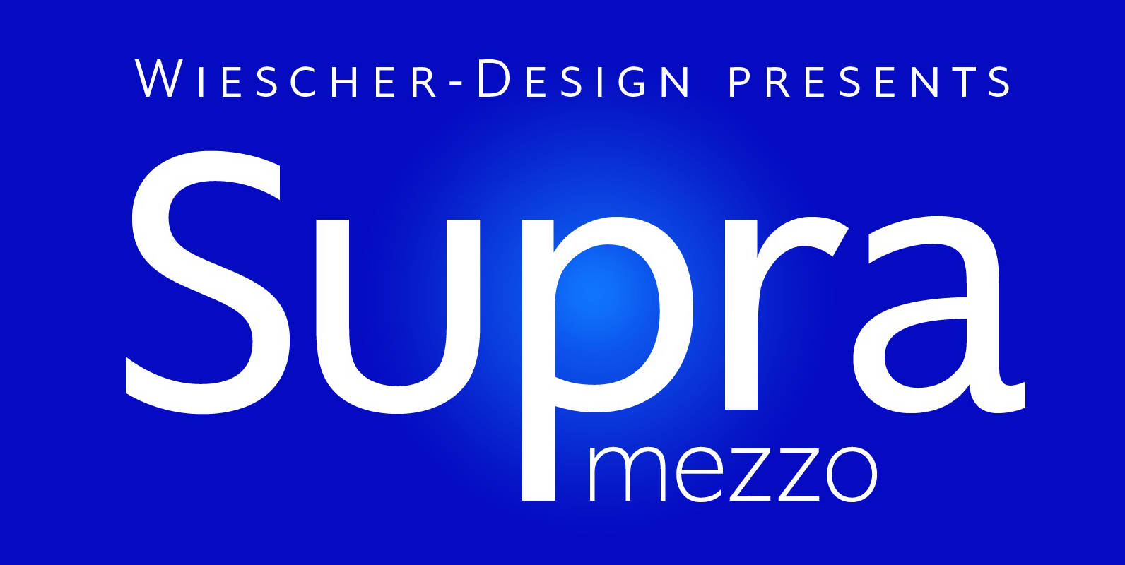
Supra Mezzo Font
Supra Mezzo designed by Gert Wiescher in 2012/13 – is an unusual addition to the Supra family, aweight in between the normal and the condensed width. This cut comes in very handy if you need to put lots of text
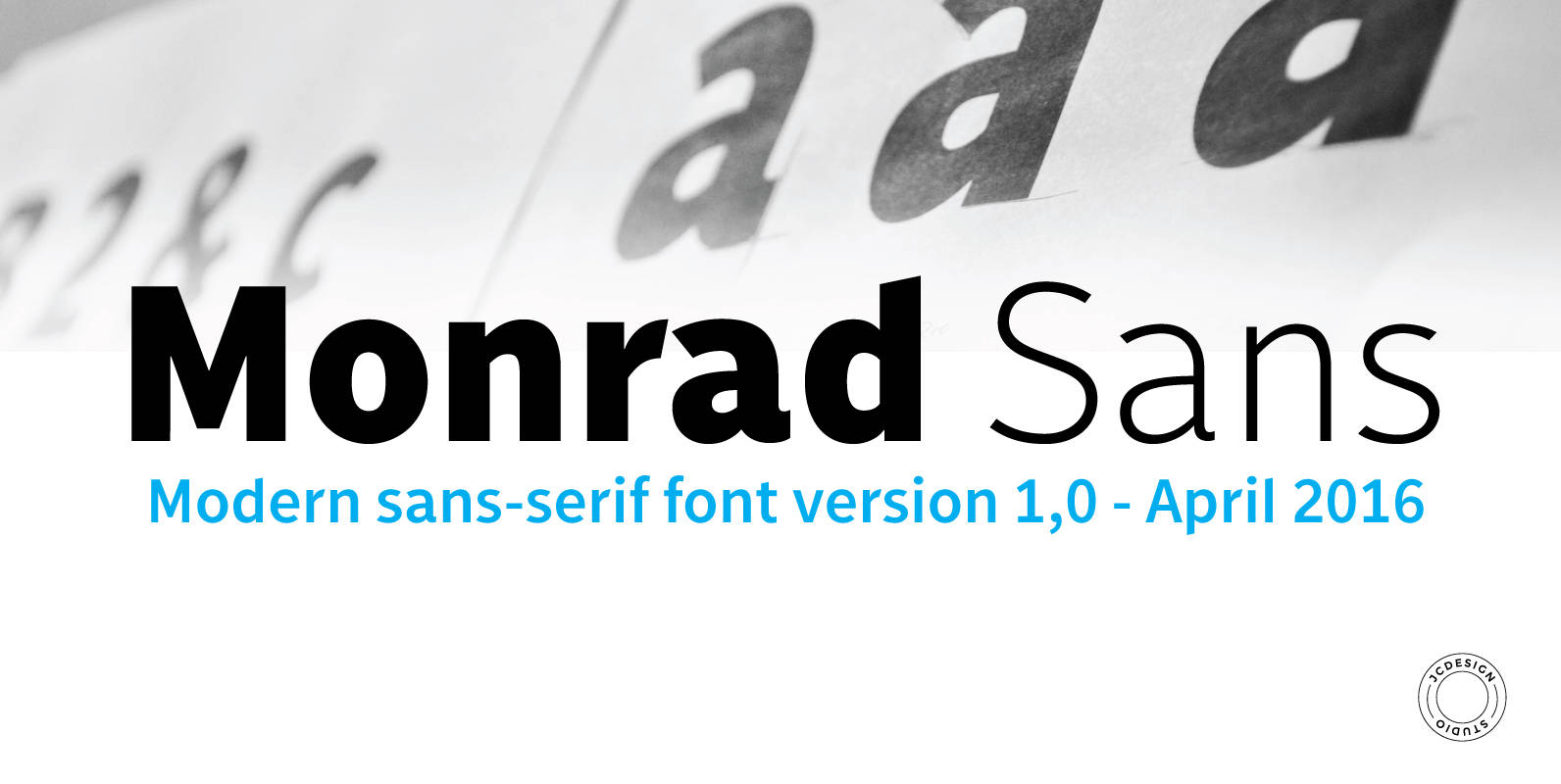
Monrad Font
Monrad is a font family characterized as grotesque sans serif. The final ink consists 6 styles including italic version, manually edited kerning. The idea of the font is to create a blend of dynamics and organic balance in the letters.

Supra Extended Font
Supra Extended – designed by Gert Wiescher in 2013 – is the extended version to this new sans typeface family of eight weights. The extended version is designed for sheer elegance and has no italics because they didn’t look nice
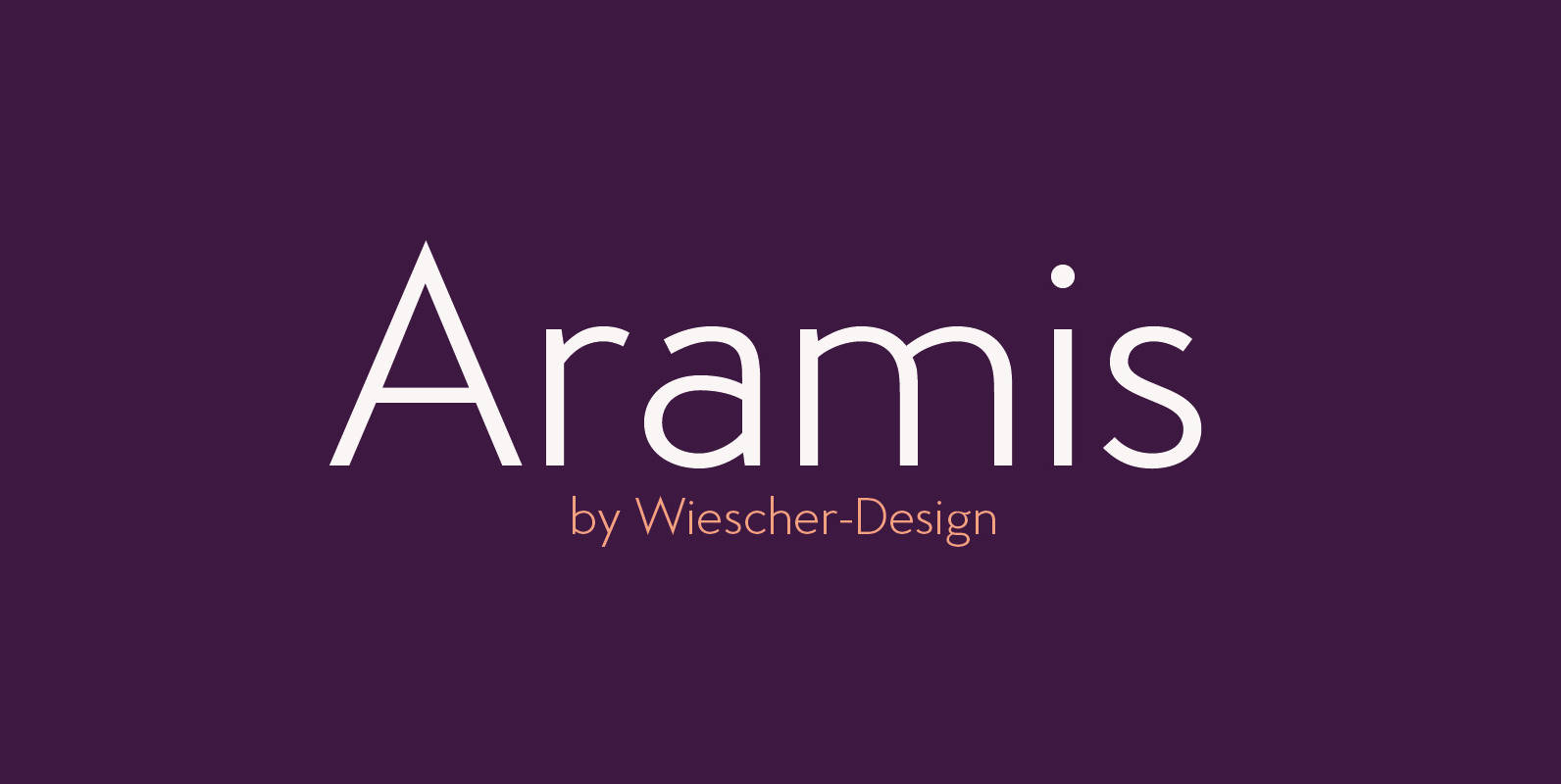
Aramis Font
“ARAMIS” is a new linear Sans with a French touch– designed by Gert Wiescher in 2014 and 2015 – has 7 weights with corresponding italic cuts. The small contrast in the linear Sans makes it not quite so linear and
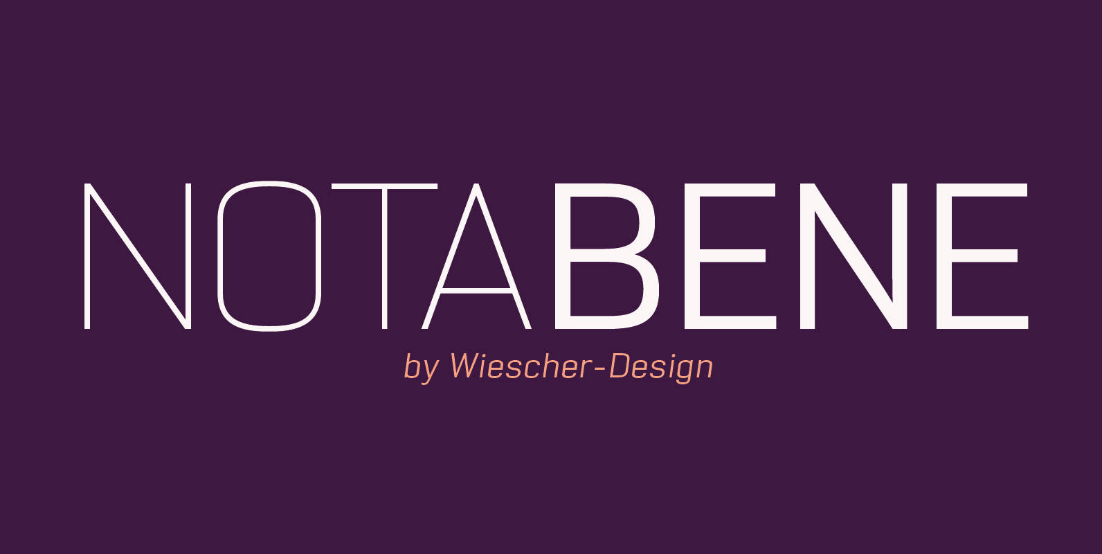
NotaBene Font
“NOTABENE” is a new, squarish, narrow, technical font– designed by Gert Wiescher in 2015 – has 7 weights with corresponding oblique cuts. “NOTABENE” is well suited for advertising, logo, billboards, small text, signage, branding, packaging, editorial, posters, web and screen

Supra Font
“Supra” – designed by Gert Wiescher in 2012/13 – is a new sans typeface family of eight weights with matching italics. Supra is influenced by current and past sans typefaces, but has a completely new look. The pleasant flow and

Zega Grot Font
Celebrate good times with Zega Grot family! This font is the companion of Zega Text but less “serious” than its predecessor. The Grot version has old vertical proportions, with higher capitals and asc-descenders, height difference between capitals and ascenders, beyond

