Tag: grotesk
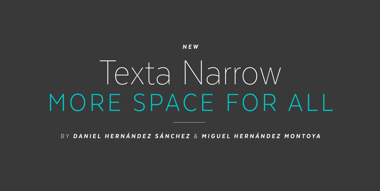
Texta Narrow Font
Texta Narrow. More space for all. Through studying humanists’ models from Edward Johnston to Adrian Frutiger and the Gothic Alphabet made by sign painters comes Texta Narrow, a contemporary, rational, transparent and useful Sans to compose all kind of texts.
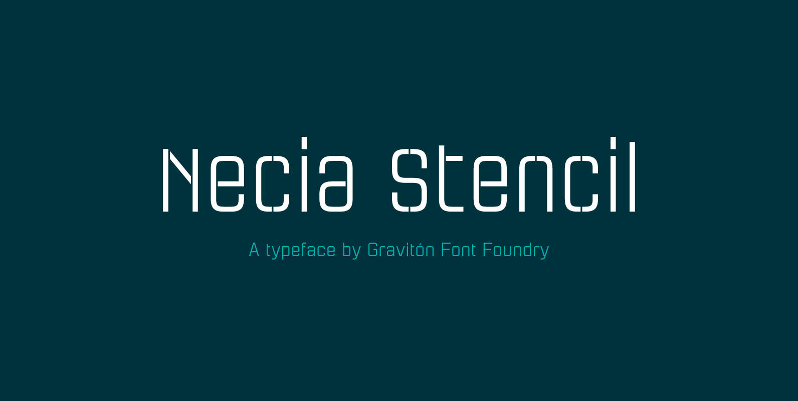
Necia Stencil Font
Necia Stencil font family is the stencil version of Necia font family, it has been designed for Graviton Font Foundry by Pablo Balcells in 2014. Necia Stencil consists of 16 styles. The 8 “Stencil 1” styles contain a narrow stem
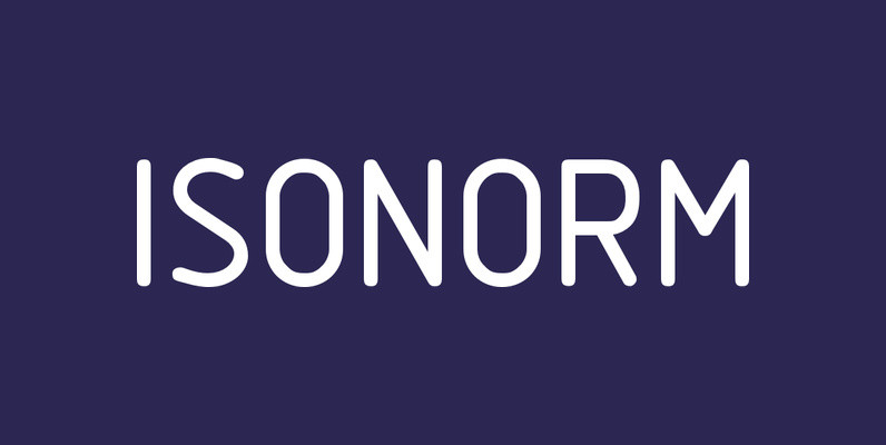
Isonorm Font
Isonorm is a font design released for the Mecanorma Type Collection. Copyright 2004 Trip Productions BV. Published by MecanormaDownload Isonorm
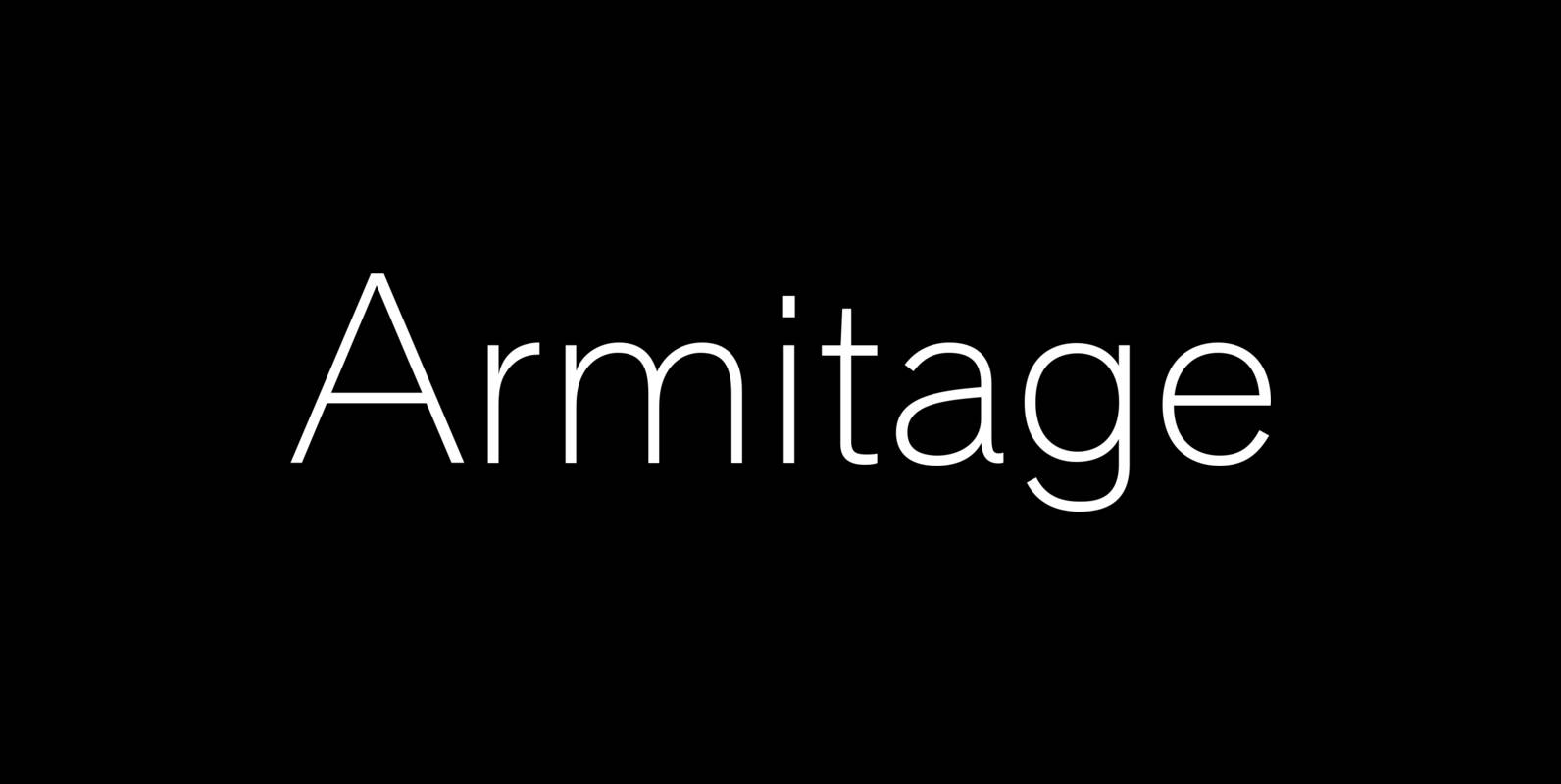
Armitaged Font
Sturdy and humane, Armitage renders type with vintage American warmth. Even with a subtle sparkle, Armitage stays humble to let words work. Rather than build on recent trends, Armitage starts over, derived from designs of the late nineteenth century. Designer
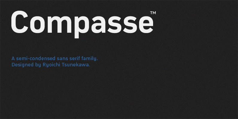
Compasse Font
Compasse is a semi-condensed sans-serif family designed by Ryoichi Tsunekawa and the whole family consists of 12 style: six weights from Thin to ExtraBold and their matching Italics. The range of styles provides flexibility for title, headline and body text.
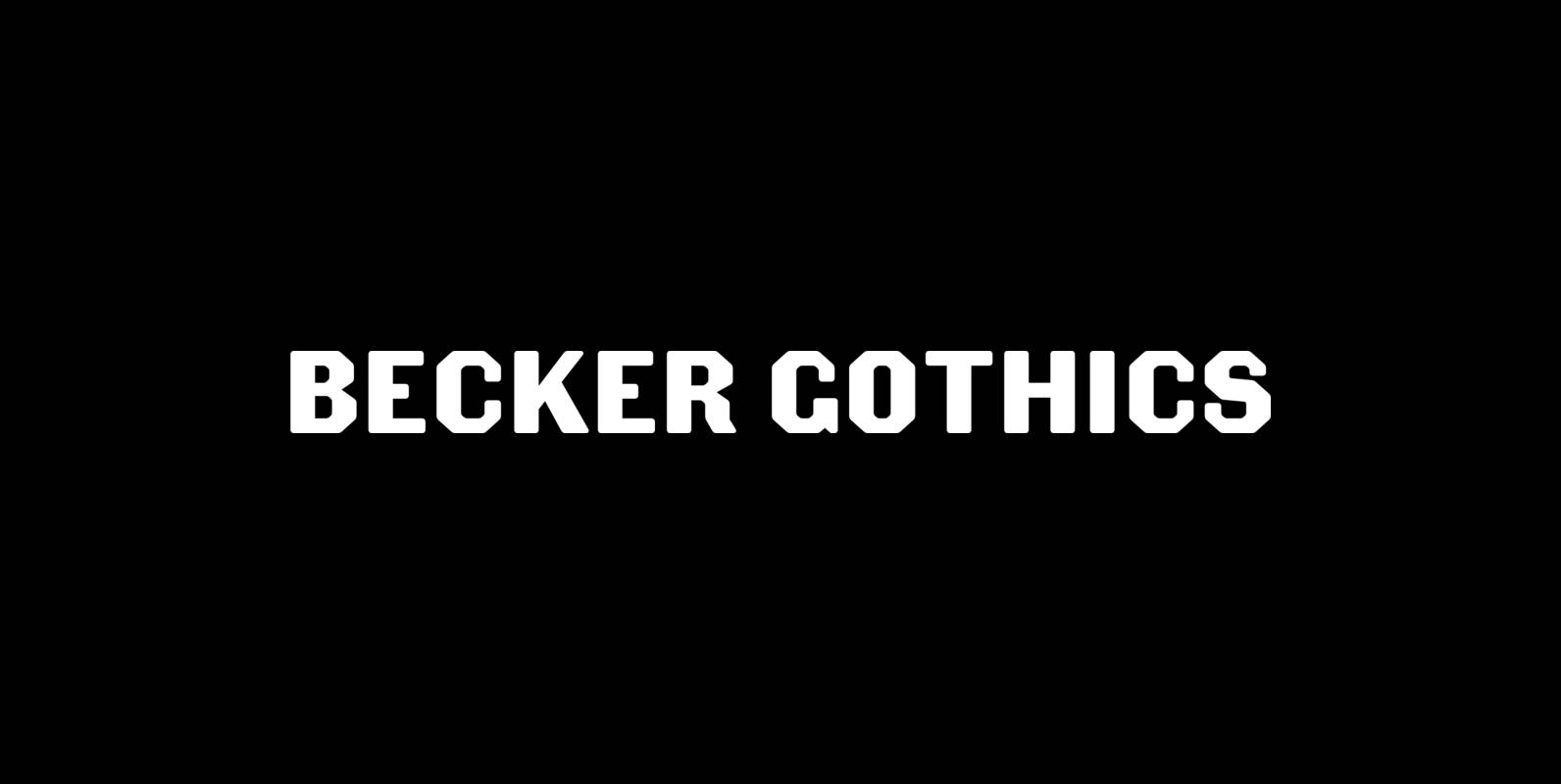
Becker Gothics Font
The Becker Gothics pay homage to the nineteenth century American lettering master George Becker. Designer James Puckett has given new life to the ingenious gothic alphabets found in Becker’s 1854 lettering manual Ornamental Penmanship. Use this quintet of typographic voices
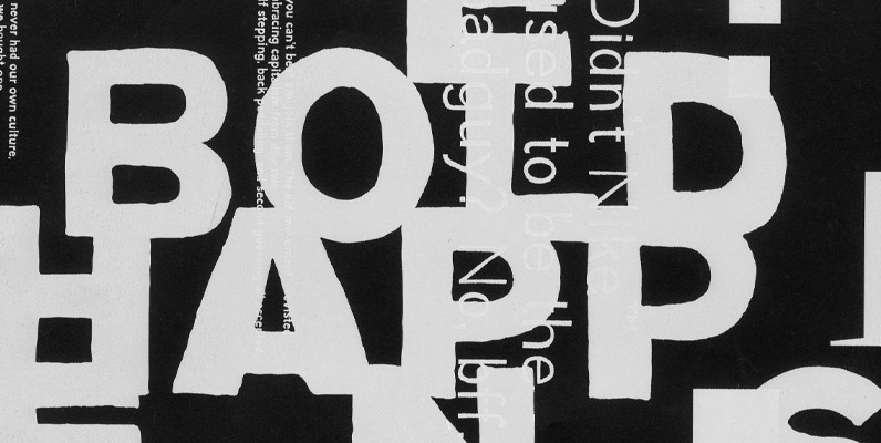
YWFT Absent Grotesque Font
In these over-Photoshopped times, a little imperfection can make your work stand out and excel. YWFT Absent Grotesque was created to be an imperfect typeface, exploring ideas found in Univers and Helvetica without the serious attitude and over-marketing. It was
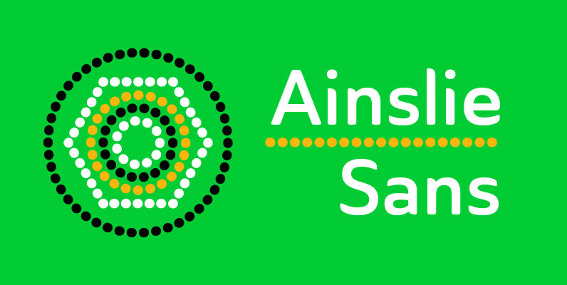
Ainslie Sans Font
The original Ainslie was inspired by Mt. Ainslie and the city of Canberra’s inner suburb of the same name. Canberra is Australia’s capital–a planned city designed by American architect Walter Burley Griffin. Griffin’s style and geometric design for the city,
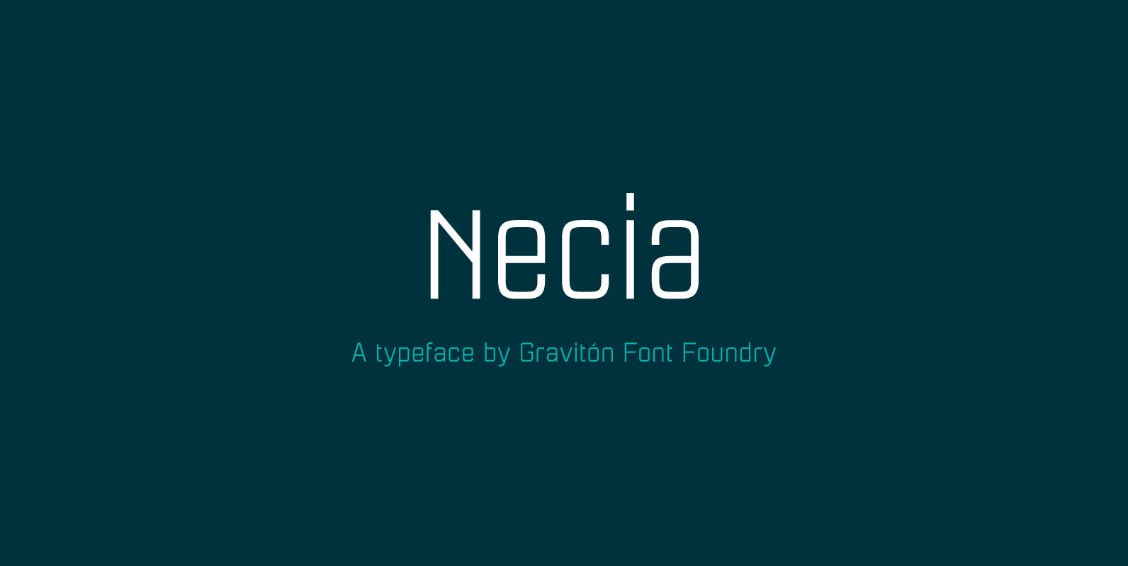
Necia Font
Necia font family has been designed for Graviton Font Foundry by Pablo Balcells in 2014. It is a modular, geometric and slightly condensed typeface which has been conceived to be primarily a display typeface, but given its clarity it can
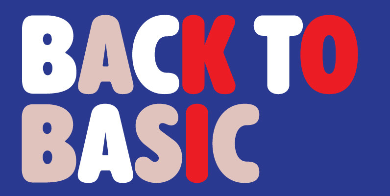
Alphabet Soup Pro Font
Designed by Steve Jackaman. In the early 1980’s, Steve worked at Typographic House in Boston, Massachusetts. At the time, ‘Typo’ House, as it was affectionately known, was the largest type house in New England. This font was designed and produced
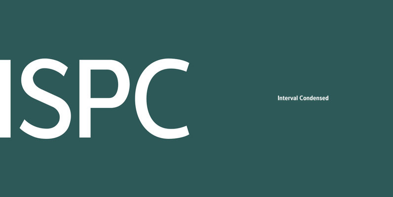
Interval Sans Pro Condensed Font
The new Interval Sans Pro is a pratical choice when you need a contemporary sans serif for text typography, headlines, signage or brands creation. This new version has many more OT features like small caps, ligatures, stylistic set, localized form.
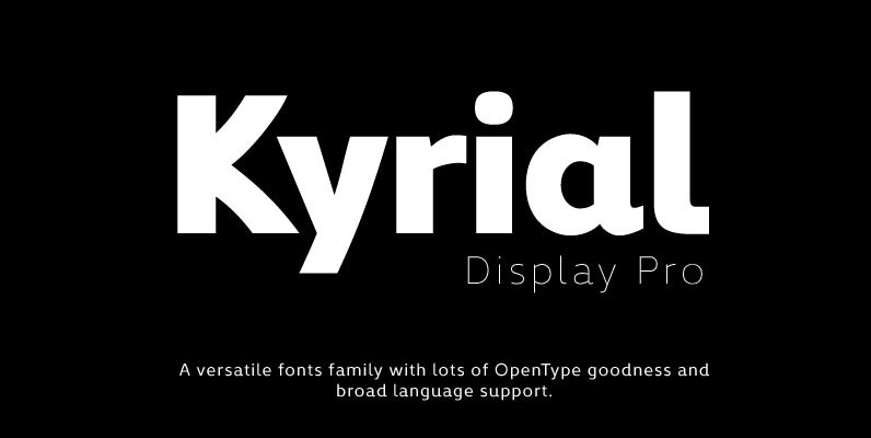
Kyrial Display Pro Font
Designed in 2011 by Olivier Gourvat, this font family has generous proportions with a range of weights make it a versatile family for print and web design work. Kyrial Display Pro is also a pratical typographic choice to express strength,
