Tag: grotesk

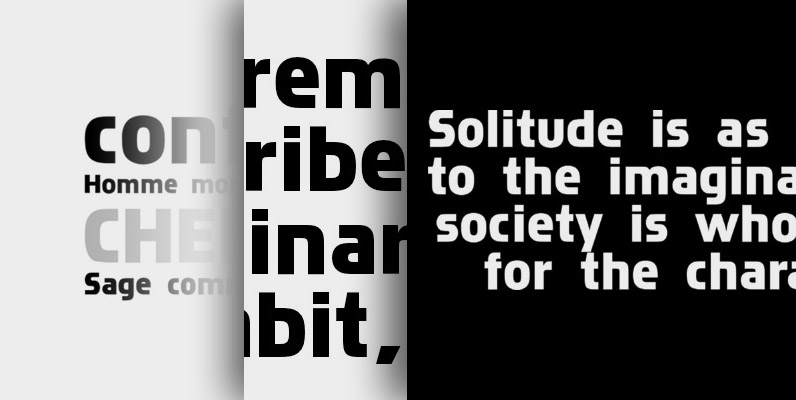
Normalise Din Font
Normalise Din is a font design released for the Mecanorma Type Collection. Copyright 2004 Trip Productions BV. Published by MecanormaDownload Normalise Din
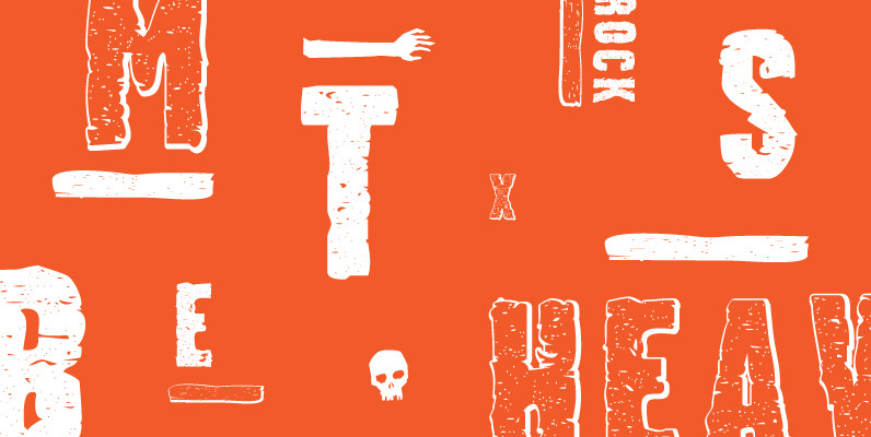
Stalker Font
Stalker is one of those necessary fonts in a designer’s toolbox: Grungy sans serif caps that are most useful for entertainment project chores. Originally made in the summer of 2003 for set and prop design of an Alliance film, Stalker
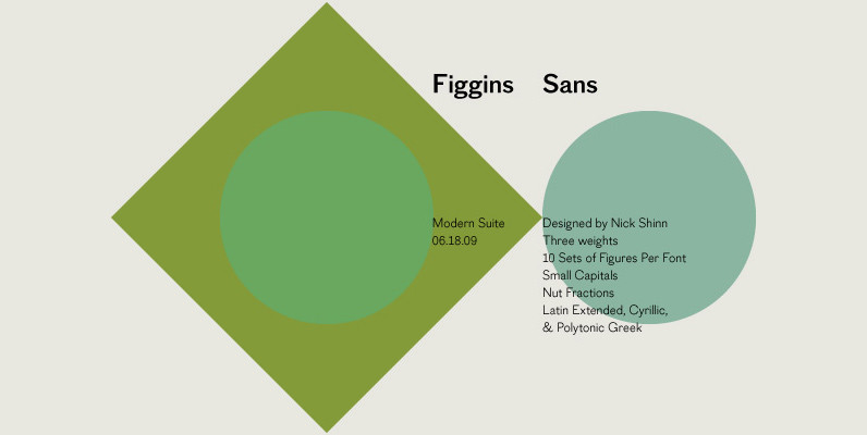
Figgins Sans Font
The first sans serif types were made in London in the early 19th century. They were severely modern, all caps and bold. The Figgins foundry, inventor of the term sans serif, showed a fine example in its specimen of 1836.
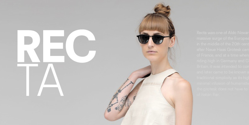
Recta Font
Recta was one of Aldo Novarese’s earliest contributions to the massive surge of the European sans serif genre that was booming in the middle of the 20th century. Initially published just one year after Neue Haas Grotesk came out of
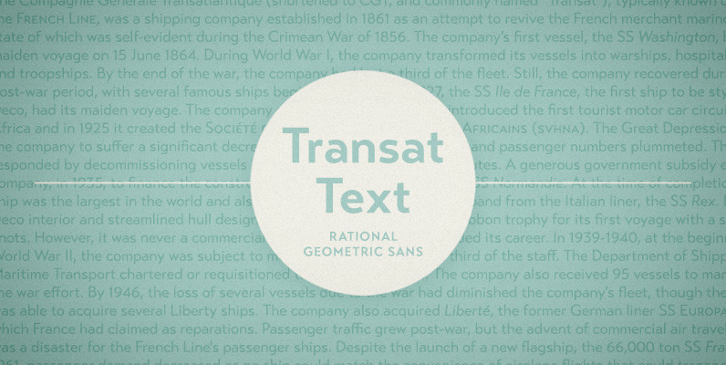
Transat Text Font
Transat Text is a geometric sans serif typeface, and is the more rational sibling to the unabashedly Art Deco “Transat”. Transat Text has a slightly taller x-height than its counterpart, making it easier to read at small sizes, but also
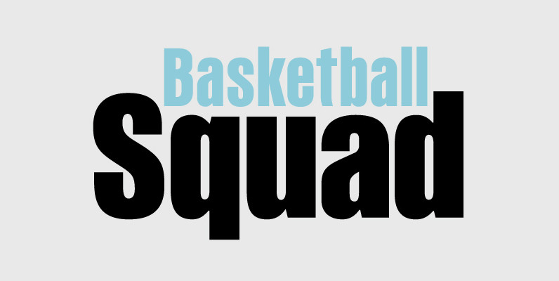
PF Fusion Sans Pro Font
Fusion Sans is an amalgamation of traditional early nineteenth-century sans-serif letters. Despite its monotone structure it retains certain features common to roman. For instance lowercase ‘a’ and the two-storey ‘g’ are normal roman characters, while most letters are designed with
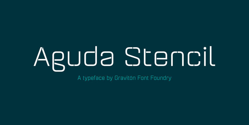
Aguda Stencil Font
Aguda Stencil font family is the stencil version of Aguda font family, it has been designed for Graviton Font Foundry by Pablo Balcells in 2014. Aguda Stencil consists of 16 styles. The 8 “Stencil 1” styles contain a narrow stem
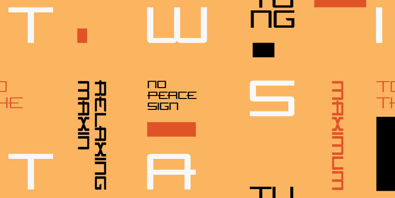
Flywheel Regular Font
Although Flywheel™ was designed in the early 90s, its design was popular in the 80s and remains popular today as an iconic look for futuristic themes: books, movies, arcade games and packaging. The design is rigid, geometric, straightforward and yes,

Creighton Pro Font
Designed by Steve Jackaman and Ashley Muir. It was our initial intention to develop a suitable lowercase for Les Usherwood’s ‘Elston’ typeface, based on a few characters from an old German typeface called Hermes Grotesque (Woellmer, Berlin). However, the new

Quarca Font
Quarca’s masculine power runs strong across the page with bold self-assurance and a raw energy that courses through its thick veins. Don’t think the continuous, smooth geometry of this semi-modular face is captively chained to the grid, though. Quarca has

Metrisch Font
Metrisch is new sans serif type family of seven weights plus seven italics uprights in each weights. The typefaces designed based on traditional geometric construction that have been built with letter size wider, the x-heights taller and short descender that
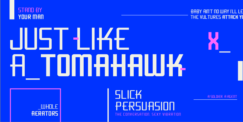
Flywheel Condensed Font
Although Flywheel™ was designed in the early 90s, its design was popular in the 80s and remains popular today as an iconic look for futuristic themes: books, movies, arcade games and packaging. The design is rigid, geometric, straightforward and yes,
