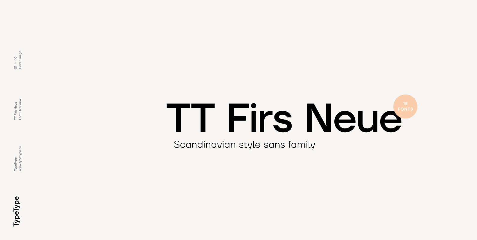
Tag: grotesk  

Vikive Font - Image 1

Vikive  Font

Vikive is a family of Sans Serif fonts, better known in its origins as “Gothic” in America or “Grotesque” in Europe. Some authors divide them into three categories: Grotesque, Geometric and Humanistic. Probably, it can be defined that Vikive  has

FT Switch Font - Image 3

FT Switch  Font

Swiss aesthetics for a universal font 5 Weights: Bold, Medium, Regular, Light, Thin 3 Style Sets: SS00, SS01, SS02 62 Languages: Afrikaans, Albanian, Asu, Basque, Bemba, Bena, Chiga, Congo Swahili, Cornish, Danish, Dutch, English, Estonian, Faroese, Filipino, Finnish, French, Galician,

Flat10 Fraktur Font - Image 4

Flat10 Fraktur  Font

This 8-bit pixel font is designed with respect for 80s game designers and the pixel font pioneers in middle 90s. Use at size 10 pixels or multiples of 10 and anti-alias off is recommended. Published by Dharma TypeDownload Flat10 Fraktur

Piñata Font Bundle (106 Fonts) Font - Image 9

Piñata Font Bundle (106 Fonts)  Font

We present our Piñata font bundle which includes all your favorite fonts and consists of a total of 106 fonts. The value of this bundle is $629. On the occasion of summer, we give an unprecedented 95% discount and  you

Dopis Font - Image 11

Dopis  Font

Dopis (Допис on Cyrillic) is neo grotesque family available in four weights and in two widths. It is universal and neutral typeface, fully applicable in every situation. Contains extended Latin character set with Cyrillic support. Published by Tour de  Force

Multiple Font - Image 14

Multiple  Font

As its name suggests, Multiple is a family with multiple font styles. The idea that sums up the concept behind the typeface is workhorse—the challenge was to develop a useful font fit for any scenario and suitable to any  design

Gardenia Font - Image 15

Gardenia  Font

Gardenia is a grotesk sans-serif. It comes in 9 weights with matching italics. It was designed by Salvador Rodríguez in 2015/2016. It is characterized by legibility in the medium sizes, black and thin weights are great performers in display  sizes.

Antipol Font - Image 16

Antipol  Font

Antipol is a Sans Serif design that reverses the conventions of a regular Latin Sans Serif. With a weight emphasis on the horizontals and its vertical terminals Antipol radiates a 1970s charisma known from the like of Antique Olive.  Its

Brightwell Font - Image 17

Brightwell  Font

Brightwell is a sans-serif typeface consisting of 6 upright weights and 6 italics. Initially following the grotesque-geometric forms popular during the 1920’s, Brightwell’s structure has evolved into a different one, with narrower and more organic proportions, increased contrast and smaller

Zierde Grotesk Font - Image 18

Zierde Grotesk  Font

Zierde is a take on early advertising, small-copy grotesks of the late 19th/early 20th century, and is largely inspired by Miller & Richard’s own range of Grotesques. More importantly, Zierde is accompanied by a large set of ornaments (+200)  which