Tag: grotesque
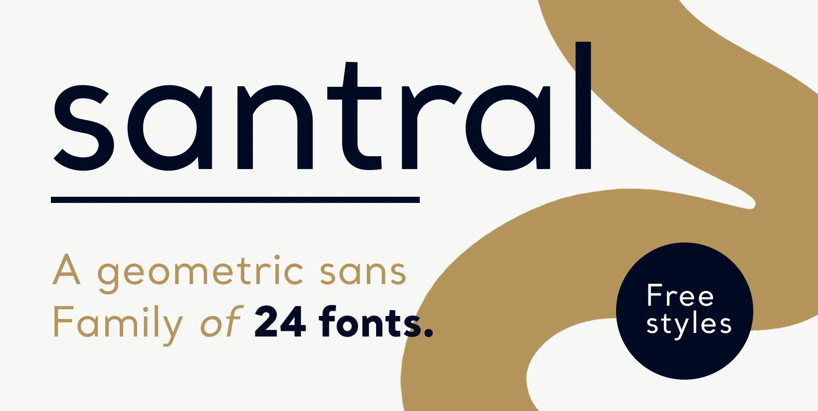
Santral Font
Santral typeface has been designed with the idea of achieving the ideal balance of geometrical perfection and optical impression. The sharp and precise design of Santral leads to a clear and reliable communuciation with the reader. 12 weights and italic
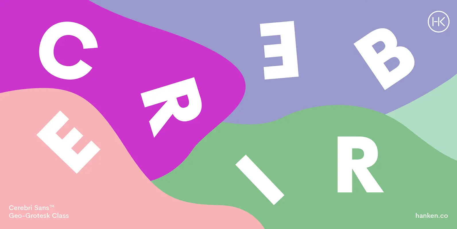
Cerebri Sans Font
Cerebri Sans is a sans serif inspired by the early geometric and grotesque typefaces that are both functional and elegant—with humanistic features. Published by Hanken Design Co. Download Cerebri Sans
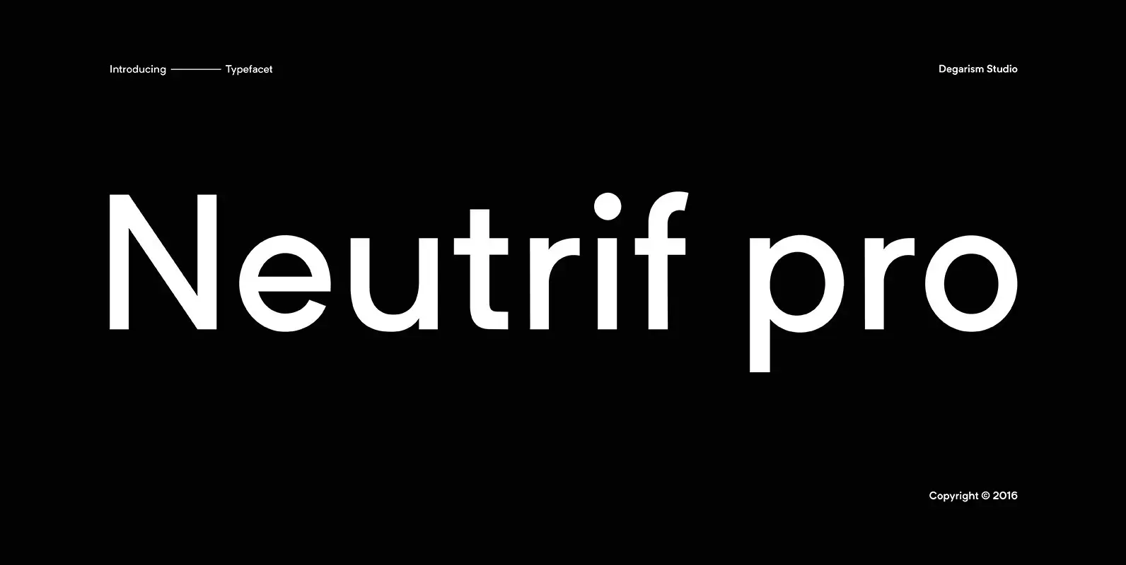
Neutrif Pro Font
Neutrif Pro is a modern style sans serif, designed for flexibility, proportions and better balance with carefully crafted diacritics and extensive kerning for a Grotesque typeface. Inspired from Geometric sans-serif typefaces and modernism style Neutrif Pro™ was a Grot constructed
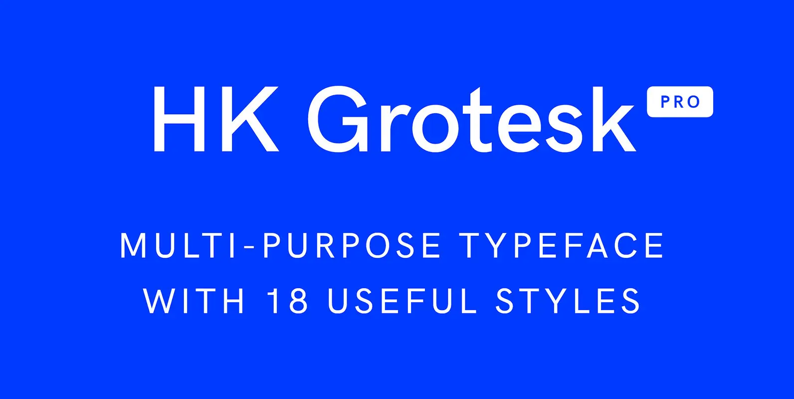
HK Grotesk Pro Font
HK Grotesk Pro is a sans serif typeface inspired by the classic grotesques. It is a multi-purpose typeface that can be used on a wide range of topics without being obtrusive to the reader’s eye. It has features that can

Granary Typeface Font
Granary is a clean, geometric typeface that explores a design style of low x-height and neat curves. Published by Samuel OakesDownload Granary Typeface
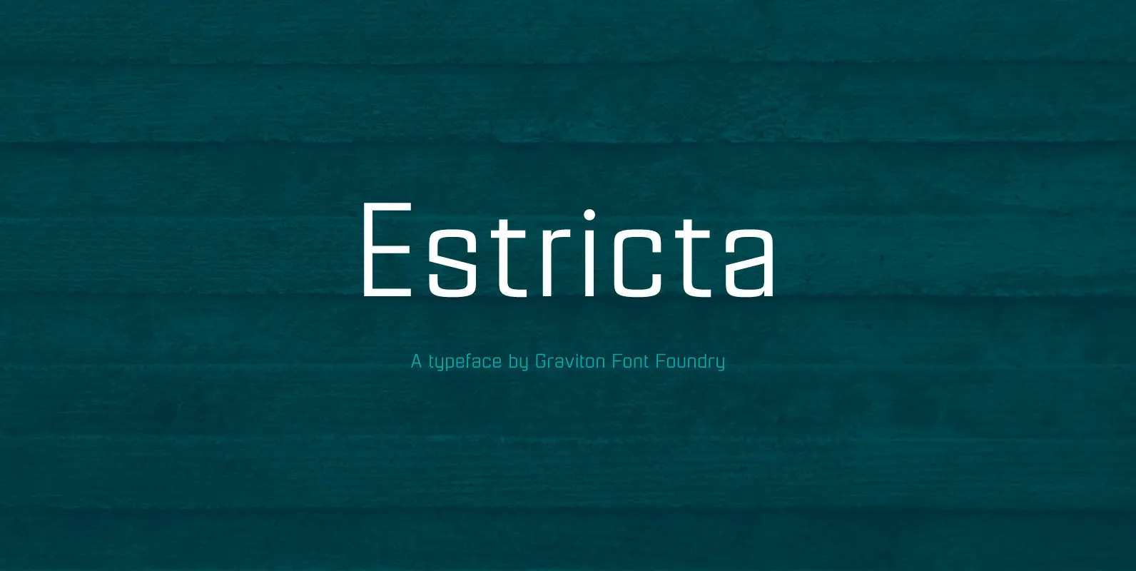
Estricta Font
Estricta font family has been designed for Graviton Font Foundry by Pablo Balcells in 2017. It is a sans serif typeface with a geometrical and mechanical appearance, its sharp, angular edges provide a strong and solid design. It has been
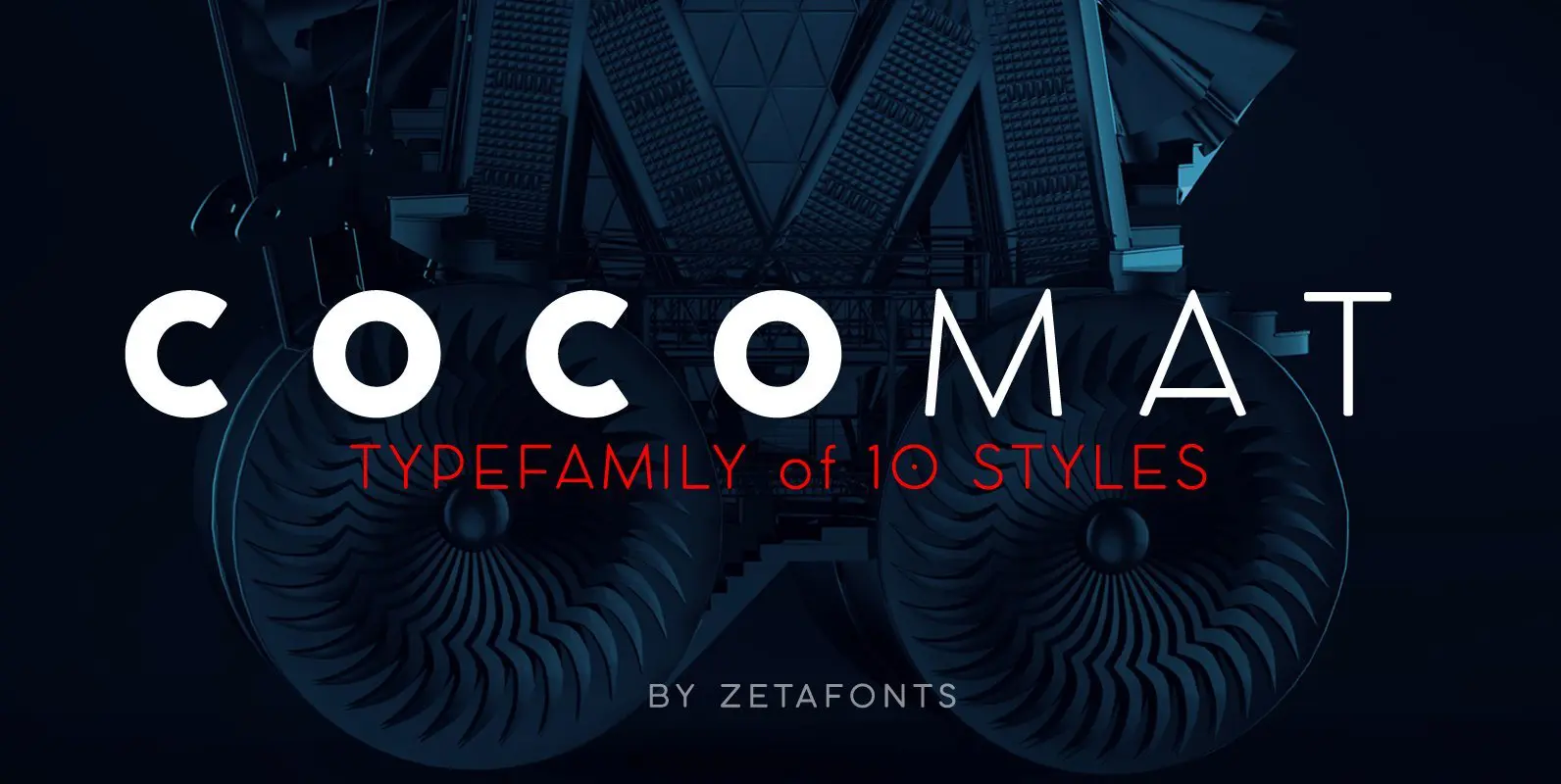
COCOMAT Font
COCOMAT is a typeface variant from the COCO GOTHIC family of sans serif geometric typefaces. It’s inspired by the style of the twenties and the visions of italian futurists like Fortunato Depero, Giacomo Balla and Antonio Sant’Elia. It’s a typeface

Oakes Grotesk Font
Oakes Grotesk is a more corporate take on the Oakes typeface. It explores a set of brand new metrics that allow it to be more legible in body text as well as headings. The letter ‘g’ has been tweaked to
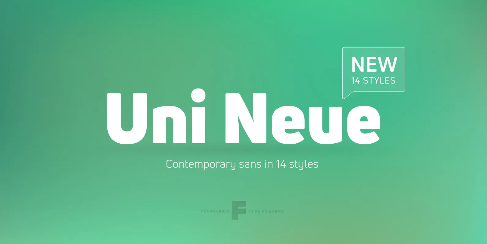
Uni Neue Font
Uni Neue is the whole new redesigned version (remake) of Uni Sans – one the most recognizable and signature font families of Fontfabric type foundry. From major changes like proportions, widths and thickness (weights) to the smaller details, this new
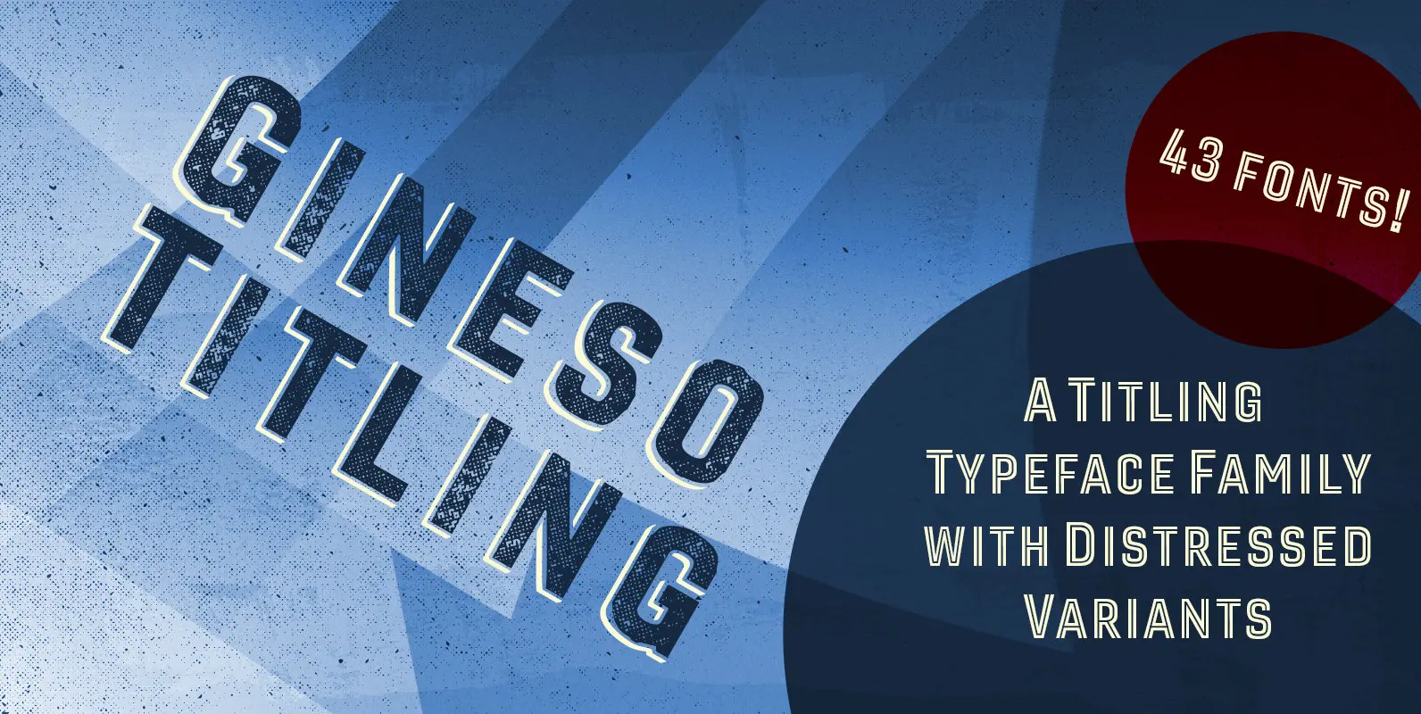
Gineso Titling Font
Before the Great War, there were great posters. Posters of elegance and grandeur. Posters calling people to the pleasures of sunny southern France and to the perfections of northern Italy’s dolce vita. Le Havre, based on a poster by AM
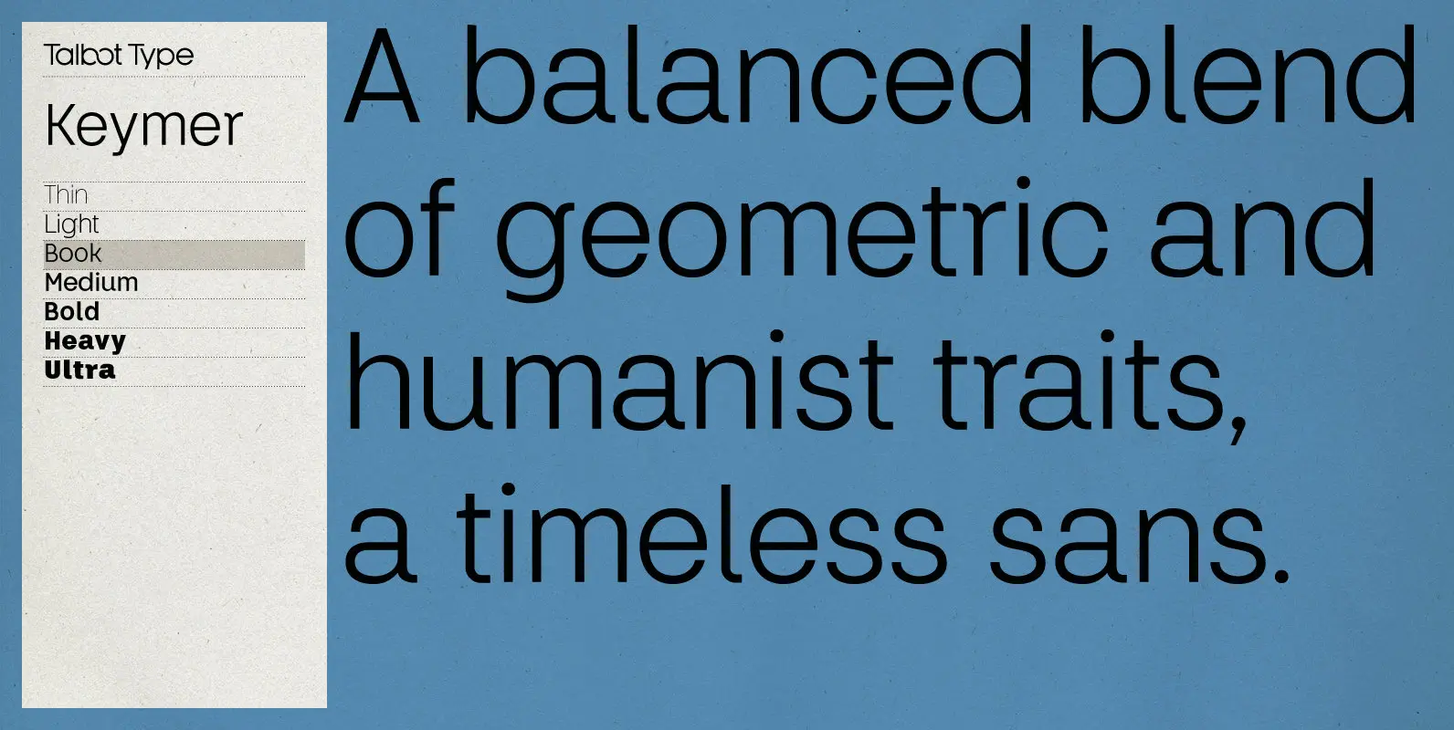
Keymer Font
Talbot Type Keymer is inspired by Margaret Calvert’s Transport typeface, designed for the British road sign system in the early 1960s. Keymer mixes geometric and humanist traits to achieve a modern, clean, elegant appearance. It is a legible and versatile
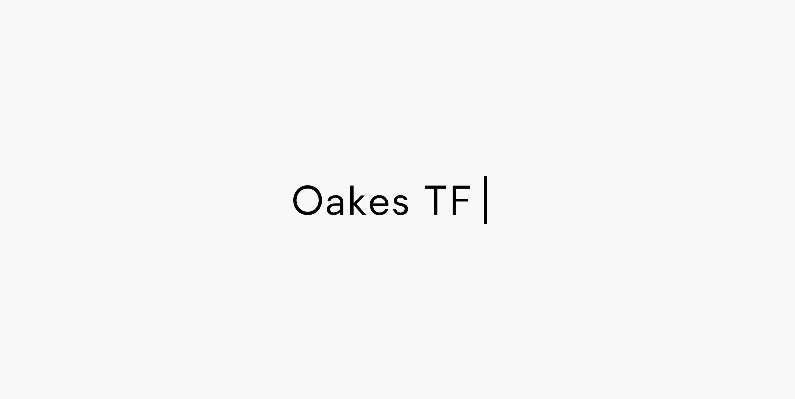
Oakes Typeface Font
Oakes is a typeface that is a progression of my previous typeface – Orkney. It retains the same metrics and character, whilst becoming more smart and corporate. The aim for this rendition of the typeface was to make a letterset
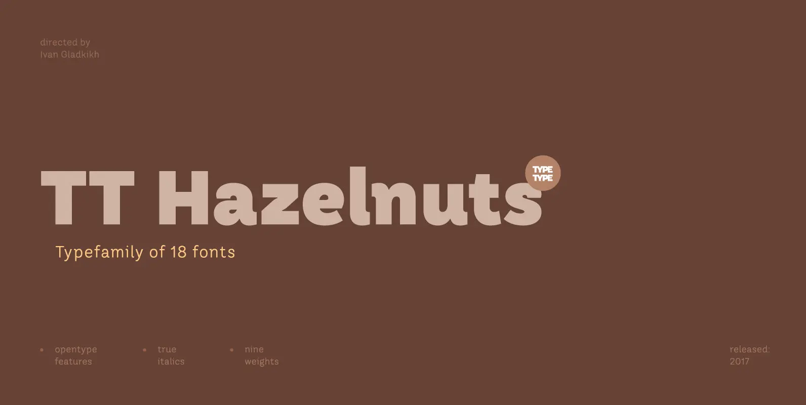
TT Hazelnuts Font
TT Hazelnuts is a display sans-serif font family containing a set of elegant and delicate decorative elements. Initially the family was designed for highly specialized areas, but we’ve decided to extend the number of typefaces and to make the family
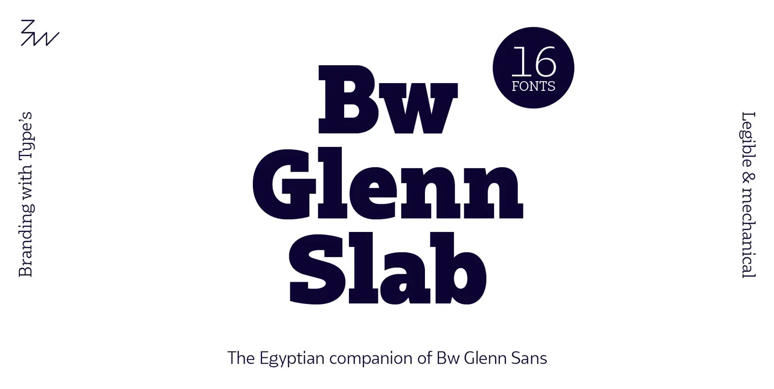
Bw Glenn Slab Font
Bw Glenn Slab is a confident and robust font family with a sturdy feel offering no concessions for ambiguity. Its strict geometry and open shapes provide a very legible and clean texture, performing well on print and screens alike. It’s
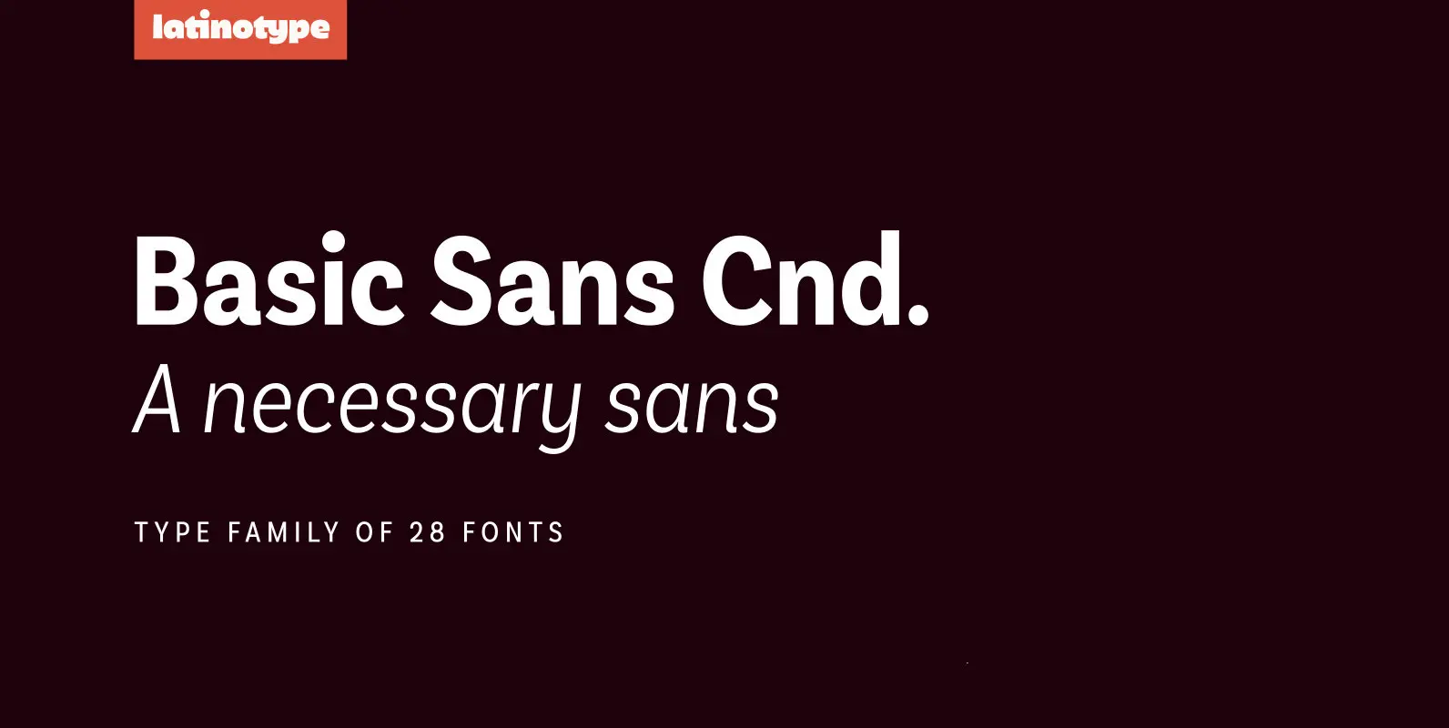
Basic Sans Cnd Font
Basic Sans Cnd: A new sans. Designed by Daniel Hernández Basic Sans Cnd is a narrower version of Basic Sans. It is a family of Grotesque features with a functional, neutral and seeming clean style that looks to keep a
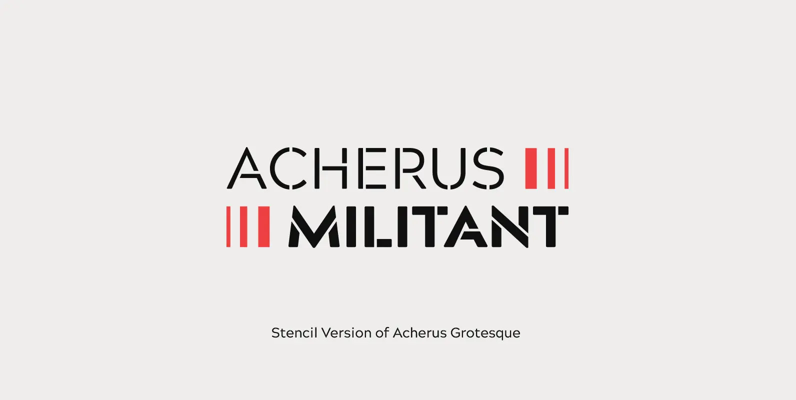
Acherus Militant Font
Acherus Militant is a sportier, more aggressive stencil version of Acherus Grotesque. Its key attributes are its contemporary flavor and high degree of legibility, a unique characteristic that sets it apart from other stencil fonts. Acherus Militant is an adaptable
