Tag: grotesque
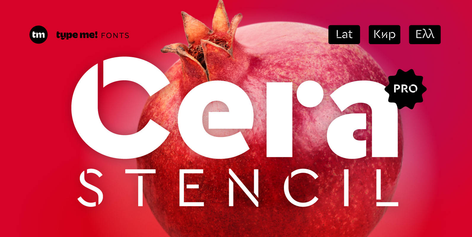
Cera Stencil PRO Font
Cera Stencil Pro is part of the Cera Collection is driven by pure geometry and containing the bestselling Cera, its stenciled counterpart Cera Stencil and the hand-crafted display companion Cera Brush. Cera Stencil, with six weights, useful dingbats and arrows,
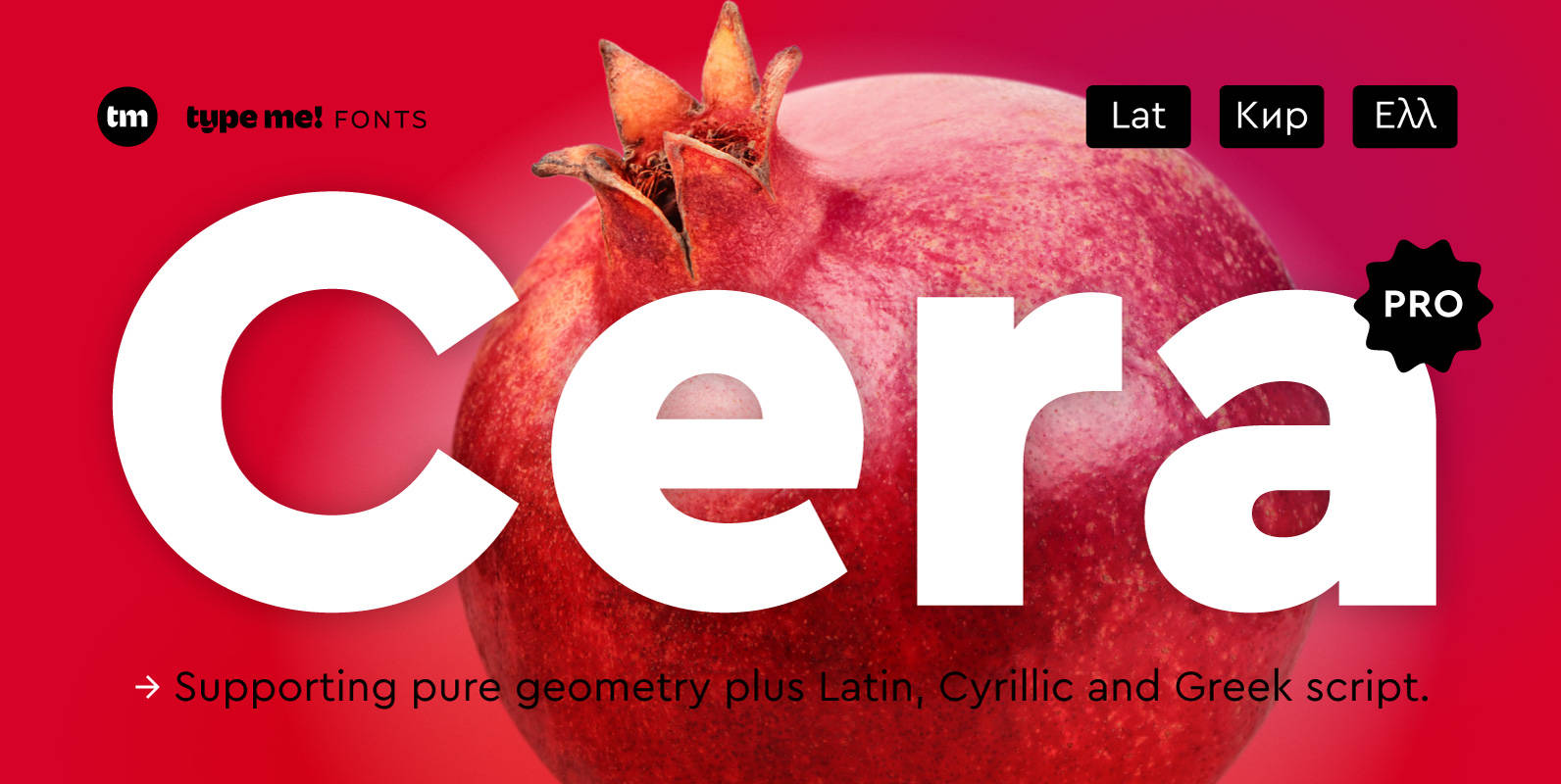
Cera PRO Font
Cera Pro is part of the Cera Collection driven by pure geometry and containing the bestselling Cera, its stenciled counterpart Cera Stencil and the hand-crafted display companion Cera Brush. With six weights, a clean italic – carefully slanted 10 degrees
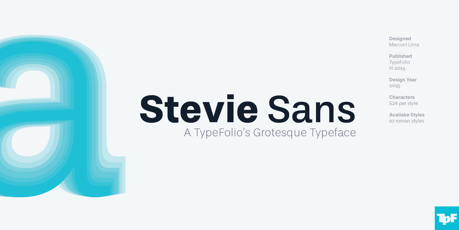
Stevie Sans Font
Many years ago I had my first contact with a grotesque typeface, when handling a sample catalog of typographic specimens from the age of phototypesetting. The style eventually settled in my memory waiting for the work of time. Behind its
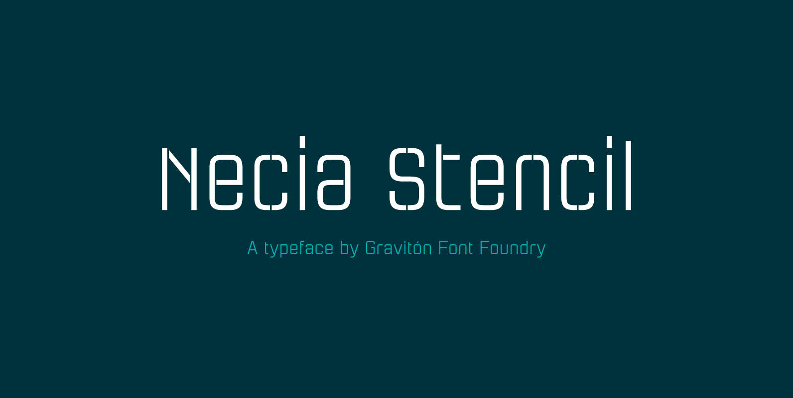
Necia Stencil Font
Necia Stencil font family is the stencil version of Necia font family, it has been designed for Graviton Font Foundry by Pablo Balcells in 2014. Necia Stencil consists of 16 styles. The 8 “Stencil 1” styles contain a narrow stem
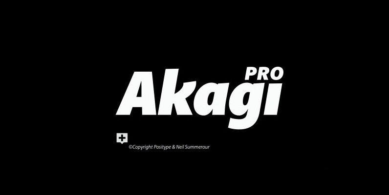
Akagi Pro Font
Akagi Pro is a complete rebuild and expansion of my popular Akagi typeface. Contemporary, clean, simple and friendly continue to serve as the adjectives for an expansion that includes 250 additional characters per weight, many new ligature options, expanded stylistic
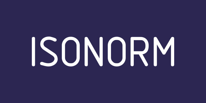
Isonorm Font
Isonorm is a font design released for the Mecanorma Type Collection. Copyright 2004 Trip Productions BV. Published by MecanormaDownload Isonorm

Grota Sans Rounded Font
Grota is back in its new Sans and Rounded versions. The complete family consists of 40 fonts, 10 different weights, cursives and an alt version. Grota Sans Rounded, designed by Eli Hernández and Daniel Hernández, is a grotesque font with
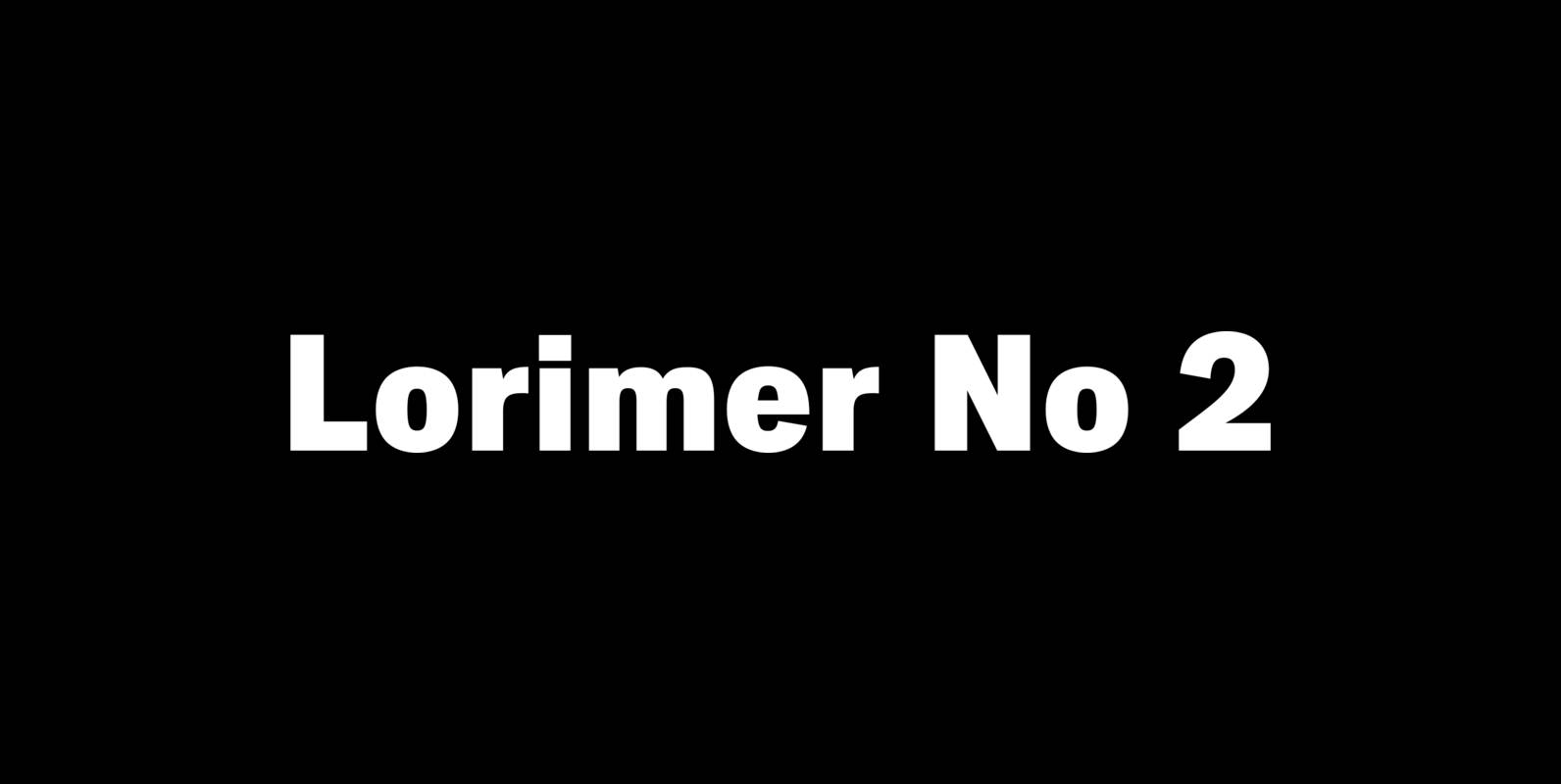
Lorimer No 2 Font
Lorimer No 2 is a sans family designed for display settings. Narrow letters, tight spacing, and a low x-height make Lorimer No. 2 better suited to display settings than fonts adjusted to work in text settings. Packaging, identities, and headlines

Grota Font
Grota is a very expressive font, has a gestural character inspired by the hand lettering. Grota is grotesque, unicase and exceptional. It has six weights ranging from thin to black with their italics. Grota is ideal for logos, brands, magazines,
Light Fit Font
Drawn by Hajime Kawakami in 2005, Light Fit is a display sans-serif that works great in both content and headline usage. Published by URW Type Foundry GmbHDownload Light Fit
Ainslie Sans Font
The original Ainslie was inspired by Mt. Ainslie and the city of Canberra’s inner suburb of the same name. Canberra is Australia’s capital–a planned city designed by American architect Walter Burley Griffin. Griffin’s style and geometric design for the city,
