Tag: grotesque
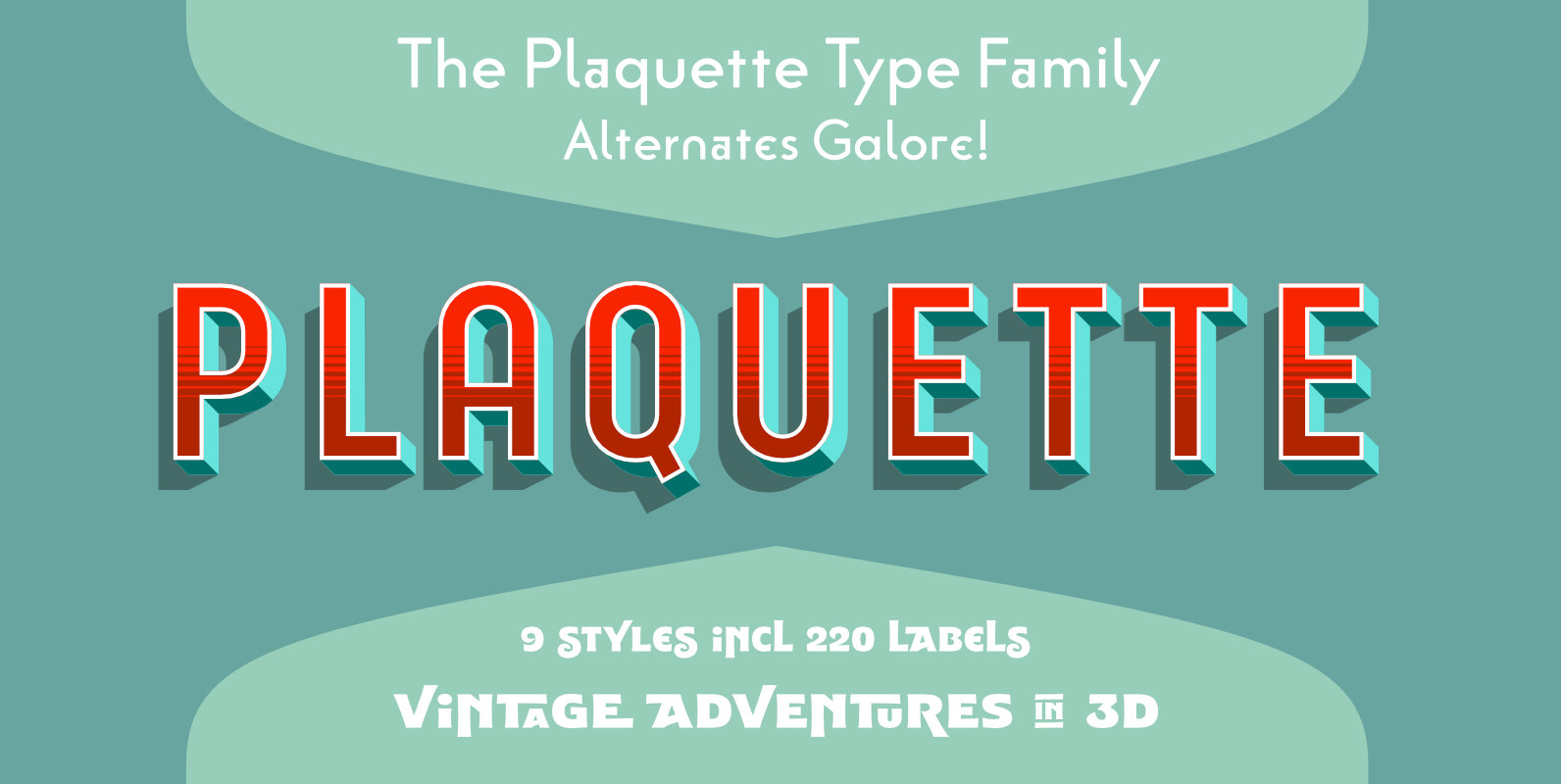
Plaquette Font
‘Plaquette’ is a collection of retro typefaces ranging from victorian to bauhaus to the sixties. They are all equipped with a load of OpenType features such as alternates, catchwords, stylistics sets and others. Plaquette 3D: A chromatic set of fonts
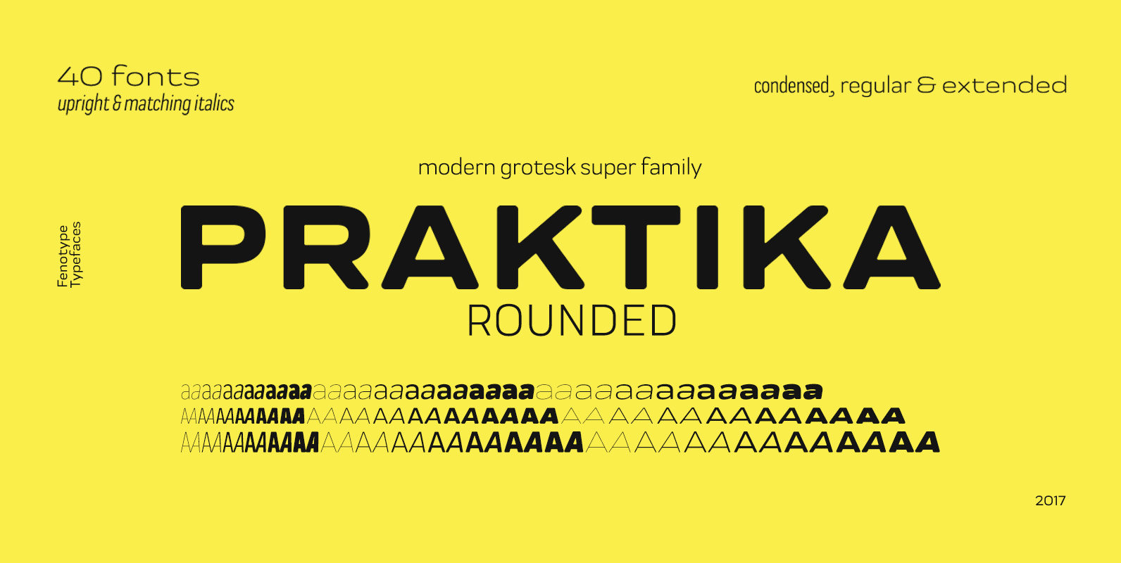
Praktika Rounded Font
If you happened to sleep on Praktika – the previous bestseller of Fenotype – don’t worry, as here’s its new rounded counterpart. Perhaps even more functional than its predecessor, Praktika rounded has a distinct look & feel of its own
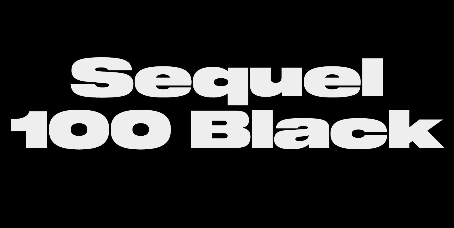
Sequel 100 Black Font
Sequel 100 Black was designed in 2018 by type designer Jeschke in Berlin. It is based on the sans-serif typefaces of the early 19th century. A characteristic feature of the Sequel 100 is the almost equal thickness of the vertical

Squad Font
Squad is a humanist sans serif with semi-condensed proportions. Inspired by Adrian Frutiger’s perfectionist style this typeface is a harmonious breed of humanist heritage and contemporary simplicity. The balanced characteristics, clear and legible silhouette and simultaneously vivid appearance of Squad
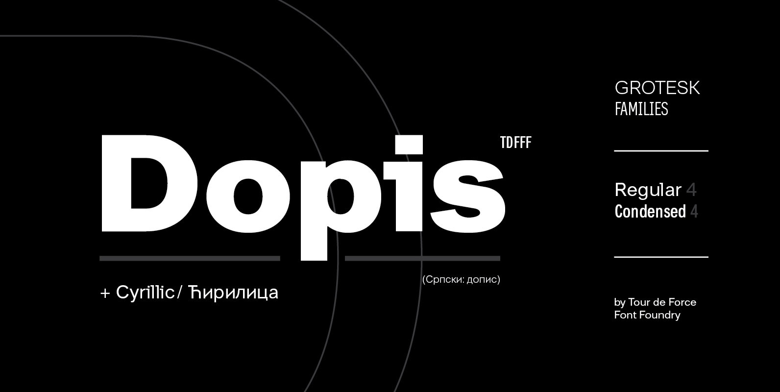
Dopis Font
Dopis (Допис on Cyrillic) is neo grotesque family available in four weights and in two widths. It is universal and neutral typeface, fully applicable in every situation. Contains extended Latin character set with Cyrillic support. Published by Tour de Force
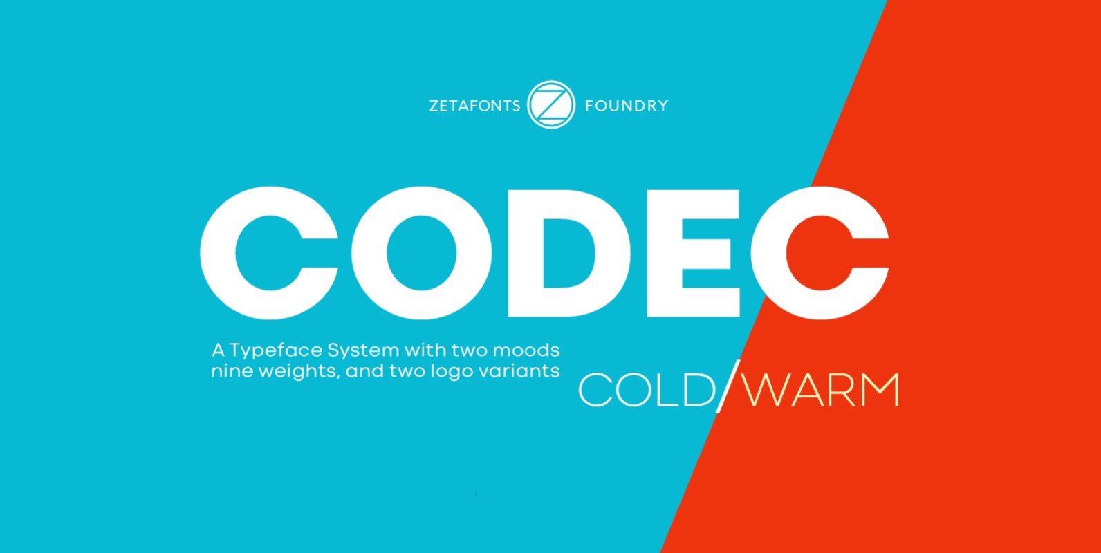
Codec Font
Codec is a geometric sans serif type system, designed by Cosimo Lorenzo Pancini with Francesco Canovaro and Andrea Tartarelli. Codec provides you with two coherent variant fonts built on the same base skeleton: Codec Cold and Codec Warm. In Codec
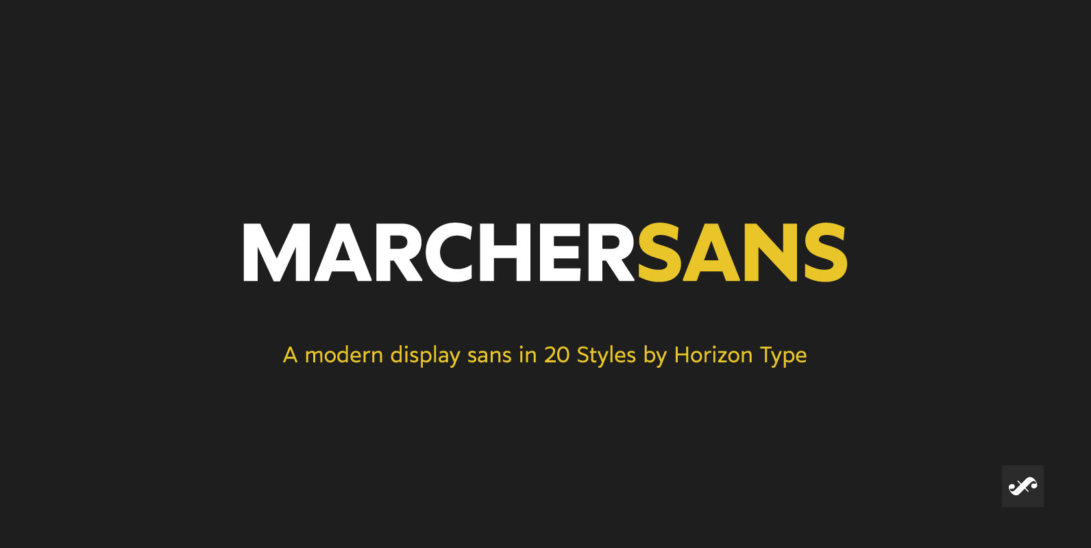
Marcher Sans Font
Marcher is a modern display type family in 10 weights plus matching true italics. Designed for an impactful and stylish visual impression especially on logos and posters. Marcher has semi humanist and semi geometric details and extensive language support. Marcher
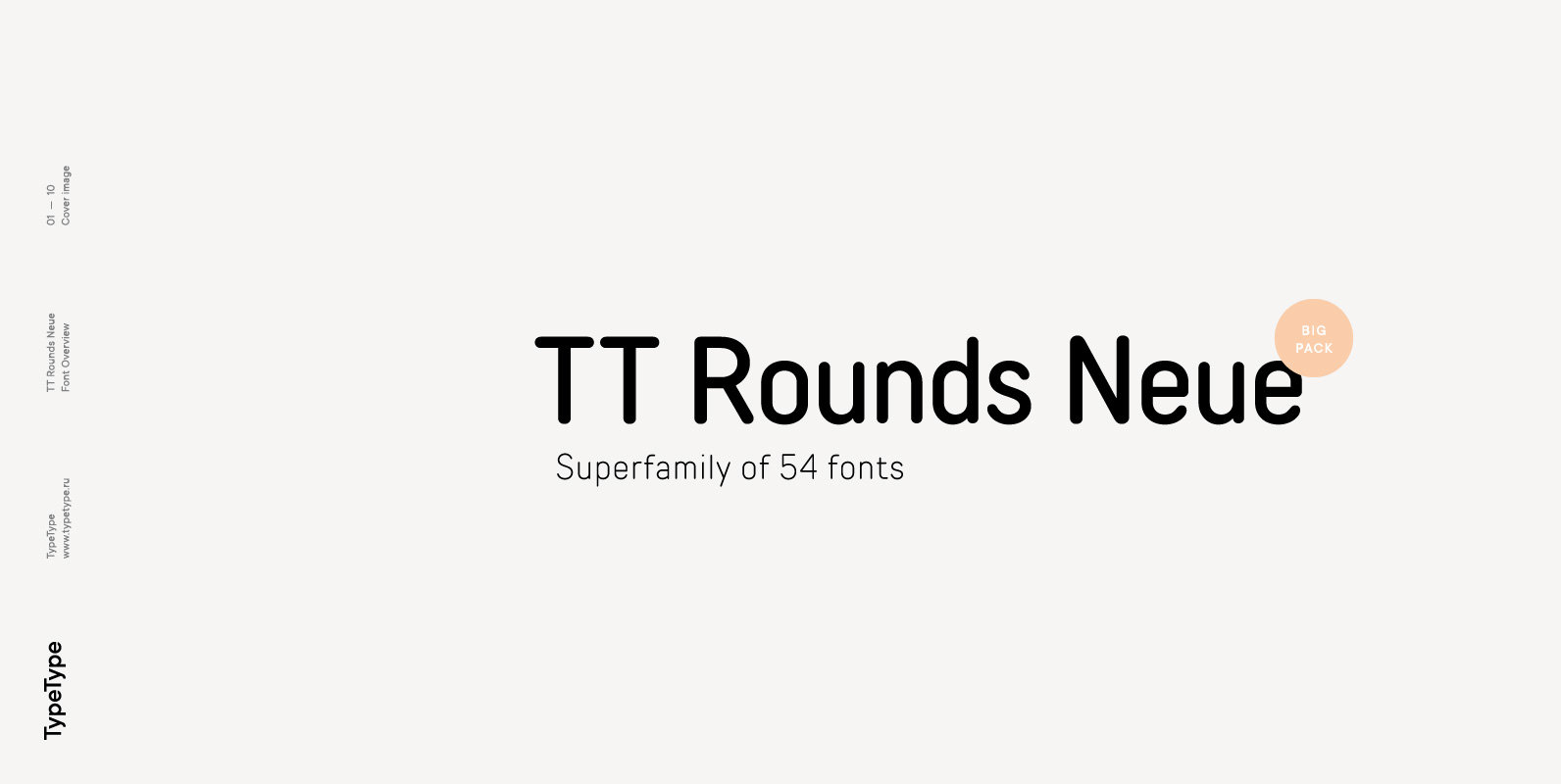
TT Rounds Neue Font
TT Rounds Neue is a new modern look at the once popular TT Rounds and TT Rounds Condensed typefaces. At some point, we realized that the old “rounds” could no longer cope with the modern requirements for typefaces, and we
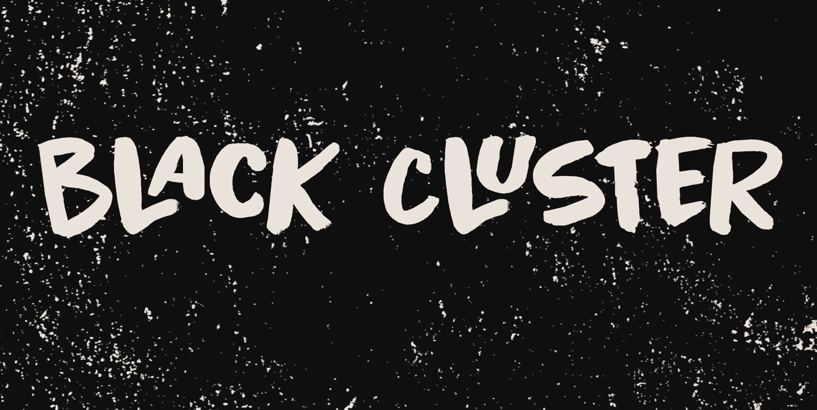
Black Cluster Font
First things first: I am really not a Star Trek fan. I did come up with this name, which I thought had a good ring to it. When I checked whether the name was already taken, I found out that
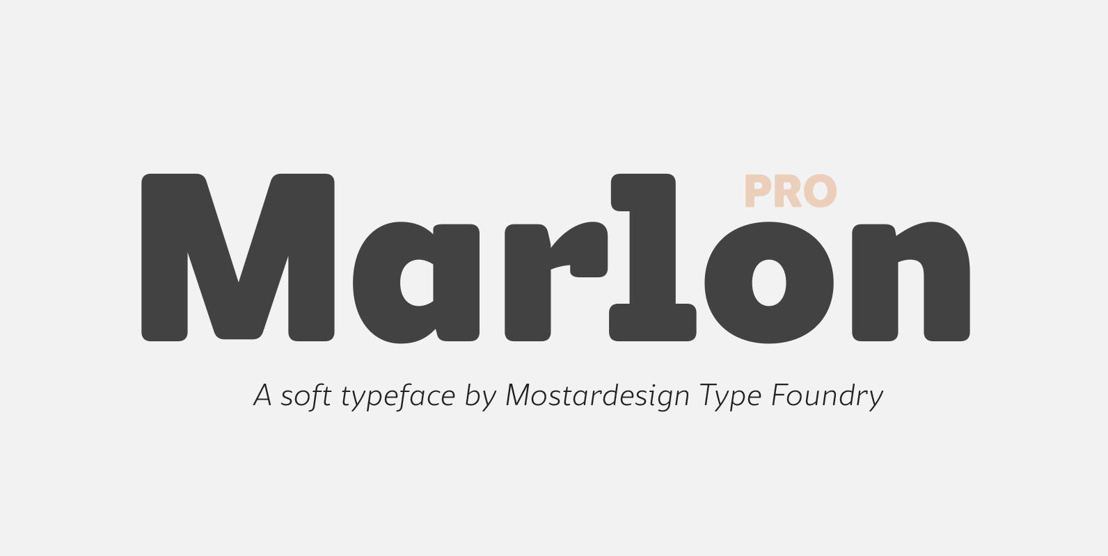
Marlon Pro Font
Marlon Pro is a soft sans serif font family characterized by its contemporary aspect and its warm touch. It provides advanced typographical support with features such as case sensitive forms, small caps, ligatures, alternate characters, fractions, slashed zero, circled gures,
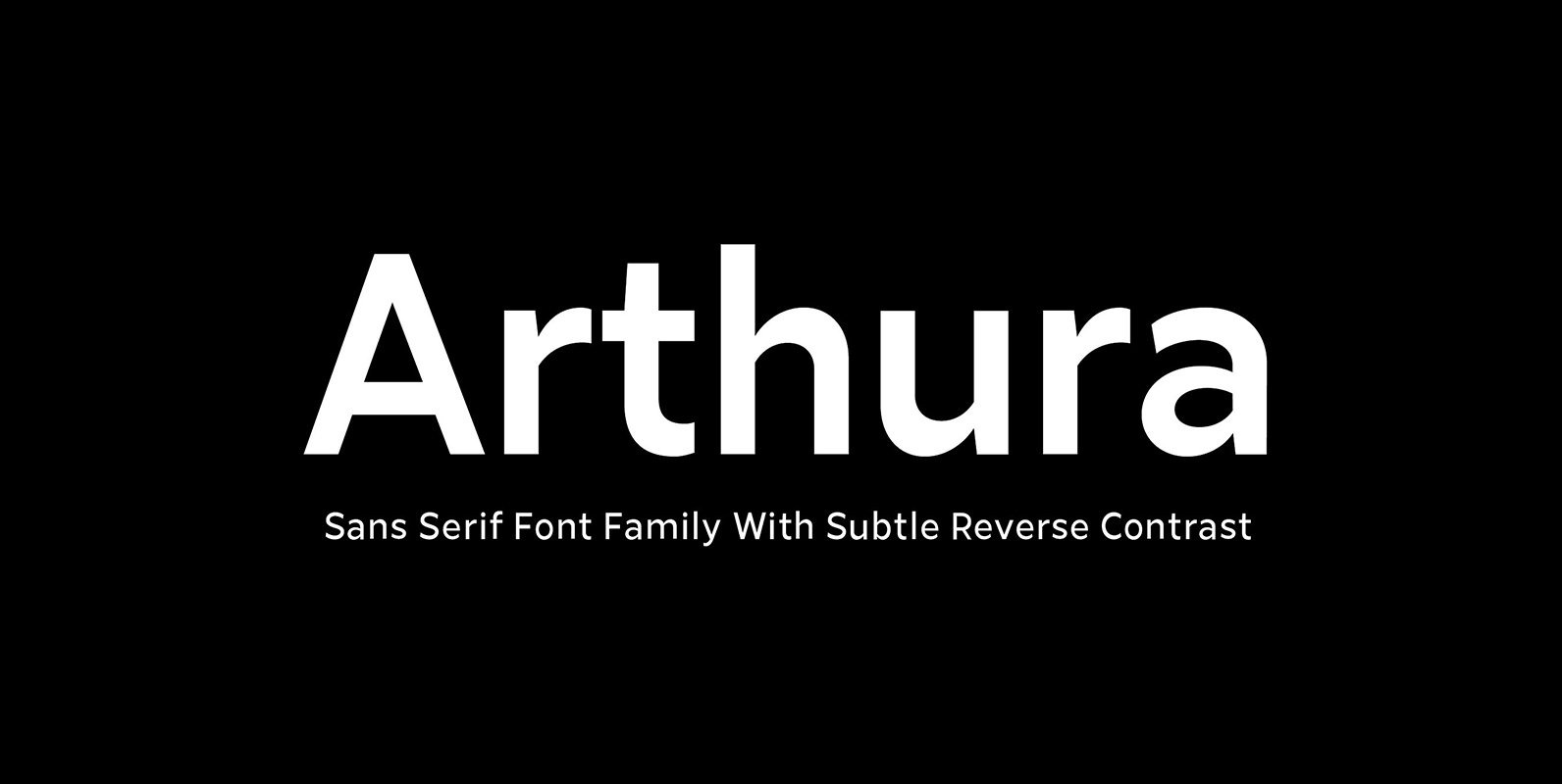
Arthura Font
Arthura is a sans serif font family with subtle reverse contrast, particularly visible in its ultra bold ‘Black’ style. Six weights plus matching italics. Simple geometry and with humanist nuance that adds warmth. t’s a perfect choice for branding, magazines,
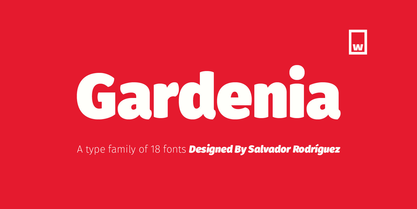
Gardenia Font
Gardenia is a grotesk sans-serif. It comes in 9 weights with matching italics. It was designed by Salvador Rodríguez in 2015/2016. It is characterized by legibility in the medium sizes, black and thin weights are great performers in display sizes.
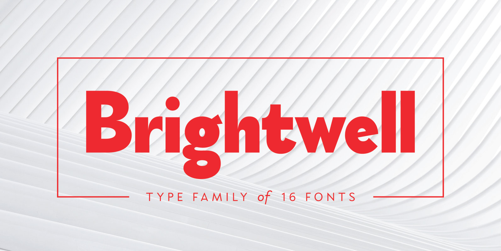
Brightwell Font
Brightwell is a sans-serif typeface consisting of 6 upright weights and 6 italics. Initially following the grotesque-geometric forms popular during the 1920’s, Brightwell’s structure has evolved into a different one, with narrower and more organic proportions, increased contrast and smaller
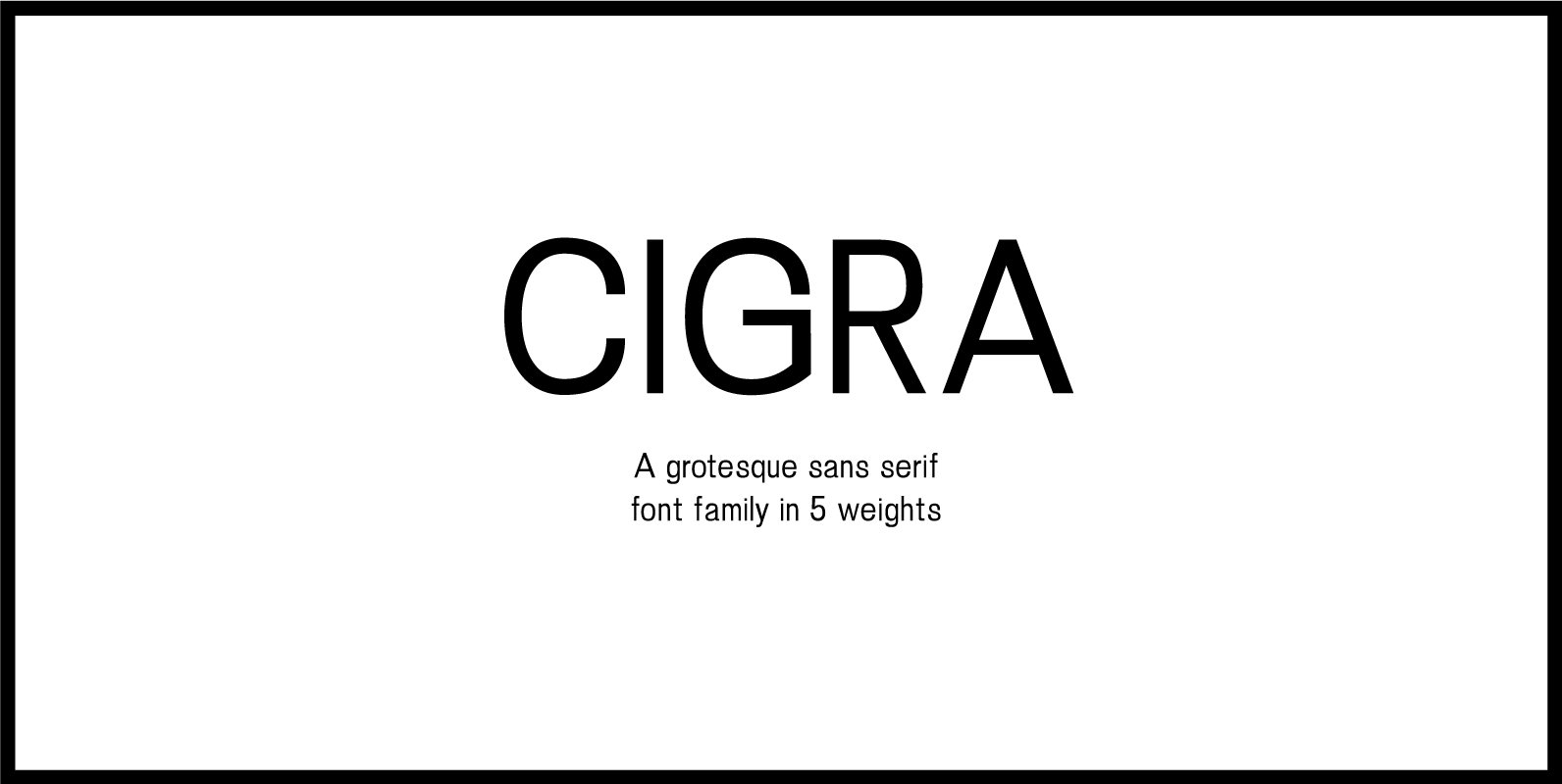
Cigra Font
This contemporary, witty sans serif is a nod to the quirks and nuances of early grotesque fonts. With medium contrasts, a medium x-height, 90-degree terminals and rather tight apertures (especially in the heavier weights), this sans serif makes a distinctly
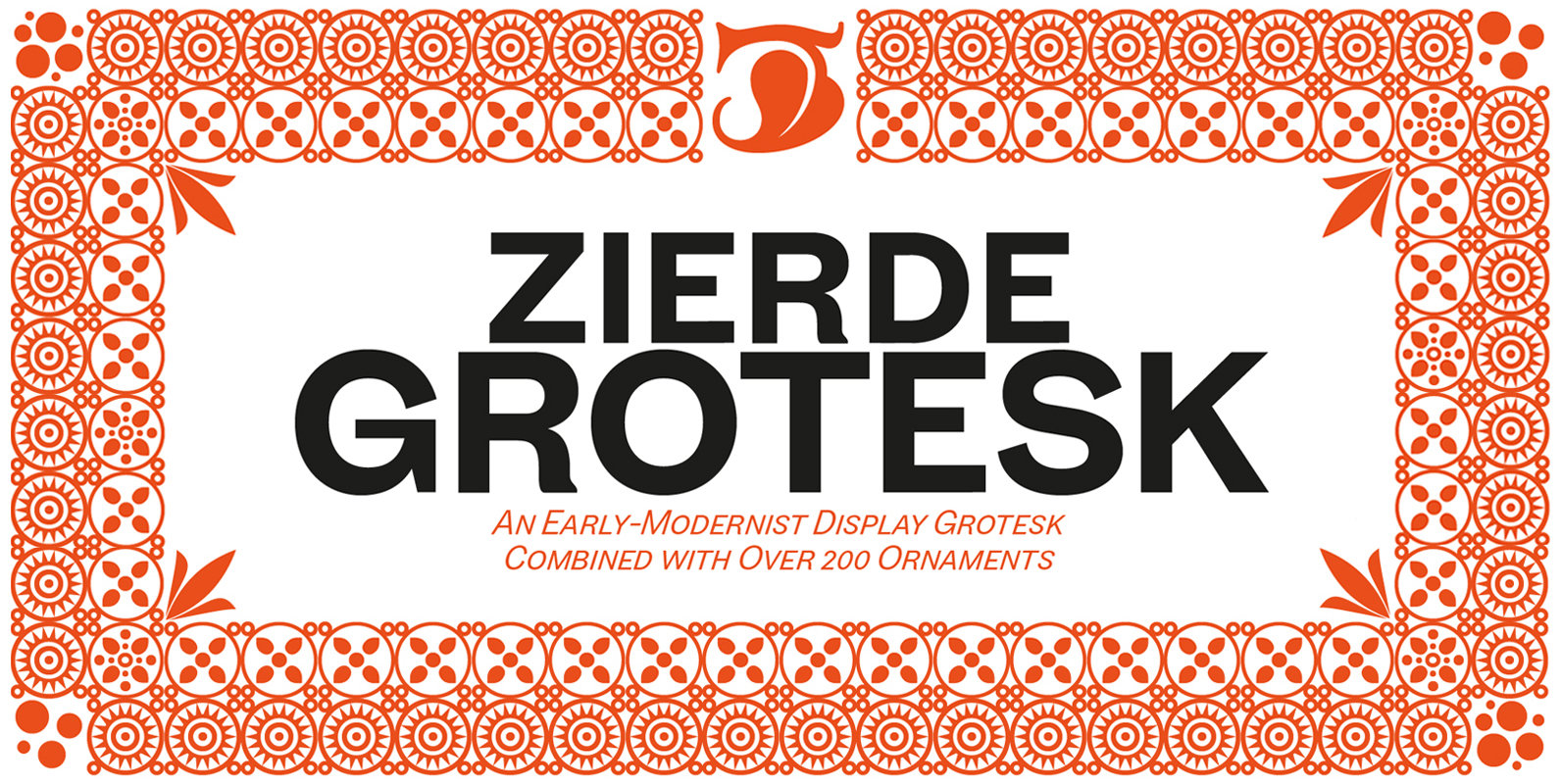
Zierde Grotesk Font
Zierde is a take on early advertising, small-copy grotesks of the late 19th/early 20th century, and is largely inspired by Miller & Richard’s own range of Grotesques. More importantly, Zierde is accompanied by a large set of ornaments (+200) which