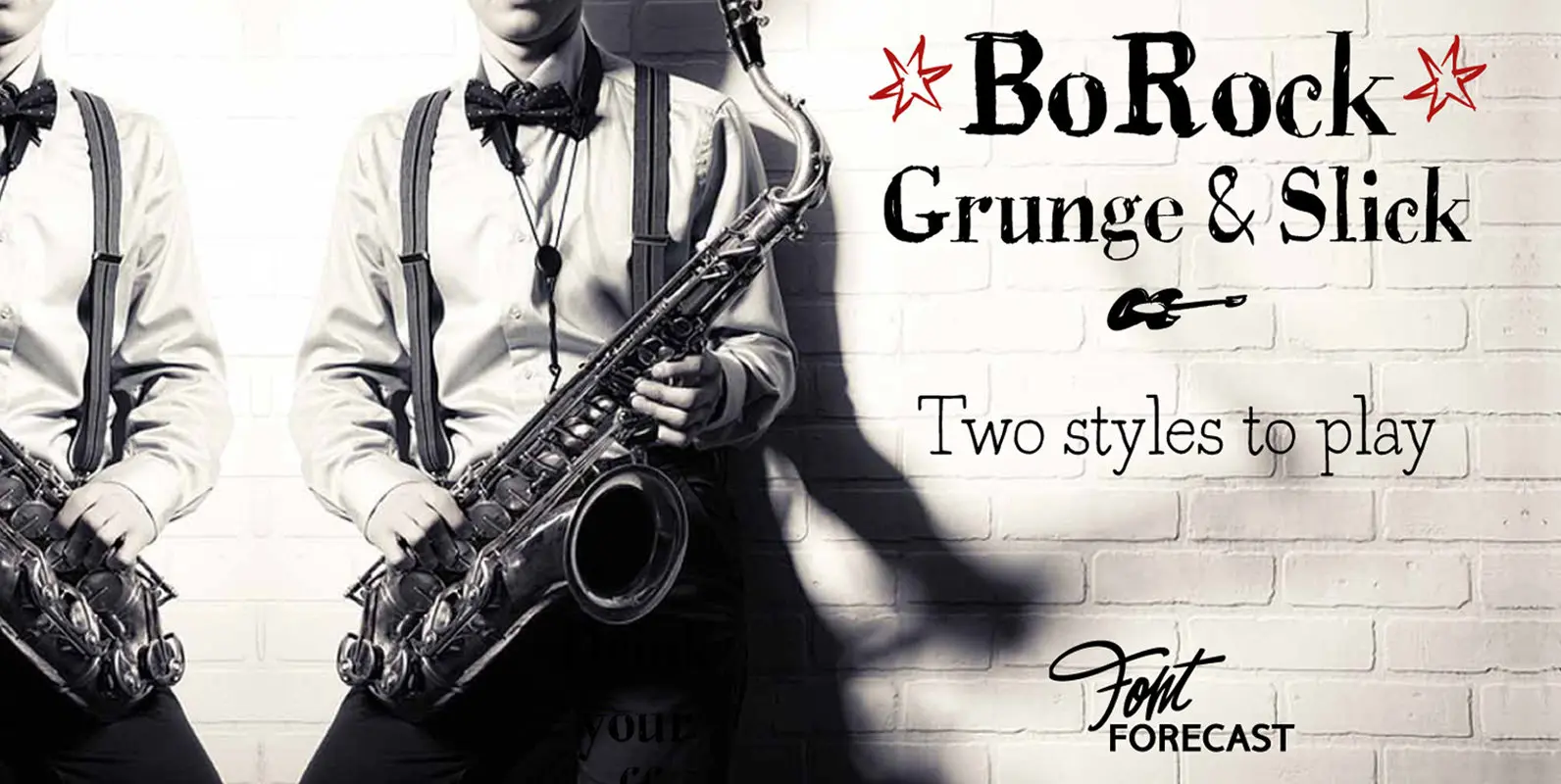
BoRock Font
BoRock is a handcrafted font that comes in two pigheaded styles, inspired by the rock music scene. You can use BoRock instead of the usual neat serif fonts. BoRock Grunge is a rough crispy serif font, excellently suited for use
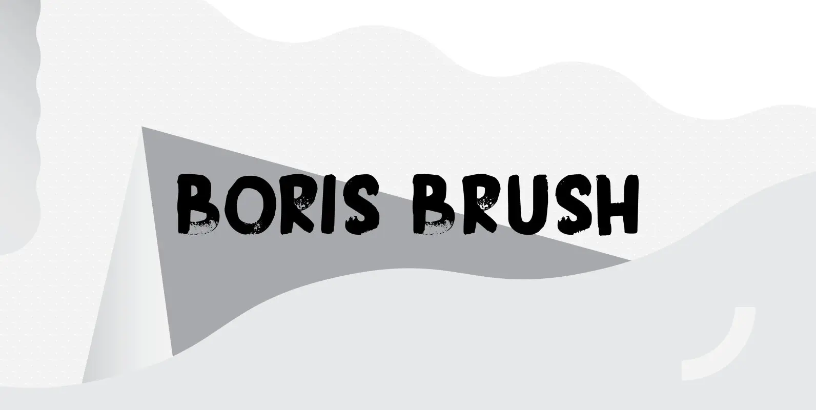
Boris is my son: he was born on January 7th and he is as cute as can be. Boris Brush font is a very loud, very useful brush typeface, which I created using some fine-haired brushes and black paint. It
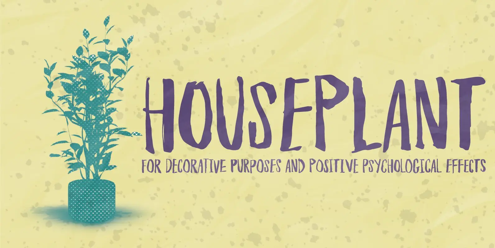
Houseplants are commonly grown for decorative purposes, positive psychological effects, keeping fresh or health reasons such as indoor air purification. Actually, just like this font has a positive effect on your artwork! This font comes with a heavy load of
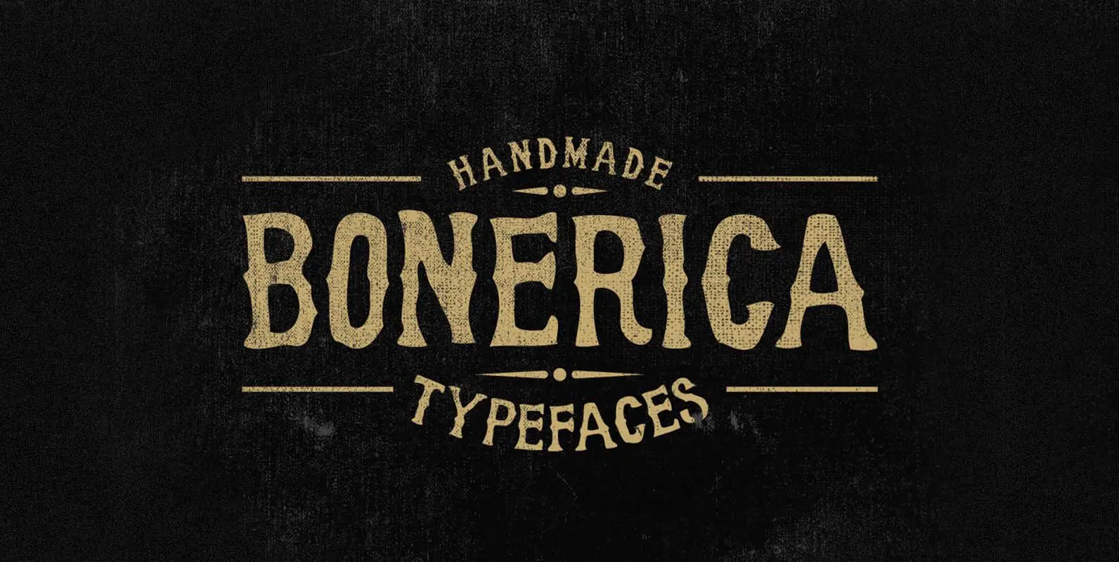
Bonerica is a wood type design released and designed by Panji Nugraha. Published by Panji NugrahaDownload Bonerica
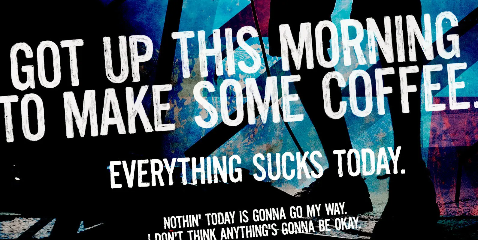
Boring titles? Boring chunk of text? Unbore’em all! This nifty stackable family features two fonts, both with two options for each letter. Pile them up and play with opacities for a killer superposed effect. Or use each alone if you
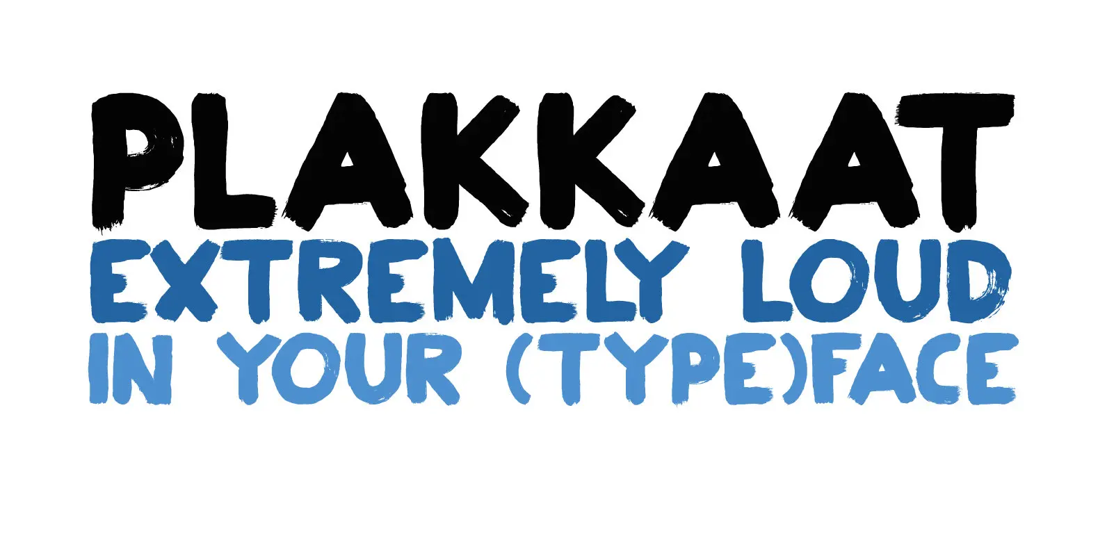
Plakkaat is a fat brushed font, made with wide brushes and paint. Since it is a very easy to read font (and not to be missed), it is ideal for advertising campaigns, or demonstration signs.. This 2019 version comes with
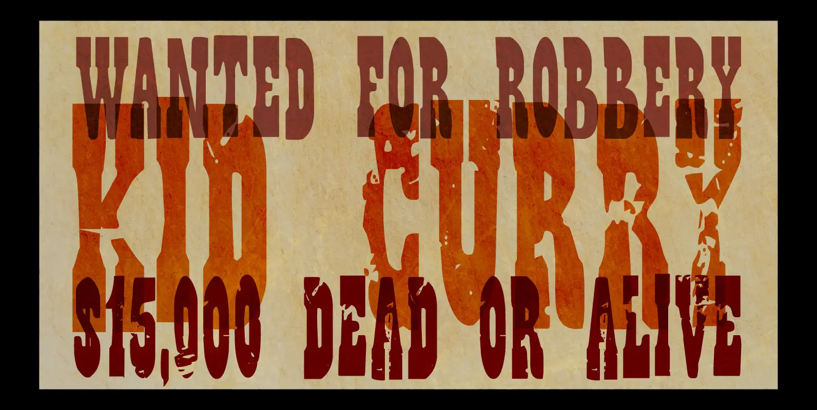
The Wild Bunch, also known as the Doolin–Dalton Gang, was a gang of outlaws that terrorized Kansas, Missouri, Arkansas, and Oklahoma Territory during the 1890s. They robbed banks, killed lawmen and held up trains. Of course its members were hunted
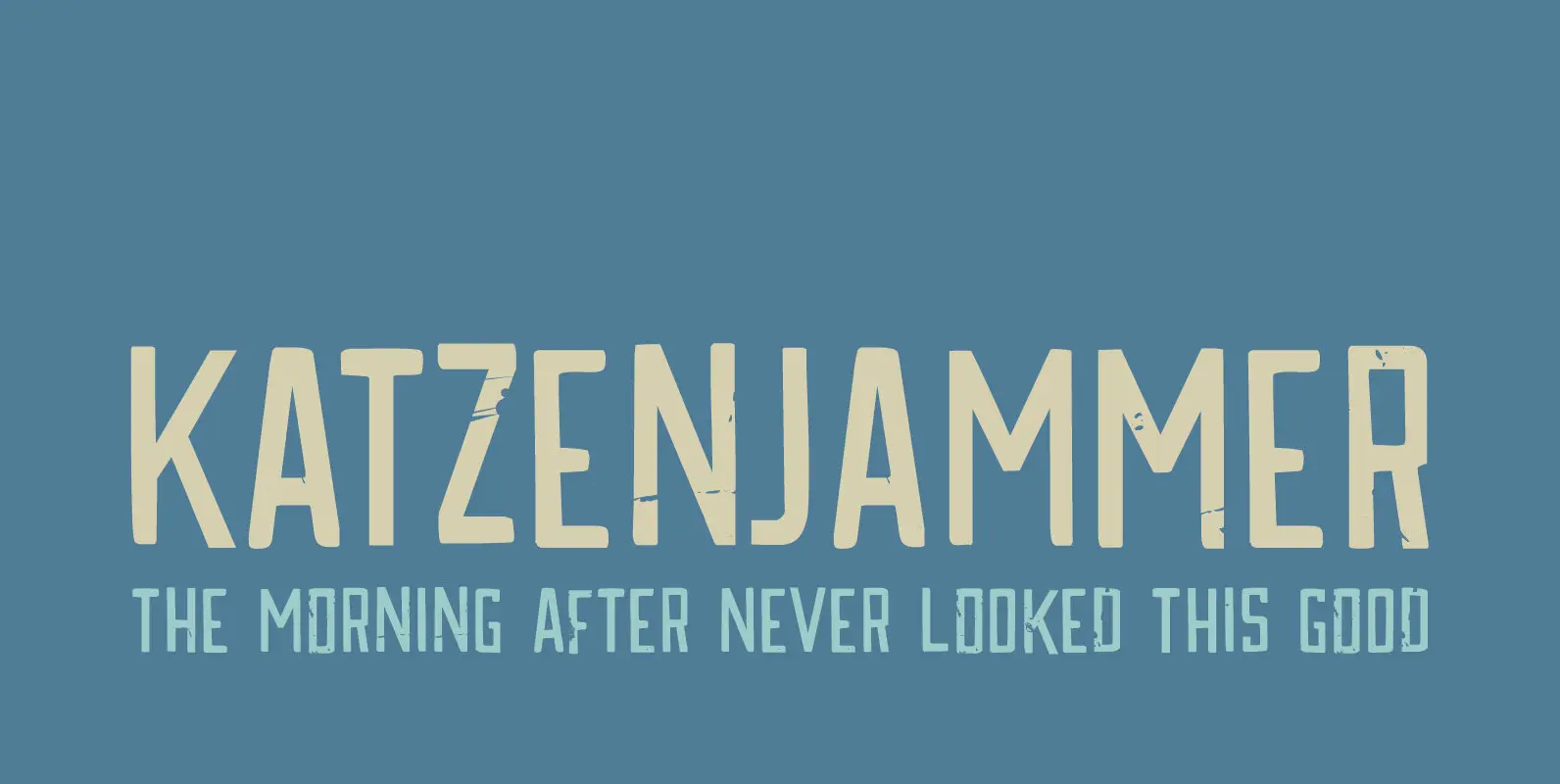
Katzenjammer is a German word meaning ‘Cat’s Wail’ – it is used to describe a hangover. Katzenjammer font is a slightly eroded, squarish typeface, which would be ideal for headlines, packaging, posters and websites. This all caps font comes with
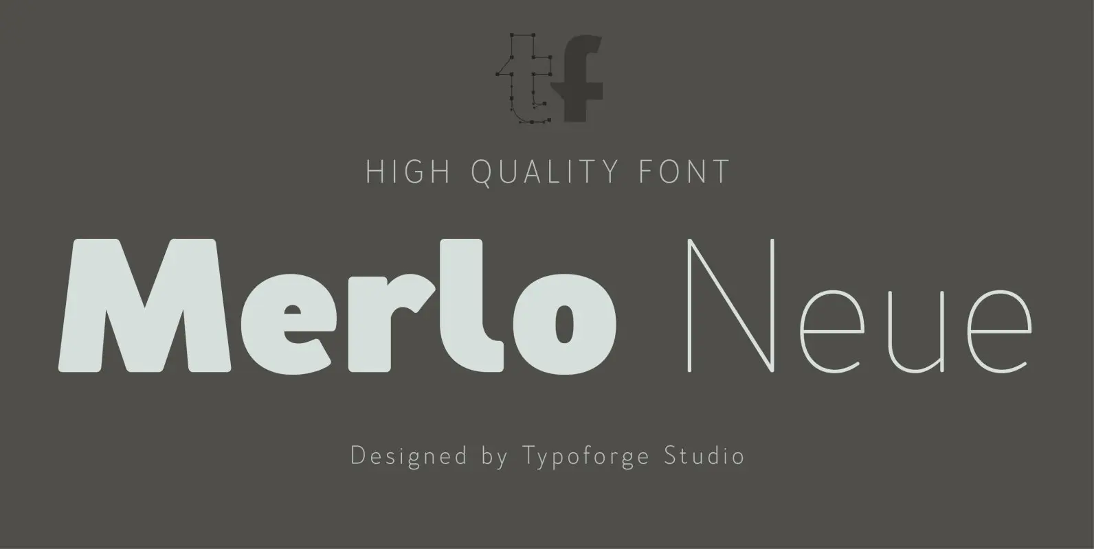
Merlo Neue is the younger brother of Merlo. New family received refreshed, more square proportions and a new shape of many glyphs. However, what is the most important in new Merlo, is the wide range of instances – nine new weights,
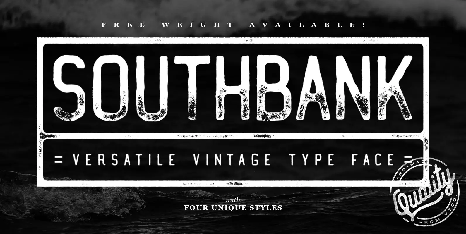
Southbank Display Font is the latest font from Vintage Type Co. and comes with packed 4 unique condensed styles, each with an italic, and inked counterpart. Whatever you’re designing, one of these styles is sure to fit your needs! Aside
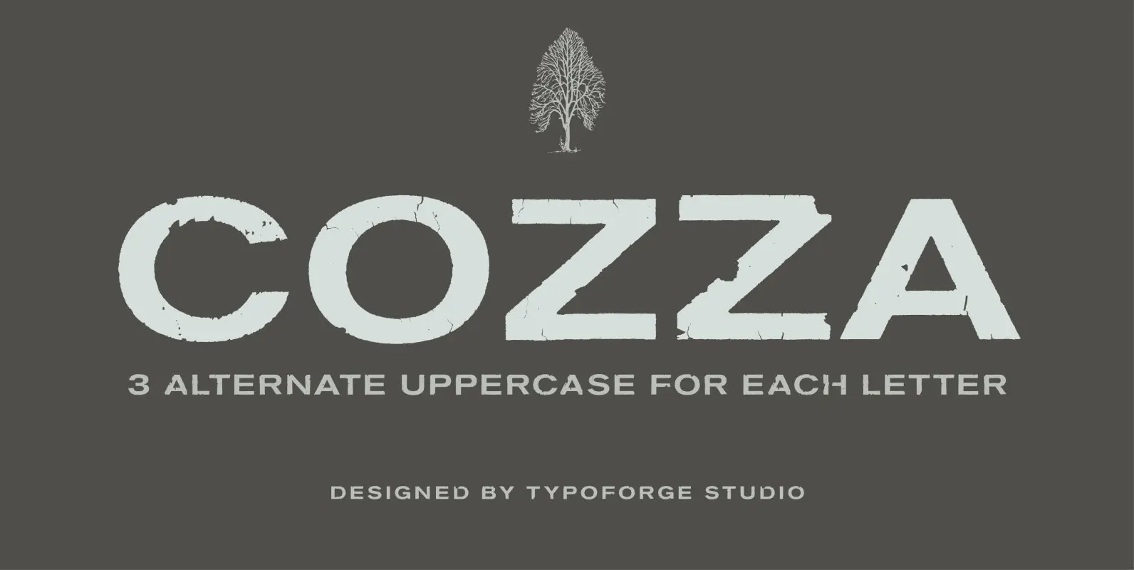
The inspiration for the design of the font Cozza was Unitra Letraset from the 80s. Dry transfer lettering was used by architects from Poland and Czech Republic. Font Cozza, for each character has three alternative characters with their automatic replacement.
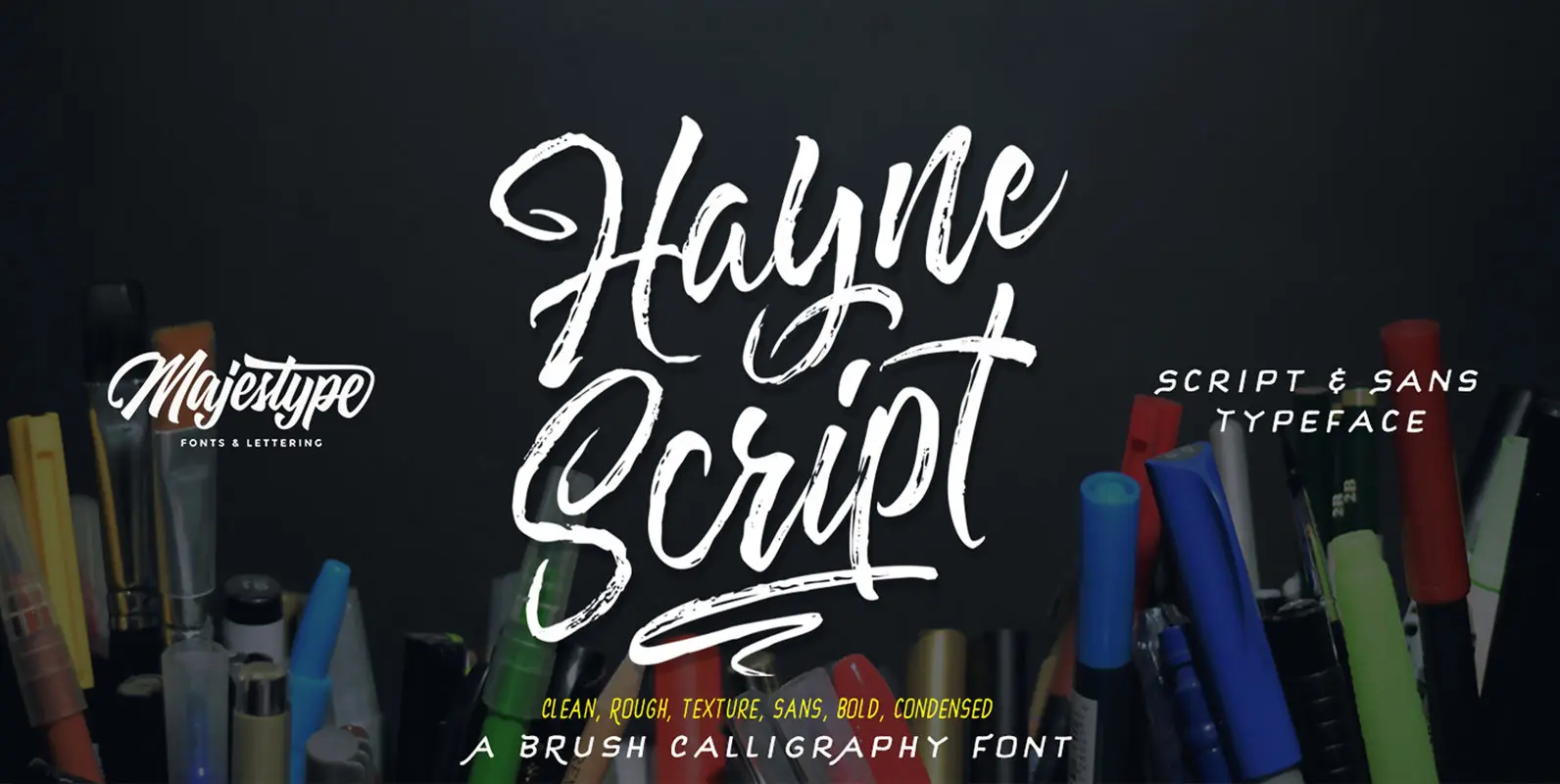
Hayne Script + Sans is a brush style design published by Majestype. Published by MajestypeDownload Hayne Script
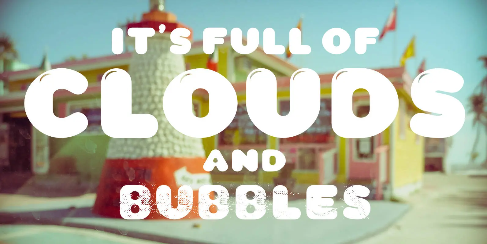
Yum, yum, a fat sausage font including plain and highlighted letters and a »Stencil« style if you need to spray something on walls. No, no! The form of the typeface was inspired by the pixelated in-game title font of the
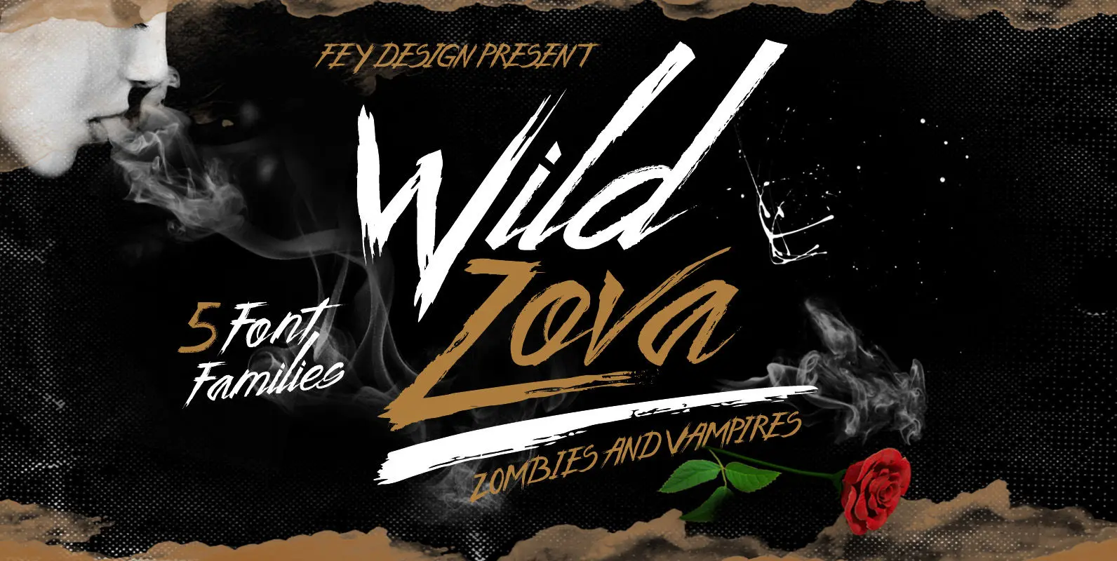
Wild Zova is script font design by Ferry Hadriyan. Published by Ferry HadriyanDownload Wild Zova
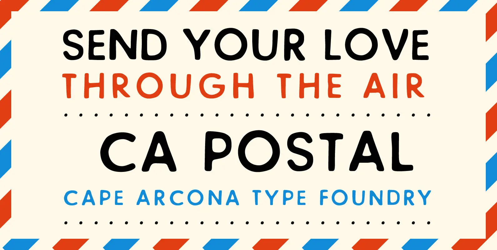
CA Postal is a cute and clever little stamp-font. It was originally intended for a record-cover only, but when the artist wanted all lyrics printed in the booklet, it was time for a font. The initial inspiration was a moveable-stamp