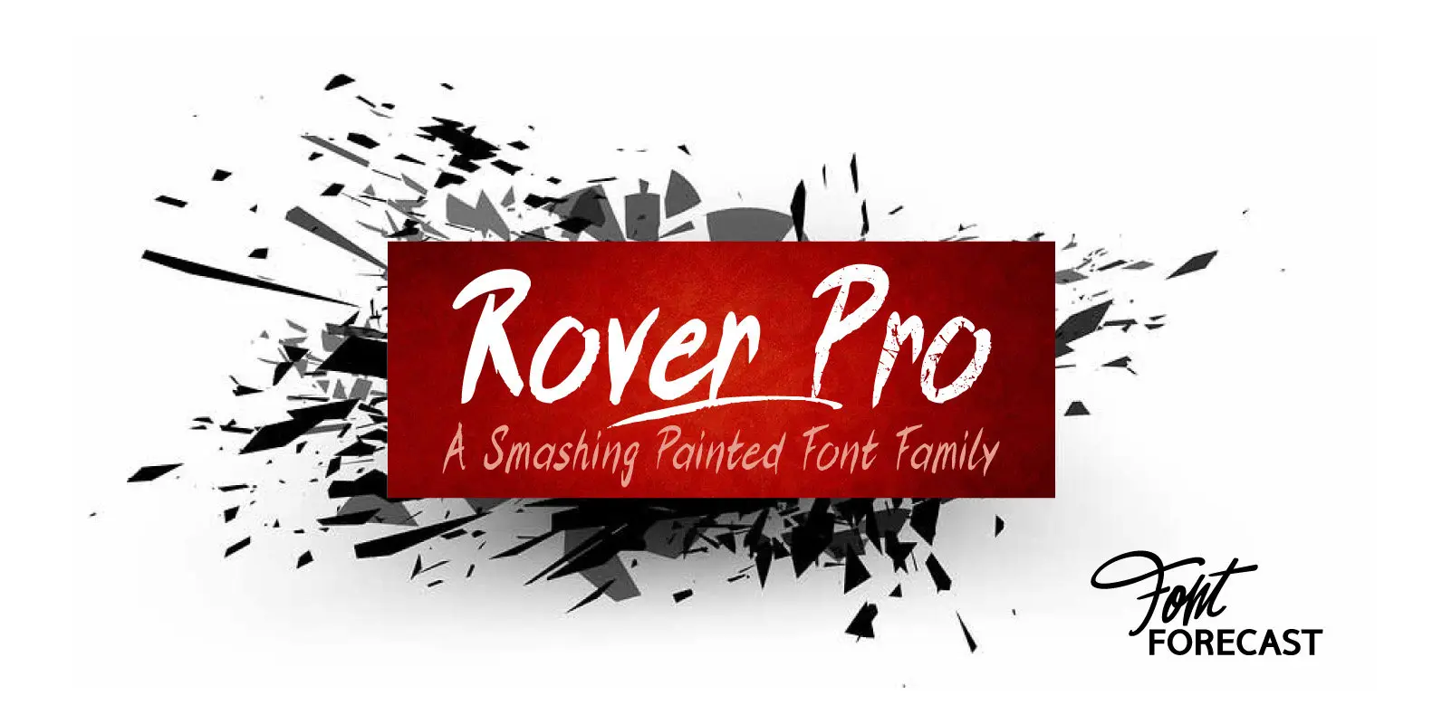
Rover Pro Font
Rover Pro is a hand painted font family that comes in 5 styles: Regular, Bold, Bold Shadow, Bold Rough and Extra. It was designed with retail in mind, but is also perfectly suited for other uses. The flat brush that
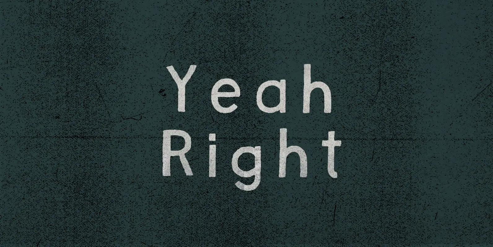
Not far enough removed to harmonize through sarcasm, the remark struck a sour note. Skepticism, on the other hand, ducked that discord and countered with open confrontation: Yeah Right. Convince me. Published by BLKBKDownload Yeah Right
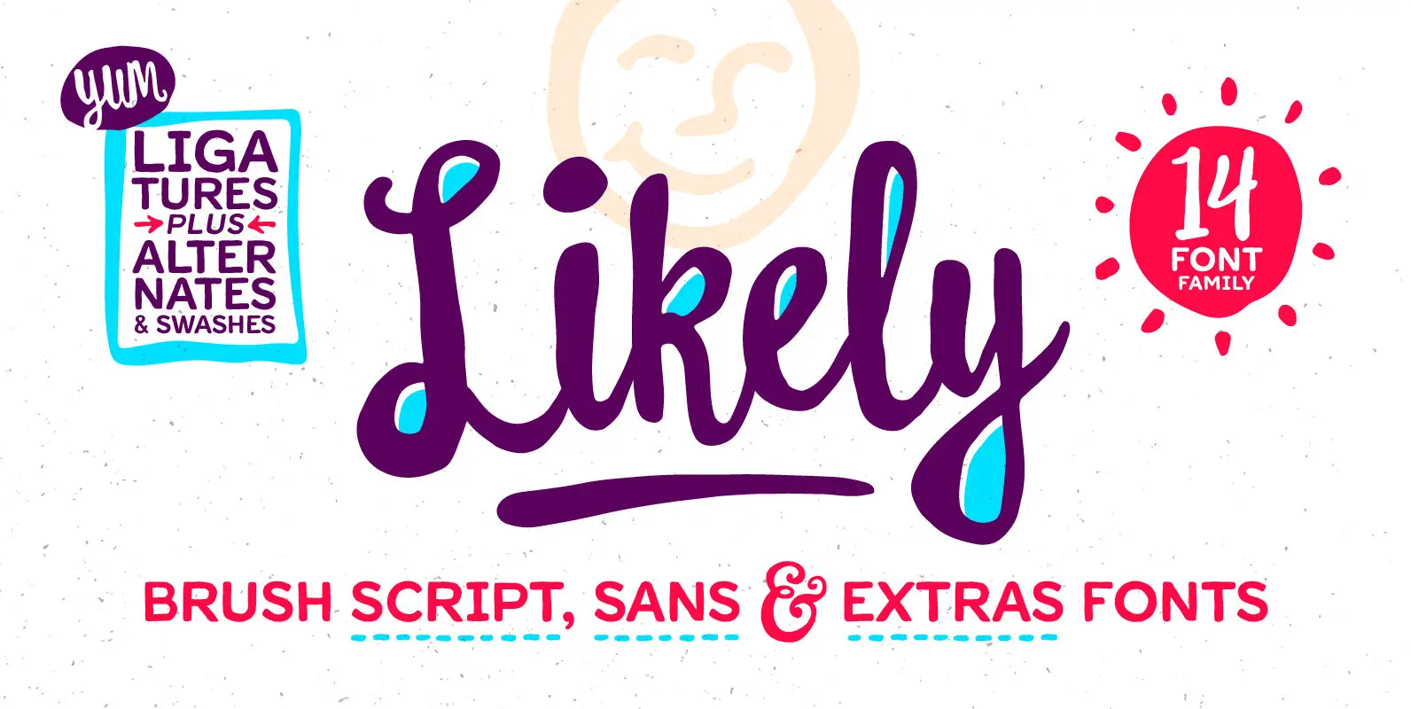
Likely is a joyful, brush script type family with complementary sans serif and extras styles. Hand drawn freely but carefully, each of the fonts are designed to work together to present a vibrant and natural package. Layer and colorize the
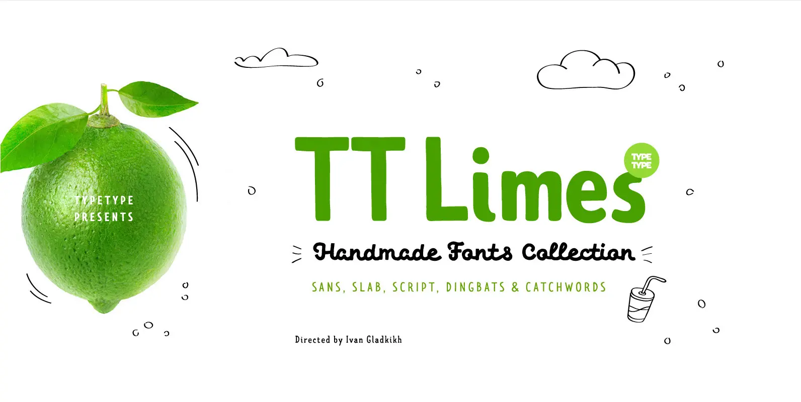
The idea of TT Limes emerged at the seashore last year in late summer. Getting ready in advance for a dark winter, we've decided to design a special fontfamily which would bring a bit of vitamins and summer sun into
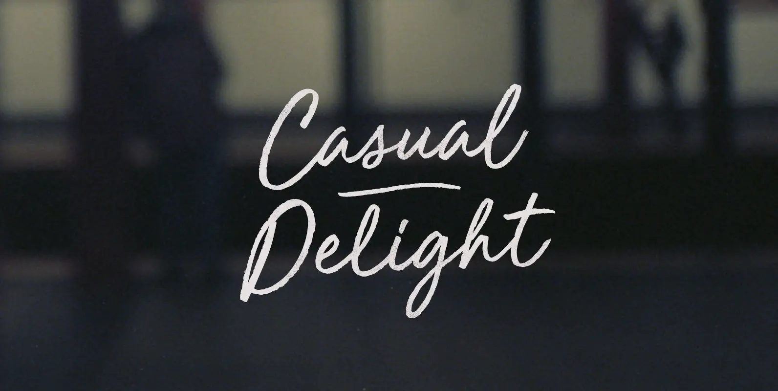
He stood, pinching and pulling the front of his chinos off his Derbys like a still-thin Wilford Brimley. The strained gesture belied our customary Casual Delight. He wasn't born and bred in those clothes–his old man wore sweatpants like the
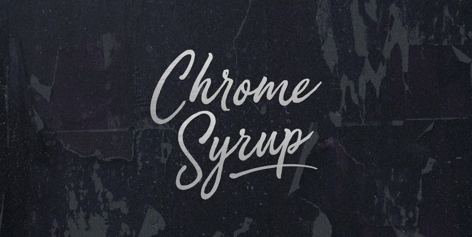
Here we are, giving matter mad shine. Mad as bathing hot cakes in mercury, dripping off quick like silver with a sticky sparkle. Chrome Syrup in squeeze bottles, in the door of your fridge, to the door of your car,
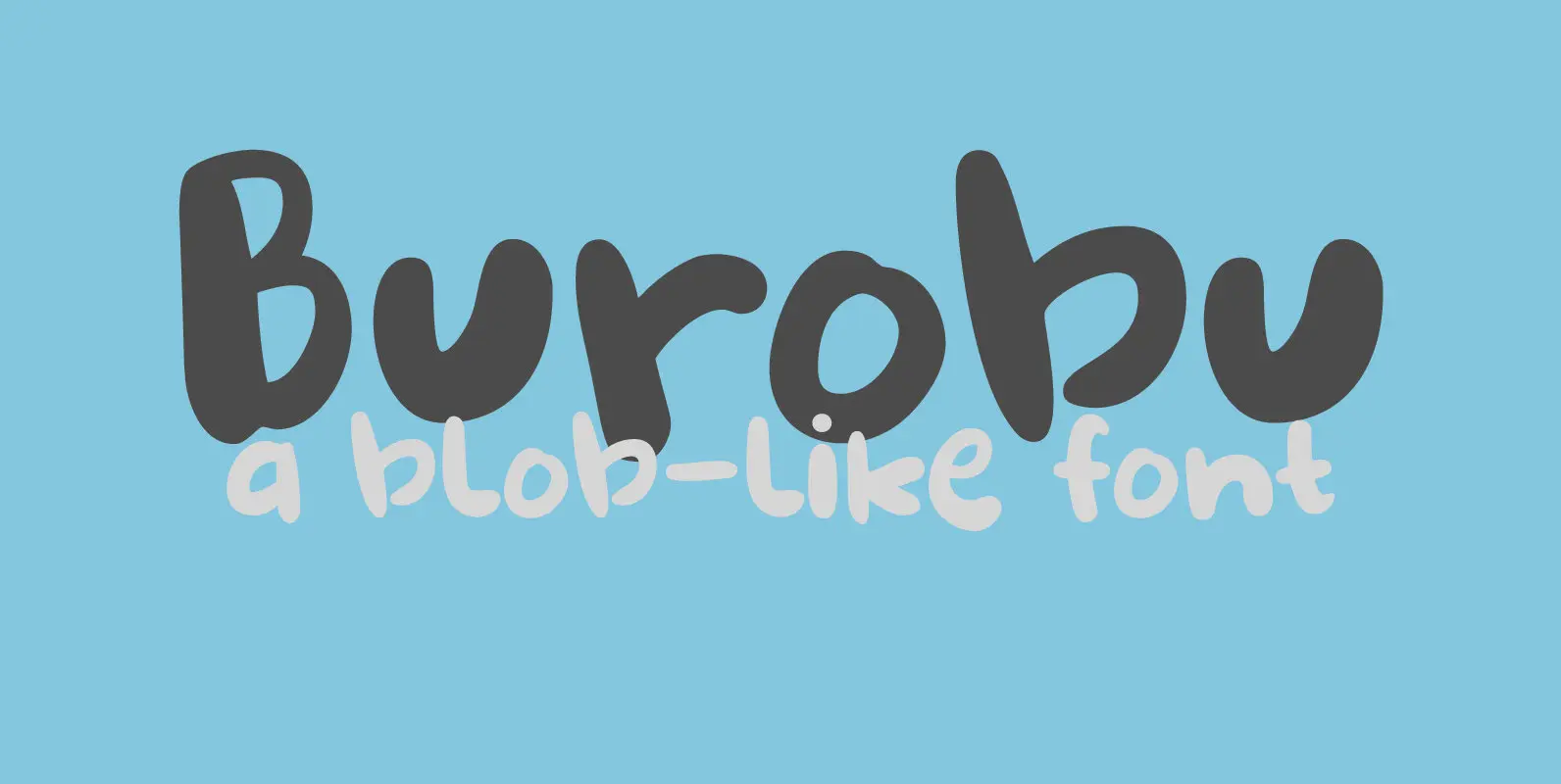
Burobu, in case you’d like to know, means ‘blob’ in Japanese. I thought it was quite an appropriate name for this blob-like font! Burobu is a messy font and comes with a generous helping of jittery, jumping glyphs, exaggerated strokes
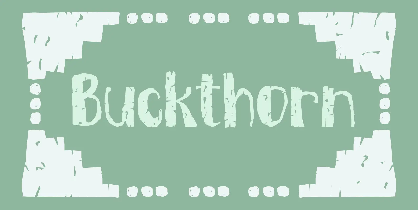
Buckthorn is a genus of about 110 species of shrubs and small trees, native to North America and Asia. Its uses are varied: it is used for dye, oil, printing ink and oil. That concludes the botany class for today,
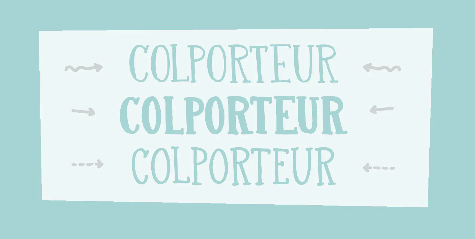
A Colporteur is a peddler of books, newspapers, and similar literature. When I was young, we often got visits from colporteurs – mostly they wanted to sell us a very expensive encyclopaedia. I haven’t seen them for a while –
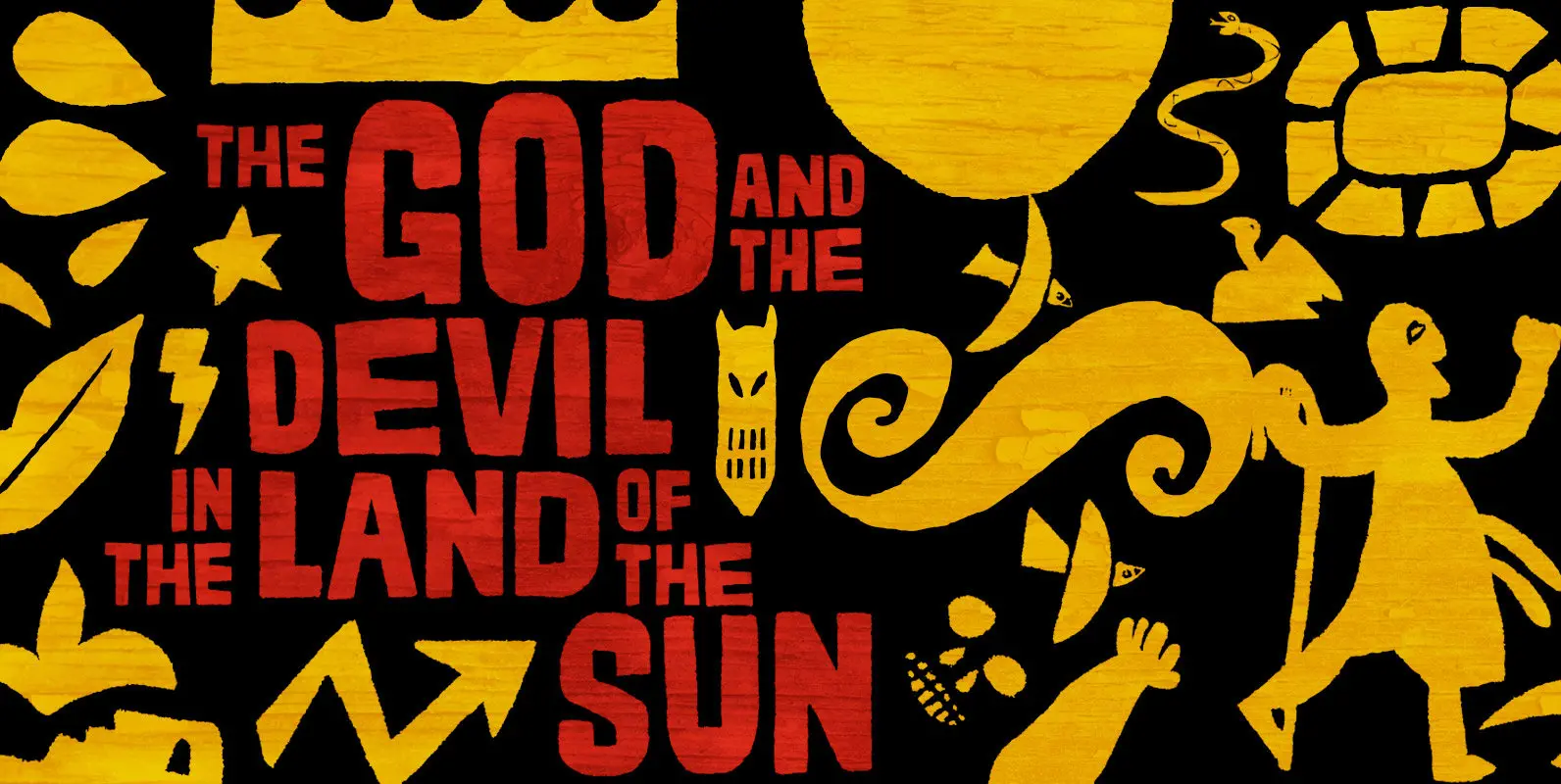
Impacting and vibrant, Cordelia family draws inspiration from covers of ‘cordel literature’, small booklets of popular story-poems that played an essential role on the folk-popular cultural life of Brazil. Printed in coarse paper, usually with an woodcut illustration and lettering
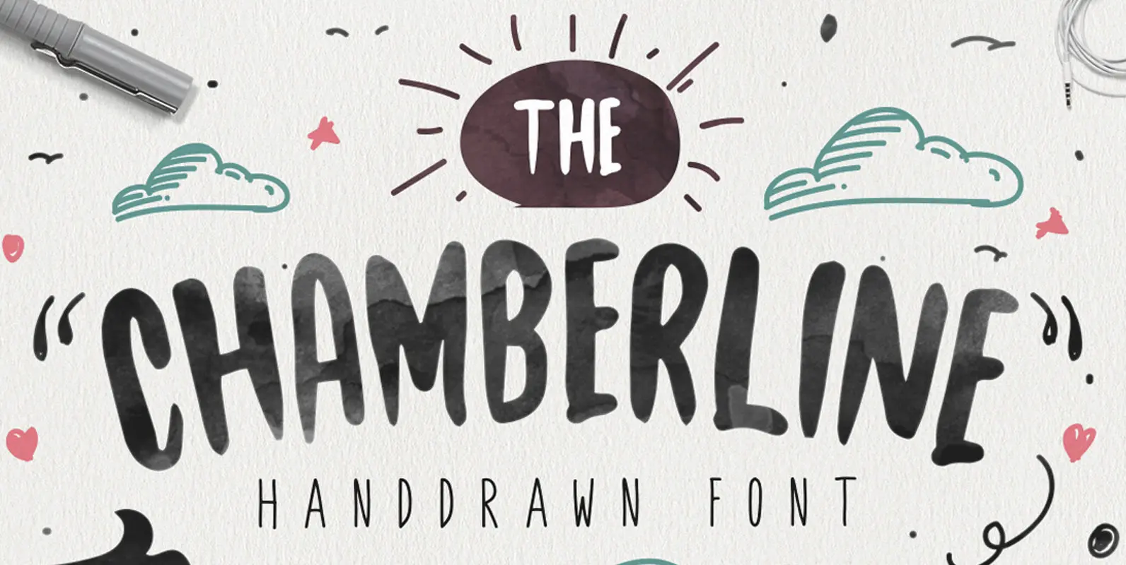
Chamberline is a lovely, hand lettering style typeface that works best for wedding invites, stationery, print designs and other types of print & packaging projects. Published by MaghribDownload Chamberline
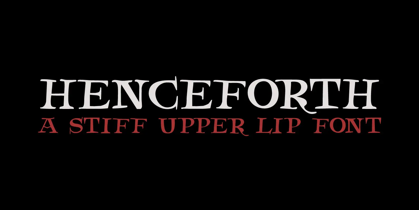
Henceforth is a hand-drawn, all caps didone-style typeface. It is a little rough, a little uneven, but lively and elegant as well. Personally I think it has a certain poshness about it: I mean, it wouldn’t look out of place
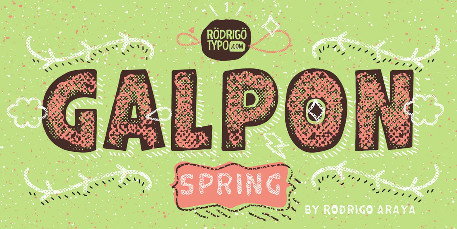
Galpon Spring Is a new version of “Galpon” where it can be combined with “Layer One” or shadow has multiple variants which makes it very attractive for different designs . Published by RodrigoTypoDownload Galpon Spring
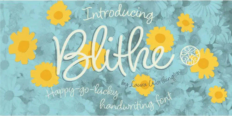
Bouncy, effortless-looking handwriting can put us at ease or make us smile. Blithe captures the casual flair of a felt-tip pen with clean monoline strokes. Laura Worthington has retained the distinctive quirks of real handwriting – such as characters that
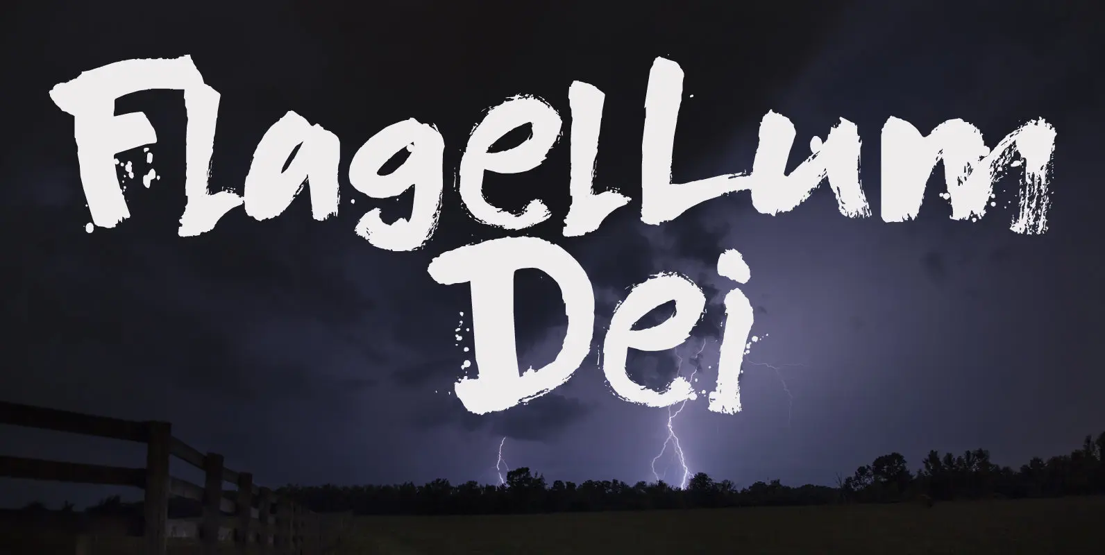
Flagellum Dei is Latin for ‘The Scourge of God’. It is a title given by later generations to Attila the Hun (406-453 C.E.). Flagellum Dei is also a rather scary font, which I made with the use of a stiff