Tag: headline
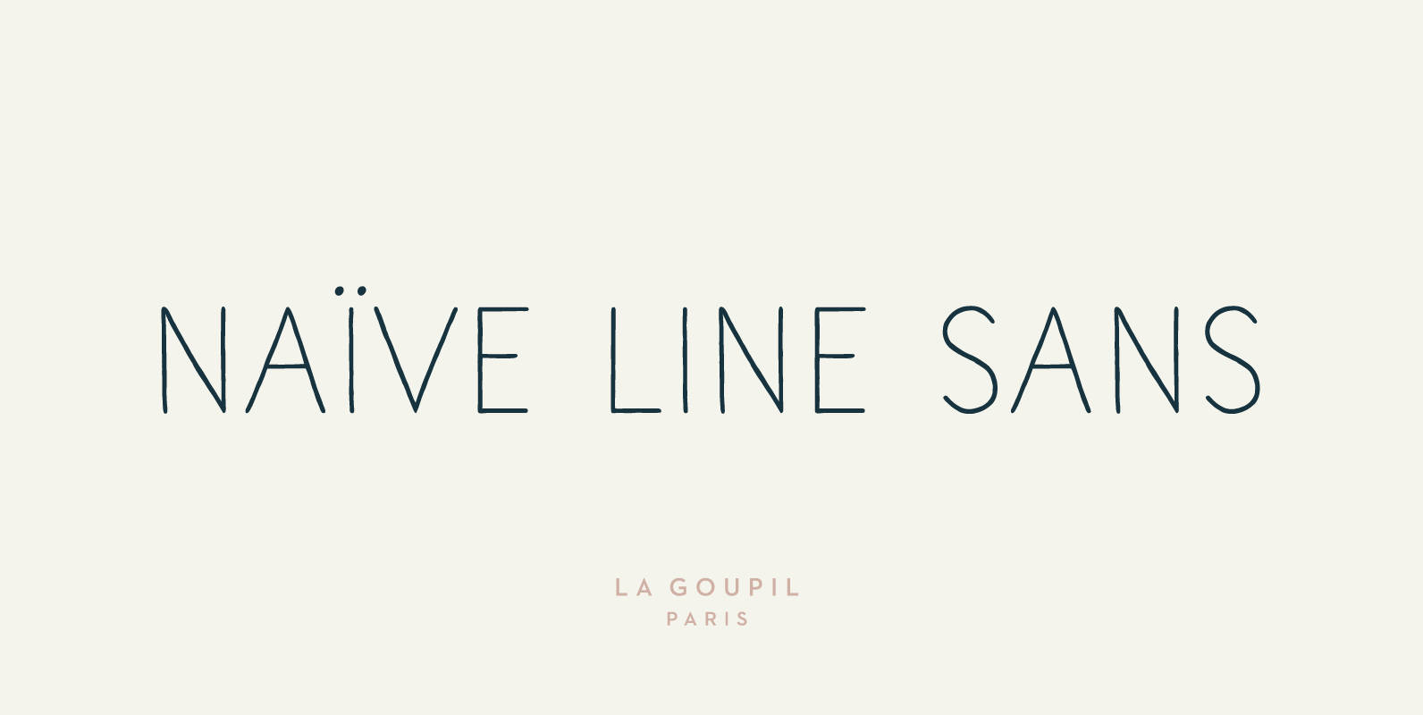
Naive Line Sans Font
Naïve Line Sans is an unusual handwritten sans serif font designed by Fanny Coulez and Julien Saurin in Paris. Our goal was to draw a font with finely irregular lines that give a human and whimsical feeling. We designed five
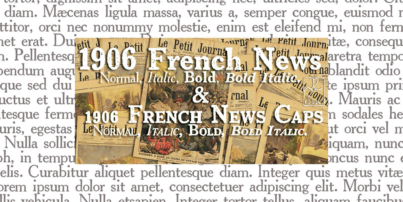
1906 French News Font
We have created this family inspired from the numerous derivatives in use for newspapers since the middle of 1800’s to the years 1970’s, inspired from the well known Clarendon. Mainly, the patterns are these used to print “Le Petit Journal”,
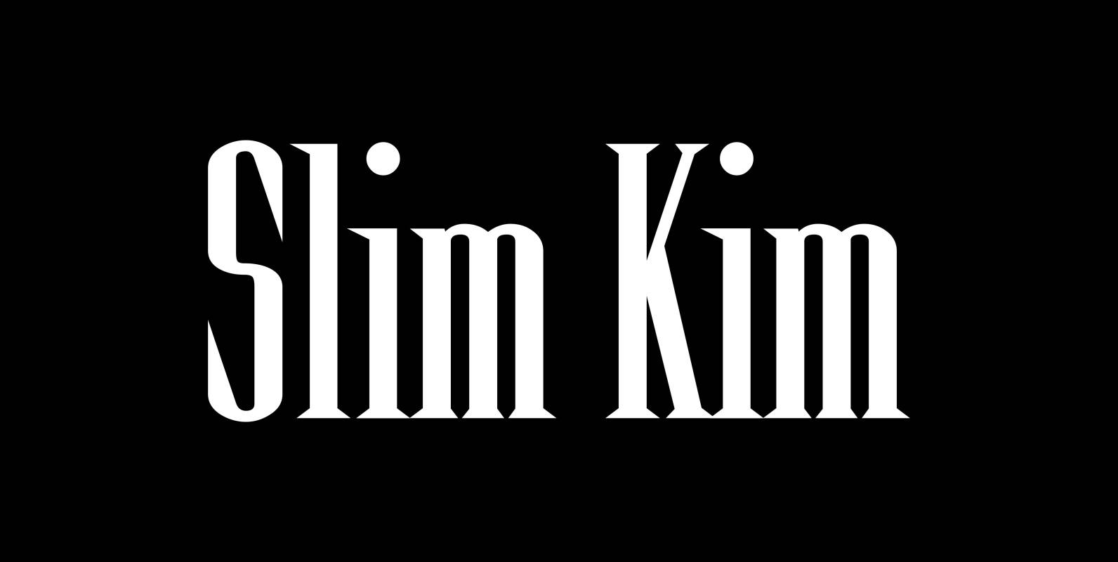
Slim Kim Font
“Slim Kim” is the sister font of “Julienne”. This font has very spiky serifs, so I did not want to make an extra slim version. This font mixes perfectly with “Julienn”. So whenever you need an especially slim serif font
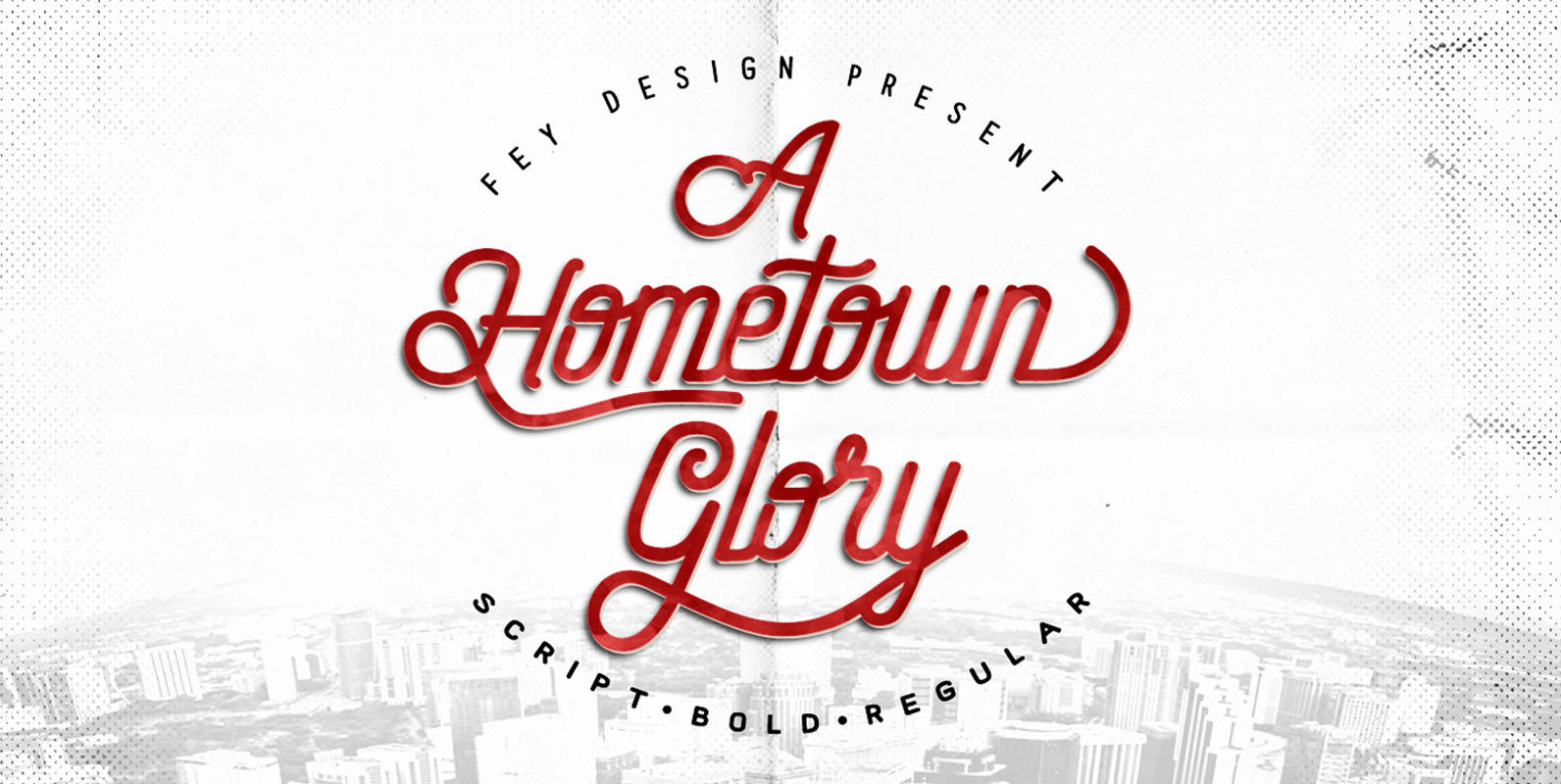
Hometown Family Font
This is Brush style font design that is suitable for weddings, events, t-shirts, logos, badges, stickers, and much more. Published by Ferry HadriyanDownload Hometown Family

Soft Times Font
“Soft Times” has been easy on my nerves after the strain of “Hard Times”. The harder the Times are the more do we need some soft typefaces, this one is the soft counterpart for “HardTimes”. Published by Wiescher DesignDownload Soft
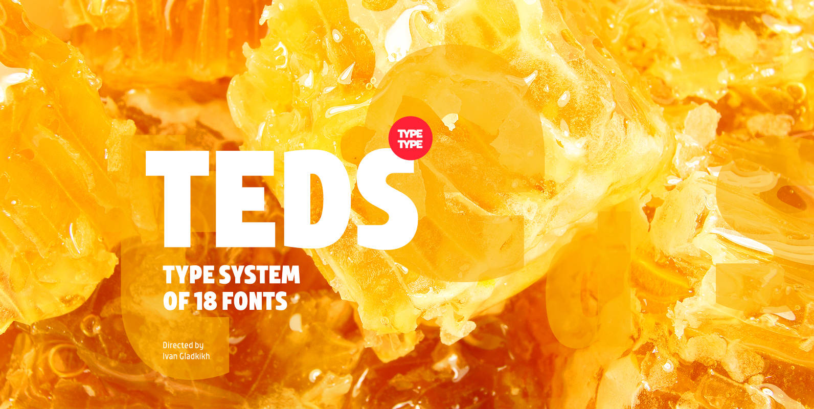
TT Teds Font
Teds is a geometric non-serif with narrow proportions created for universal application in any types of text. Relatively tall lowercase characters, open forms of semicircular characters, and low contrast between vertical and horizontal lines make this font type easy to
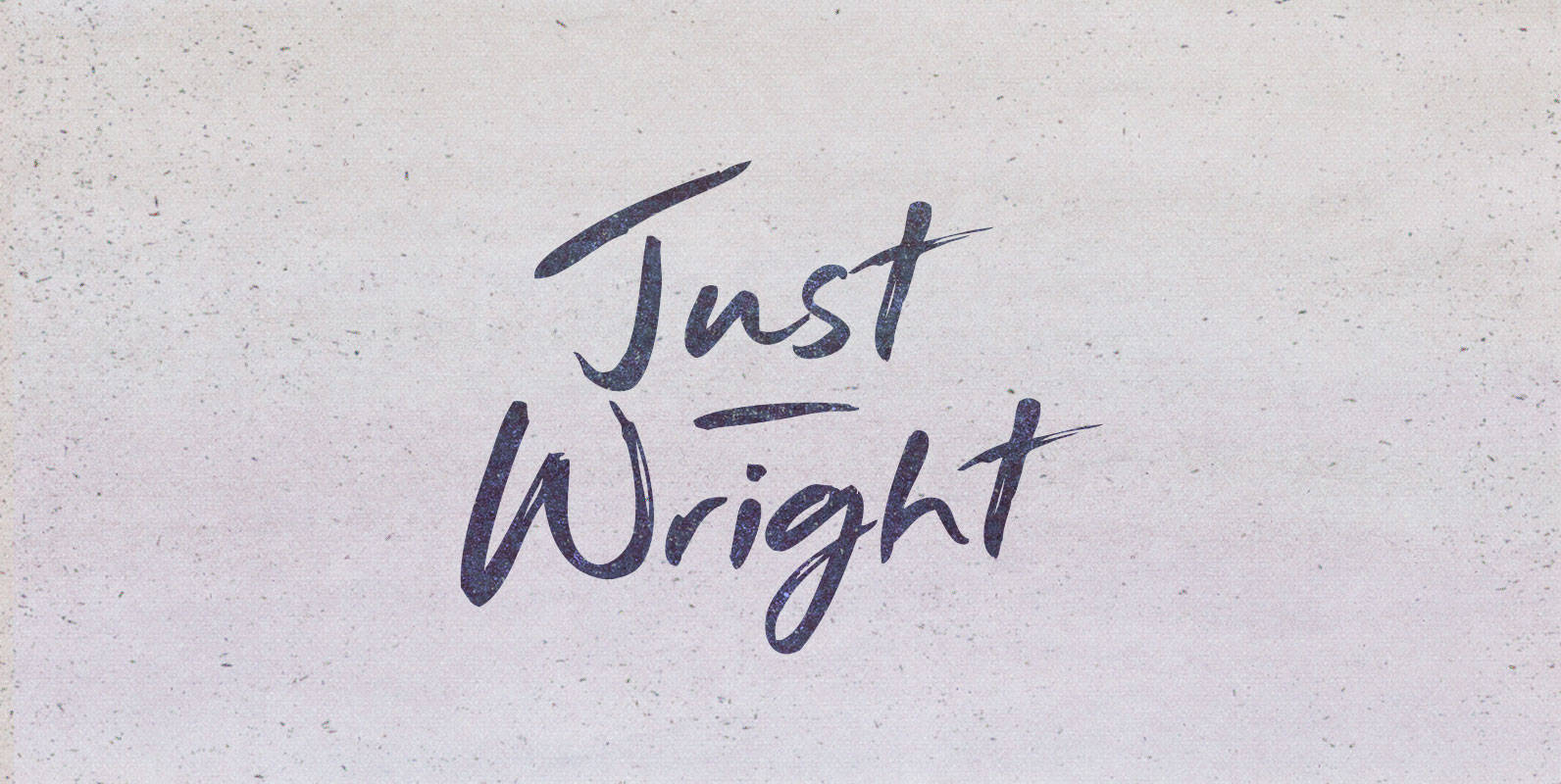
Just Wright Font
They had come for justice. It had been on order for centuries and they carried the bill their ancestors bestowed upon them. They came as a nation seeking her grand fleet, long under the nurturing of a great ship wright.
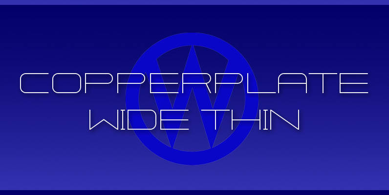
Copperplate Wide Font
“Copperplate Wide” is remotely based on the traditional Copperplate typeface that can be seen on many business cards. I have completely redrawn the typeface in a much wider version and without those stubby little serifs. In the place of the

Fleischer Font
Fleischer is a rough and playful display typeface good for headlines and posters. The face is based on historical letterforms combined with energetic 20th century pulp-style lettering. Fleischer comes with caps and small caps plus West, Central and East European
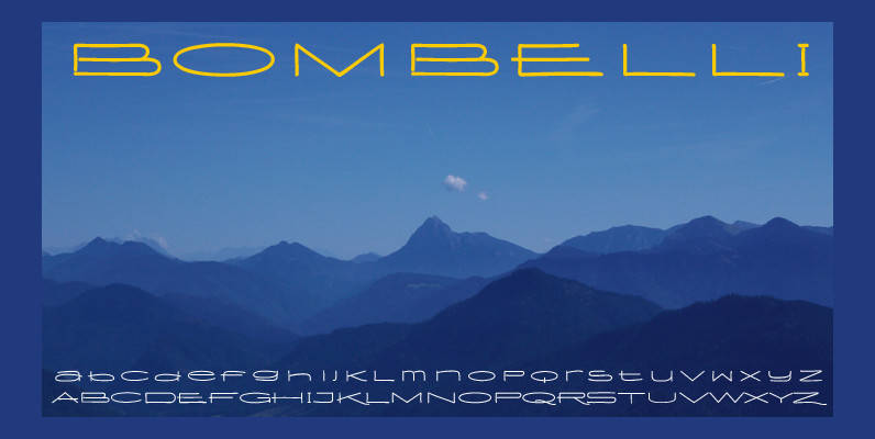
Bombelli Light Hand Font
Bombelli is a font that looks like it has been handwritten by a meticulous architect in one of those hand-drawn blueprints of the old days. I chose the name to honor one of my ex-bosses — a graphic designer-architect who
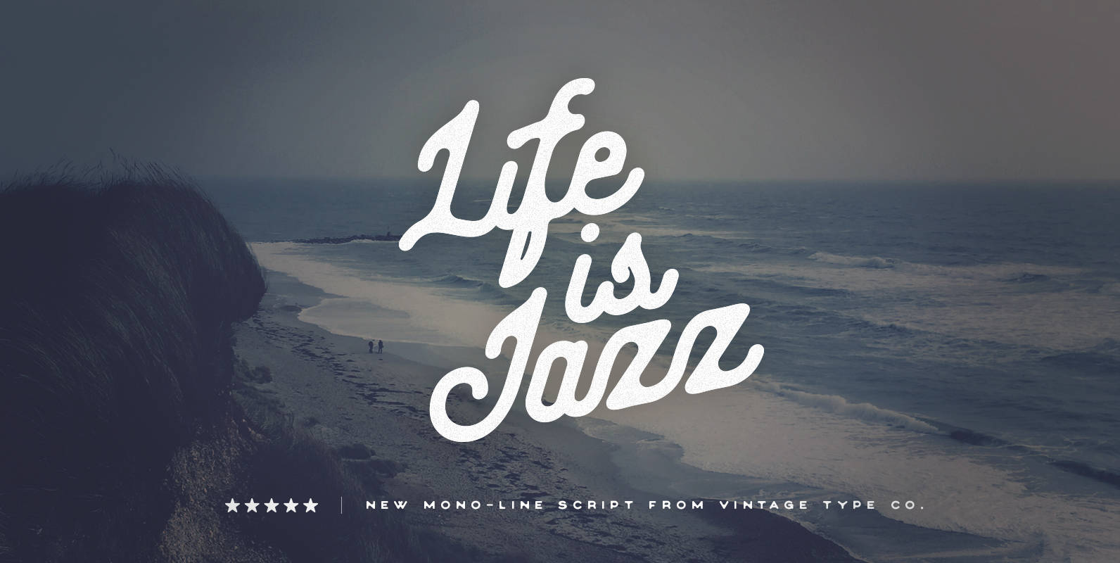
Life Is Jazz Font
Life is Jazz script is a vintage, hand-drawn inspired, monoline font that is sure to be a great addition to your type arsenal. Use it for branding, packaging, posters, logos, print campaigns, web campaigns, cover design, motivational posters and printed
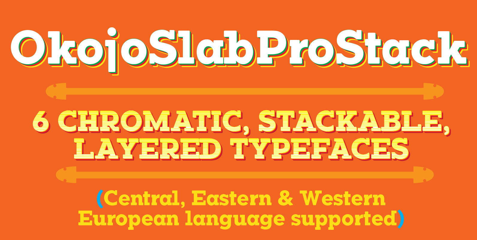
Okojo Pro Slab Stack Font
Once upon a time, a young man with scribbles on his face rapped the words, “Stacks on stacks on stacks”. Prophetic. Engaging. And more than anything―*interesting*! OkojoPro Slab Stack is a family of six stackable typefaces: three layers of extrusion,
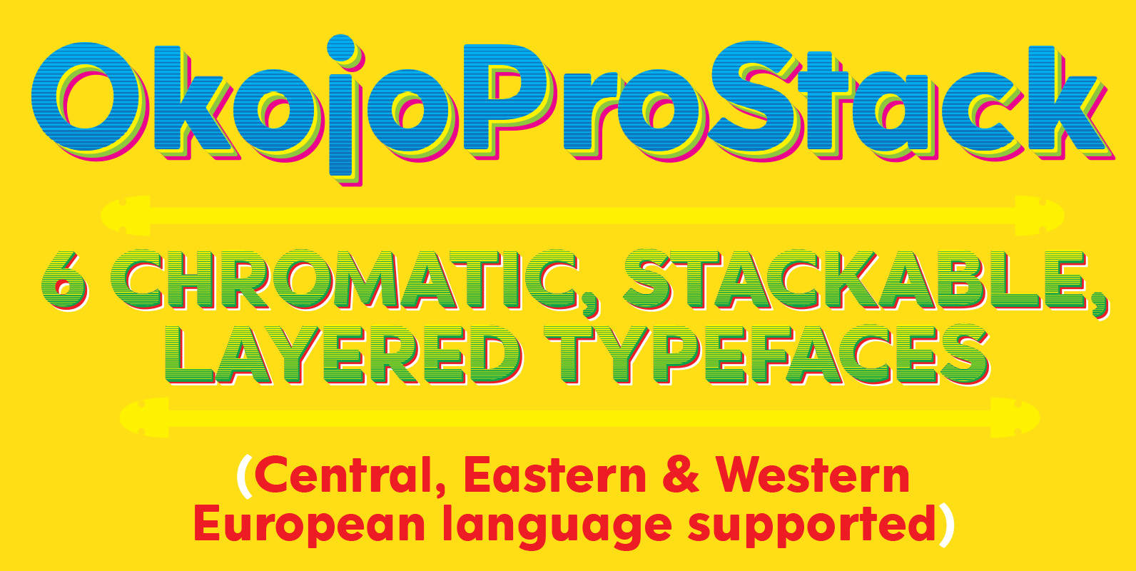
Okojo Pro Stack Font
Once upon a time, a young man with scribbles on his face rapped the words, “Stacks on stacks on stacks”. Prophetic. Engaging. And more than anything―*interesting*! OkojoPro Stack is a family of six stackable typefaces: three layers of extrusion, a
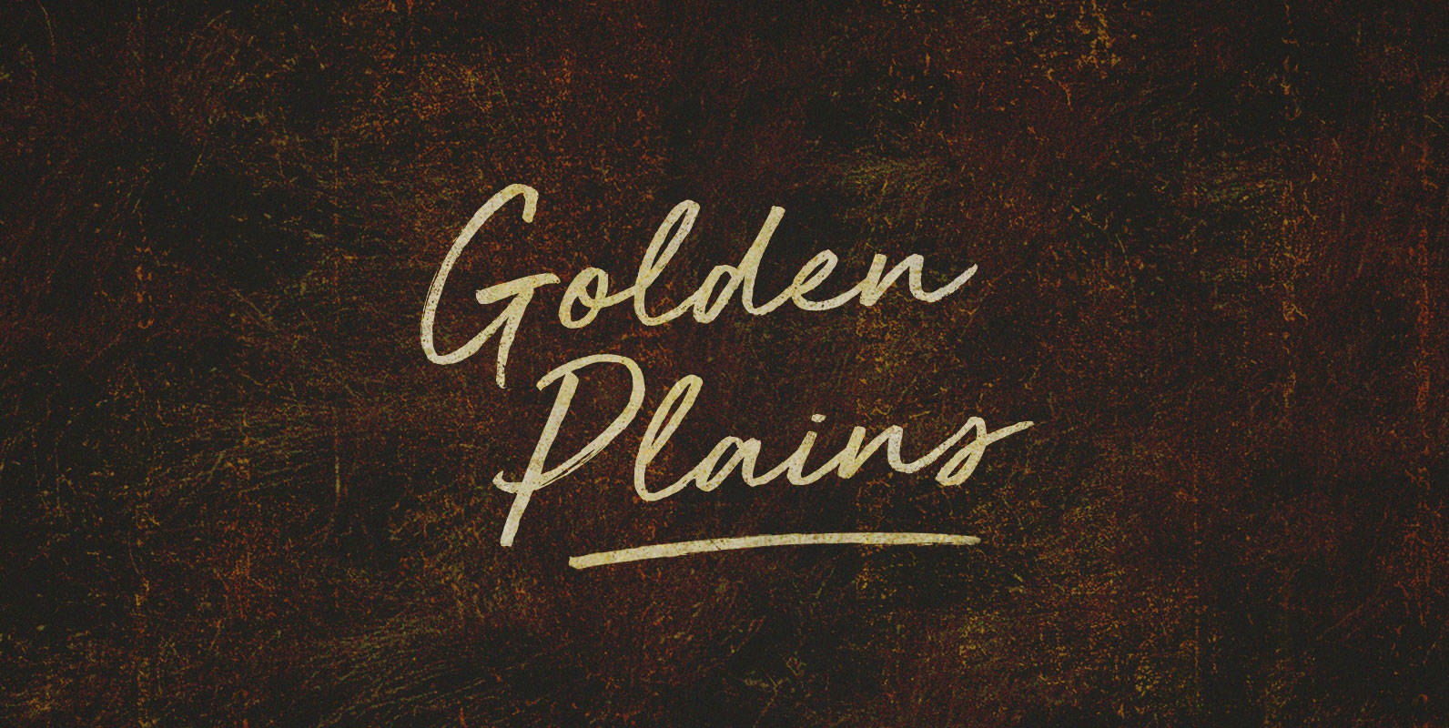
Golden Plains Font
Great shaggy heads and powerful shoulders, herded up against the hundredth meridian or breaking away into the sunset. Give me a home on that Golden Plain, and make my address a redress. For we will roam. Published by BLKBKDownload Golden
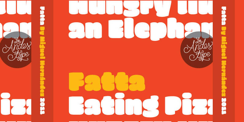
Fatta Font
Huge, bold and friendly. With original fat curves & paintbrush terminals. Fatta is Miguel Hernandez font, an ultra black humanist sans. It has three variants: Regular, Italic & Italic Swash, which allow the user to compose display text in a
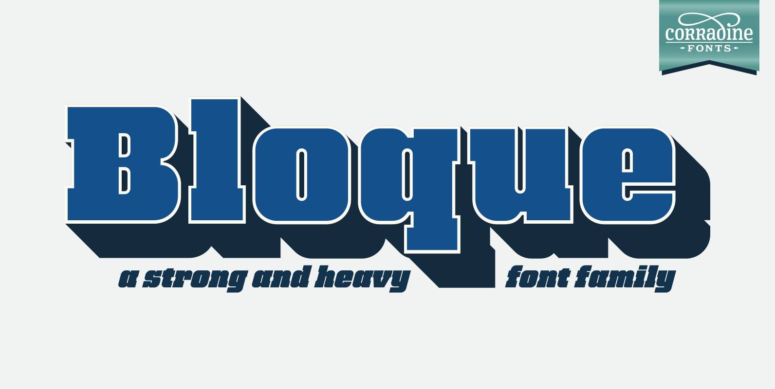
Bloque Font
Bloque is a heavy slab font family which contains six fonts. It has three layers for both roman and italic styles, including an inline and a shadow versions to make different color combinations. Published by Corradine FontsDownload Bloque
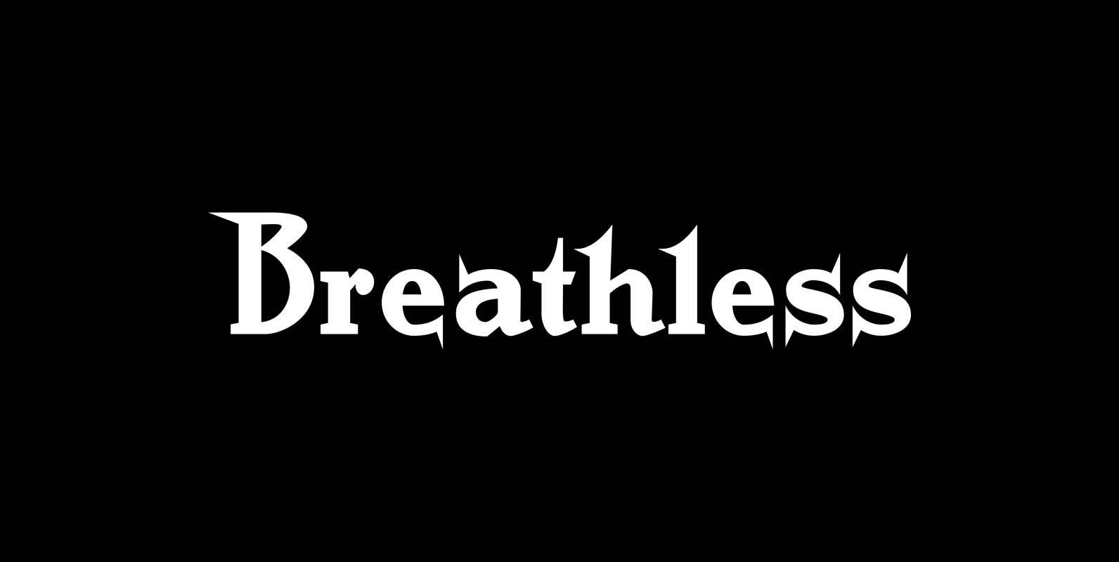
Breathless Font
“Breathless” was inspired by movie posters of the “Nouvelle Vague” era. When Jean Seberg and Jean-Paul Belmondo were young and films in black and white. So I named this very spiky affair after that phantastic movie of my youth “A
