Tag: headline

Etruria Font
Etruria is a Etruscan writing style font design created by Dima Pole Published by Dima PoleDownload Etruria
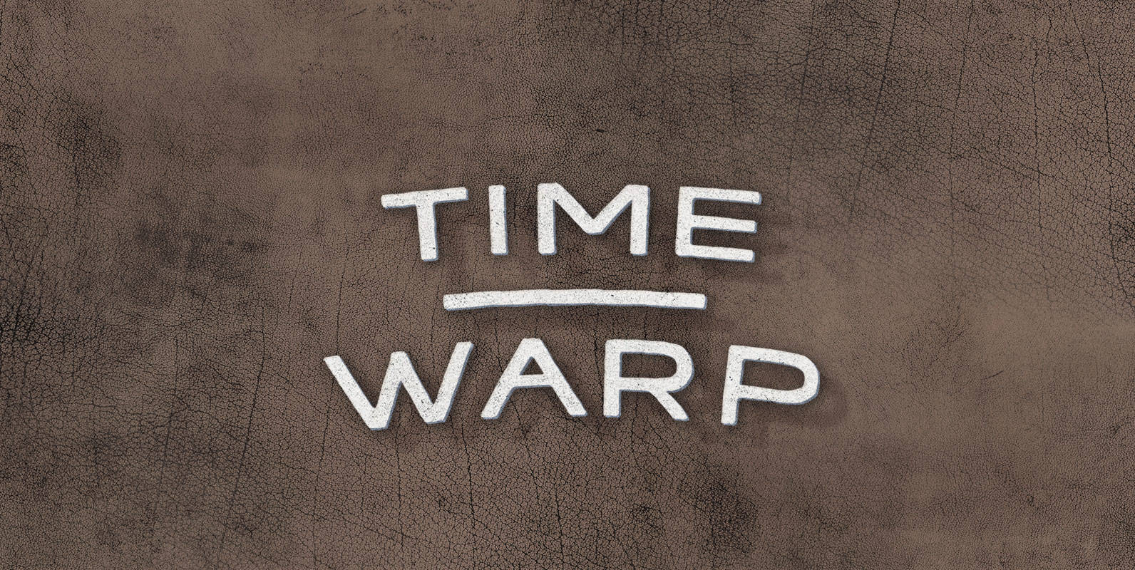
Time Warp Font
In the year 2004, Time Warp is a reality. It wasn’t, but a mysterious temporal distortion connected 2004 directly to 1994. Time warpers flooded through the rift, bringing heinous time-crime with them. Only a squad of tough as nails minute

Hinton Font
Hinton is a modern, clean text font, that contains 840+ characters & many Opentype features. It is calm, orderly and a bit perky. Hinton has a lightweight and pleasant design, so it fits well and easy to read. Its characters
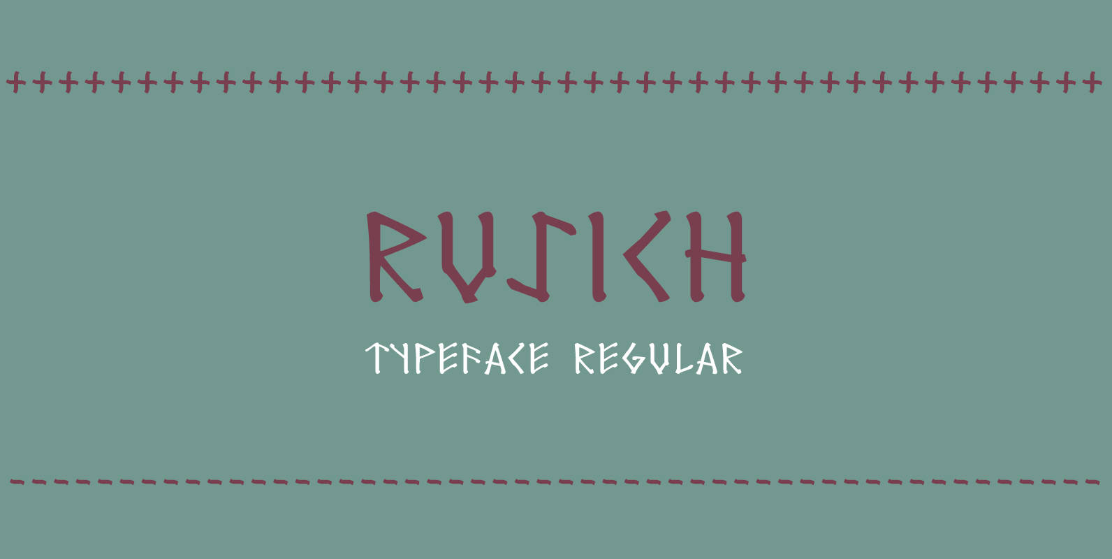
Rusich Font
Rusich is a display font designed in the style of an ancient language similar to woodcut lettering. Rusich was designed with Western and Russian language support, along with mathematical symbols and punctuation glyphs. Published by Dima PoleDownload Rusich
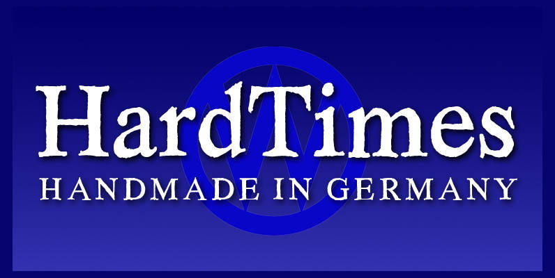
Hard Times Font
“Hard Times” has been hard work, designing a handmade typeface must always have the right balance between rough and smooth, specially with this Times-like face. It has the big European glyph-set, so that it can be used all over the

Bobik Font
Bobik is a display type family with three faces – sans, serif and slab. The family was drawn initially on basic principles described in Jean Alessandrini’s Codex 80 and then further developed, including adding a lowercase and ligatures. With a
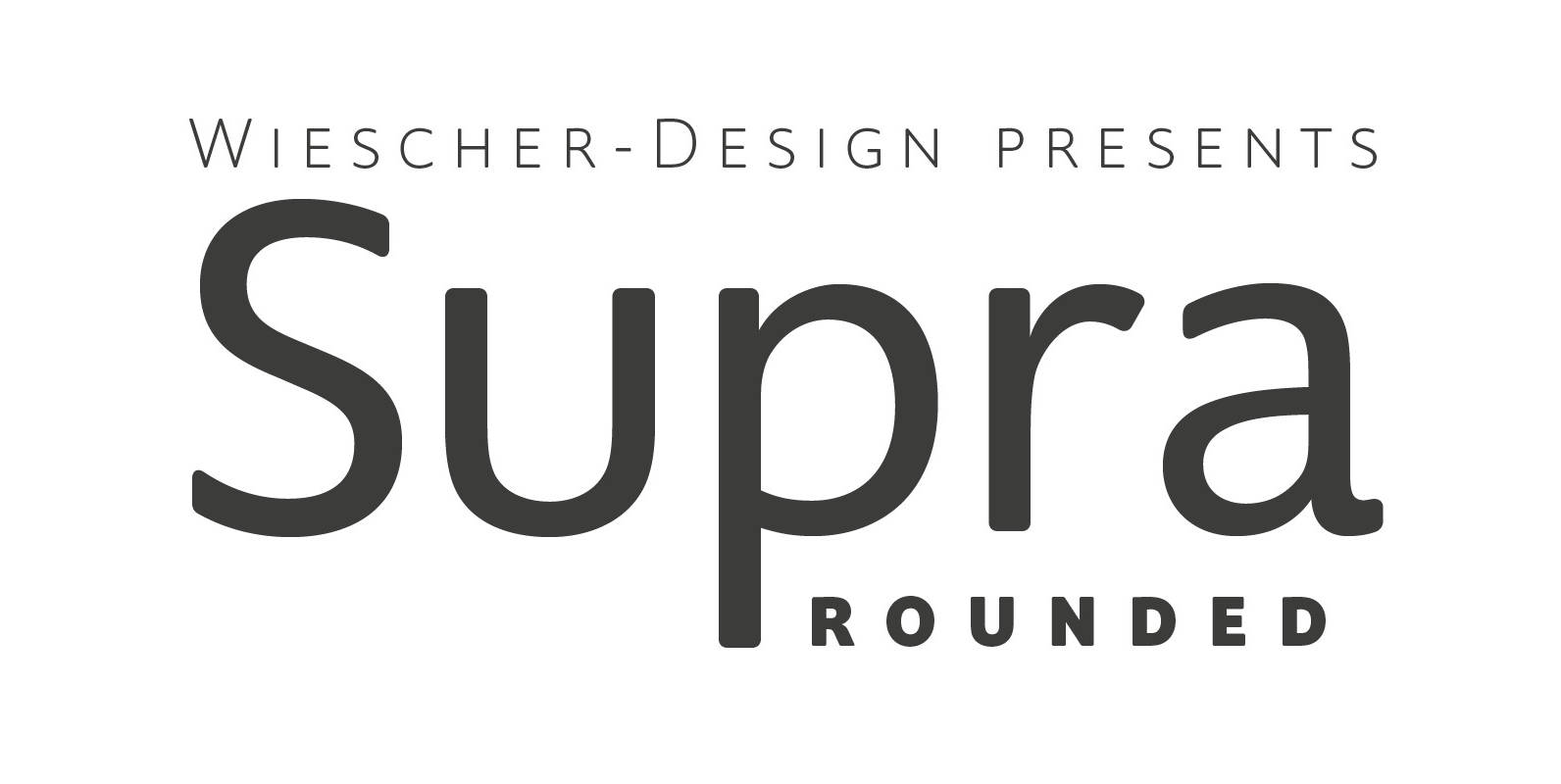
Supra Rounded Font
“Supra Rounded” is the newest addition to my big Supra family. It really rounds of the huge family with a friendly design, that makes it an excellent and elegant text-typeface. It is an OpenType family for professional typography with an
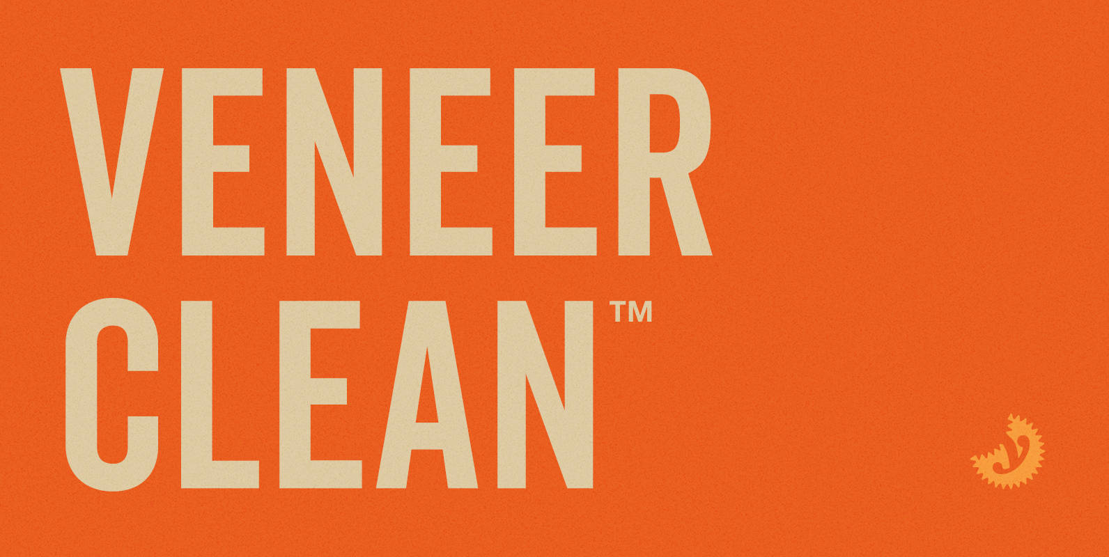
Veneer Clean Font
Veneer Clean from Yellow Design Studio is the non-distressed version of the Veneer letterpress type family. The 8-font family includes Regular, Soft and Round versions with italics plus a free set of funky icons. Published by Yellow Design StudioDownload Veneer

Franklin Gothic Hand Light Font
Franklin Gothic Hand Light is part of a series of hand-drawn fonts from way back in time – before computers changed the way we worked. When I was in advertising – before computers – a very time consuming part of
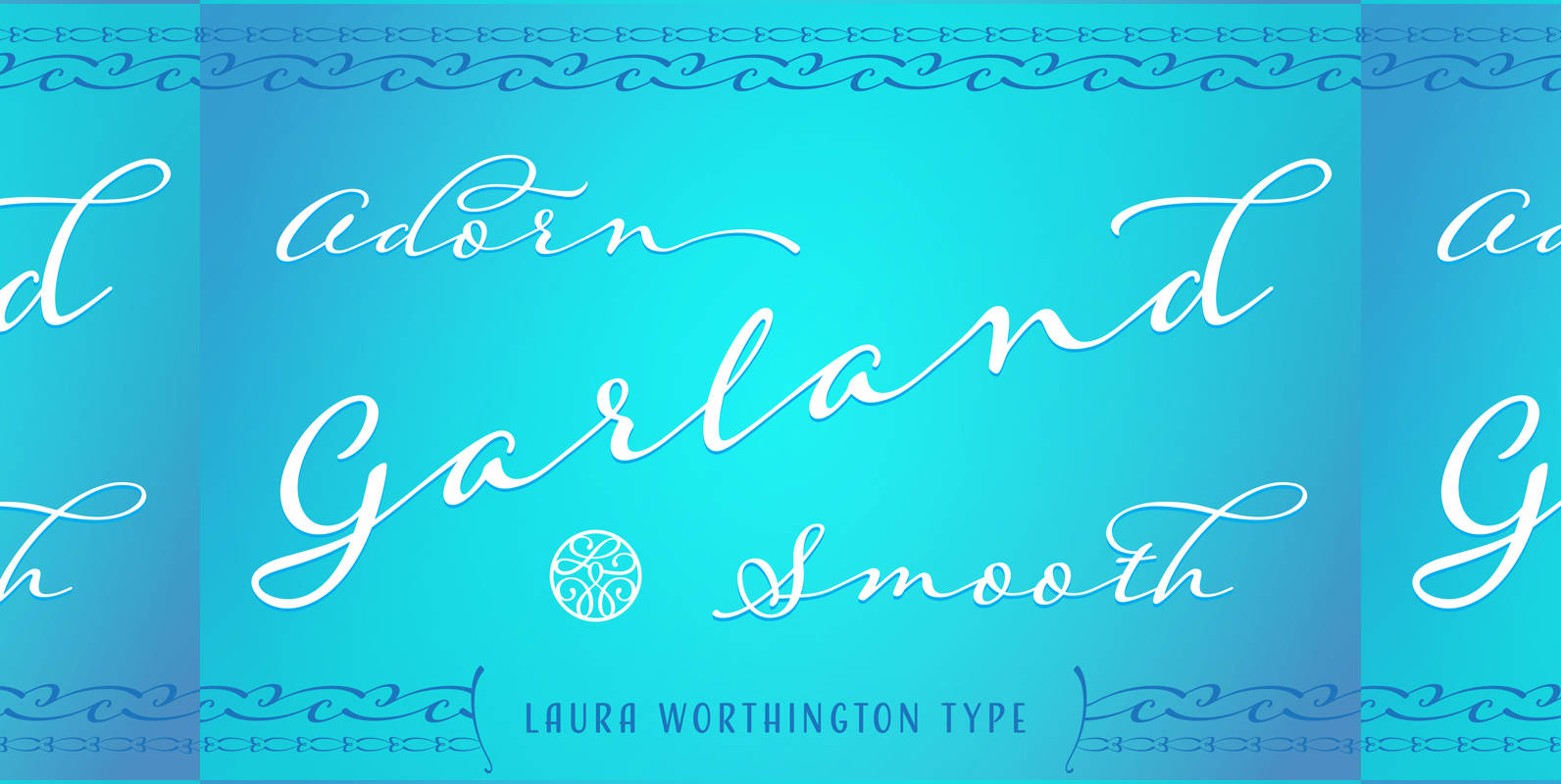
Adorn Garland Smooth Font
Adorn Garland is a script face that runs along a different, and somewhat “vintage” direction. Rather than deriving its strength from a heavy skeleton or structure, it uses its sense of contrast, its light touch upon the page, and its
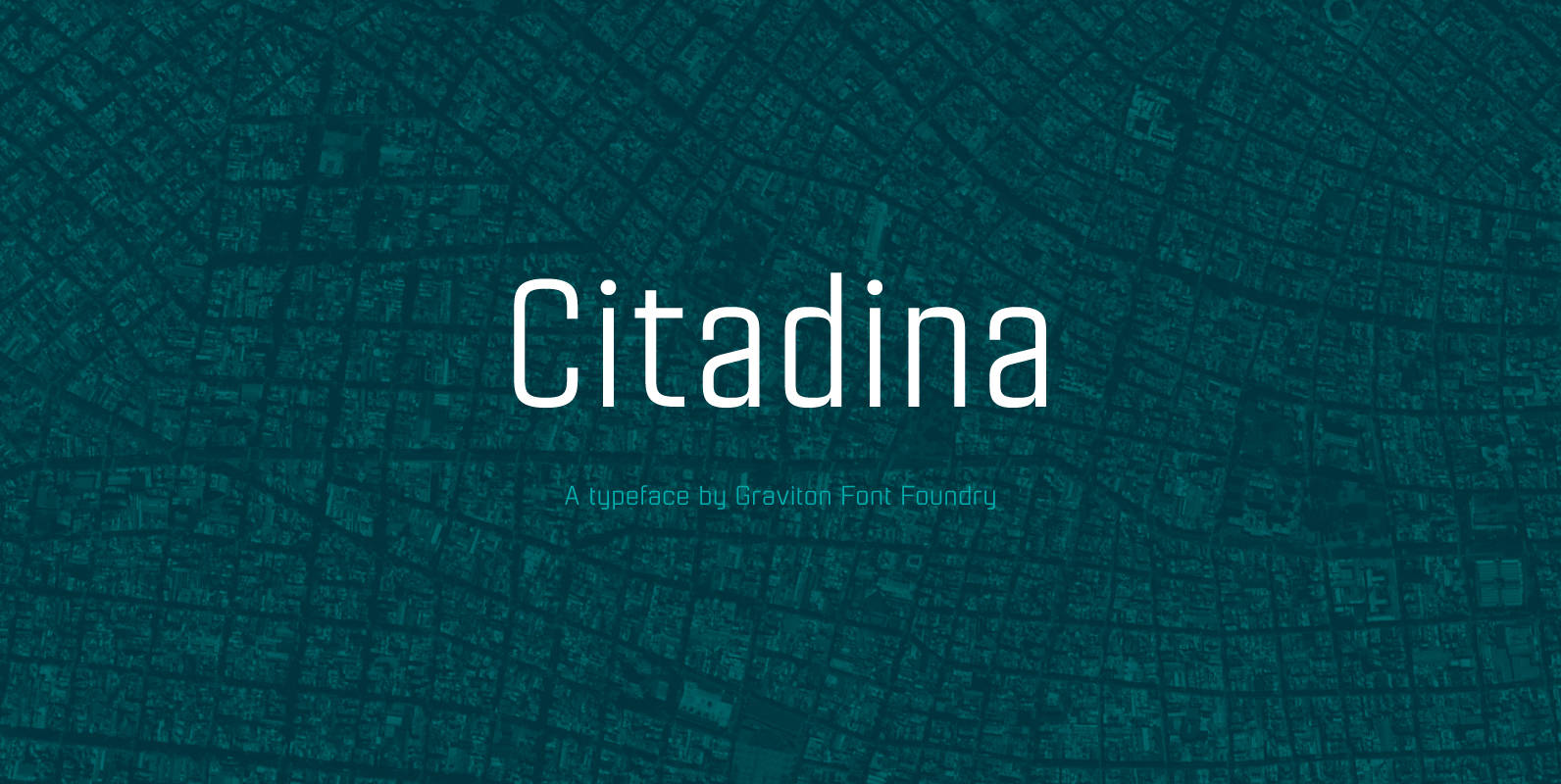
Citadina Font
Citadina font family has been designed for Graviton Font Foundry by Pablo Balcells in 2016. It is a sans serif typeface with a geometrical, mechanic, neutral appearance and a slightly condensed design which makes it particularly effective for space economizing.
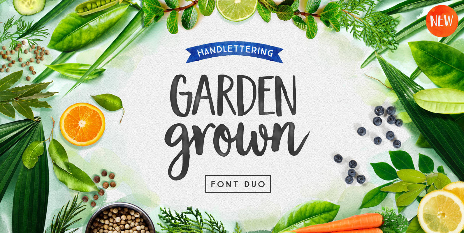
Garden Grown Font
Garden Grown is a lovely font duo by Cindy Kinash. This new font family includes a caps and script. The script comes with alternates and ligatures. Try Garden Grown for book covers, stationery, marketing, magazines and film. Poster art by
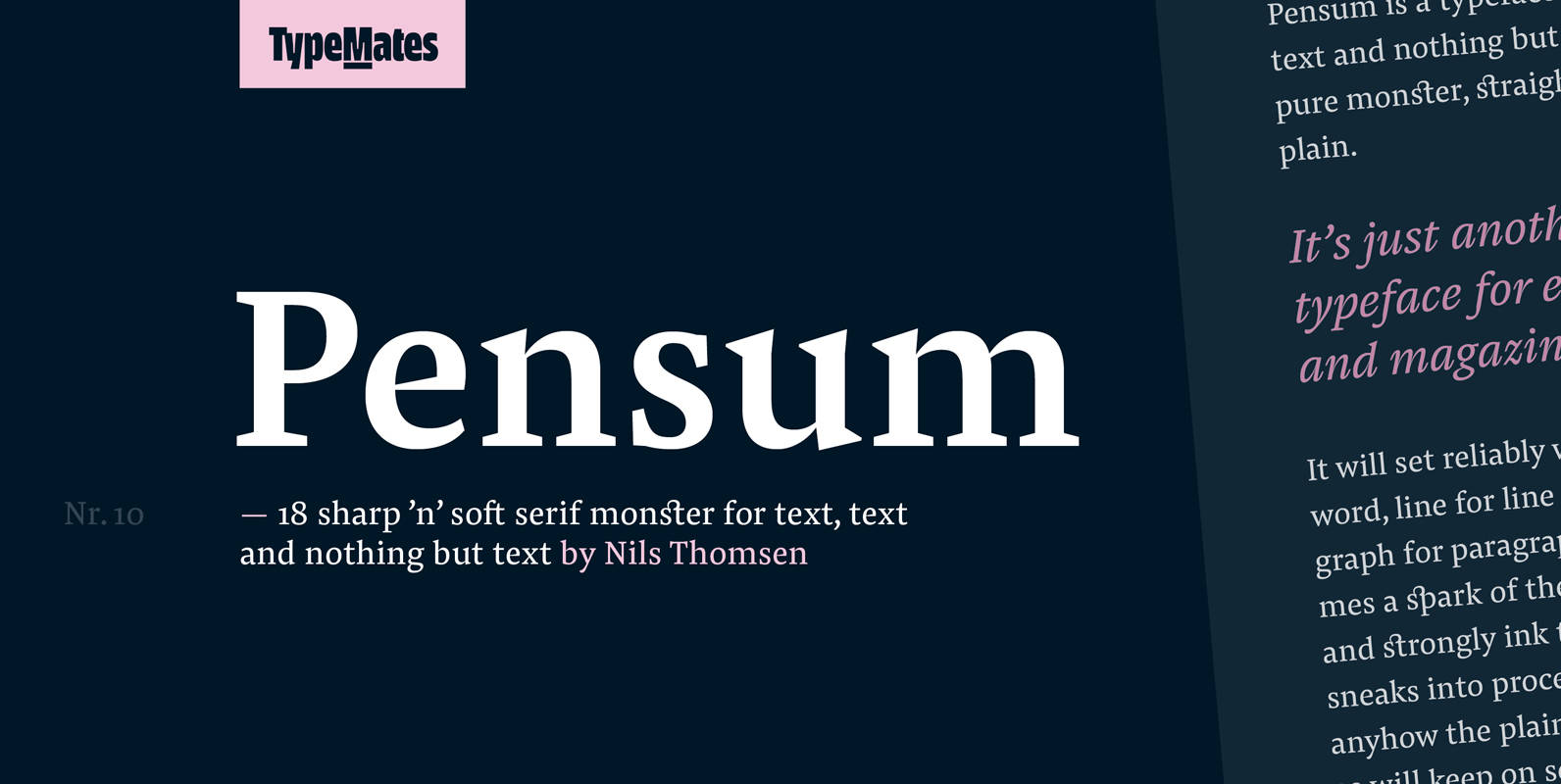
Pensum Pro Font
Pensum is a typeface for text, text and nothing but text. A pure monster, straight and plain, it will reliably set word after word, line after line and paragraph after paragraph. Sometimes a spark of the sexy, curvy and sharply

Grenale Slab Font
Grenale Slab adds to the new standard of elegance within the Grenale family. Not your typical slab, Grenale has some unique forms that give it a look all its own. This glamourous slab still draws much inspiration from Grenale’s Didone
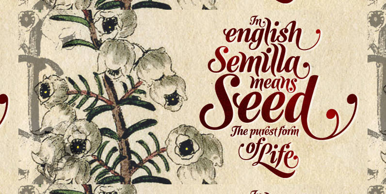
Semilla Font
I spend a lot of time following two obsessions: packaging and hand lettering. Alongside a few other minor obsessions, those two have been my major ones for so many years now, I’ve finally reached the point where I can actually
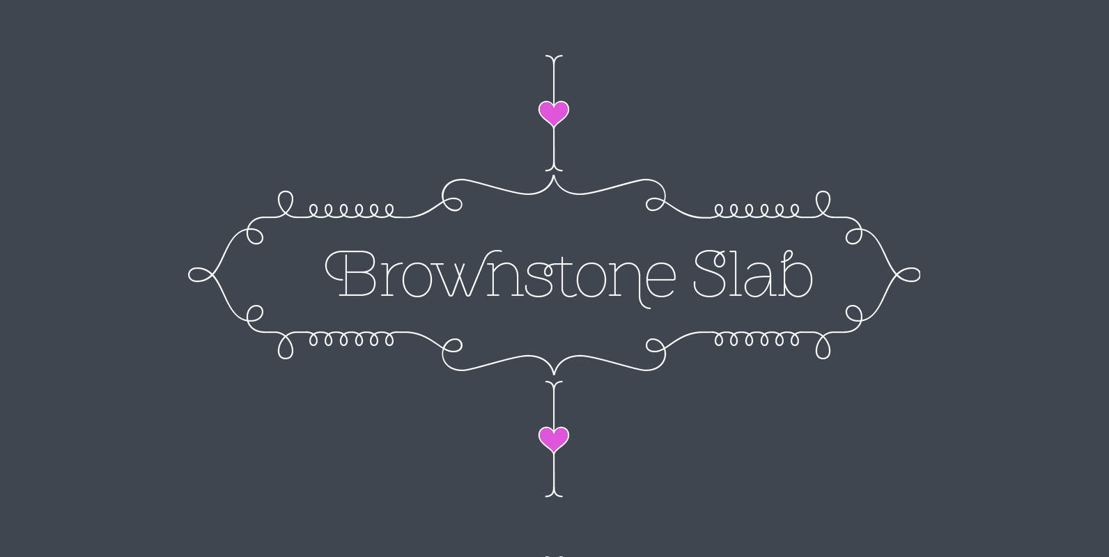
Brownstone Slab Font
Alejandro Paul’s Brownstone Slab is based on his own popular, award-winning, Brownstone Sans typeface. Like the original Sans, Brownstone Slab is a 21st-century design, influenced by the Victorian decorative motifs of the ironwork and carved decorations of New York City

Filson Soft Font
Filson Soft is the rounded version of the popular Filson Pro. At first sight, the main feature of Filson Soft are the distinctive letters ‘K’, ‘Q’ and especially ‘R’ that make the font family very elegant. With its rounded terminaisons,
