Tag: header
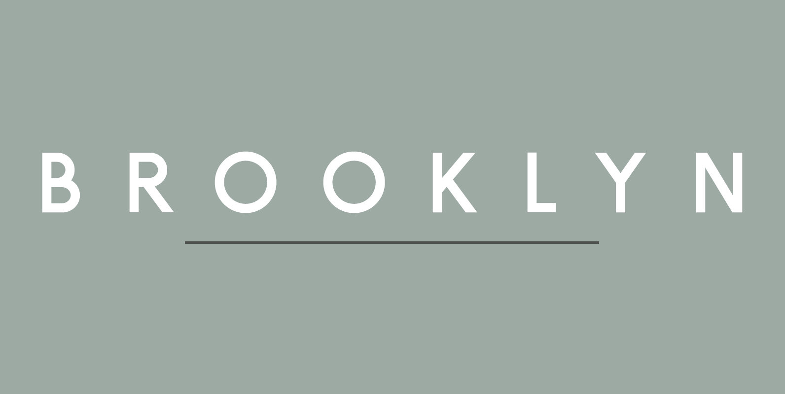
Brooklyn Font
Brooklyn is a stunning all-caps sans serif that comes in two beautiful weights to complement every project you’re working on. Resembling a cross between Futura and Gotham, Brooklyn will very easily become a staple in your type kit. Use to
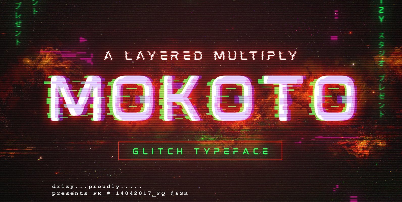
Mokoto Font
Mokoto is an experimental font that gives the appearance of digital glitching effect. Inspired from modern fonts and slicing image in error system, to create something different and compelling. Published by Drizy StudioDownload Mokoto
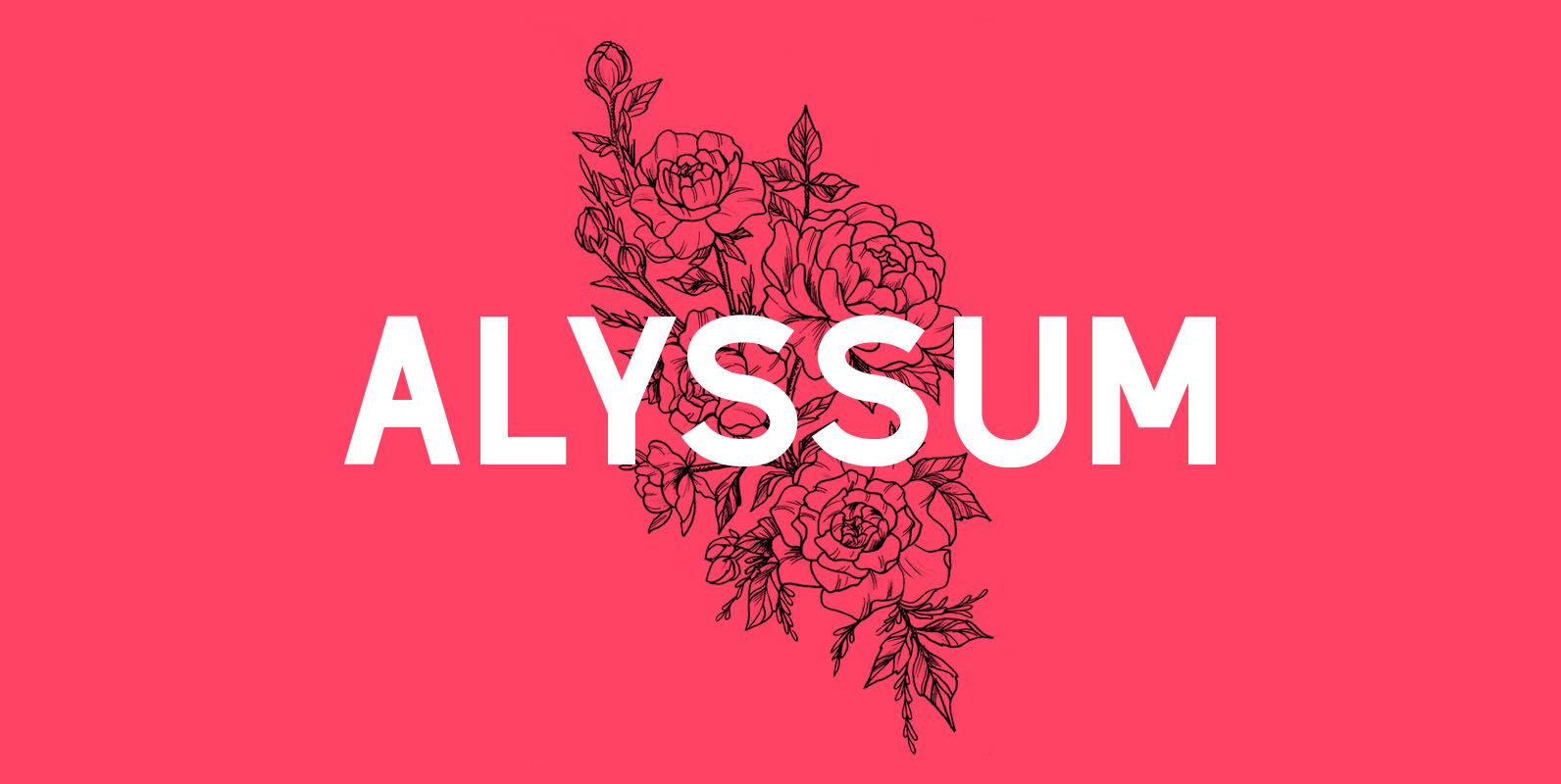
Alyssum Font
Alyssum is a beautiful sans serif font that can be used in different projects such as for wedding invitations, magazine headlines, social networks, signage, etc. What is in the package: Alyssum font in OTF format All Caps Font Language Support:
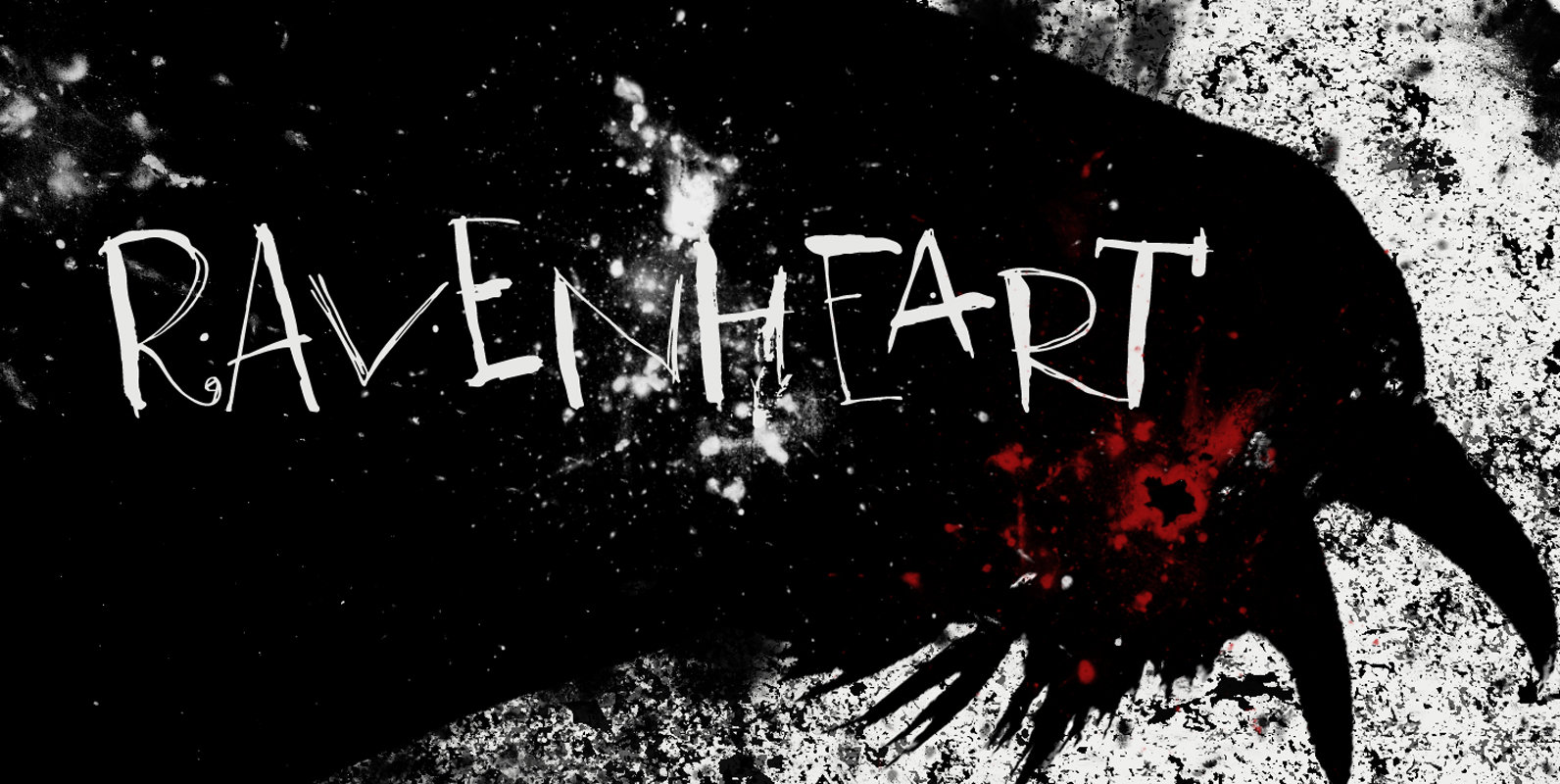
Ravenheart Font
I like Ravens. In fact, I like them so much that I have a tattoo of a Haida raven! Ravenheart was more or less modelled on my Qilin font, but it is completely different. It is scary and inky, but
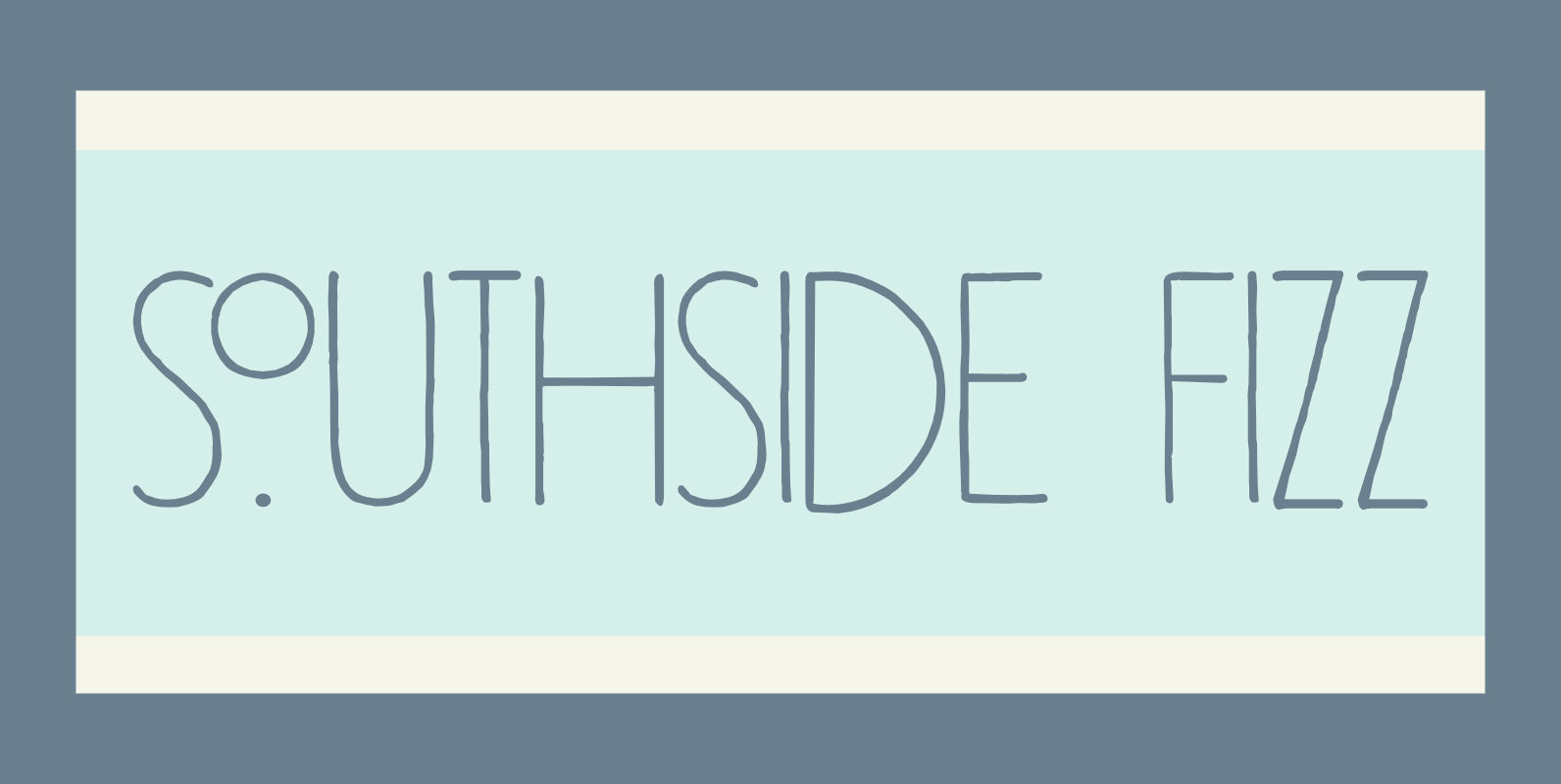
Southside Fizz Font
Southside Fizz is a cocktail (made with gin, lime, mint and soda). Southside Fizz font was based on a single word in a 1930’s advertisement and my Palembang font. I did not have that many glyphs to work with, so

JT Alvito Font
The JT Alvito family includes 5 weights with matching italics. It is ideally used as a display typeface but can also be used in body copy. You will find that it works particularly well in advertising, packaging, logo design and
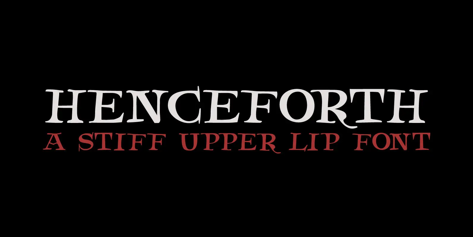
Henceforth Font
Henceforth is a hand-drawn, all caps didone-style typeface. It is a little rough, a little uneven, but lively and elegant as well. Personally I think it has a certain poshness about it: I mean, it wouldn’t look out of place
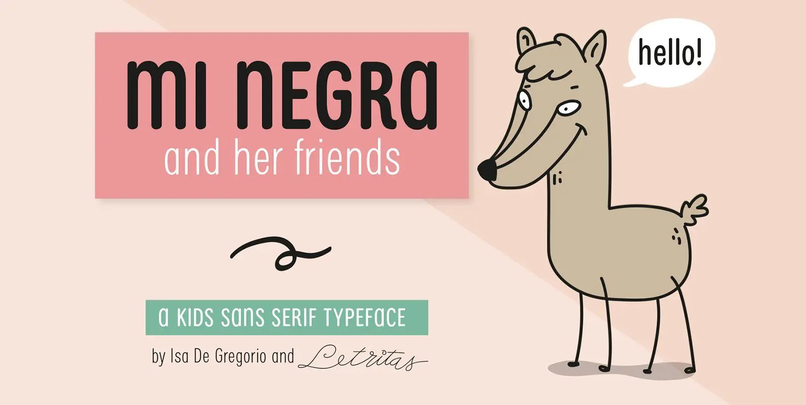
Mi Negra Font
Mi Negra is a funny and hilarious typography designed especially for children, thought and created by Isabel de Gregorio. It could be described as an original combination between a semi-handwright and semi sans-serif font. Thanks to its structure and nice
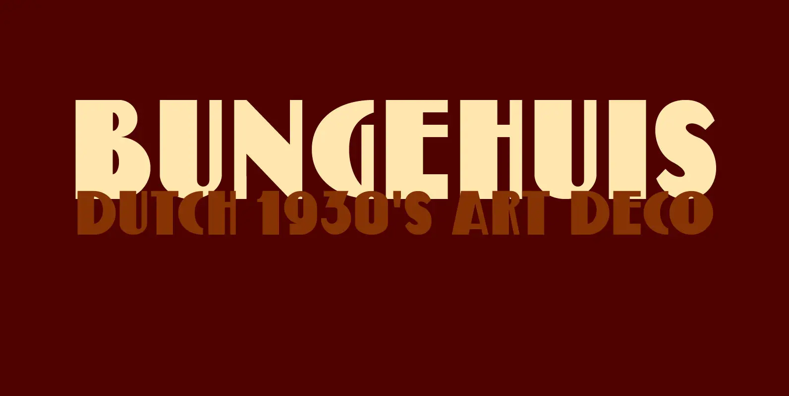
Bungehuis Font
Bungehuis font was modeled on the lettering found on an Amsterdam art deco building from 1931. This building on the Spuistraat, also called ‘Het Bungehuis’, used to house offices, but is now part of the University of Amsterdam. In 2015
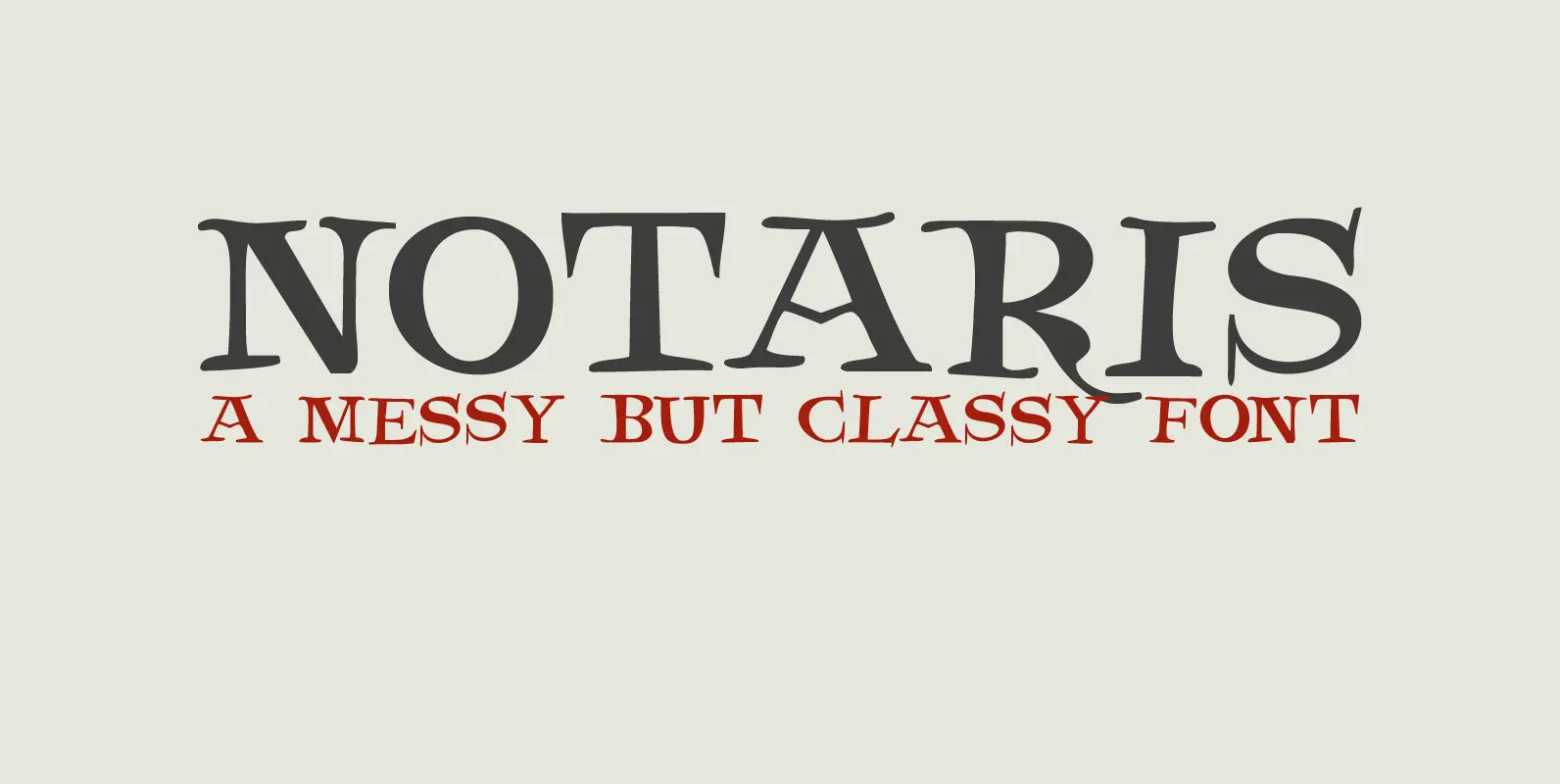
Notaris Font
Notaris (‘Notary’ in Dutch) is a hand-drawn, all caps didone-style typeface. It is a little rough, a little uneven, but lively and elegant as well. Comes with an abundance of diacritics and, lo and behold, some end-ligatures as well. Published
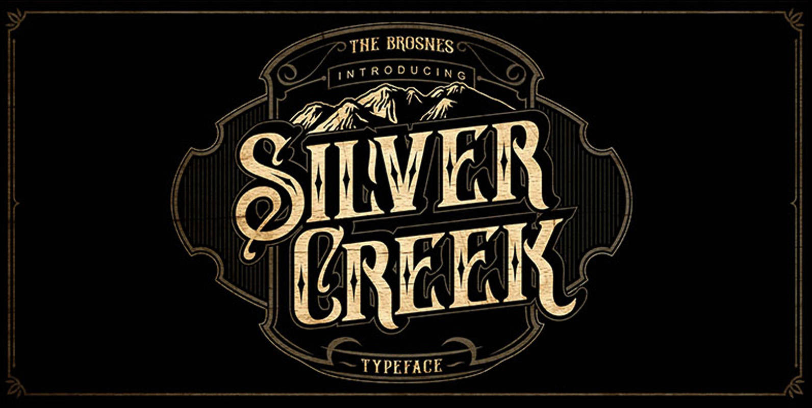
Silver Creek Font
Silver Creek Typeface is the new font from The Brosnes Design Co. Inspired by vintage sign painting, poster and label that have a strong shapes so it will create more attention for people to look more closely. Silver Creek Typeface
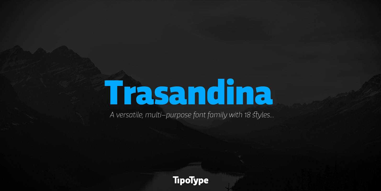
Trasandina Font
Trasandina is a very unique font-family: a modern, versatile, workhorse typeface with a special personality, given by the mix of humanist and geometric models, remaining far from both extremes. This typeface has 9 styles plus their matching italics, it has
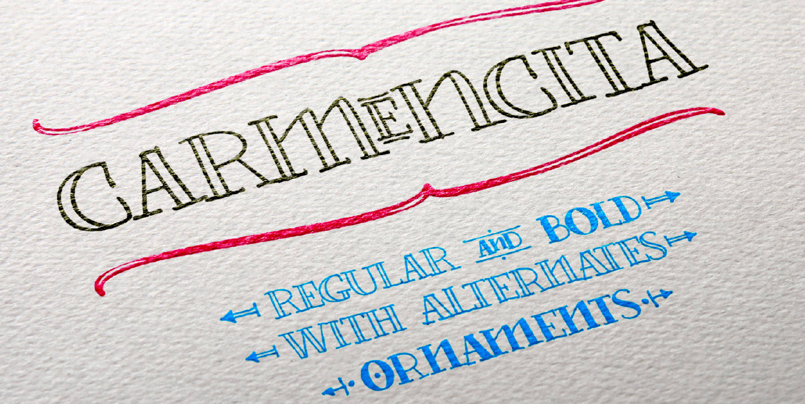
Carmencita Font
Type Designer: Fernana Núñez Carmencita is a typeface specially designed to give graphic products that hand-made feeling, slightly rustic with a handcrafted touch. It was created with a focus on signage, products and graphics that need to convey closeness, warmth
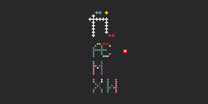
YWFT Crossover Font
YWFT Crossover is oh-so-aptly named, since it started as custom lettering for branding work, then crossed over into font format. It also is comprised entirely of crosses–so very meta. YWFT Crossover functions much like a bitmap font, but contains beautiful
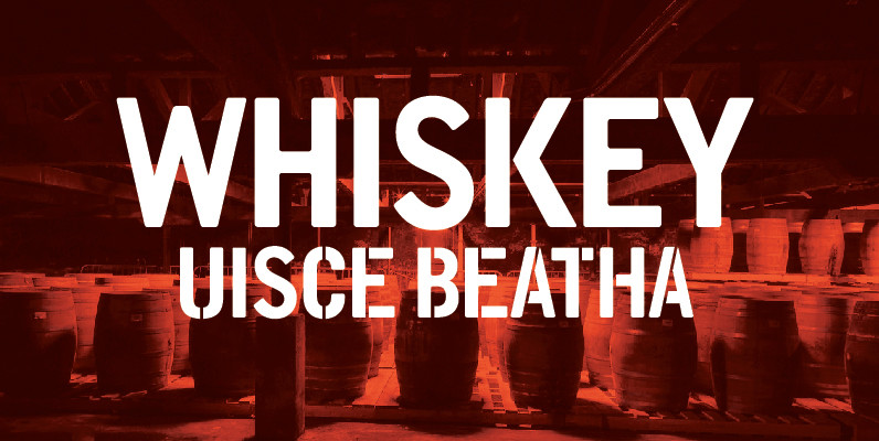
DWC Headline Condensed Font
DWC headline is a font based on the hand rendered type used on Whiskey casks Inspired by the beautiful hand rendered, stenciled and paint forms we found on old Irish and Scottish Whiskey casks, particularly the casks from the Scottish
