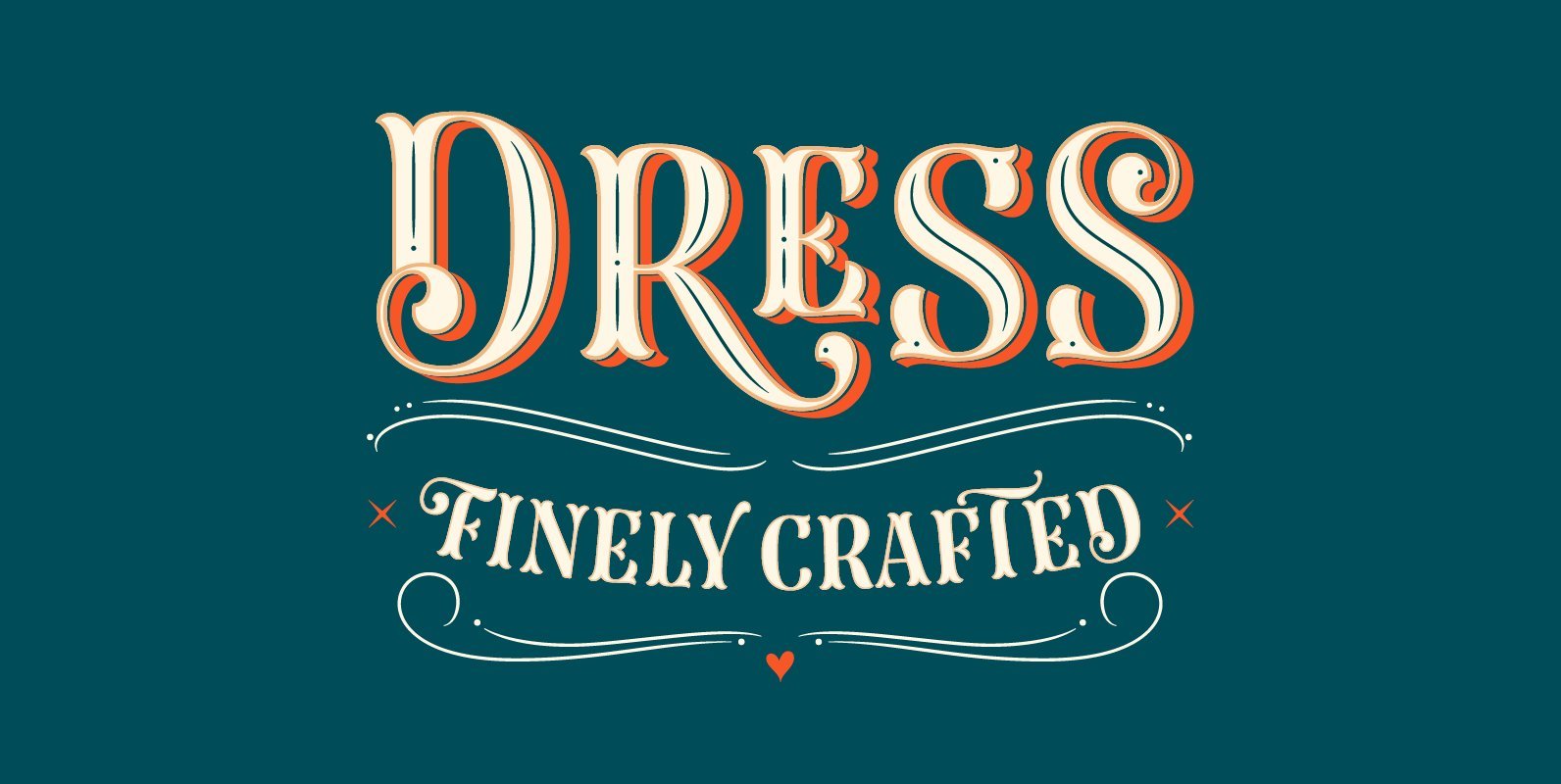
Tag: Heading
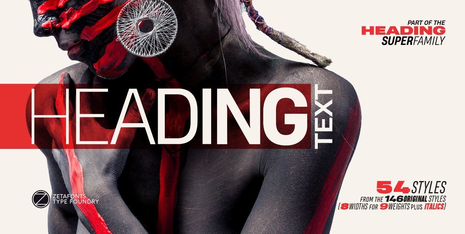
Heading Pro Text Font
Heading Pro Medium, Heading Pro Double and Heading Pro Treble are three variants of the original Heading Pro typeface designed by Francesco Canovaro for Zetafonts. These three medium width families have been added to the original condensed width family to
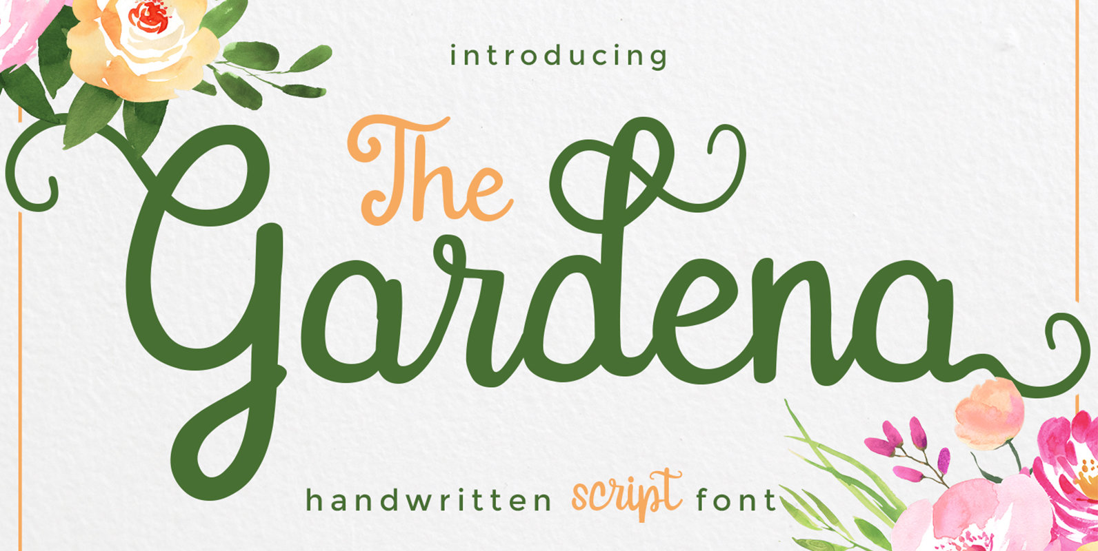
Gardena Font
Gardena Script Font is designed and inspired from handwritten font. Gardena is great for invitation, greeting, headline, casual design, branding design, menu designs, wedding related design, quote or simply design with stylish text overlay to any background image. Includes :
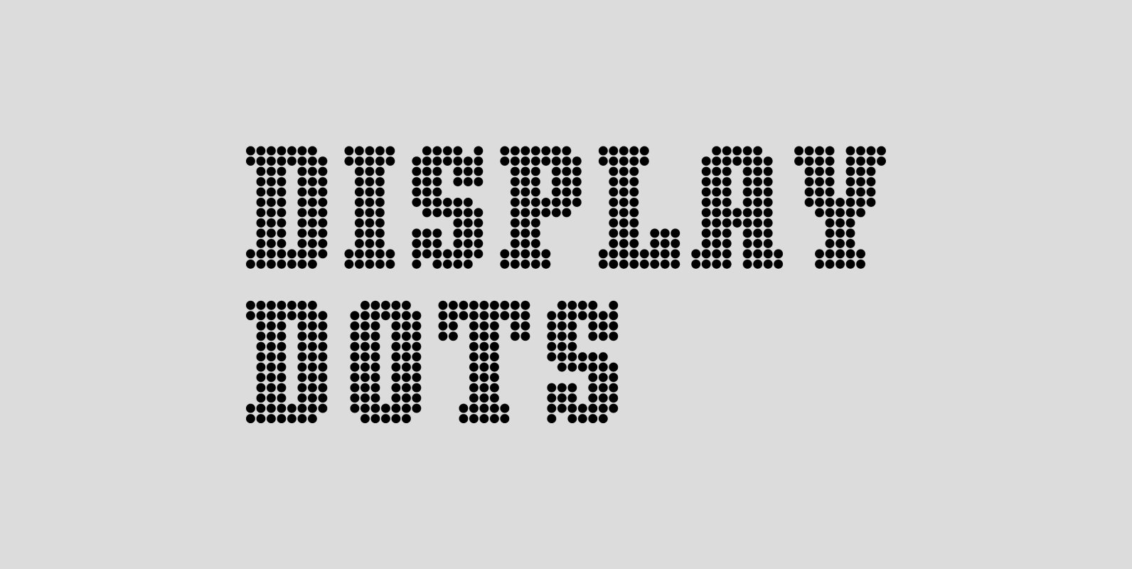
Display Dots Font
Display Dots is a display font not intended for text use. It was designed specifically for display, headline, logotype, branding, and similar applications. Display Dots has upper and lowercase alphabets, numbers, and punctuation. Published by Gerald GalloDownload Display Dots
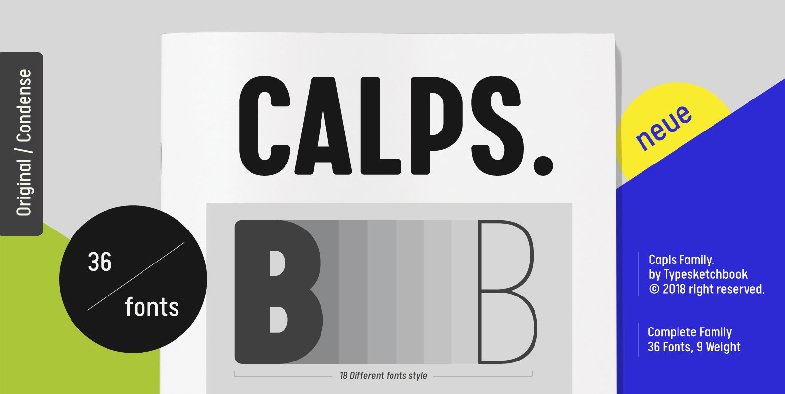
Calps Font
Calps is a condensed sans serif font. An unfussy design, the font is designed to be consistent across such letters as a, b, d, q, p, g and C, G, O, Q, creating a uniformity for the set. Each corner
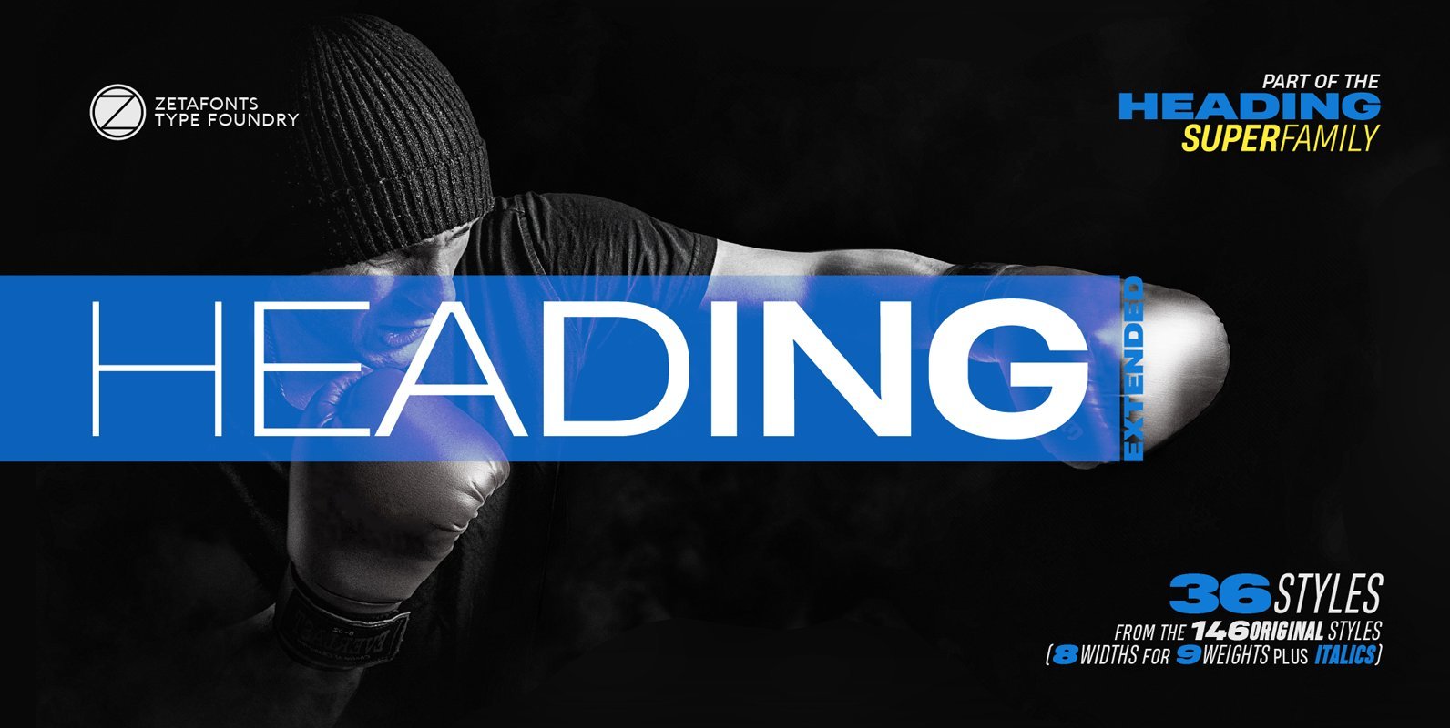
Heading Pro Extended Font
Heading Pro Wide and Heading Pro Ultra-Wide are two variants of the original Heading Pro typeface designed by Francesco Canovaro for Zetafonts. These two extended width families have been added to the original condensed width family to be used for
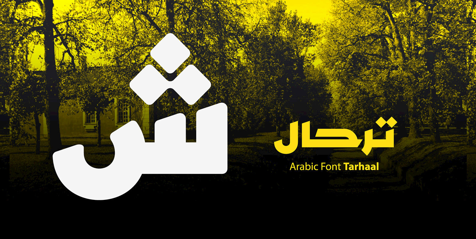
Tarhaal Font
Tarhaal is an Arabic display font that features a unique style due to its solid geometric structure and its heavy letterforms. The font consists of three styles namely; Sharp, Rounded and Outlined and it suits all kinds of creative heading.
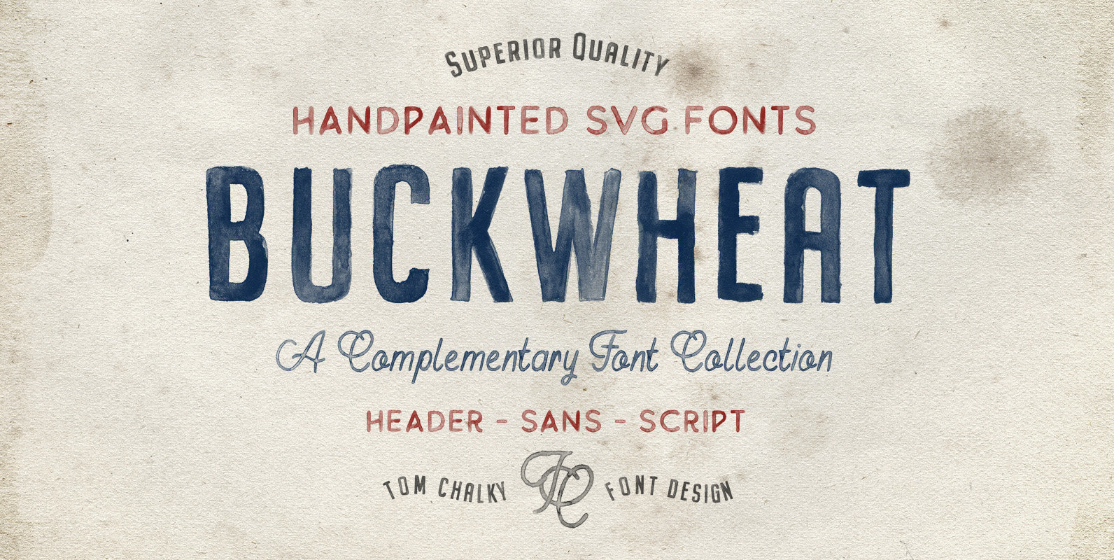
Buckwheat Opentype SVG Font Family Font
Introducing the Buckwheat Opentype SVG Font Collection ———— Opentype SVG Fonts require Photoshop CC 2017 or Illustrator CC 2018 (or newer). TTF fonts are included (See screenshot No.4) and these work universally ————— What the heck are Opentype SVG Fonts?!
Midfield Pressed Font
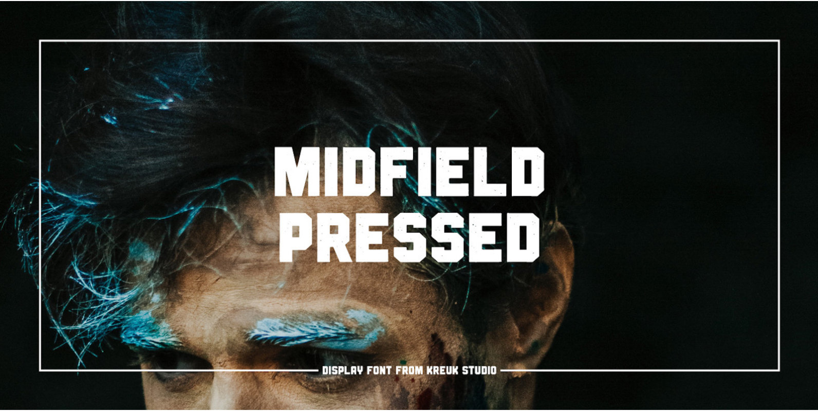
Midfield Pressed Font. Midfield Pressed is part of Midfield Display Family. Midfield Pressed is All Caps textured display typeface with urban, sporty, rough & bold character. Each glyph is very well suited to make an interesting quote, headline & striking
BIXA Font
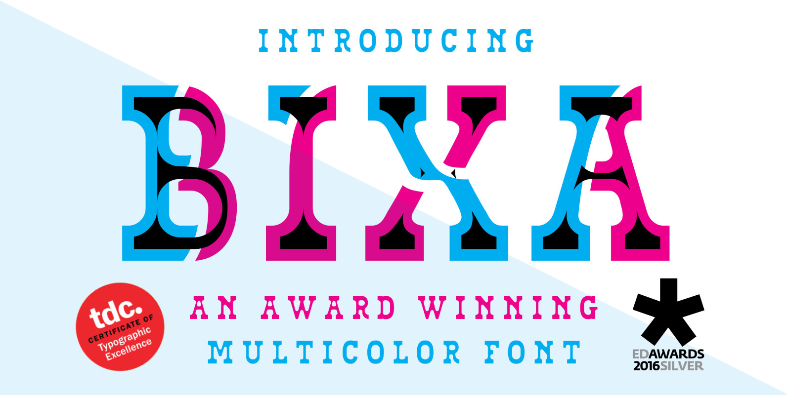
Bixa is a chromatic typeface designed for display use. Bixa comes in 13 different layers containing 11 weights for beautiful color combinations. Bixa was originally designed for the Typewood project in 2015. Read more about this project here: http://www.novotypo.nl/expo/Typewood.html In
Heading Pro Font
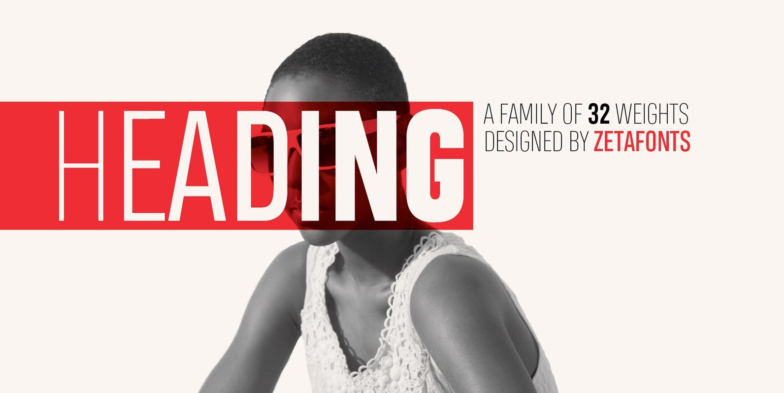
Heading is a typeface family designed by Francesco Canovaro for Zetafonts. It’s a geometric condensed typeface with high legibility and a powerful personality, created to optimize space on the printed page and on the screen. Heading Pro, coming in eight
Merlod Font
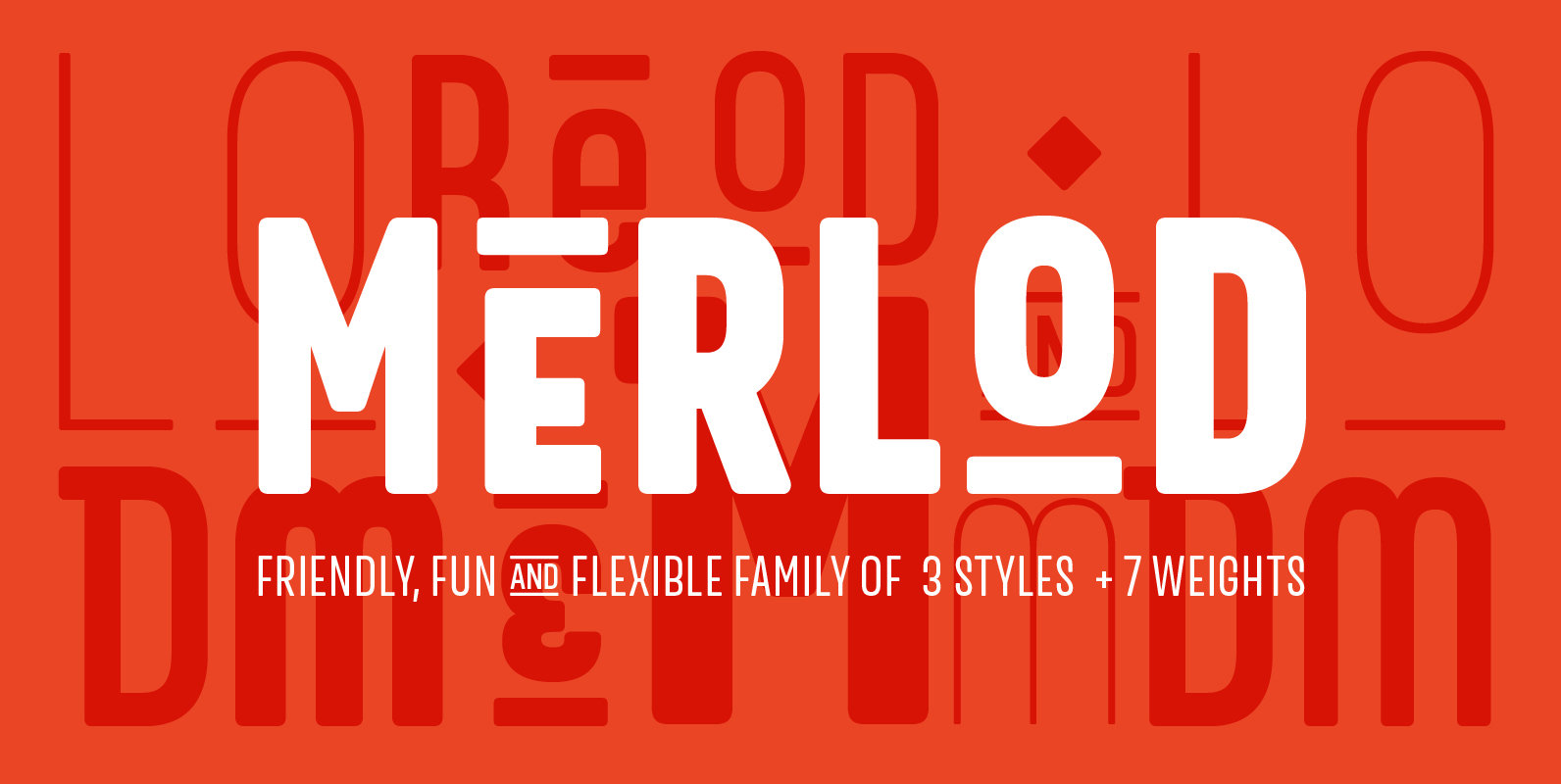
Merlod depicts its style from Latin-American sign painting and reinterpreting them into a modern design. Merlod is a friendly, fun and flexible type family that consists of 3 different styles, each style includes 7 weights. Each style of Merlod (Norme,

Oakes Grotesk Font
Oakes Grotesk is a more corporate take on the Oakes typeface. It explores a set of brand new metrics that allow it to be more legible in body text as well as headings. The letter ‘g’ has been tweaked to
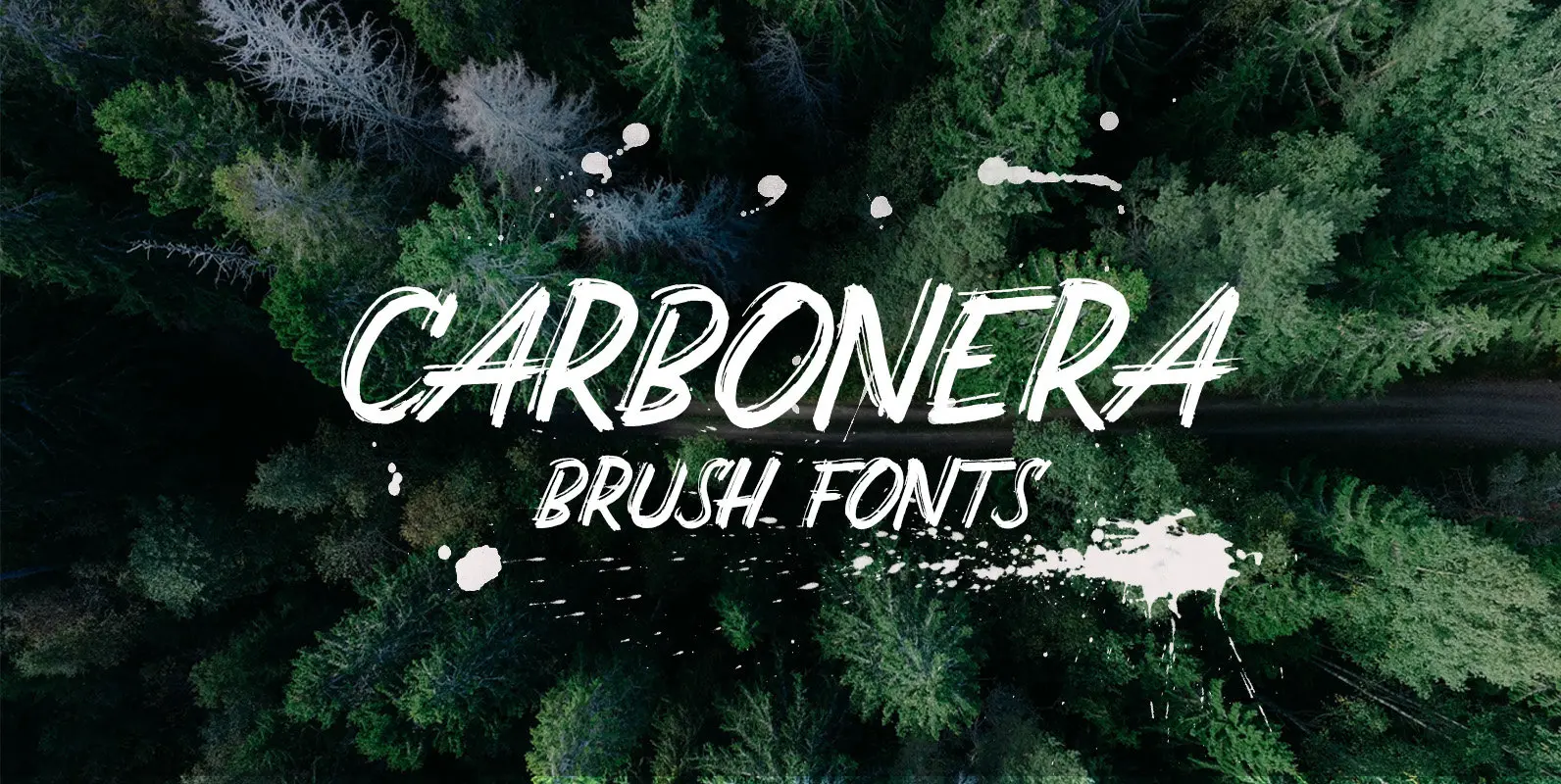
Carbonera Font
Carbonera is a distressed script design published by Adam Fathony. Published by Adam FathonyDownload Carbonera
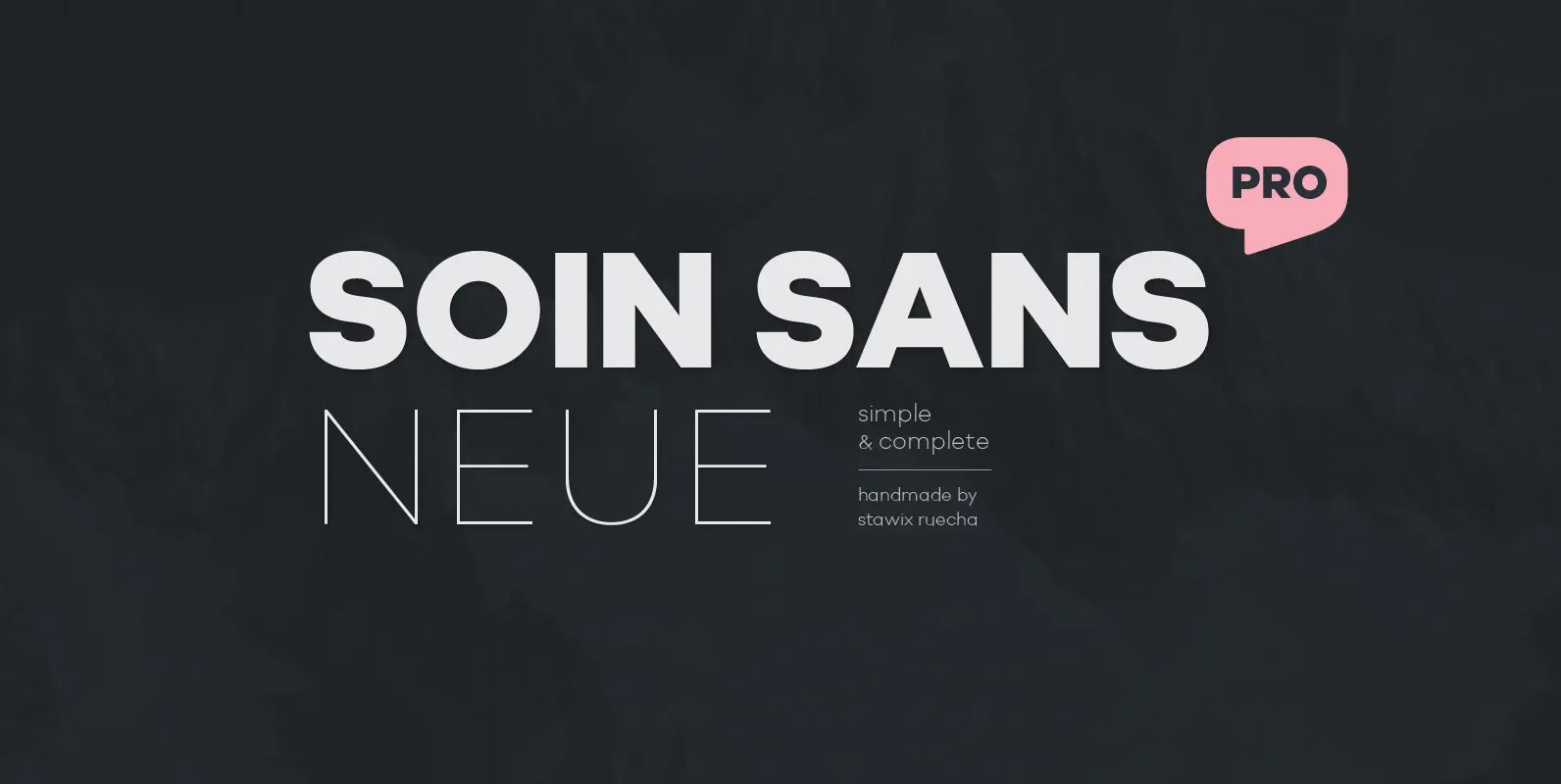
Soin Sans Neue Font
10 hours a day for almost as long as one anniversary of the Olympics to harvest the experience of designing many typefaces, thinking process and refining the craftsmanship throughout these years. From Soin Sans that has been designed and released
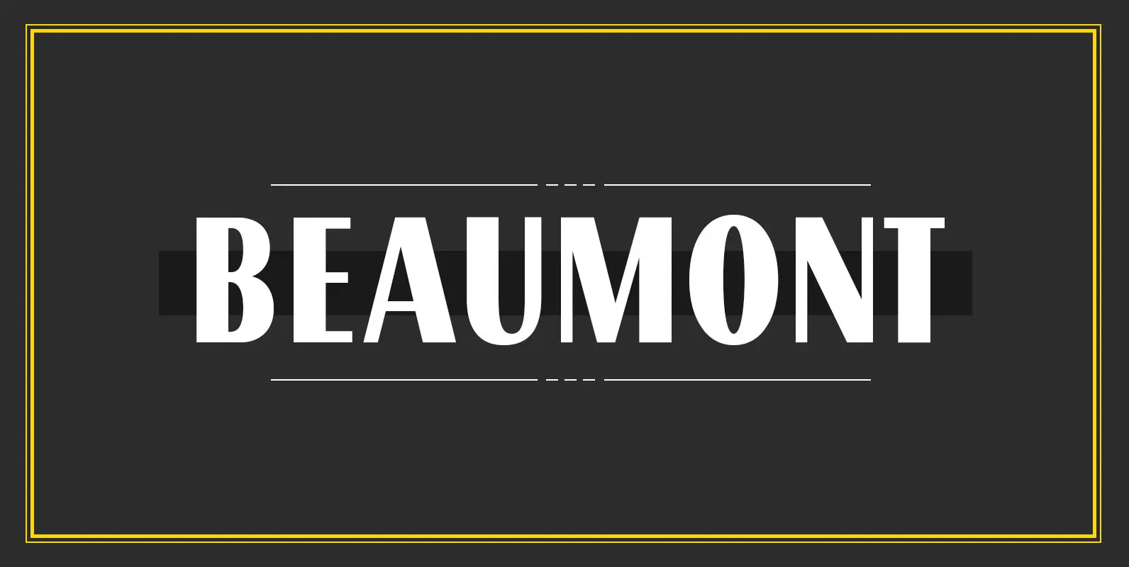
Beaumont Font
Beaumont is a modern take on classic 1920’s type, playing with stroke contrast and art deco forms. The result is a 10 font family, providing options for setting readable body copy or high impact display headings. With full multilingual character
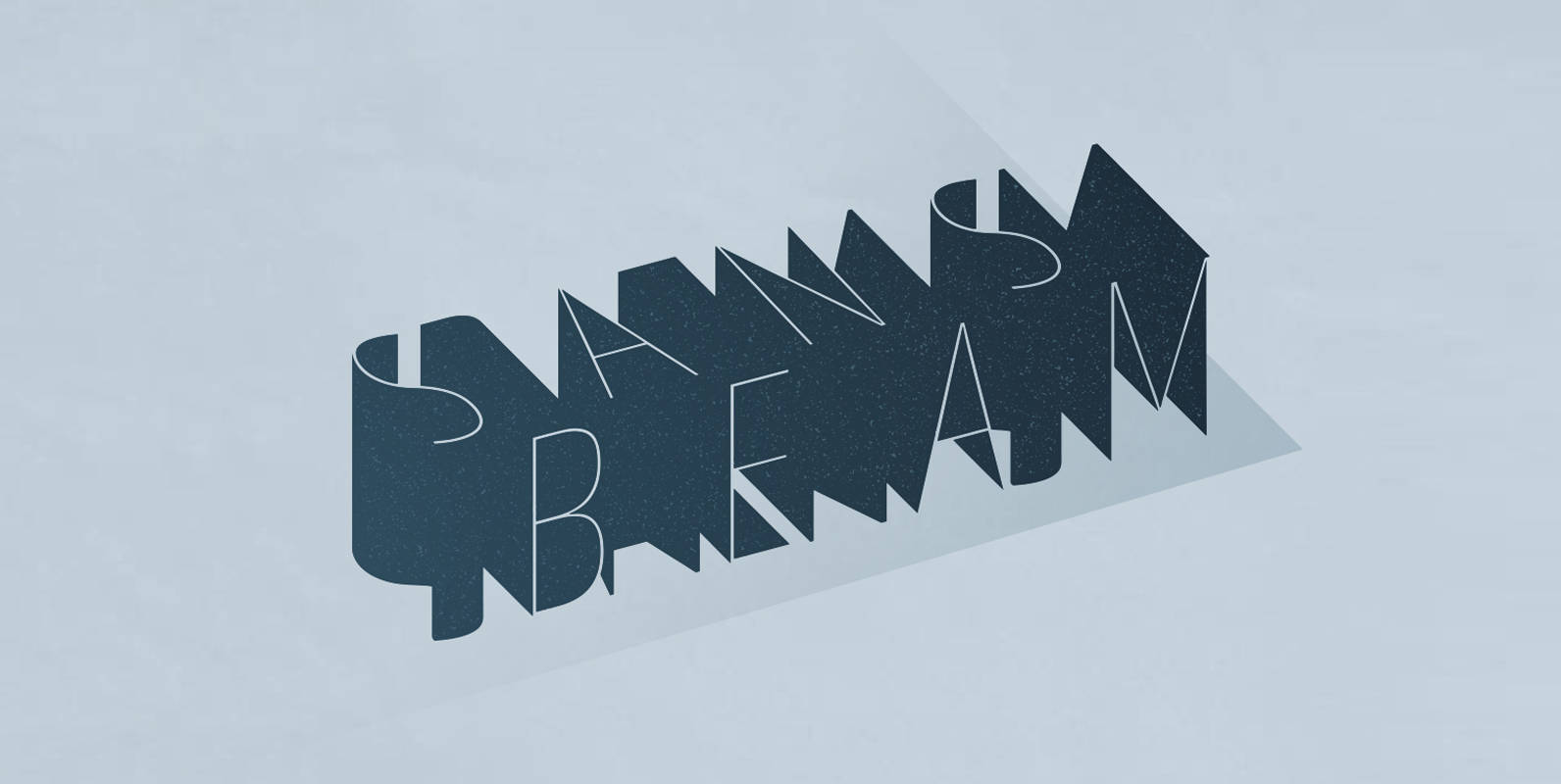
Sans Beam Font
After releasing Amsi in 2015, this year Sans Beam is now ready to launch with the design that support many different usability from Headline to Body text, and specifically designed to be compatible with other font families of Stawix Foundry.
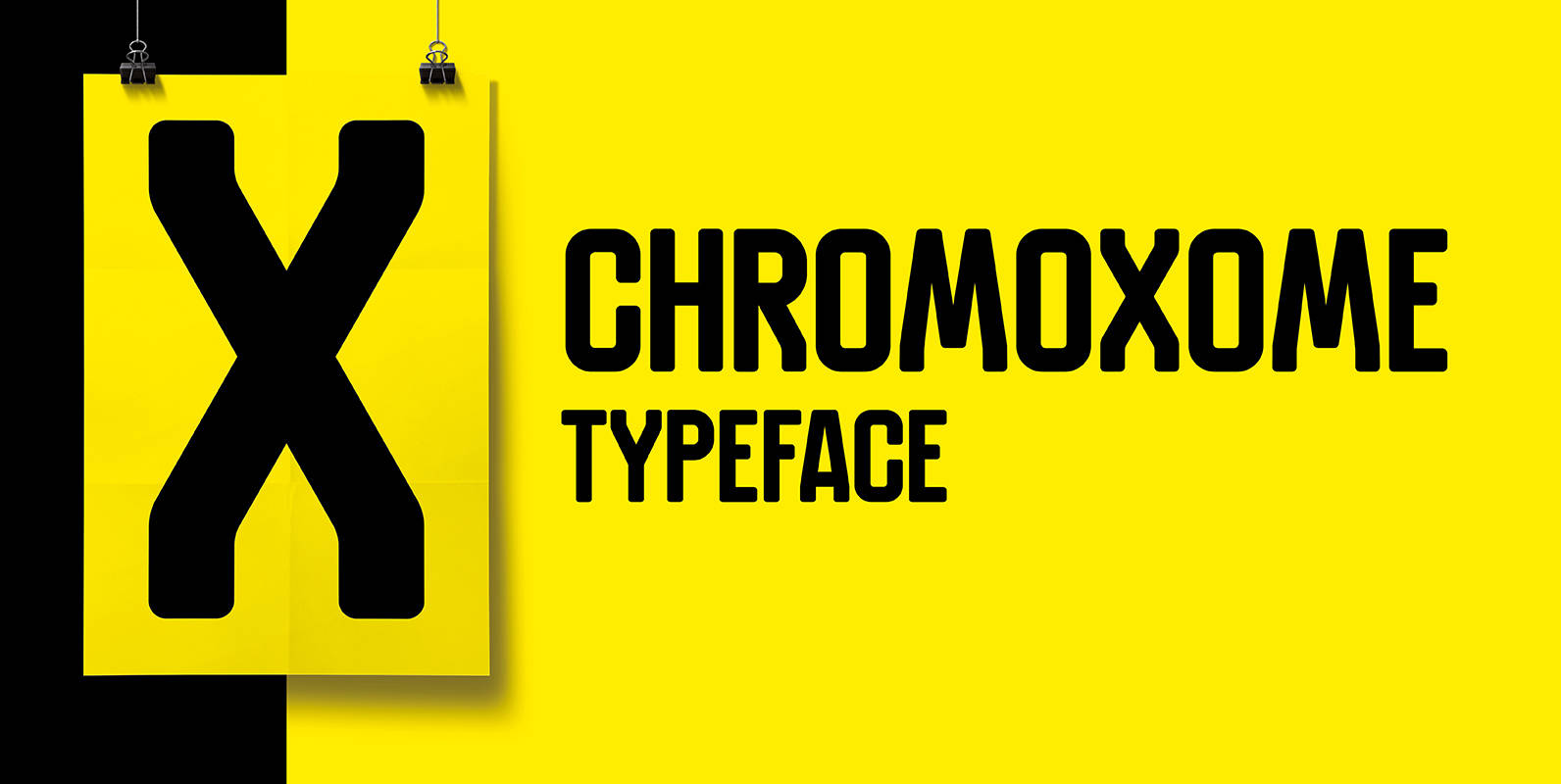
Chromoxome Font
Chromoxome is a modular techno, all caps typeface designed by thmbnl. graphic design. Chromoxome suits perfect for headings and/or logo designs and has an extensive character set (350+). Published by Thom NiessinkDownload Chromoxome
