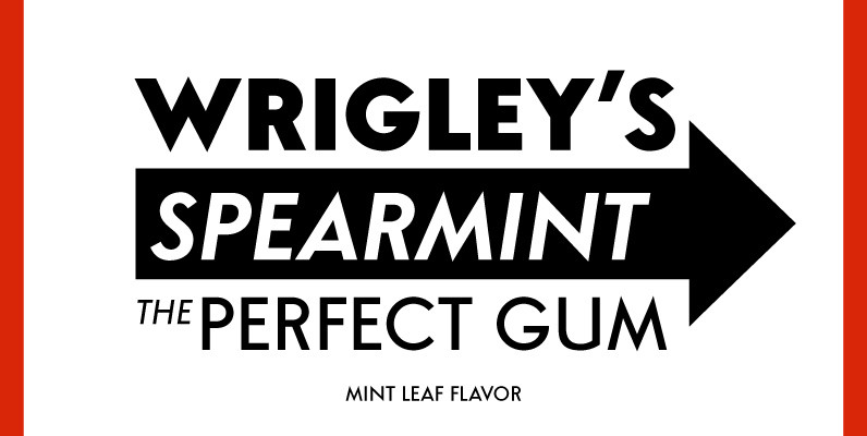
Tag: headline

Bristol Adornado Font
Bristol and Bristol Adornado (also known as Greco) was first released by Fundición Richard Gans of Madrid, Spain, in 1925. The Richard Gans Foundry is a defunct Spanish foundry which existed from 1888-1975. Throughout its existence, types were designed by

Creighton Pro Font
Designed by Steve Jackaman and Ashley Muir. It was our initial intention to develop a suitable lowercase for Les Usherwood’s ‘Elston’ typeface, based on a few characters from an old German typeface called Hermes Grotesque (Woellmer, Berlin). However, the new
Richard Miller Font
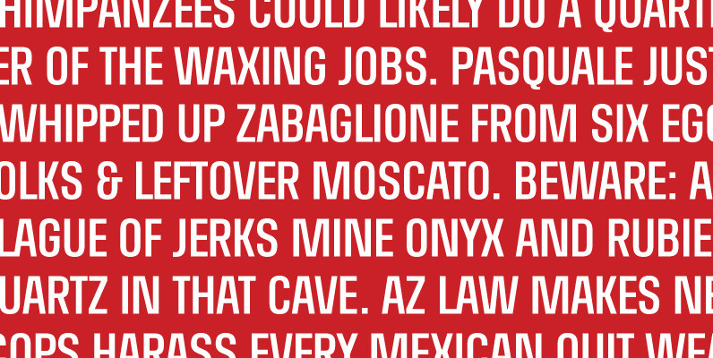
Richard Miller started out as a logo for a website/business card, and now is a family of 4 all caps fonts. It is a modular sans that works well in both print and web design. Published by Miller Type FoundryDownload

Achille II Cyr FY Font
For our first cyrillic font, we choose to complete Achille FY, one of our favorite Fontyou fonts. Its robust and solid structure was an excellent opportunity to make a cyrillic version of it. Like its latin cousin, Achille II Cyrillic
Mangerica Font
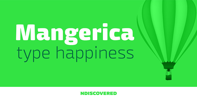
This design incorporates different styles into a consistent look. A pinch of script, a little of geometric and some humanistic shapes as well create a very distinguishable sans-serif. It has an overall good feeling specially on the heavier weights that
Zambesi Font
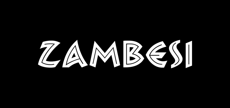
Zambesi is a font design released for the Mecanorma Type Collection. Copyright 2004 Trip Productions BV. Published by MecanormaDownload Zambesi
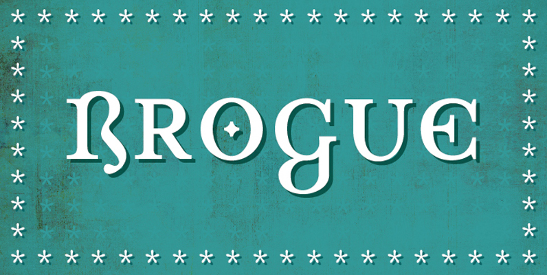
Brogue Font
Brogue was designed to be a display typeface, but it can be used for a small body of text. At its core it is an uncial influenced typeface that has been allowed to stray from its roots. Embracing other alphabets,
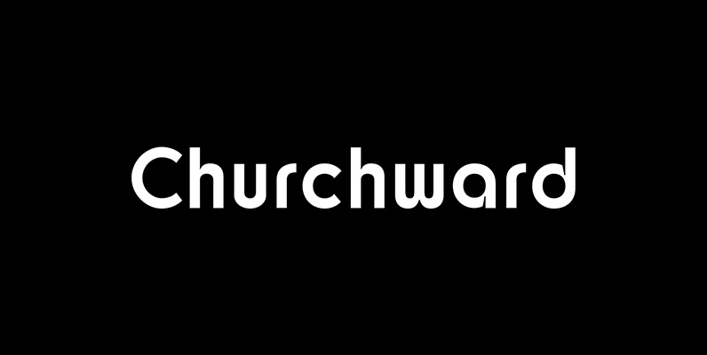
Churchward Design Font
Churchward Design Lines is the latest addition to the Churchward Design family. The family now consists of nine unique fonts, all based on a classic, straightforward geometric glyph forms, with the addition of Churchward’s quirky details. Published by BluHead StudioDownload

Pancetta Serif Pro Font
Pancetta Serif Pro is a squarish serif typeface – a natural companion to Pancetta Pro. Its skeleton is a blend of modern serif and slab faces, featuring prominent obtuse pillow-shaped serifs. Pancetta Serif Pro comes in 8 weights with real

Naive Inline Sans Font
Naïve Inline Sans is a layered sans serif handwritten font designed by Fanny Coulez and Julien Saurin in Paris. Our goal was to draw a font with finely irregular lines that give a human and whimsical feeling. We designed three
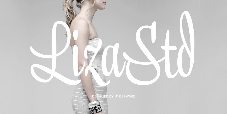
Liza Std Font
Flirting, fashionable, provocative, emotional, casual, moderate, extremely sensible & beautiful – Liza. Liza Std is a little sister of Liza Pro; it contains 1 basic OpenType script font. Take care: Liza Pro’s intuitive & intelligent OpenType features and extensively large
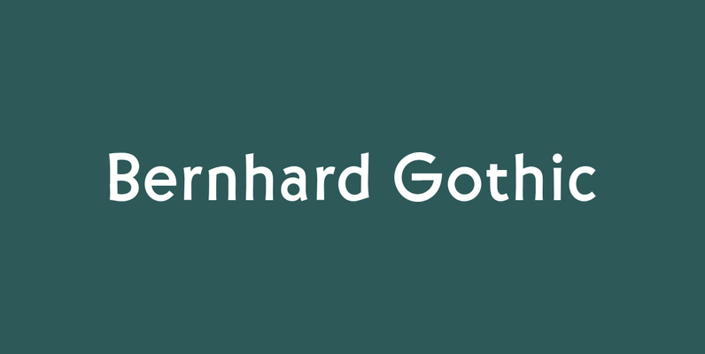
Bernhard Gothic Font
Bernhard Gothic is a family of geometric sans serif typefaces designed by Lucian Bernhard in 1929 for the American Type Founders (ATF). The five style variations by Bernhard were introduced over a period of two years. Bernhard Gothic is more
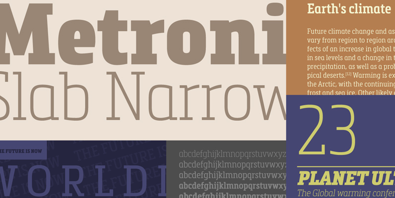
Metronic Slab Narrow Font
Metronic Slab Narrow is the condensed version of the Metronic Slab font family. This condensed style is designed for space-saving typography but with high legibility and versatility in mind. This Family also improved the needs of developers and graphic designers
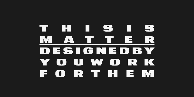
YWFT Matter Font
Take the Matter into your own hands. YWFT Matter, that is–a wide, bold and grotesque typeface design based on several concepts from Victorian-era science texts and manufacturing/marketing materials. YWFT Matter features alternate characters, like a “two-story” lowercase “a,” that are
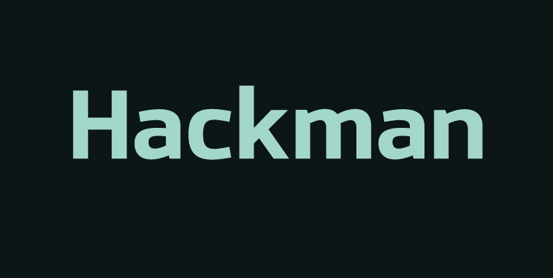
Hackman Font
A geometric sans serif with contemporary lines. Distinctive curves are combined with classical letterforms to produce a clean, linear typeface best suited to identity, mobile and web applications. Details include 9 weights with italics, 500 characters, 5 variations of numerals,

Stream Font
Script Stream was developed for the series of handwriting fonts based on the writing samples of real people. The font delivers natural sincere touch and can magically convert any annoying advertising text into intimate advice of your good friend. The
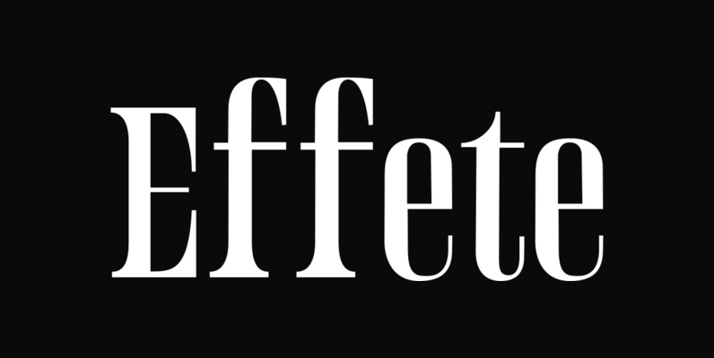
Effete Font
Effete is a metropolitan titling typeface, similar in weight and proportion to fonts like Imre Reiner’s Corvinus, but both more expressive and less goofy. Effete conveys a sense of quality and authenticity. Published by WordshapeDownload Effete
