Tag: headline
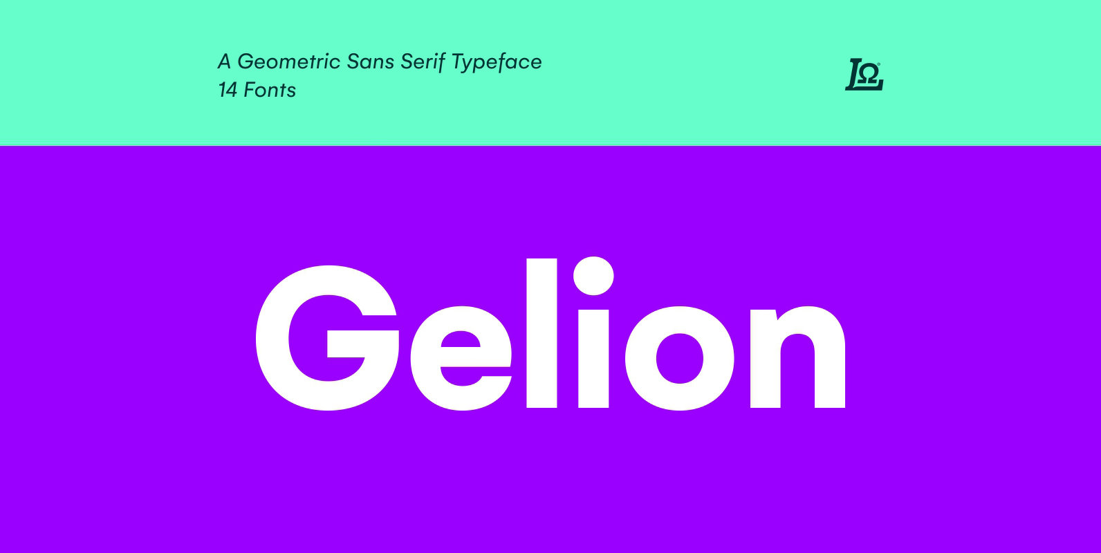
Gelion Font
Gelion is a Sans serif with a geometric touch with a minimal contrast of strokes, inspired by Futura, Avant Garde, Avenir and neo-grotesque Akzidenz-Grotesk, Helvetica form remaining true to the gracefully geometric look of the early 20th-century typefaces, that ticks
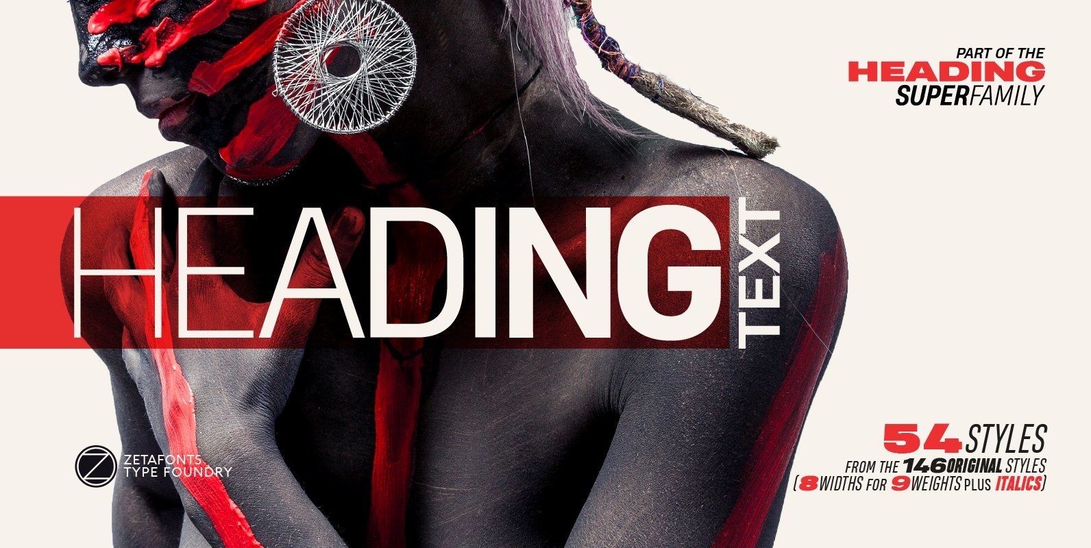
Heading Pro Text Font
Heading Pro Medium, Heading Pro Double and Heading Pro Treble are three variants of the original Heading Pro typeface designed by Francesco Canovaro for Zetafonts. These three medium width families have been added to the original condensed width family to

Flexo Soft Font
Flexo Soft is the soft companion of Flexo. In Flexo Soft, the sharp edges of Flexo’s characters have been tempered by a moderate rounding—creating a softer and friendlier typeface. Flexo Soft has a squarish design, making it stand out in
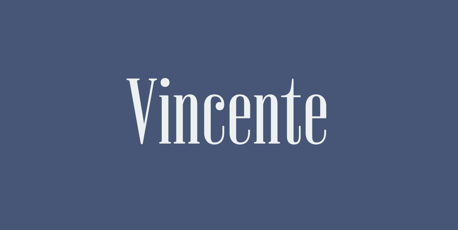
Vincente Font
Vincente is a contemporary but Didone-look serif with condensed proportion. Inspired by vintage iron works and antique botanical pictorial book. Very simple and orthodox letter forms with some charming accent such as can be seen in “y”. Sophisticated curves but
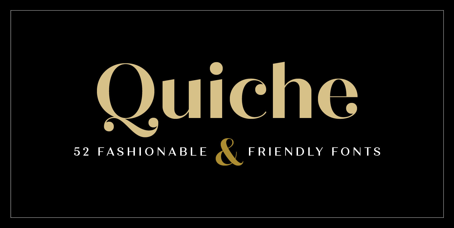
Quiche Font
Quiche is a high-contrast, sans serif typeface featuring ball terminals and angled stems. This 52 font superfamily is a complete branding suite. The 4 subfamilies—Display, Fine, Stencil, and Text—were created to work harmoniously together based on the need. With weights
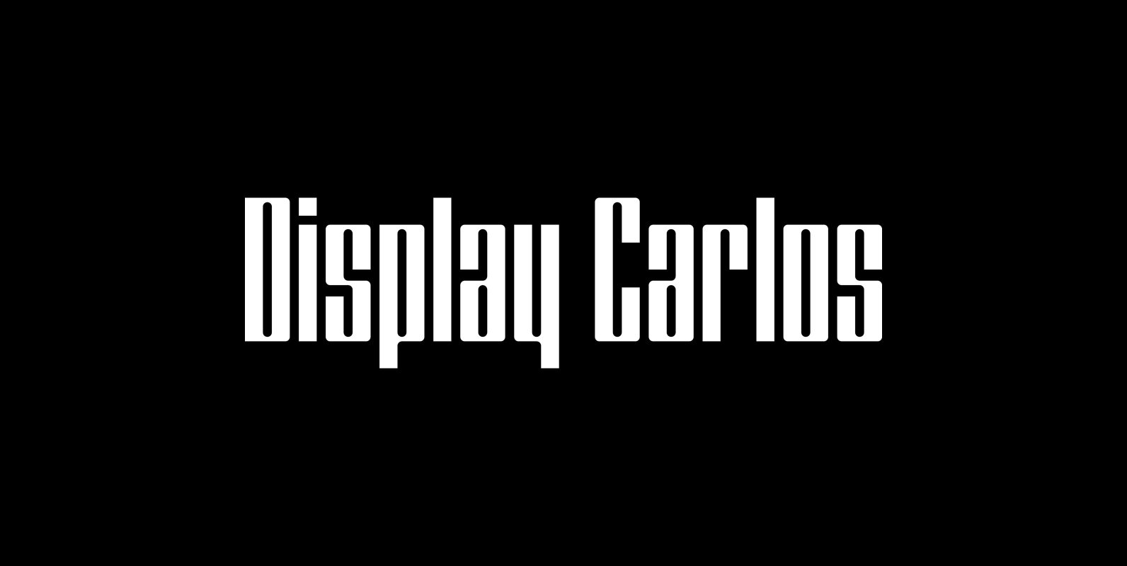
Display Carlos Font
Display Carlos is a display font not intended for text use. It was designed specifically for display, headline, logotype, branding, and similar applications. There are numbers and punctuation located under their respective keys. Published by Gerald GalloDownload Display Carlos
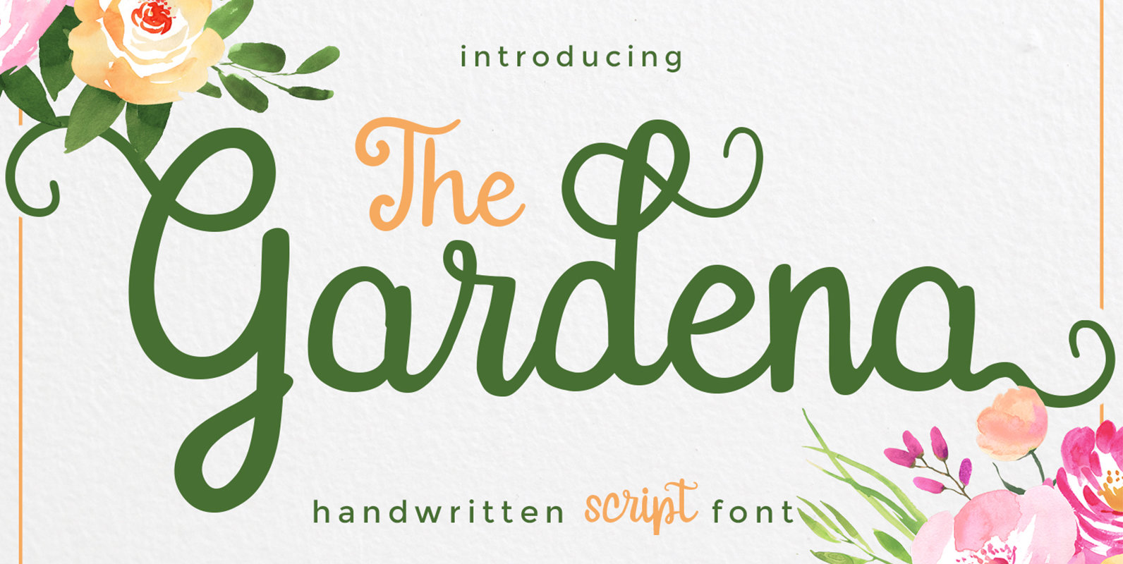
Gardena Font
Gardena Script Font is designed and inspired from handwritten font. Gardena is great for invitation, greeting, headline, casual design, branding design, menu designs, wedding related design, quote or simply design with stylish text overlay to any background image. Includes :
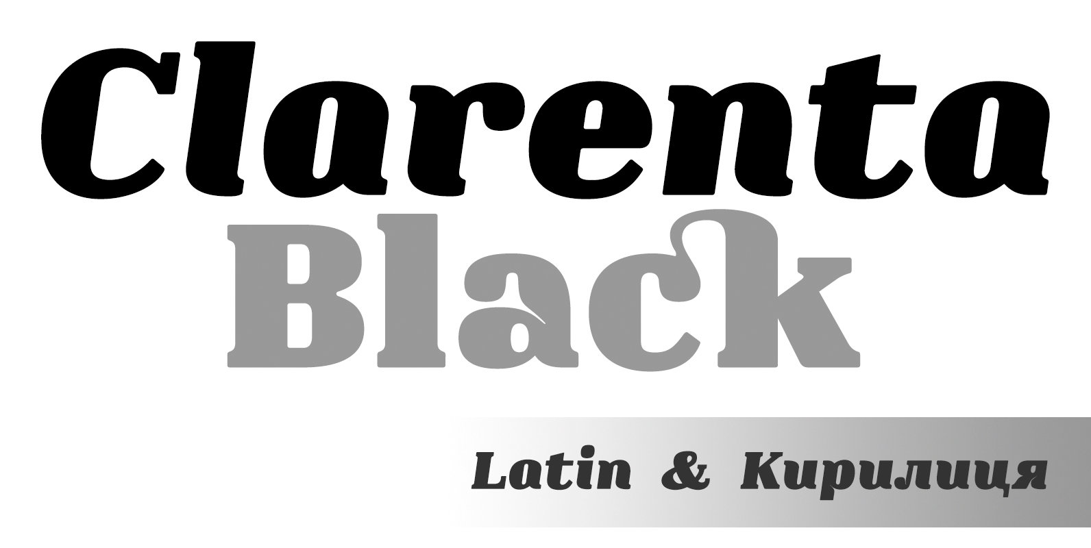
Clarenta 4F Font
Clarenta 4F is a serif font design published by Sergiy Tkachenko Published by Sergiy TkachenkoDownload Clarenta 4F

Vin Slab Pro Font
Vin (translated from Ukrainian as “he”) is a superfamily consisting of three distinctly masculine typefaces with pronounced vertical stems and rounded corners. All three typefaces feature very large x-height for even more expression and assertiveness. Vin Slab Pro is a
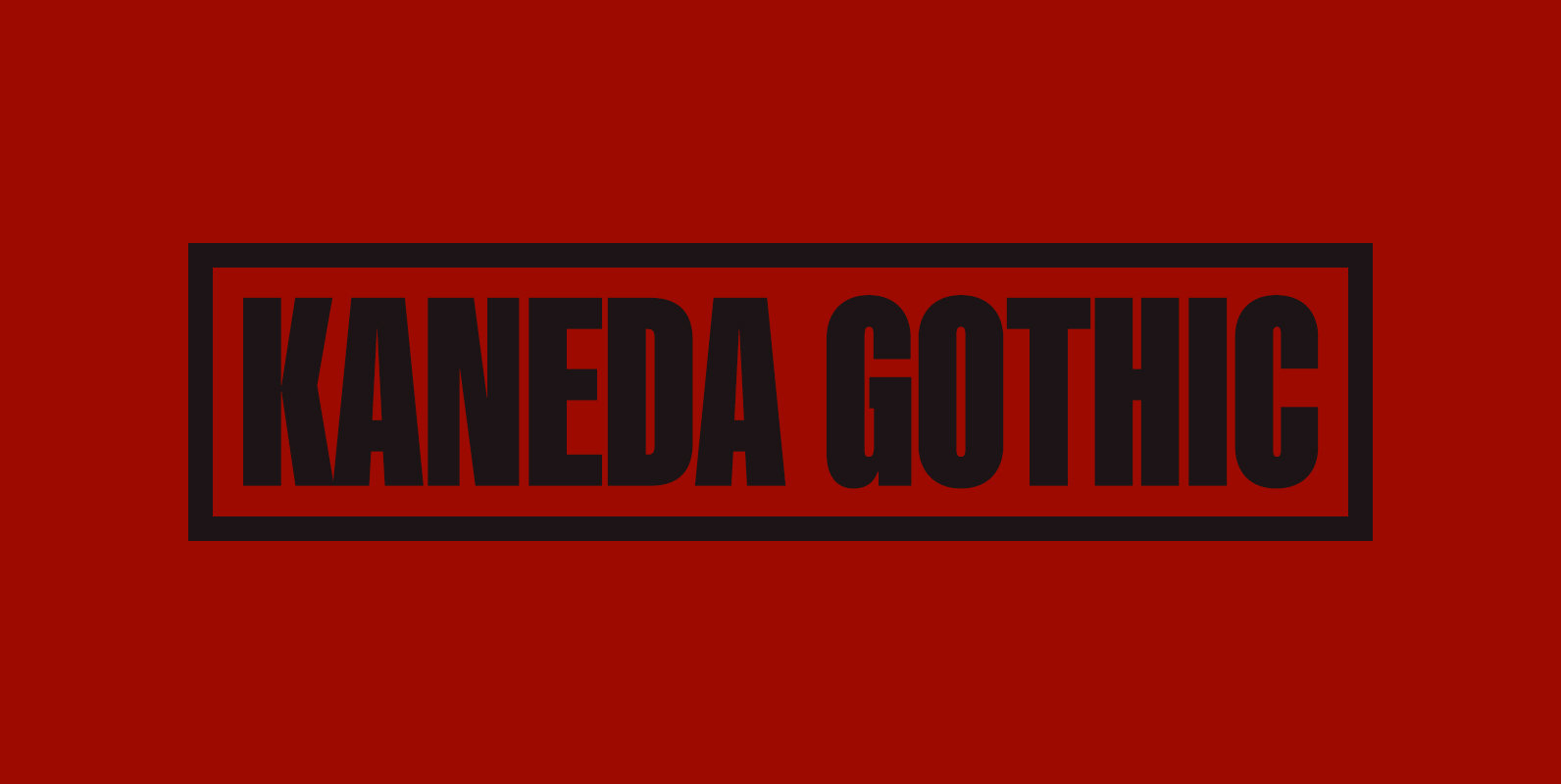
Kaneda Gothic Font
Kaneda Gothic is a whole new basic gothic. Philosophically, Kaneda Gothic is the one of the niche answers in the interspace between these antinomies. Image of near-future and giant metropolis in 80s, 90s vs our real life in the 2010s,20s.
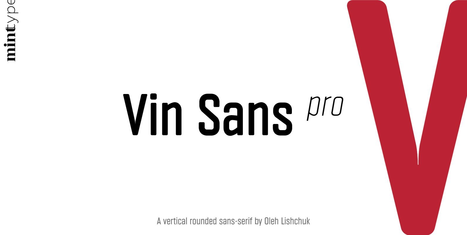
Vin Sans Pro Font
Vin (translated from Ukrainian as “he”) is a superfamily consisting of three distinctly masculine typefaces with pronounced vertical stems and rounded corners. All three typefaces feature very large x-height for even more expression and assertiveness. Vin Sans Pro is a
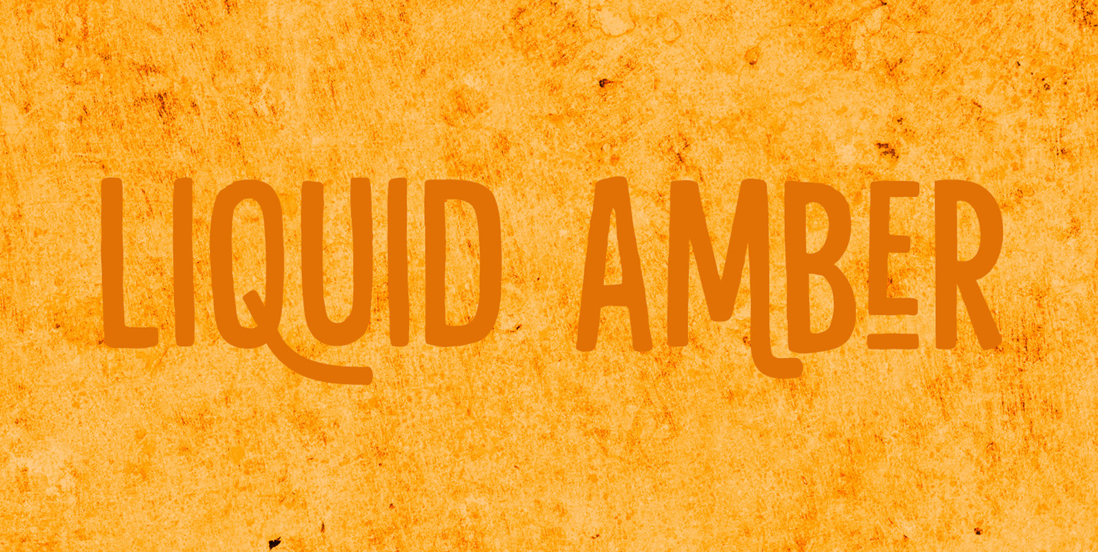
Liquid Amber Font
Liquidambar is actually a beautiful tree, native to America. I have one in my garden and I love its autumn colors! Liquid Amber is something else: it is a handmade all caps font that comes with oodles of diacritics, some
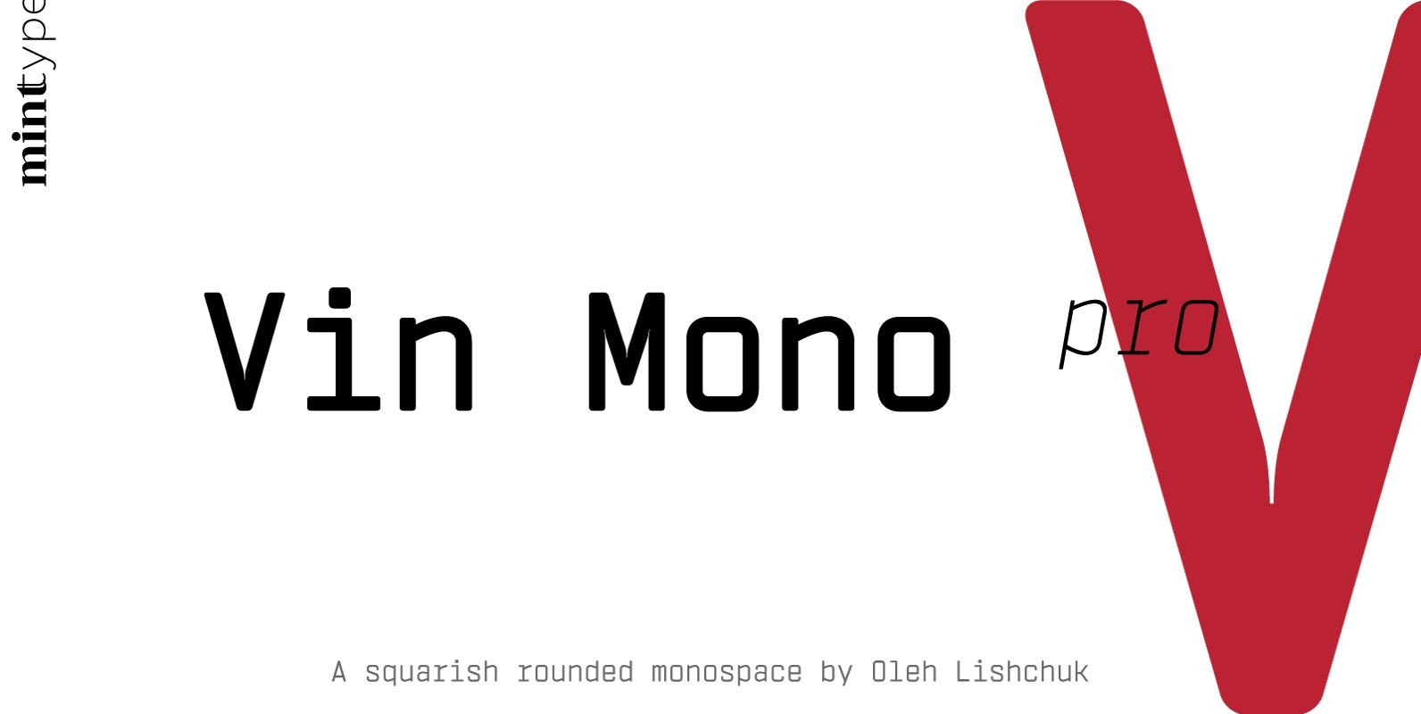
Vin Mono Pro Font
Vin (translated from Ukrainian as “he”) is a superfamily consisting of three distinctly masculine typefaces with pronounced vertical stems and rounded corners. All three typefaces feature very large x-height for even more expression and assertiveness. Vin Mono Pro is a
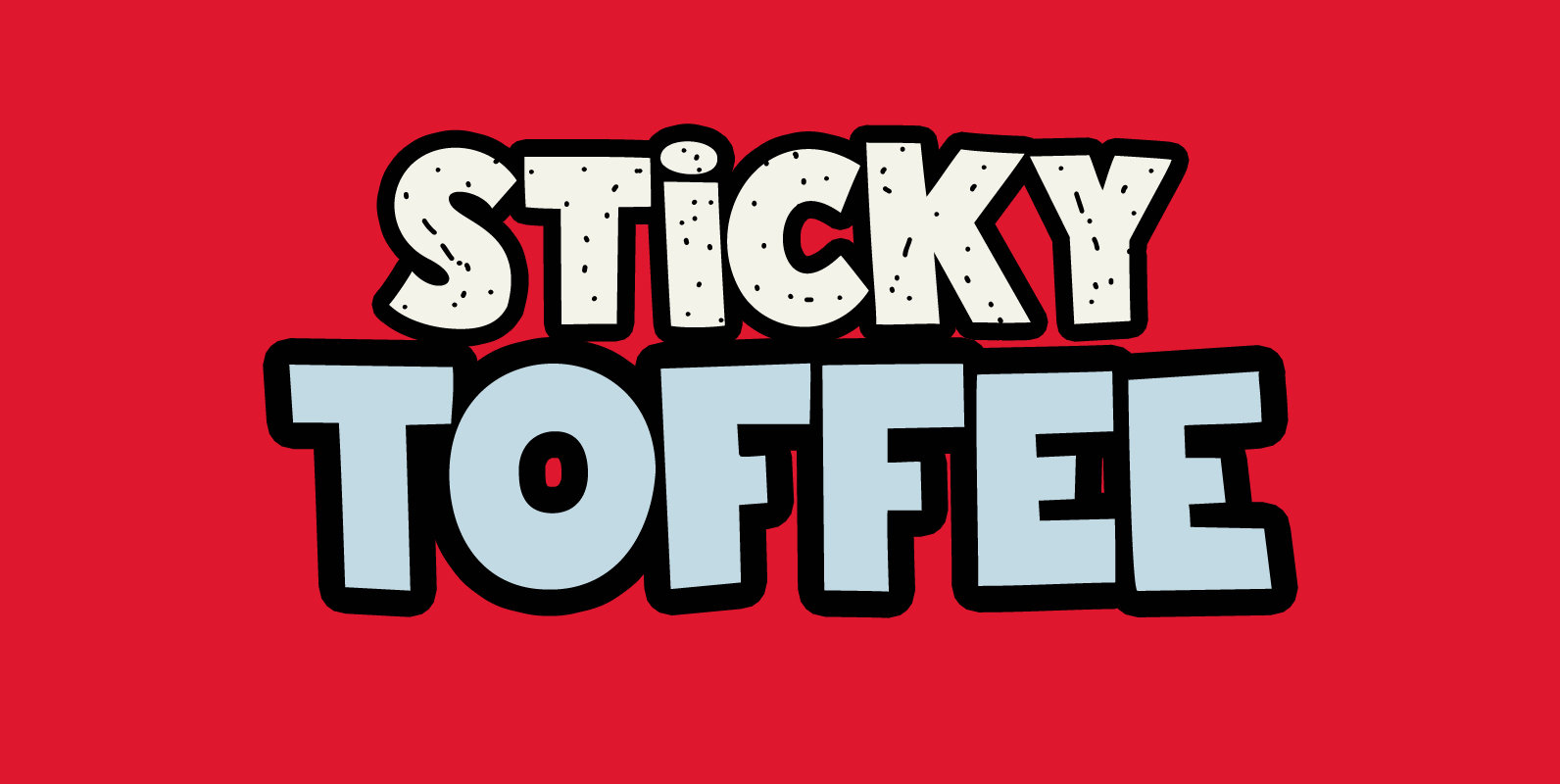
Sticky Toffee Font
I don’t have a sweet tooth myself, but I do like toffee! One of my favourite desserts is English Sticky Toffee Pudding, so I really had to name a font after this delicacy. Sticky Toffee is a bold display font.
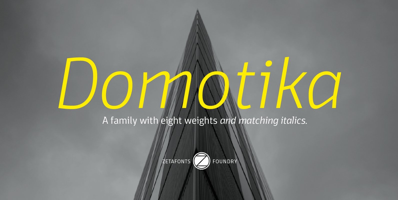
Domotika Font
Domotika is a typeface family designed by Cosimo Lorenzo Pancini, with italics designed by Andrea Tartarelli. It's a humanist sans serif font, with a semi-condensed feel, great for editorial and display usage where readability and personality must match convenient space
