Tag: headline
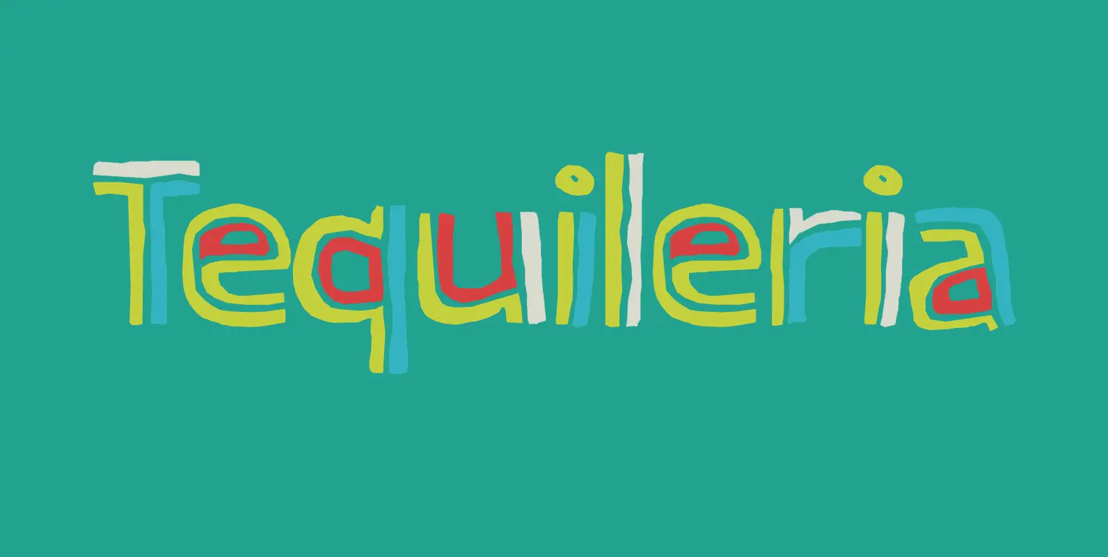
Tequileria Font
Tequila… I have to admit that I am not a drinker. I do like Tequila, though, even though I can’t remember when I last had a shot. Tequileria is a very recognisable inline display style font. It would look great
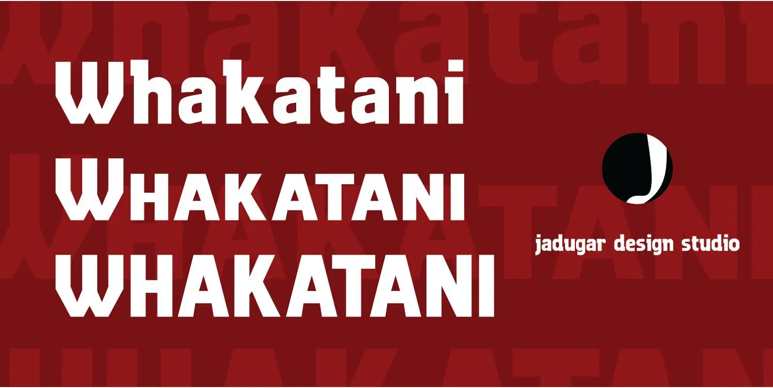
Whakatani Font
Whakatani is a new font with only have Bold option at the moment, beautifully kerned letters and multi language supporting. Whakatane invites you to throw away your watch, relax in the sunshine, experience the special lure of the ocean and
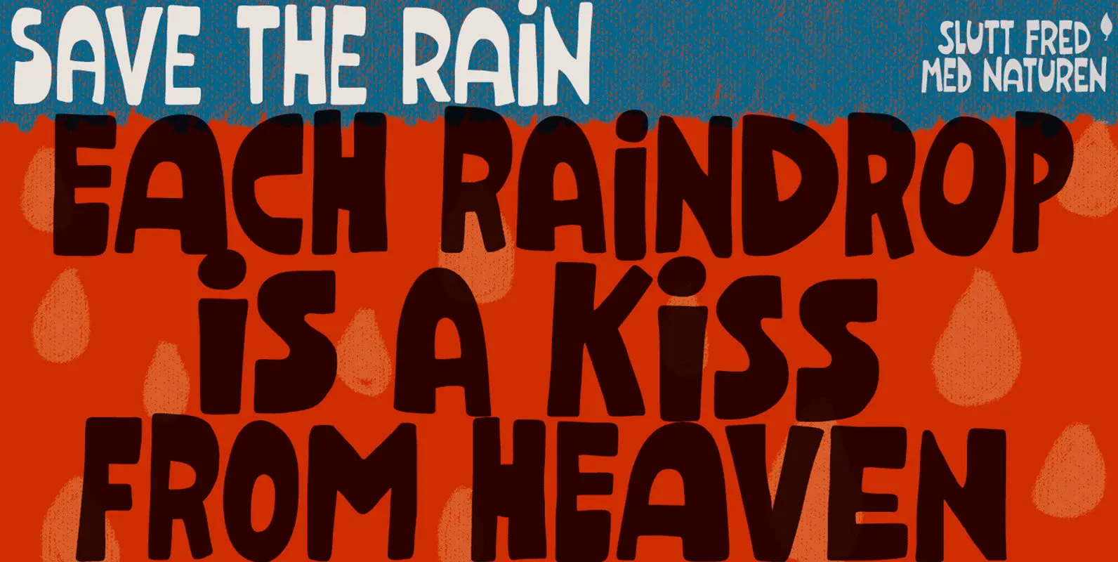
Dunkelbunt Font
Dunkelbunt is freely inspired by works and words of the wildly eccentric artist, architect and designer Friedensreich Hundertwasser. It’s an all caps font, with 2 cuts for each letter, loaded with imaginative energy and organic forms that will certainly make

Starlight Lovers Font
I have always loved gazing at the stars. Too bad that you don’t get to see a true starry night these days – mostly because of light pollution. Starlight Lovers is a messy serif. It is hand painted, using a
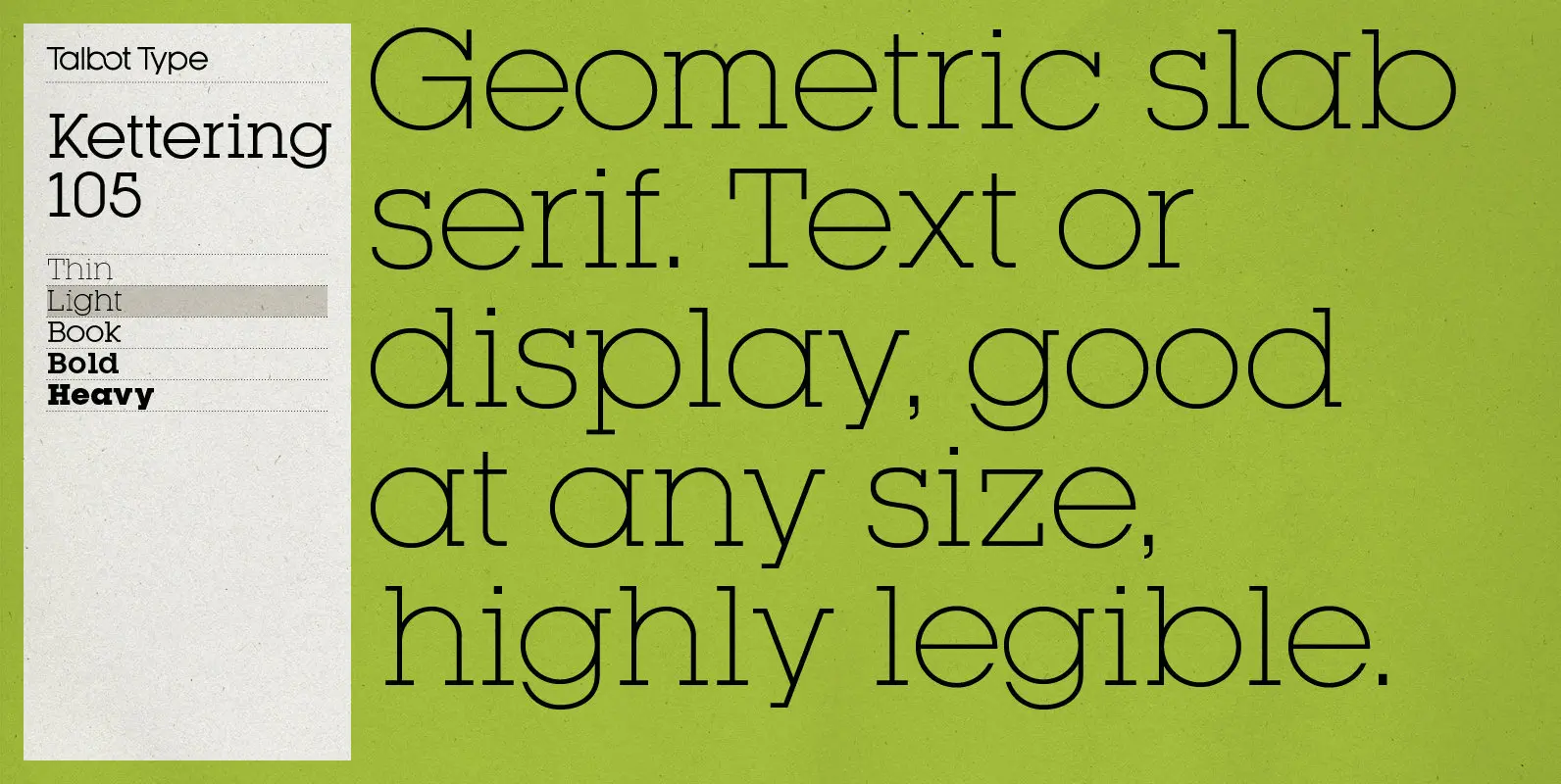
Kettering 105 Font
Kettering 105 is inspired by the classic, geometric slab-serifs such as Lubalin, but has shallower ascenders and descenders for a more compact look. It’s a versatile, modern slab-serif, highly legible as a text font and with a clean, elegant look
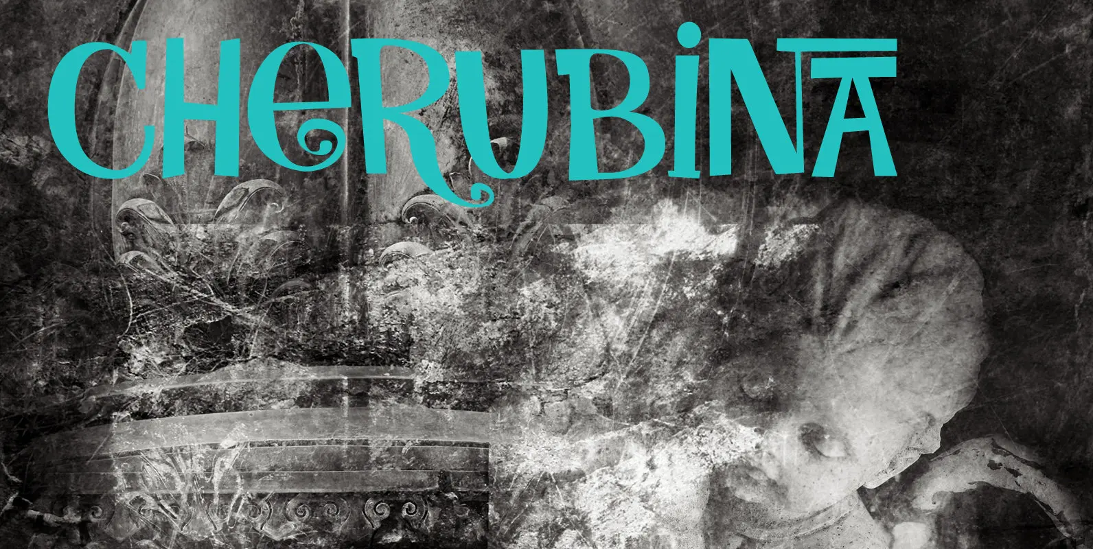
Cherubina Font
Cherubina means ‘Blessed’. It is a name derived from the Akkadian “karabu / kuribu”, meaning “blessing, blessed”. A cherub is a type of spiritual being mentioned in the Hebrew Bible, often depicted as a baby with wings. This font was
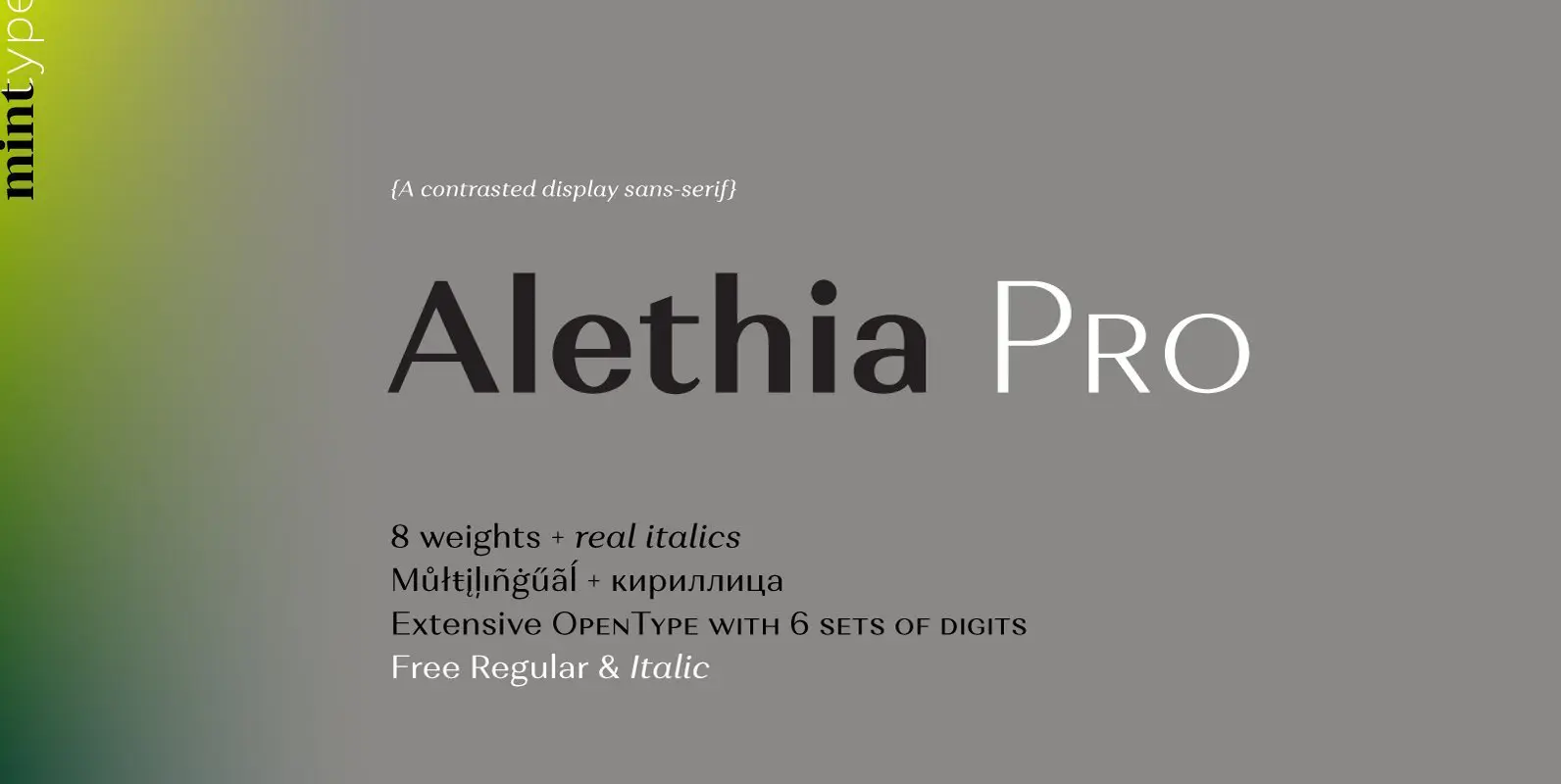
Alethia Pro Font
Alethia Pro is a grotesque sans-serif typeface with high contrast in all weights. It has been designed to serve as a display typeface in various editorial projects, such as magazines or corporate brochures, as a sans-serif pair to serif types
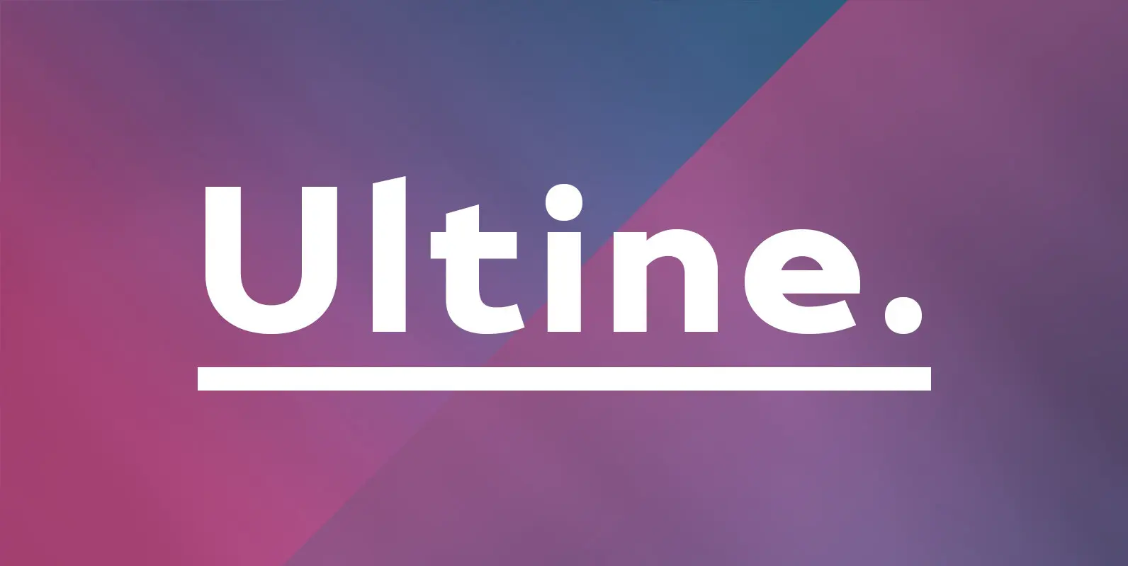
Ultine Font
No frills. No fluff. Still friendly. Keep your look clean and simple with the utilitarian but gentle Ultine. This font with a slightly extended geometric architecture gets straight to the point without pushing your reader away with too firm an
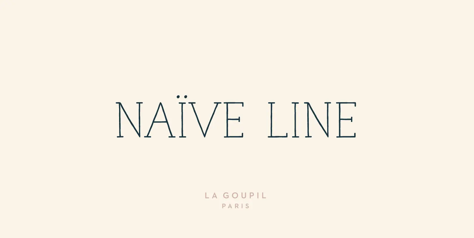
Naive Line Font
Naïve Line is an unusual handwritten serif font designed by Fanny Coulez and Julien Saurin in Paris. Our goal was to draw a font with finely irregular lines that give a human and whimsical feeling. We designed five weights, finely
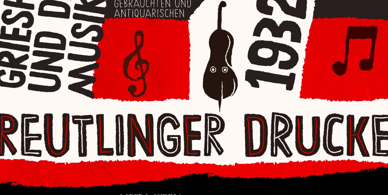
Chronic Font
Chronically strong, yet pacific. Chronically bold, yet friendly. This font was at first inspired by a HAP Grieshaber work and soon incorporated elements from pieces by Willem Sandberg, two astonishing artists who lived through two world wars. They had to
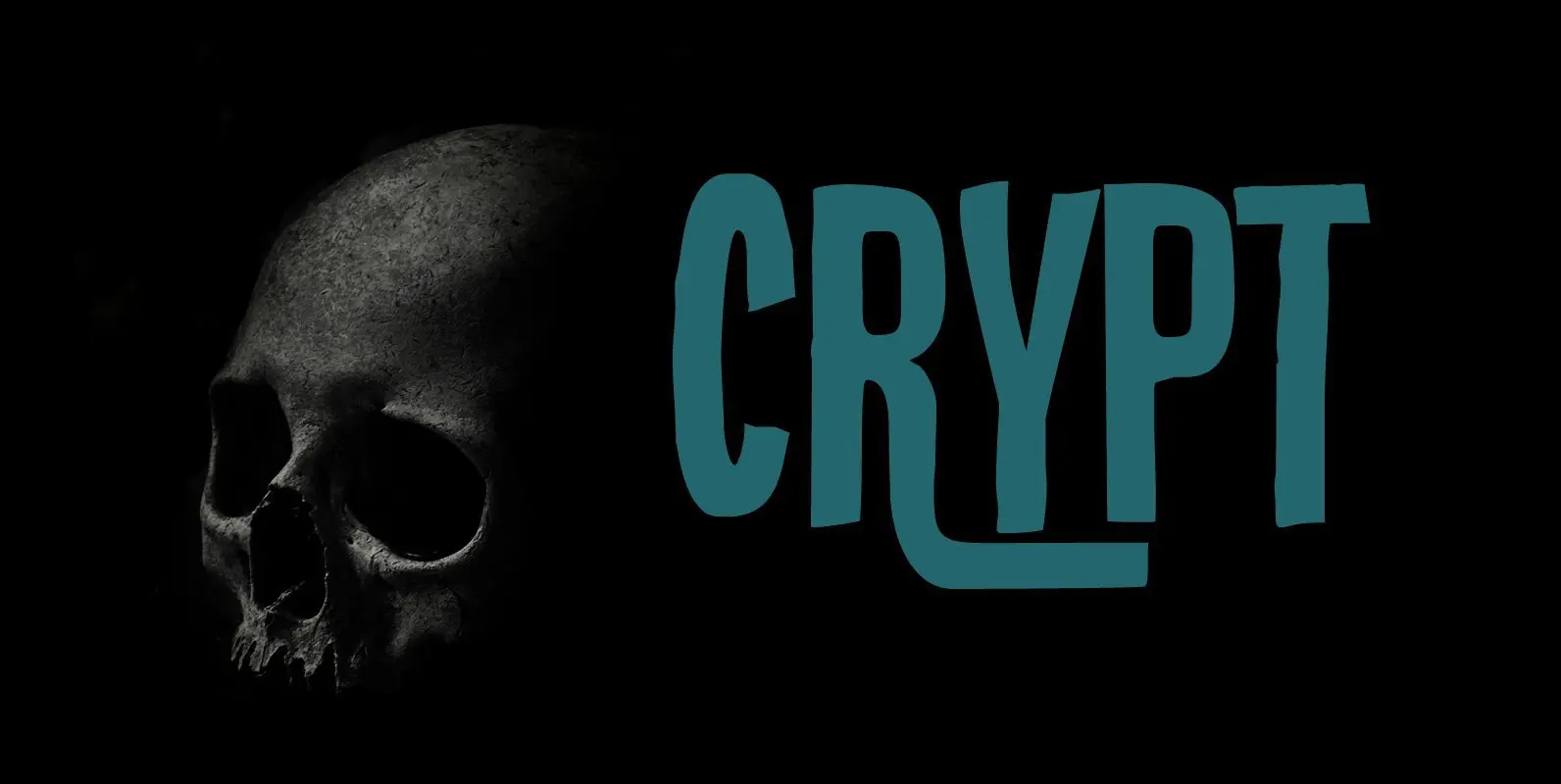
Crypt Font
Crypt is a seemingly lovely font that will look good in just about any design. But if you take a closer look, then Crypt is actually quite a scary font: it has jagged edges and a sinister undertone, making the
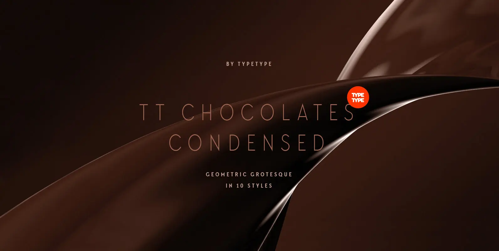
TT Chocolates Condensed Font
Have you heard the expression, 'you can never have too much chocolate'? We completely agree with this point of view and are gladly presenting you the TT Chocolates Condensed fontfamily, the narrow version of your favorite TT Chocolates. Keeping its
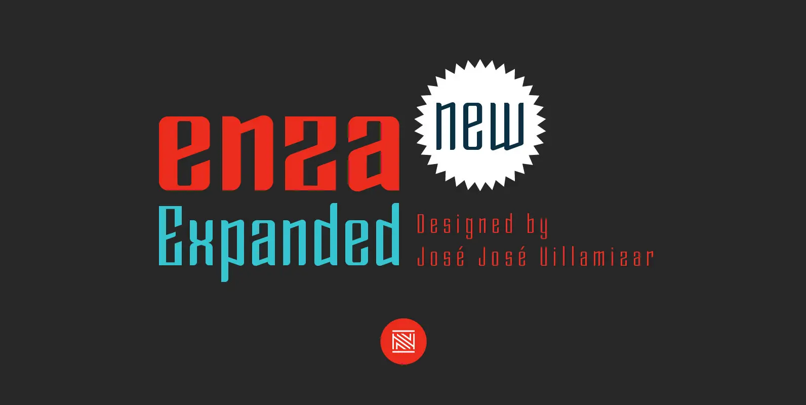
Enza Expanded Font
“Enza Expanded” is the new display typeface of the family Enza designed by José José Villamizar for Neo Type Foundry. Its design stems from the typographic exploration for conducting an identity aimed at entrepreneurs of the Millennial Generation. This typeface
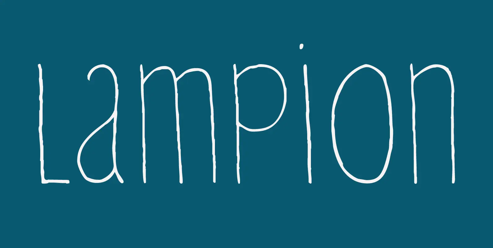
Lampion Font
A lampion is a paper lantern. They are very popular in Asian countries, where they are used at festivals. Lampions are mostly made from rice paper cuttings which are glued to a bamboo frame. Lampion font is a tall, narrow
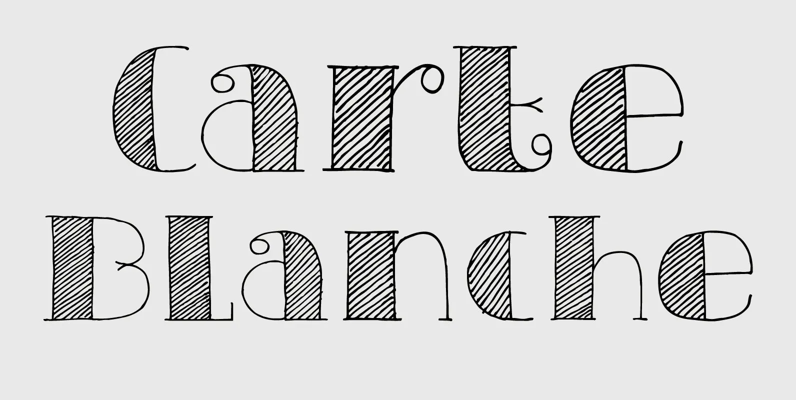
Carte Blanche Font
Carte Blanche literally means ‘Blank Ticket’. Yeah, yeah, it is also a very 007-ish catchphrase, but I wanted to give this elegant font a ‘stylish’ name and Carte Blanche popped up. All glyphs were hand drawn on a rather expensive
