Tag: headline
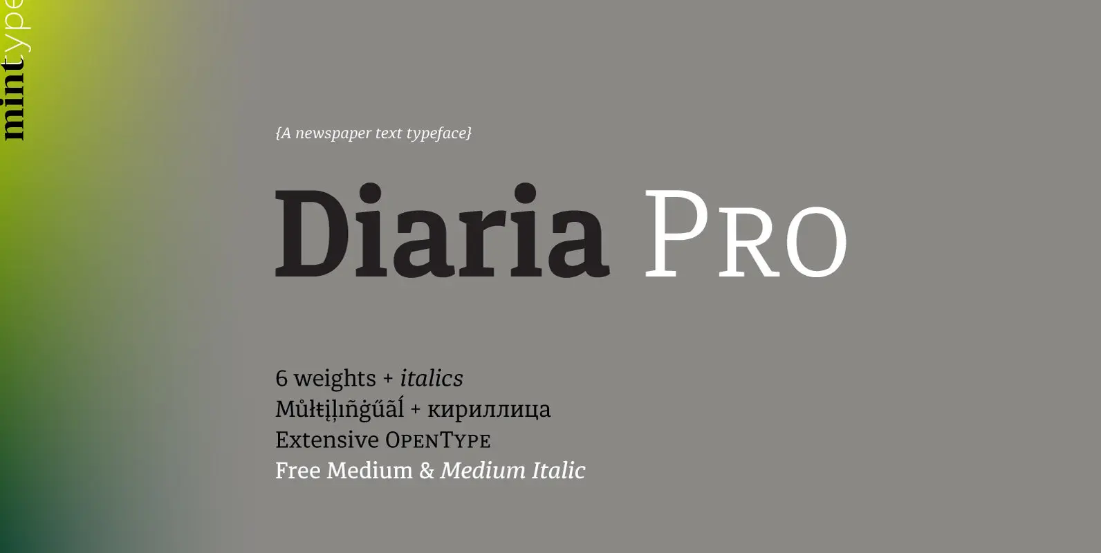
Diaria Pro Font
Diaria started as a project in Typeface Architecture for Master in Advanced Typograghy at EINA, Centre Universitari de Disseny i Art de Barcelona, a course tutored by Laura Meseguer and Íñigo Jerez Quintana. Later it has developed into Diaria Pro,
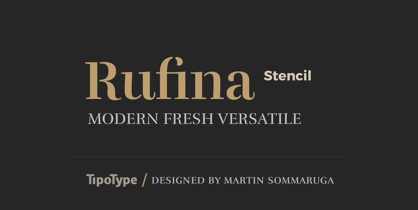
Rufina Stencil Font
Simplicity, delicacy and elegance are the words that best characterize Rufina. Based on an idea that was conceived long before its “birth”, Rufina was created from dark-text on light-background combinations. Refined and at the same time distant, Rufina seduces the
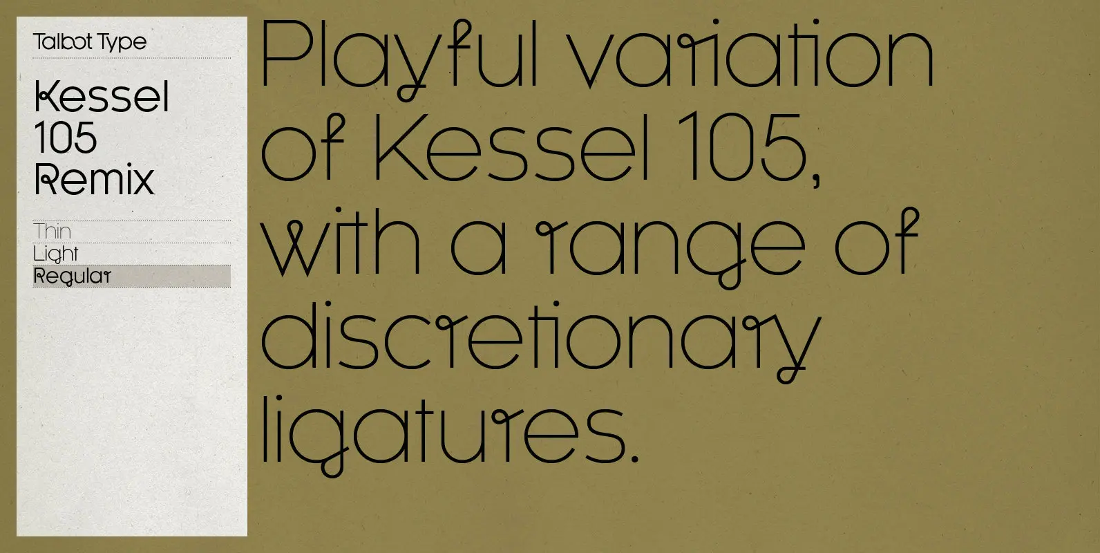
Kessel 105 Remix Font
A remixed variation, available in three weights, of the popular Talbot Type geometric sans Kessel 105. The addition of occasional flourishes at the intersections of strokes, in both upper and lower case, adds character charm, making the font a perfect
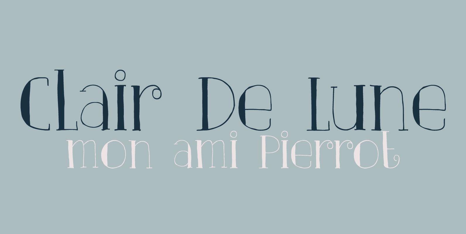
Clair De Lune Font
Clair De Lune is part of the famous Suite Bergamasque, written by Claude Debussy in 1890, and published in 1905. It means Moonlight in French, a kind of romantic name. The name is exactly what I had in mind for

Lemon Yellow Sun Font
Lemon Yellow Sun is a line from my favorite Pearl Jam song – Jeremy. It also happens to be the title of a Stiltskin song, so I had to name a font after it. LYS is a tall, all caps
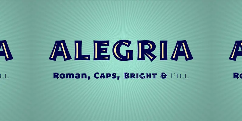
Alegria Font
Alegria is a font family for joyful communication. The family consists of Alegria Roman (with upper/lowercase and oldstyle figures), Alegria Caps (with uppercase, small caps and lining figures), Alegria Bright (a small caps version with a three-dimensional feel) and Alegria
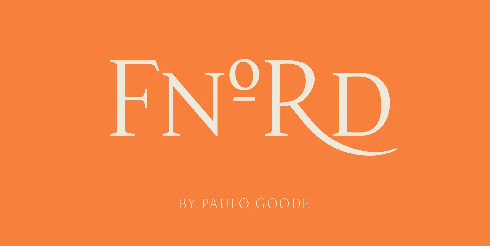
Fnord Font
Fnord is a contemporary humanist serif typeface, it is ideally suited for display purposes and branding. The family has been designed to be highly versatile, containing a total of 23 fonts – each font features discretionary ligatures, swash alternates and
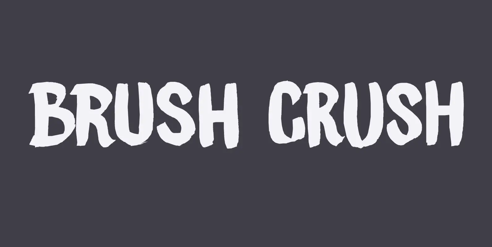
Brush Crush Font
I bought a few new pencils and I tried them out using Chinese ink and quality French watercolor paper. The result is Brush Crush – a very nice brush font. Brush Crush would look perfect on packaging, book covers, posters
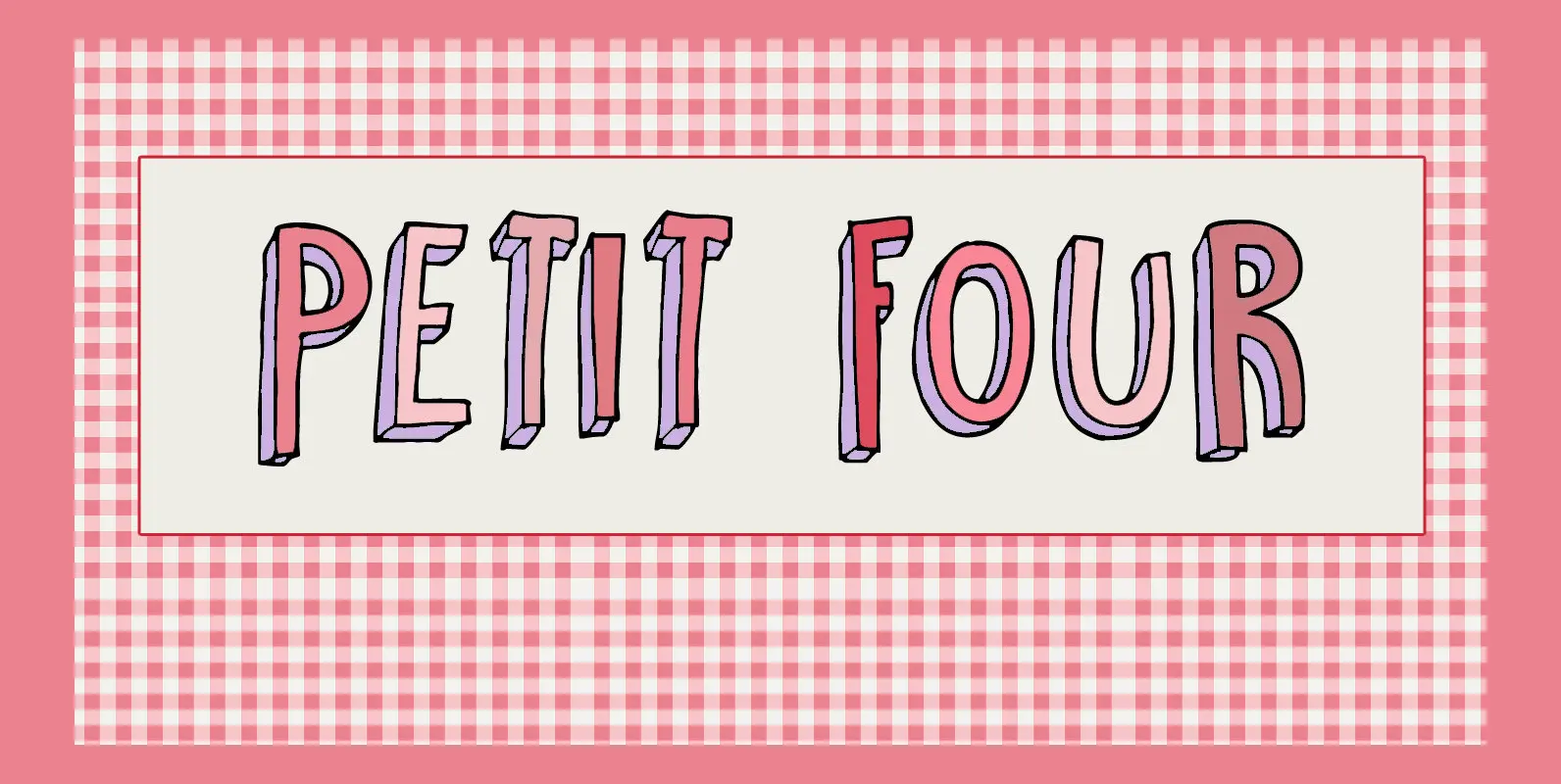
Petit Four Font
A “Petit Four” is a small, bite-sized, French pastry. The font before you is a bite-sized Hanoded original. It is handmade, fun to use and comes with a lot of calories. Like its namesake, use Petit Four sparingly and it
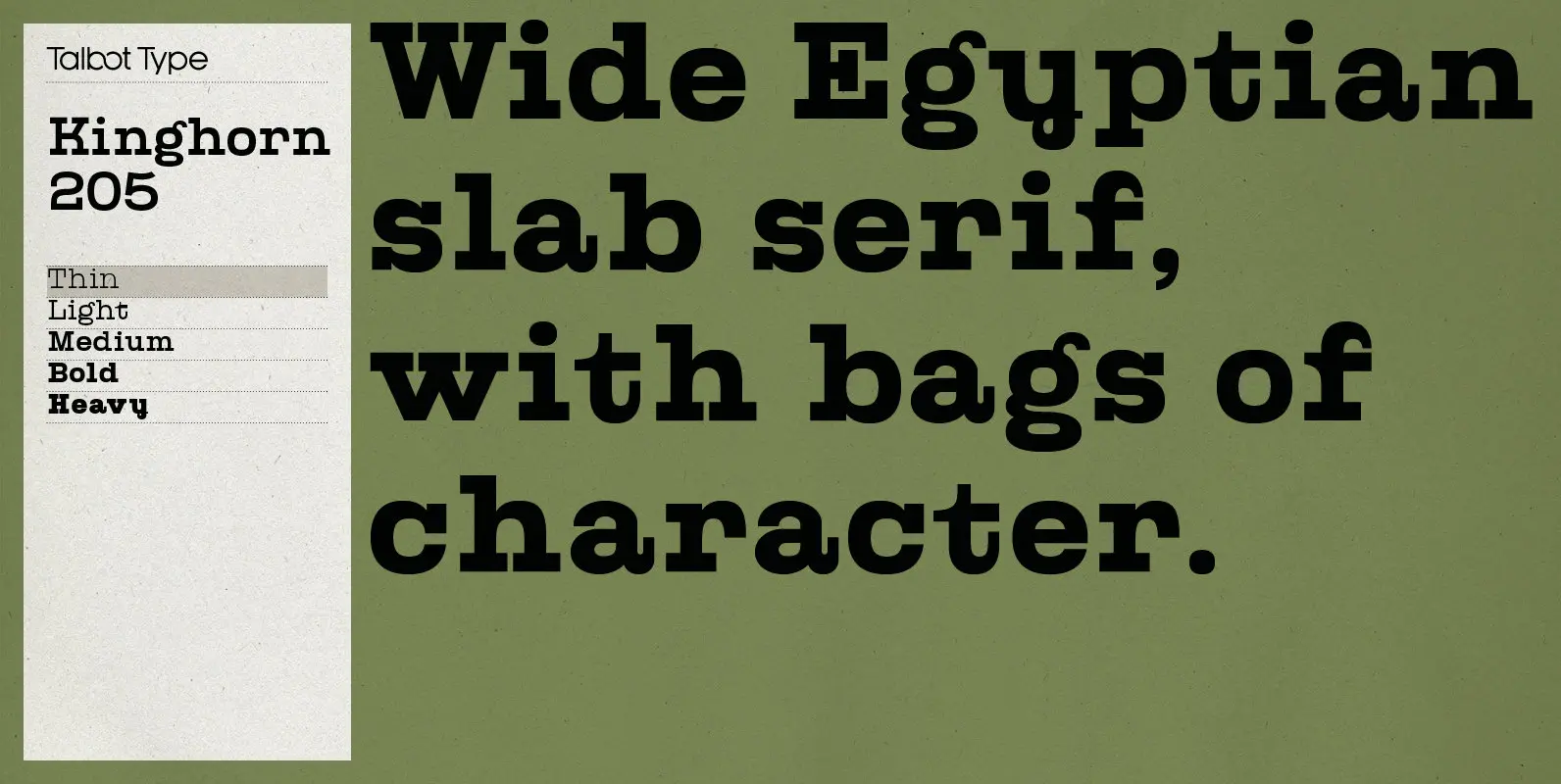
Kinghorn 205 Font
Kinghorn 205 is an Egyptian style slab-serif. The strokes are all of a roughly equal weight for an even, geometric look. Although original Egyptian slabs date from the early 19th century, the even look gives the font a balanced, contemporary

Smurrie Font
Smurrie means ‘sludge’ in Dutch. It is not an exact translation, but as good as I could find. The name refers to the rounded, blob-like shape of the glyphs. I think this font would look very good on posters, book
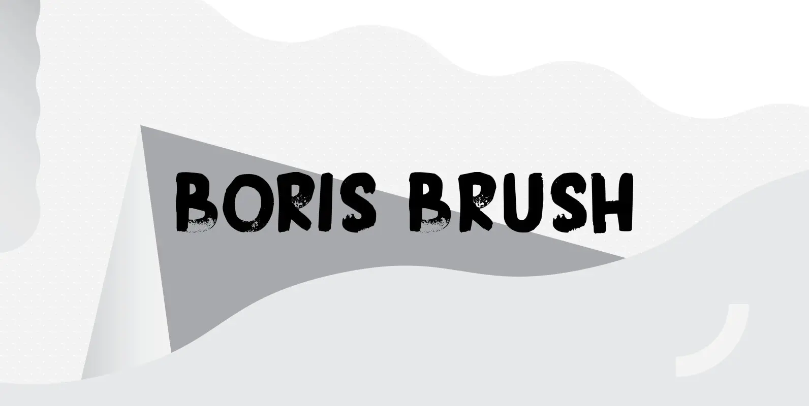
Boris Brush Font
Boris is my son: he was born on January 7th and he is as cute as can be. Boris Brush font is a very loud, very useful brush typeface, which I created using some fine-haired brushes and black paint. It
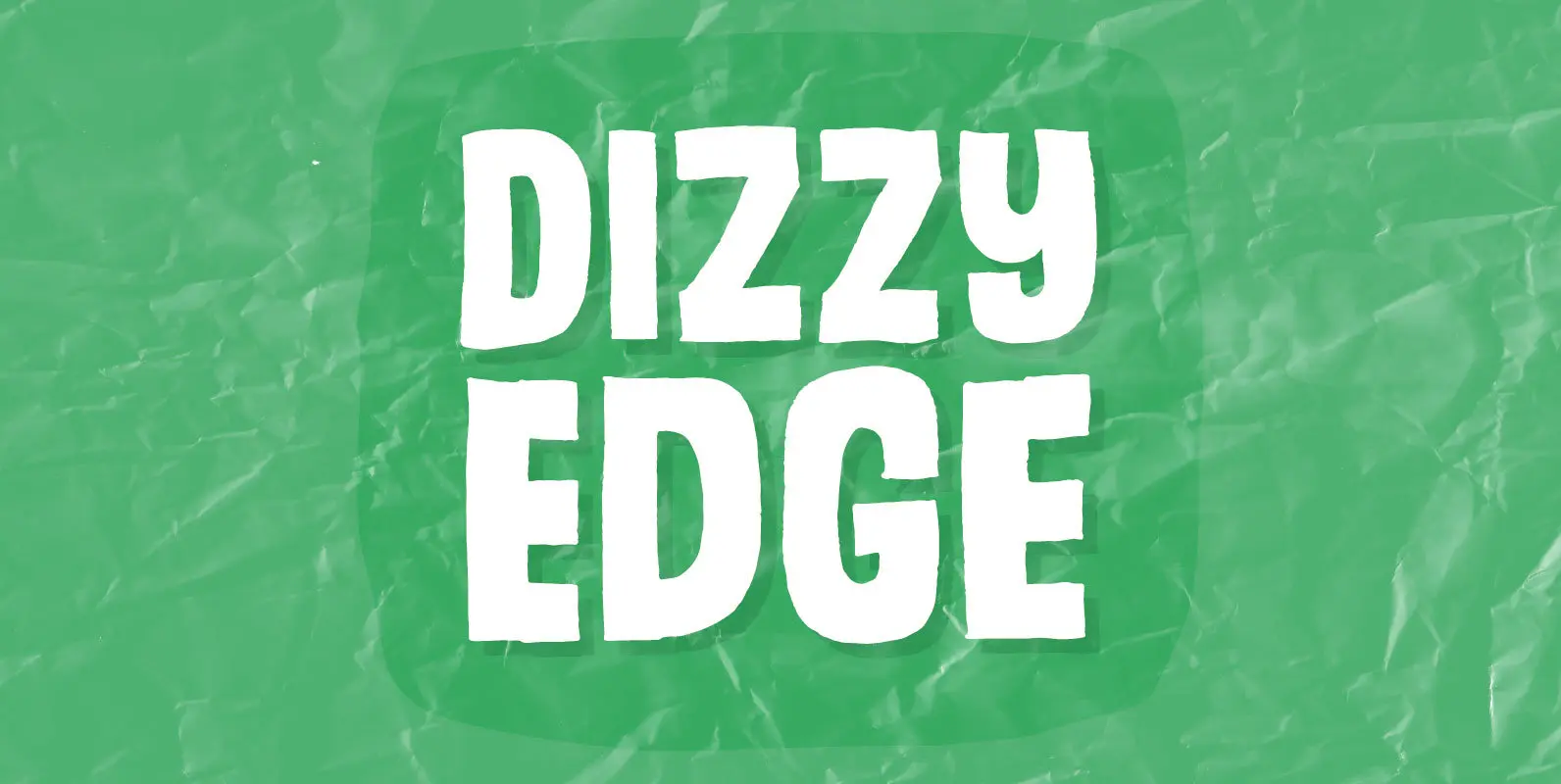
Dizzy Edge Font
My Dizzy Edge font is really not that dizzy! Actually it’s quite steady and legible – super good for packaging, greeting cards and perhaps even commercials for toys, candy, t-shirts, movie posters…yep, that list is long! What’s more interesting is
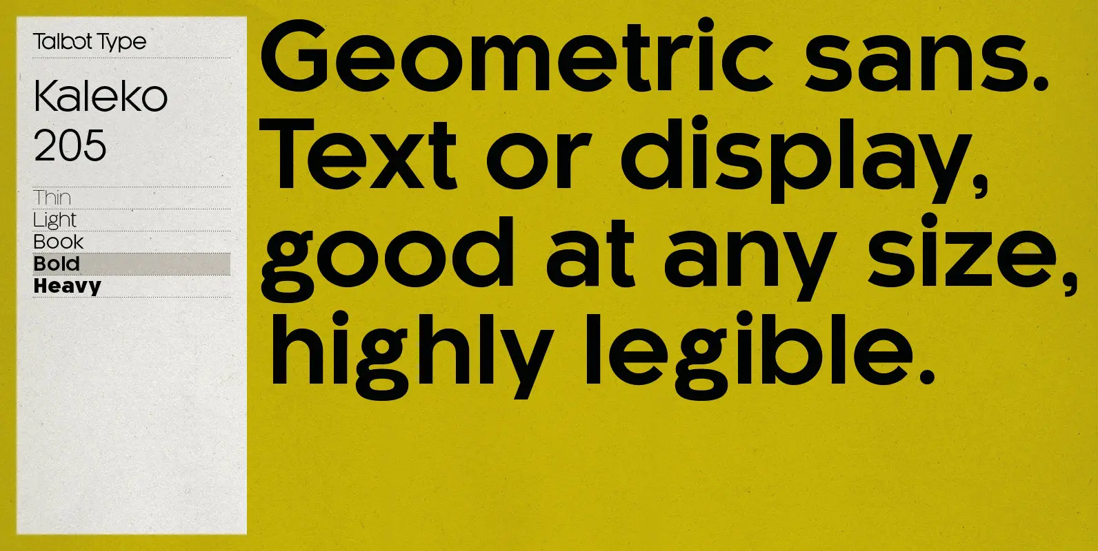
Kaleko 205 Font
Kaleko 205 is inspired by the classic, geometric sans-serifs such as Gill Sans, but has shallower ascenders and descenders for a more compact look. It’s a well-balanced, versatile, modern sans, highly legible as a text font and with a clean,
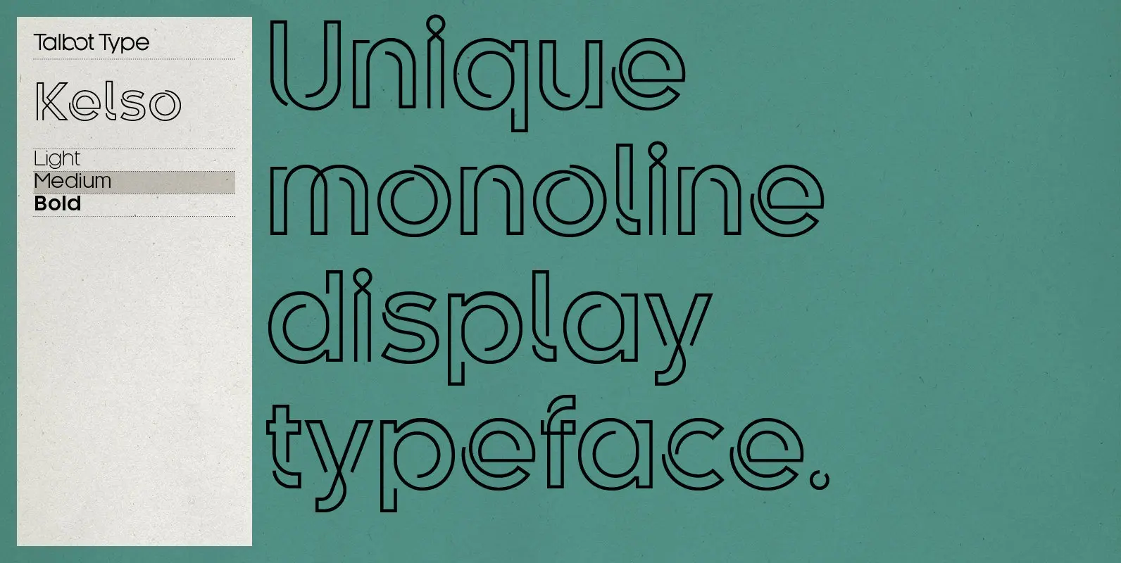
Kelso Font
Kelso is a highly original, outline display font. Each character is represented by a single continuous line to create a fluid and rhythmic look. This technique seems somehow to bring out the individual characteristics of each letter, resulting in a
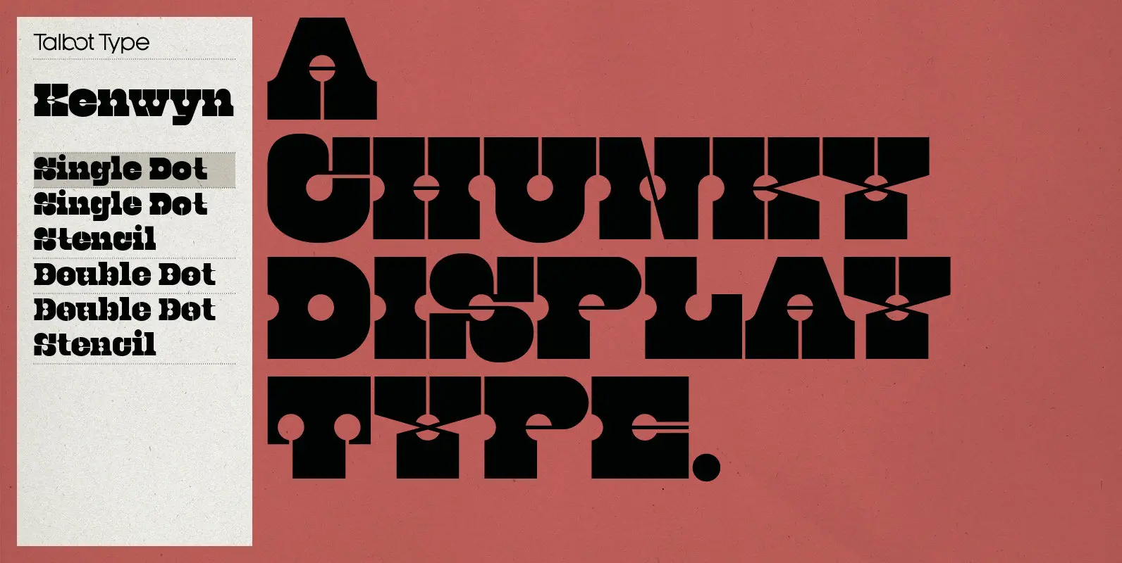
Kenwyn Font
Kenwyn is a bold, geometric, Egyptian style slab-serif display font. It comes in two variations — Single Dot and Double Dot — each with an accompanying Stencil variation. Essentially a blend of circles and squares, Single Dot features a circular
