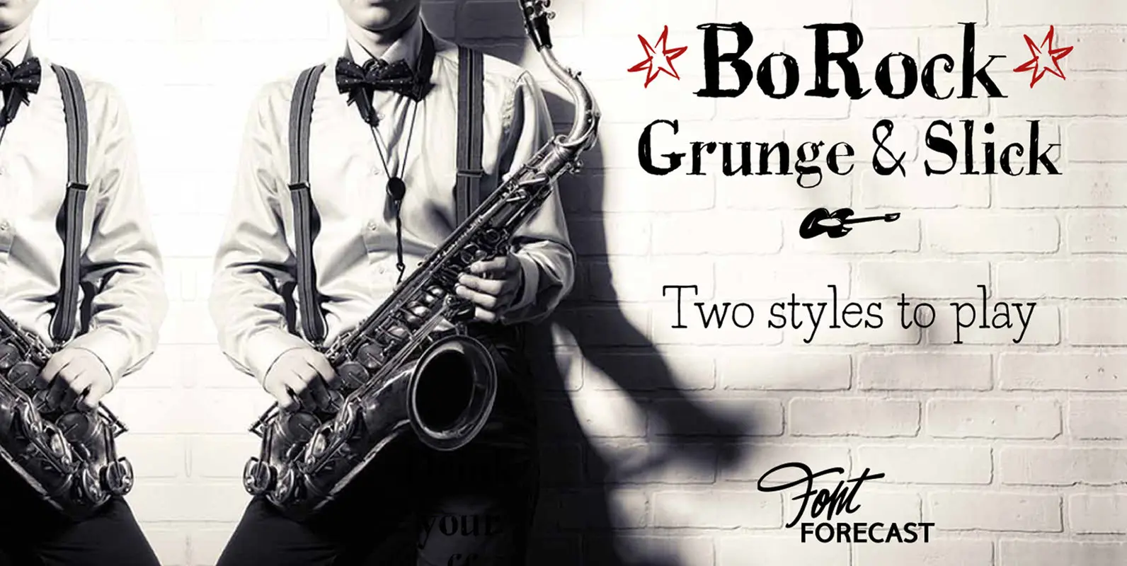
BoRock Font
BoRock is a handcrafted font that comes in two pigheaded styles, inspired by the rock music scene. You can use BoRock instead of the usual neat serif fonts. BoRock Grunge is a rough crispy serif font, excellently suited for use
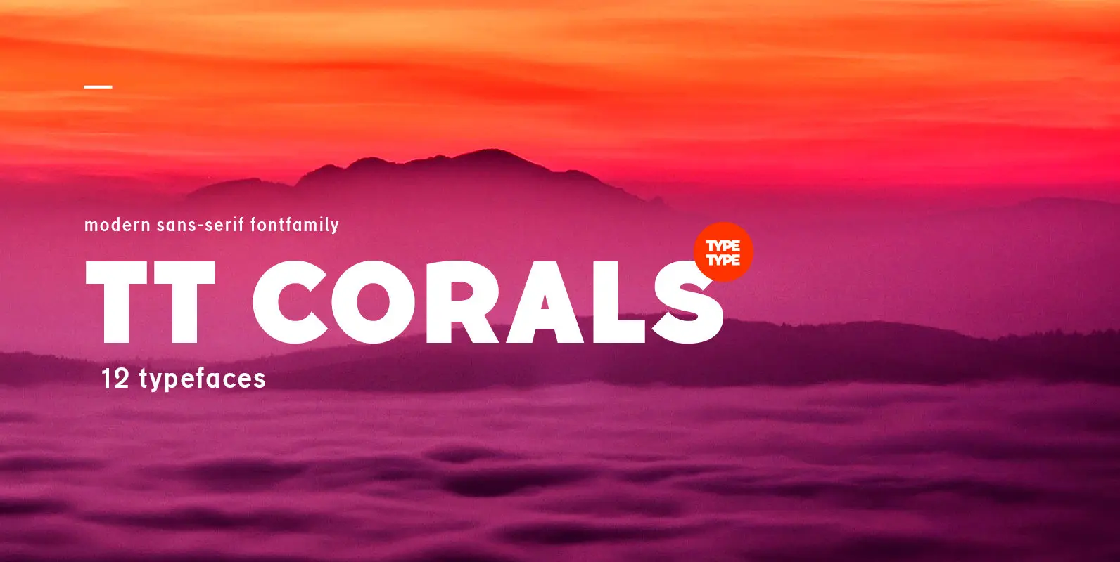
TT Corals is a modern humanistic sans-serif which has many typical traits of the beginning of the 20th century. For an increased functionality of the font family we’ve created 6 typefaces of various weights: Thin, Light, Regular, Bold, Extrabold, Black.
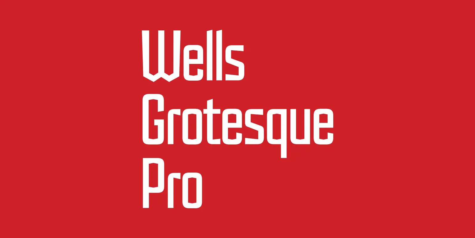
Designed by Hal Taylor. Inspired by the H.G.Wells science fiction novel ‘War of the Worlds,’ first published in 1898. Wells Grotesque also contains Small Caps, Old Style Figures and alternate glyphs, plus all the high-end features expected in a quality
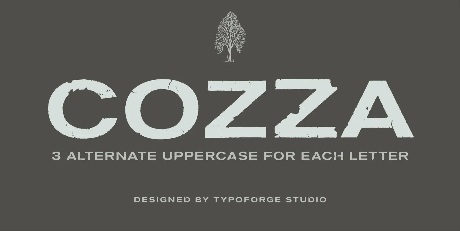
The inspiration for the design of the font Cozza was Unitra Letraset from the 80s. Dry transfer lettering was used by architects from Poland and Czech Republic. Font Cozza, for each character has three alternative characters with their automatic replacement.
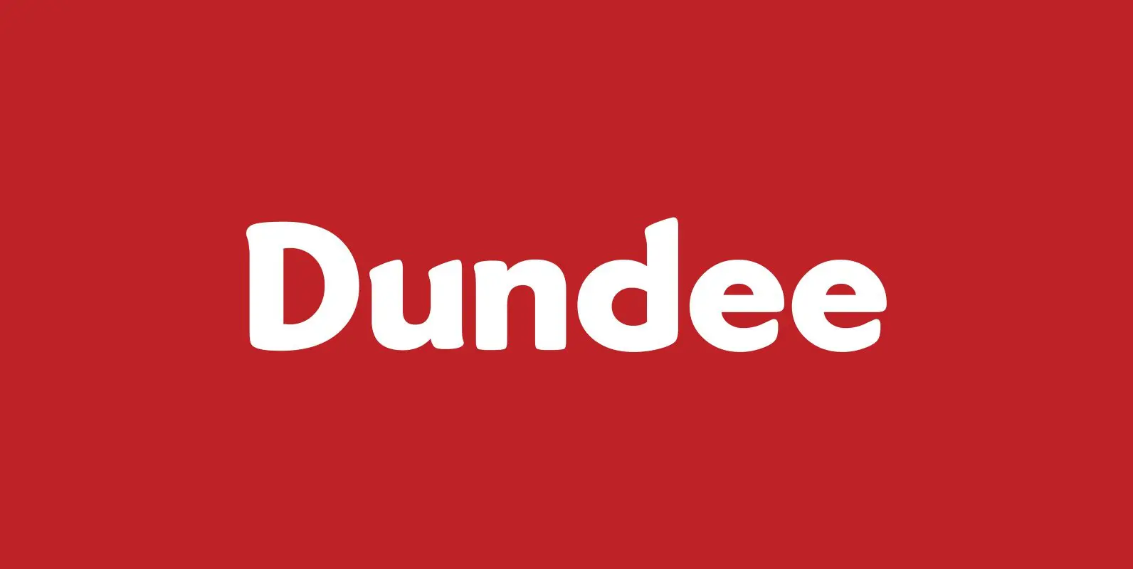
Designed by A. Pat Hickson, Dundee is a new design inspired by the various mastheads used in children’s comic books in England, published by D.C. Thompson of Dundee, Scotland. Published by Red RoosterDownload Dundee
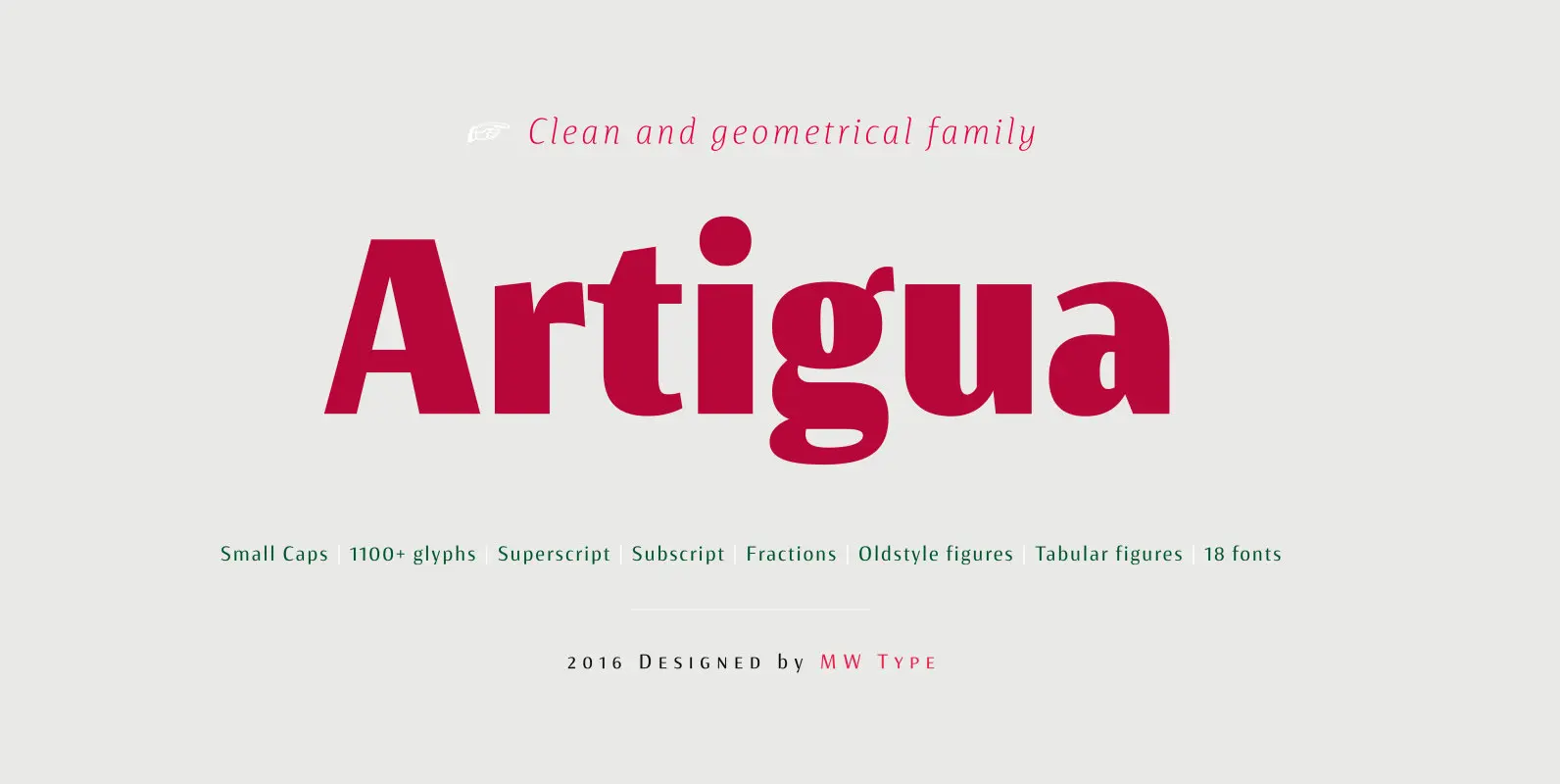
High contrast, sharp endings and geometrical shapes – these are the main features of Artigua. The relation of vertical and horizontal lines reduces with weight – this makes regular weight appropriate for longer texts and black ideal weight for headings.
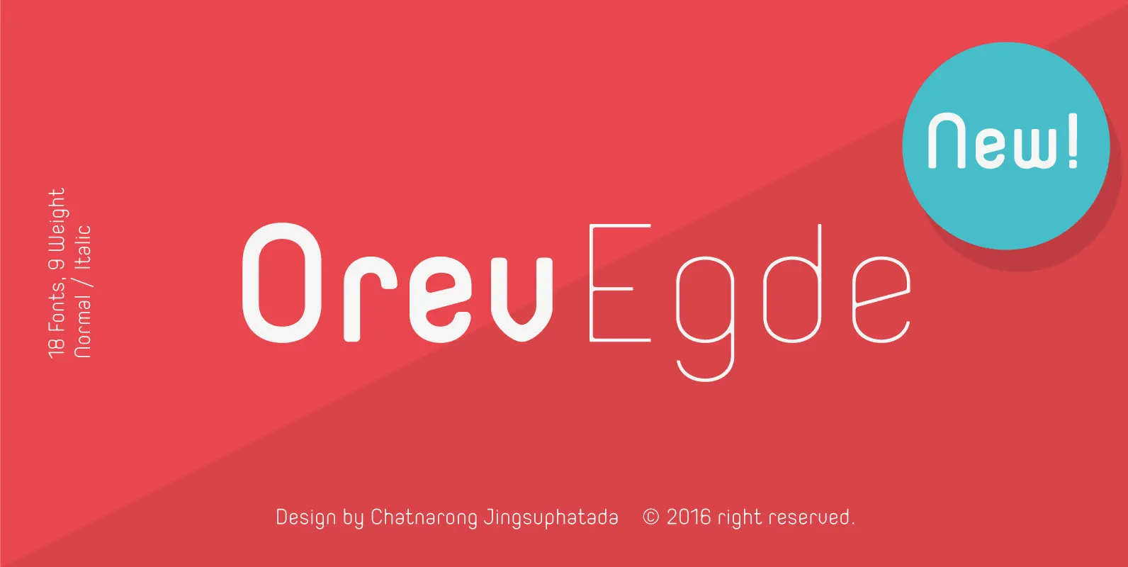
Orev Edge is altered modified from the form of the original “Orev” typeface. We added curved line in both inner and outer edges, including the structure of typeface. Import to be more friendly, the font family has smoother terminals that
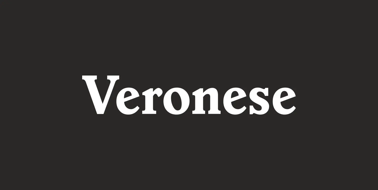
Designed by Steve Jackaman, Veronese is based on the early original Monotype design, you can definitely see the influence of Italian Old Style, Jenson and Morris Golden Type. Published by Red RoosterDownload Veronese
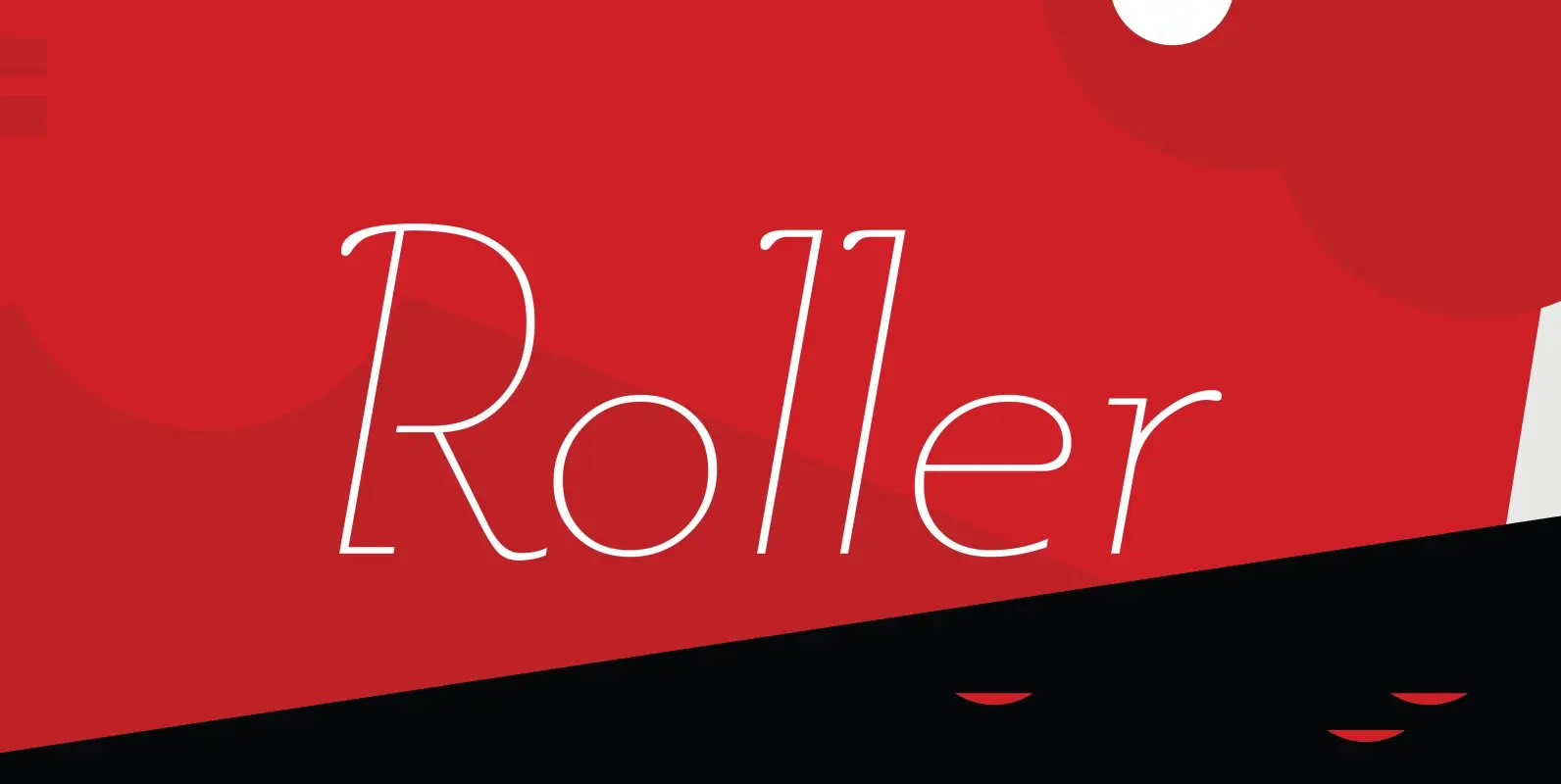
Designed by A. Pat Hickson, Roller is a retro font design based on Iberica by Carlos Winkow for the Spanish foundry, Nacional, circa 1942. Published by Red RoosterDownload Roller
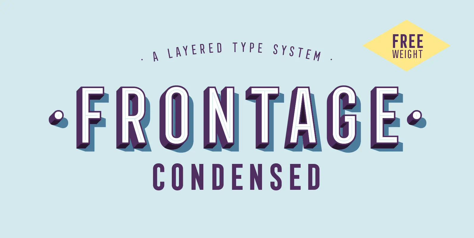
Frontage Condensed is a layered type system inspired by eye-catching and colorful facade signage. Its main aspect is — like many typographic installations on storefronts — three dimensional. The narrow, generously spaced letterforms lend the typeface a bold and eminent
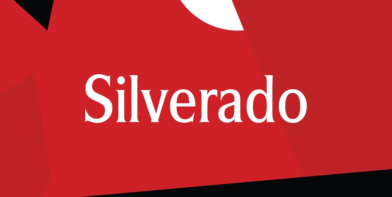
Designed by Steve Jackaman, Silverado is based on a classic serif type design called Eldorado. Published by Red RoosterDownload Silverado
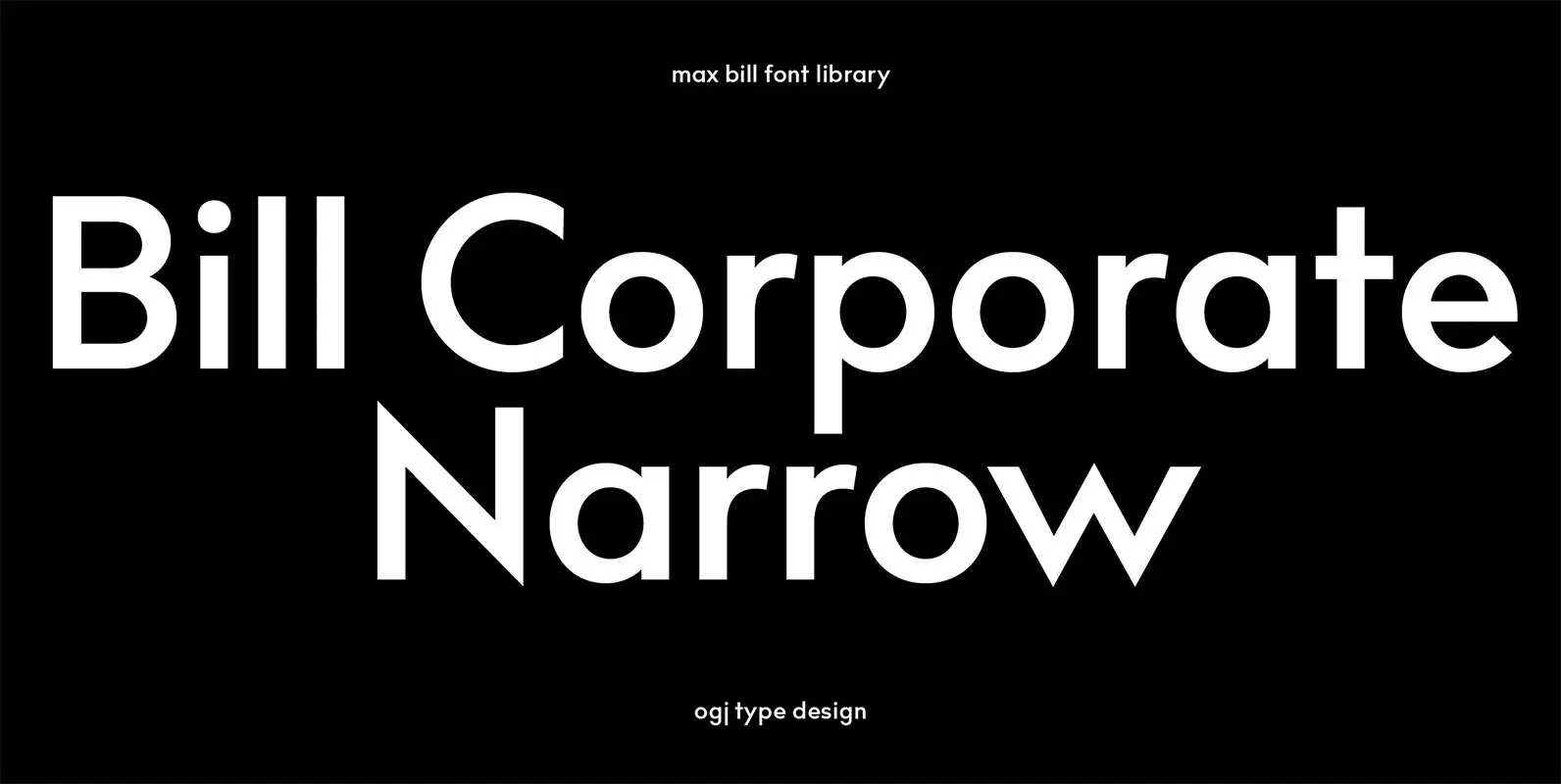
bill corporate narrow supports central, eastern european and western european languages. for special wishes, e.g. a license without limitation or a customized design, contact ogj via email (ask the YWFT-agents for information). Published by ogj type design Download Bill Corporate
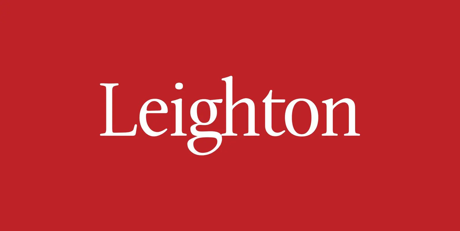
Designed by Paul Hickson, Leighton is a clean serif based on Lectura, a design by Dick Dooijes of the Amsterdam Foundry (1966). Published by Red RoosterDownload Leighton

Ovsyanka (oatmeal) is a typeface with rounded corners and a slight distressed effect. Ovsyanka is ideal for packaging designs, for example chocolate or coffee box designs. Published by Dmitry MashkinDownload Ovsyanka
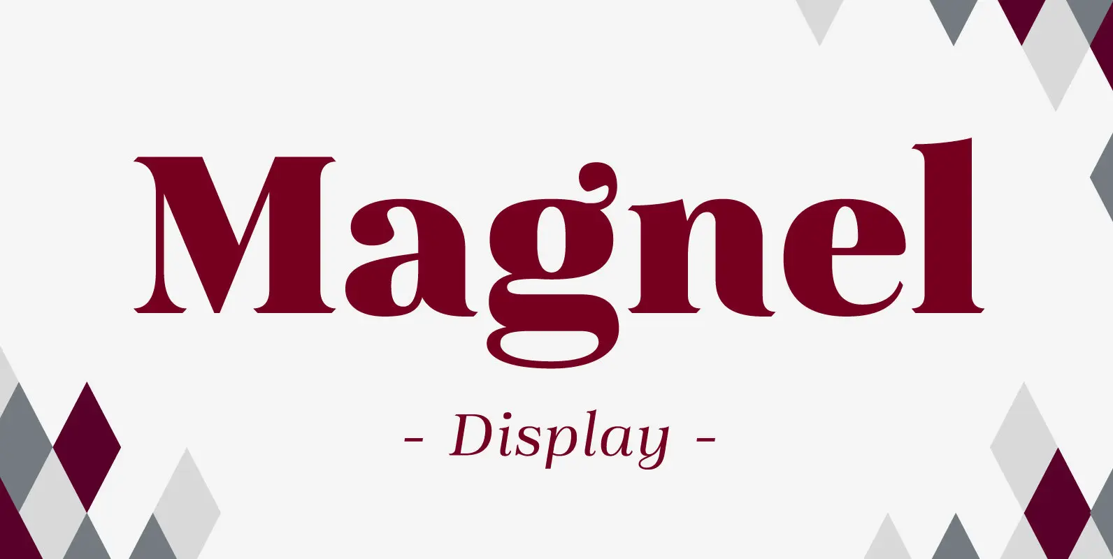
A display Didone of four weights plus italics. The defining stylistic features are large x-height and asymmetric legs that give feminine, oriental, floral look. Includes accented swashes, decorative ligatures and oldstyle numerals. Published by Eimantas PaskonisDownload Magnel Display