Tag: headline
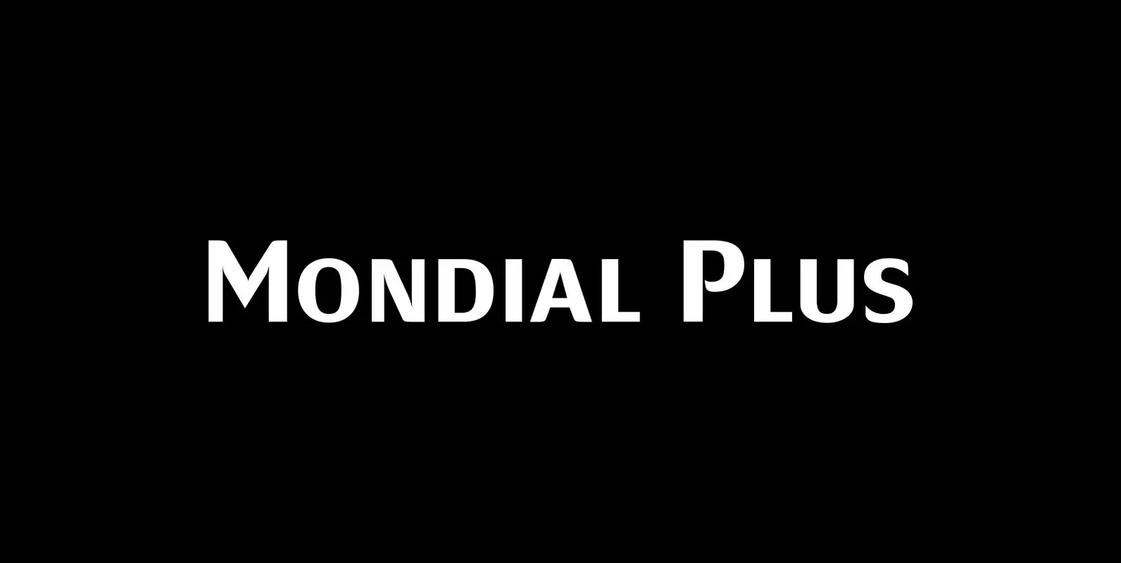
Mondial Plus Font
Mondial Plus is – as the name implies – a font meant for the whole world. Mondial Plus is the newer and better version of Mondial. Mondial Plus is designed to work in small sizes for body text. Only in
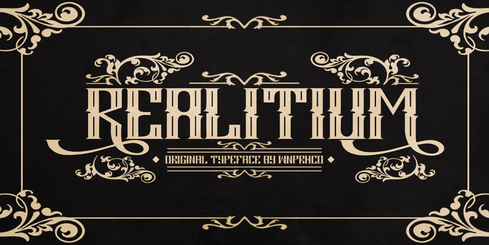
Realitium Font
Realitium is a vintage style blackletter font by WNPRH Collective. Published by WNPRH Collective Download Realitium
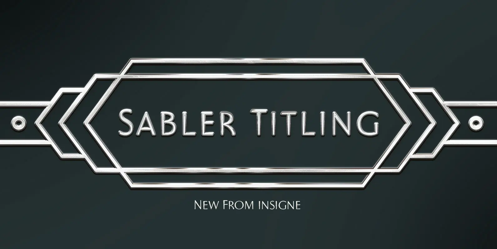
Sabler Titling Font
Make the right statement with the elegant Sabler Titling. This showstopping font features an inherent grace combined with the classic style of the Art Deco period. The subtle beauty of its letters is highlighted by the typeface’s stems, which taper
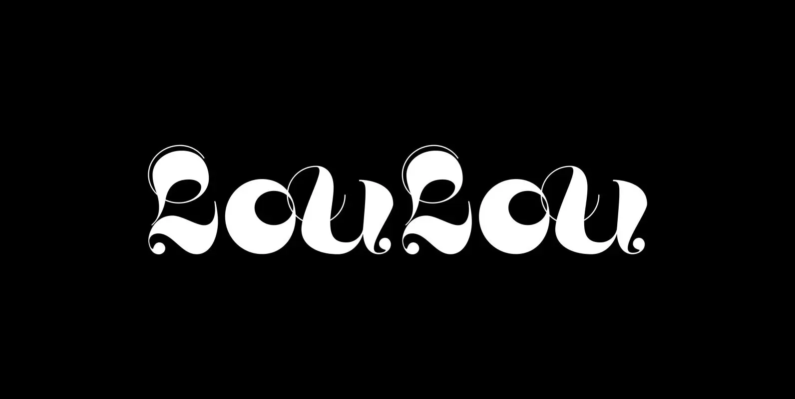
LouLou Font
“LouLou” is a scriptlike typeface that looks as if it came right out of the sixties and seventies. Flowerpower! I enjoyed doing this one your swinging type designer Gert Wiescher Published by Wiescher DesignDownload LouLou

CA Geheimagent Font
CA Geheimagent is perfect for setting text about restrictions, or permissions if you prefer. Not quite a text font, not quite a headline font, it’s a bit of both. The Italic style break up the strictness of the regular fonts.
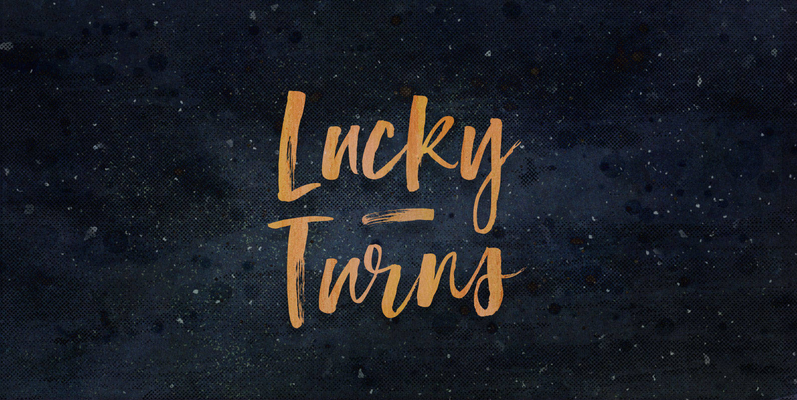
Lucky Turns Font
You have reached your destination. Whether you knew where you were going or not, all that matters is that you made it. Whether the best, or a blind pathfinder, either is only a few Lucky Turns away from making it.
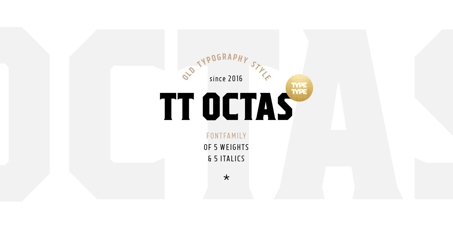
TT Octas Font
TT Octas is a narrowly proportioned font family built upon the principle of octagonal forms: all circles in this font family are actually octagons. Thanks to small serifs, TT Octas has a saturated and vintage character to it. Simple depiction
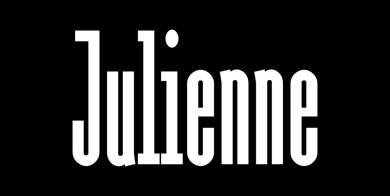
Julienne Font
Cooks call thinly cut – like matchsticks – vegetables »Julienne«. I found that was a fitting name for this very narrow typeface. Julienne Slim is the extreme cut of the two. Personally I do not use narrow typefaces very often,
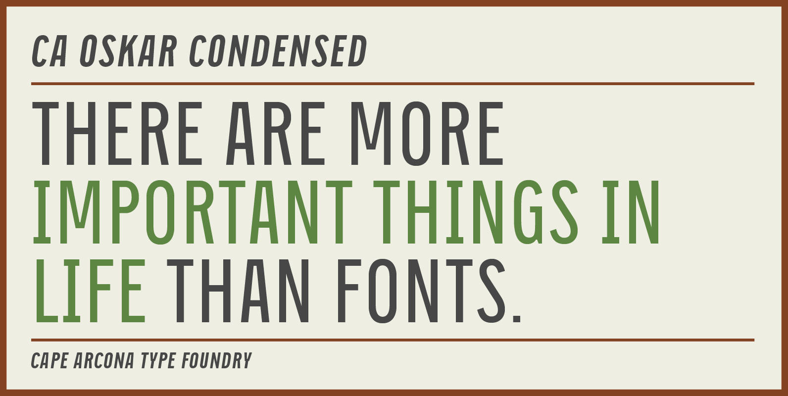
CA Oskar Condensed Font
CA Oskar came into being as a custom typeface for the international Traumzeit music festival. As a substantial part of the new corporate identity, it had to be characteristic, but also flexible in use. Starting with the design of compressed
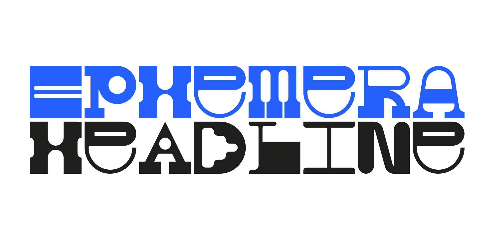
Ephemera Font
Ephemera is a fixed-width headline typeface with a range of glyphs and alternate characters FROM PARTS UNKNOWN. Published by FROM PARTS UNKNOWNDownload Ephemera
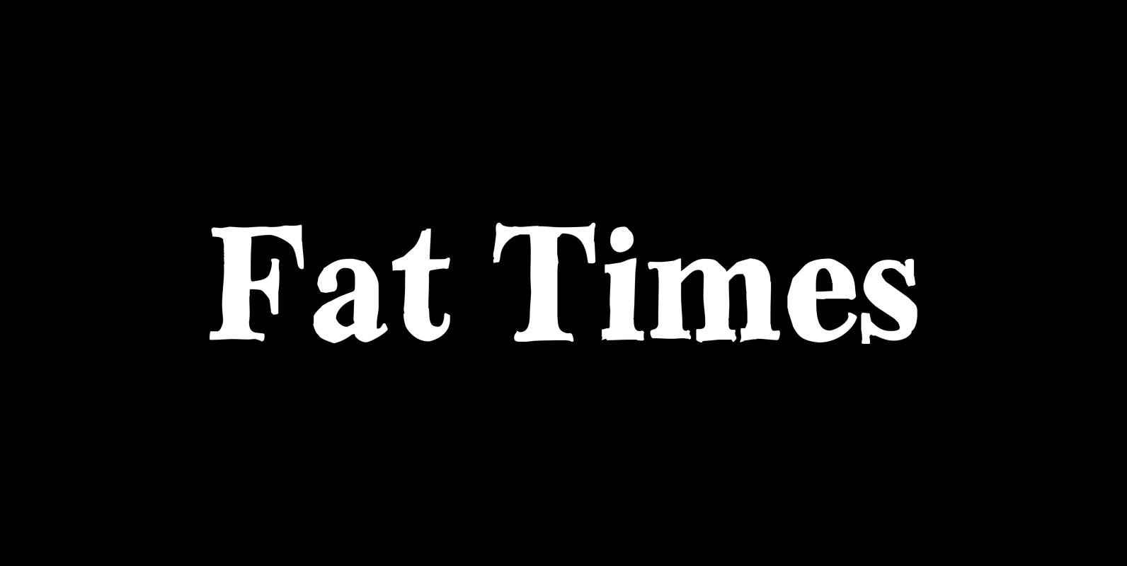
Fat Times Font
“FatTimes” is an extension to my HardTimes family. Times are too hard for boring typefaces, so try the fat one one for a change. Published by Wiescher DesignDownload Fat Times
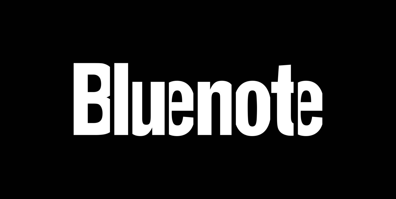
Bluenote Font
“Bluenote” is a font based on “Franklin Gothic condensed”. In the 60s and 70s the record label Blue Note published all those classic jazz records of my youth. Someone at their arts department cut letters to ribbons and designed wonderful
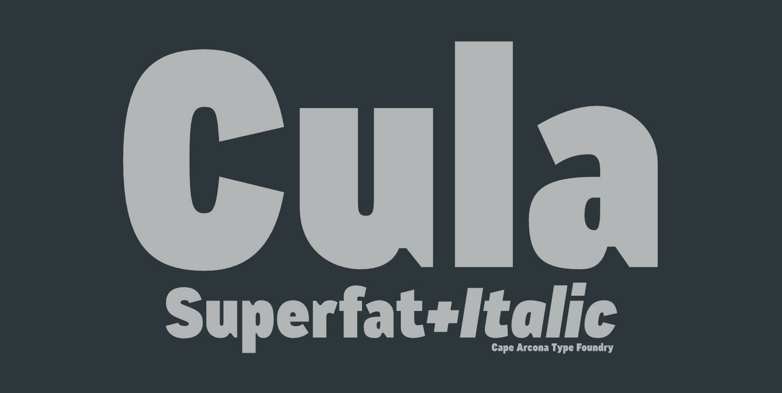
CA Cula Superfat Font
CA Cula Superfat is a distinctive fatty typeface, mainly intended for display purposes. You will find out that it looks best in extremely large sizes, or in very small ones. Whatever you do, avoid the ordinary and expectable. It’s not
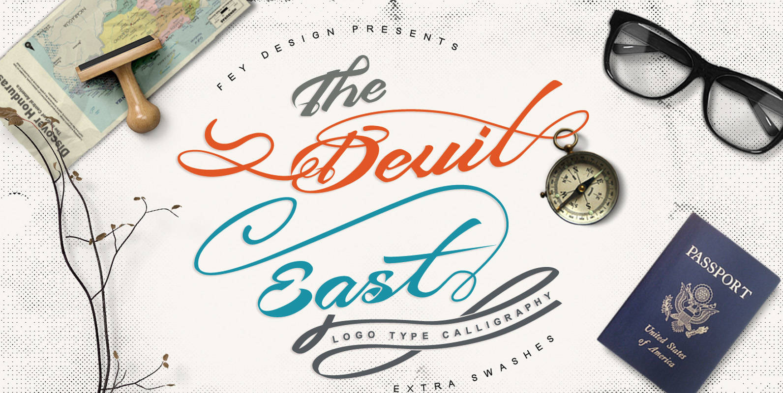
Devil East Font
Devil East is a script design released by Ferry Hadriyan. Published by Ferry HadriyanDownload Devil East
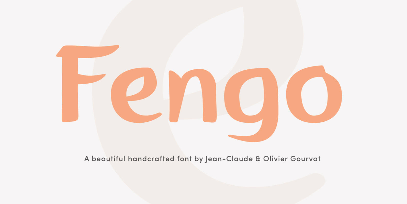
Fengo Font
Fengo is a beautiful handlettering font inspired by Sino-Japanese and traditional Chinese hieroglyphic characters. As a result the font looks authentic and very friendly. It contains a wide range of features such as initials, finals, swashes, arrows, circled numerals. Fengo
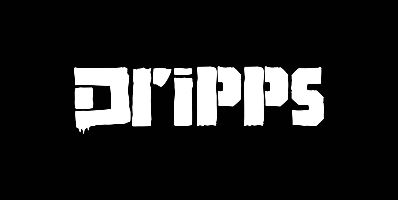
Dripps Font
“Dripps” is a hand painted, stenciled typeface with lots of drips and two different sets of capital letters – no lowercase. Published by Wiescher DesignDownload Dripps
