Tag: headline
Marita Pro Font
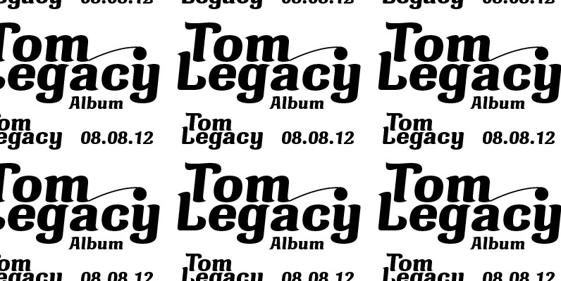
Marita combines sternness with swing and, from this, develops its own, unique elegance. This makes Marita quite versatile, also and especially for headline settings. Apart from numerous ligatures, the font also includes old style figures. Marita is based on brush
Vanage Font
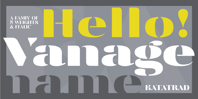
Vanage is is an elegant high contrast contemporary sans-serif stencil typeface provides advanced typographical support with features such as ligatures and alternate characters. It is rooted in the style of a classic high contest typeface, excluding the typical serifs and
Aculida Font
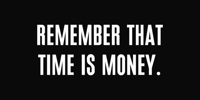
Aculida is a strong, condensed, and headline sans-serif font designed by Claudia Kipp in 2004, published and released by URW. Published by URW Type Foundry GmbHDownload Aculida
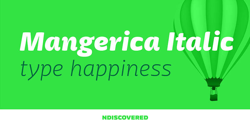
Mangerica Italic Font
The italic version of Mangerica is deeply rooted in the calligraphic heritage of the Italics. This way the brush inspired strokes are emphasized as well as an overall calligraphic look. Far from being a mere slant, Mangerica Italic had every
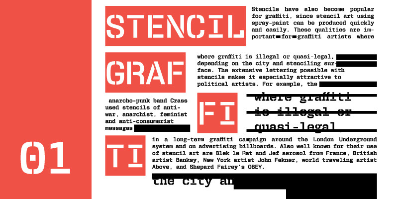
User Stencil Font
User is a monospaced type family with 30 styles, from Hairline to Bold, divided in Regular, Upright and Stencil, with five weights (Hairline, ExtraLight, Light, Medium and Bold) all with Cameo versions. Complexity and versatility are the keywords for this
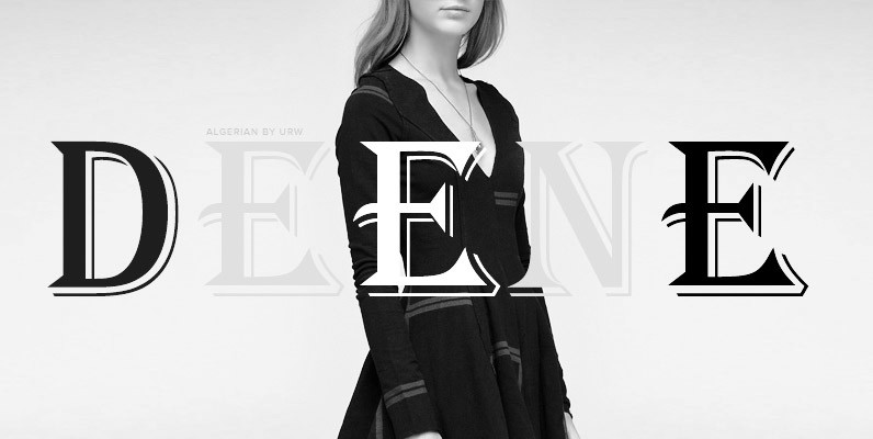
Algerian Font
Algerian is a well known decorative display font, published and released by URW Studio in 1985. Algerian is well known for being used a bit too much in previous design eras, but it still retains a certain freedom to be
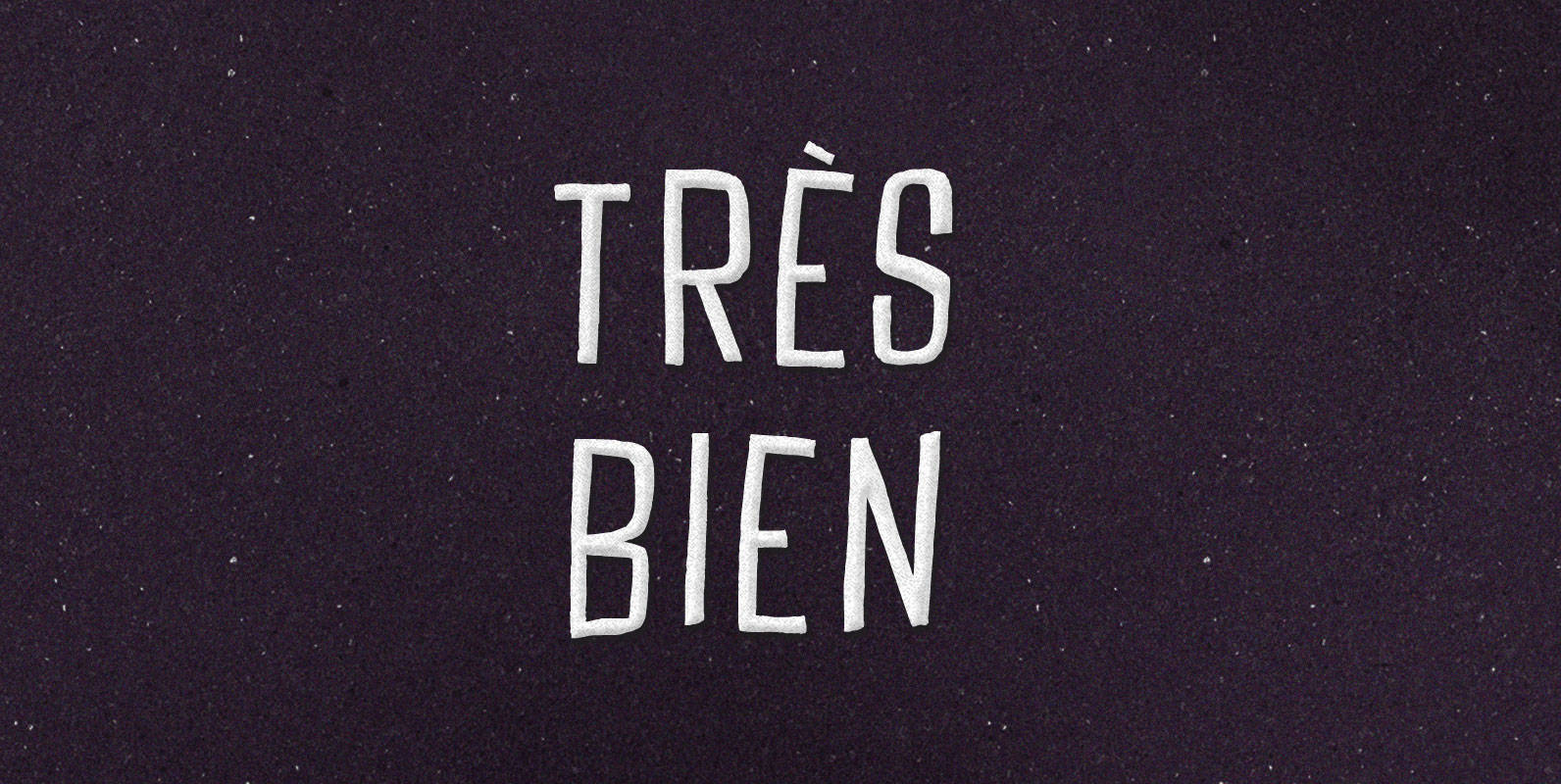
Tres Bien Font
We may say that a thing is good when on its own account it ought to exist, and bad when on its own account it ought not to exist. If it seems to be in our power to cause a

Robotik Font
This slab serif Egyptian typeface follows the trend for simple, mechanically constructed typefaces and is an ideal choice for communicating a feeling of precision and strength. Robotik is equally effective when set with normal or wide letter and word spacing.

Cornelia Font
Cornelia, an ‘undesigned’ typeface. Made by Novo Typo. Designers from Amsterdam, The Netherlands. Published by Novo TypoDownload Cornelia
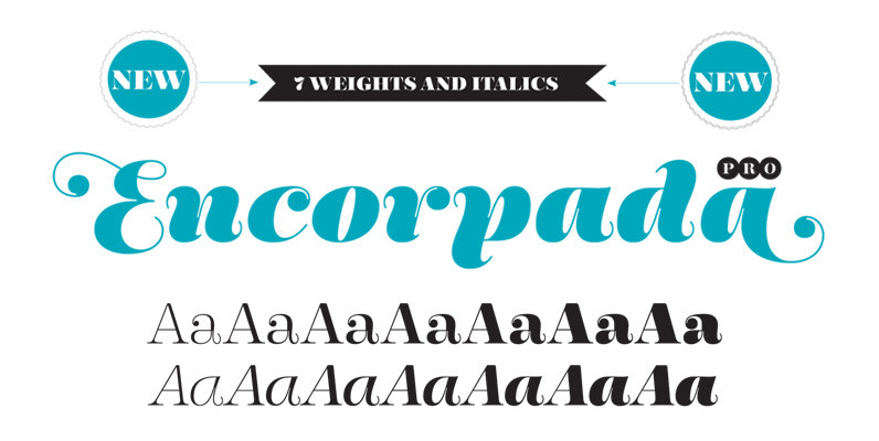
Encorpada Pro Font
With seven weights and a lot of curves. Freely inspired by the didones shapes, Encorpada Pro now have a extended character set with more than 40 languages supported, Opentype Features and Amazing Swashes in Italic Version. Enjoy It. Published by
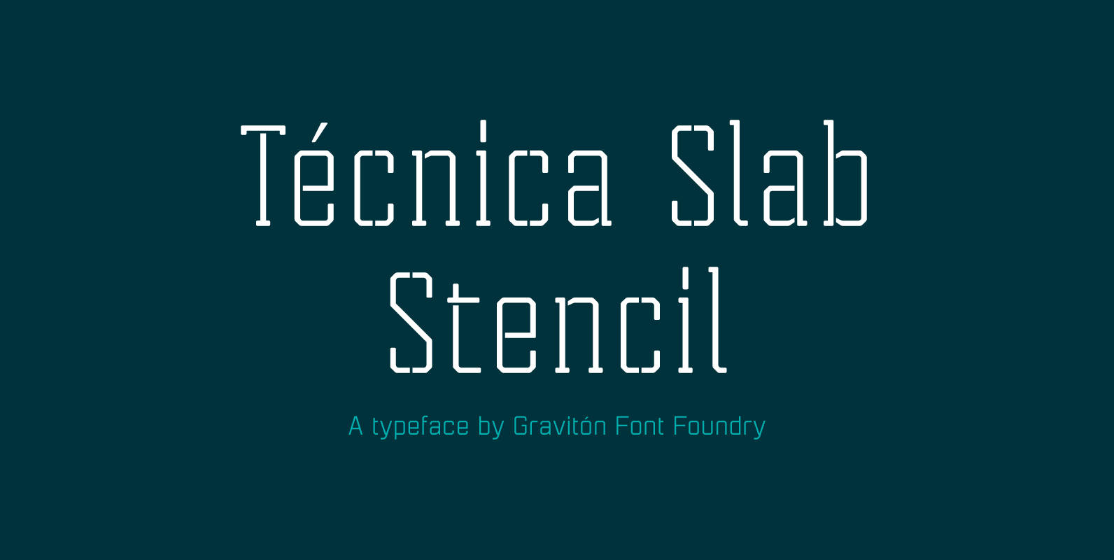
Tecnica Slab Stencil Font
Tecnica Slab Stencil font family is the stencil version of Tecnica Slab font family, it has been designed for Graviton Font Foundry by Pablo Balcells in 2014. Tecnica Slab Stencil consists of 8 styles. The 4 “Stencil 1” styles contain
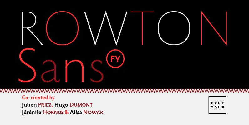
Rowton FY Font
Rowton FY digs its roots in Eric Gill’s views on typography in his book “An essay on Typography”. This typeface has the very British feel of the 20th century. Taking as inspiration the calligraphic illustrations of the book, Julien Priez,
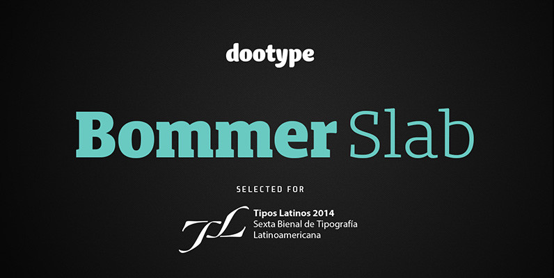
Bommer Slab Font
Bommer project started in January of 2014 and I am happy to announce the first family – Bommer Slab – is now ready for release. This family includes 14 weights – been seven uprights and seven italics. This font has
