Tag: headlines
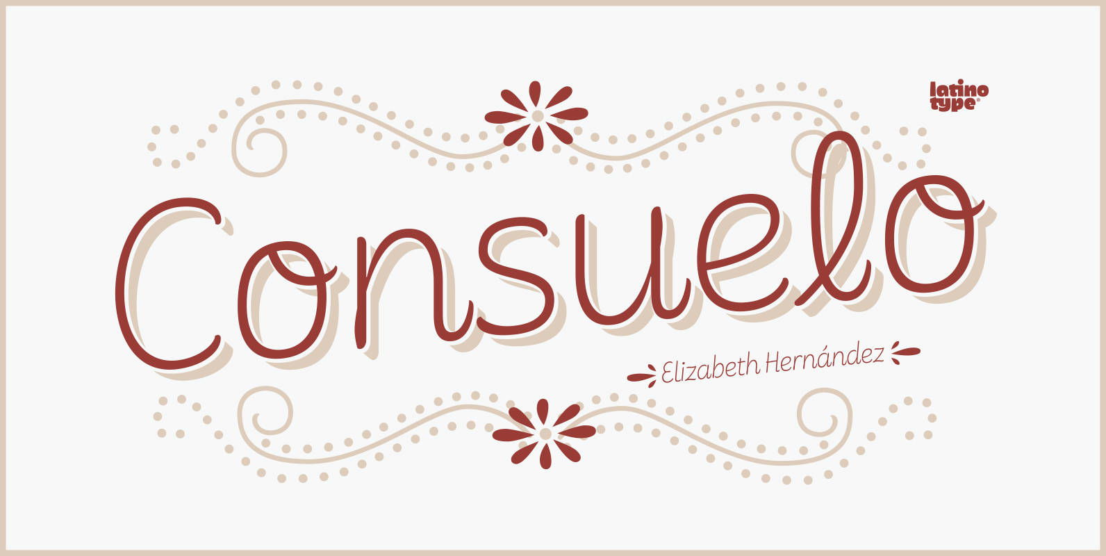
Consuelo Font
Consuelo is a font based on brush strokes. The family consists of a set of 4 variants with matching italics, plus a set of ornaments that gives designers multiple choices when composing texts. Consuelo is ideal for use on decorative
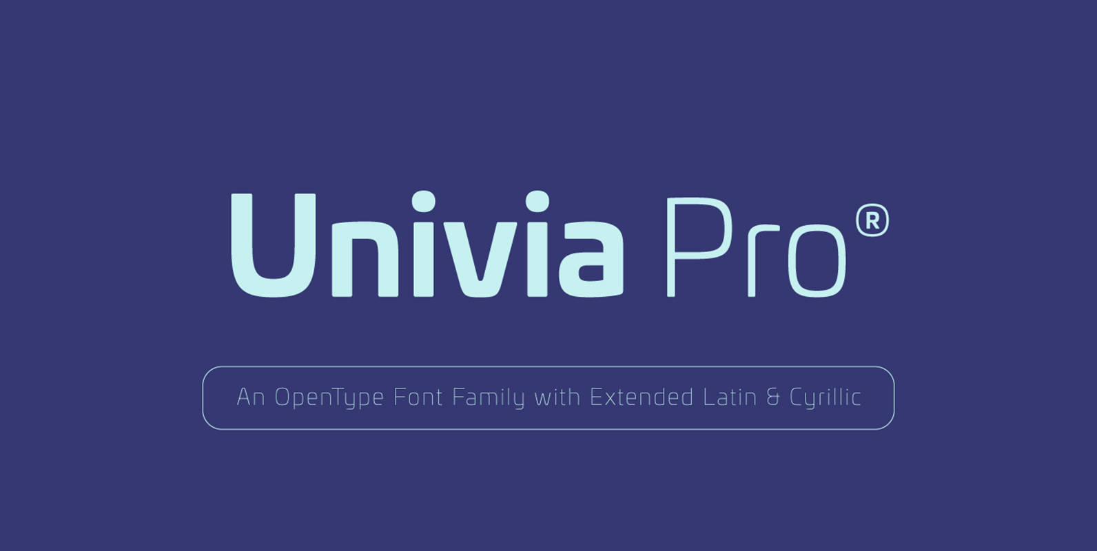
Univia Pro Font
Univia Pro is a new contemporary OpenType font family with modernity and versatility in mind. Distinctive with its pleasant look extremely modern, Univia Pro have a lot of personalty mostly achieved by smooth curves and round corners that forms a

Decour Soft Font
Decour Soft is the rounded-edged version of Decour. It is a slab serif humanist low contrast typeface. The overall design also features strong curves, making it a very friendly face. The font retains the original elegant features of Decour—based on

Corporative Sans Complete Family Font
Corporative Sans typeface is developed by Latinotype Team. Corporative Sans is the new version of Corporative. This font has a marked personality and distinctive traits, what makes it suitable to be used at large text sizes. Since it is a
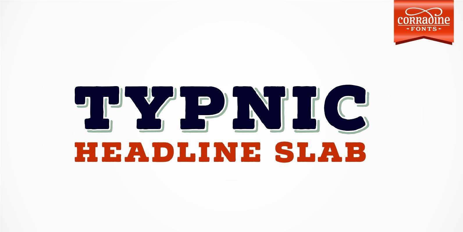
Typnic Headline Slab Font
Everybody likes to have a picnic: some fresh fruits, cheese, ham, wine and so on. Like a “typographic picnic”, Typnic font system gather many fonts with different flavors too, and you can enjoy them mixed or on their own. Typnic
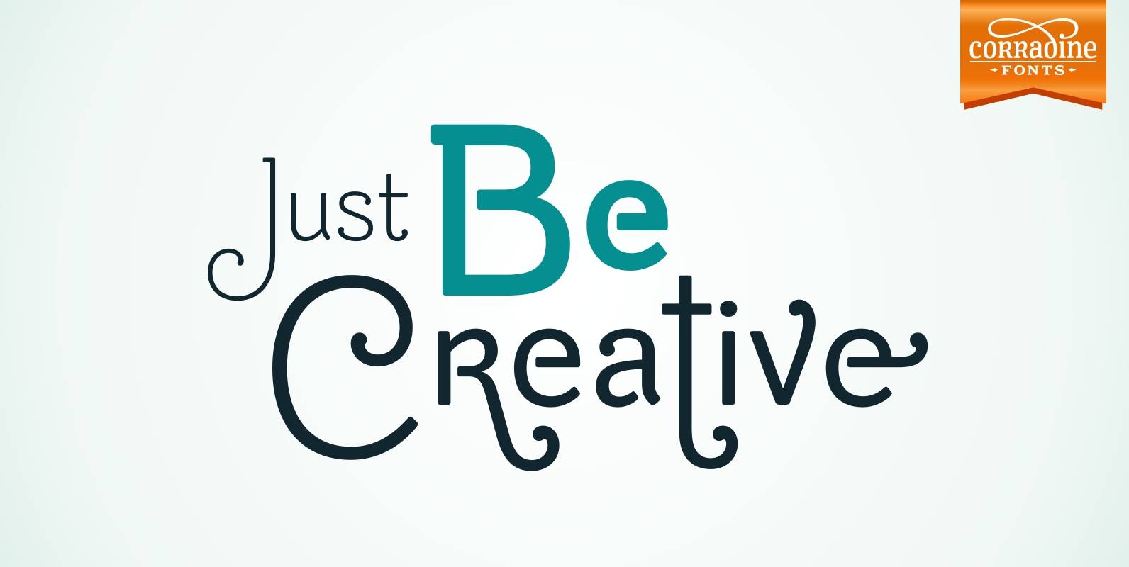
Be Creative Font
When you are trying to solve any problem, surely you round the solution like a swirl. This typeface represents that continuous search of creative solutions. So, our recommendation is “Be Creative” always. Based on the skeleton of the classic typeface
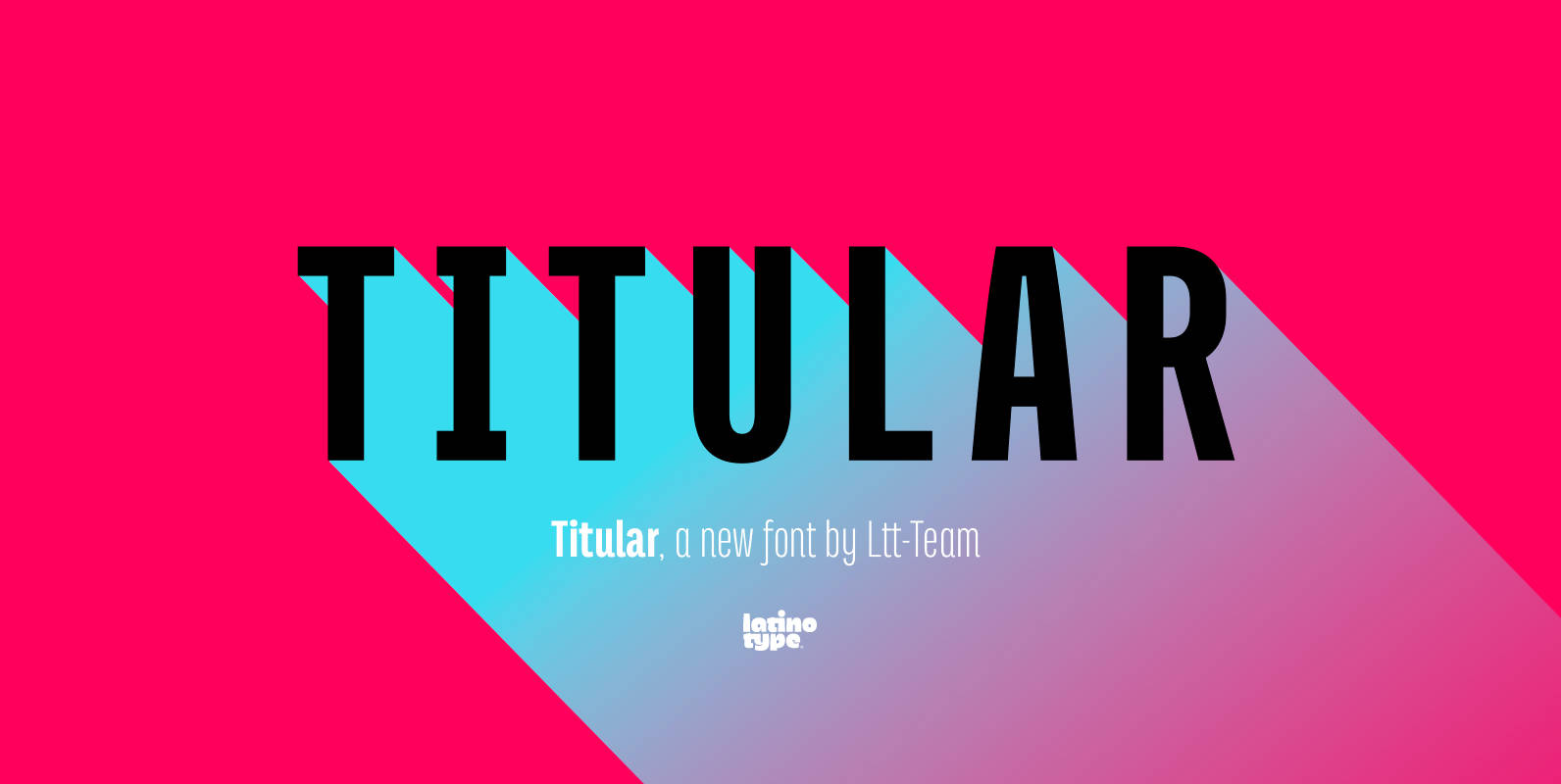
Titular Font
Titular is a condensed Sans Serif typeface that works well with headings, subheadings, newspapers, magazines as well as with logotypes, brands and posters. This typeface revives the spirit of old Woodtypes, but adding a contemporary flavour and Latin American seasoning.

Blanc Font
Blanc is a functional humanist sans typeface with a marked personality and great style that make it ideal for use in headlines. Blanc is an ode to neutrality: a geometric face characterised by low contrast between thick and thin strokes
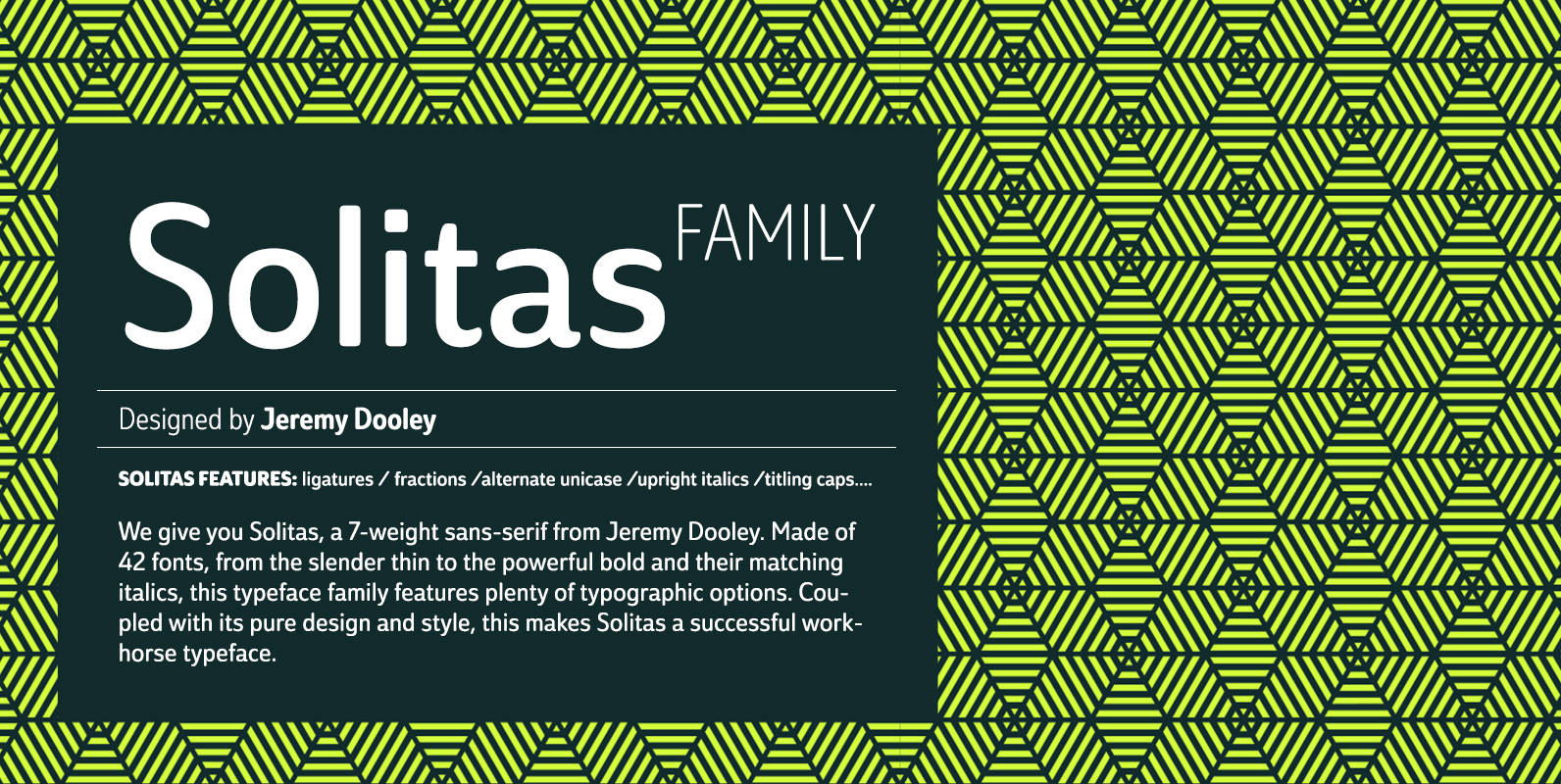
Solitas Font
We give you Solitas, a 7-weight sans-serif from Jeremy Dooley. Made of 42 fonts, from the slender thin to the powerful bold and their matching italics, this typeface family features typographic options including ligatures, fractions, alternate unicase, upright italics, and
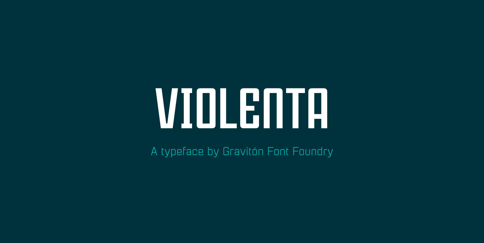
Violenta Font
Violenta font family has been designed for Graviton Font Foundry by Pablo Balcells in 2015. It is a display, geometric typeface, with a condensed design and sharp angles that provides an aggressive and strong appearance. Violenta consists of 8 styles.
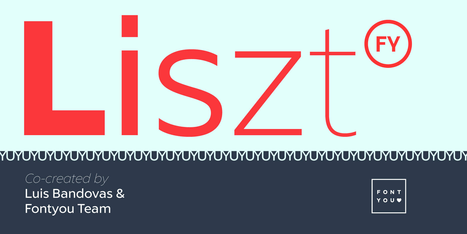
Liszt FY Font
Listz FY is definitely the new sans serif family you were waiting for. With its friendly & sharpened shapes and its big contrasts from hairline to black, this contemporary font family will be perfect for any kind of uses, from
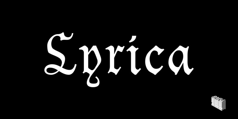
Lyrica Font
The 1910 Ludwig & Mayer font Lyrisch was redrawn and redesigned and given the name Lyrica. This cozy and familiar blackletter font is ideal for all informal purposes, giving your jobs a special kick and touch of romance. Published by
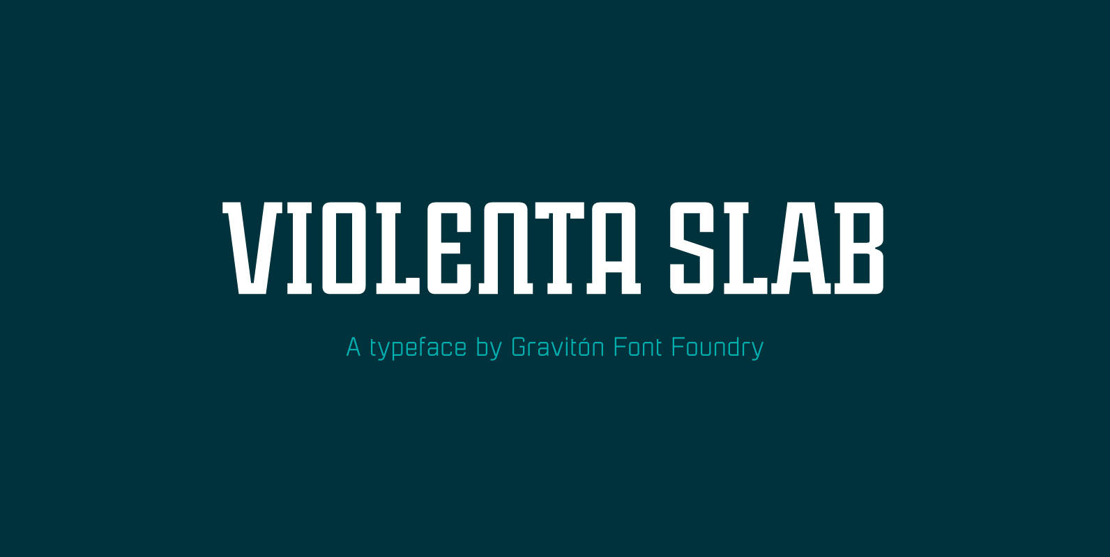
Violenta Slab Font
Violenta Slab font family has been designed for Graviton Font Foundry by Pablo Balcells in 2015. It is a display, geometric typeface, with a condensed design and sharp angles that provides an aggressive and strong appearance. Violenta Slab consists of
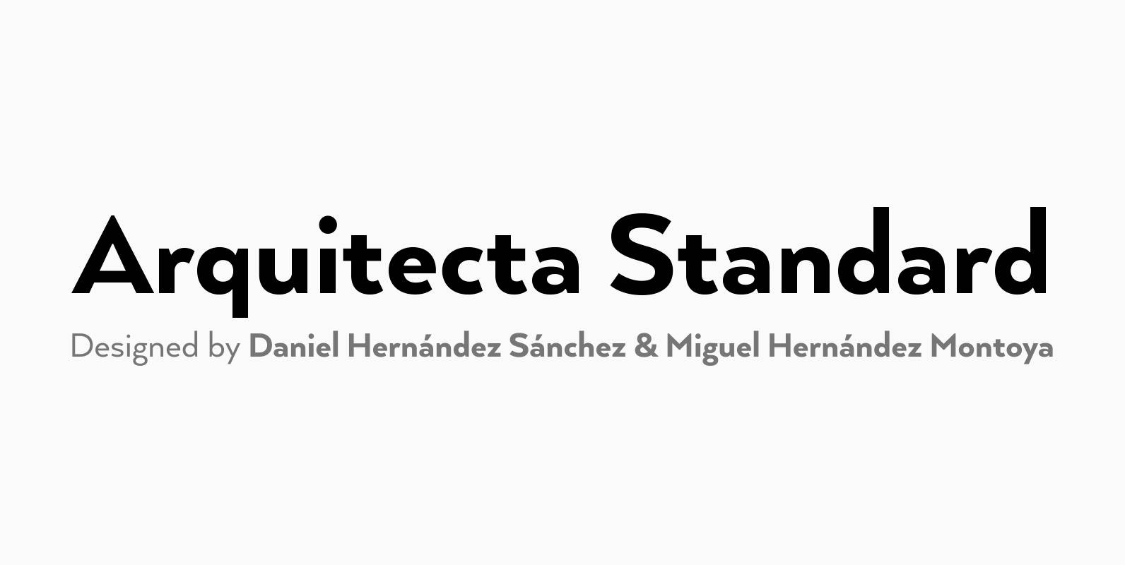
Arquitecta Standard Font
Arquitecta Standard. The humanist typography as a rational project. Since the experimentation from the Bauhaus through modern sans history we looked for a new mix to construct a rational geometric typeface with humanist proportions suitable for text layout and continuous
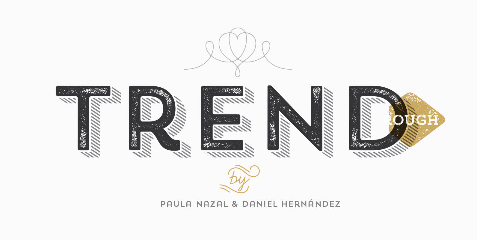
Trend Rough Font
Trend Rough, Trend & Trend Hand Made is a font made of layers, taking as a basis a sans and a slab font. It is the result of observation, search and study of the last global trends. Trend tries to
